Where journeys end

There's a bit of a theme this week: migration and movement. It's not a perfect fit with everything that follows, but I don't know what you expect from a weekly newsletter about data visualization. If I could perfectly tailor content to themes every single week, I'd probably figure out some more lucrative outlet for that skill, right?
Chapter 1
A long walk and a short peer
Instead of honing my theme-making craft this week, I decided to take a walk. And, happily, I live near one of the best places in the world to take walks: Manhattan.
I've gone for long walks across the borough in the past. Once, my sister and I walked from the top of Central Park to the tip of the island. Another time, I walked from The Washington Post's office in Greenwich Village back to my apartment on the Upper West Side. But this time I decided to go even further, starting at 125th Street in Harlem and heading to Battery Park all the way to the south.
So I did, my watch and phone tracking my progress as I went. Although — as is almost always the case — I forgot to start tracking my walk until I was already a few blocks in. (The walk began at the circle on the map below.)
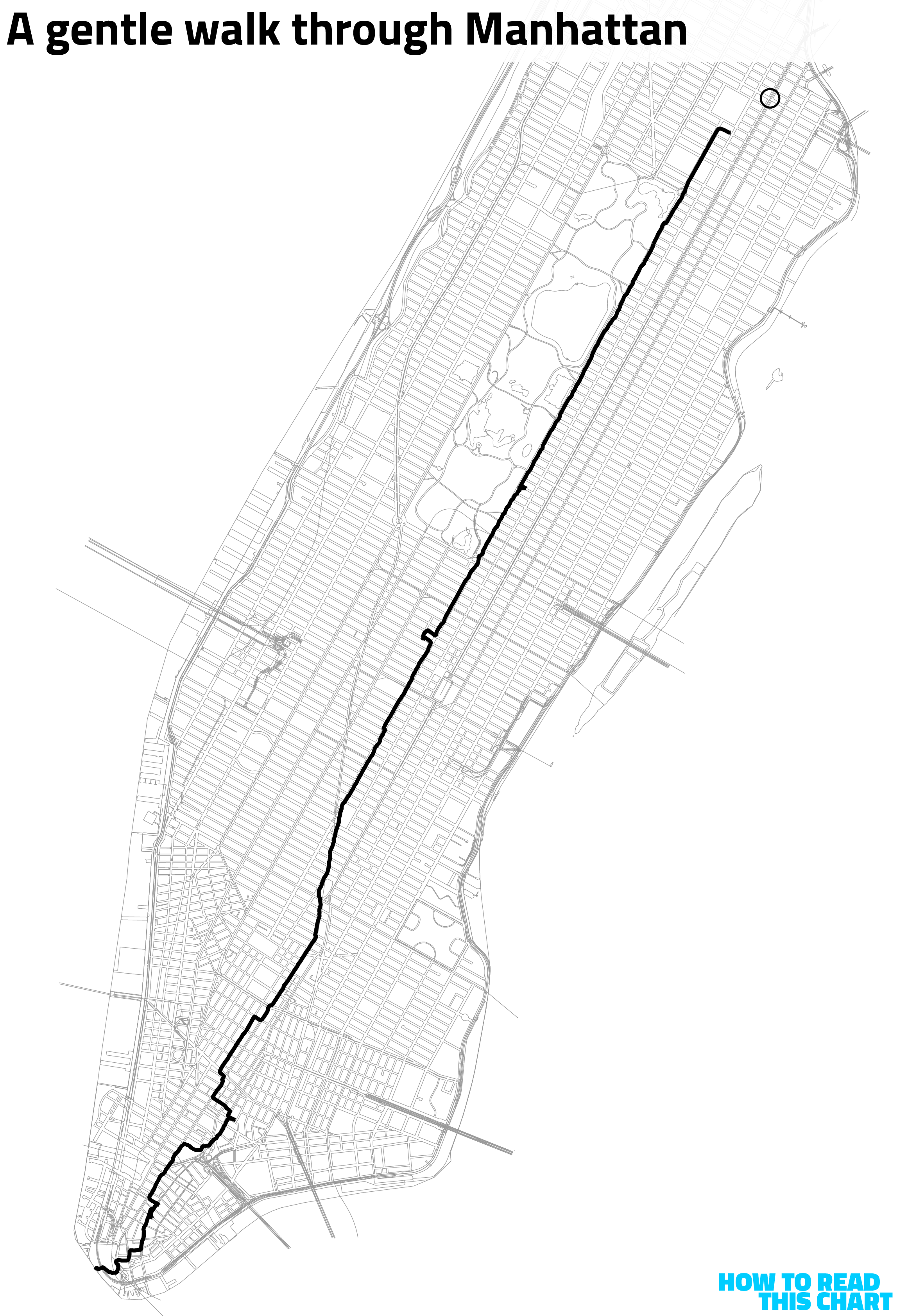
You can see a few spurs and shifts in course on my route. Before I explain those, though, I'd like to take a moment to marvel at what technology now offers us: about as thorough a catalog of our activity as is imaginable.
Back in college, in that long, hazy era before smartphones, I used to imagine how cool it would be if you could see everywhere you'd ever been indicated in the world around you. A set of overlapping paths on the ground, for example, muddied and thick in places you spent a lot of time or isolated and lonely in places you'd only been once. I tried to think about how such a device could exist; little did I realize that in a few decades' time, I'd be carrying one around in my pocket.
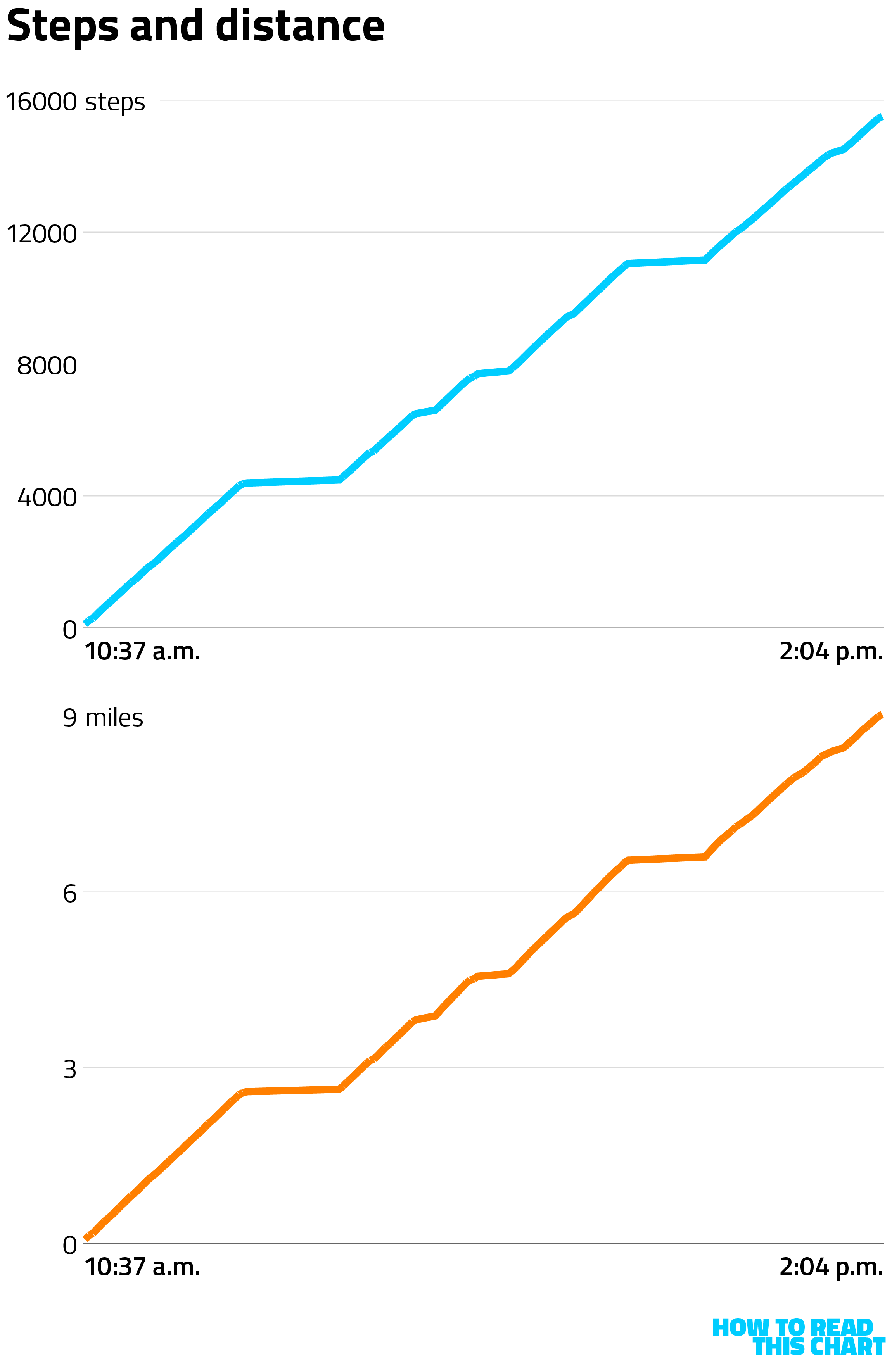
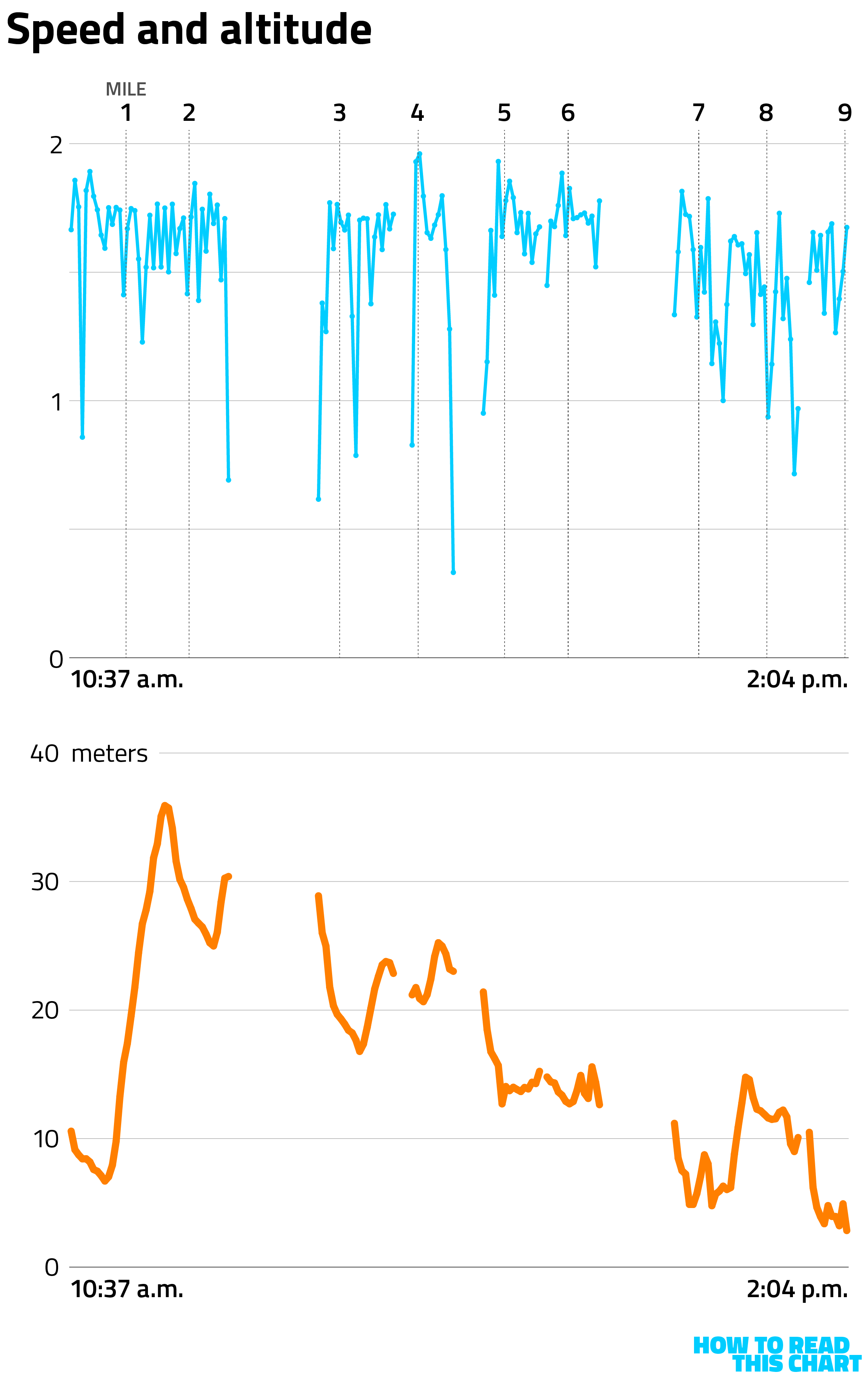
So I know, for example, that my route from Harlem to the Battery involved my taking about 16,000 steps. In total, I traveled just over nine miles over the course of about three-and-a-half hours, including those little spurs and detours but excluding the destinations to which those detours brought me.
I mean, I was walking in Manhattan! What, I wasn't going to stop and enjoy myself? So I stopped at the Frick Museum (which I hadn't seen since a relatively recent renovation) and at the Nintendo store (for the kiddos) and to eat (because I am a human being) and to grab a beer (uh, for some other noble purpose, no doubt).
You can see those stops both as spurs on my route and as places my pace suddenly slackened when I overlay speed data onto the map. (All of this was extracted from my phone using the Health Auto Export app, FYI.)
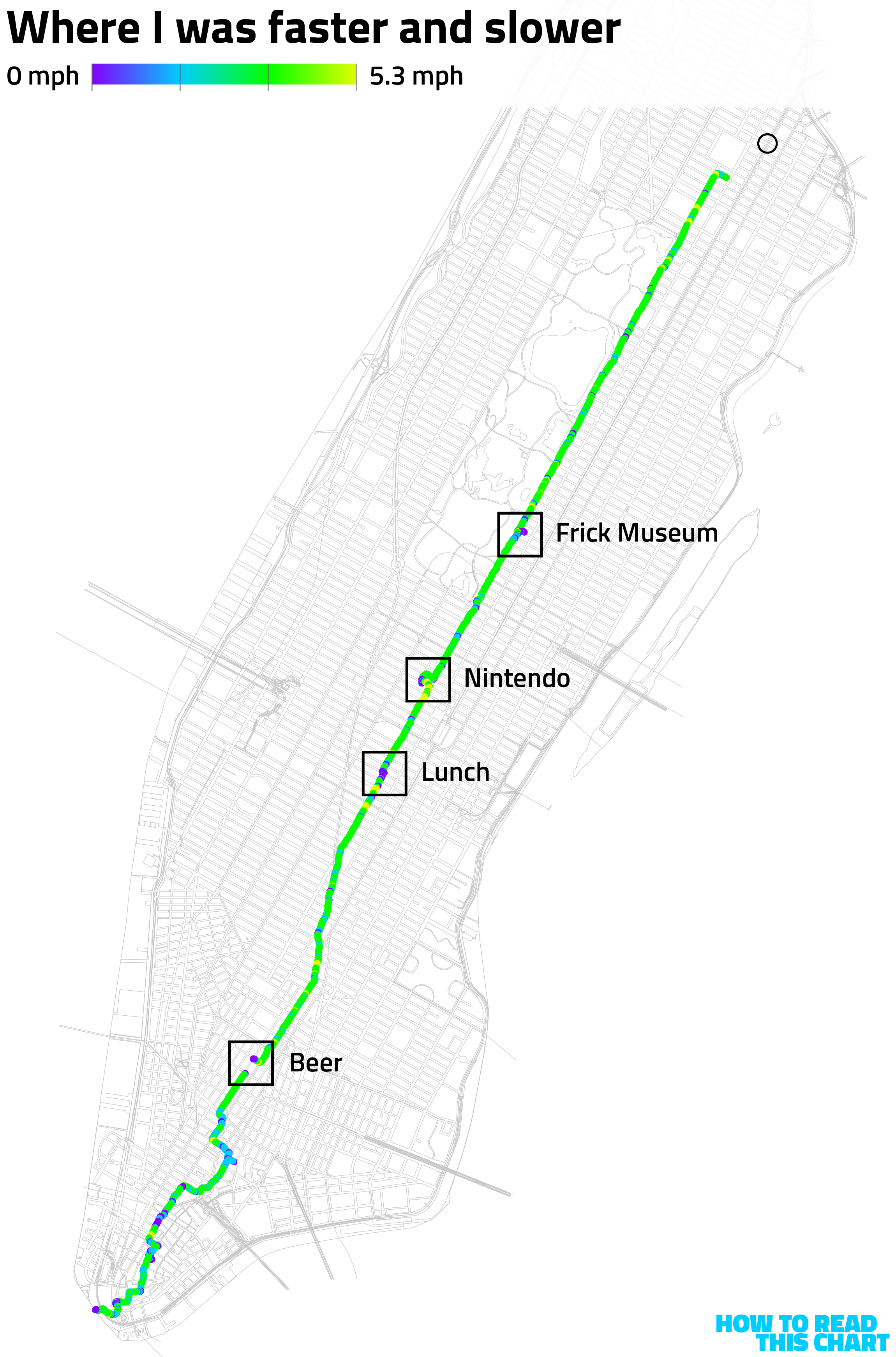
You'll notice that there's a lot more purple and blue at the southern end of the island. That's because, seven, eight, nine miles in, I got a little tired. You can see how I slowed down on the graph below (showing speed in meters per second). You can also see that this slowdown occurred even though I was mostly still heading downhill.
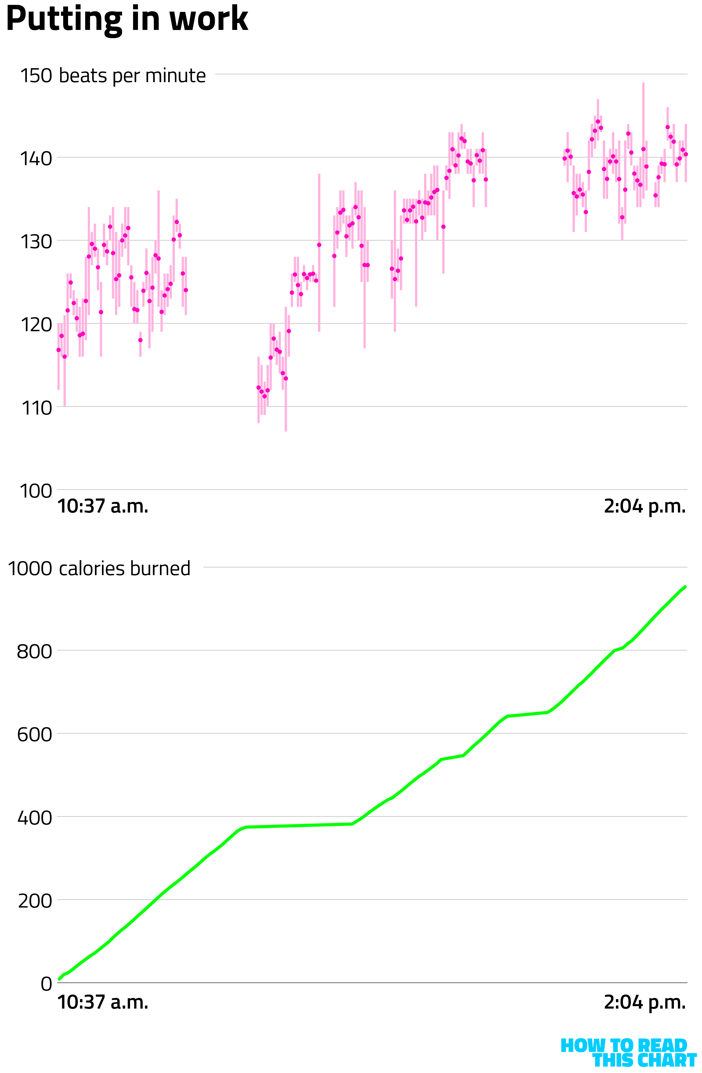
The point of these health apps, of course, is to measure one's health. So I got plenty of data about what my body was doing: my heart pumping away (moreso as I got tired) and burning plenty of calories. (Oh, that's why I needed the beer. It was for health/replenishment purposes.)
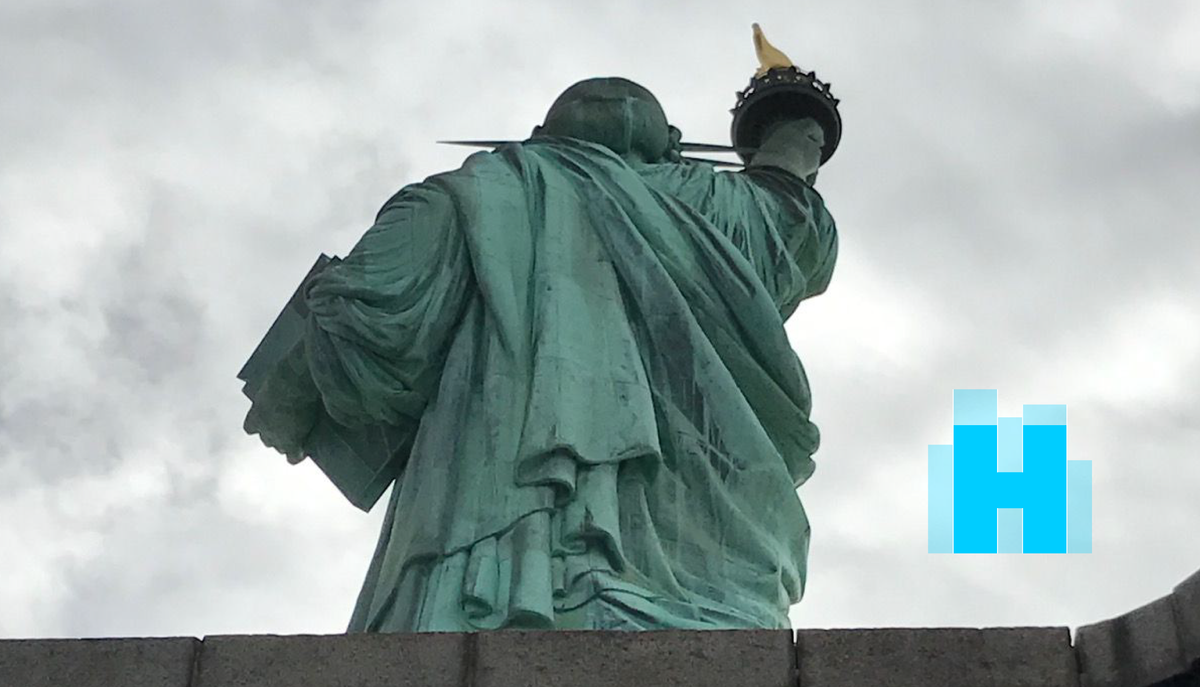
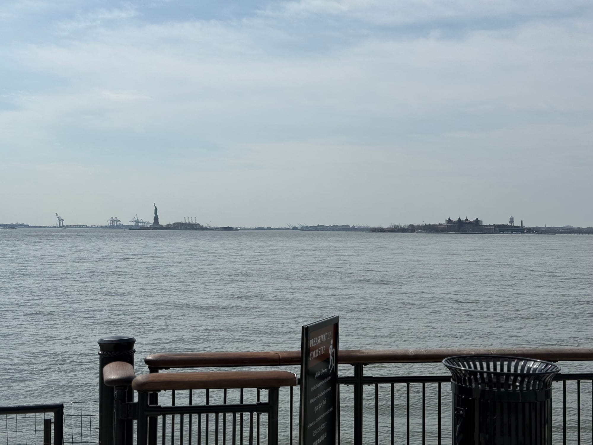
And then finally, just after 2 p.m., I arrived at my destination. I looked out past the sea of tourists and over a forest of barricades to see New York Harbor and its two monuments to American immigration: the Statue of Liberty (at left) and Ellis Island (at right). This had been my destination, but only after it had been a destination for so many others back over the past few centuries.
But less so now.
Chapter 2
Congratulations, I guess?
Immigration is one of the things that has long set the United States apart. The nation thrived in large part because people from around the world came here and wove into the fabric of society. They built lives that built a country that lured more new arrivals, and the pattern repeated.
Immigration has been a central driver of population growth in the U.S., particularly in recent years. Across the U.S., more people have moved into the country than out of it, adding to the pool of workers and taxpayers that help bolster the economy.
Immigration has also made the country more diverse. Some see that as a detriment, one that more than offsets the economic benefit of their arrival. And by "some," of course, I mean the president and his administration.
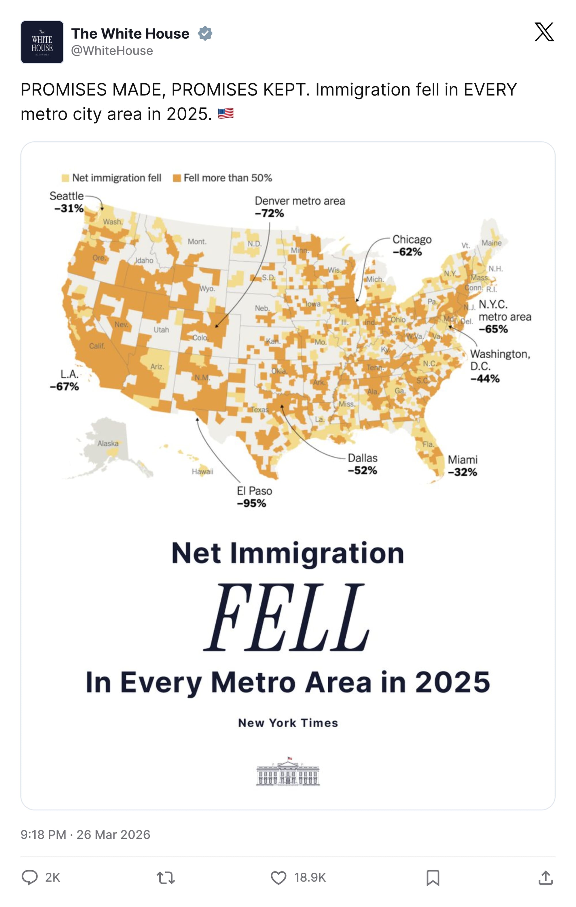
This week, the White House celebrated new Census Bureau data showing that net immigration (those arriving minus those leaving) had fallen relative to 2024.
Never mind that Trump's campaign promise was to combat undocumented immigration, not immigration overall (though it didn't take much reading between the lines to see his actual intent). And never mind that, as the baby boomers age, there's more need for new workers, not less. Fewer people were arriving.
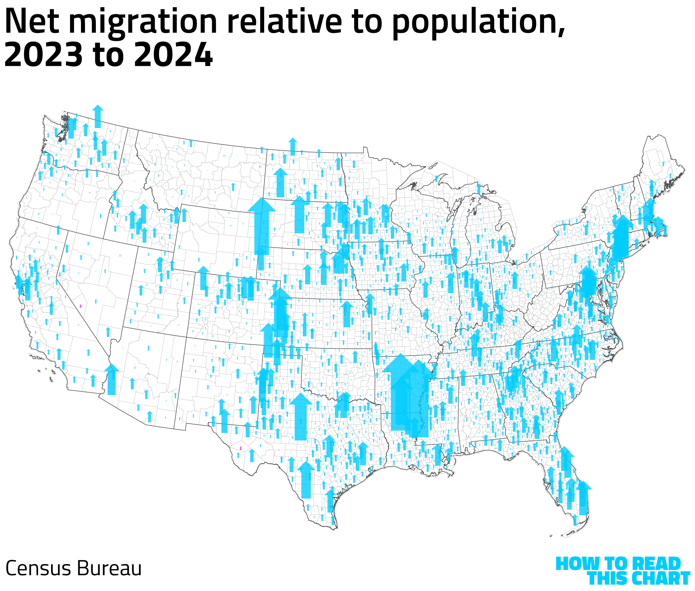
You can see the difference. In most places, net migration was still a positive, but it fell dramatically from 2024 to 2025.
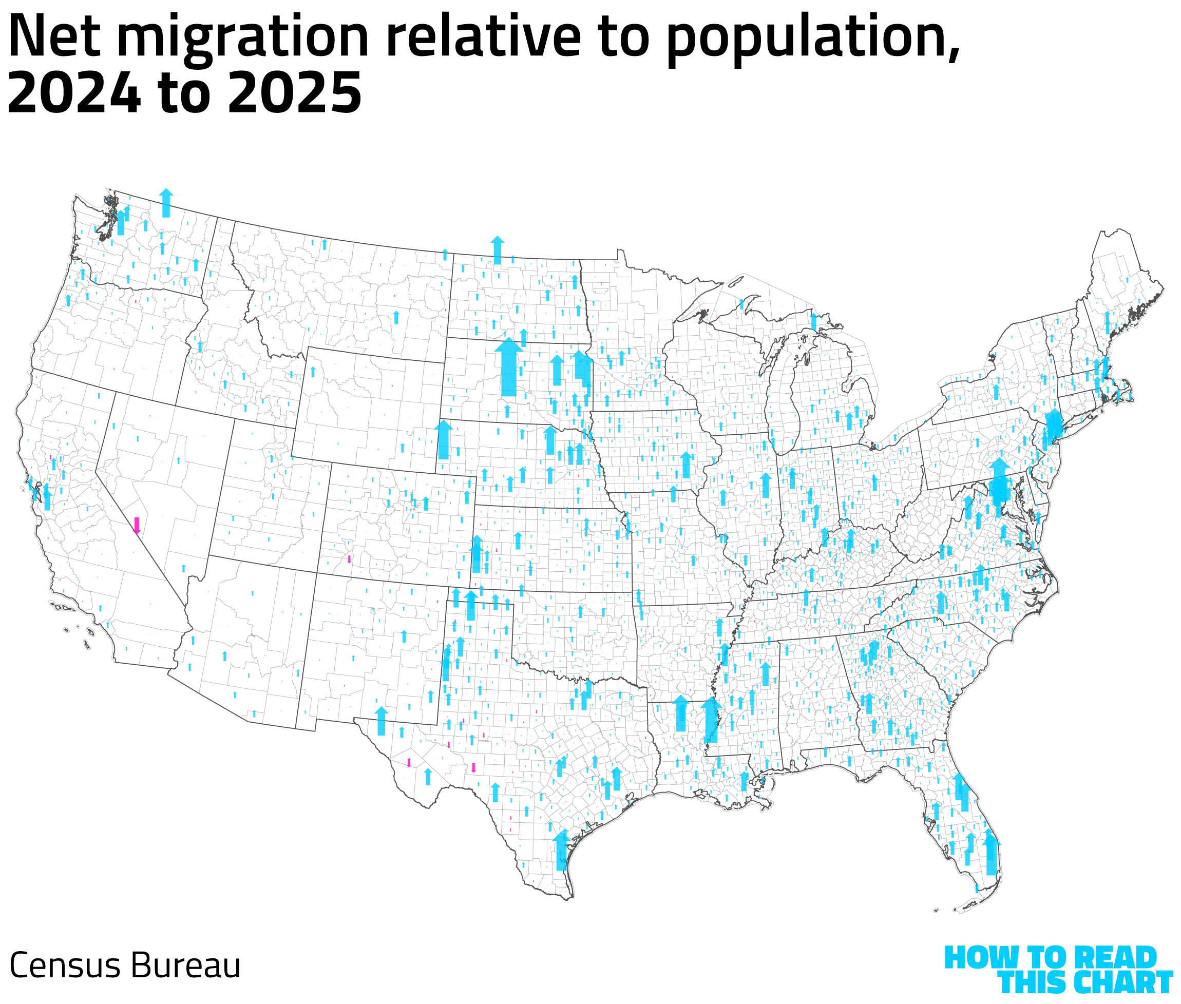
When we plot the change net migration rates by county, the pattern is clear.
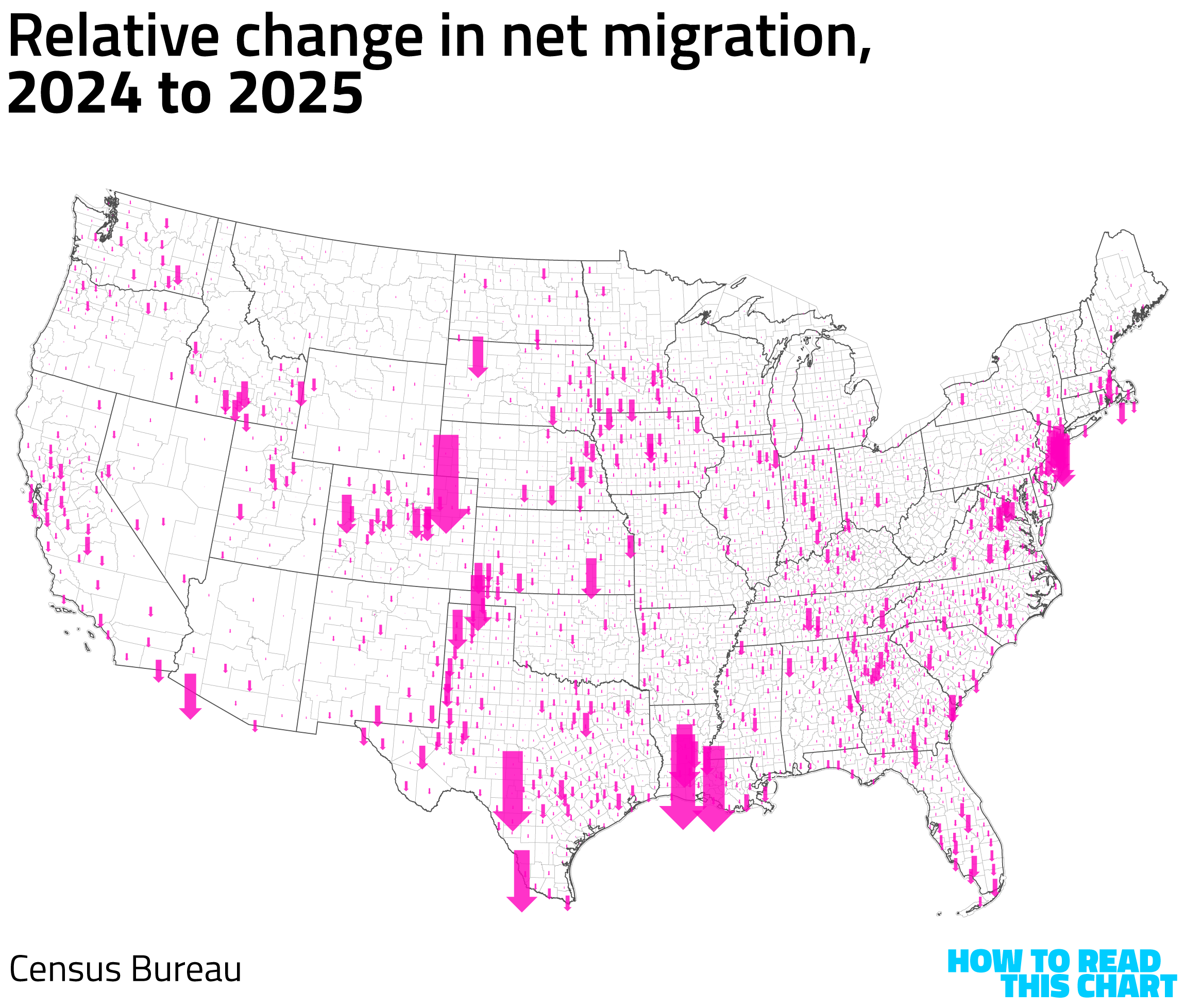
You'll note that some of the biggest shifts are in relatively low-population counties; that's because a change of a few hundred (or few dozen!) people has an outsized effect. But the point here isn't particular places, it's nation as a whole — a nation that has sent the world a message that the world has obviously received.
Chapter 3
From 12.345679 to 100%
As a palate cleanse, let's pivot from the erosion of national exceptionalism to the eroding national pastime.
This week was Major League Baseball's Opening Day, a moment of joy for America's diehard baseball fans and a thing that was the fourteenth story in local news coverage for everyone else.
As one of the diehard lot, I decided to try to figure out whether Opening Day was at all predictive: did winning the first game of the year tell us anything about a team's season? And the answer, as it usually is, was "sort of." Teams that won were slightly more likely to have winning seasons than teams that didn't.
So I decided to dig a little deeper. If an Opening-Day win was a coin toss as a predictor, how about the first 20 of a season's 162 games? As you might expect, this was a much clearer guide, with teams that won 10 of their first 20 games ending up with winning seasons just over half the time in the past 40 seasons. (The chart below shows the average number of wins in a season for teams that started with zero to 20 wins in their first 20 games.)
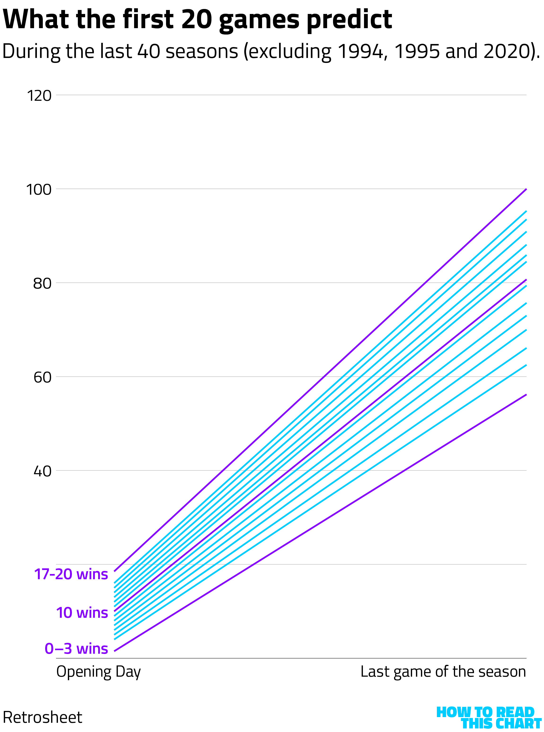
Teams that won 17 or more of their first 20 always had winning seasons in that period; teams that won three or fewer never did. But what about everyone else?
As you'd expect, a broad range of outcomes has followed those first 20 games. A team that started 4-and-16 ended up winning 85 games (the 1996 Red Sox). A team that started 16-and-4 ended up winning 78 (Cleveland, in 1988). If we plot all of the ranges of outcomes, things get muddy.
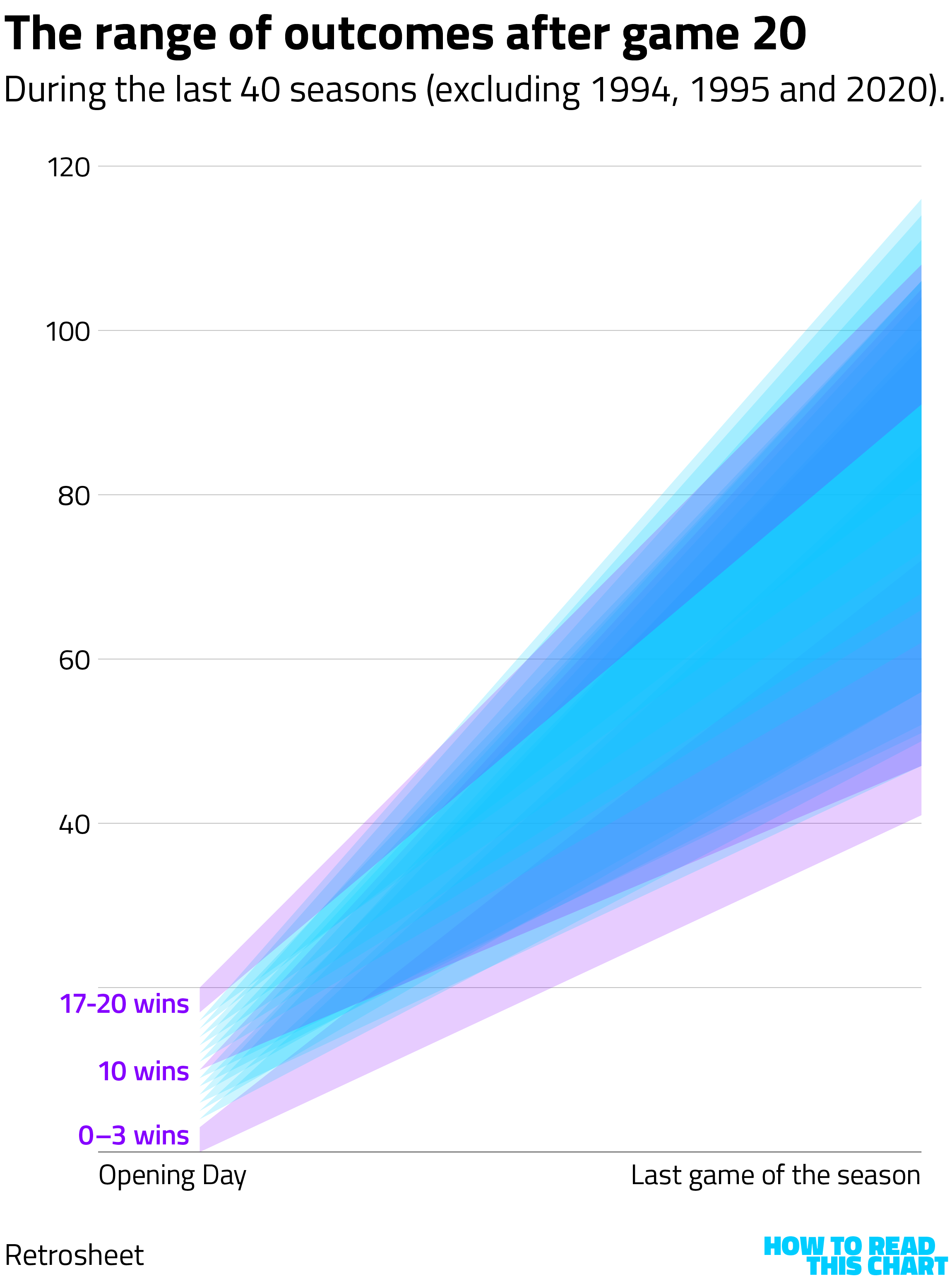
So, as a public service, I broke out all of the outcomes over the past four decades, allowing you to see at a glance how teams fared in games 21 through 162. The pattern established in those first 20 games tends to hold: teams that did poorly to start a season generally don't get that much better.
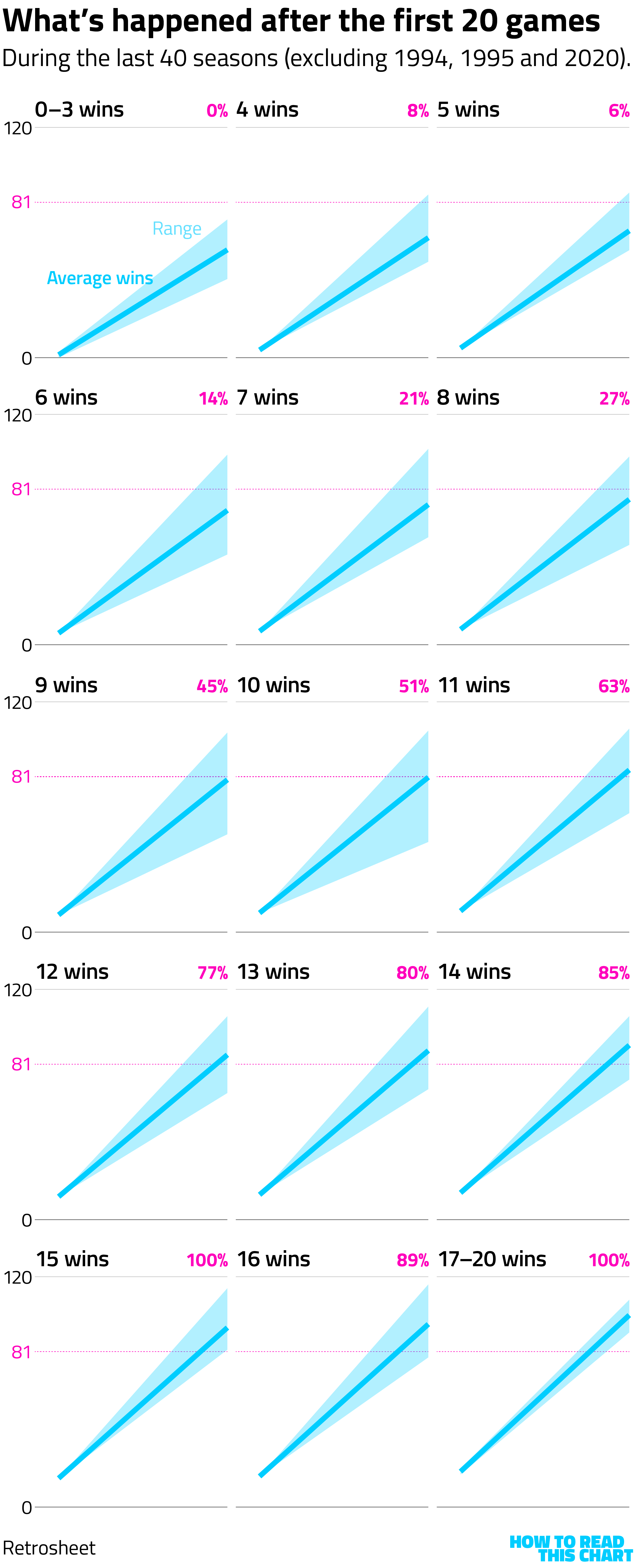
The beginning of each team's journey, if you will, leads to a predictable destination.
And that's how you shoehorn things into a theme.
Chapter 4
Even the government doesn't trust the government
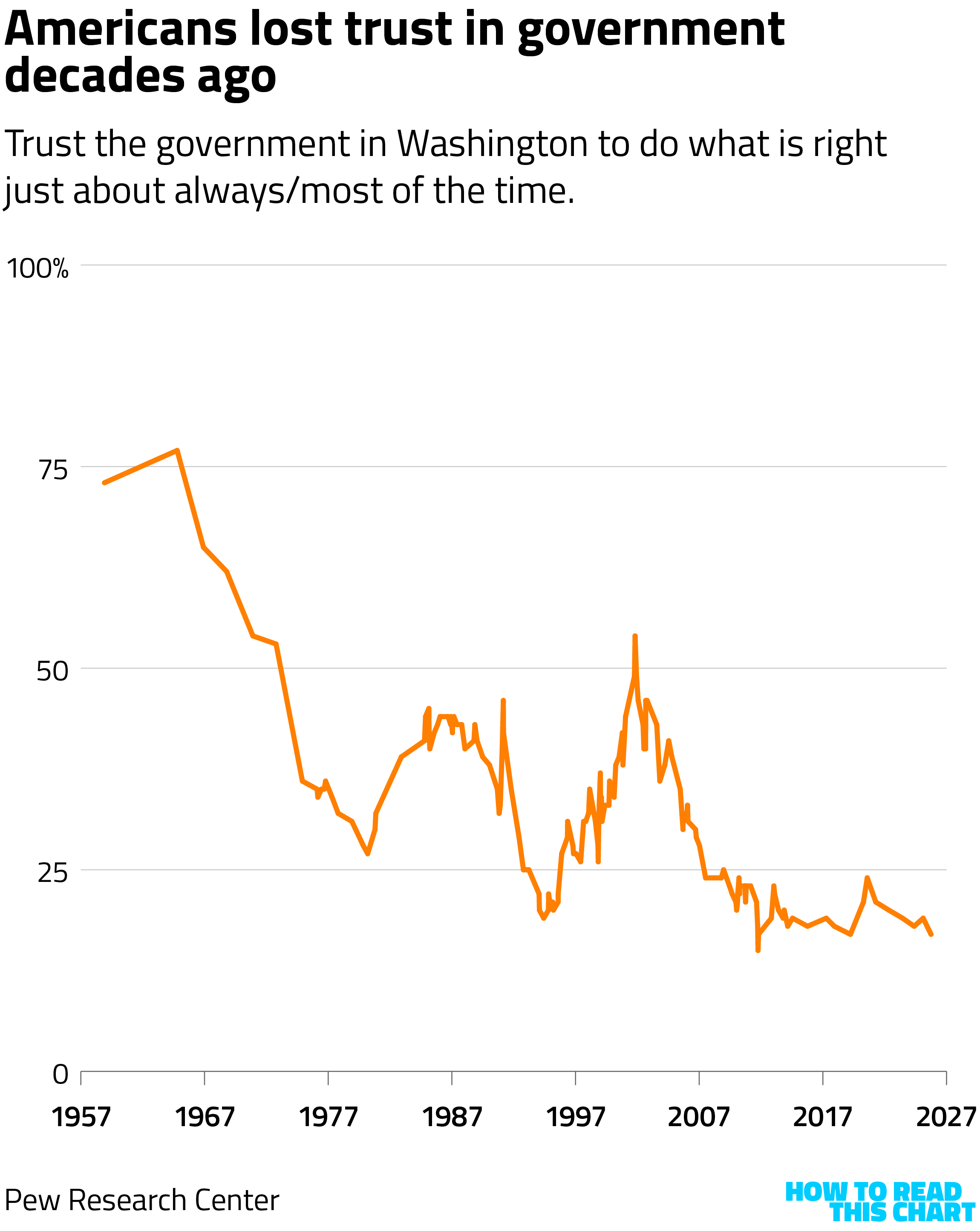
The odds are pretty good that you don't have a lot of confidence in the federal government to consistently do what's right.
That's not me casting aspersions about you; obviously you have the good sense to be interested in data visualizations and this newsletter so I can hardly criticize your judgment or values. I'm simply commenting on the fact that most Americans don't have that confidence and haven't for the past few decades (at least).
But there has been a remarkable shift over the past year when assessing how much confidence people have in the government. In the government itself, confidence in the government has fallen.
That's clear in survey data compiled by the Partnership for Public Service. The organization used to query government workers in partnership with the government itself, but the administration cancelled last year's survey. So the Partnership went ahead and did it solo.
The findings were striking. As Catherine Rampell at The Bulwark reports, confidence that federal leadership acts with honesty and integrity plunged from 2024 to 2025, across government agencies. (I've listed the agencies in order on the chart below, but the point is that all of the arrows point very sharply downward.)
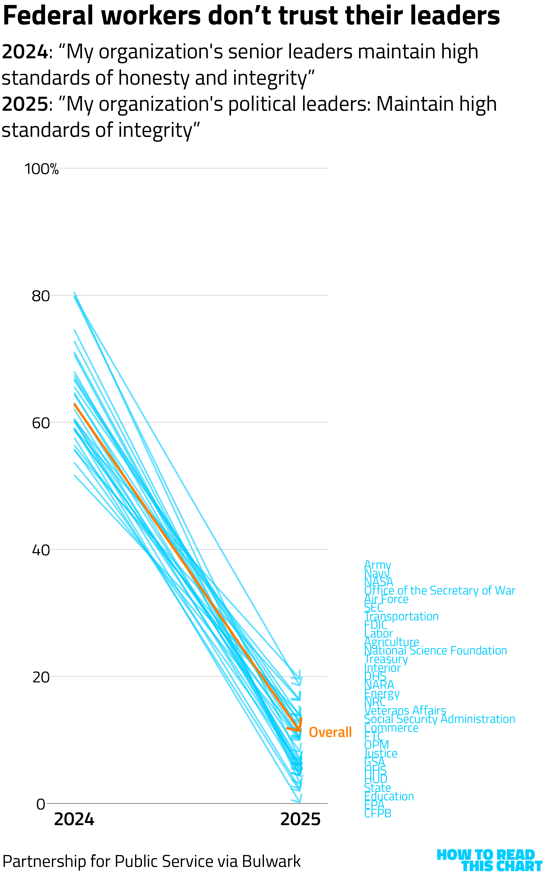
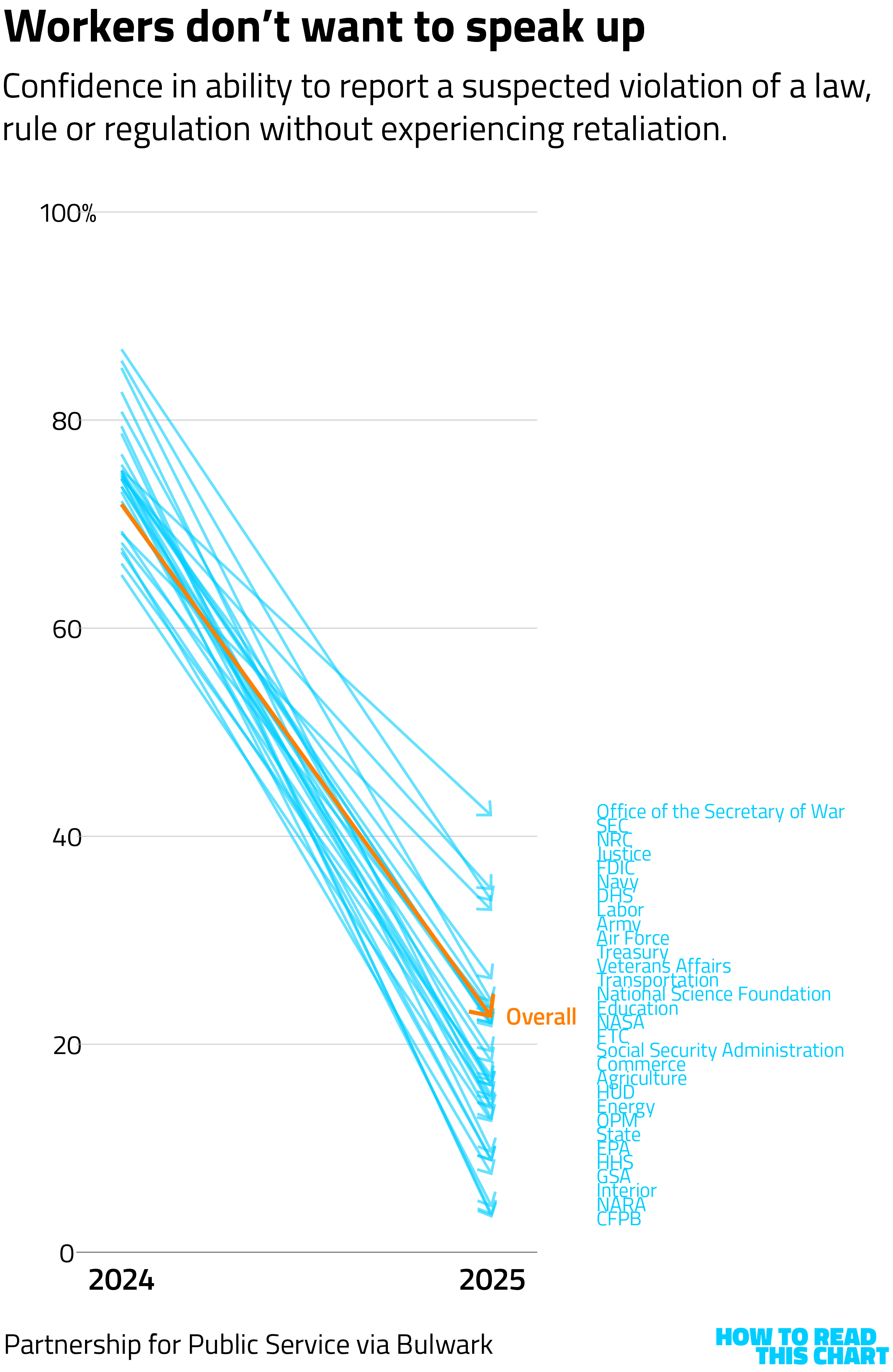
What's more, government employees don't have confidence that they can raise concerns without retaliation. Which, history suggests, is not a good way to resolve significant problems within an organization.
It is extremely easy to see how this overlaps with the shifts in immigration during Trump's second term in office, too. Just as the White House celebrated the decline in immigration, it has also celebrated the firing of hundreds of thousands of government workers.
A change in direction has brought us to a different place.
Chapter 5
¡Chart Attack!
(Decided to give the ol' Chart Attack a little Spanish flair.)
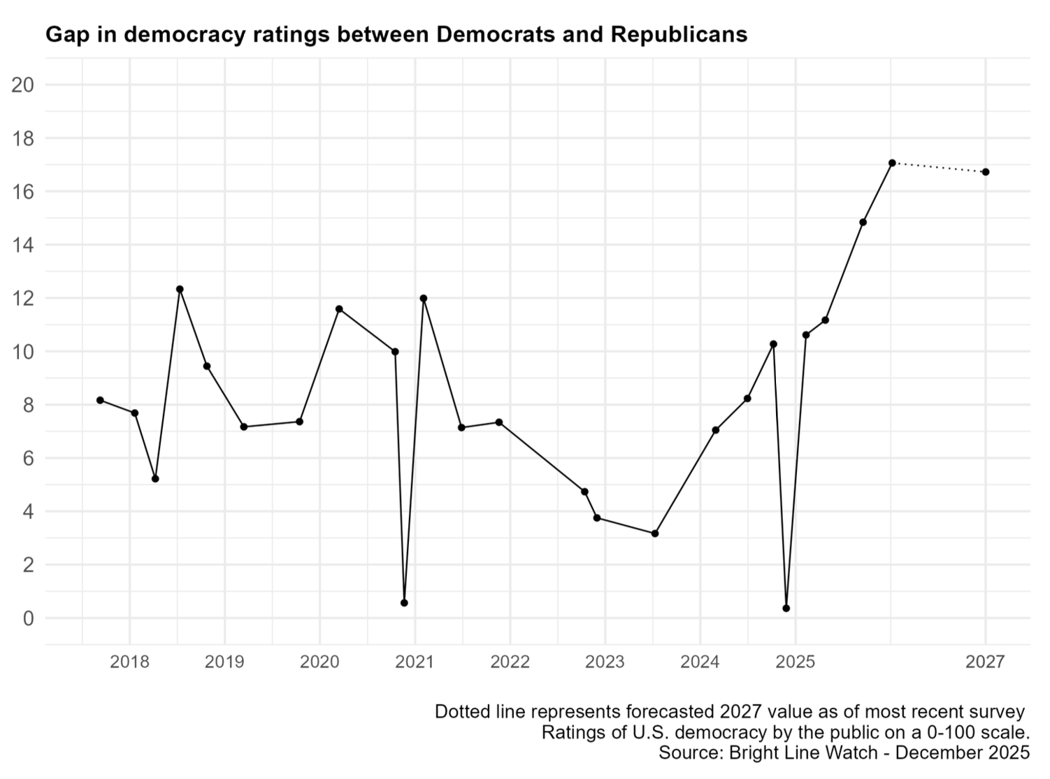
We aren't quite done with visualizations of the changes that the country has undergone over the past 15 months. A new report from Bright Line Watch, for example, shows ongoing concern about American democracy — including the sharp gap in that concern by party.
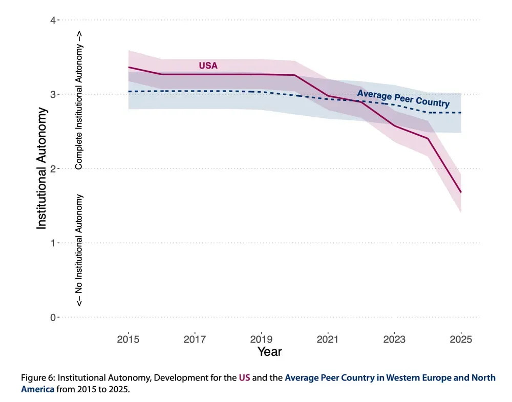
An annual measure of academic freedom, meanwhile, shows how that metric has collapsed in the U.S. in recent years.
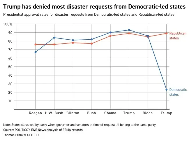
Politico this week charted the extent to which federal disaster response is politically polarized.
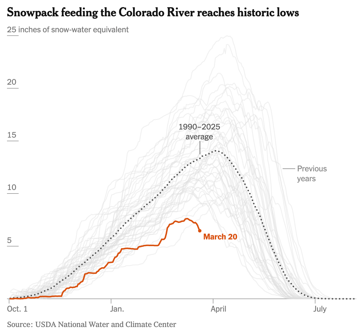
The bad news isn't solely a function of the federal government. An exceptionally warm Western winter has meant much less snow to be turned into snowmelt over the course of the year.
But let us now leave the bad news behind, like so many Old Countries With Insufficient Economic Opportunity And Freedom.
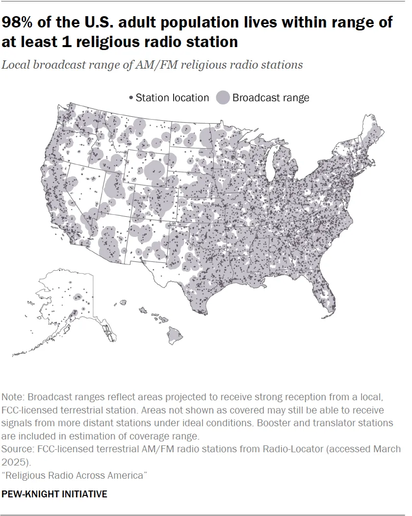
Pew Research Center produced a fascinating map of religious radio coverage across the country.
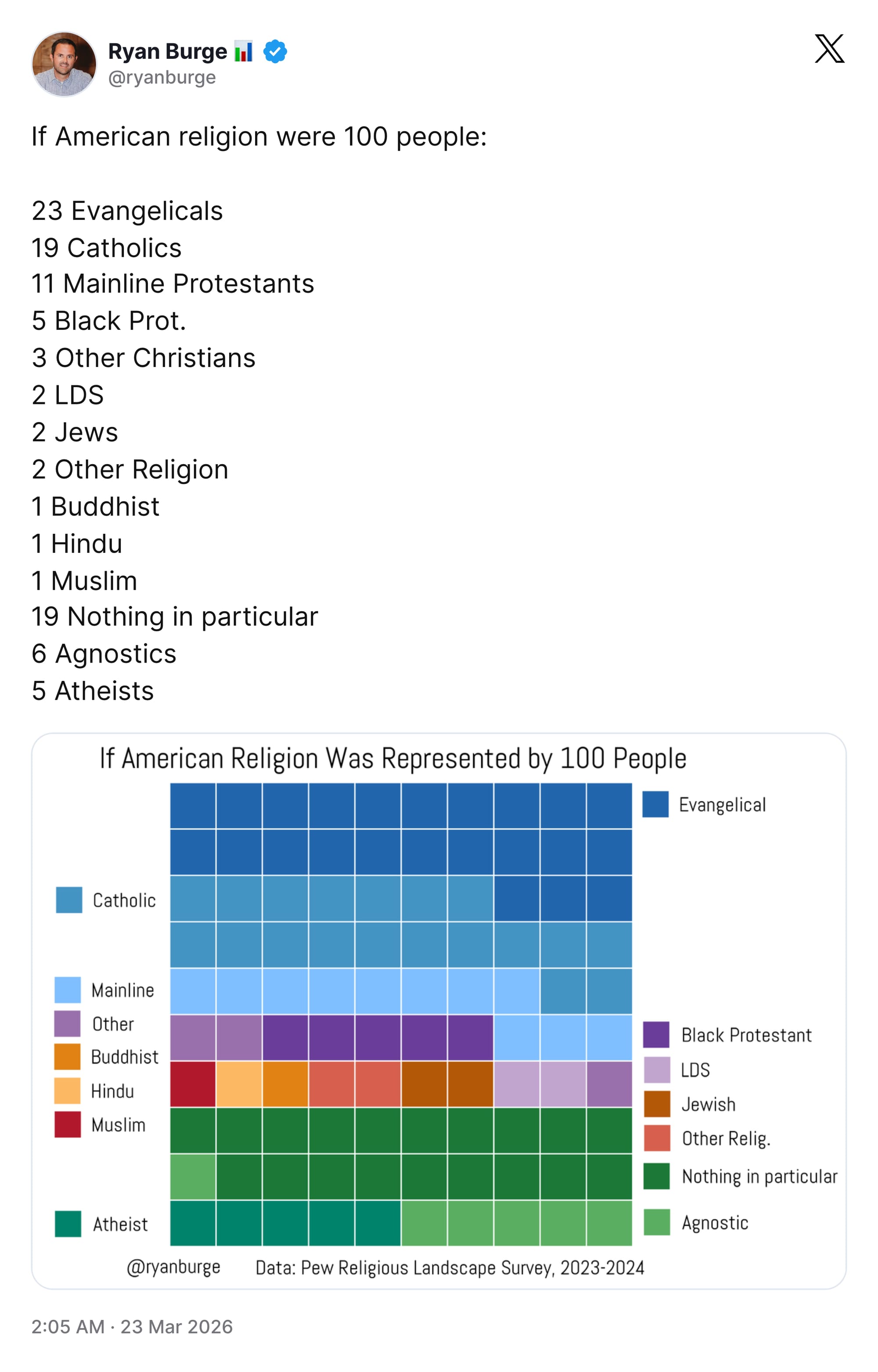
And Ryan Burge once again created a terrific visualization of American religion. (This religious diversity is the sort of thing that brought a lot of people to America in years past, you might recall!)
But now we will set aside even the most tangential efforts to comport with our theme in order to consider this graphic sent by reader Jim Beaver, plucked from a March Madness television broadcast. It attempts to put the exceptional height of Florida's Olivier Rioux in appreciable context.
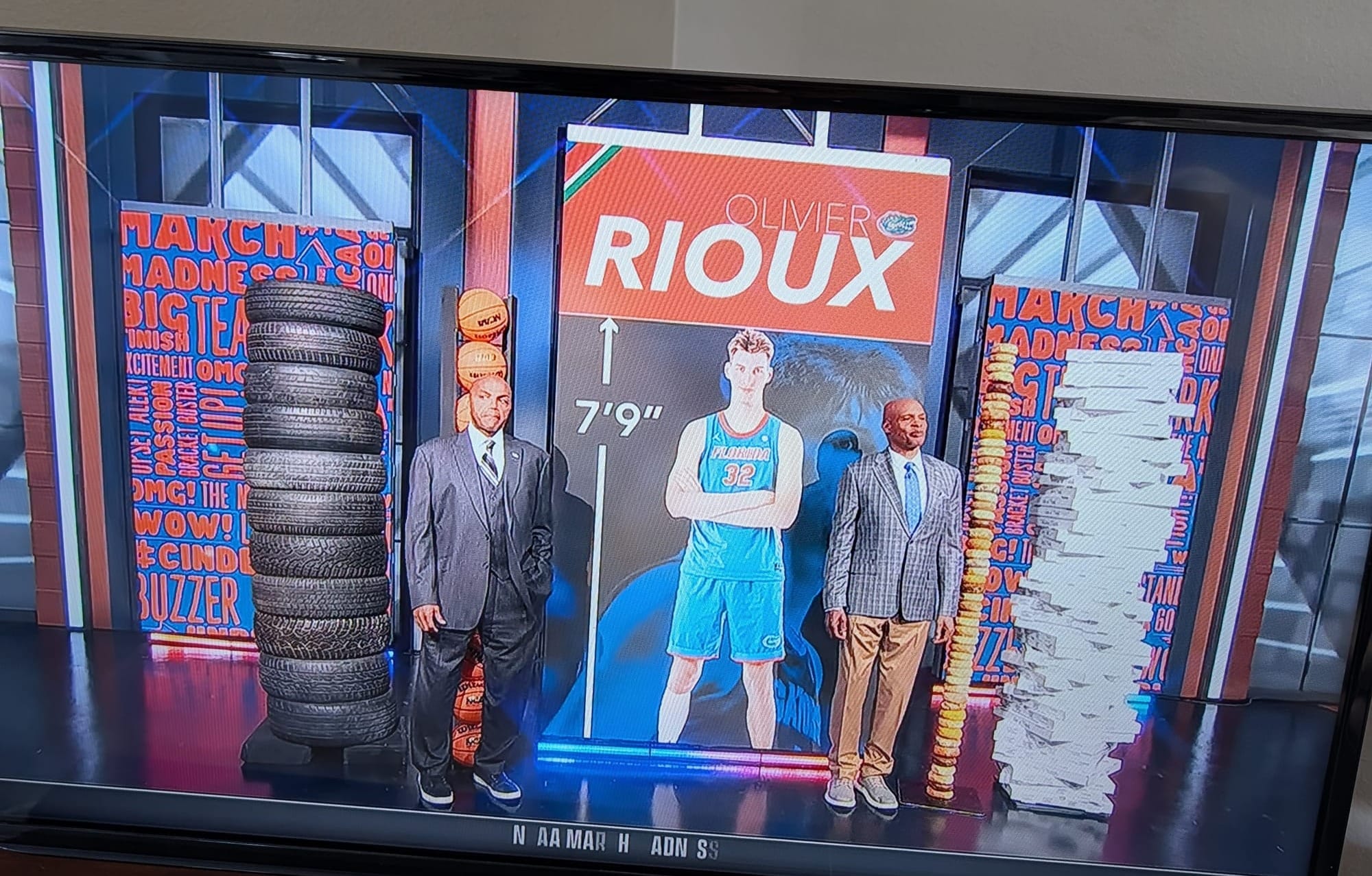
I'm not entirely sure why "bagels" was seen as a useful indicator, but I do know this: If my head were shaped like Charles Barkley's, I would not stand in front of a tower of basketballs.
That's next week's theme.
Appendix
Another thing I've written
You are receiving this email because you at some point in time volunteered to, either at Ghost or Substack or pbump.net or pbump.com. If you don't want to receive future emails, take a hike.
Anyway, another newsletter is coming soon. You have been warned.