The web that tried to steal the presidency

Chapter 1
What is it that happens when first we practice to deceive? I forget.
If you are anything like me, you tuned into cable news coverage of the Capitol riot on Jan. 6, 2021 and thought to yourself, "Hmm, this is bad."
Well, that's just us. A sizable and Donald-Trump-loyal segment of the population looked at it and thought, "Hmm, where'd antifa get all that Trump merchandise?" Or, "Gosh, I'm spotting lots of FBI here." Or, in some cases, "Hey, pretty good."
The riot was the culmination of months of effort by Trump and his allies to subvert the results of the 2020 presidential election so that he could stay in office. This effort to functionally overturn democracy led, as one might expect, to a federal criminal investigation, one that ultimately led to Trump's indictment.
Which, I think I can safely say, he didn't like.
So it, like the Russia investigation before it, has become the focus of one of the tentacles of Trump's campaign of retribution. Anything that can be done to undermine the 2020 election probe is welcomed by the president, so — as with efforts to "prove" the 2020 election was stolen — any number of his allies have scrambled to meet the demand.
One of them is Iowa Sen. Chuck Grassley. The Senate equivalent of the House's egregiously dishonest Oversight Committee, Grassley this week released nearly 200 subpoenas from Special Counsel Jack Smith's investigation into the post-2020-election efforts, documents that sought information or testimony from a range of organizations and individuals. The scale of the document dump was the point; the argument was simply in the vein of "look at how deranged these guys were."
Looking at the documents, though, something stood out to me. It depicts thoroughness, not overreach. And buried in that thoroughness are patterns, implied connections between people and organizations that hint at the scale of the effort.
The word "implied" is important there. When Person A is asked for any information about Person B, it doesn't mean that Jack Smith knew the two were in cahoots. It just means that Smith and his team had reason to believe they might have been in contact.
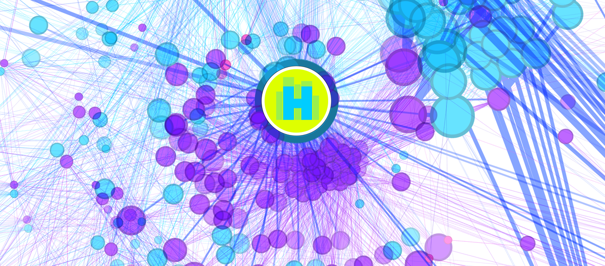
That said, something interesting happens when you (as I did) walk through the 1,700-plus pages of documents and correlate all of the Persons A and Organizations B. You get a network of connections, one that also inherently highlights participants more important to the network.
Using the open-source visualization program Gephi, I created a visualization of those networks. Here's an early draft.
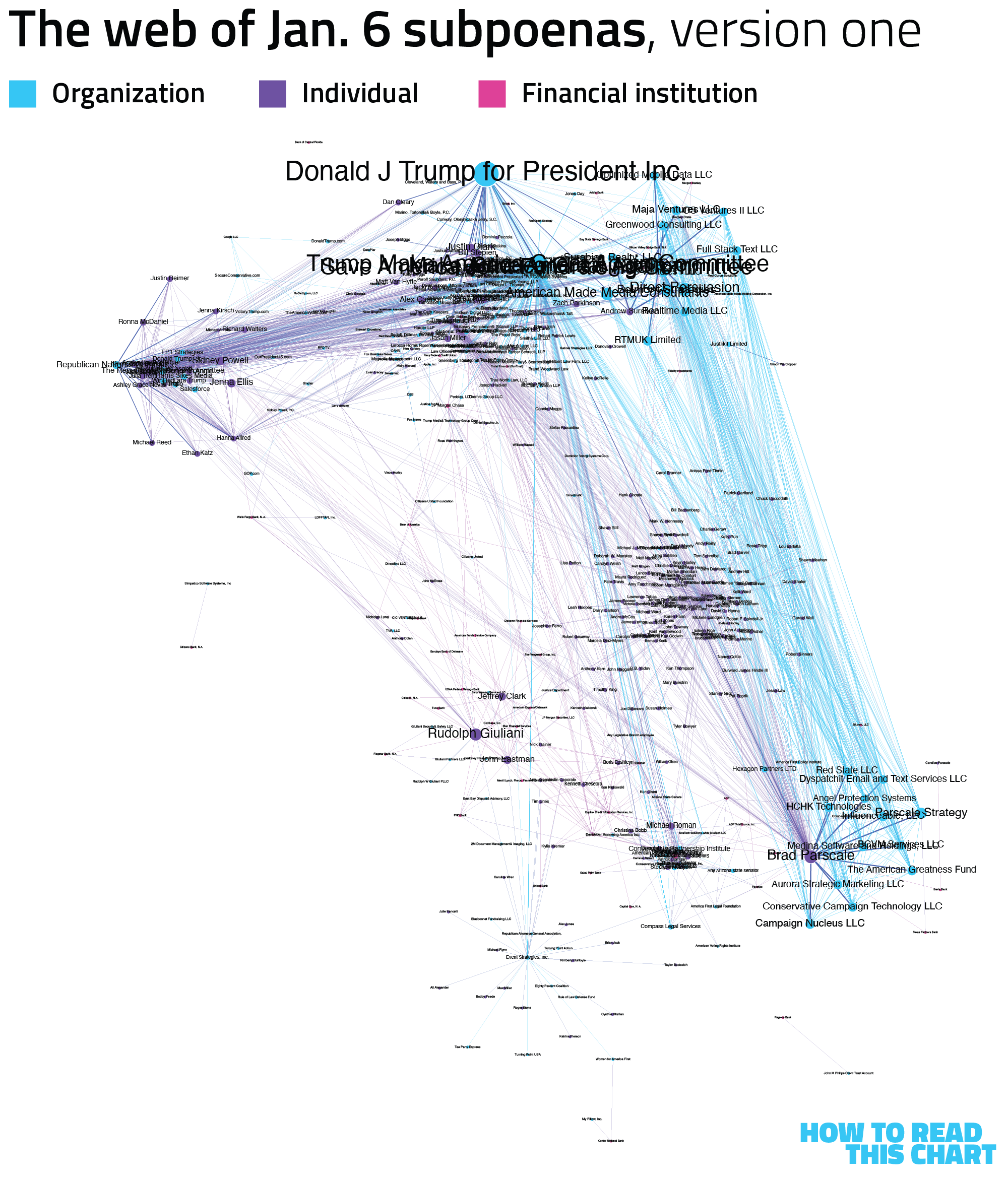
What's cool about the tool is that it algorithmically sorts the individuals and organizations into clusters based on incoming and outgoing links. In other words, the image above required no manipulation of the points by me; it's how the software understands their importance and relation.
There are a few things that stand out in that image, most notably that the Trump campaign ("Donald J. Trump for President, Inc.") is the largest node. That's because it has the most mentions in subpoenas which, given the context, isn't really surprising. It sits just above a muddy collection of other campaign and political entities, and is tied into clusters scattered around the image.
That version of the graphic used one sorting algorithm. It's a bit messy, though, so I switched to another, yielding a much cleaner layout of the web of connections, with Trump's campaign at the center,

(If you want to peruse a much larger version of the graphic above, click the image. It's big.)
Now let's zoom into it a bit.
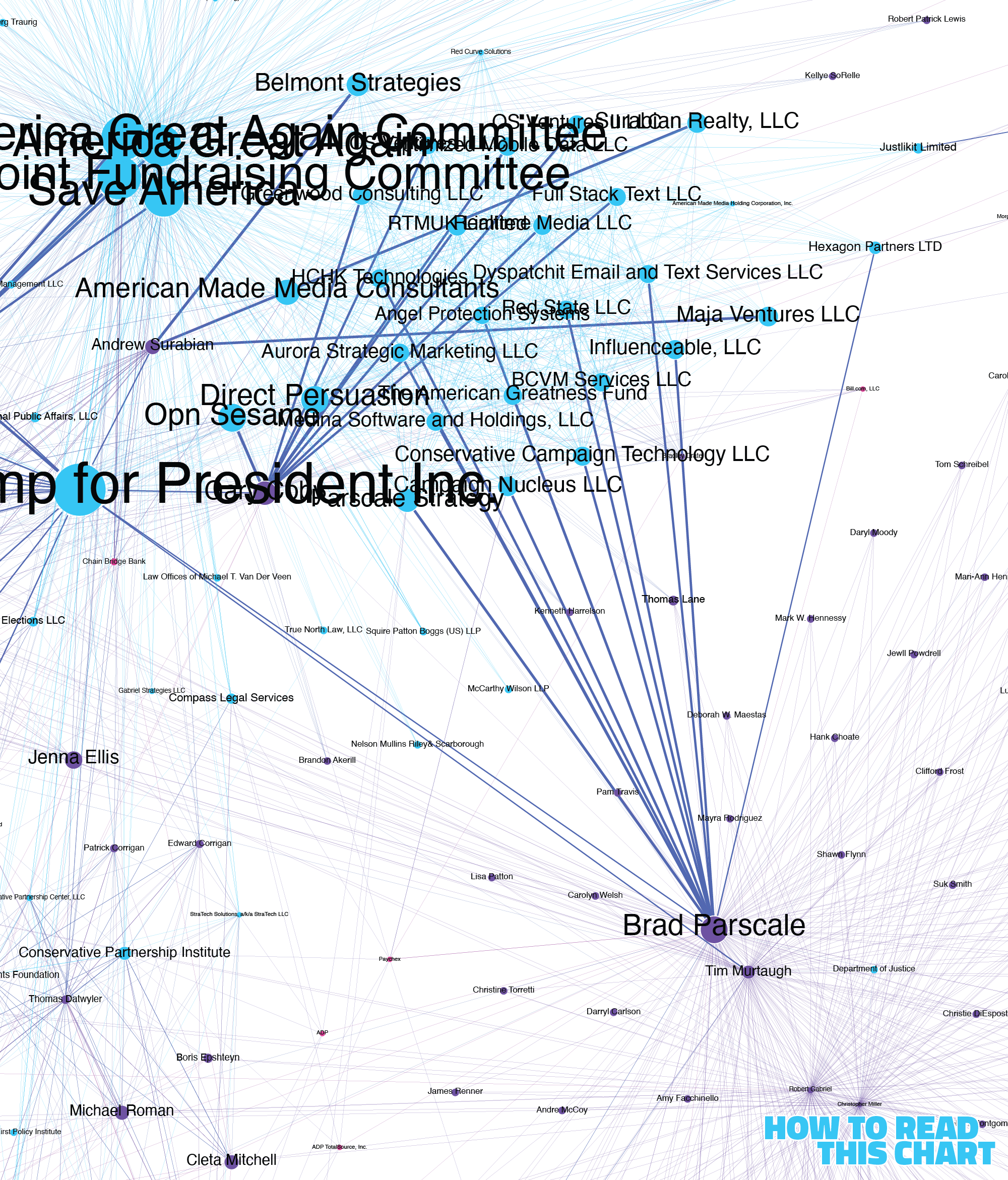
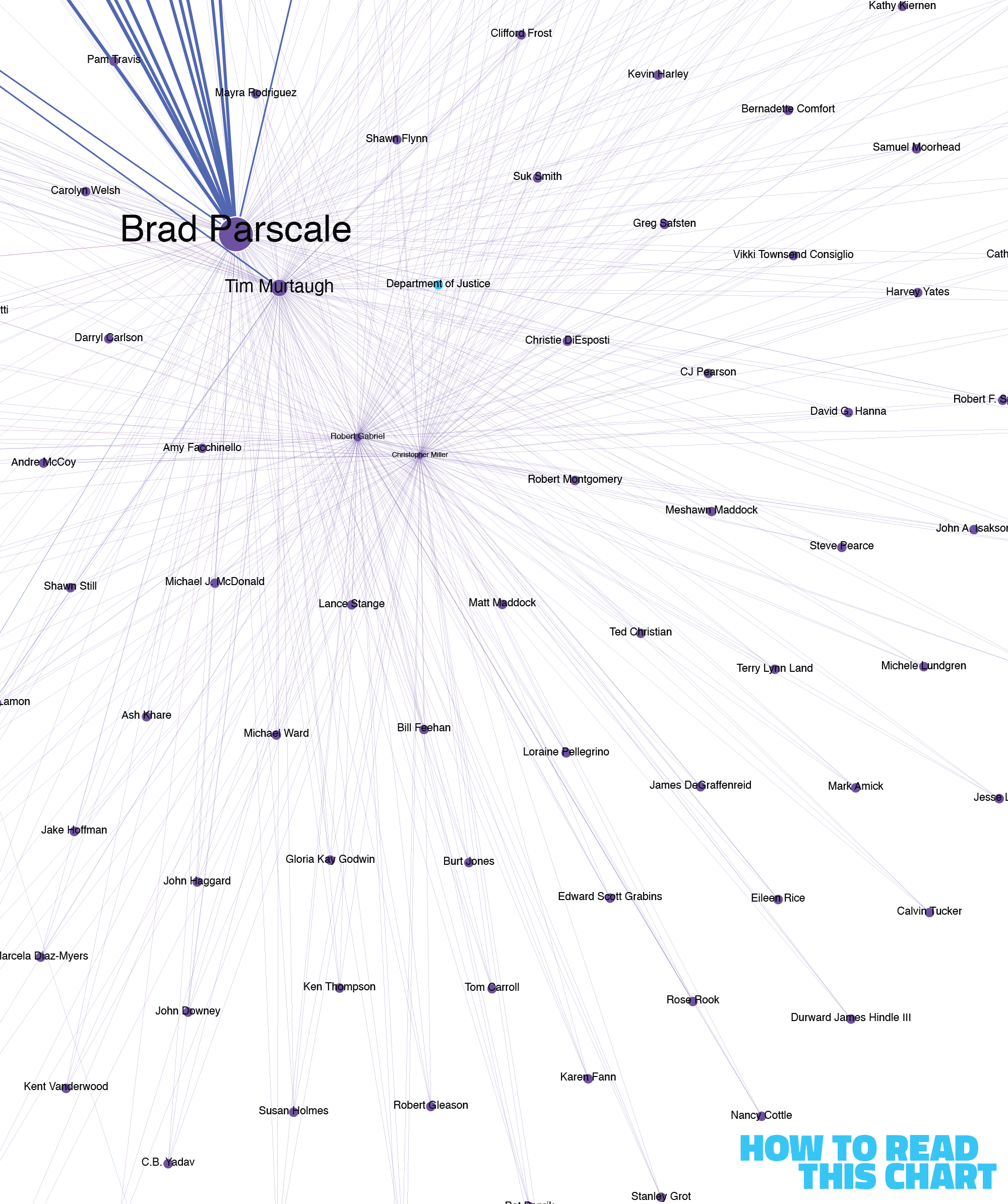
At right and a bit below the middle, you can see a number of organizations tied both to former Trump campaign manager Brad Parscale and Trump's political committees. Parscale's name is mentioned a lot, in part because he's tied to so many of these companies that Smith's team believed to be involved in the post-election efforts.
To the left of the president's campaign sits the Republican National Committee and a galaxy of staffers who work with it. Many of these nodes are small because they're mentioned rarely and often only in context to one another; Staffer A was asked for communications with Staffer B, for example.
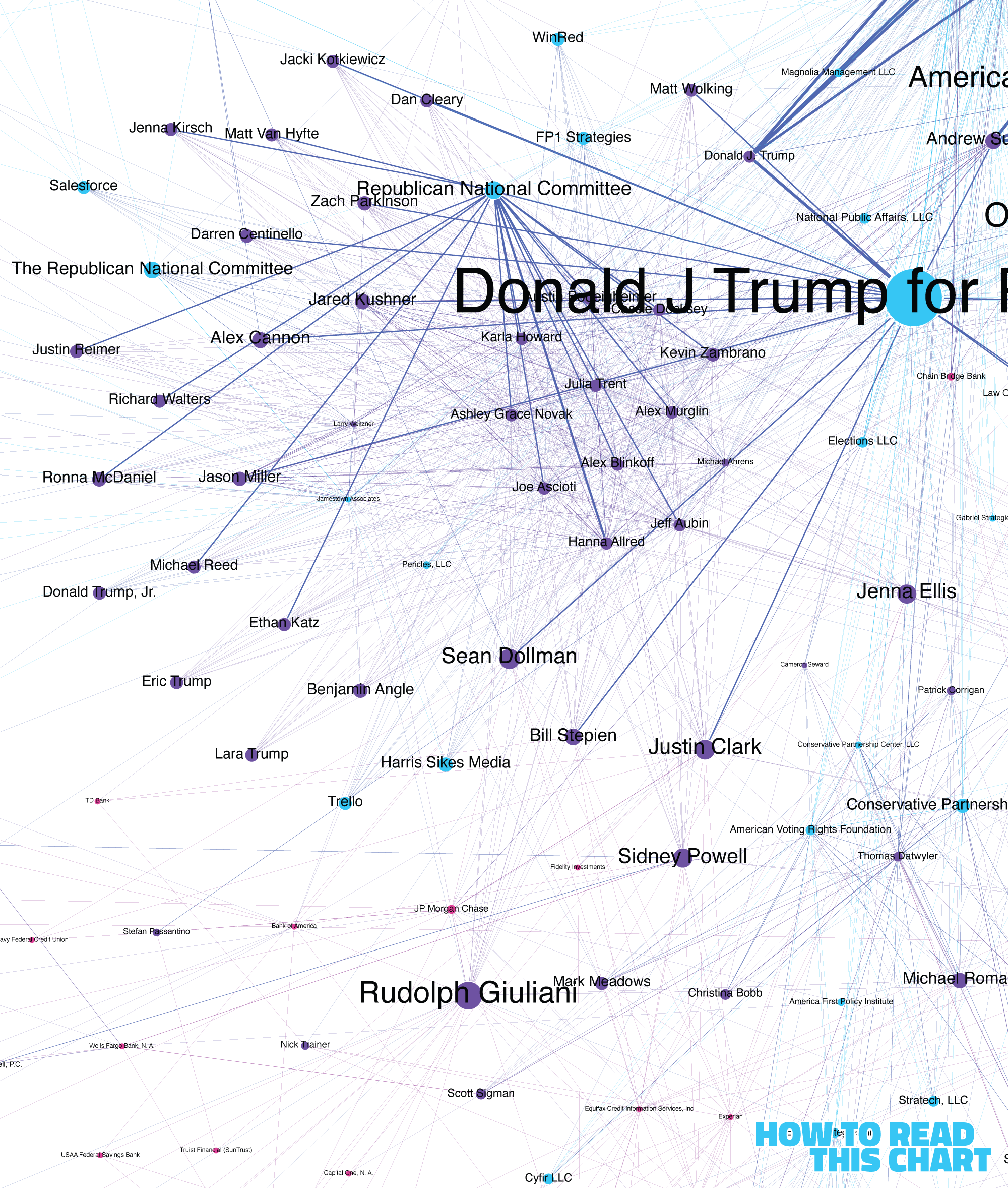
Near the RNC you'll see some other familiar names, too. It's like a Where's Waldo that's mostly Odlaws.
In a cloud around Parscale sit a number of other rarely named individuals: people identified by the campaign as Trump electors in states that he lost. They generally connect back to people tied to the campaign, like communications director Tim Murtaugh.
If you look very closely, you can also see one of the most important elements of the connective tissue here. Many of the subpoenas target financial and technology companies, organizations asked for information about bank or email accounts. They're small in our visualization because they are not generally mentioned as targets of subpoenas. But those subpoenas are useful in tying people to organizations and to each other.
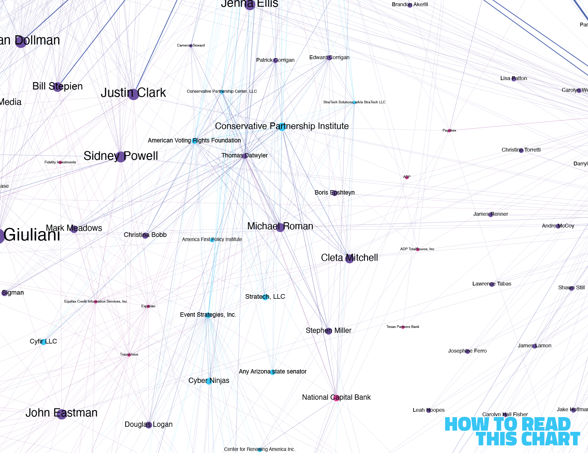
That alone helps give the lie to Grassley's framing. He claims that Jack Smith sought records "for over 400 Republican targets." But Google isn't a Republican target. PNC Bank isn't a Republican target.
And, of course, Smith had a very good reason for subpoenaing scores of Trump-adjacent actors. As you'll recall, they tried to overturn the election? Stoked outrage that contributed to the Capitol riot?
Maybe Grassley's mad Smith didn't subpoena antifa.
Chapter 2
The art of lying with charts
Despite headwinds out of D.C., there remain academics doing important work in evaluating how and why misinformation spreads on social media.
Among those at the forefront on this effort are researchers from the University of Washington's Center for an Informed Public. This week, members of that group published new research looking at an interesting subset of online misinformation: misleading or corrupted data visualizations.
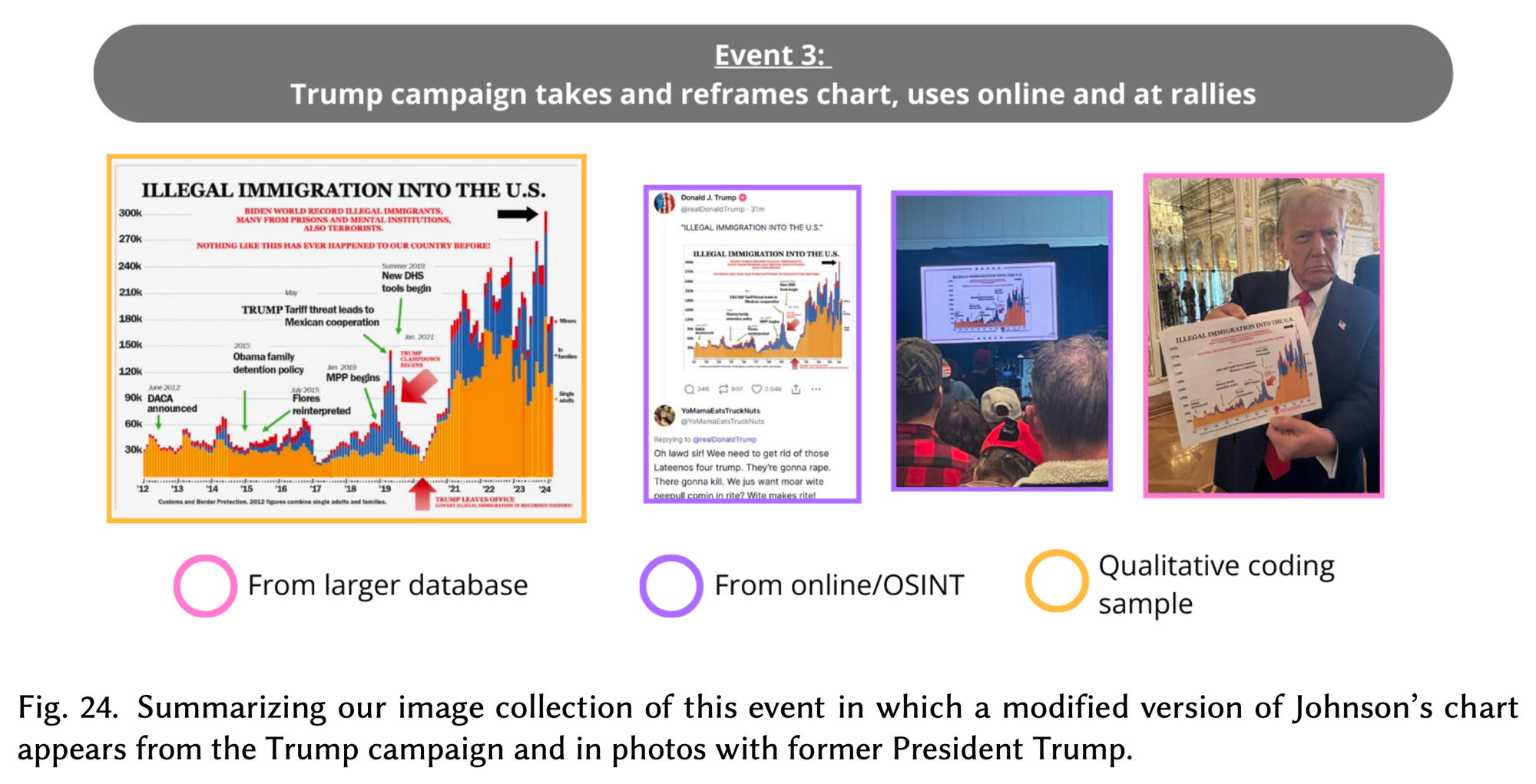
They cite an example with which you may be familiar. During the 2024 campaign, Trump regularly highlighted a chart that he insisted showed how much better he was at handling immigration than President Biden. But it was riddled with inaccuracies and misrepresentations (as I wrote back in May 2024).
As it turns out, that chart originated with Sen. Ron Johnson's (R-Wis.) office, going through various iterations before Team Trump seized and revised it.
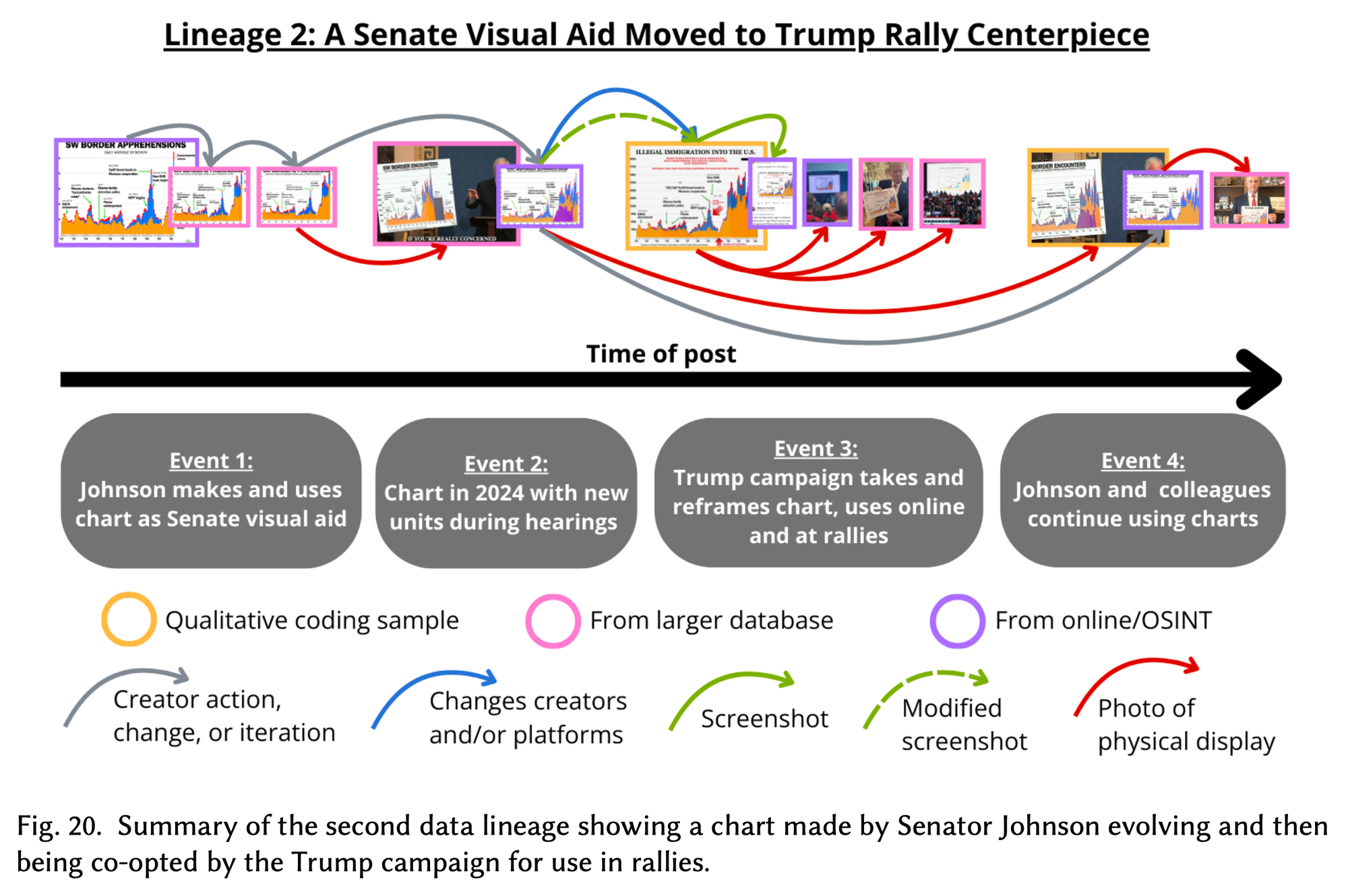
There's a reason they did so.
"Data visualizations carry a lot of credibility, regardless of whether they are accurate or not," researchers Priya Dhawka and Nina Lutz explained in an email. "From the user perspective, combating misleading visualizations requires us as audiences to be skeptical of the data visualizations we are being fed, especially when these charts can be easily designed or modified by anyone."
They noted that, among the changes the Trump team made to Johnson's chart was to remove an indicator that many of those apprehended at the border had been quickly removed — giving the impression that many more adult men had come into the country than had.
Doing so, Dhawka and Lutz explain, helps "underscore a criminality framing of immigrants that the Trump campaign, and now administration, push quite often."
"Data visualizations, like other visual content, can be stylized and curated to tell any story," they wrote, "and it’s important that users remember there’s a lot of design choices made before they see a visualization."
The good news, dear reader, is that all of my charts are free from subjectivity and perfectly reflect the nature of the world as it is.
Interlude
Let's talk.
Now, don't quote me on this, but I think that I have figured out how to let you reply directly to this email. If you hit reply to this email (if you're reading it as an email), it should send a message back to me? Should. I'm still figuring this out, like a grandfather suddenly handed his grandkid's iPhone. (What even is an "app"?)
If not, you can always email me directly, or add a comment to this edition of the newsletter at the website. If I see it, I will respond! Note: My responses, too, are objectively correct.
Chapter 3
Mapping the damage done to Tesla
Last month (because it's November now hahaha oh god where has the year gone), the National Bureau of Economic Research published a paper assessing how Elon Musk's submergence into politics affects sales of Tesla vehicle.
I'd flagged this to look at when reader Josh Frankel reminded me that I'd written about this before, back in early 2023. Meaning that I had data on Tesla ownership in New York state from then that I could compare to more recent data. So I did.
Well, actually, I compared it to data from January 2024, before Musk really went all-in on politics. And what I learned is that there were more Teslas in every single county in New York last month than in January 2024, save one: Schuyler County, near the Pennsylvania border in Western New York. But there the change was … subtle, going from 22 to 21.
Where things get interesting is when we look at change relative to the state overall. Across New York, there was a 40 percent increase in the number of Teslas from then to now. In individual counties, though, that change varied.
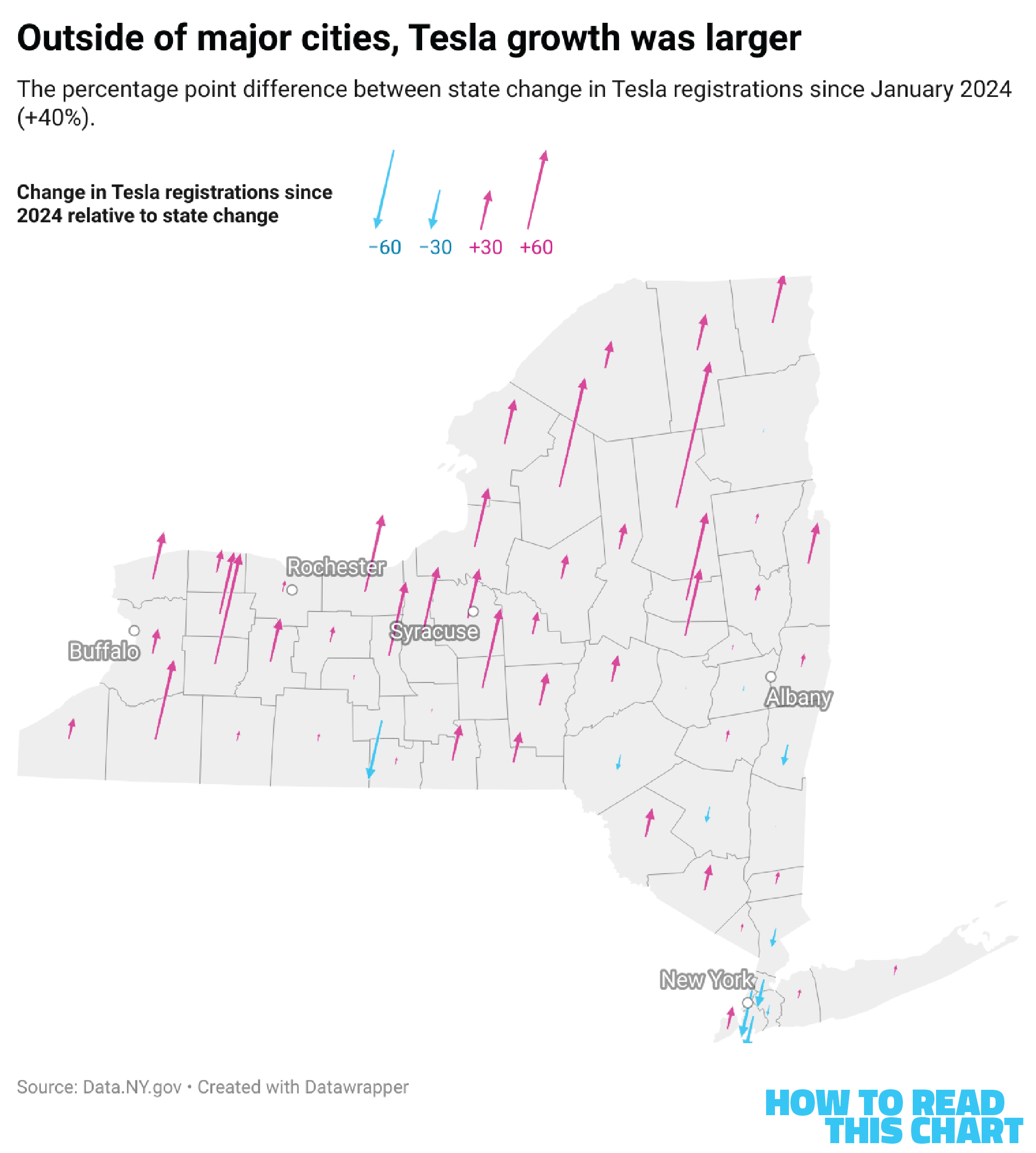
See the pattern? If we zoom into New York City (one of the few places where ownership growth was consistently slower than the state), it becomes very clear. In Manhattan, the Bronx, Queens and Brooklyn — all reliably Democratic — Tesla growth was slower than the state. On Republican-voting Staten Island (emotionally and culturally part of New Jersey), Tesla sales outpaced the state.
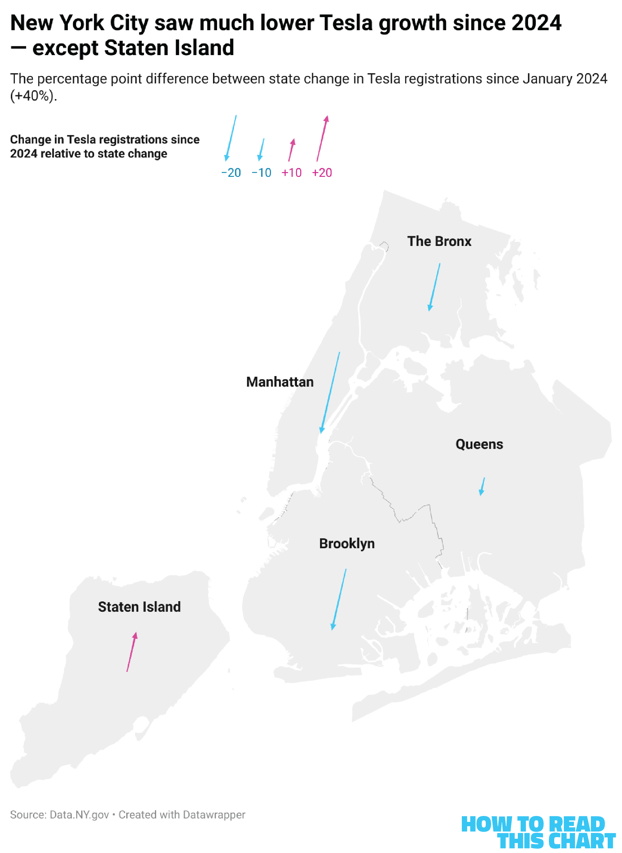
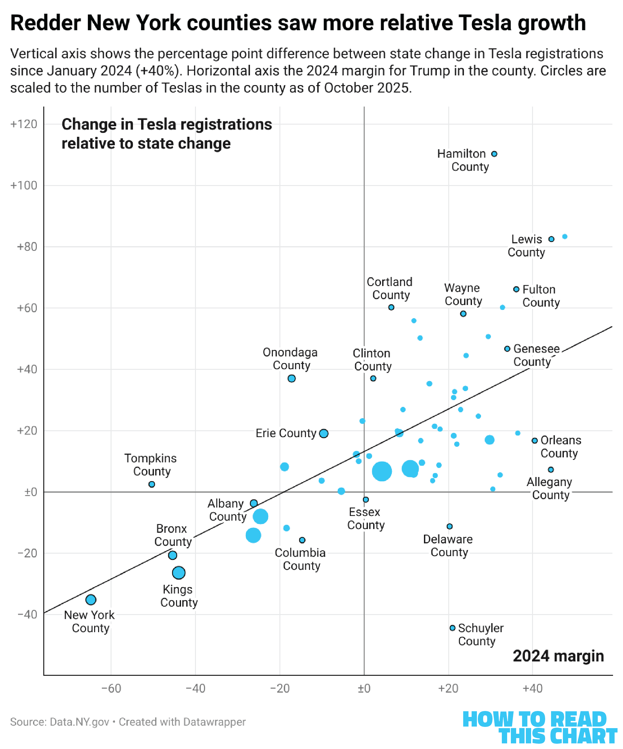
There is a correlation. The bigger Trump's margin in a county in 2024, the more that county tended to outpace the rate of growth in New York State. The diagonal line below shows the trend — up and to the right. Take out Schuyler County, and it becomes steeper still.
For Musk, the bottom line here may simply be that Tesla kept selling cars. For investors, though, the bottom line might be less optimistic: how many could they have sold had Musk not decided to become who he has become?
And also what if they'd never made the Cybertruck? Lots of better worlds were possible.
Chapter 4
Chart Attack
We now commence the attack of charts.
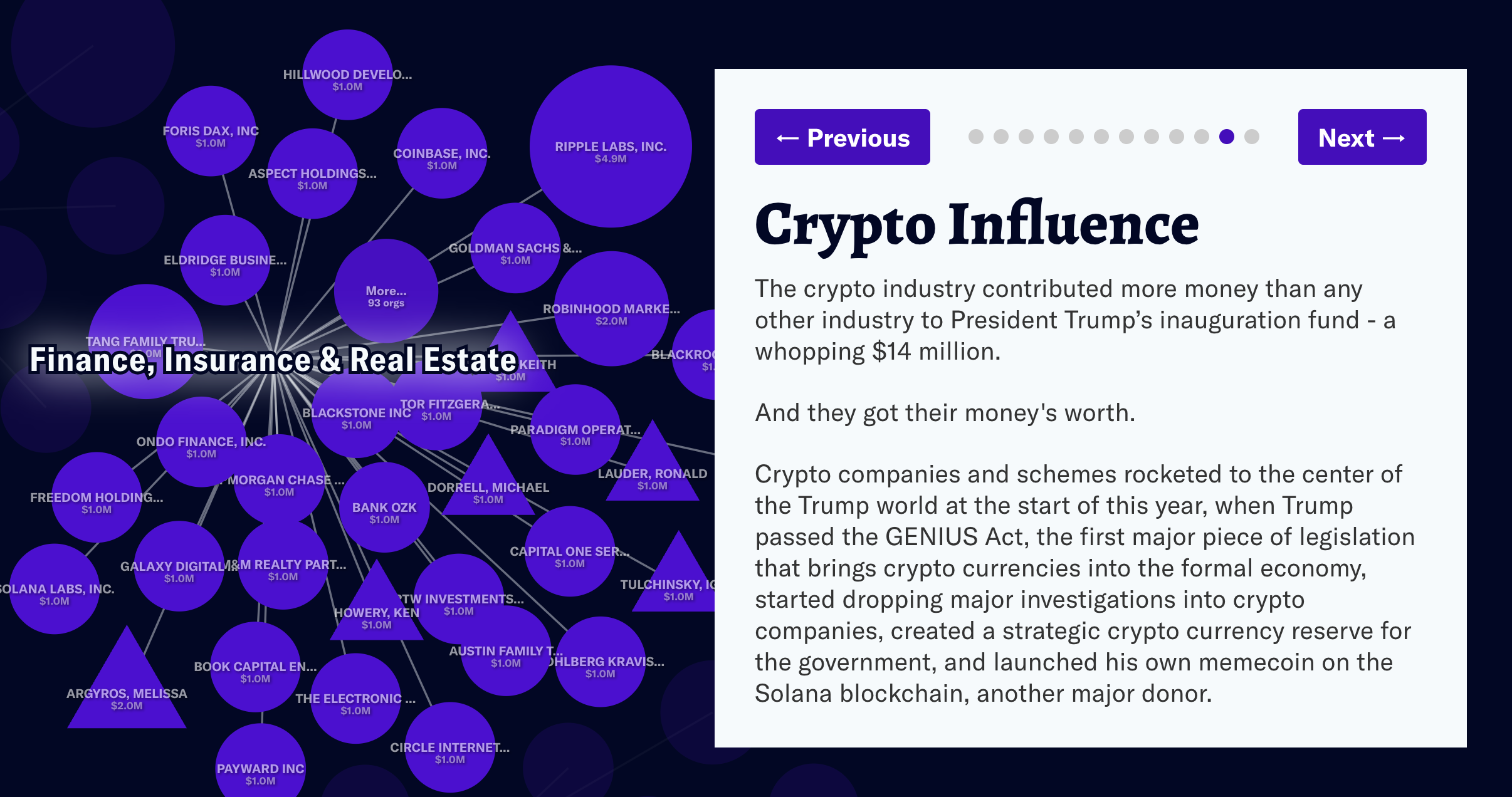
The site More Perfect Union created a network-style visualization showing the donors who gave to Trump and how they've benefitted from his administration.
Reader Lynnette Haggerty passed along this great visualization, showing the density of stars on national flags.

From the New York Times, we get this look at how much Obamacare premiums are set to rise. This is based on data from KFF, which Trump administration official Dr. Oz (sigh) told reporters had been retracted which (sigh) they had not been.
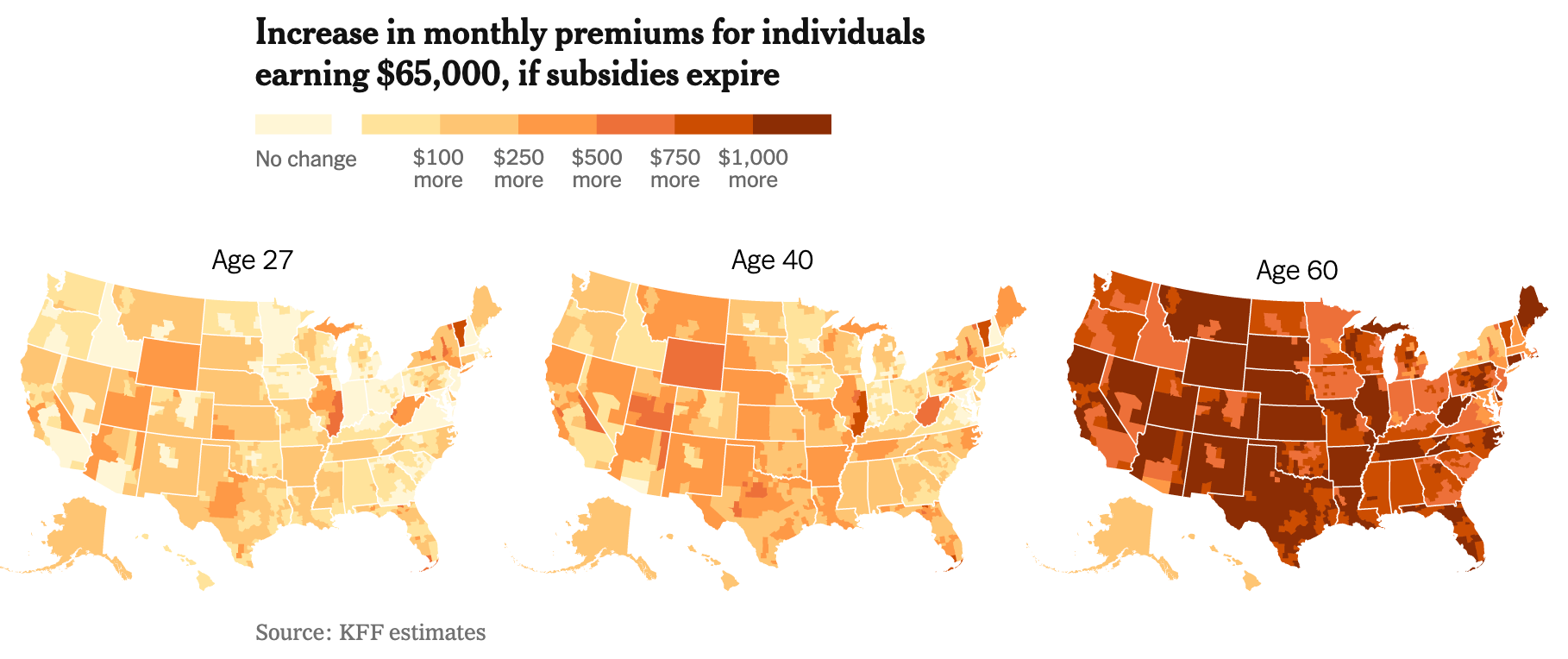
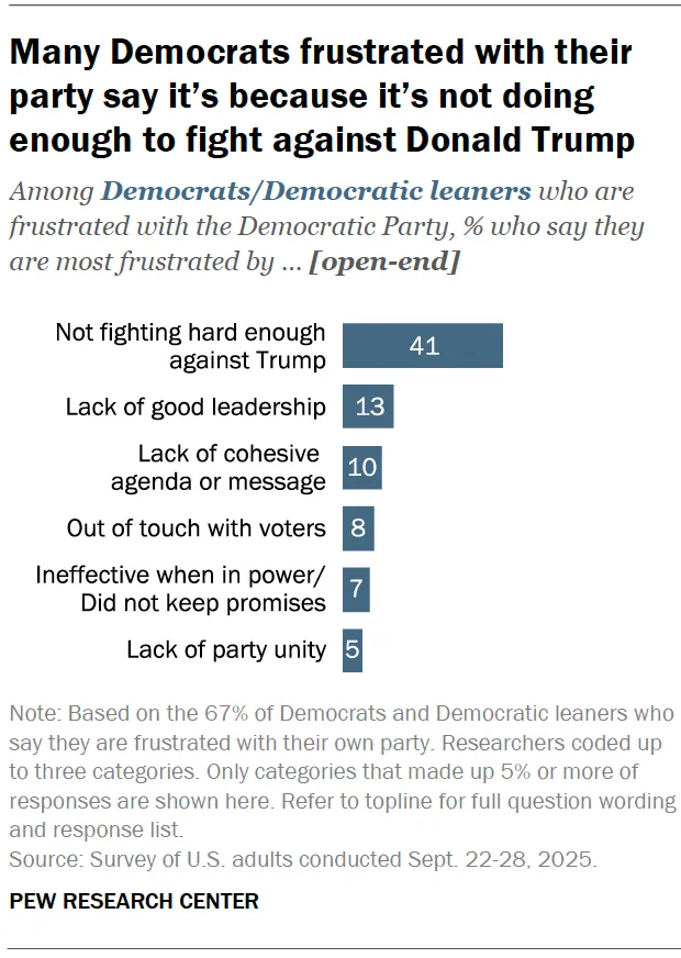
Those premium increases, you may recall, were the trigger for the ongoing government shutdown. But the shutdown is also addressing another concern of Democrats, captured in Pew Research Center polling released this week: The Democrats are giving Trump a fight.
Over in the natural world, geese are taking to the air to skywrite "vvvvv" for some reason. The Guardian put together an interesting interactive showing when you might expect them to pass over your house.
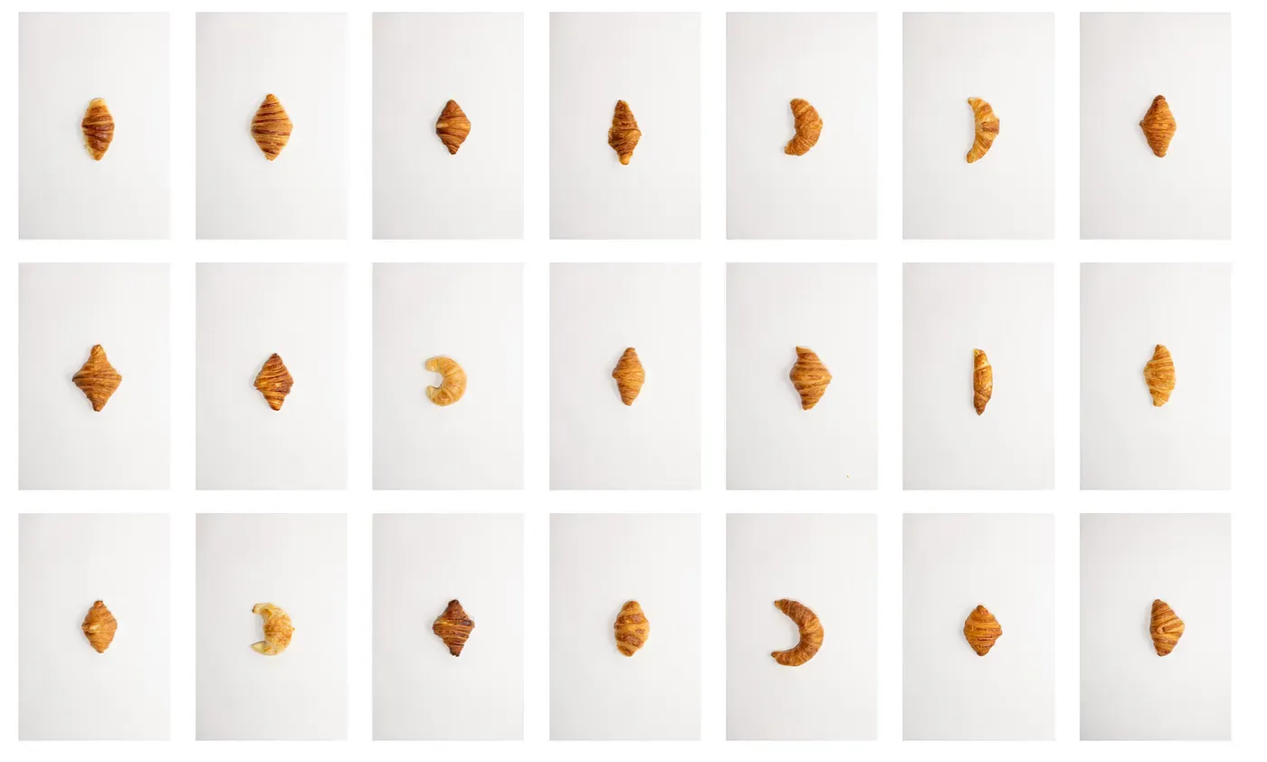
That link came from the always-great Flowing Data, as did the one below, showing the results of Alina Birjuk's effort to sample every croissant in Zürich. A lot of the croissants in Zürich aren't tres croissanty, but c'est la vie.
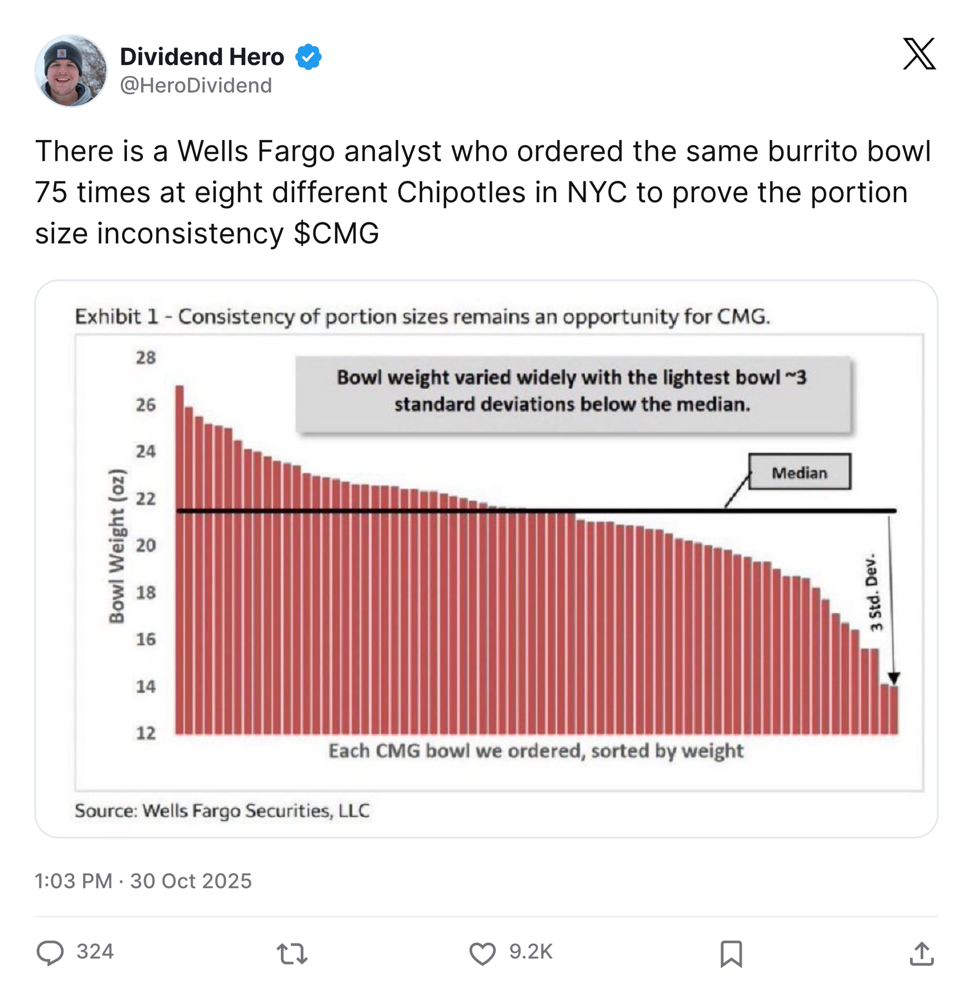
Speaking of food-related data analysis, kudos to the guy who bought and weighed dozens of Chipotle burrito bowls, showing, I guess, where to get the most meat for your money.
You are receiving this email, incidentally, on one of the busiest days each year for bespoke food-related data visualizations. Over the past 24 hours, scenes like the one below unfolded across the country, including in my own living room.
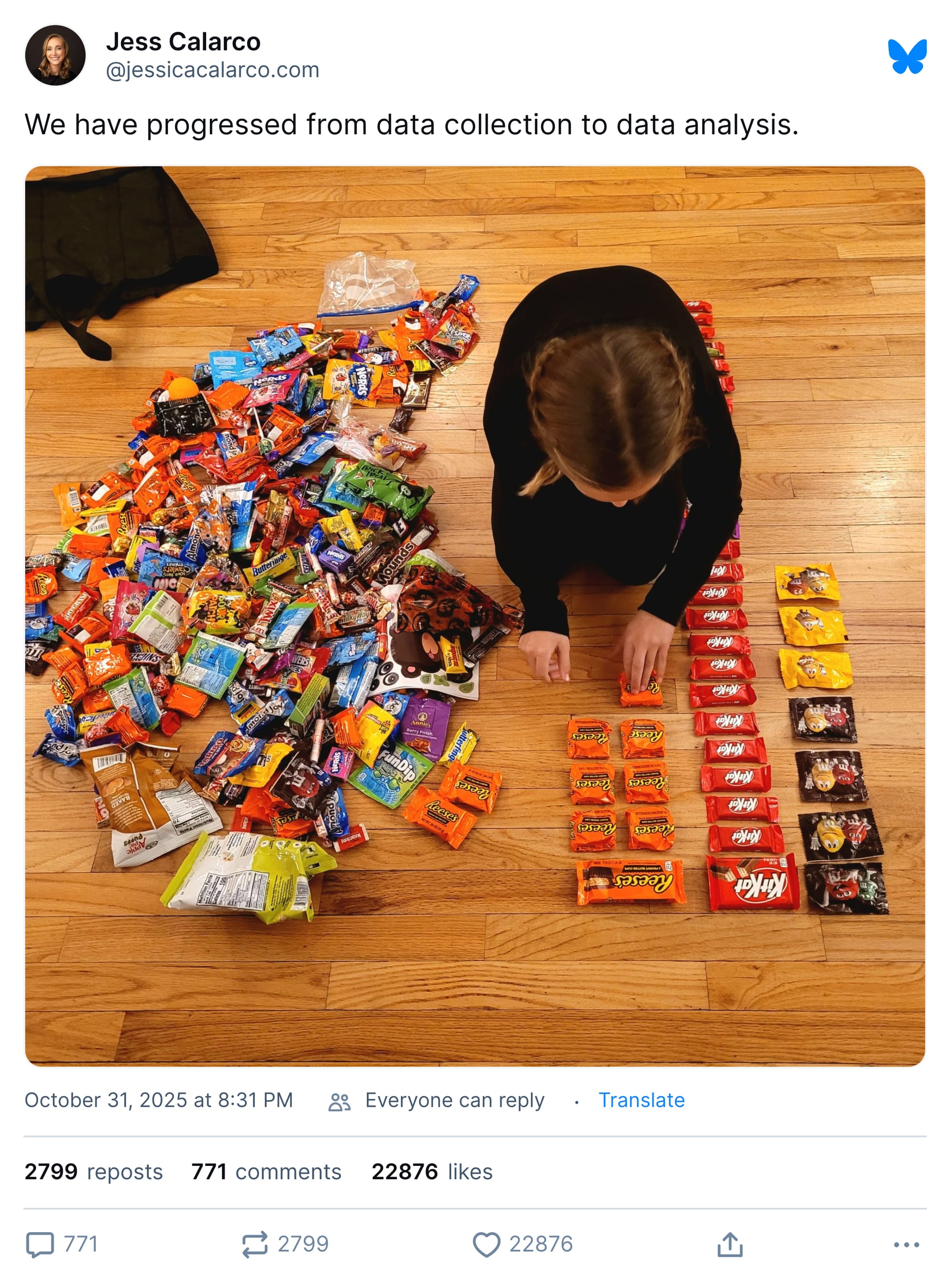
I can report that my kids did not land a haul anywhere close to the one above and, further, that I will make sure that neither of them sees what sorts of sugar-soaked hauls are possible.
The sole consolation I could offer them is that some large part of that cache will fester for months, picked at mostly by a parent, until it ends up thrown away. Not to inject my subjective experience into this or anything.
Appendix
Some other things I've written

You are receiving this email because you at some point in time volunteered to, either at Ghost or Substack or pbump.net or pbump.com. If you don't want to receive future emails, I'll need you to fill out Form 232-A(1) in triplicate and submit it to the main office between 9 a.m. and 9:10 a.m. on Thursday. You don't want to do that. What you want to do is support the newsletter financially, right?
Another one is coming next week. You have been warned.