The robots have arrived.


Introduction
So today we are going to talk about A.I.
The chances are very good that you experienced a medium-to-strong emotion at reading that sentence and the chances are also good that the emotion was not terribly positive. The arrival of A.I. has guzzled electricity and water as it delivered self-harm, manipulated images and slop. What's to talk about?
Well, the thing is that "A.I." is a broader category than we often appreciate. It includes the things above, and those drawbacks. But it also has an uncanny ability to slice through some of the Gordian knots that encumber our lives and the economy. Including ones centered on data.
When I decided on this week's theme, I reached out to my friend Christopher Mims, a technology columnist at the Wall Street Journal. The timing was fortuitous; he has a book coming out this week — How to AI — about how normal people can use A.I. effectively.
"For the vast majority of us, A.I. isn't about replacing us," he told me. "It's about having a tireless assistant and tutor we can delegate things to. If you're smart about how you do that, it's a powerful tool that can save you time and energy."
Here I will stipulate — forcefully! — that this involves some offshoring of time and energy consumption to data centers. But bear with us.
"Deep research tools can be really good—and fast—at fact checking," Mims said. "But unless you pay for one and get good at using it, Google's hallucination-filled generative search summaries would lead you to believe their AI is so unreliable as to be a menace to truth-seeking."
This mirrors my experience. I began using A.I. tools last year as I attempted to build a database of poll results. I tried to use OpenAI's ChatGPT and found it clunky to the point of being idiotic. Anthropic's Claude, on the other hand, is adept at extracting numbers from lengthy PDFs — and constructing tools that use that data. As I used it more, I got a sense of how powerful the tool actually is.
Again, I am not denying the downsides. (Nor does Mims, who noted that "A.I. doesn't have to be intelligent in order to really screw up the labor market.") I am this week simply going to present an upside of which you might not be aware.
That's a lot of writing and earnestness for this newsletter. I apologize.
Chapter 1
Hope you didn't pivot your career to coding
Regular readers will be aware that I have two kids in elementary school. True to the stereotype, this does mean that I am often asked unexpected questions. A common one, for example, is "where is that plane going?"
It's admittedly an interesting question to ask! Haven't we all, at some point, looked up and wondered where those people were headed? Well, if you haven't, my kids have made up for your lack of curiosity. I've gotten adept at opening the FlightAware app on my phone.
Earlier this week, though, I had an idea: What if I asked Claude to track what planes flew over my house? So I asked it to create an app that would sit in my laptop's menu bar and do that: take my location and, within a certain radius and elevation, check for the appearance of planes. Over the course of an hour or two, I had a self-contained application that did exactly that.

It was eye-opening. First, because it was trivial to create: I literally asked Claude to make an app that tracked planes, it asked a few questions and, in a couple of minutes, had something running on my machine.
But my eyes were also opened by the patterns is found in the overhead traffic. For example, a lot of flights from Boston pass overhead on their way to cities in the South. I also found that there were a lot of private planes over my house that were headed to or from the airport near White Plains. One flight from Montreal to Florida passed overhead as it sought to avoid a storm.
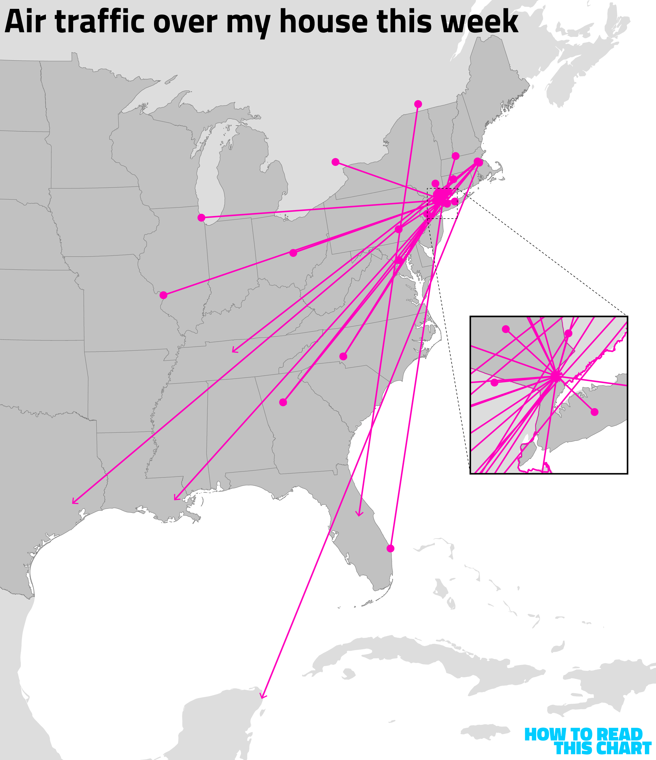
Could I have made this myself? I think so. I know how to code, although not enough to create an application like this. I could have learned—but I wouldn't have. I wouldn't have spent the who-knows-how-many-hours to make this, but did spend the maybe-an-hour to let Claude build it.
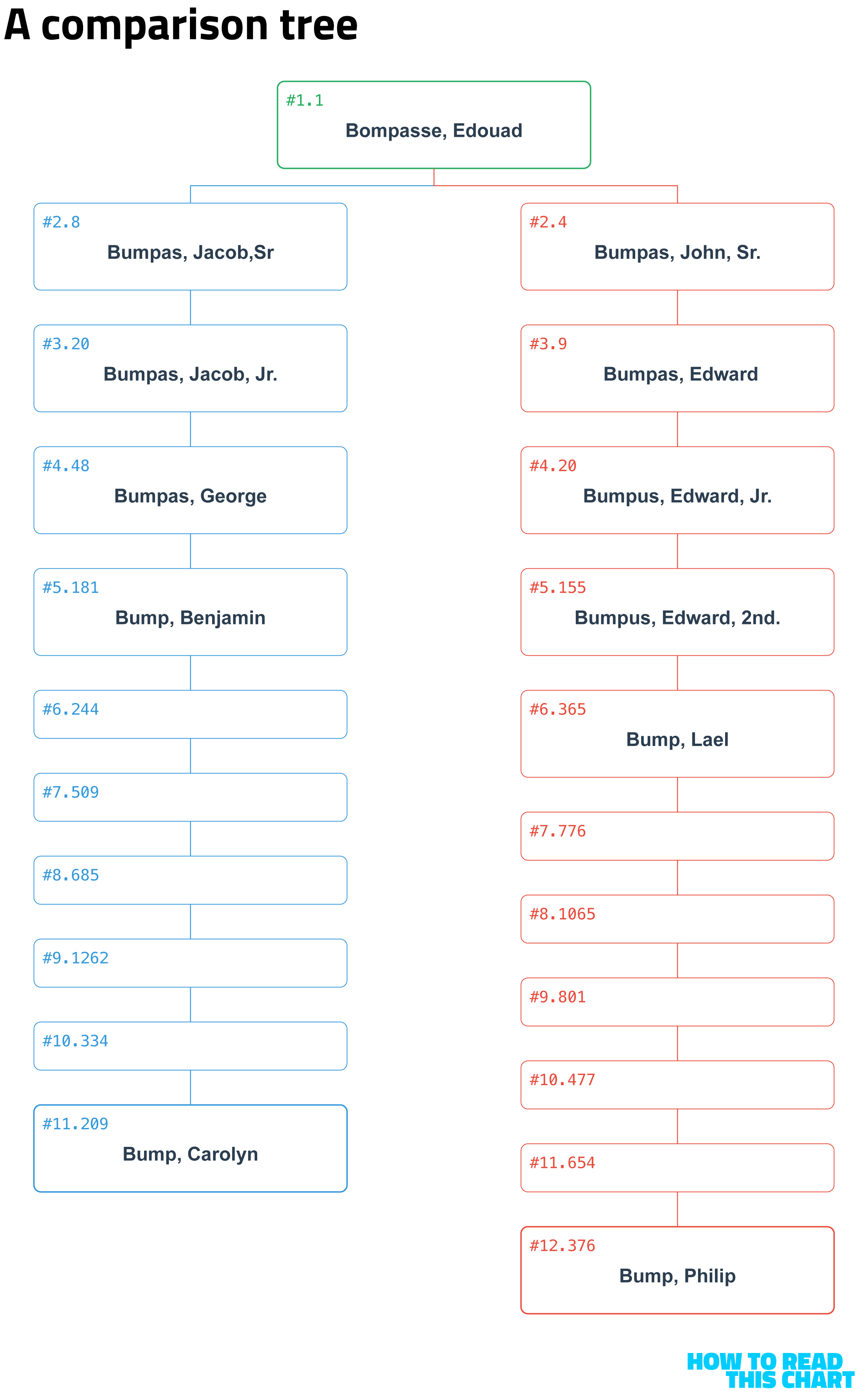
But then I had another task for Claude. I was writing something centered on my family history and decided to spend a minute digging into the connection between myself and Edward Bompasse, who arrived at the Plymouth Colony in 1621. I found a big, clunky text file with an extensive genealogy of the Bompasse/Bumpus/Bump family. I asked Claude to create a tool to navigate it.
Again, after a short while, I had a full website I could explore and augment. I added a tool, for example, that shows how any two Bumps are related. The comedian Paula Poundstone once asked me if I was related to her grade-school teacher Carolyn Bump; I can now report that we are ninth cousins, once removed.
The chart below was generated by the website Claude made. I just cleaned it up a bit and removed the names of ancestors once they'd become Bumps.
I also had Claude generate a vector diagram of the family that I could edit. Below, each ring is a different generation, from Edward (né 1603) on out. The pink circles show the progression of my particular branch, culminating (for now) in my sons.
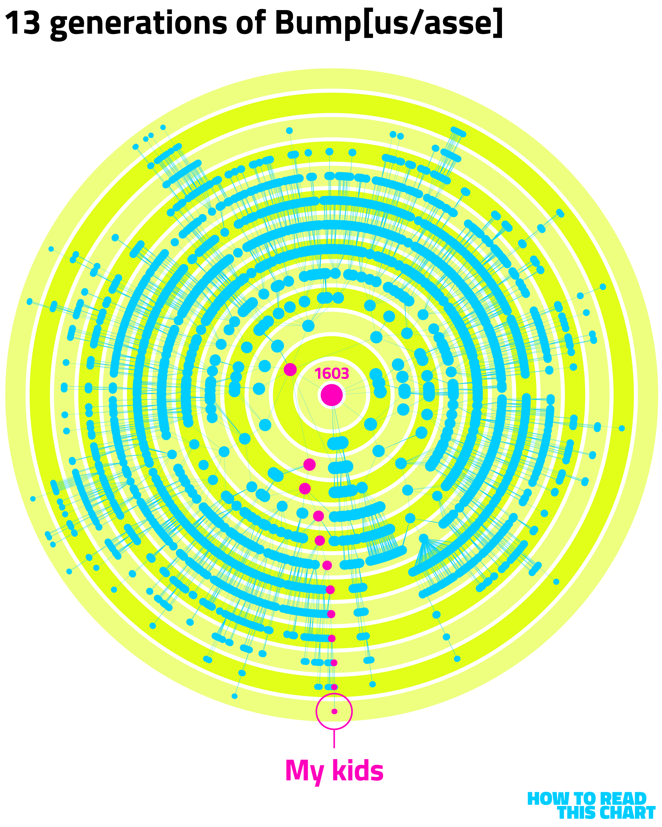
From 1603 to 2026, through 13 generations. A visual that I could have spent weeks or months making after digging into the text files I found. But one that I was able to make in about 10 minutes with the help of A.I.
Chapter 2
How adept are you at spotting partisan identifiers?
Two weeks ago, this newsletter focused on Bellingcat's tools for extracting information from publicly available photos and videos. This week, I stumbled onto a fascinating example of how that can work — one built using Claude's coding tools.
Data scientist Alex Lundry created a tool called "Ballot Blocks" which shows a Google Street View image of a neighborhood somewhere in the U.S. Your task is simple: guess who won the neighborhood in the 2024 presidential race, and by how much.
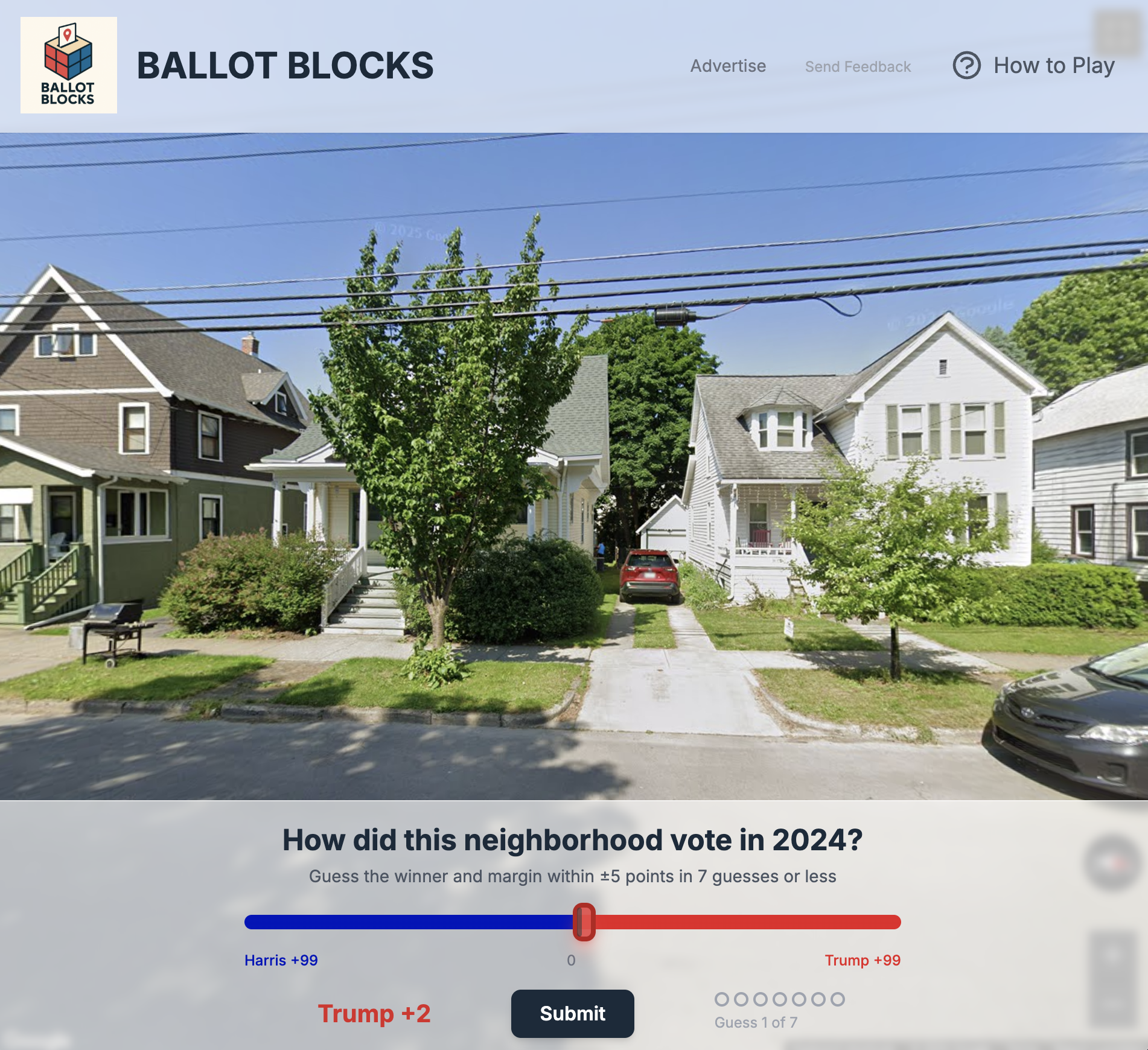
Lundry told me that he was inspired by the New York Times' similar tool, released after the 2020 election. He figured it could use an update.
"I've got coding experience for data science that can get me part of the way on this (data wrangling, finding interesting precincts, etc)," he explained, "but no web development experience. So this seemed like a great opportunity to try out Claude Code. And, boy, did it blow me away."
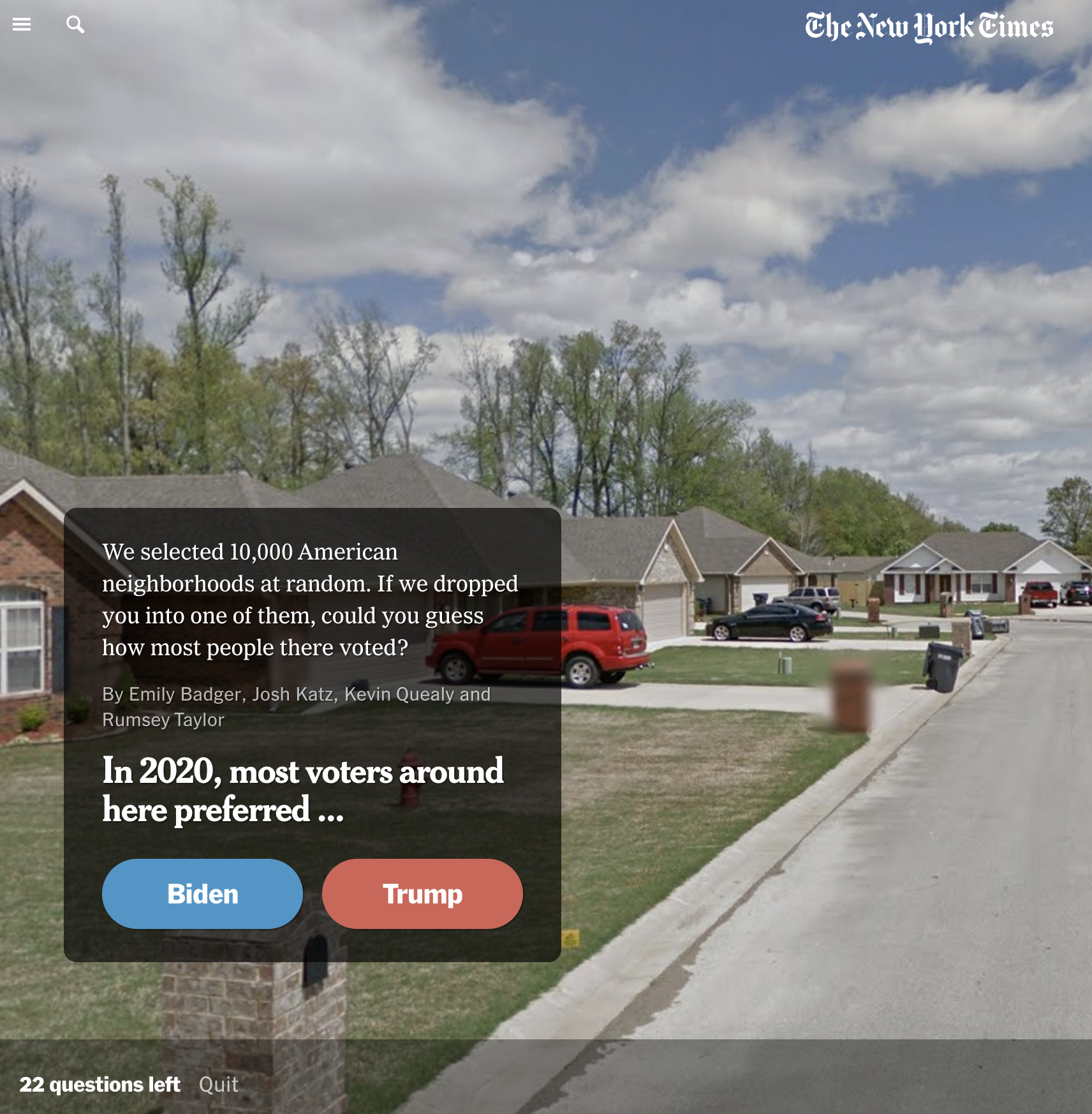
Lundry's game includes new daily challenges and a sort of speed mode where you can trawl through a number of neighborhoods at once. You're likely to find that your instincts are right: Lots of pick-up trucks points in one direction, city streets in another.
For Lundry, the marvel was in the creation.
"It's pretty insane—in total it took me about 8-10 hours of work spread out over the long weekend," he said, "and I’ve got a fully deployed game" that includes Street View integration, ads, progressive hints and other sophisticated elements of modern web design.
And … it's fun. Again, something that likely wouldn't have existed if Claude didn't facilitate it. Lundry told me he "already had a thousand other ideas to try," which resonates. This subset of the A.I.-iverse, in the context of amateur noodling, is like a kid's recorder: you're up and playing around pretty quickly. It just also carries the risk of obliterating huge swaths of the music industry.
So ends my gentle appreciation. Now let's discuss something about which no one has strong opinions: professional sports.
Chapter 3
Baseball in the News™
Every so often, I come across a data analysis that makes me very mad because I wish I had done it. VoteHub's look at the party registration of professional athletes is one such exploration.
There are some very pointed and obvious stories about American society contained in the chart below.
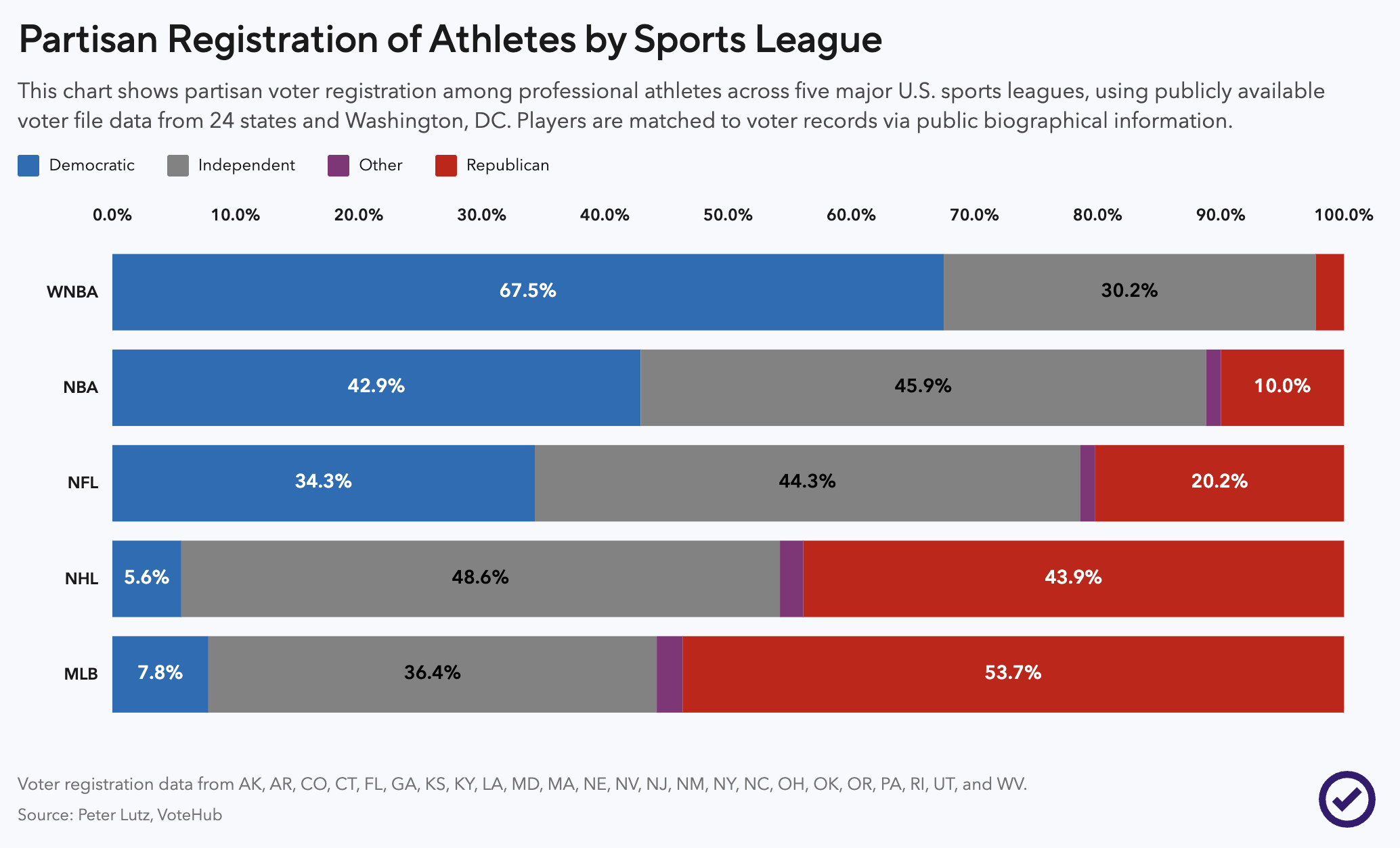
Why is Major League Baseball so Republican? As VoteHub's Peter Lutz notes, it's mostly demographics. The MLB is much less Black than it used to be, and many of the non-White players are not U.S. citizens (as the Giants' Jung Hoo Lee can attest). So they're mostly wealthy White men, which… well…
The WNBA, on the other hand, has a different demographic pool.
This week also saw the finalization of voting for the Baseball Hall of Fame. Carlos Beltran and Andruw Jones earned the honor, and good for them. What I'd like to highlight, though, is Nathaniel Rakich's aggregated data on voting, which allowed me to make this chart showing the upward trajectory most Hall of Famers take toward selection. (To gain entry, retired players need to be selected by 75 percent of ballots cast.)
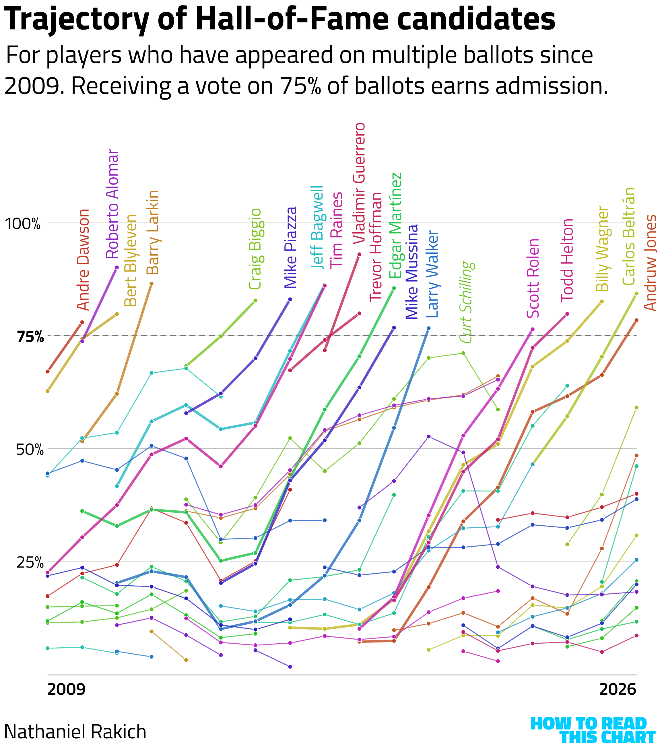
You can see a range of paths to Cooperstown. Some are voted in during their first year of eligibility; they aren't shown above. Others slowly accrue more votes until they get there. Some surge — and then fade, like former pitcher Curt Schilling, who probably blames his falling short on "woke."
Chapter 4
The Trump era, mapped
Gahhhh this newsletter is already so long, what with all that throat-clearing at the top. And now I have this self-referential paragraph, making it longer still. Shut up, Bump! Get a move on!
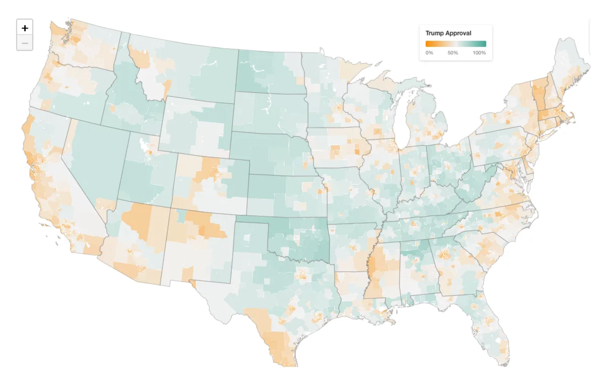
OK. Here are three maps of the state of President Trump's America, a sort of Map Attack (patent pending).
The first, from G. Elliott Morris's Strength in Numbers newsletter, shows Trump's approval rating at a county (and lower) level.
Next, the unappealingly named Sludge has a map of the companies that have contracted with ICE.
The American Sunlight Project has launched a tool tracking administration censorship, including a map by state (that is also a loose proxy for population).
Clicking on each of these maps will allow you to explore and interact with them, should you feel like being slightly depressed.
Chapter 5
I made this, so here it is
I was going to write about the House Democrats who voted to advance a bill that provided funding to the Department of Homeland Security but then I didn't, even though I'd made the chart. Then I remembered that I write a newsletter about charts and figured this would be a good thing to present about 2,000 words into the thing.
So here you go.
The vertical axis is VoteView's DW-NOMINATE measurement, showing the relative liberal- and conservativeness of legislators. The horizontal axis is The Downballot's measure of presidential voting in House districts. The seven Dems who backed the bill are in green. They are all fairly moderate and from Trump-voting or -leaning districts — but other moderates from Trumpian districts didn't go sideways.
But I didn't write about this, so you'll have to expound on this yourself.
Chapter 6a
Chart Attack (bleak)
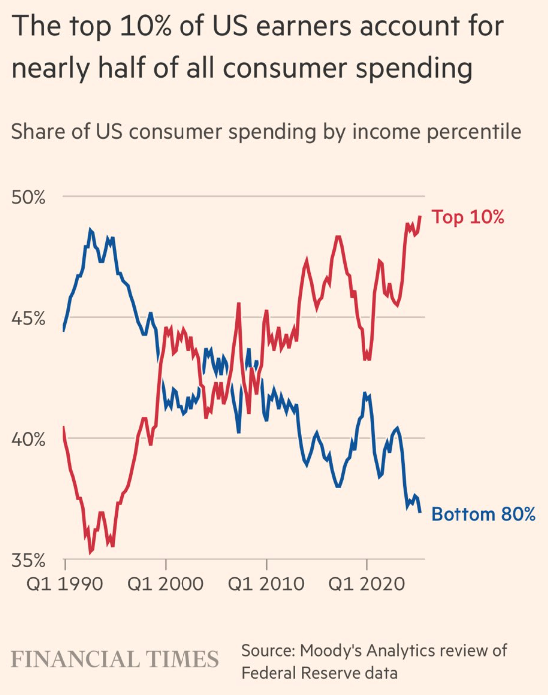
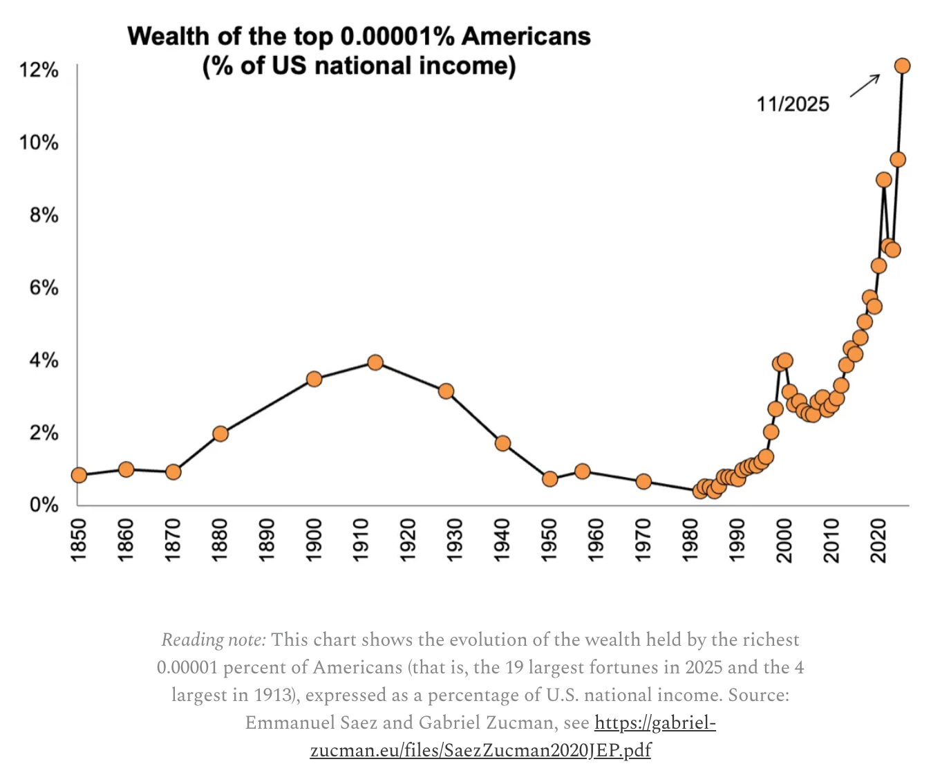
Just to make this thing longer, there are two Chart Attacks this week. The first one is the grim, un-fun one; feel free to skip ahead to the fun, non-political one.
We start with a chart from a December Financial Times story that just started getting traction this week. Nearly half of consumer spending in the U.S. comes from the wealthiest 10 percent of incomes. Neat!
The wealthiest hundred-thousandth of Americans, incidentally, earn around one out of every eight dollars distributed as income. That's cool!
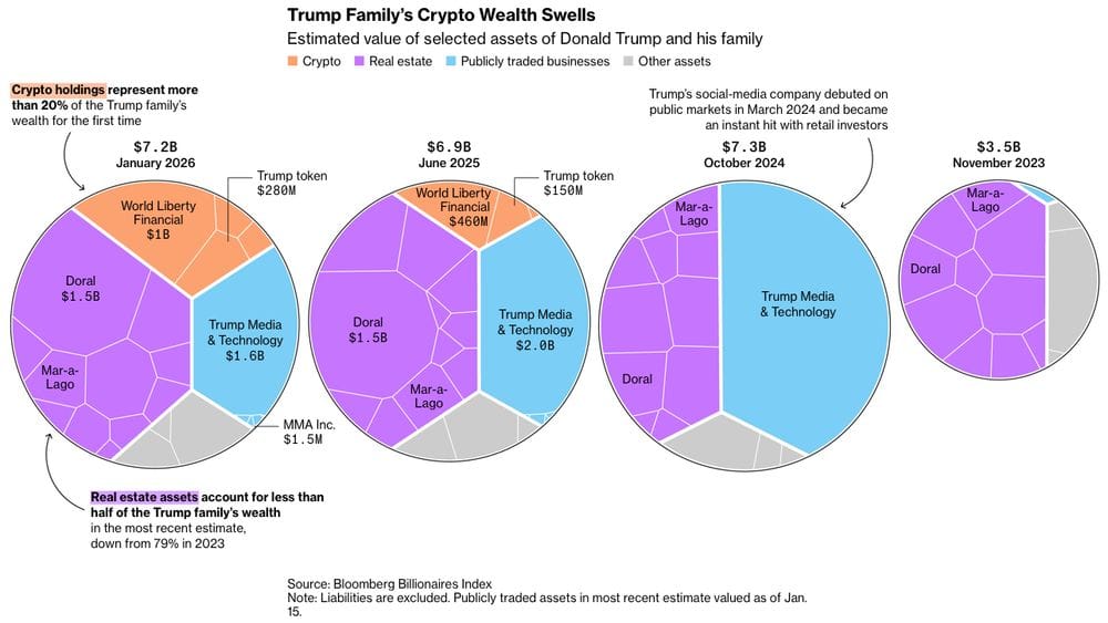
Since Donald Trump's inauguration last year, his family has added nine figures of wealth from the crypto industry that he helps regulate. Awesome!
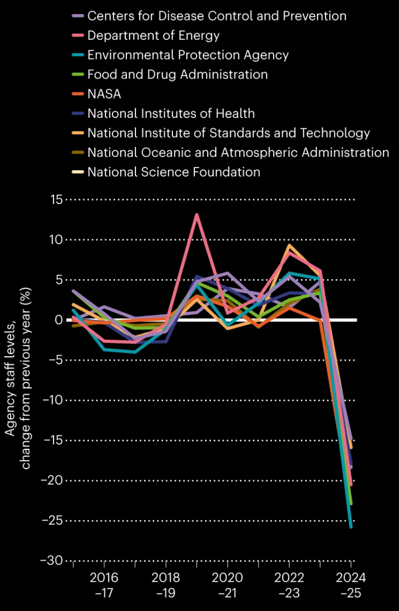
But he has also dramatically slashed staffing in federal public health agencies. Great!
OK. If you were waiting for the unbleak charts, you can open your eyes now.
Chapter 6b
Chart Attack (less bleak)
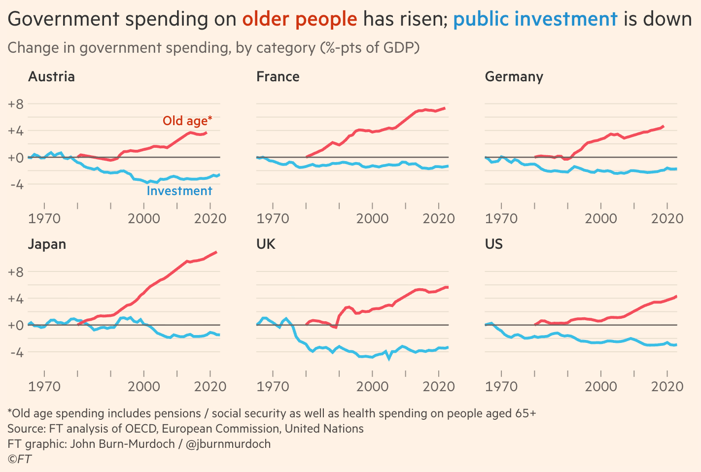
I debated putting the chart below in the "bleak" section, but it's really not that bleak. It is, in part, a function of there being more old people, something I wrote a book about.
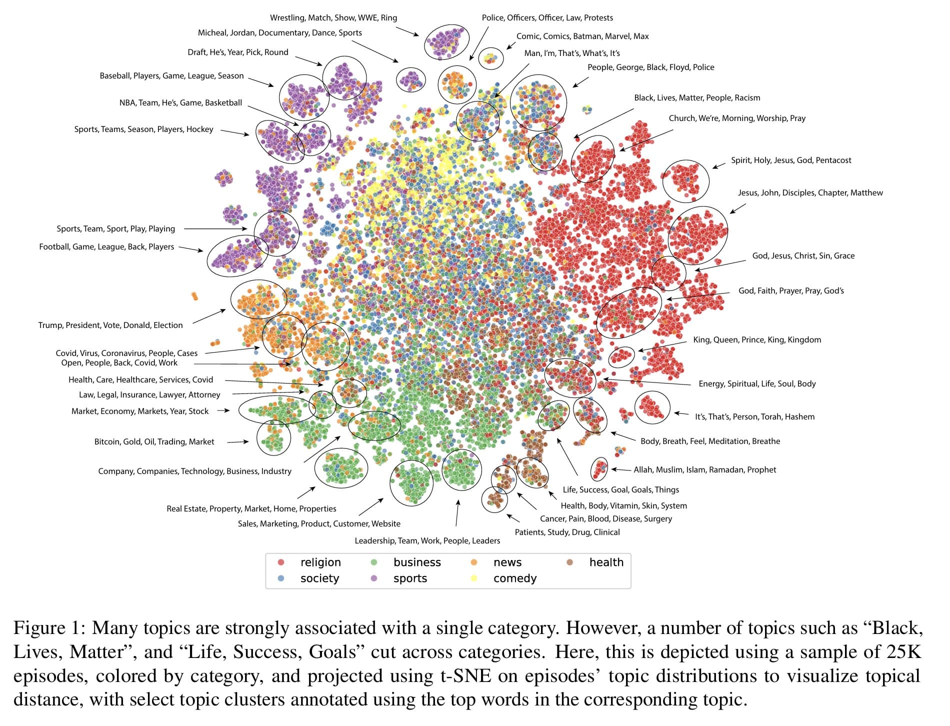
Researchers from a lesser-known university in a town called Ann Arbor mapped the ecosystem of podcasts.
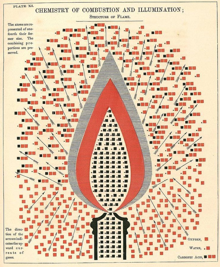
A long time ago, another guy named Edward made an intriguing and maybe over-complicated illustration of how flames work.
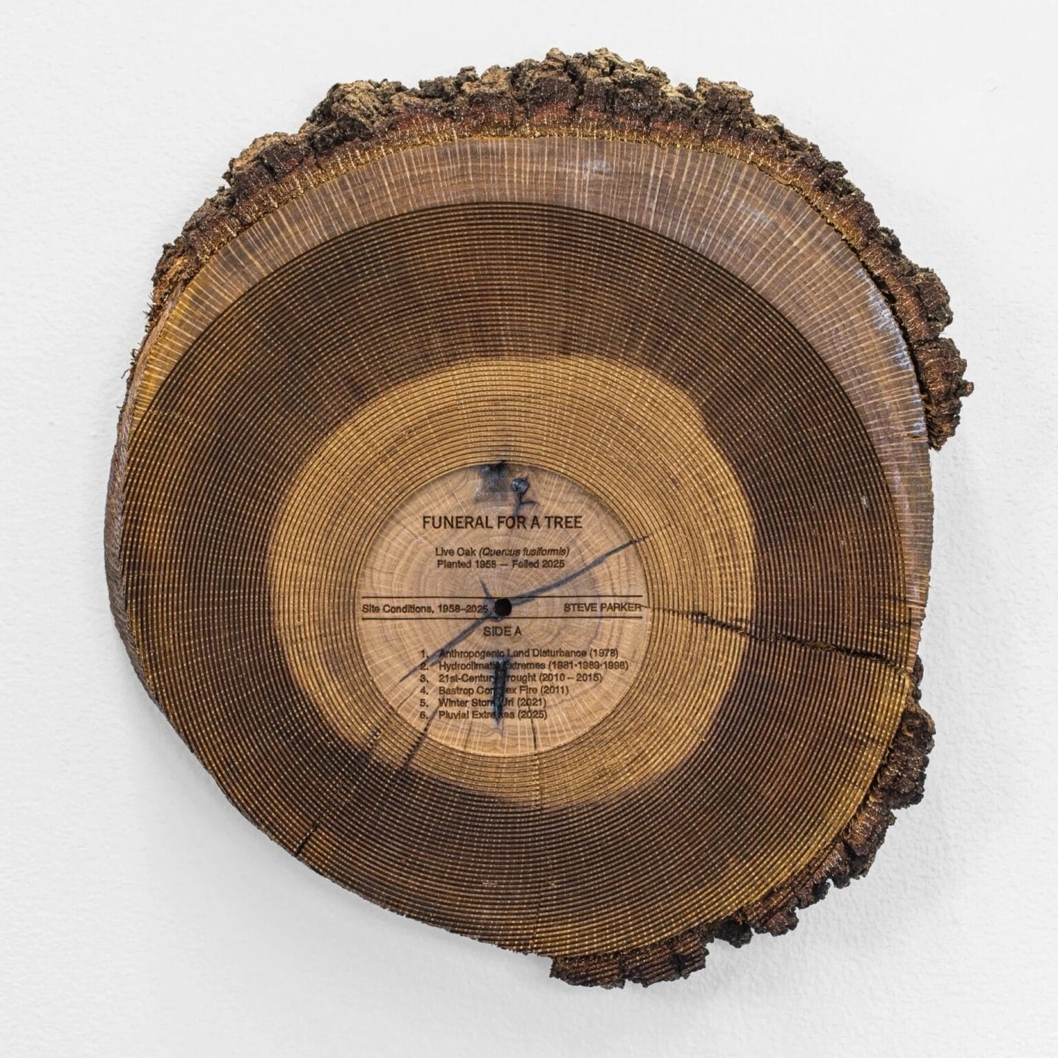
Artist Steve Parker memorializes fallen trees by slicing them into records on which he encodes bird songs. There's a video at the link; it's really great.
And so we come to our final entry for the week, the termination of an awful lot of words and pictures. But that's good, because 99.4 percent of the country is going to be buried under 82 inches of snow come Sunday. This newsletter gives you something to do. Assuming that you are not crushed by trees covered with so much ice that it is equivalent to 109.5 Golden Retrievers.
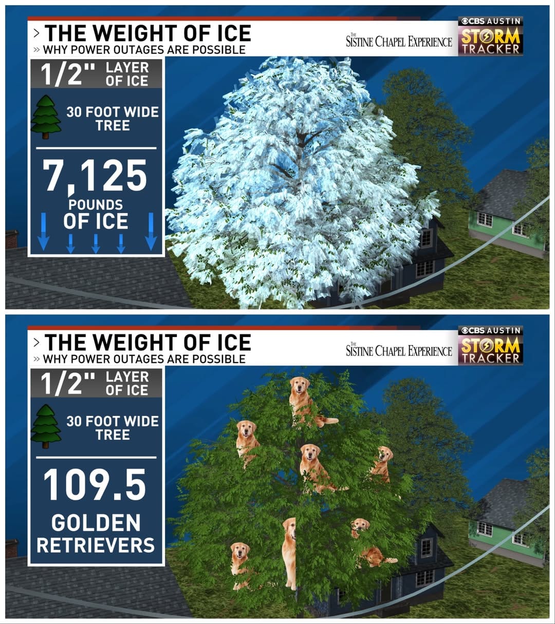
Though it fails to show precisely 103 of the retrievers, this is obviously the best data visualization in human history, obviating the need for me to ever write this newsletter again. If you want to check out some snow-related data visualizations while you take a break from shoveling, I covered that a few weeks ago.

And if you want to read some full articles that are nonetheless shorter than this newsletter: here you go.
Appendix
Some other things I've written


You are receiving this email because you at some point in time volunteered to, either at Ghost or Substack or pbump.net or pbump.com. If you don't want to receive future emails, please find an AI agent who does. What you really want to do is support the newsletter financially, right?
Another one is coming next week. You have been warned.