The ebbs and flows of the nation

Prologue
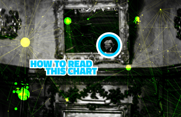
About that picture
As you are likely aware, this newsletter is the resurrection of one that I wrote for years while I was at The Washington Post. That means that I am adjusting my muscle memory slightly, adapting how I did it to how I am doing it.
The old newsletter, if you knew it, didn't feature art at the top. It just had a terrible photo of me (and, later, a not-great drawing of me) in accordance with Post style. But this one does have an introductory image.
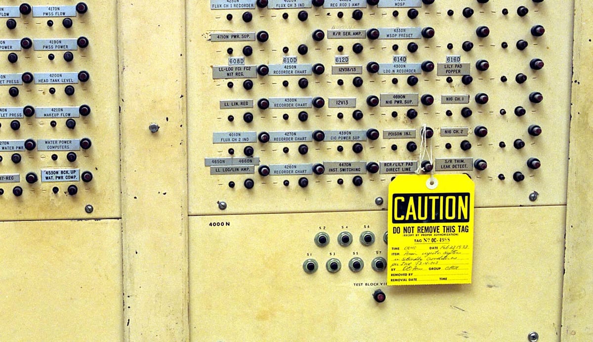
I could have used the space above to show whatever visualization I was going to be talking about. But I've always preferred to write this as though I was saying it to you, having buttonholed you at some dull event I'd wormed my way into. I want to show the chart when I'm talking about the chart! So at the top of the article, I want to show something else interesting, like, in this case, a control panel at a nuclear plant.
But I'll probably end up doing something different in the future.
Chapter 1
A fundamental, essential shift — visualized
I would now like to tell you about a chart. Grab a drink, and settle in.
A few years ago, I wrote a book about the baby boom and the evolution of America's demography. (It's called The Aftermath; the New York Times complained about all of the charts in it.) Two things that became apparent as I was writing it were 1) that we often fail to appreciate the scale of the baby boom and 2) that we often fail to appreciate how the country's demographics have evolved.
There's a style of data visualization often used to show population distributions called a population pyramid. Usually, it shows men on one side and women on the other, arrayed from young to old on the vertical axis. The result is a chart that looks like lamb meat on a vertical rotisserie, wide at the top and tapering down.
Having some free time, I figured I'd create a similar visualization, but considering race rather than gender. I happen to have more than a century of age data on-hand (thanks to the book research) so I made a series of population pyramids showing the White and non-White populations every five years from 1900 to 2020.
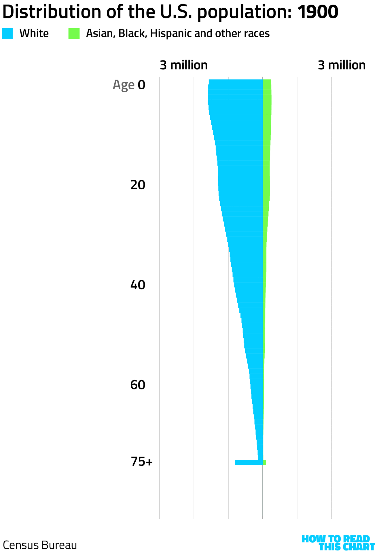
So, a century ago, the population of the U.S. looked as it does on the chart below. Heavily White, and those who weren't White were mostly Black. There were more young people than old, in part because people had more kids which, in turn, was in part because kids were more likely to die before reaching adulthood from diseases that are for now prevented by vaccination.
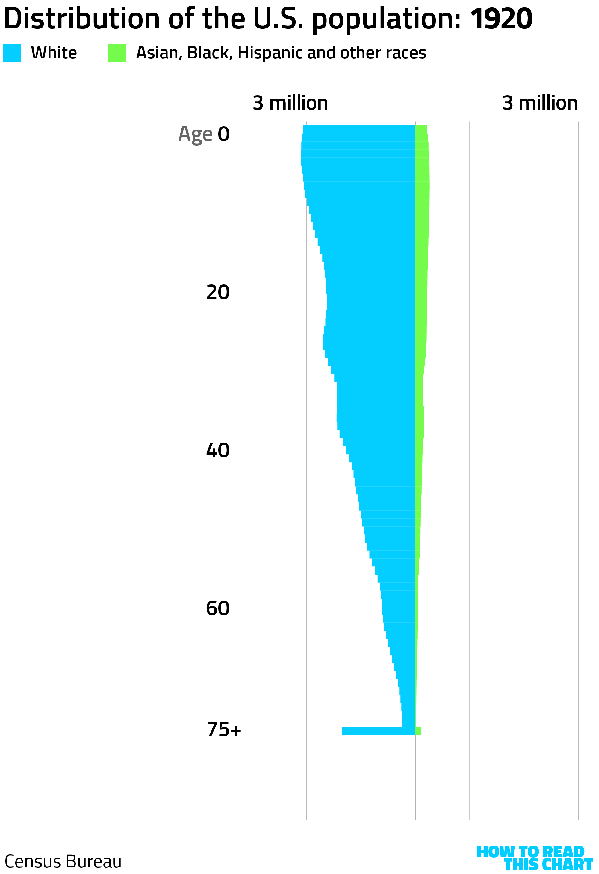
Thirty years later, we can see the baby boom. There was a small boom before the baby boom, actually, which you can see on the chart below. But it paled beside the big boom, like the atomic explosion that precedes a hydrogen bomb. (I recently rewatched Oppenheimer.)
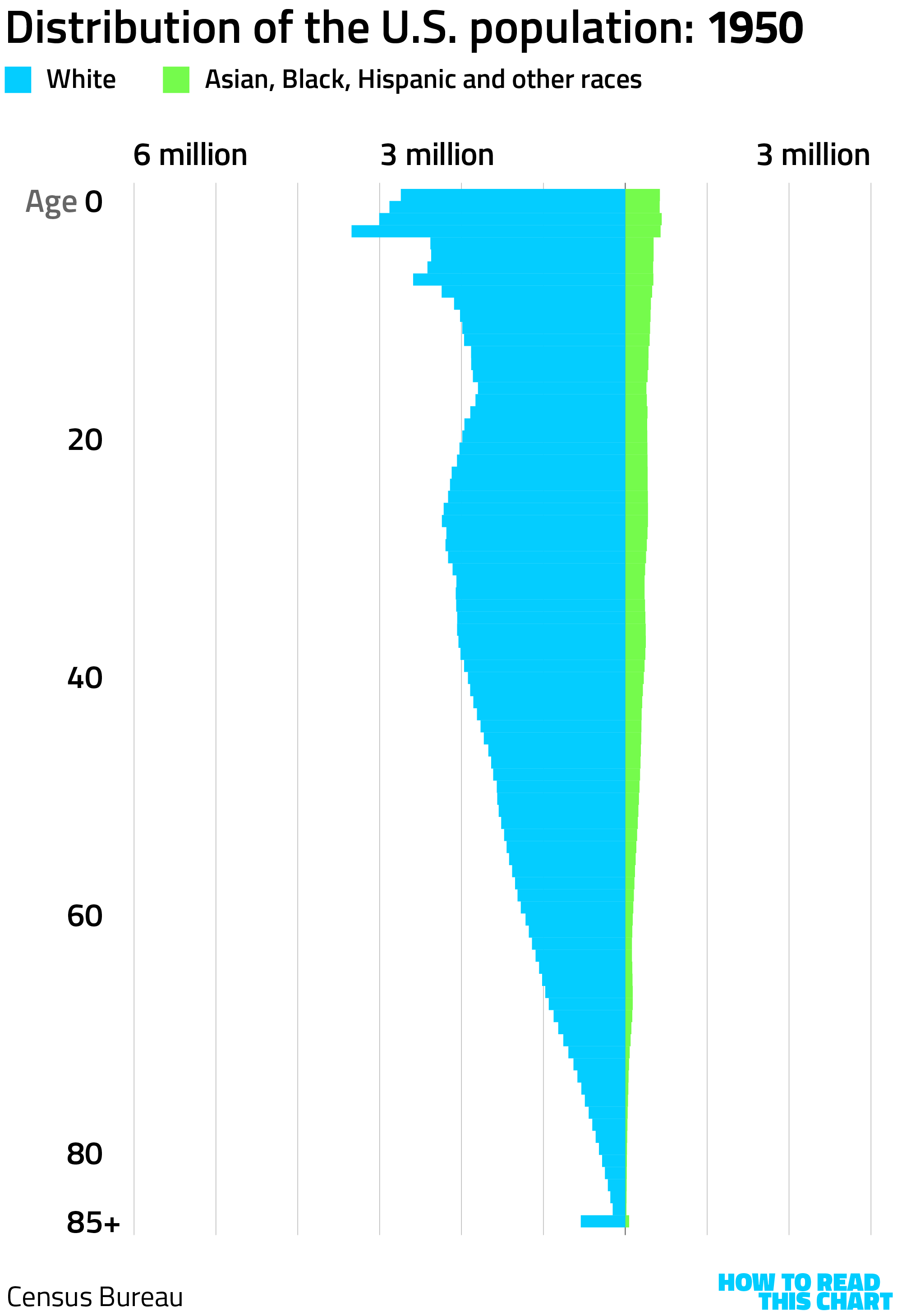
Notice that the data now breaks out ages from 75 to 85. There were more people in that range, thanks to increased longevity! And now, as Americans get increasingly older, Census Bureau data breaks out single years of age up to 100.
Anyway, 30 years after 1950, the boom had come and gone. But the population of U.S. residents born during the baby boom years (1946 to 1964) kept growing until 2000 — thanks to new immigrants.
The boom itself occurred during a period when immigration was constrained by law. By the late 1960s, though, those restrictions had been removed. As a result, the population of Asian and Hispanic Americans had begun to grow.
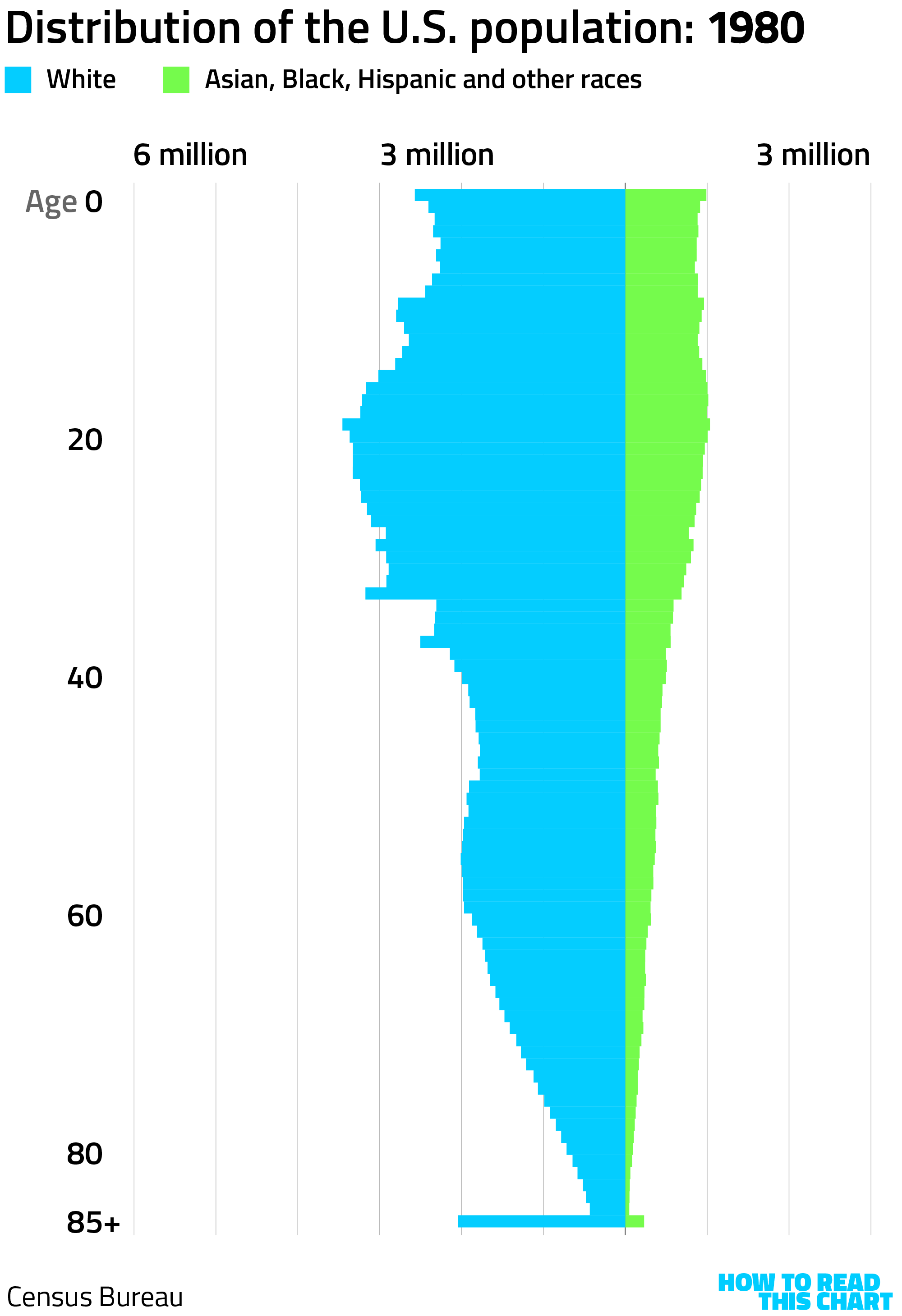
By 2020, our race-centered population pyramid has a distinctly Illinoisian shape. You can see the heavily White baby boom down there among the 60-year-olds. But younger Americans are about as likely to be Asian, Black or Hispanic as White. And at 85+, a huge spike.
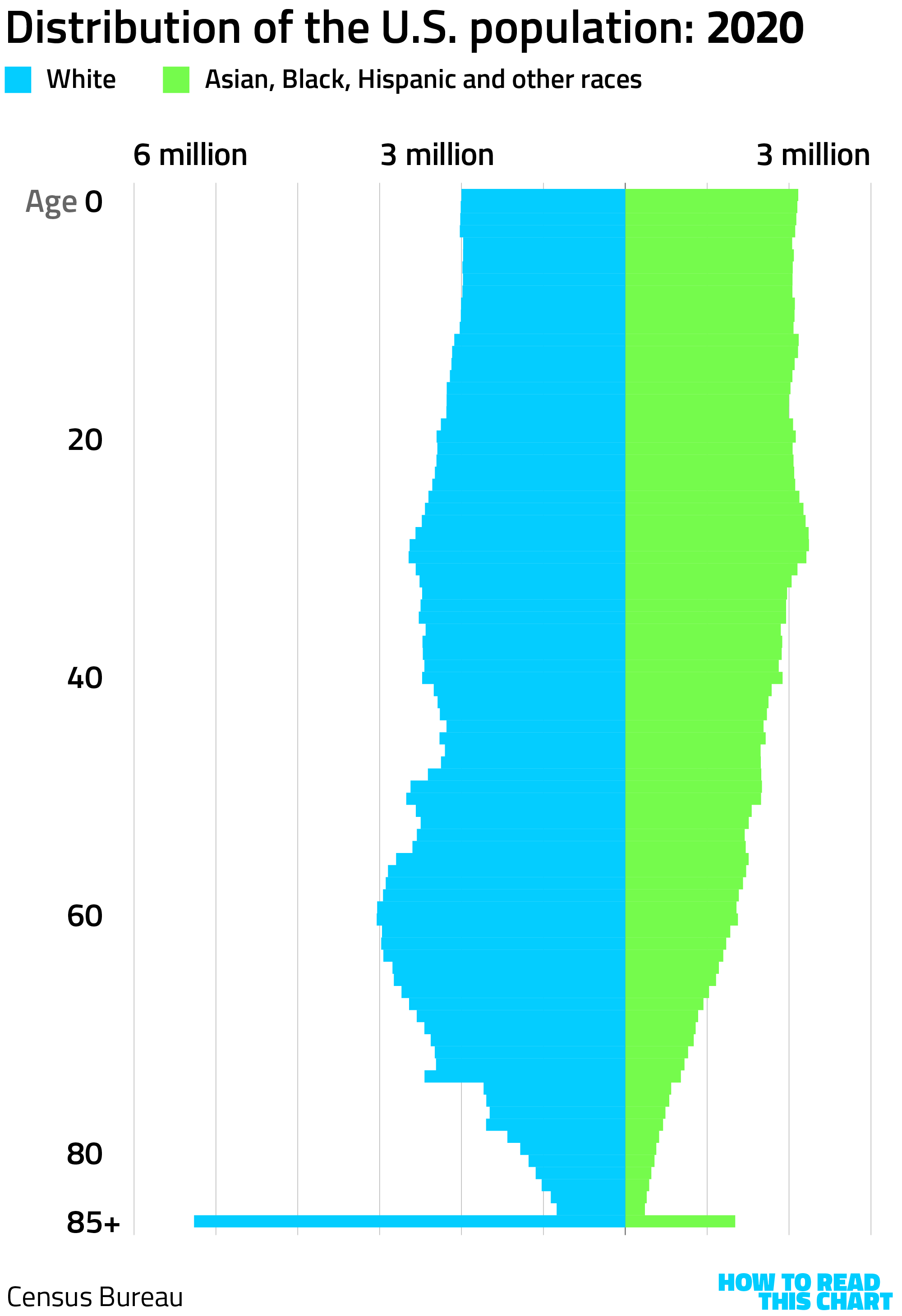
My book (which, unsurprisingly, I recommend!) explores how this demographic shift overlaps with the emergence of Trumpism in the U.S. But instead of rehashing that, I'll finish by showing you a neat little animation of our population pyramid from 1900 to 2020. It does a good job showing both the baby boom and the growth in the country's non-White population.
I see you squirming, here at this event (maybe a Halloween party?) where I'm talking your ear off. So let me change course and talk instead about entertainment.
Chapter 2
ALERT: There is a game about charts
I am one of those people who enjoys the little games that news outlets use to lure you into paying to be better informed. I've written about Wordle before but that only scratches the surface: I also play Connections and Threads and the Mini Crossword and Flashback and Bloomberg's (on-brand) betting/trivia game Pointed.
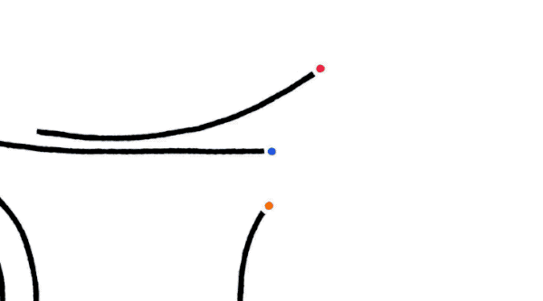
As you might expect, I was therefore quite pleased when Bloomberg introduced a chart-based word-trivia game, Alphadots. Friday's puzzle is shown below.
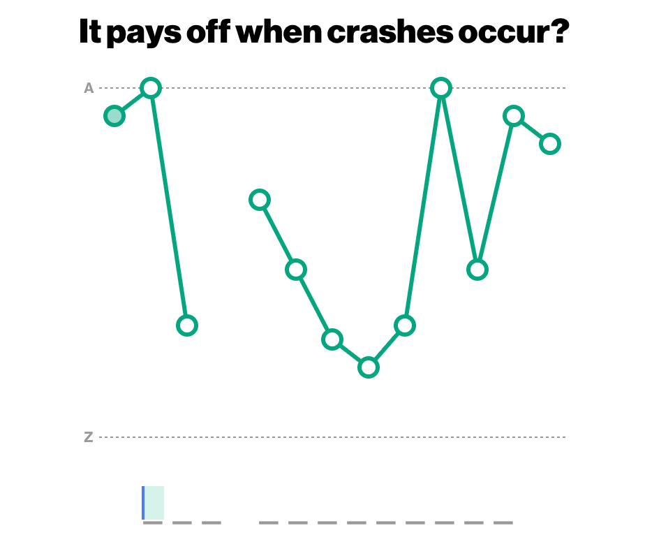
The premise is simple. Each letter in the answer is shown on a vertical axis from A to Z. You know, for example, that the second letter in the answer above is A because, well, it's on the line that says "A". The first letter, though, isn't far from that — so maybe C? D?
I emailed Chadwick Matlin, the editorial director of games at Bloomberg (a terrific title, I'll note) to ask where the idea for the game came from. He explained that he'd reached out to crossword constructor Jeff Chen to see if there was a crossword-like game that might fit into Bloomberg's approach to news coverage.
"One of [his ideas] was 'Stock Phrases,' which eventually became Alphadots," Matlin explained. "The core of the idea was the same as what you see today: Have a clue, and a hidden answer, and chart the answer on a y-axis of the alphabet. Originally there was a historical stock-performance layer to his idea, but we peeled that off and refined the mechanics from there."
He shared an early example of the game, created as a slide in a Powerpoint deck.
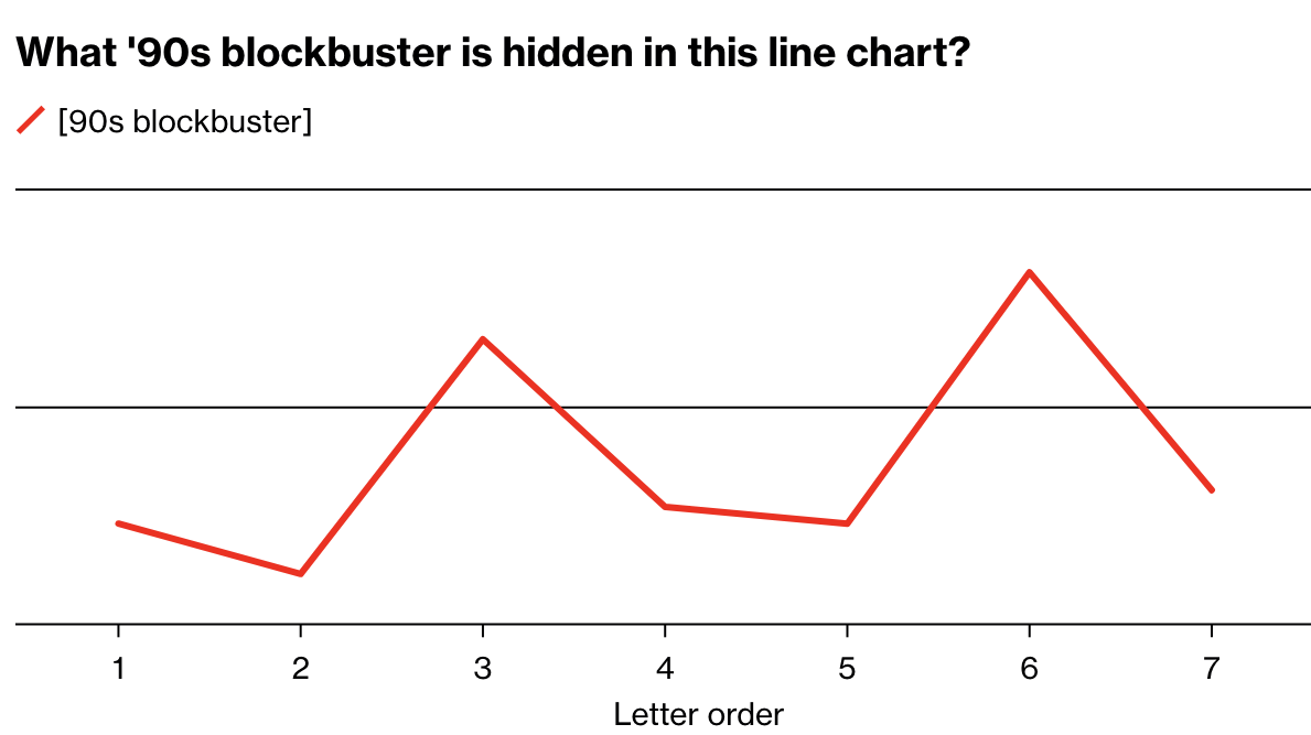
(The answer to that one, if I'm not mistaken, is DOG DAY AFTERNOON.)
"One of the things I emphasize as we're designing games here at Bloomberg is that they need to allow for savvy – if you can't solve something one way, you should have another way to do it," Matlin said. So Alphadots allows you to have particular letters identified, making it easier to solve.
I asked which puzzle had proven the most difficult for players to date. The clue was "Person with immunity to foreign bodies?" and the answer: AMBASSADOR.
The answer to Friday's puzzle, by the way, was CAR INSURANCE. (See the first C? See the A-N-C-E at the end?) And, upon further reflection, I realize that the answer to the '90s blockbuster puzzle was actually REAR WINDOW†. I regret the error.
Intermission
Some housekeeping and some questions
(I know I'm mixing book and movie metaphors with the sections here. Just go with it.)
So this is the second edition of the revived How To Read This Chart and (as the prologue indicated) I'm still figuring out how best to make this work.
For example, the response to my initial supplication that people might help support the newsletter financially was enormous and humbling. I very much appreciate it! But it means that I have a lot of pictures of dogs and recognitions to provide to subscribers, and I'm behind on doing so. But I will! (If you'd like to receive one of those things, here's how you do so.)
I am curious, though, what people would like from this newsletter-slash-cult. (The newsletter is now also a cult.) So let's do a quick survey. Clicking answers will record your votes at my writing site, pbump.net.
- Do you have any interest in a chat room (on Discord for example)? I do. I don't.
- Should I let people pay to get my pbump.net articles (see examples below) emailed to them? Please! Meh.
- Should I post videos of myself (like this one) making charts or doing math to Instagram? Yep. Nope.
Also, if you are in or around Columbus, Ohio next week — meaning anywhere from Des Moines to Philadelphia to Nashville to Saginaw — I'll be speaking at an event on Wednesday at noon. I cannot promise you I will have anything interesting to say, but I will at least cobble together words in a way that an English-speaker can comprehend, and that's not nothing.
Chapter 3
A few kings, just not here
You are perhaps reading this as you are preparing to attend one of the myriad "No Kings" rallies centered on ousting Sacramento's NBA team. If so, you might have noticed that, in England, the rallies are called "No Tyrants" because, well, England is actually pretty OK with kings. 'No Kings'? they say — well, how about 'One King'? That alright, chap?
This prompted me to wonder just how many kings exist here in the modern world. So I turned to Wikipedia, where people with different niche interests document their niches for the benefit of the rest of us. And I learned that there are still a good number of non-"king" royalty out there — as well as some more than a few kings.
Here is a map of them, should your protest be seeking to avoid kings at all cost.
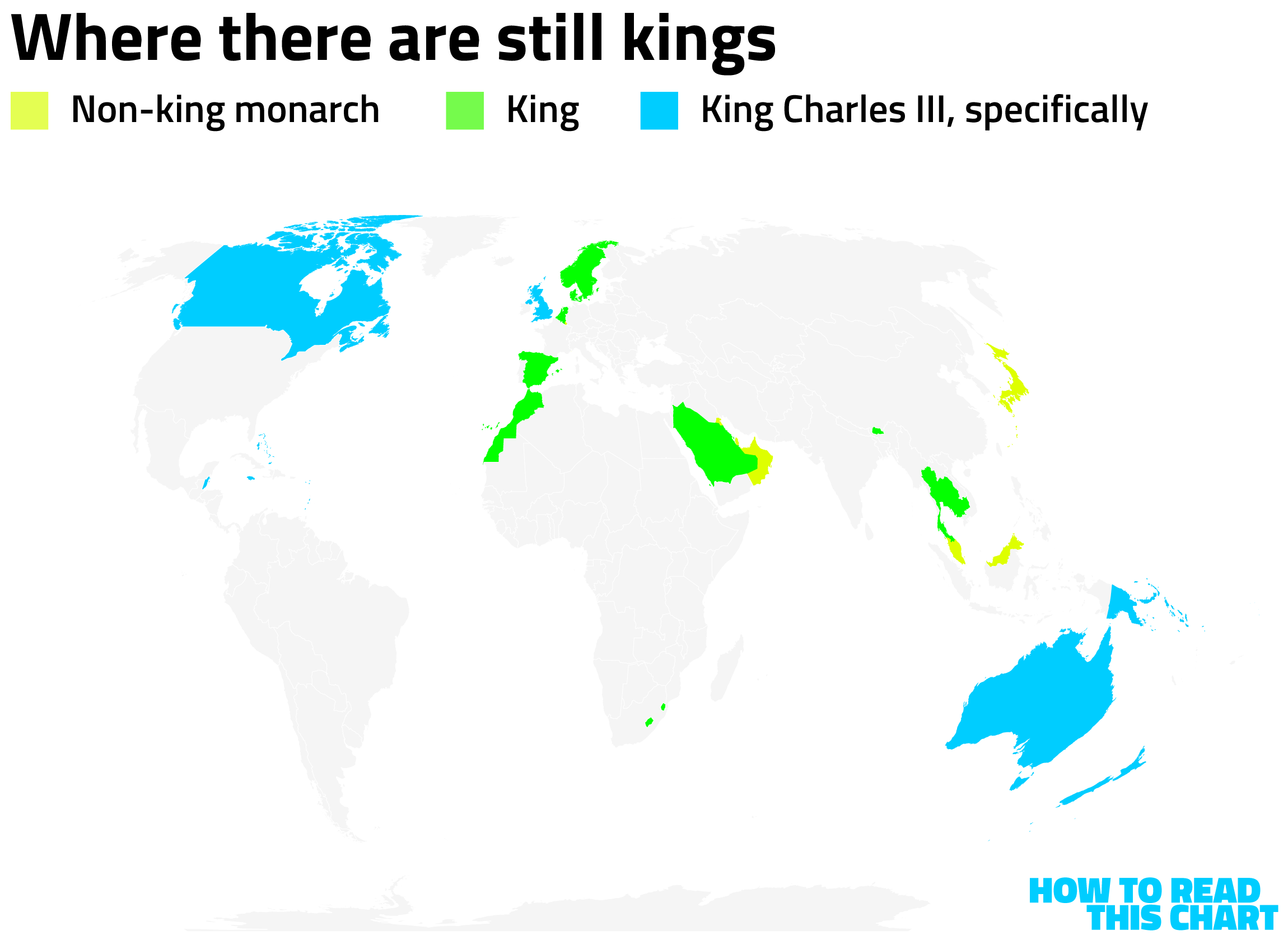
You will notice that a lot of those kings are actually one king: the afore-referenced Charles III, son of Elizabeth II. He's also an indirect descendant of George III, the guy that triggered the creation of the U.S. in the first place. This is the history being referenced with the protests, obviously, useful because "No Kings" is catchier and less disconcerting than "No Fascists."
If it makes Charles uncomfortable from his castle on the foggy moors of Stropshire or whatever, so be it.
Chapter 4
Chart Attack
And now, Chart Attack, where I share limited-context data visualizations with brief commentary due to personal laziness.
Below, for example, we have an update on the famous chart proving that a human on a bicycle is the apex of efficiency.
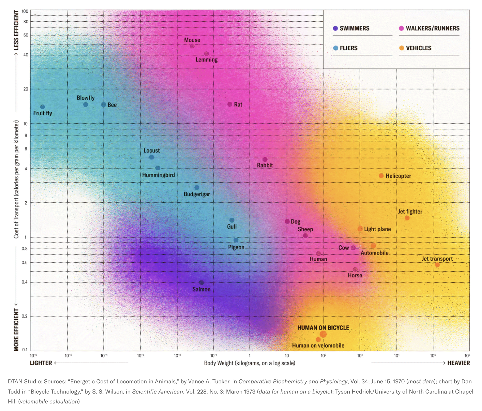
A fish on a bicycle, by contrast, is the apex of U2 lyrics.
Jason Kottke's site, kottke.org, has long been the apex of internet arcana. From it I came across an elegant visualization of the New York subway system, created by Pentagram. A snippet is below, but click through for the whole thing.
Kottke also shared TheTrueSize.com, which allows you to correct the bias introduced by standard map projections. Did you know, for example, that Argentina is far larger than the entire east coast of the U.S.?
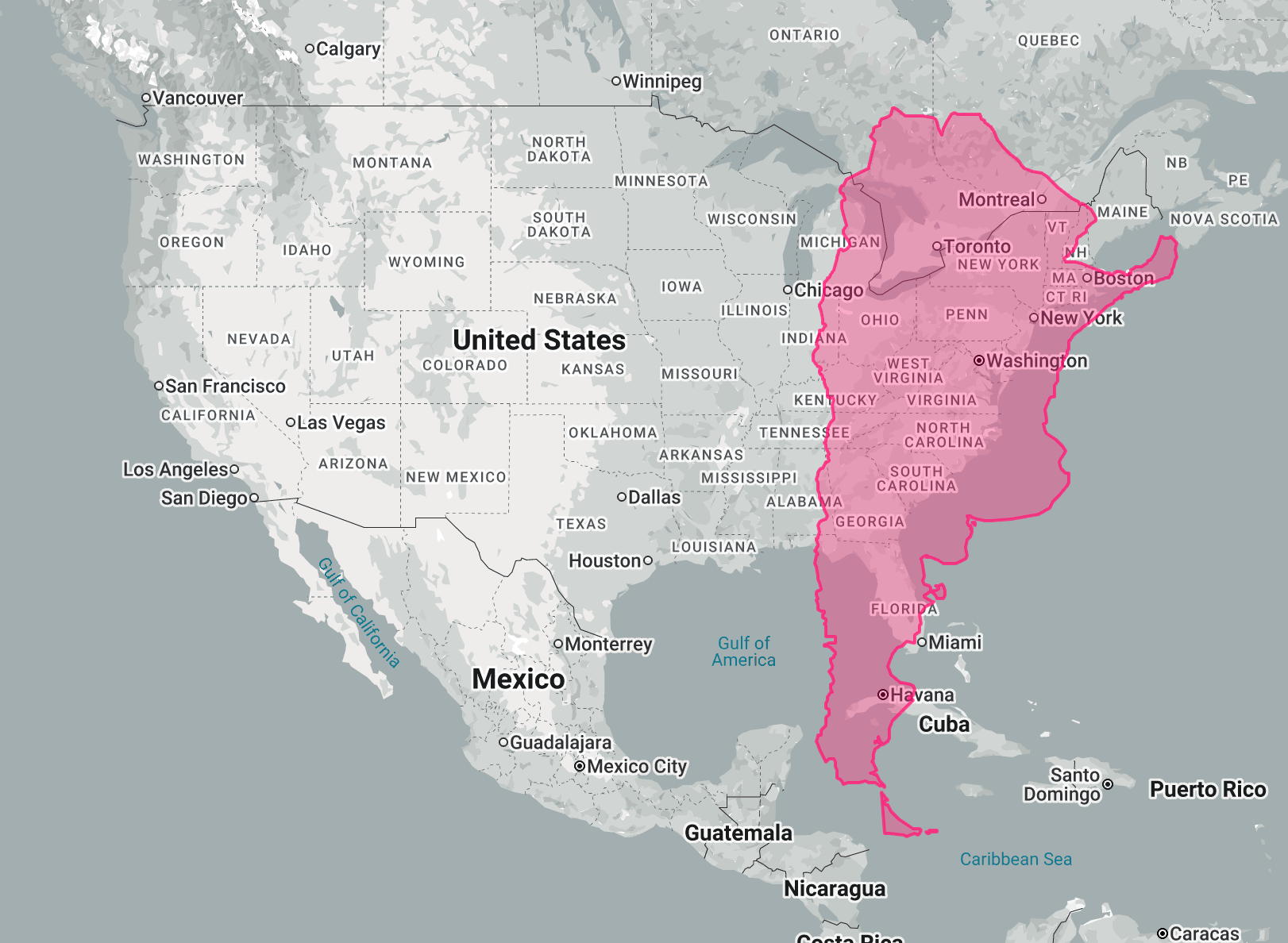
I apologize for that map incorrectly labelling the body of water adjacent to Louisiana. I hope it got Google some good tax breaks or something.
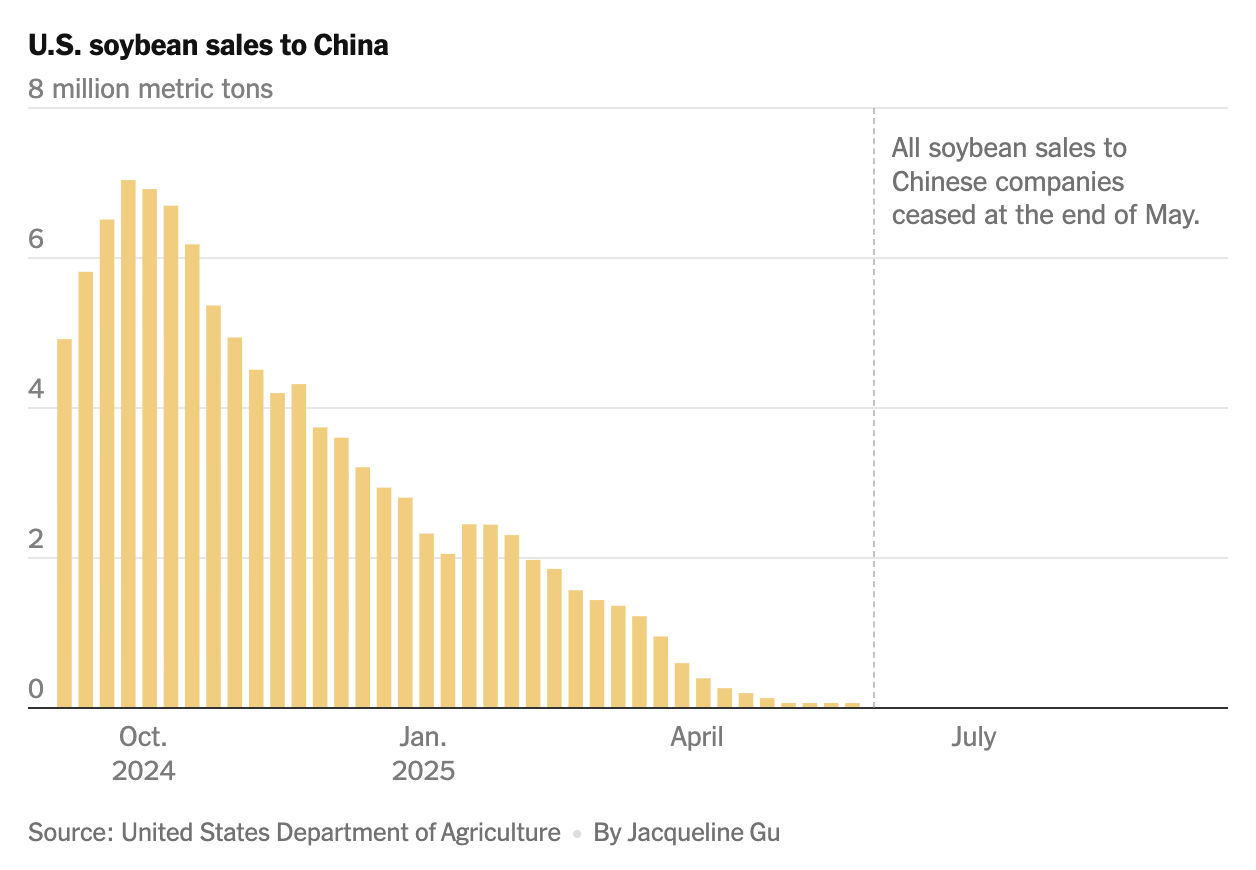
Speaking of long-tail effects of the capriciousness of the president, here's a chart of soybean sales to China by month. The Chinese, it seems, have called our bluff after the imposition of tariffs on agricultural products.
The good news is that the tariffs are at least making both imported and domestic products more expensive.
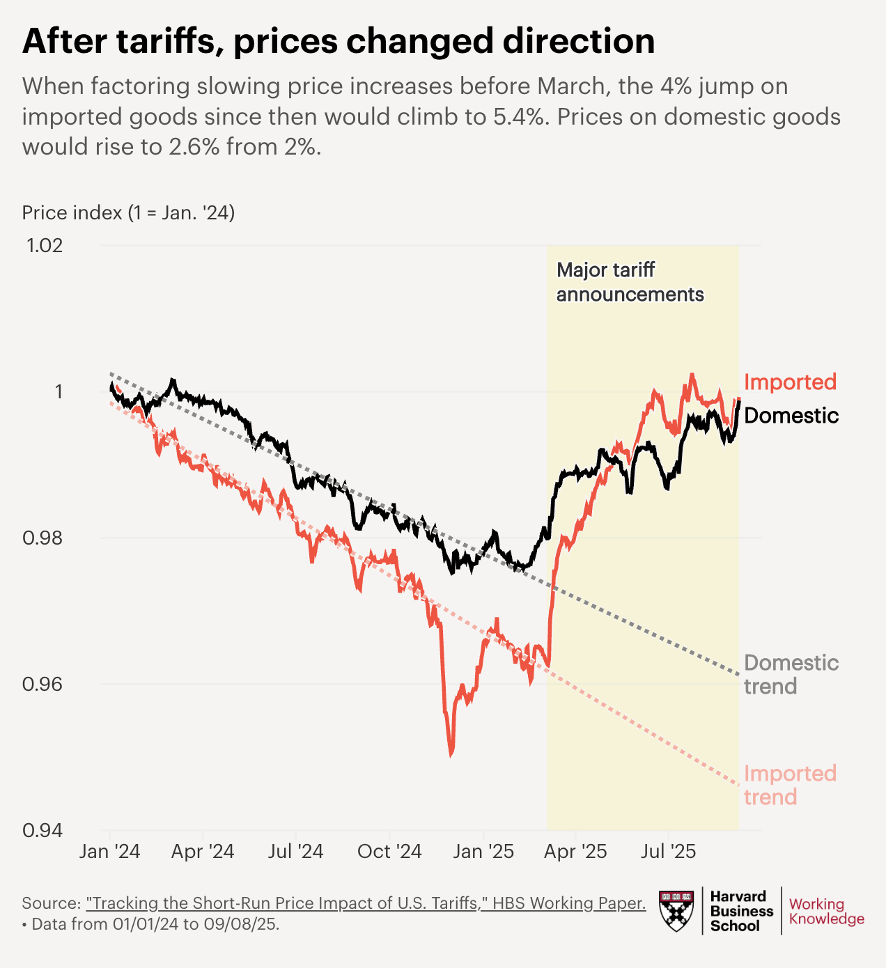
In theory, we should note that the correlation of prices rising does not prove that the tariffs are a cause of that rise. But, come on. We are all adults here, talking at this Halloween party.
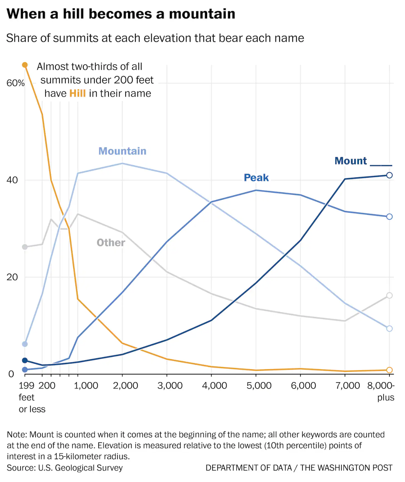
My former colleague Andrew Van Dam, meanwhile, has done the hard work of figuring out how high a hill has to be to unequivocally be a mountain. The answer is "about 6,500 feet."
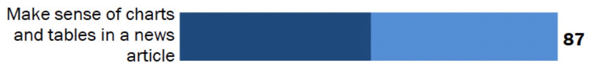
And Pew Research Center's Conrad Hackett (so many good names in this newsletter!) informs us about the things Americans are confident that they can do.
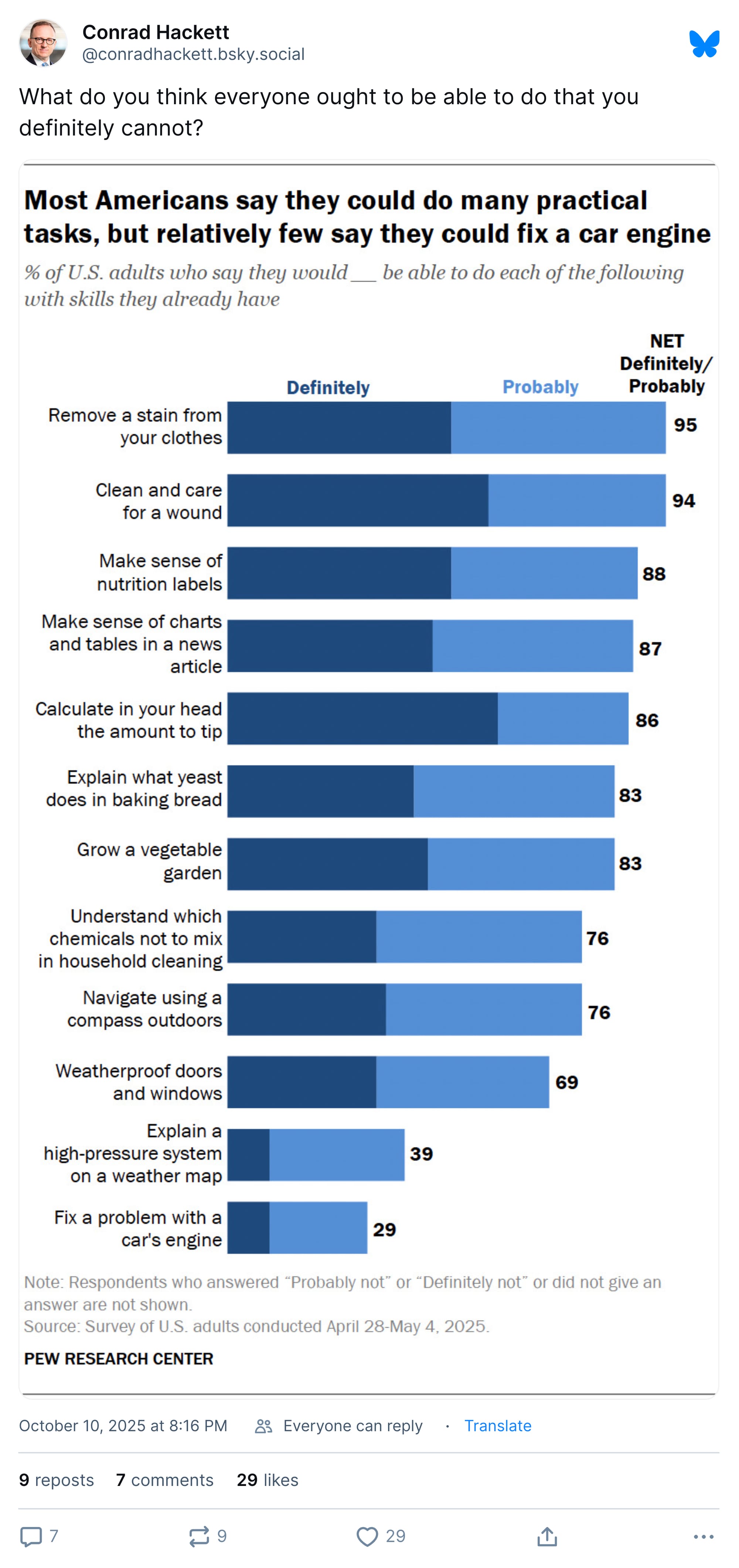
Wait, I'm sorry. What's that fourth one?
Oh man, 13 percent of Americans: Do I ever have a newsletter for you! Here, let me talk to you for a second.
Appendix
Some other things I've written


† The answer was actually GONE WITH THE WIND.††
†† Just kidding. It was L'ARRIVÉE D'UN TRAIN EN GARE DE LA CIOTAT.†††
††† It was TWISTER. (Really.)
You are receiving this email because you at some point in time volunteered to, either at Ghost or Substack or pbump.net or pbump.com. If you don't want to receive future emails, you'll need to explain that to these adorable puppies. What you want to do is support the newsletter financially, right?
Another one is coming next week. You have been warned.