The answers to five questions


I've been at this a while, gang, this business of looking at the world around me and wondering what patterns hold it together. It's the seventh-grade-biology-class version of The Matrix; I see a thing and suddenly find myself trying to dissect the strings of numbers that make it what it is.
Hence my appreciation for data visualizations. With charts, graphs and maps, no dissection! The numbers are on the outside.
If, for example, you are perusing the 1910 census on a Friday evening and come across a map of the territorial expansion of the United States, you can spend 14 to 18 hours picking out patterns and datapoints, the way nature intended. (Two of those hours will be spent ruminating on the grim distinction between "ceded," "annexed" and "acquired.")

Over the course of this week, I realized that this extremely cool tendency to dig into data had provided me with the answers to several questions that I'd been mulling over for a while. So, instead of my normal approach to this newsletter (charts that I saw or made organized into "chapters" due to some inscrutable affectation), I thought I'd do something a little different (present those charts as the answers to the questions that prompted their creation).
Don't worry; I'm very confident that this abrupt departure from the norm will not prove to be too confusing.
So:
Where do losing presidential candidates' votes come from?
Last week, I wrote a column about the weirdness of the "will Texas turn blue" question, as though Democrats winning one Senate race would constitute an inversion in the state's deeply rooted Republican politics.
In writing that piece, I ran a calculation that I'd run a few years prior, determining if the losing candidate in the most recent presidential election (Kamala Harris in 2024 and Donald Trump in 2020) had won more votes in states they'd won or in states they'd lost. The answer, in both cases, was they won more votes in states they lost. In other words, most Harris voters lived in Trump-voting states and, four years prior, most Trump voters lived in Joe Biden-voting states.
Setting aside questions of the extent to which this fosters resentment — I am a dissector of numbers, not of psychologies — I was curious how common this divergence was. Pulling numbers from U.S. Election Atlas, I got my answer.
It's very common, indeed. Over the past century, losing presidential candidates have almost always won more votes in states they lost than in states they won.
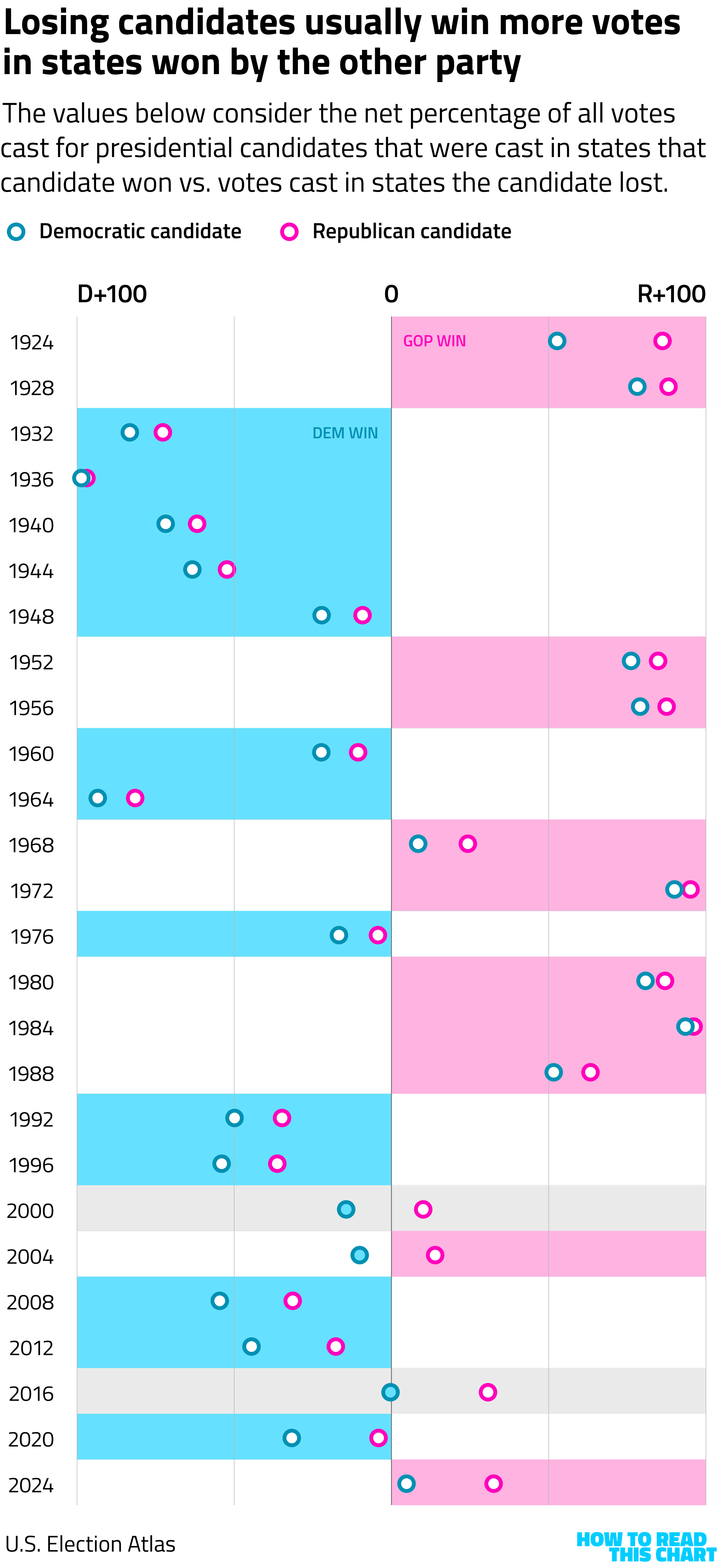
How to read this chart: It took me a while to figure out how to effectively visualize this. In short, each election is colored according to the victor. The dots show the net percentage of votes cast in states won by the Democratic candidate and those in states won by the Republican. So dots to the right of the center line indicate that a candidate won more votes in Republican-voting states.
In almost every case, those dots line up with the actual election winner, meaning that both candidates won more votes in states that voted for the winner. Which makes sense; the winners of presidential elections generally win more states. (In 2020, both candidates won the same number of states, excluding D.C.; in 1960, Richard Nixon won more states.)
Note the exceptions, though, the circles with colored centers like delicious blueberry cookies. In 2000, 2004 and 2016, the losing candidate earned more votes in states they won. In 2000 and 2016, those losing candidates also won the popular vote. Making 2004 a rarity: a contest in which the candidate who got fewer votes overall earned more of them in states he won than in ones that he lost.
If that wins you bar trivia at some point, you owe me a beer.
Does higher primary voting lead to general election wins?
One of the reasons that Democrats are optimistic about "turning Texas blue" in November is that Democratic candidates won more votes in the recent primary than did Republican ones — 7 percent more, in fact. Doesn't that augur a victory in the general?
Happily, we have plenty of data about past Senate elections which can help answer that question. The Federal Election Commission, for example, has spreadsheets with the results of every recent federal election, including primaries.
Looking at that data, we see a clear pattern: the party that wins more votes in the primary usually wins the general.
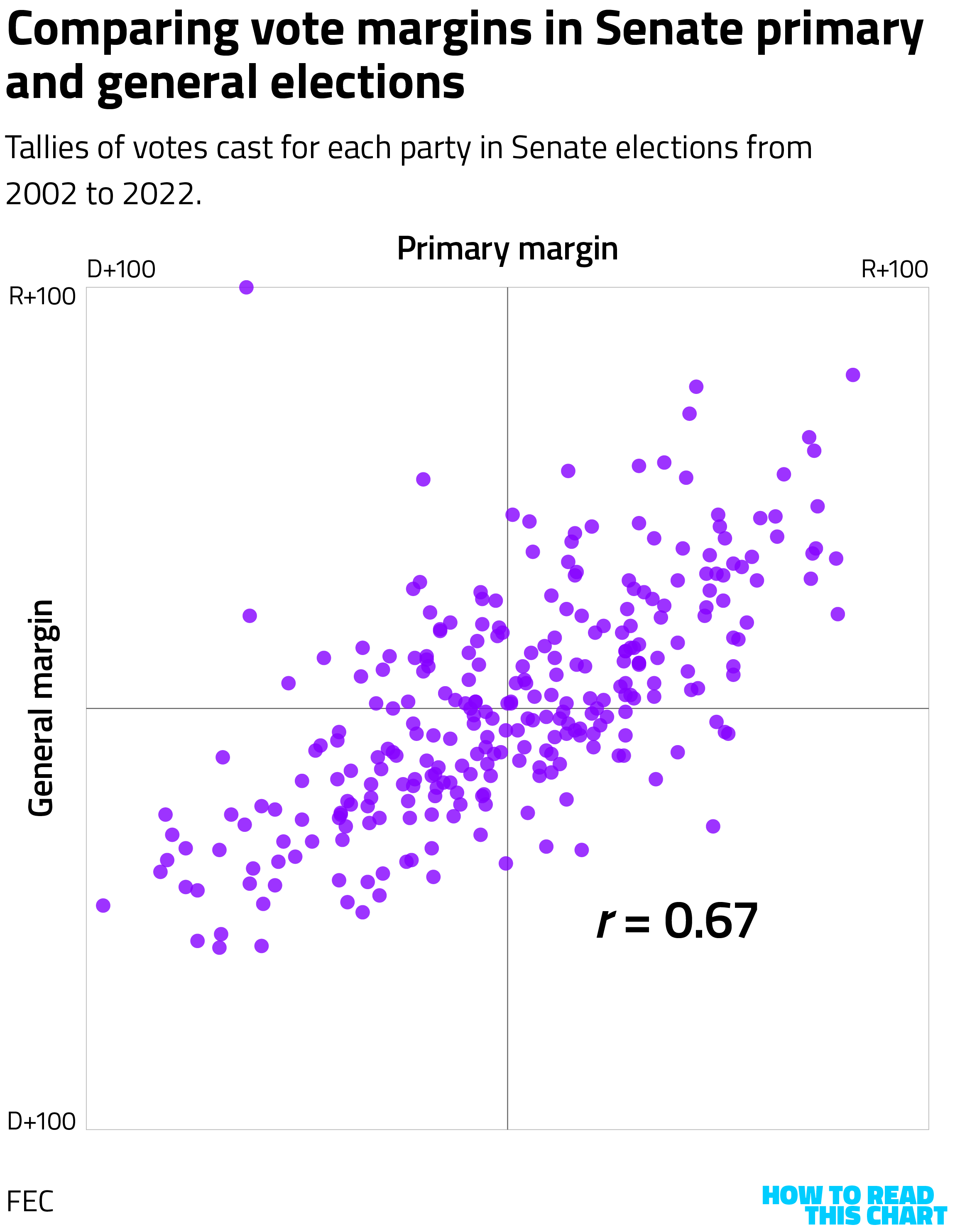
There's a reasonably robust correlation here — one that can be measured directly using the correlation coefficient, indicated with the variable r. The closer to 1 an r value, the stronger the correlation. And here the correlation is pretty strong, also discernible visually by the way the dots (very loosely) fall along a line running from lower left to upper right.
Good news for Democrat James Talarico in Texas, then! Well, not necessarily.
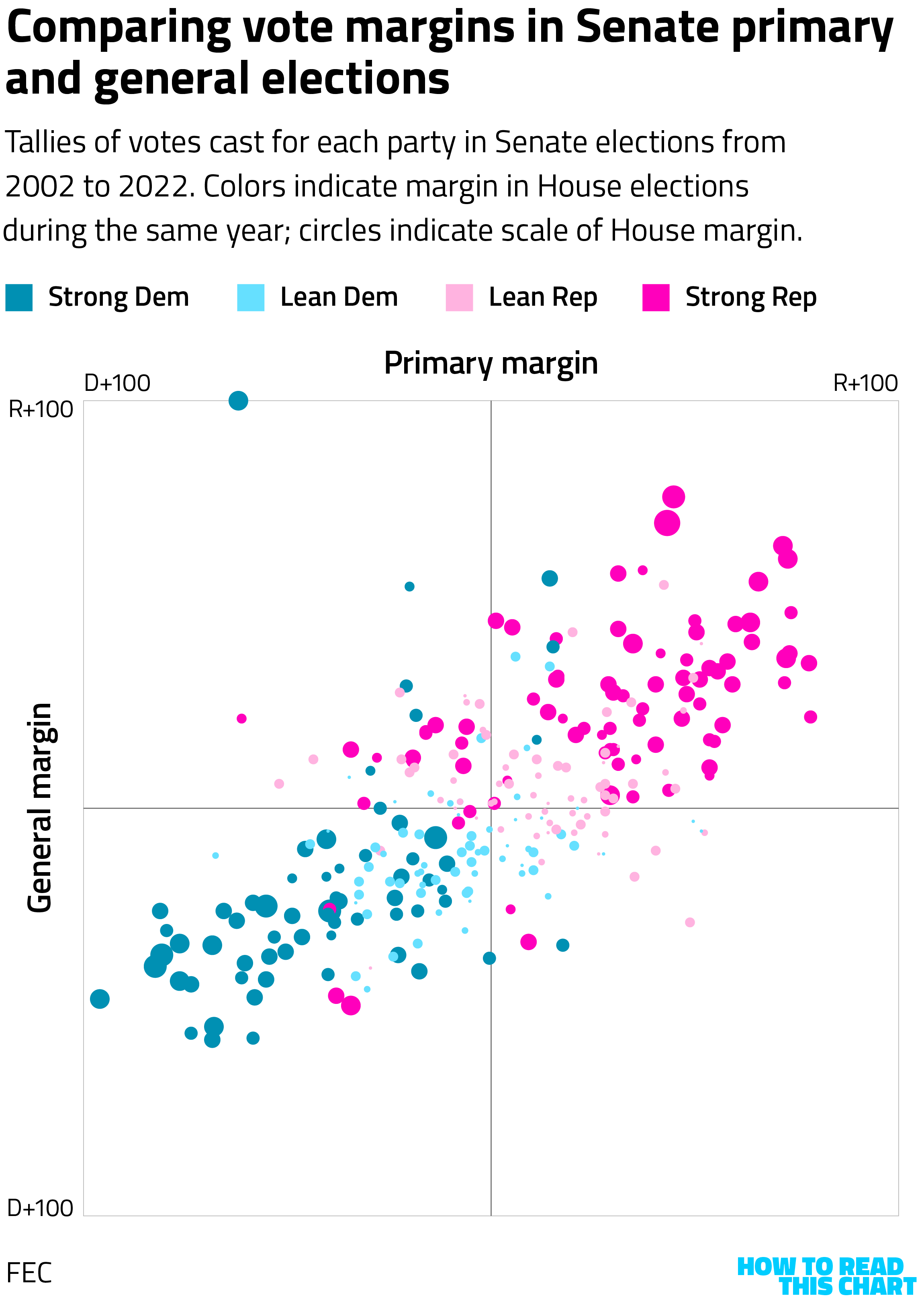
Notice what happens when we overlay the combined House vote in the states where those Senate elections were held. States where Democrats saw more votes in the primary and in the general election for Senate were mostly states where Democrats won in the House, too — meaning they were Democratic states! The same holds on the Republican side.
So if we control for those House margins (meaning, basically, that we subtract those margins out), we see that the correlation drops quite a bit. The correlation coefficient is much less strong and the cluster of dots flattens out.
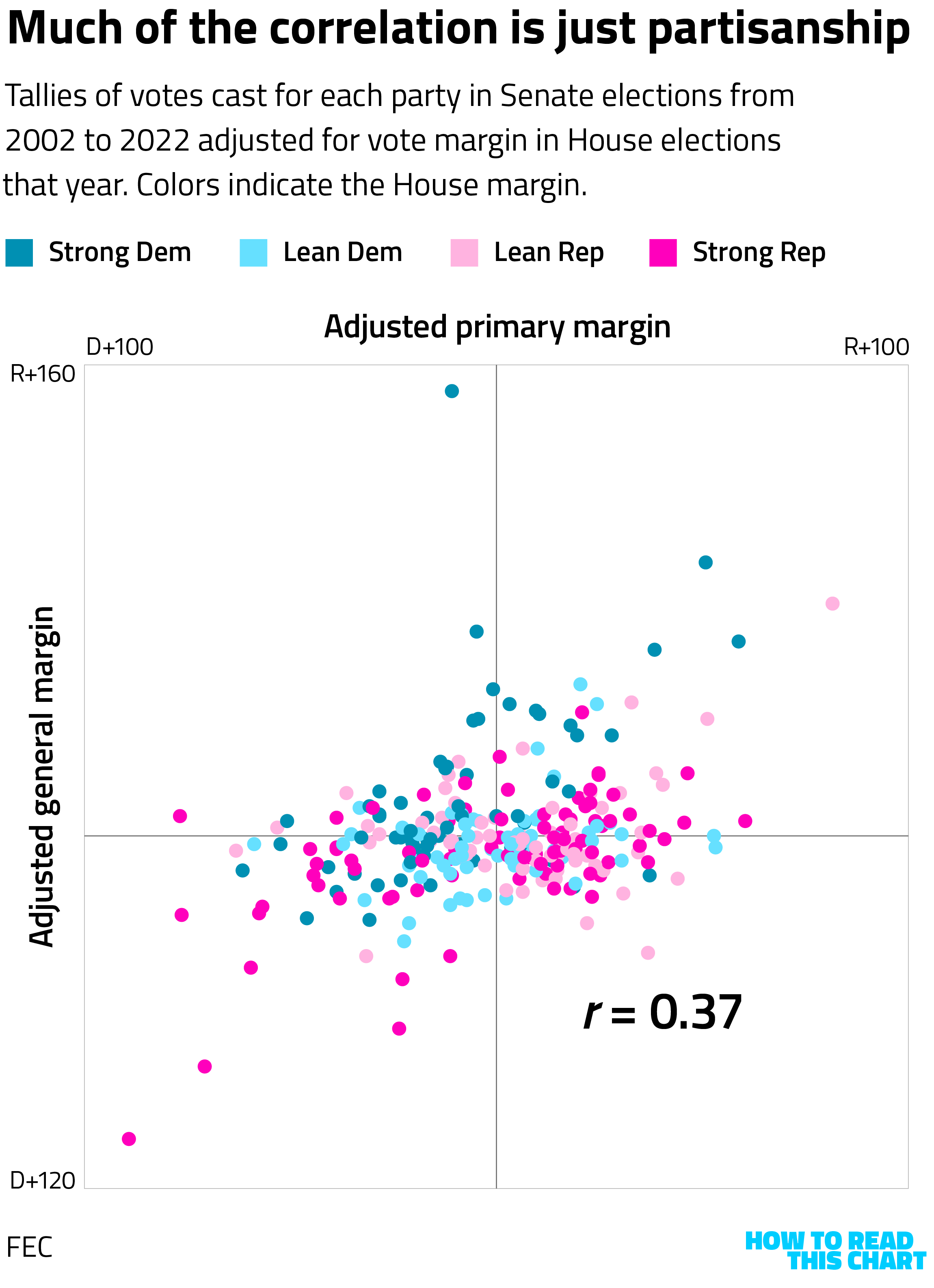
We can look at this more directly. We can group the 287 Senate elections from 2002 to 2022 into four buckets: ones in Democratic-voting states where Republicans overperformed the House margin in the primary, ones where Republicans underperformed the House margin and ones in Republican-voting states where Democrats over- or underperformed.
What we find is that overperformance in a primary isn't predictive. In GOP states, Democrats won about 1 in 5 Senate races regardless of how well the party did in the primary.
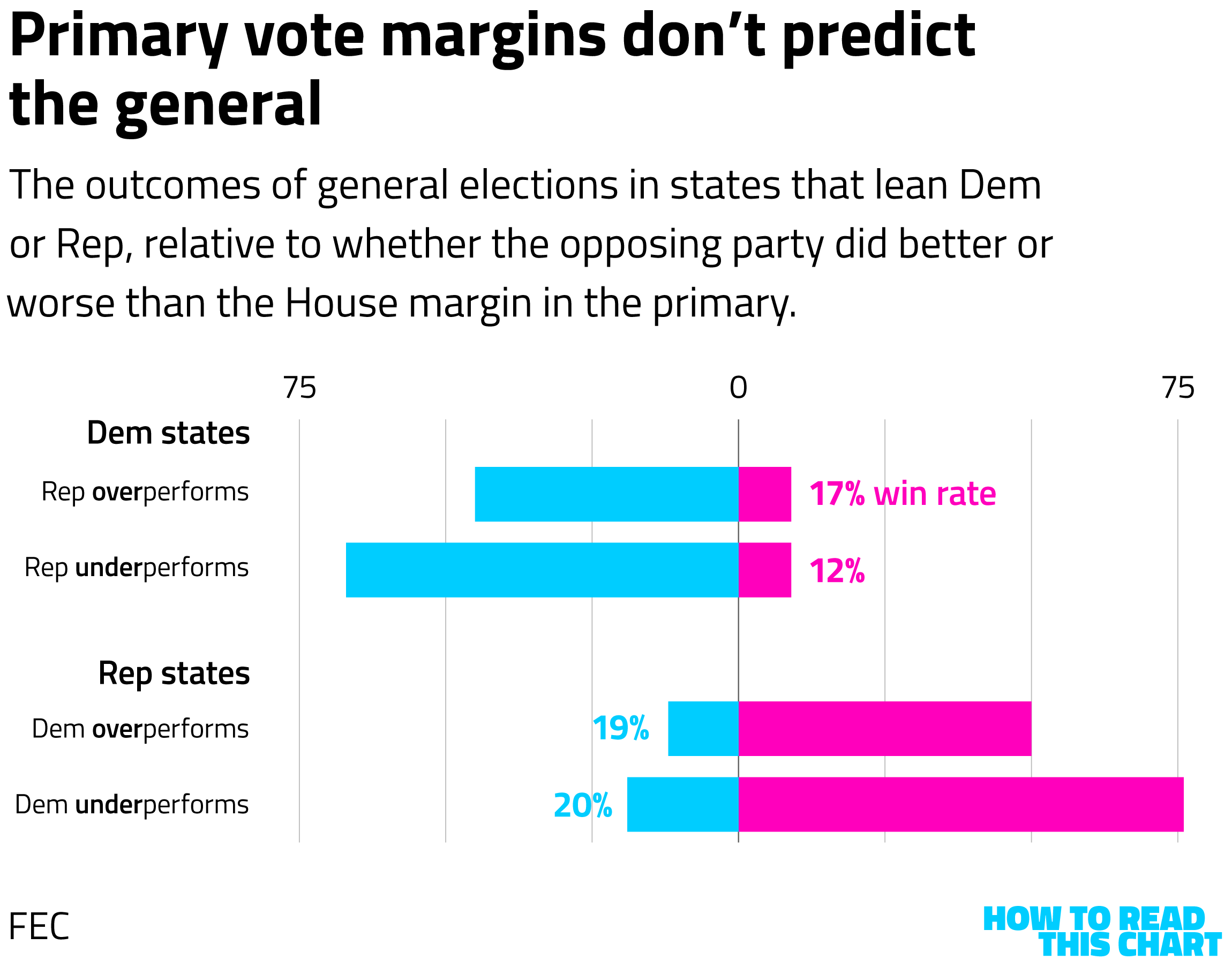
This doesn't mean Talarico is doomed any more than the primary results meant he was a lock. It means, instead, that our tendency to fill the months before an election with speculation and rumination doesn't always offer useful insights.
Of course, neither do betting markets.
What does income distribution look like in America?
For another column I wrote this week, I dug into another bit of data published by the federal government: the IRS's breakdown of annual income-tax returns. Working on a bit of a delay, the agency produces spreadsheets showing just how many Americans file returns and how much income they report earning.
I decided to visualize the recent data (meaning from 1996 to 2022). How the agency has grouped the data has shifted over that period, moving from reporting totals at $1,000 intervals for those earning under $20,000 a year back in the 1990s to — in a sign of the times — breaking out those earning $1 million or more into subcategories starting in 2000.
Here are the total number of returns, with reported incomes identified at the right.
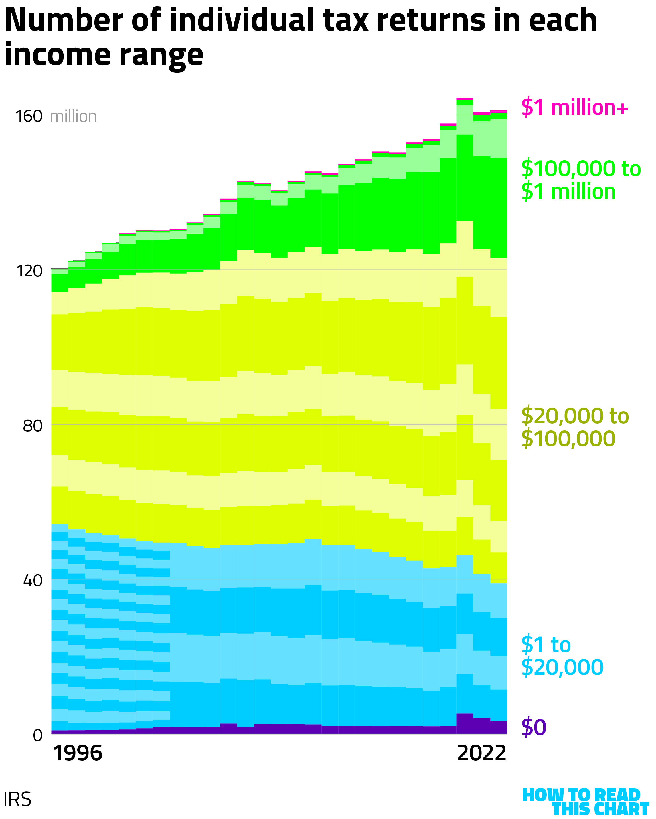
Notice that the number of returns increases pretty consistently, a reflection of the country's growing population. But there are reversals, generally linked to economic slowdowns. (The dips at the time of the Great Recession and the covid pandemic are obvious.)
Notice, too, that the number of people reporting earning less than $20,000 has dropped since 1996 while the number reporting income of less than $100,000 has remained fairly flat since the recession two decades ago.
If we depict the data above as a percentage of all filers, rather than cumulative totals, we see how the upper end of the income range has grown. In 1996, filers earning at least $100,000 a year made up 5 percent of filers. In 2022, they constituted almost a quarter of the total.
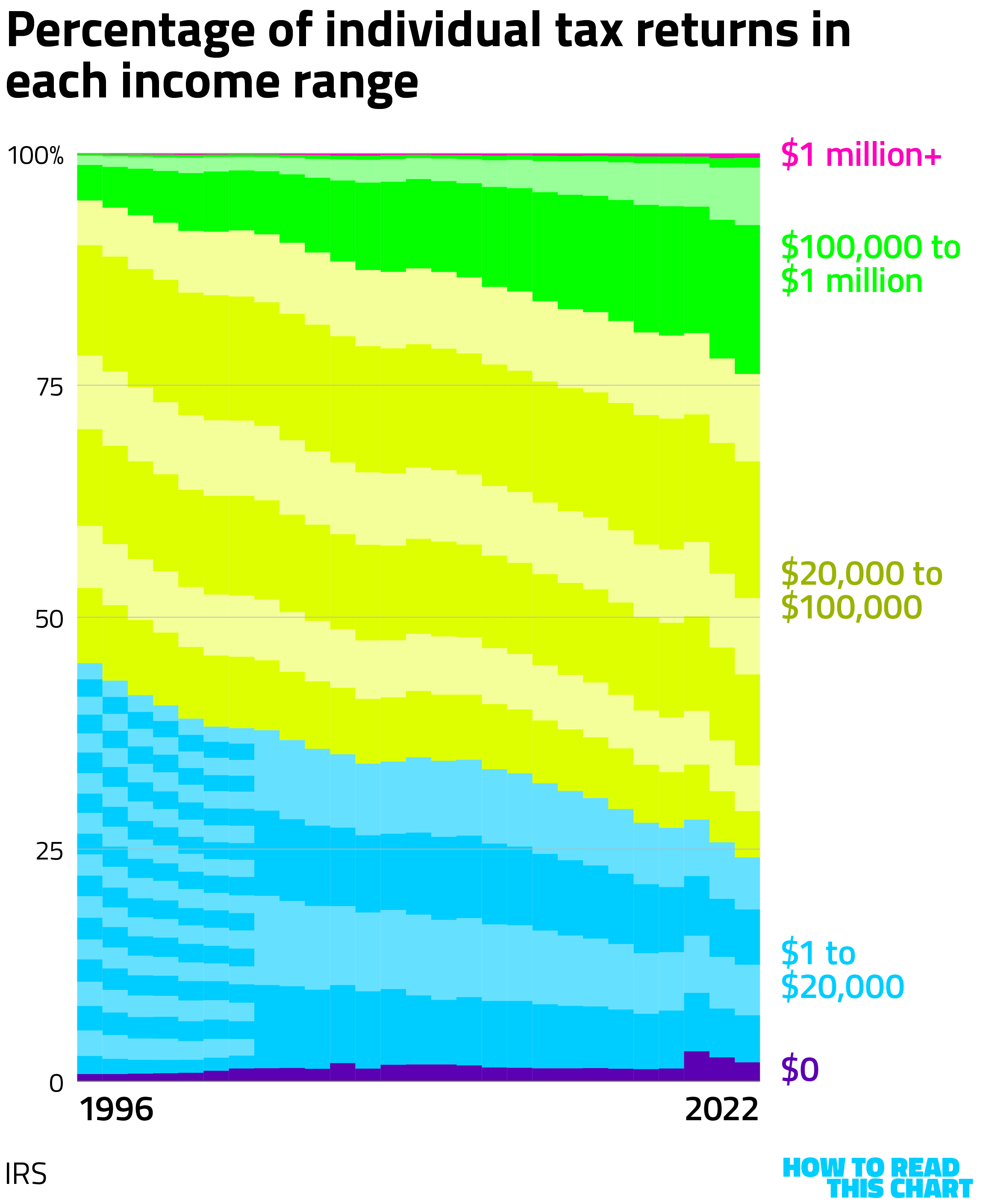
Of course, there's been a lot of inflation since 1996, too. $100,000 in 1996 was the equivalent of a bit under $200,000 in 2022. And in 2022, only about 7 percent of filers reported earning $200,000 or more.
Meanwhile, five times as many filers reported earning at least $1 million in 2022 as did in 1996. Inflation plays a role there, too, but there are also some other things happening.
Who worked for DOGE, anyway?
Students of American history will remember the early days of the second Trump presidency, a period when there was no more important effort (apparently) than having 20-something tech dudes run federal grants through computers to figure out which ones should be eliminated. It was supposedly intended to reduce government spending, leading Trump and Elon Musk (for some reason tasked with leading this effort) to promise that all of the savings would be returned to the public in the form of checks. But the government spent more in 2025 than it had in 2024 and the administration stopped talking about issuing those rebate checks.
This whole debacle was in the news again this week after depositions of some of the 20-somethings involved in "DOGE" (🙄) became public. The team at 404 Media watched the footage, discovering that the process that led to sweeping cuts to scientific research and foreign aid (leading to hundreds of thousands of deaths) were even more haphazard and less considered than you might have assumed.
I was curious where the DOGE guys (and a few women) had come from. Happily, software developer and journalist Jacob Harris has put together a database, DOGE Track, of who was involved and what they did. What his data shows is that many of them came from the world of tech — and specifically from Elon Musk's companies and inner circles.
Continuing my recent trend of making network visualizations, here's what Harris's data shows.
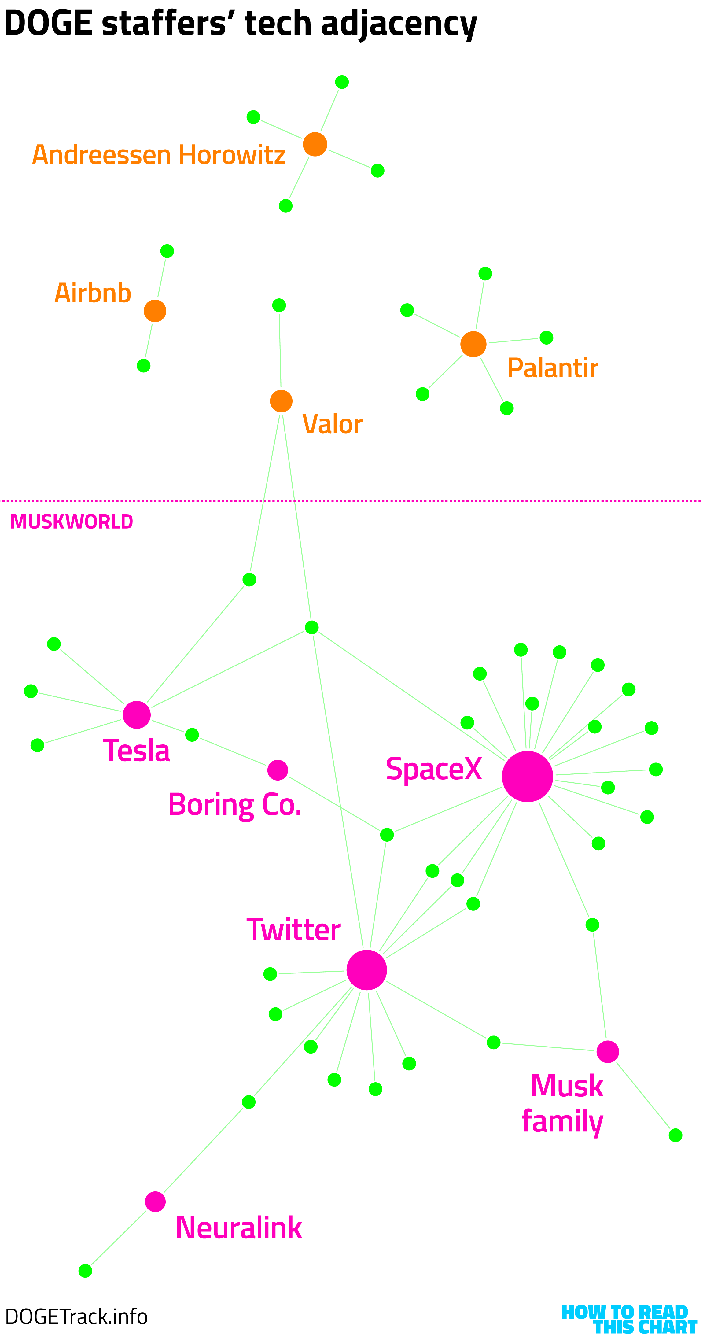
This isn't everybody, but it's a lot of them. And instead of culling the best and the brightest for reasoned consideration of the efficacy of government spending, DOGE was often pretty much what it seemed like: Musk allies tasked with wanton slashing of things they didn't particularly understand.
Incidentally, the deposition videos have now been taken down, a pretty good sign that having them explain what they did doesn't help the argument that what they did was good.
Is inflation history about to repeat itself?
I would have been predisposed to like reader Philip Rose even before he sent me an interesting chart to mull over simply because his name follows the ideal pattern for a name: "Philip" spelled properly followed by a last name that is also a noun.
But then he sent me this graphic from a Fortune newsletter. A Philip Noun who likes charts? Doesn't get much better than that.
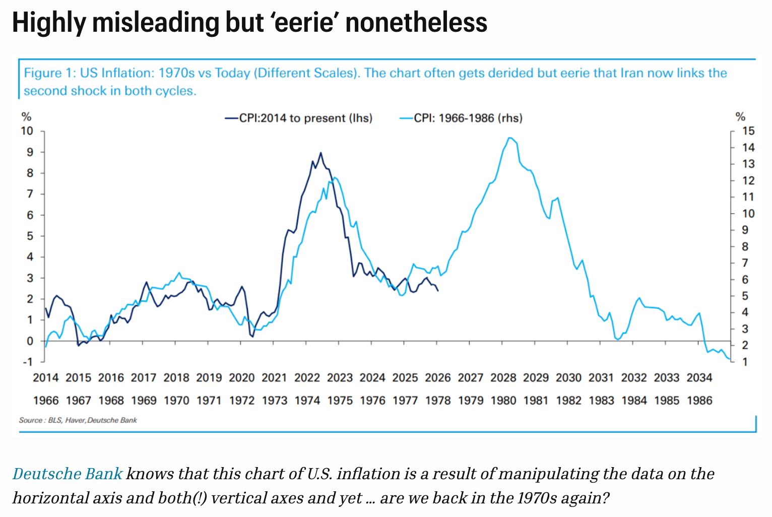
I very much appreciate how the author contextualizes the chart in the title. Maybe this is garbage, but hey! It's akin to the wonderful Spurious Correlations website, which I enjoy but worry doesn't exactly help the effort to get people to appreciate the instructive power of a data visualization.
The point in the chart above is that the monthly shift in inflation since 2014 mirrors the pattern that began in 1966, leading into the oil shock and Iran tensions of the 1970s. Perhaps, it offers, history is repeating itself?
So let's consider. Here's the data from the chart above, put into prettier colors.
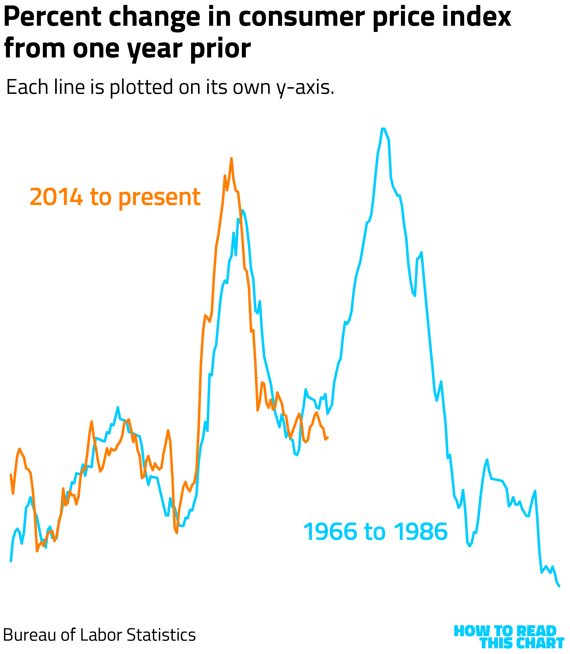
You'll notice I didn't include a y-axis scale because it doesn't matter here. The original chart used two scales for the two data series because that's the only way to make them overlap so precisely.
If we put them on an equivalent scale, the result is not quite as impressive.
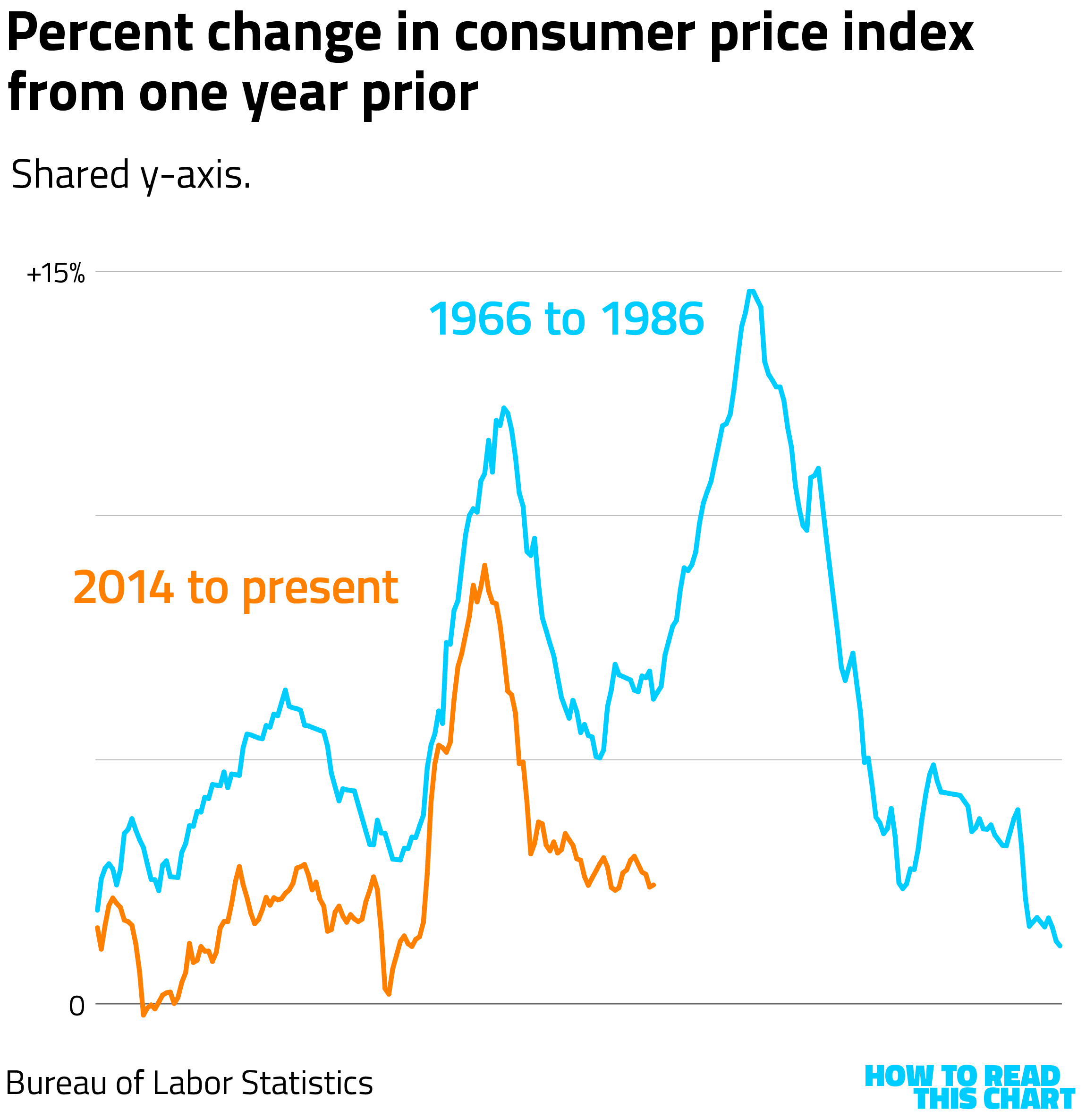
If we zoom further out, we see how the data is being cherry-picked. There's a lot of variability. What's being selected are two periods with little bumps in inflation followed by larger bumps — and then, in the 1970s, a larger one still.
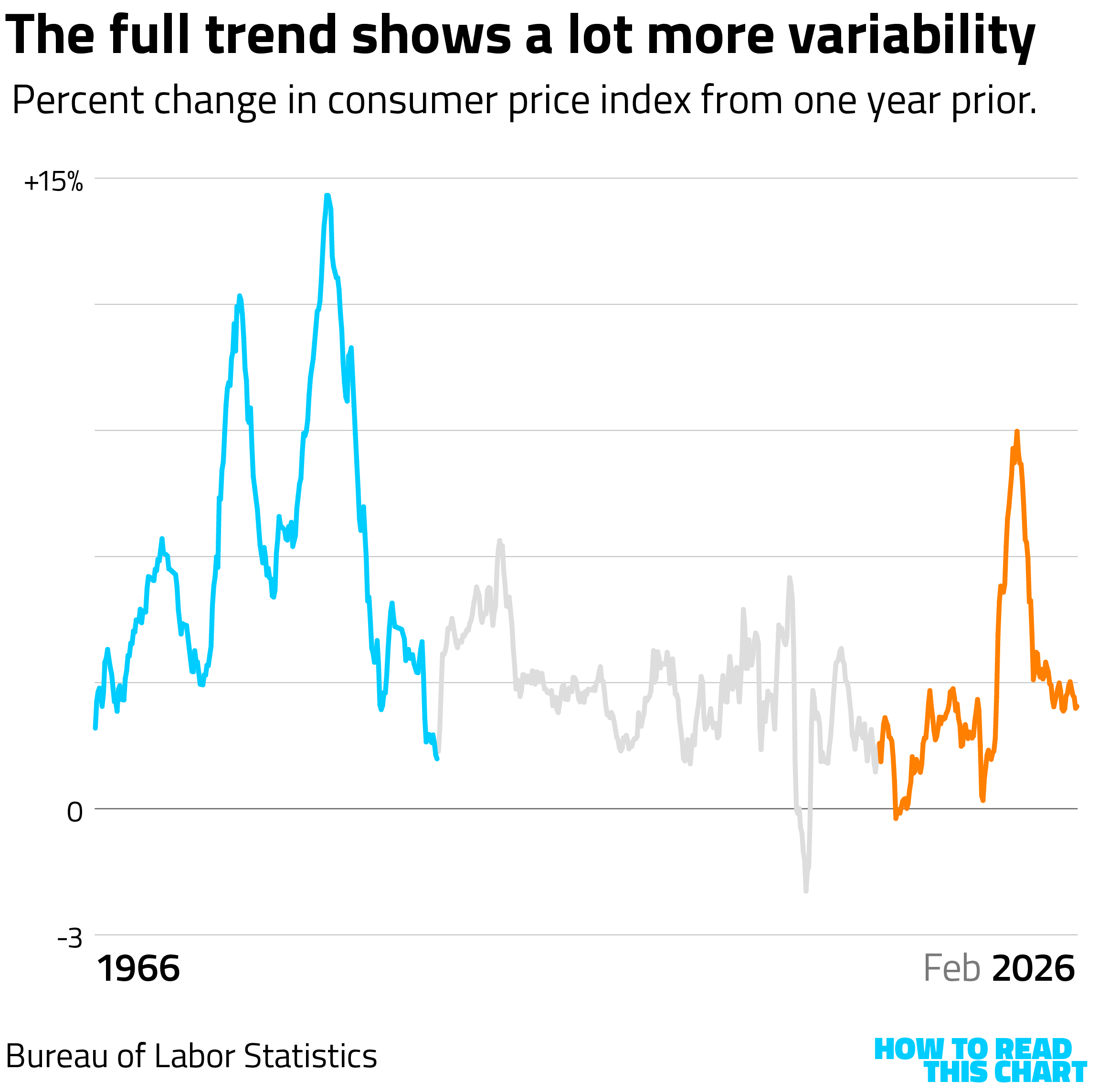
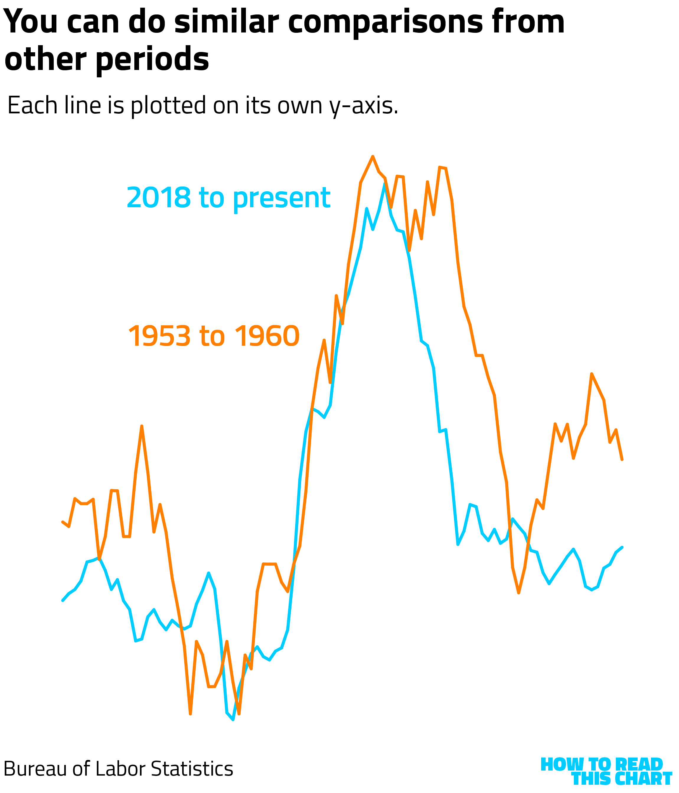
There's enough variability, in fact, that we can find other periods in which the patterns were similar. The stretch from 2018 to now, in fact, looks a bit like the stretch from 1953 to 1960, if you remove the scale and squint a bit.
To be clear, this does not mean we're not about to see another inflation surge. In fact, that seems very possible. The point, instead is that this surge is a function of geopolitics and Trump's decisions to impose tariffs and declare war, not because there's an ineffable pattern in how inflation rises and falls.
And with that, we have time for one final question.
What would an attack of charts look like?
A great question! It would probably look something like this.
It would probably start with a recent chart related to one of the other parts of this newsletter, like income distribution in the U.S.
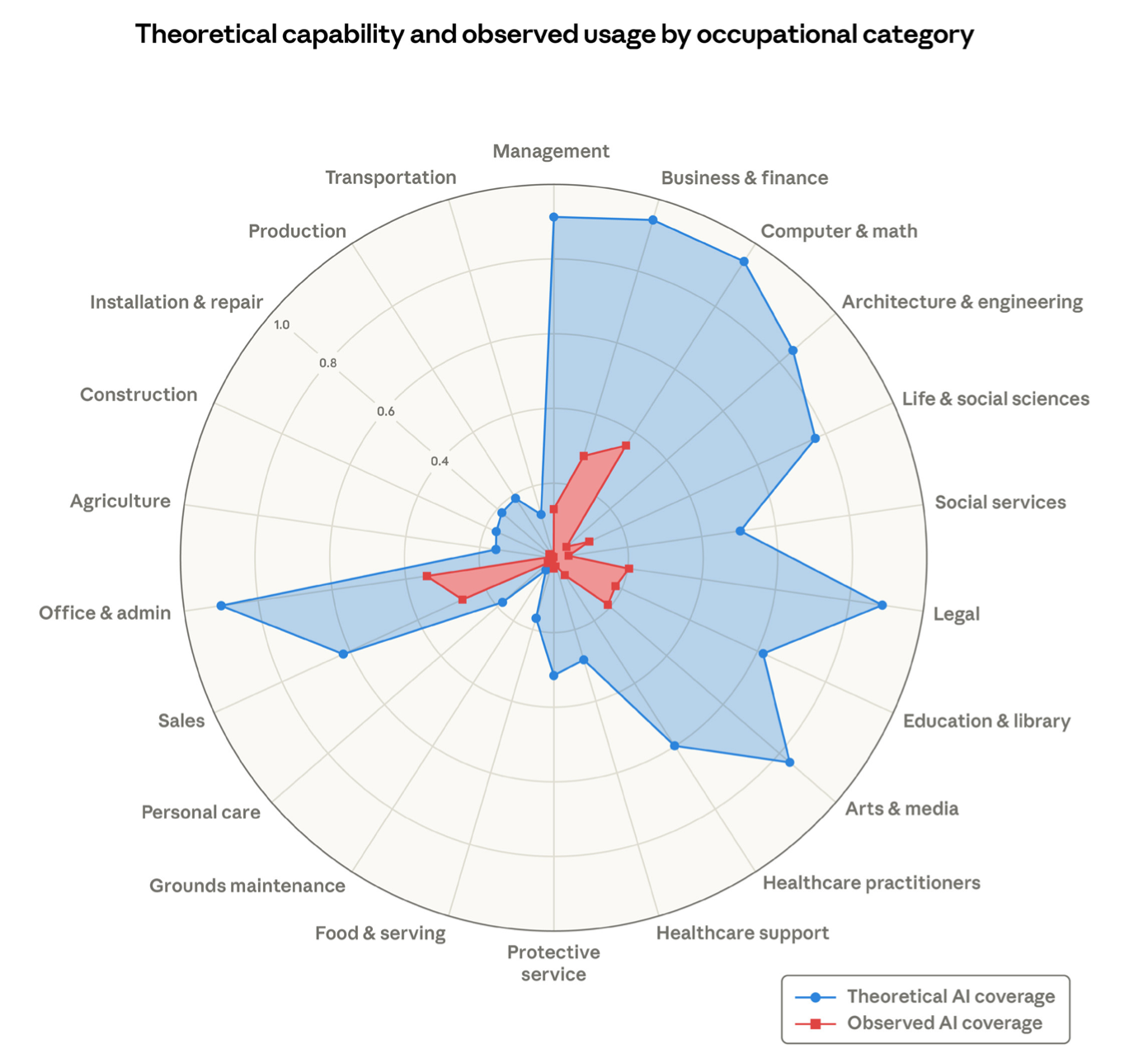
It might then share a visualization sent in by another reader, from a report by the AI company Anthropic. That reader, Mike LaBonte, doesn't have a Philip-Noun name, but his email is still appreciated. While he's right that the nature of this radial chart doesn't convey the scale of the depicted industries, I still think this is a useful way to think about the impact of AI on the workforce.
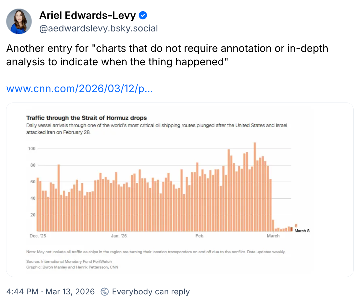
Any compilation of data visualizations produced in mid-March 2026 must necessarily include presentations centered on the war in Iran, like this one from Bloomberg.

Reuters created an alluvial diagram showing how much of the world's supply of crude oil and natural gas flows through the Iran-adjacent and -controlled Strait of Hormuz.
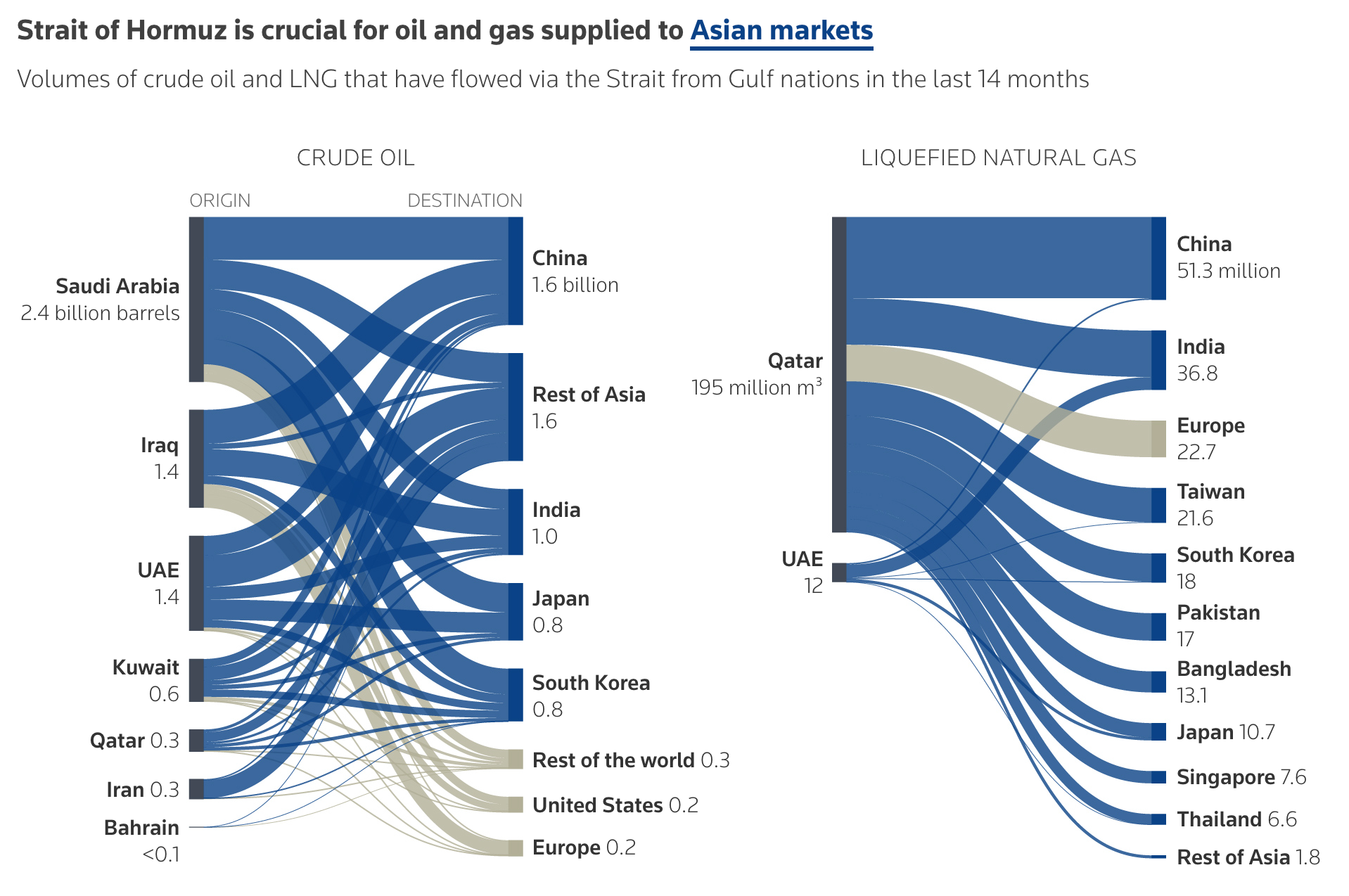
Which, as you've heard, isn't seeing much of anything flow through it at the moment.
(I seem to have dropped the bit about how this was in answer to a question and I bet you, like me, didn't notice.)
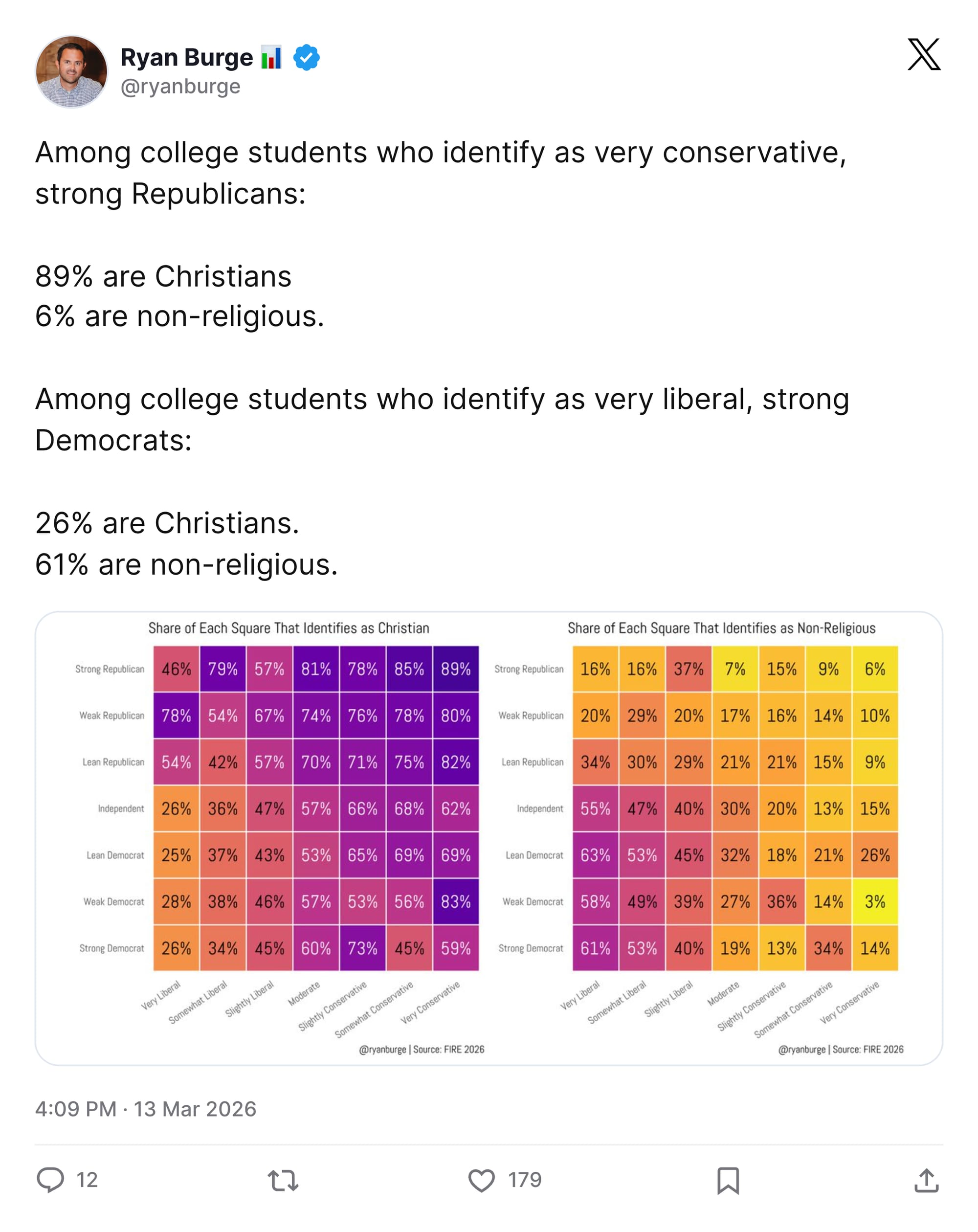
Ryan Burge continues to create interesting visualizations about religion in America. This one uses color effectively to show the overlap of religion and politics among college students.
Over at Instagram, the New York City-focused site Gothamist spoke to the team that makes maps for the NYPD. You'll need to click through to see the video, but here's a great still showing planning for a visit from Fidel Castro.

Gothamist also had a story this week about another data visualization: the production of mugs commemorating the inauguration of Mayor Zohran Mamdani that, thanks to a recently discovered miscount in the city's mayoral history, identified him as the 111th rather than 112th mayor.
Given that it is Oscar weekend, let's conclude with Walter Hickey's tabulation of the awards won by Best Picture nominees. This suggests that One Battle After Another is likely to win the top prize.
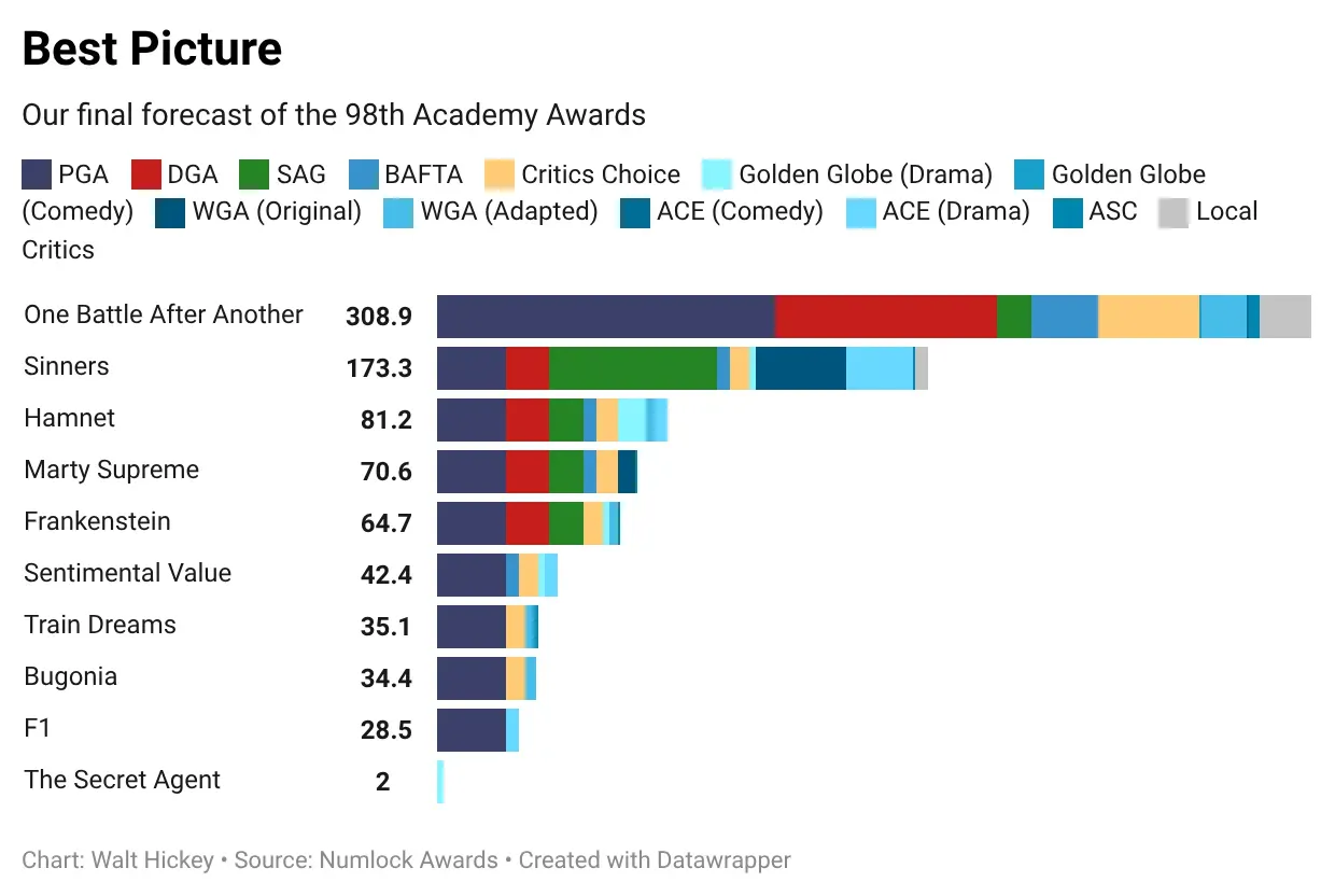
If you would like to sob heavily, though, I can recommend Train Dreams. It's a nice change of pace to feel emotionally gutted by fictional rather than non-fictional things.
Anyway. Time for one last question.
Did I write anything else this week?
Yeah, I did! These things:


You are receiving this email because you at some point in time volunteered to, either at Ghost or Substack or pbump.net or pbump.com. If you don't want to receive future emails, I'll assume it's because you have no questions about anything.
Is another one coming next week? It is.