Thanks, visualized
I'm mixing it up a bit this week, presenting charts and data visualizations and maps and so on but with a contrived theme: Things for which I am thankful. See, on Thursday it was Thanksgiving, a holiday when people give thanks for things? So what I'm doing is taking that idea and applying it to this newsletter, a bit of outside-the-box thinking that I can't imagine anyone else has ever conceived of doing.
Hopefully that complicated idea makes sense. Because here we go.
Appreciation 1
My kids — and getting to watch them learn
There are a lot of novel experiences that accompany becoming a parent, many of them involving bodily secretions. But one thing I hadn't really anticipated was the way in which you can observe kids slowly learning about the world and their place in it.
The process of learning to walk is an obvious one. But I was also struck by the way in which kids slowly learn language, forming sounds and then refining them and then figuring out how to write letters, etc.
I, being me, have also enjoyed seeing my kids discover math and science, figuring out the subtle threads within them and that connect them.
For example, earlier this month, my first grader's school held a Math Night, when kids could come and play math games. Some involved dice and, at one point, a teacher pointed out to my son that the opposite sides of a standard die add up to seven.
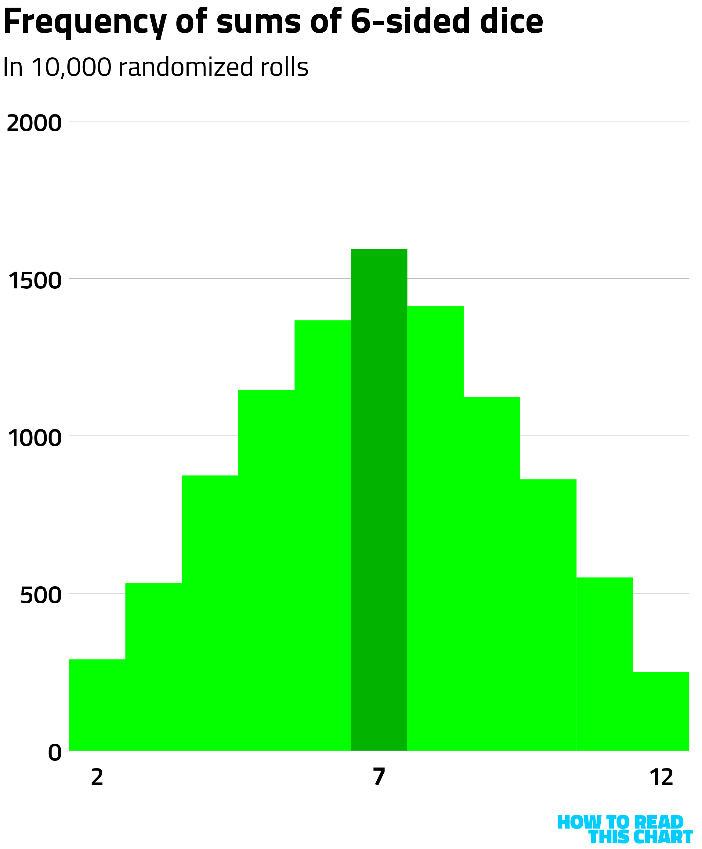
So the next day, I started talking with him and his brother, who is in the third grade, about probability and the most common result when you roll two dice. And, being me, I wrote a script that generated 10,000 random dice rolls to see what occurred.
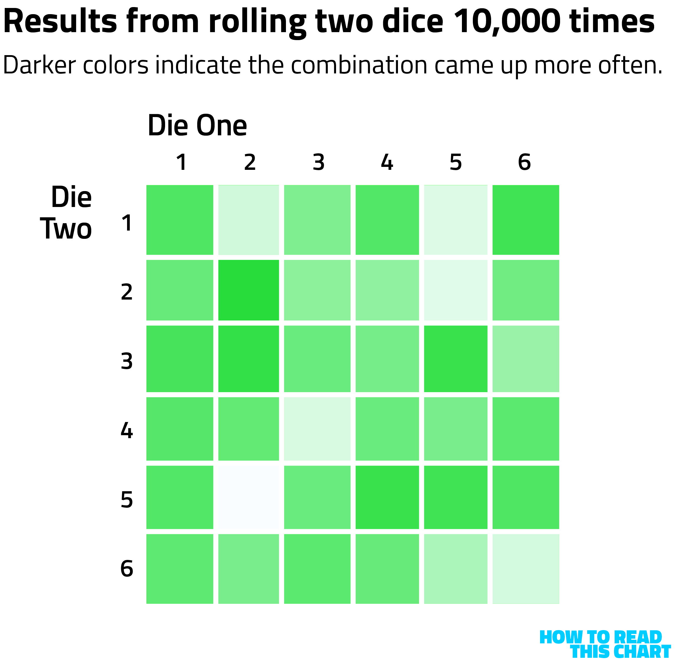
You'll notice that the pairings are fairly random, distributed among the outcomes unevenly but unpredictably. (The shading is a bit deceptive, since the lightest color represents 241 instances and the darkest 308, but you get the point.)
Yet, when we add up the sum, we get an imperfect bell curve with the most likely outcome, seven, appearing more often.
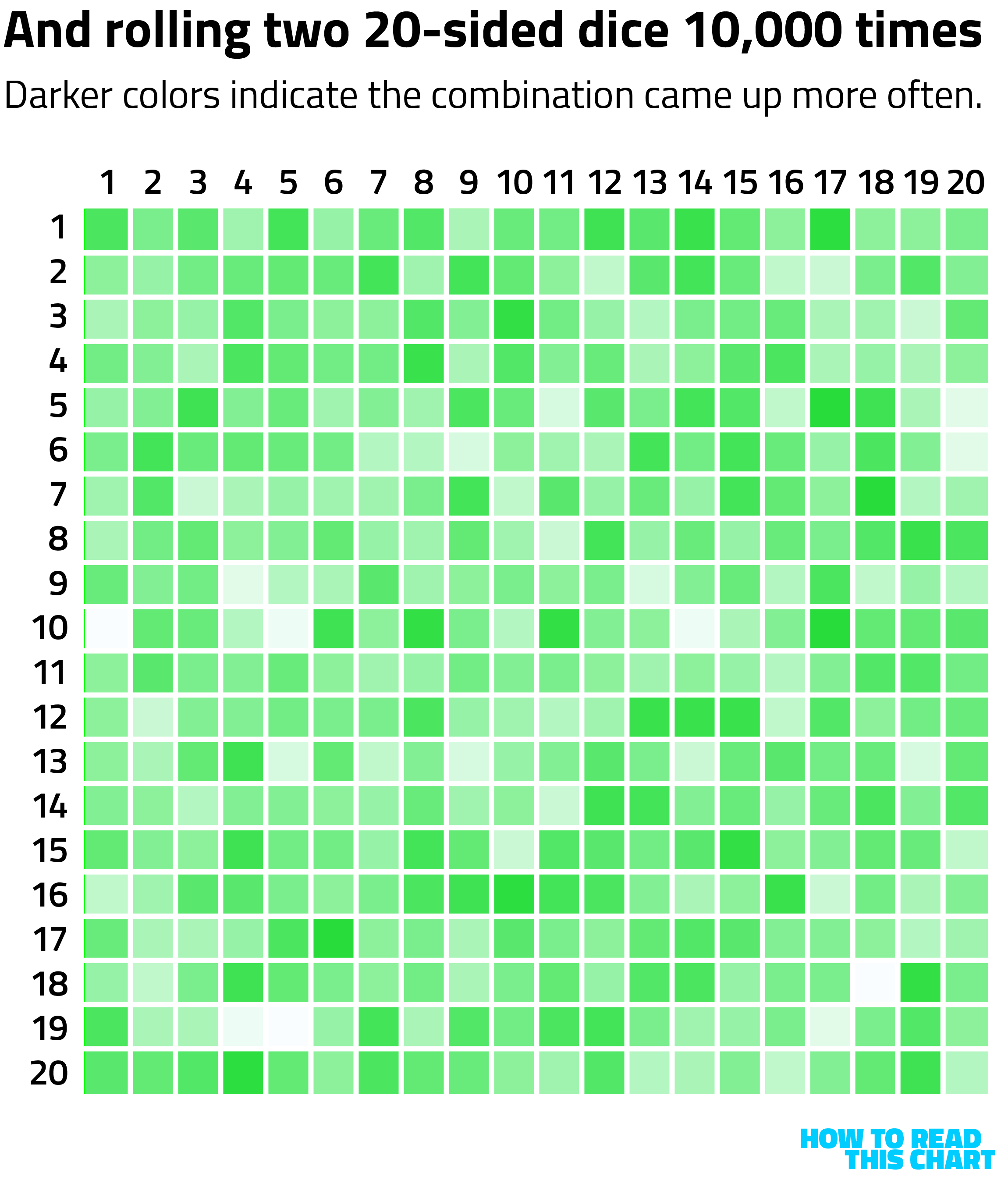
Then I had another thought. While we were in Pittsburgh visiting family earlier this year, the kids spotted a gaming store. Each came out the owner of a brand-new 20-sided die. So what would happen if we rolled those 10,000 times?
The answer, of course, is "basically the same thing." A random, uneven distribution across all 400 possible outcomes.
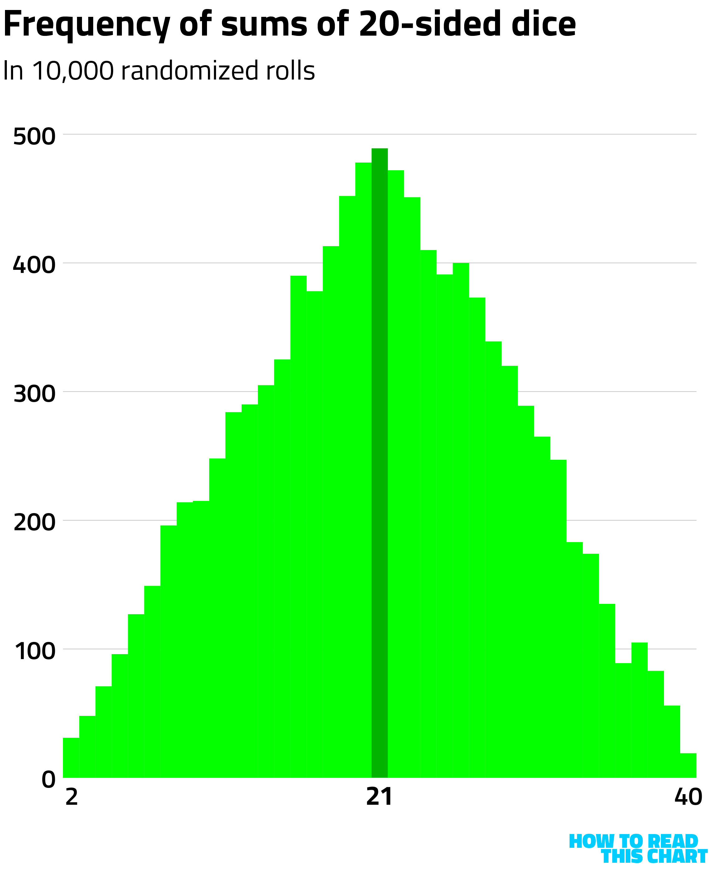
Again, though, summing the dice yielded a bell curve, with 21 at the apex.
As you know (but they didn't), this is not because there's anything more special about seven (or 21) than, say, two. On the chart below, each subtly different shade of green is a different color — and each diagonal from lower left to upper right is the same color and the same sum. There are simply more boxes that have seven (or 21) as a result.
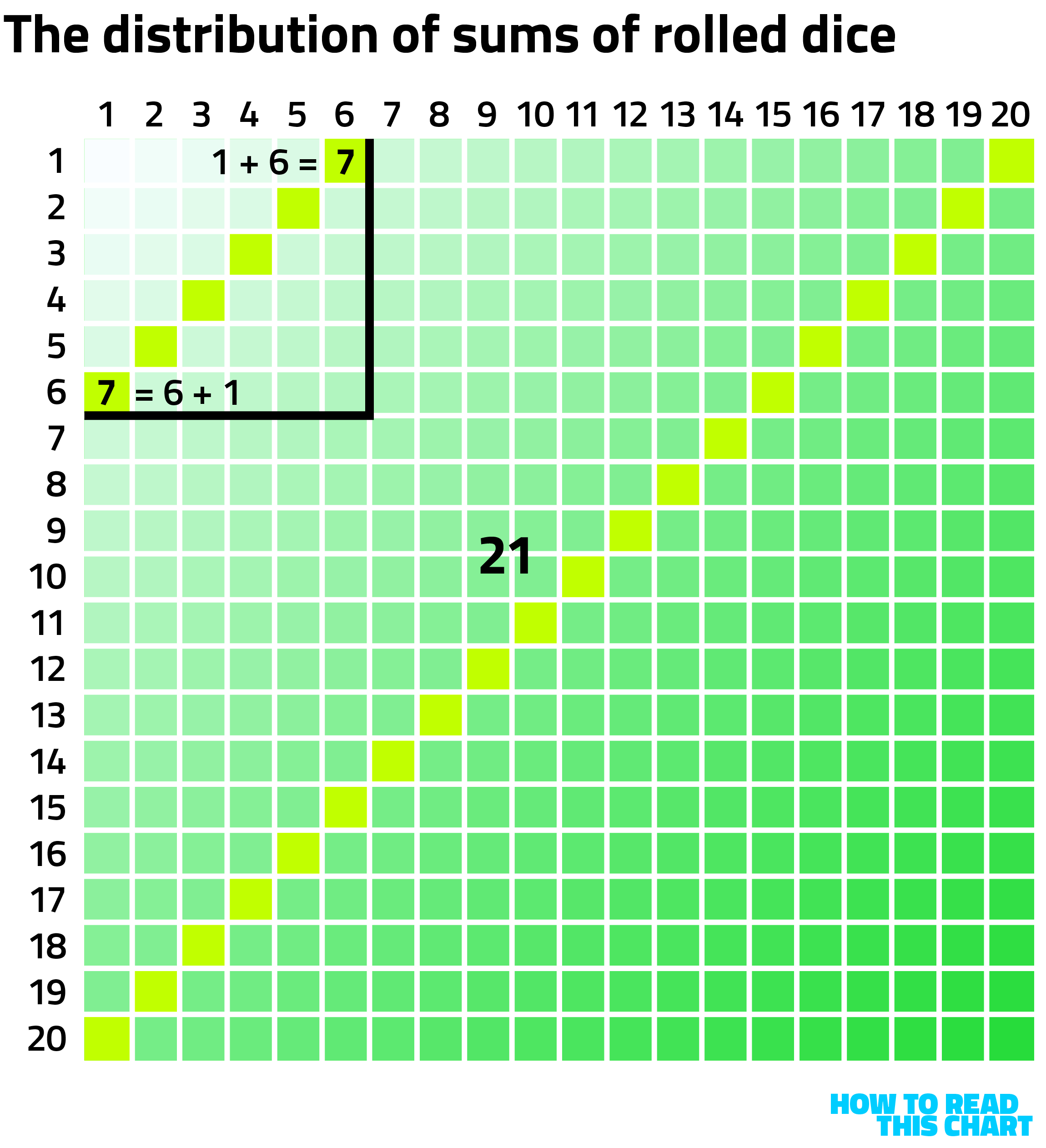
Given 400 boxes of relatively equal value, the sums from 20 of them will tend to be higher than the sums from 10 of them.
I could have gone further, explaining that since there are fewer boxes that have sums like 32 or 36, you can get random unevenness in your bell curve as we did in our 20-sided die one.
But I do need to save some math for future days. I only get so long to see the world through the eyes of someone experiencing it for the first time, and I need to make it last.
Appreciation 2
The support for this newsletter
I just wanted to take a moment and sincerely thank you for reading this and to thank the people who subscribed for helping to make it viable. Charts are an unusual thing to want to read about every week, and my jokes are an even weirder thing to appreciate, and yet many of you do. Thank you.
This is where I offer the link to subscribe, in case this earnest but uncomplicated expression makes you want to get in on the action.
But, then, I figured that maybe you are the sort of person that doesn't love subscriptions as such? It's hard to fault you, so if you wanted to chip in — no pressure, sincerely! — you can just throw in a few hundred thousand dollars (or maybe less) at the link below.
That's it. That's the hard sell. Lots of people aren't doing great right now and this newsletter is not exactly a life necessity; I recognize that. Besides, I enjoy being able to share it for free without paywalls and so on. So if you just want to skip to the next thing, I can appreciate that, too.
Appreciation 3
Not having to fly anywhere
We stayed home for Thanksgiving this year, which was great in part because it meant I didn't have to fly.
In the old, Washington Post version of this newsletter, I once wrote about how much I hate flying; you will be forgiven if you've forgotten. But, since then, some other visualizations of our unhappy skies have come to my attention.
For example, I don't remember ever having seen FlightAware's Misery Map before this year. It does what it says on the tin, showing how miserable your flight will be as a function of the frequency of delays at major airports. You can even see how it evolves over time!
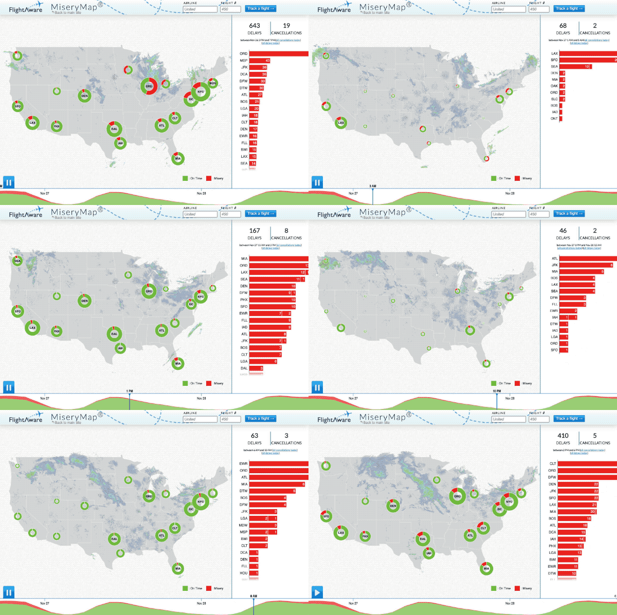
It was pretty good on Thanksgiving, though Chicago's O'Hare was generally a mess. But then Chicago's O'Hare is generally a mess.
I also hadn't seen Airloom, a site that displays a 3-D projection of an airport with live data on the altitude and trajectory of planes in its vicinity.
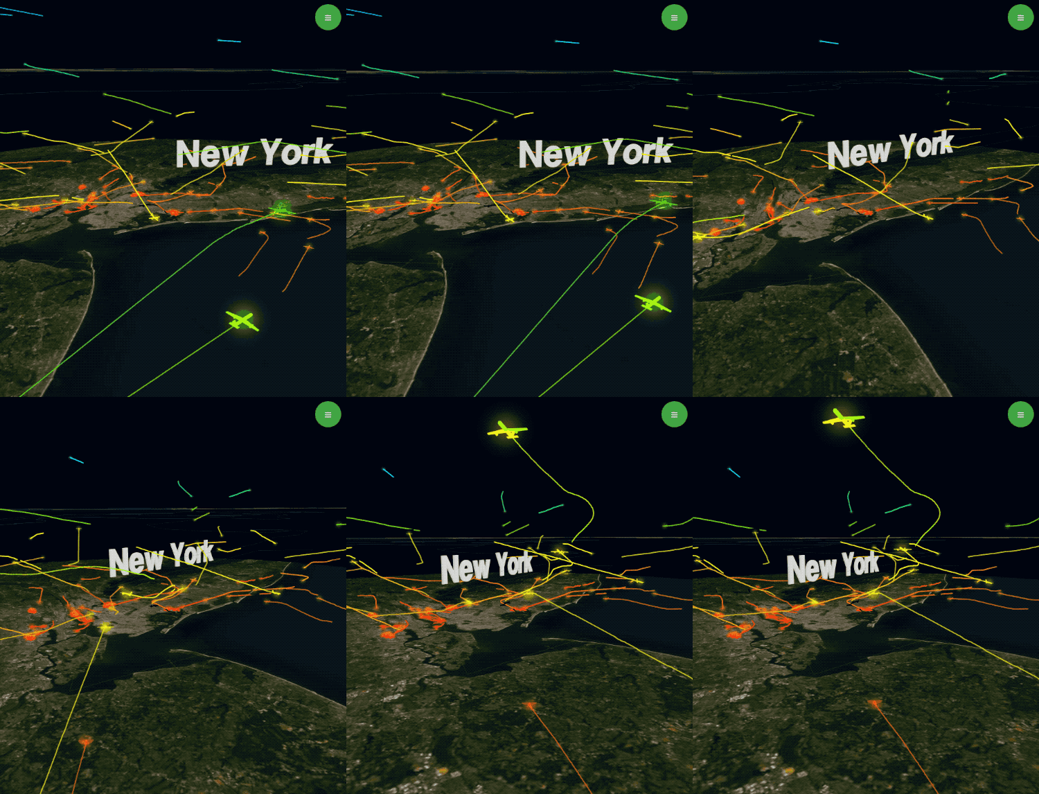
You can also click on planes to see what flight it is. Useful if you're trying to identify the one passing over you at any given moment.

I appreciate being able to look up at a overhead aircraft and sigh with contentment that I am safely on the ground.
Appreciation 4
People who make and share complicated visualizations
There can at times be a thin line between data visualization and art.
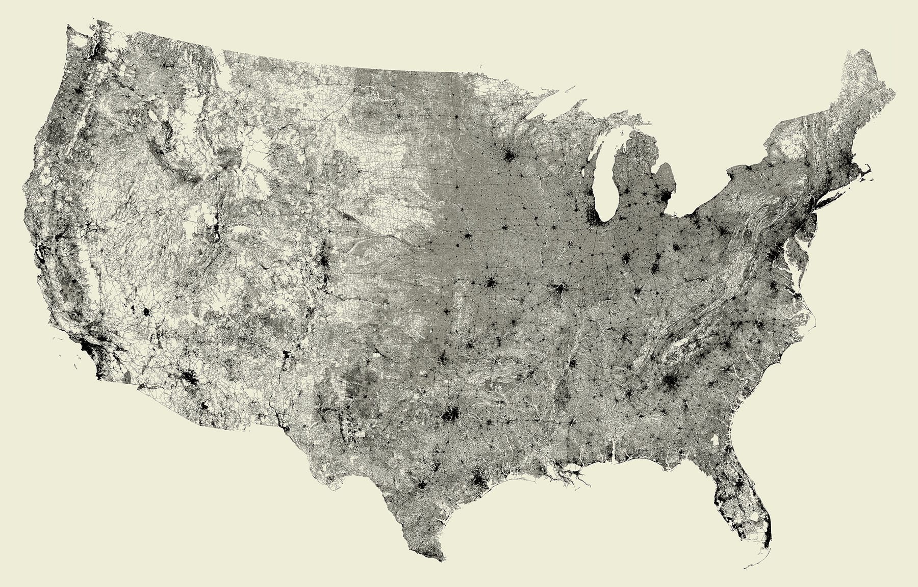
The map below, for example, depicts every road in the continental United States. Created by Ben Fry more than a decade ago. Notice that the country's borders and cities are clearly identifiable — even though none of them are directly shown.
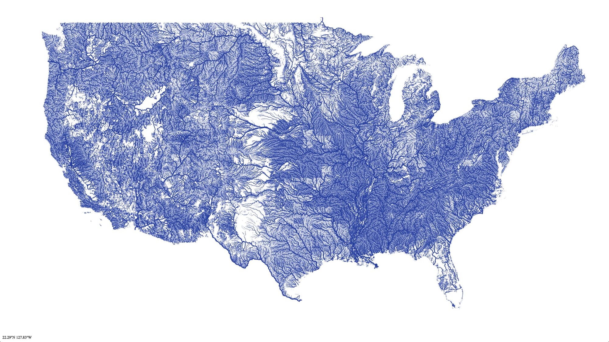
Then there's this complimentary map, created by Nelson Minar a few years later and showing every river in the same area. Here, too, you can see boundaries, including a number of state ones. (See: Iowa, Illinois, Missouri, Ohio, etc.)
And both of these decade-plus-old maps came to my attention thanks to Jason Kottke's interesting-stuff-sharing site. Which I appreciate.
Appreciation 5
Not being someone who bets on sports
(At least if we exclude the Kentucky Derby from "sports.")
A few weeks ago, I saw an interesting video shared by The Athletic, in which sports outcomes were compared to betting lines. They were able to determine that the major sport with the fewest upsets was tennis and the sport with the most was golf.

The video, which you can watch be clicking through, explains why some sports are more or less likely to result in upsets. But it resonated with me in the moment because I was also exploring just how often people lost money on sports bets.
Data published by the state of Illinois (I am also thankful for public datasets) shows how much was bet on particular sports bets over the past five-plus years and how much was returned to bettors. People placing wagers in the state got much less money back on parlays — chains of bets — than on anything else.

The sport where the most money was returned to bettors? Basketball — also a sport with relatively fewer upsets. Caveat bettor.
Appreciation 6+
Chart Attacks
I appreciate the New York Times continuing to do exceptional data visualization work, like showing where a major storm could flood Manhattan, even 13 years after Superstorm Sandy.

I also appreciate a photo visualization, like the Times's look at Donald Trump's Oval Office-adjacent gift shop. (This is not a joke.)

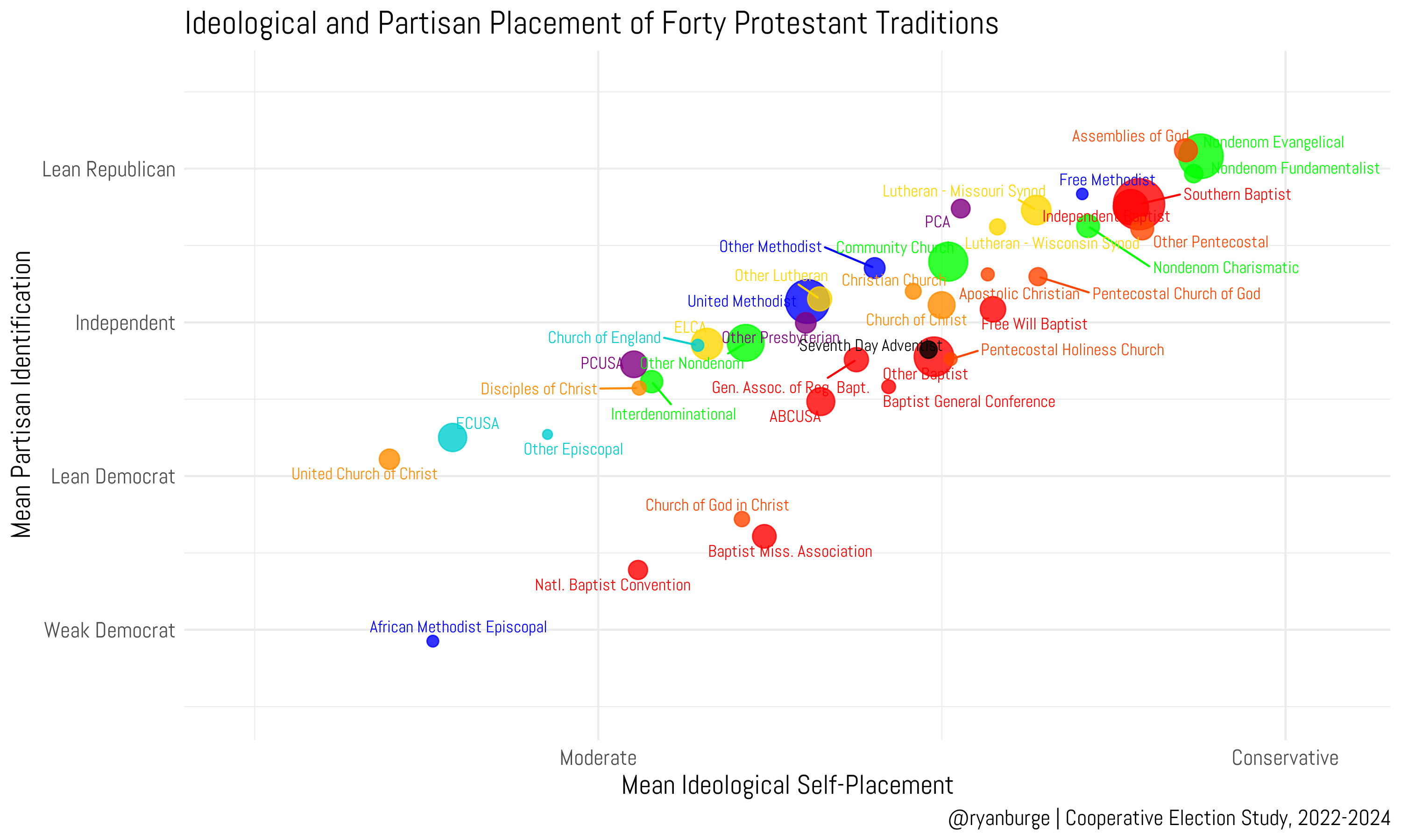
I appreciate Ryan Burge's work parsing data on American religious identity. Below, a chart he made overlapping partisanship (vertical axis) and ideology (horizontal) with religion.
The Cato Institute's David Bier has done exceptional work documenting the Trump administration's approach to immigration, compiling data showing how resources have been diverted to the arrest of non-dangerous people.
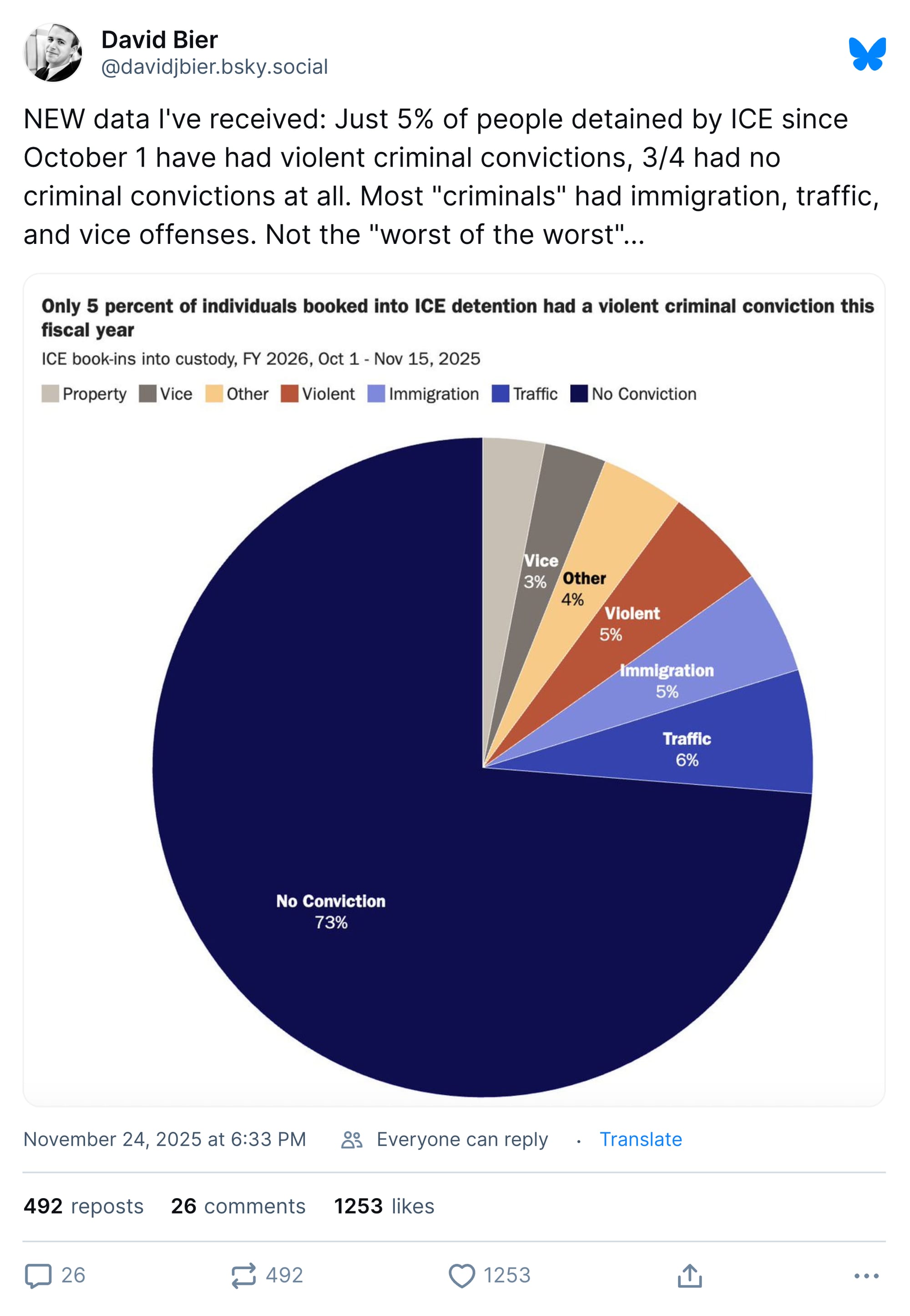
(He's even willing to mix it up with administration officials directly.)
And, in closing, I very much appreciate it when visualizations make a big point subtly.

Those last few items in ye olde Chart Attack do also highlight some things I am not thankful for this holiday season, but we will leave those for another week.
Appreciation 7
When you read some other things I've written
I didn't write much this week because I was busy doing nothing/playing my kids in Nintendo Sports. But I did write these things:


Better than writing nothing, I suppose, but you can be the judge of that.
You are receiving this email because you at some point in time volunteered to, either at Ghost or Substack or pbump.net or pbump.com. If you don't want to receive future emails, you may be at odds with the spirit of the holiday season. What you really want to do is support the newsletter financially, right?
Another one is coming next week. You have been warned.


