Red versus blue. Versus yellow. Versus gray.

Chapter 1
It's (almost) all about TV
There was an election this week, I assume you heard, one in which the people who were unhappy last year became happy and vice versa. If you're one of the current happy ones, congratulations. If you're not … well, I'm honestly a bit surprised you're reading this newsletter, but welcome!
What you are probably expecting, given that introduction, is that I am about to dive into an array of charts and graphs about the election and its outcome and What It Means™. Well, I'm not (in part because I already did elsewhere). Instead, I'm going to address a question that often comes up after the U.S. has an election:
Why is the left blue and the right red in the U.S., inverting the political color assignments that exist pretty much everywhere else in the world?
It's a fair question and one with an explanation, if not necessarily a great one. But it's also a question about data visualization and technology, which happen to be two things I enjoy talking about. So here I go.
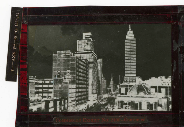
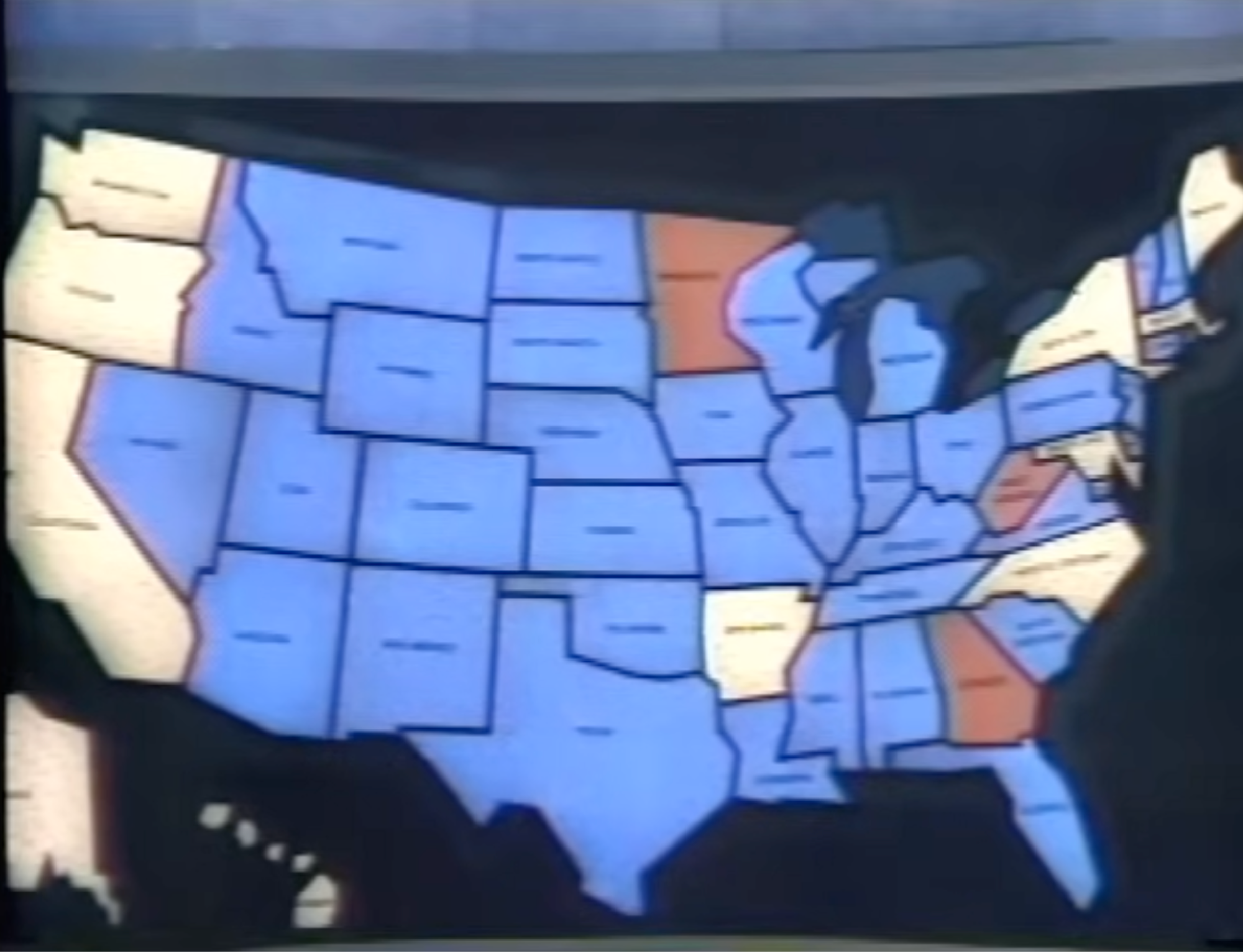
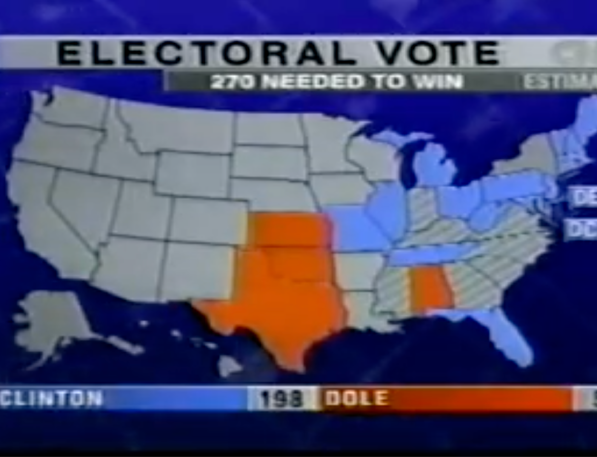
Let's start by considering the 1960 presidential election. Here's a still from CBS News' election night coverage, made available thanks to the internet allowing obsessives to share the objects of their obsession with the world, even if that obsession is old election night coverage. (Clicking any of these TV images will take you to terrific old YouTube footage.)
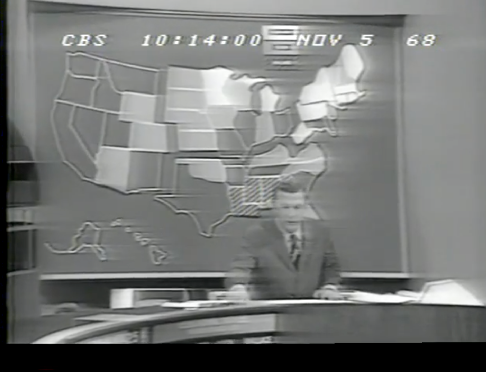
What you'll notice about the still is that the map doesn't use the now-familiar blue and red to indicate John F. Kennedy and Richard Nixon. Or, if it does, that wasn't perceptible to viewers saw in their living rooms because in 1960 almost no one had a color TV.
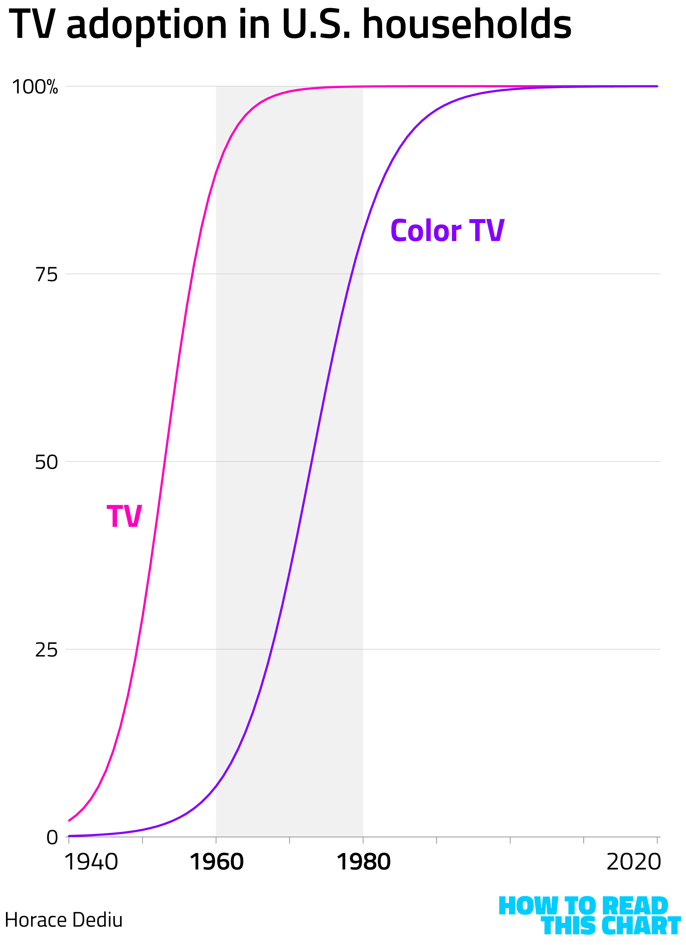
A few years ago, I spoke with analyst Horace Dediu, who shared data he'd gathered on the adoption rates of various technologies. According to his numbers, about 7 percent of U.S. households had color televisions in 1960. Twenty years later, though, 80 percent did.
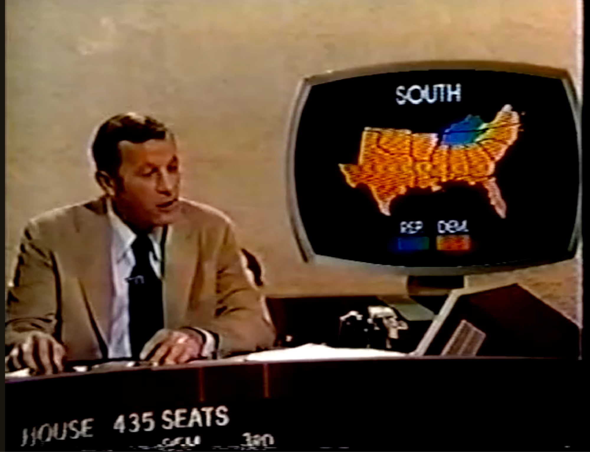
By 1972, with color TV adoption nearing 50 percent, election coverage included color broadcasts, meaning that networks needed to choose how results should be displayed. CBS's maps had Nixon (again the Republican candidate) in blue while George McGovern was in red.
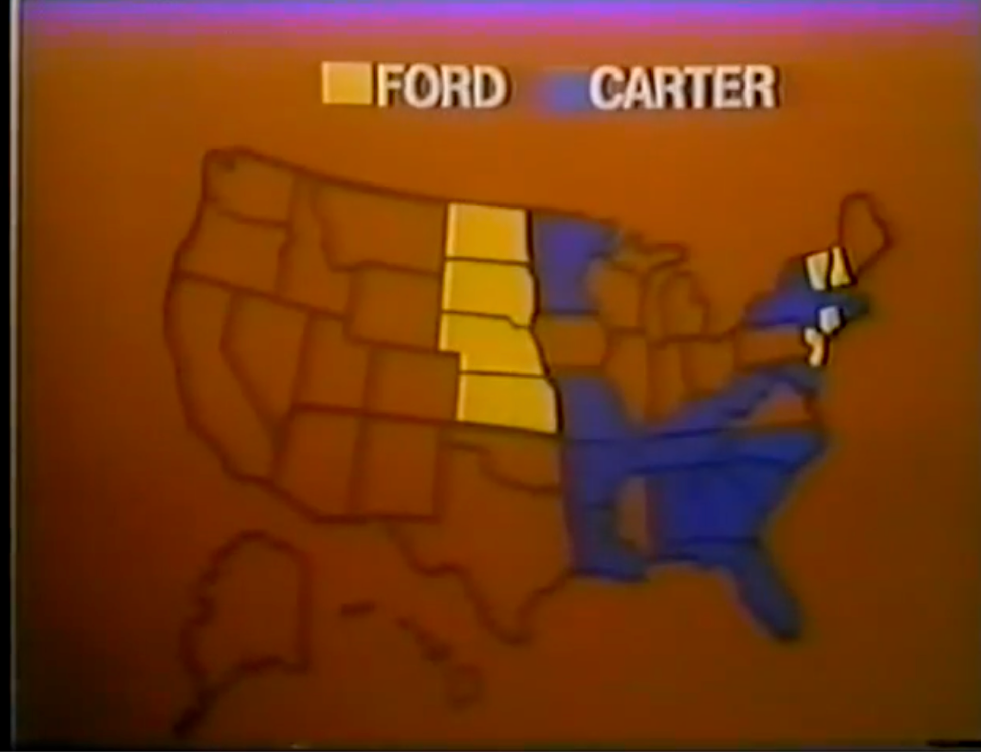
Four years later, ABC News used a different palette. Democrat Jimmy Carter was in blue while Republican Gerald Ford was in yellow, perhaps because red was used as the background color.
That same year (as I wrote in 2016 when I first dug a lot of this up), NBC used a huge physical map made of wood, with lights placed behind plastic sheeting to provide the coloration. But the lights were too hot, and the plastic started to melt.
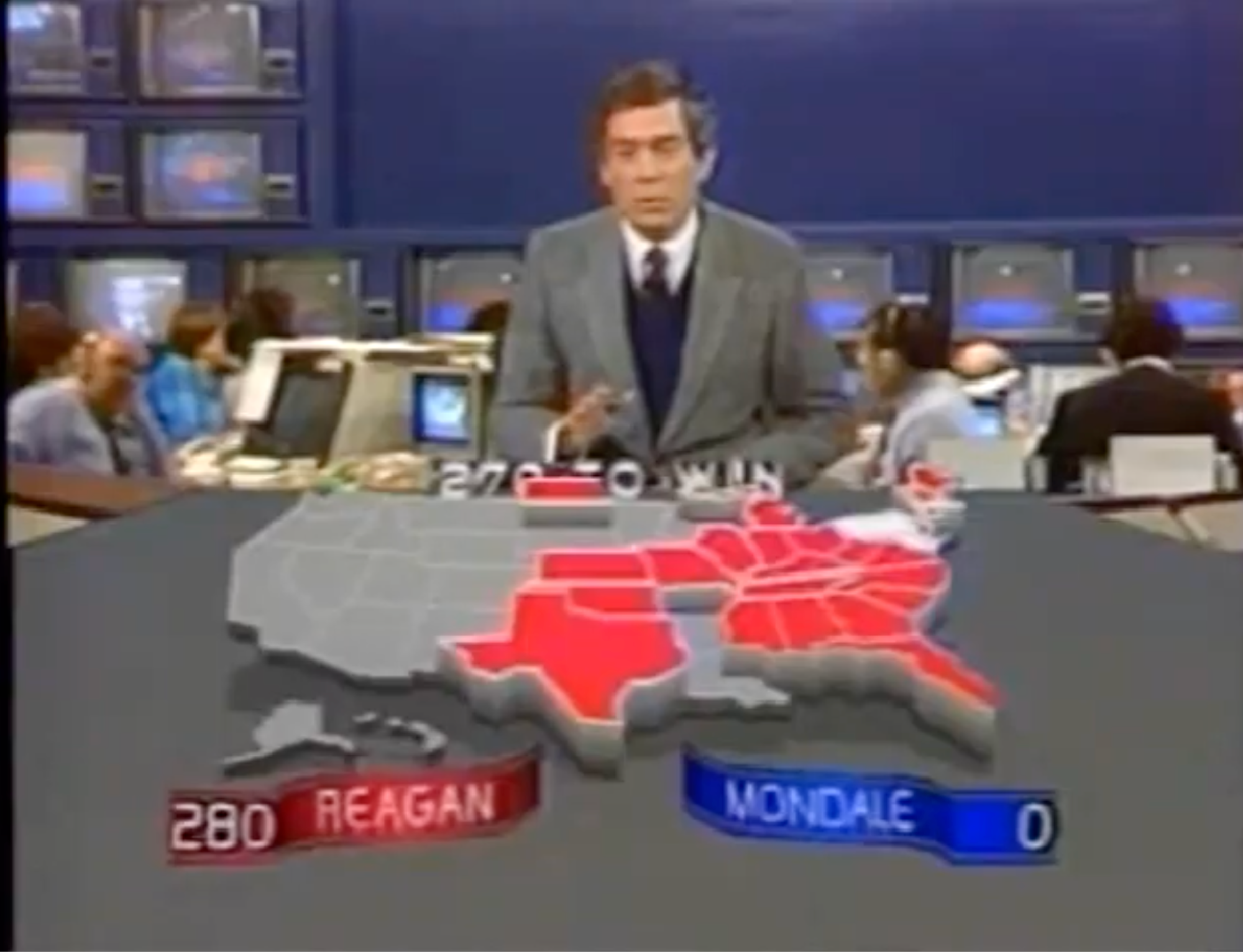
Four years later, they'd apparently worked out the kinks. Ronald Reagan's dominant performance in 1980 was shown on a big map — with the Republican in blue and Democrat Carter in red.
By 1984, on-screen graphics had gotten a bit more sophisticated. CBS News had Dan Rather positioned so that he looked like he was sitting down to tuck into a large America-shaped cake — one with red slices for Reagan and blue for his Democratic challenger.
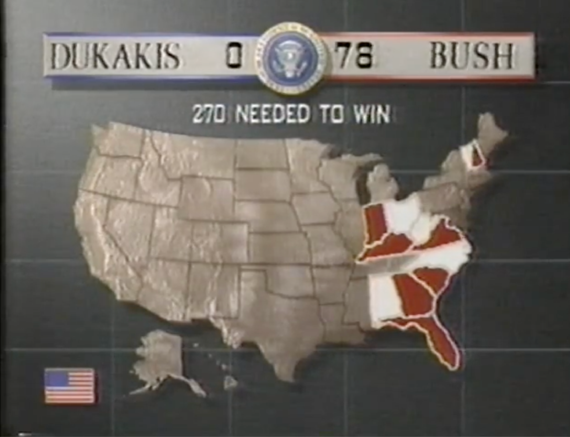
After that point, the on-air color assignments were pretty consistent. In 1988, CBS used blue for Democrats and red for Republicans.
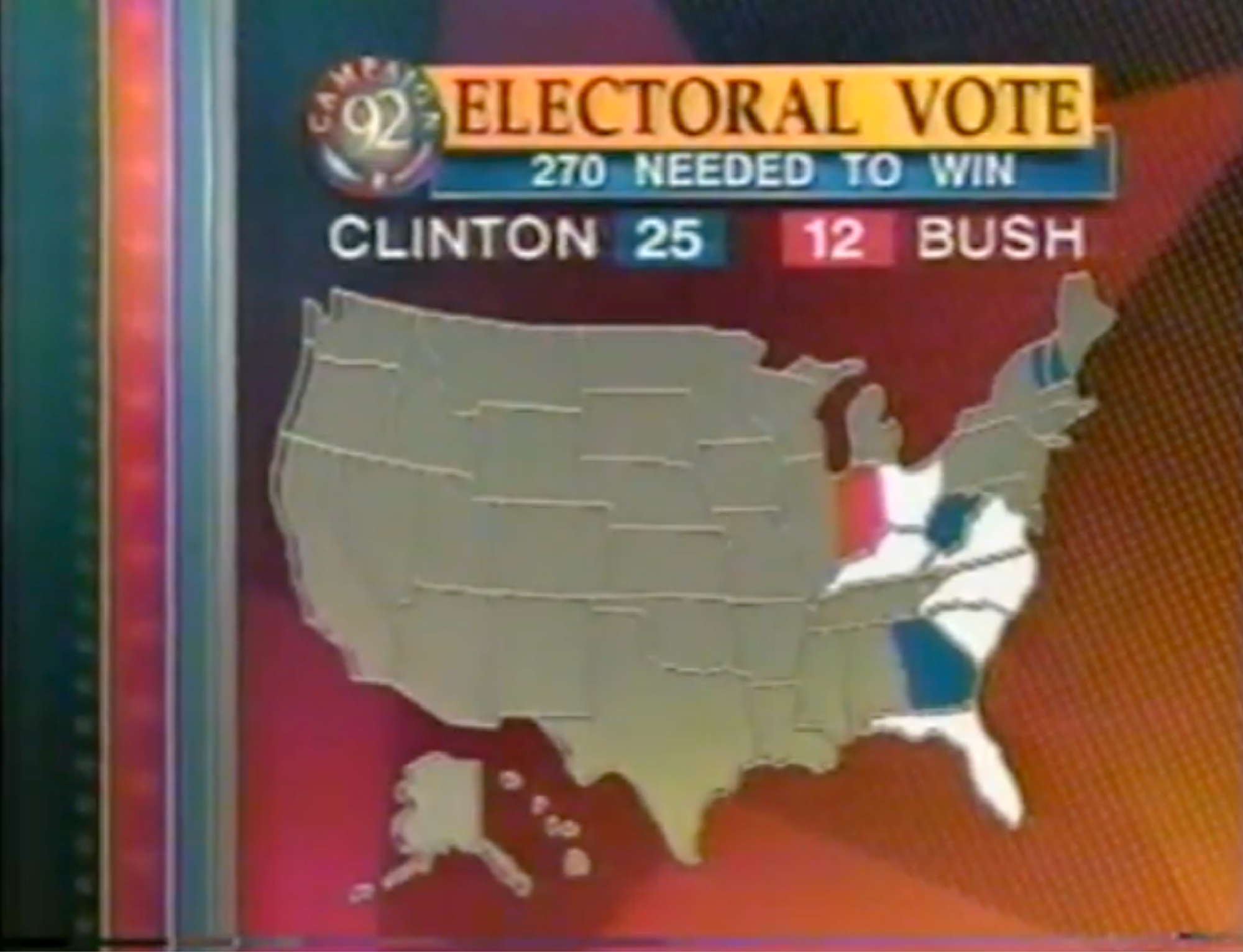
They did again in 1992, as did ABC News and the then-already-a-decade-old CNN.
Here's CNN in 1996, with Democrat Bill Clinton in blue and Republican Bob Dole in red.
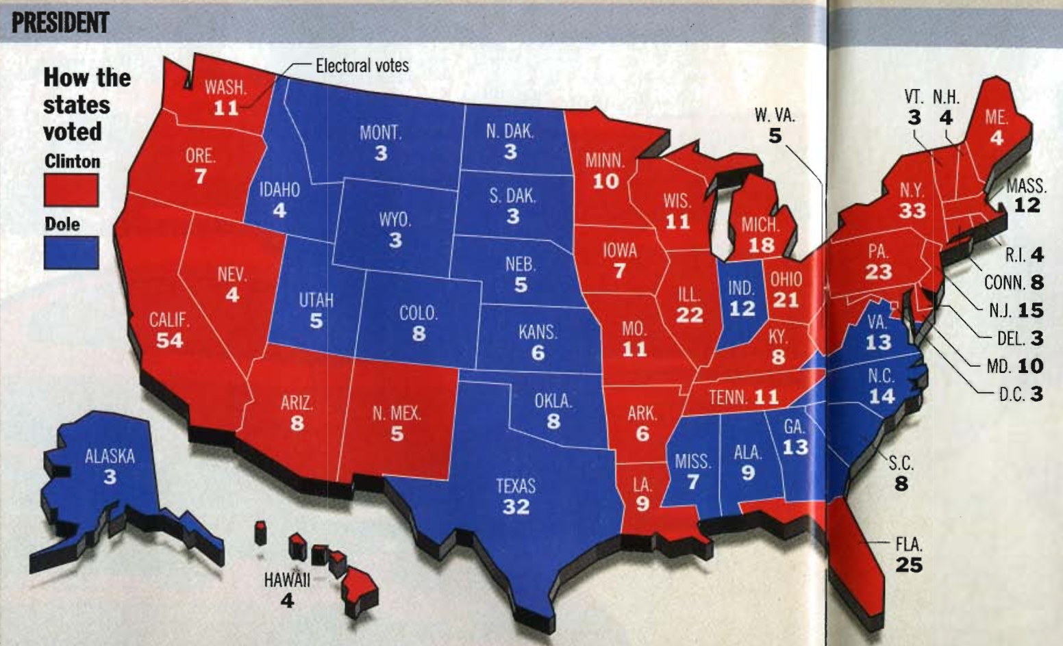
But TV isn't everything. That same year, Time magazine published a spread with election results, using red for Clinton and Blue for Dole.
Still, when the 2000 election rolled around, the blue-Democrat, red-Republican pattern was well-established for television coverage. Most Americans, though, probably didn't really notice it; after all, color broadcasts had only been around for about 30 years and there was no way to easily go back and re-watch old election footage to compare, as there is now.
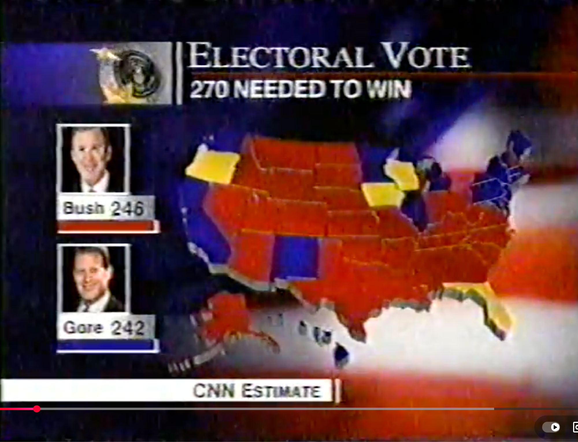
But something did change in 2000: the remarkably close election drove the widespread use of "blue state" and "red state" as a descriptor. Weeks of debate over who'd won what where made those shorthands familiar, and they stuck. (The first time the New York Times used the terms? In June 2001, in an article quoting Fox News inventor Roger Ailes.) There have been some isolated pockets of opposition, but this is not a fight many seem invested in fighting.
My review of available television coverage shows that red-Republican, blue-Democrat was pretty much established by 1988. It just took another decade and one of the closest elections in history to seep into public consciousness.
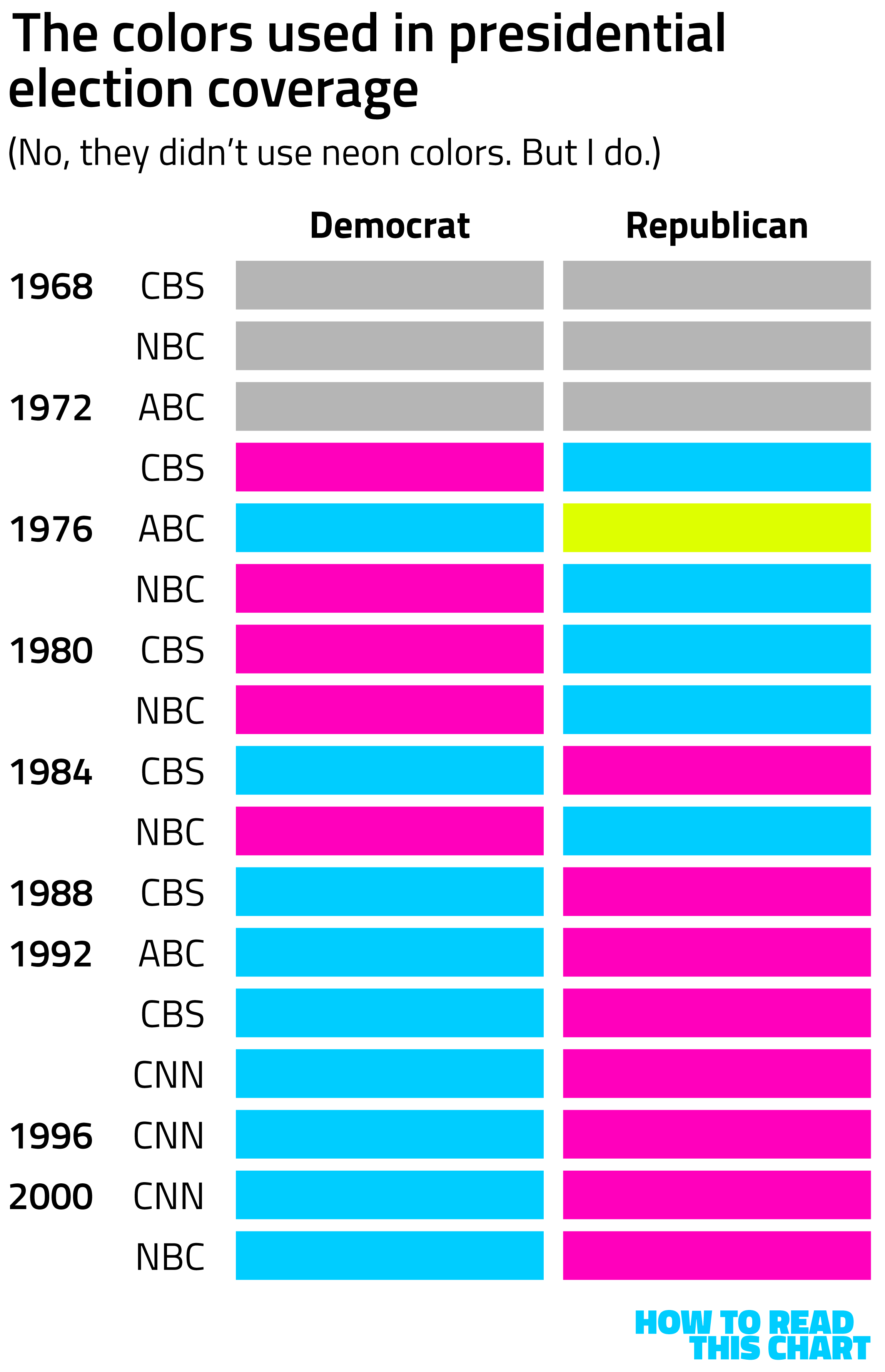
Put another way, there were about 16 years (from 1972 to 1988) during which red-Republican and blue-Democrat weren't the norm. In the nearly 40 years since, it has been. So this is less a newly-developed-pattern-of-arbitrary-origination than it is another-example-of-the-U.S.-doing-things-a-way-no-one-else-does.
Use red for Democrats and blue for Republicans? What's next, using kilometers to measure distance? Leave that sort of rhetoric for politicians like Lincoln Chafee — who, perhaps not coincidentally, was both a Republican and a Democrat at different points in his career.
Chapter 2
A presidential superlative
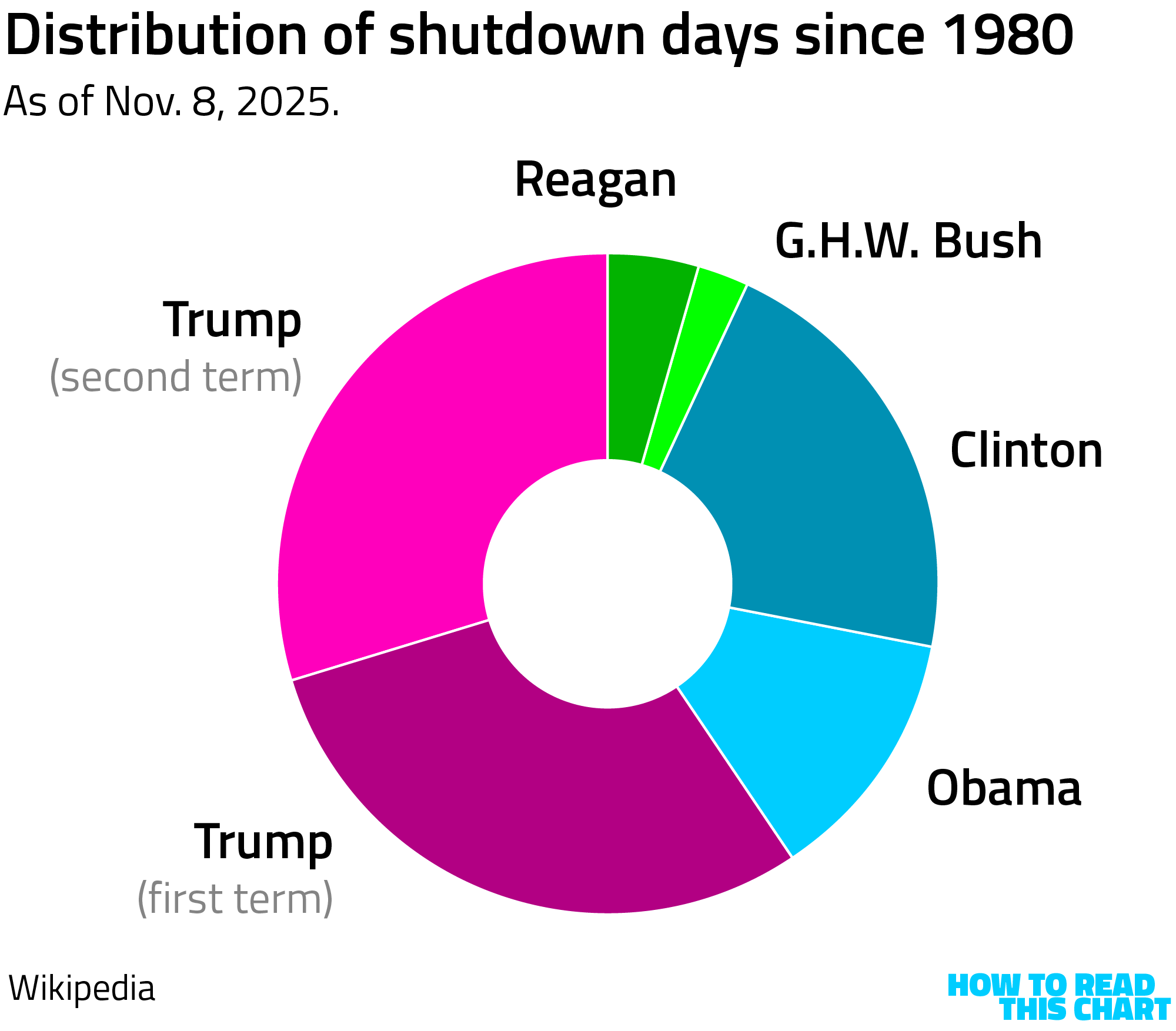
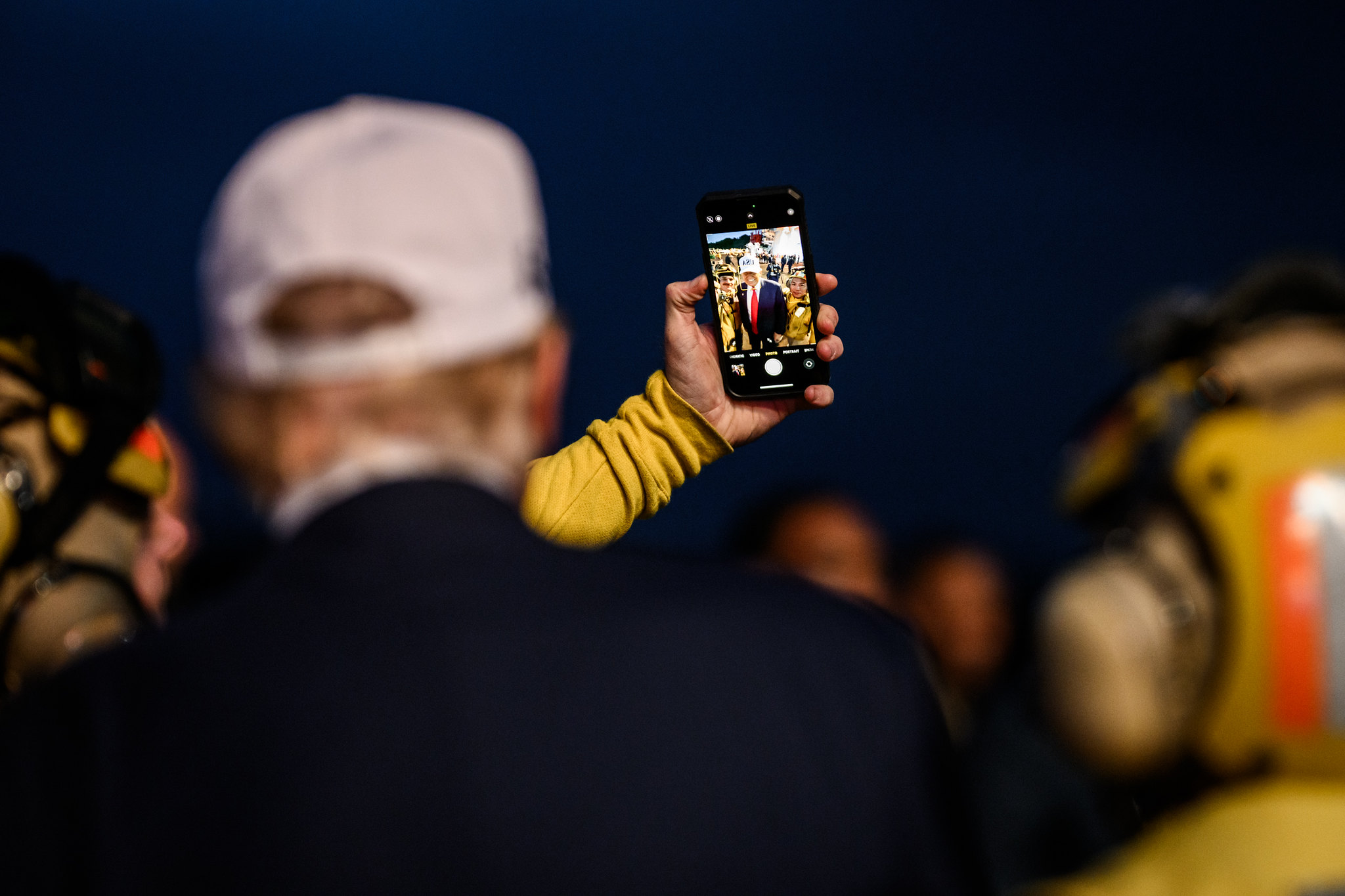
Speaking of 2016 presidential candidates who didn't win the popular vote, I would like to announce another prestigious award won by President Donald Trump: the president who has overseen the most days during which the government was shut down.
This isn't a new award; Trump took the lead in shutdown days during his first term. As I noted earlier this week, his presidencies have seen easily the highest percentage of shut-down days, with 1 out of every 23 days he's been president being one where the government was closed. The runner-up is Clinton, whose two terms saw the government shutdown for 1 out of every 108 days.
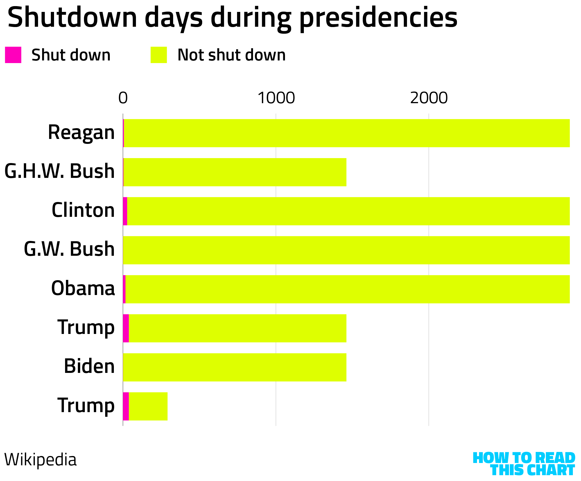
In fact, thanks to the current shutdown, Trump has earned a related honor: Most of the days the federal government has ever been shut down, Donald Trump was the president.
If the shutdown continues into early next week, which seems all-but-certain, Trump's second term will earn another dubious distinction: the equivalent of one day out of every week since his inauguration, the government has been shuttered. That's not quite as often as he's played a round of golf, but it's still a lot.
Chapter 3
Predicted failure
If you're curious how long the shutdown will last, incidentally, a word of advice: don't rely on prediction markets to tell you.
If you're not familiar with prediction markets, they're sort of like horse-racing odds but applied to everything, with all of the rigor and accuracy that suggests. People put money down on what they think is the most likely (or most lucrative) outcome in any of a range of occurrences, and get a payout if they're right.
The site Kalshi has been running a market on the duration of the shutdown since mid-September. By October 1, when it began, bettors figured it would last nine days. Eight days later, they figured it would be 22 days long. On the 22nd day, their guess was 38 days. And so on. The shutdown gets longer, the "predictions" get higher.
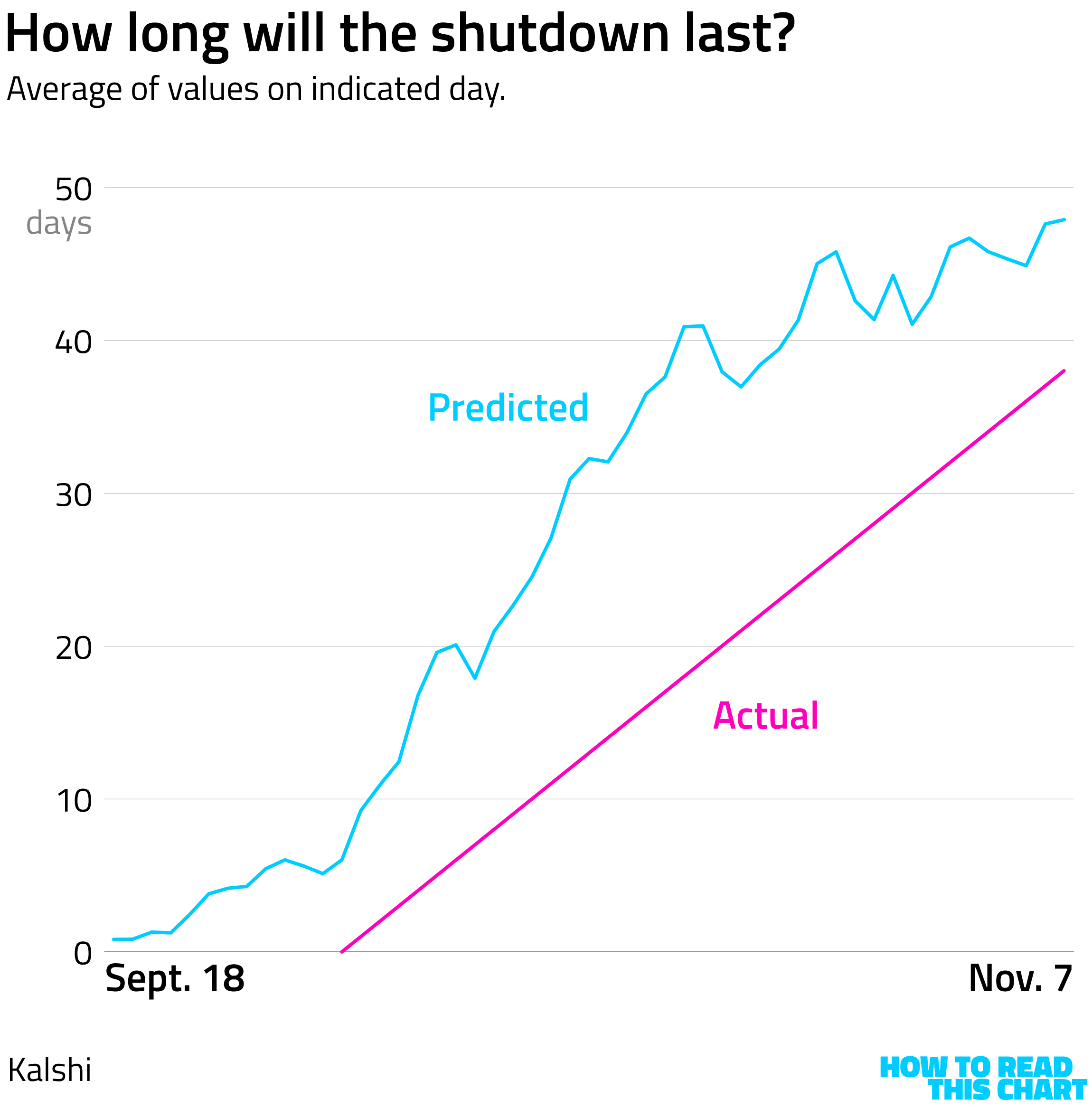
This daily string of misses is not why I'm picking on prediction markets, though. I'm picking on them because of this week's election.
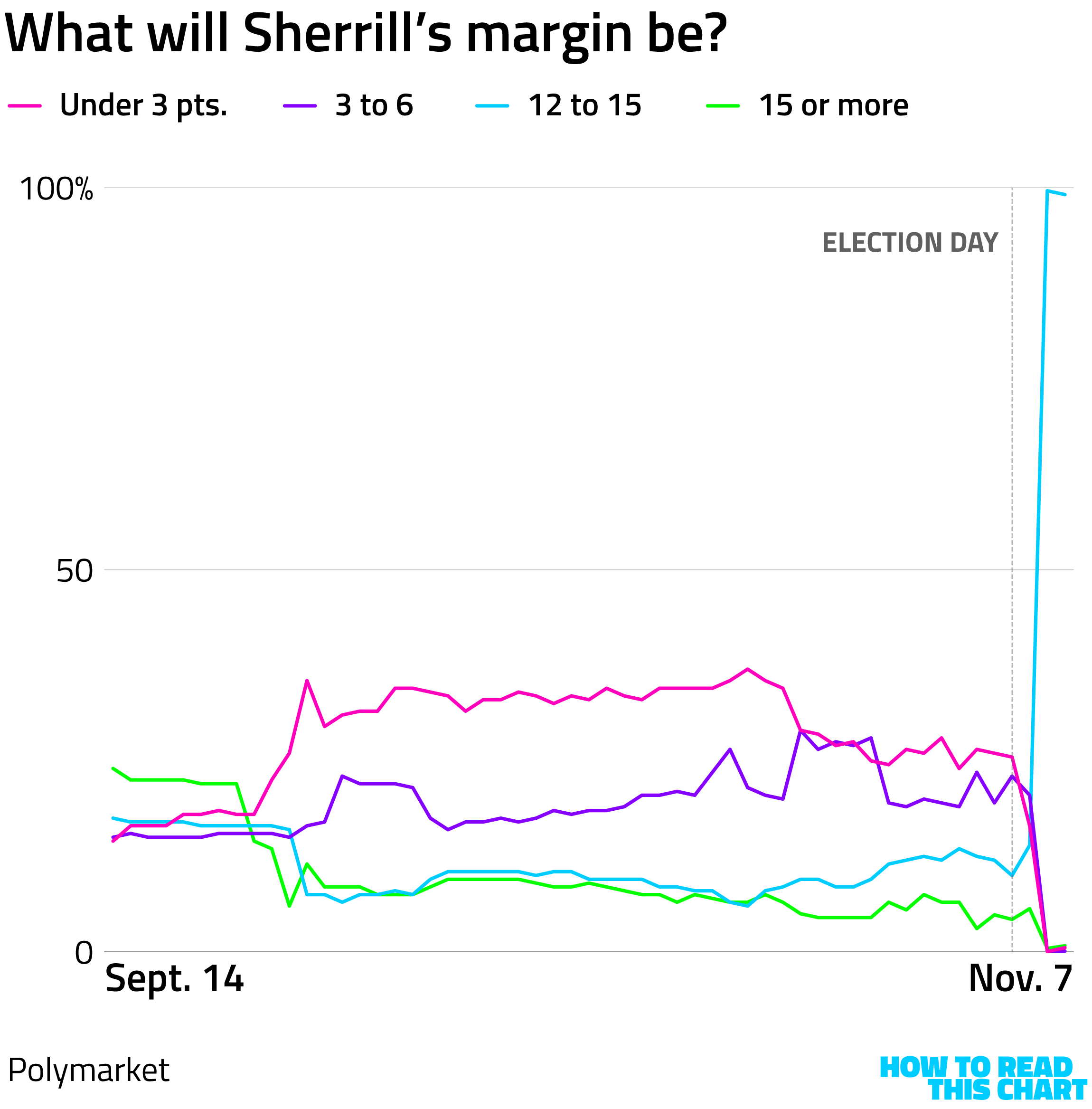
As I was watching results on Tuesday, another chart of Kalshi results popped up on social media. It aimed to predict what governor-elect Mikie Sherrill's margin of victory would be. Coming into Election Day, the estimate with the most money on it was that it would be less than zero — that is, that she'd lose. When it became obvious that she very much wouldn't, ranges that tracked with the vote totals as they were being reported shot into the lead.
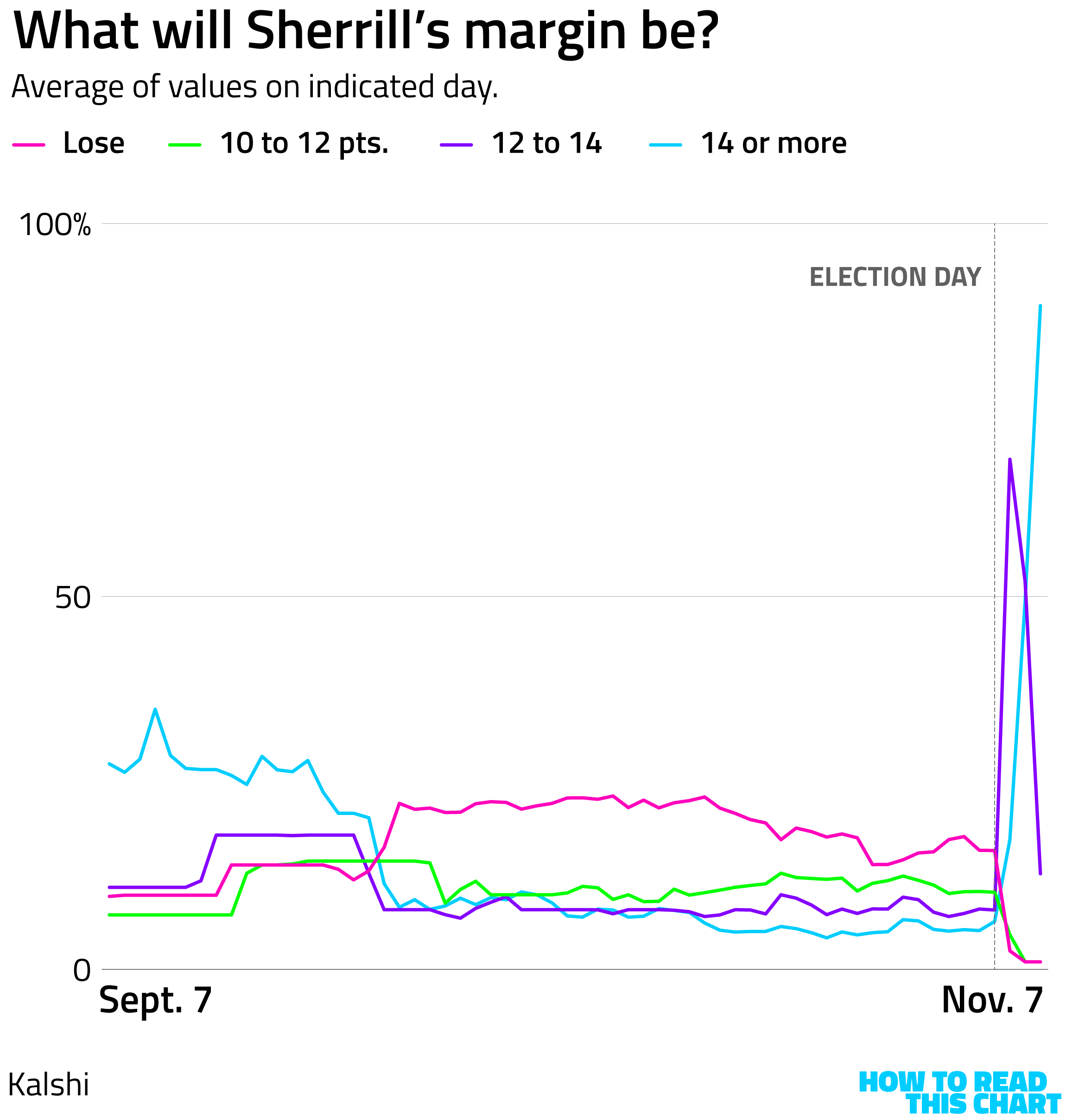
The shift occurs after Election Day on the chart above because it's a daily average, and, for most of the day, bettors thought she was doomed. In the evening, we learned that she very much wasn't — and the bets quickly changed. That's the thing about prediction markets: It's often less important that you're right than that you're first.
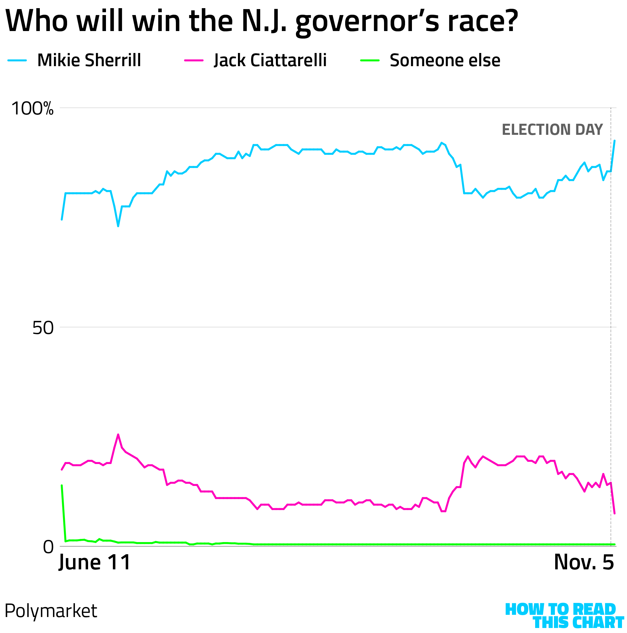
Over at Polymarket, another prediction-market site, the same phenomenon was at play. Sherrill was believed to be headed for defeat, until reality showed that she wasn't.
In fairness, that's just one market. Another Polymarket track of the governor's race had Sherrill winning all along, perhaps because investors bet heavily on her after the primaries and the more-recent concerns about her position (visible in the October surge for her general election opponent) only ate into that to a modest degree.
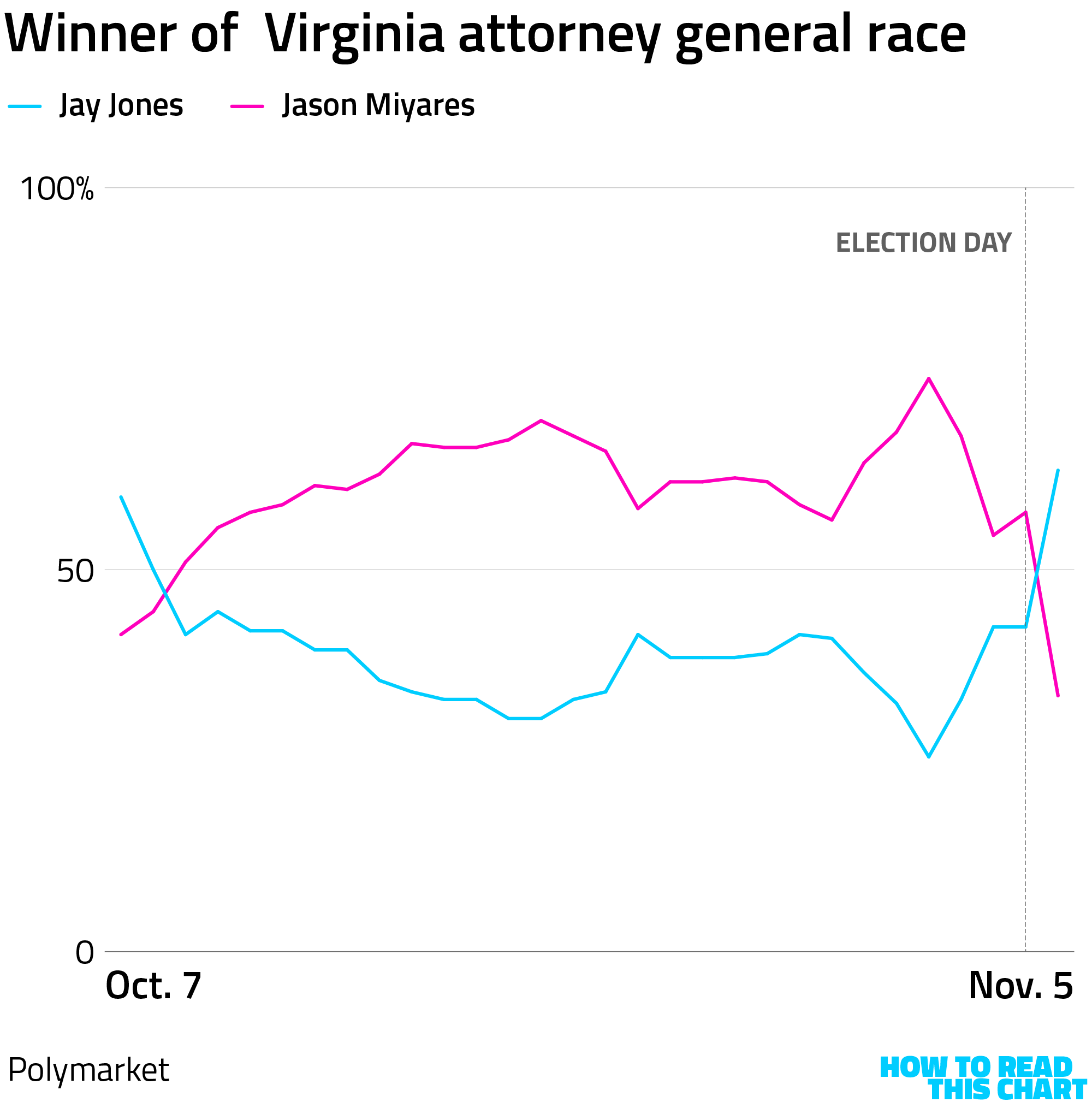
In another, lower-profile race — the attorney general contest in Virginia — bettors reacted to negative reports about Democrat Jay Jones by betting on his opponent. Until Jones won.
Again, there are examples when the markets align with actual outcomes, though it's fair to wonder the extent to which what's being measured is collective insight rather than conventional wisdom. For example, Kalshi's market on 2024 presidential election outcomes generally mirrored polling showing that Kamala Harris was likely to win the vote and the presidency.
That is not what happened.
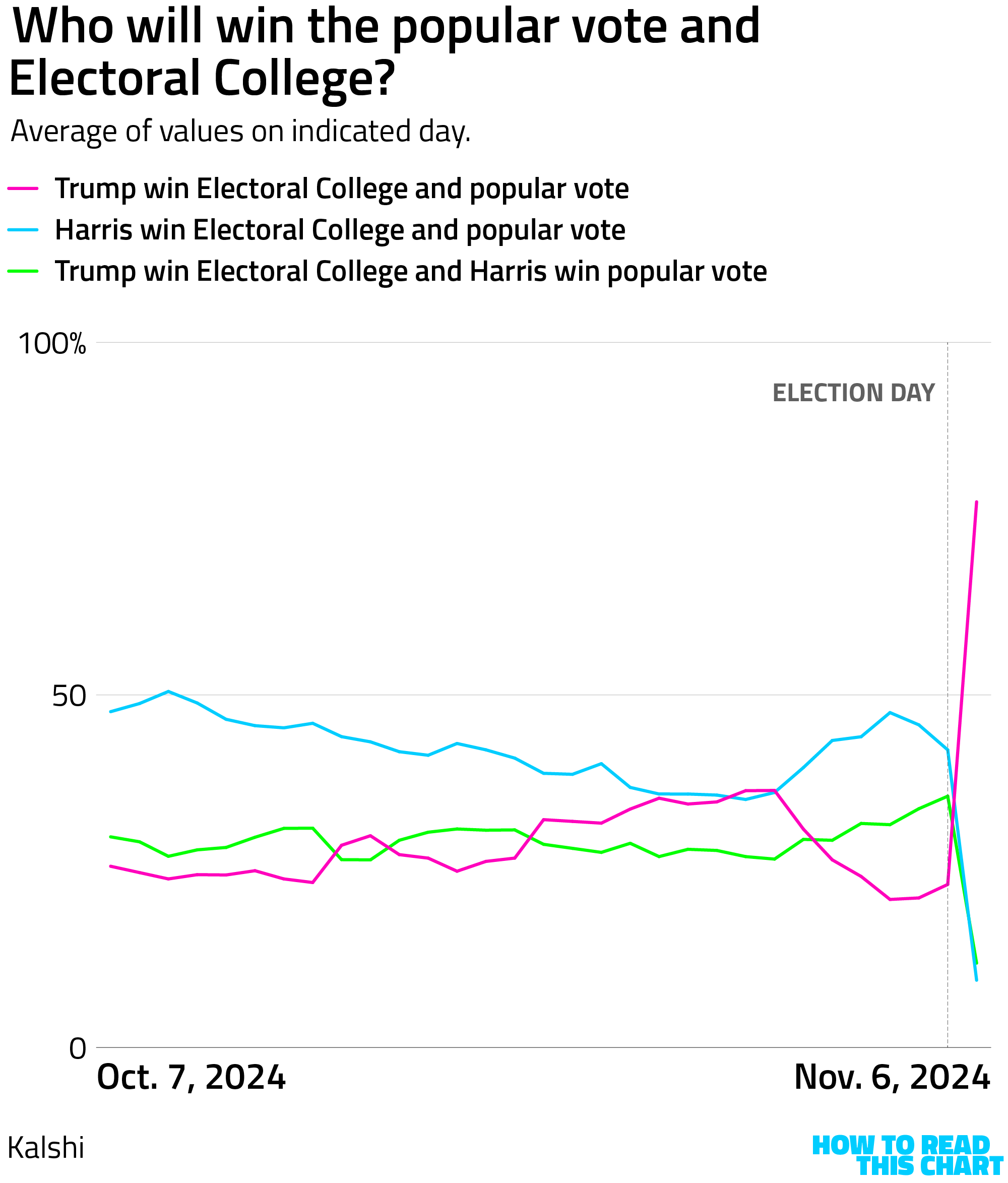
Sorry for the reminder, people who were unhappy last year.
Chapter 4
Chart Attack
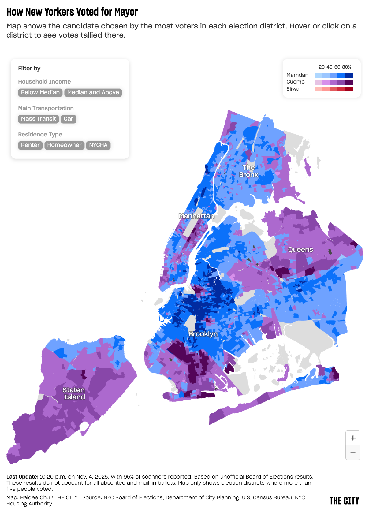
There were any number of good visualizations focused on this week's election results (including some decent ones of my own). But The City's interactive map of results in NYC stands out for its elegance and customizability.
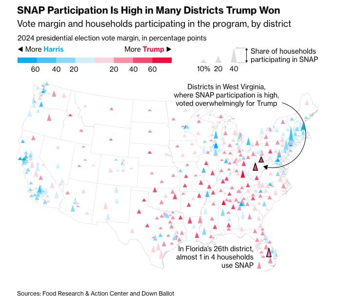
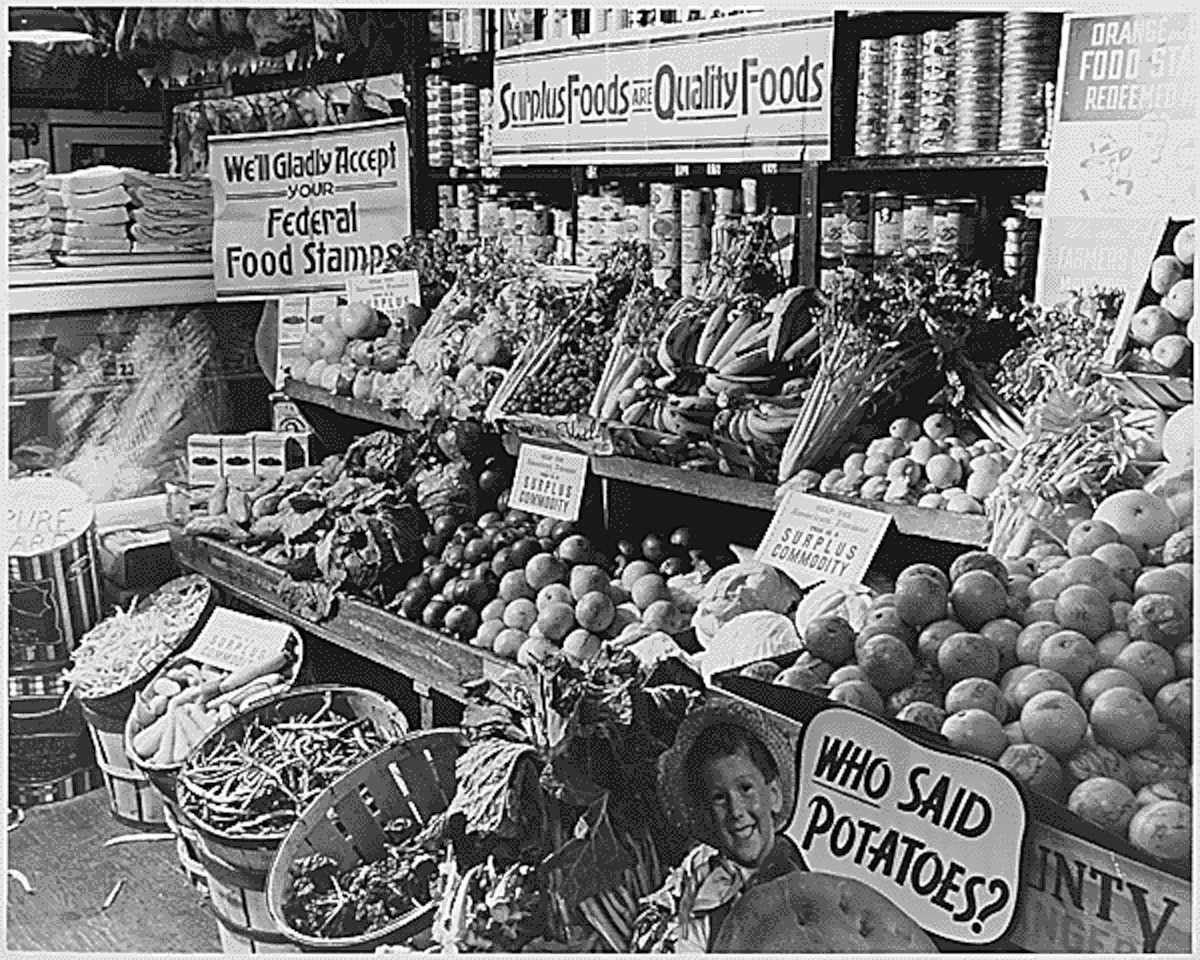
With the fight over nutrition assistance funding ranging, Bloomberg's map of SNAP recipients vs. 2024 voting offers useful context.
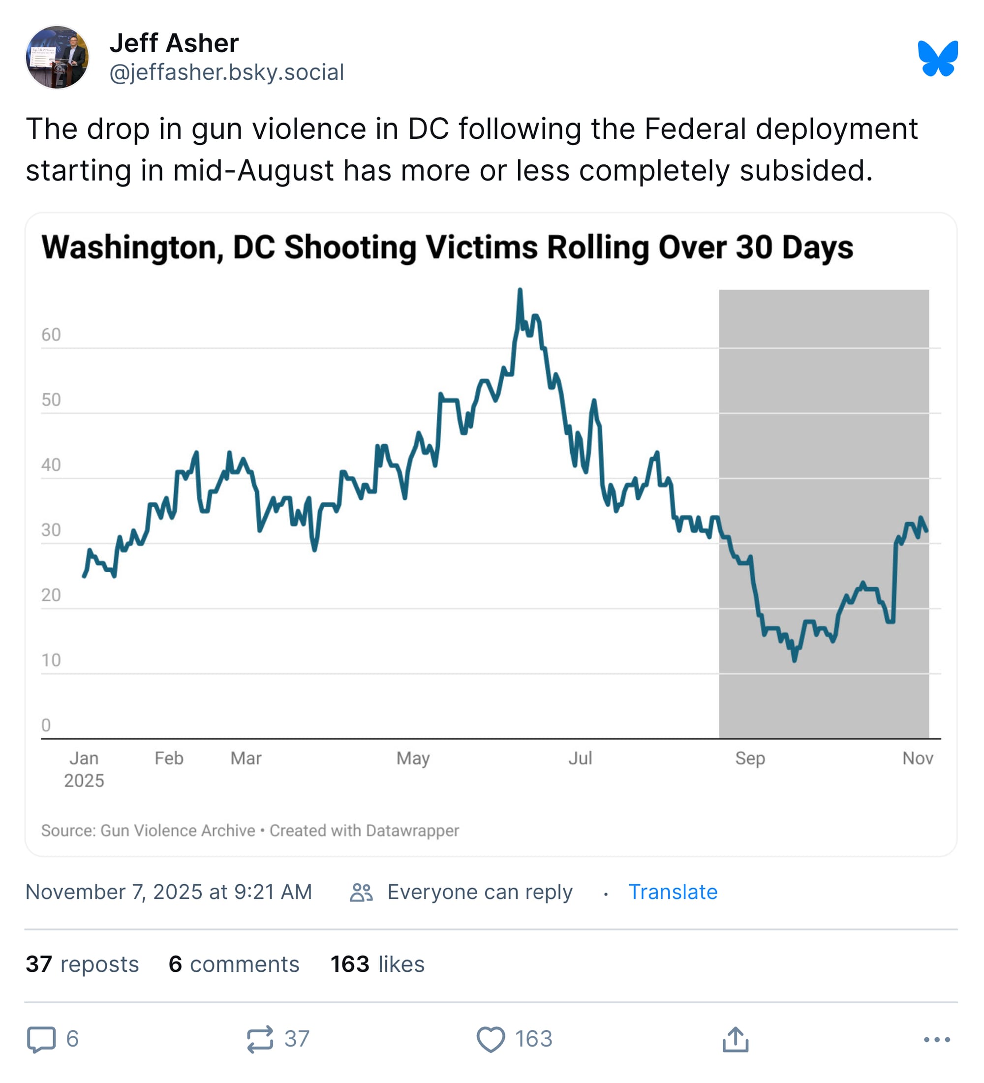
Speaking of dubious decisions from 1600 Pennsylvania Avenue, the downward trend in D.C. gun violence has reversed during its occupation by the National Guard.
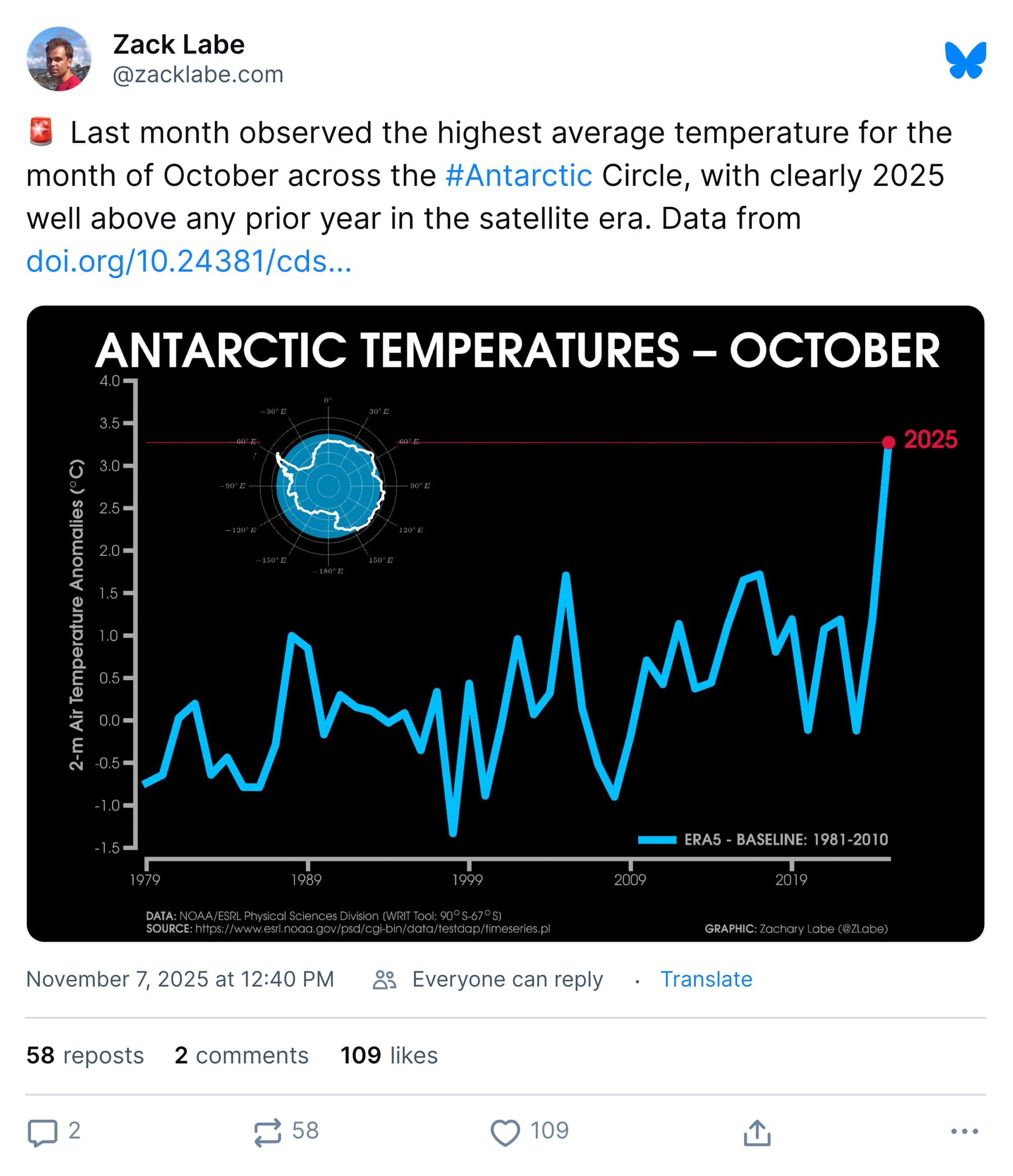
Meanwhile, the antarctic is seeing record warmth, which is good news for those who like sea level rise (dolphins).
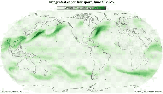
The Washington Post has a deep dive on moisture in the atmosphere, which they characterize as airborne rivers. Good news for those who like increased numbers of massive downpours (fish).
I also learned this week that there is a Google Maps for the Roman Empire, good news for those interested in invading Gaul (Caesar).
My favorite discovery, though, is this handy visualization of norms around public behavior. Curious if it's considered acceptable to cry at a job interview? Simply slide your finger down to "cry" and over to "job interview" and you will see that it … is not! Good to know.
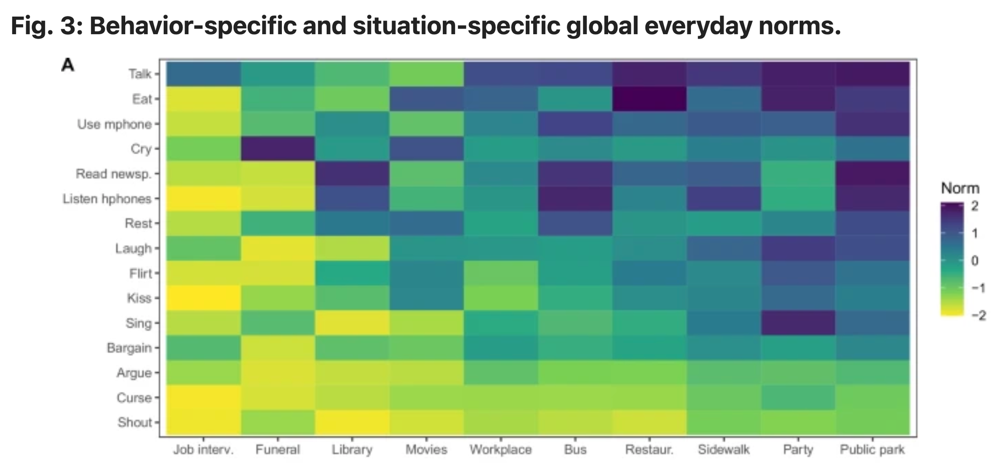
I was interested to learn that it is neither embraced nor forbidden to bargain at a movie, providing a nice boost to my new site, IntermissionAuctions.com. Which I need, because FuneralFlirts.biz has been a bust.
Appendix
Some other things I've written

I also made a video response to the administration's claims about weight loss, if you prefer to receive your snark in that format.
You are receiving this email because you at some point in time volunteered to, either at Ghost or Substack or pbump.net or pbump.com. If you don't want to receive future emails, please inform your server. But what you really want to do is support the newsletter financially, right?
Another one is coming next week. You have been warned.