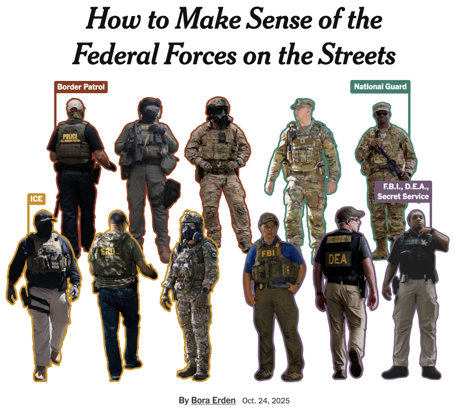
At church, in the dance hall and on the gridiron

Chapter 1
A geography of American worship
The story of the Tower of Babel, you will recall, involves God stymieing the construction of a heavens-destined building by fragmenting human language into all of its current iterations. Hard to build a tower when the foreman speaks French and the workers speak Italian! Oh, well, actually that's not that hard. But you get the point.
And yet our very own United States demonstrate that enormous things can be built despite dramatic splintering. Ours is a nation created in large part on the idea of religious freedom, and, boy, have we taken that idea and run with it.
According to the 2020 U.S. Religion Census, there are at least 372 distinct religious groups in the United States, with more than 160 million people worshipping in more than 356,000 different congregations. That doesn't even count the substantial number of Americans who adhere to no religion at all.
This data came to my attention this week thanks to a post from Ryan Burge, whose site Graphs About Religion does what it says on the tin. Burge often produces interesting, thought-provoking assessments of American religion, and his maps of the prevalence of different religious traditions are no exception.
I, however, am me, and therefore wanted to play with the data myself. Burge's maps are interesting, but some do fall into the actually-a-map-of-population-density problem. Was there a way to approach it differently?
Reader, there was.
For example, I took the county-level data on religious adherents relative to population and considered how each county compared to the national average. Counties with relatively more adherents-per-resident than the national figure were colored pink. Those with relatively fewer were colored yellow.
The result is below.
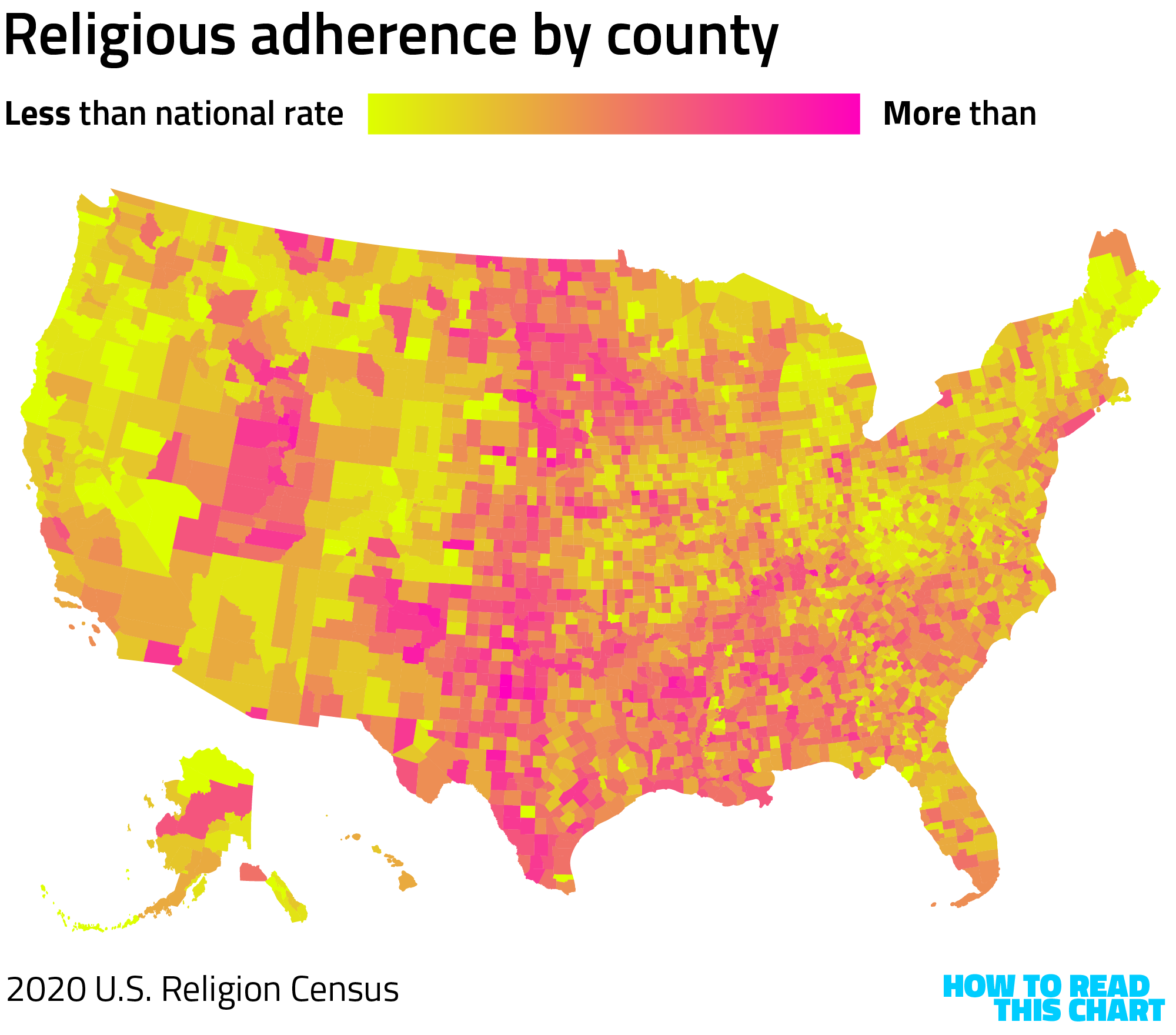
This passes the smell test. Relatively less religiosity in the Northeast and on the West Coast; a lot in the Midwest, Plains and Southeast.
I applied this same approach to a number of the 30 largest religious groups counted in the Religion Census, making a smaller version of Burge's maps but using my relative scaling. Below, the level of membership in the indicated religion is compared to the average membership nationally.

What stands out pretty effectively on those maps is the regional differentiation. Religious traditions in the U.S. are often linked to geography, a function in part of the overlap of religion and community.
To emphasize this point, I took four of the above religions and overlapped them directly, showing where any one was more common than the others. The result is a complicated but I think appealing visualization of American religion.
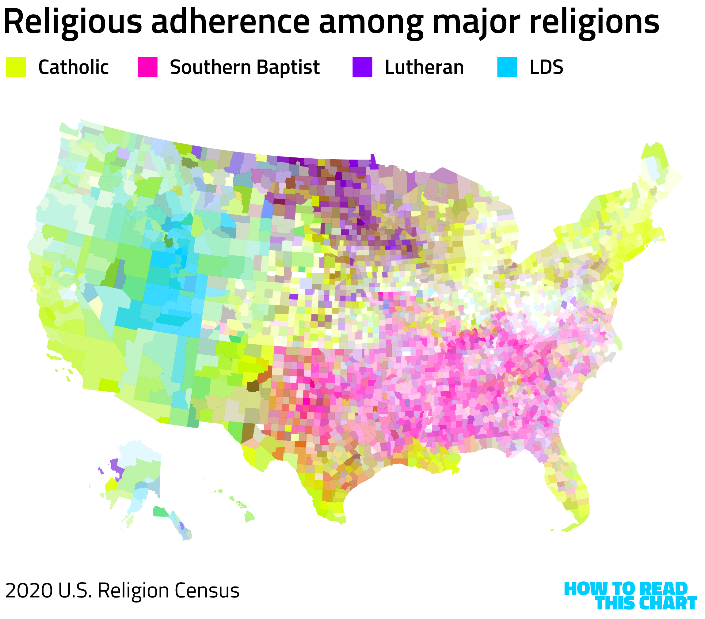
It's remarkable that Americans can diverge so widely in their assessments of the existence and manifestation of a higher power, yet come together in one secular tradition. Imperfectly, sure, but still. It's heartening, in a moment where heartening things are not exactly pouring from the heavens like bricks from a collapsing, abandoned tower.
Chapter 2, Part 1
Returning to Ohio State
I spent much of the week traveling, including a visit to (The) Ohio State University, my alma mater. It was there that I long ago learned how to code and gained my existing appreciation for math — an appreciation influenced in part by the sculpture "Garden of Constants" near what used to be the student union.

This is data visualization in a very pure sense: actual numbers, presented in space and aesthetically in ways that reflect their significance. You can explore the image (and the link with information about the sculpture) to suss out the details. But notice, for example, that the 6 is golden colored — a reflection of its status as the smallest perfect number.
At the new student union, there's a sculpture showing each of Ohio's 88 counties, represented by sections of 88 license plates cut to match the county's shape.
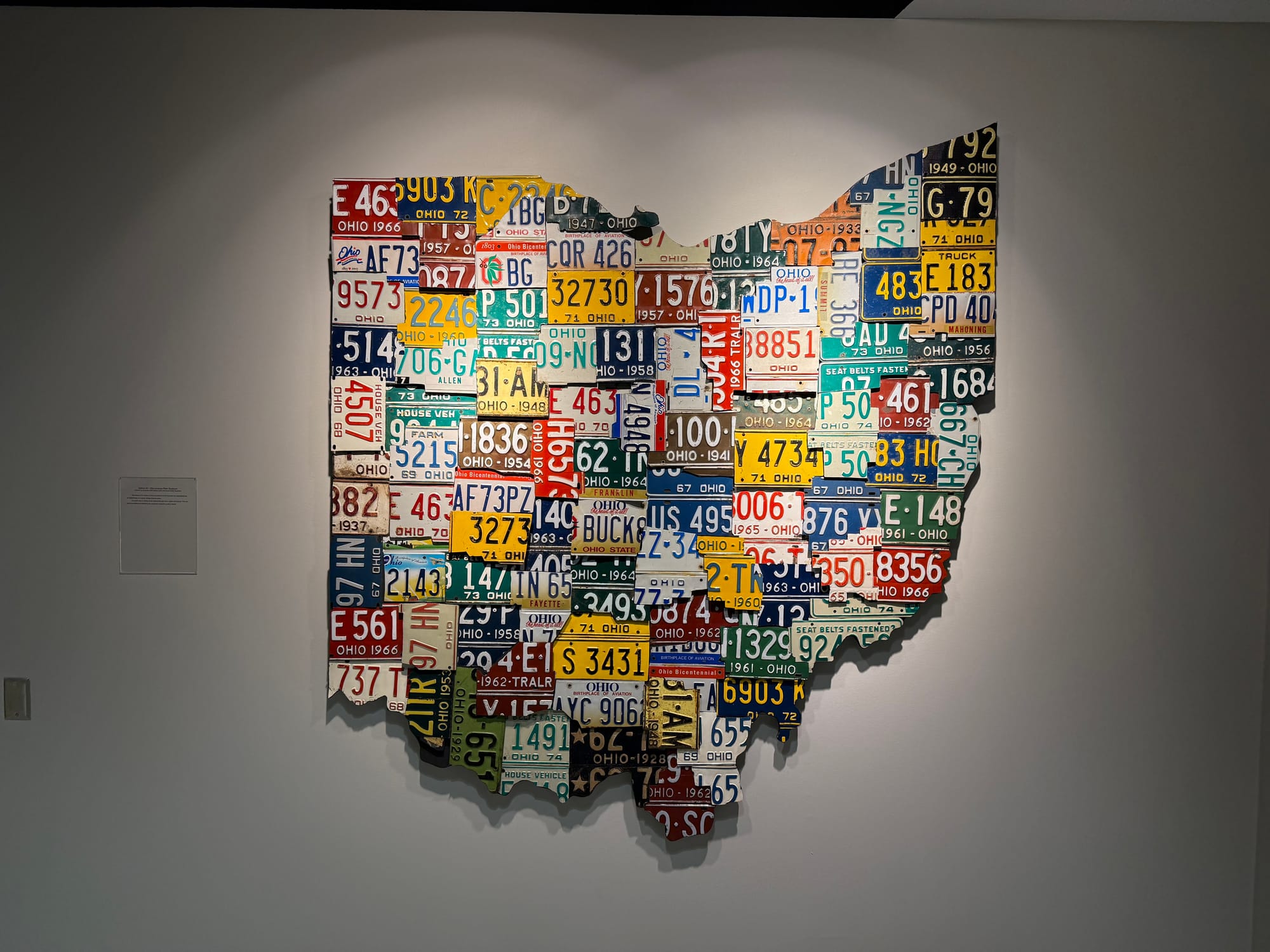
That yellow E183 in the upper right is in perfectly-square Trumbull County, where I went to high school.
When I saw that map, I thought it was a nice little visualization that I could include in the newsletter. But I soon discovered that there were much more interesting ones nearby.
Chapter 2, Part 2
Depicting dance on paper
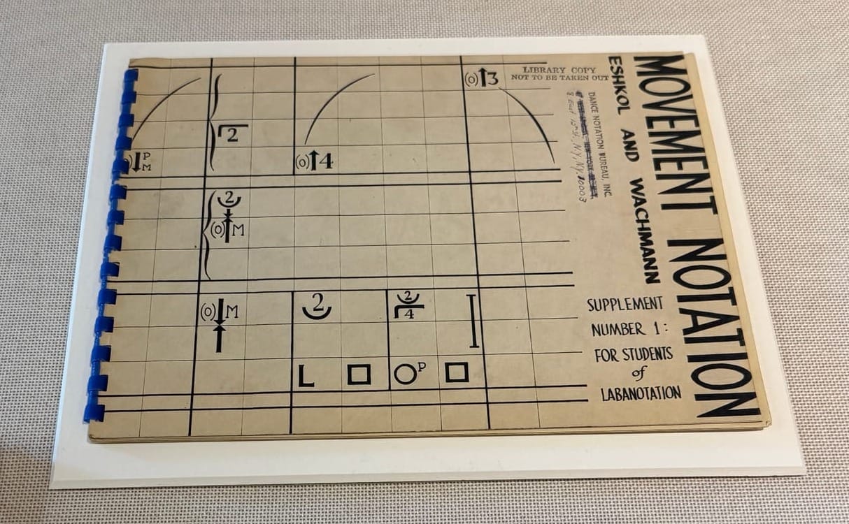
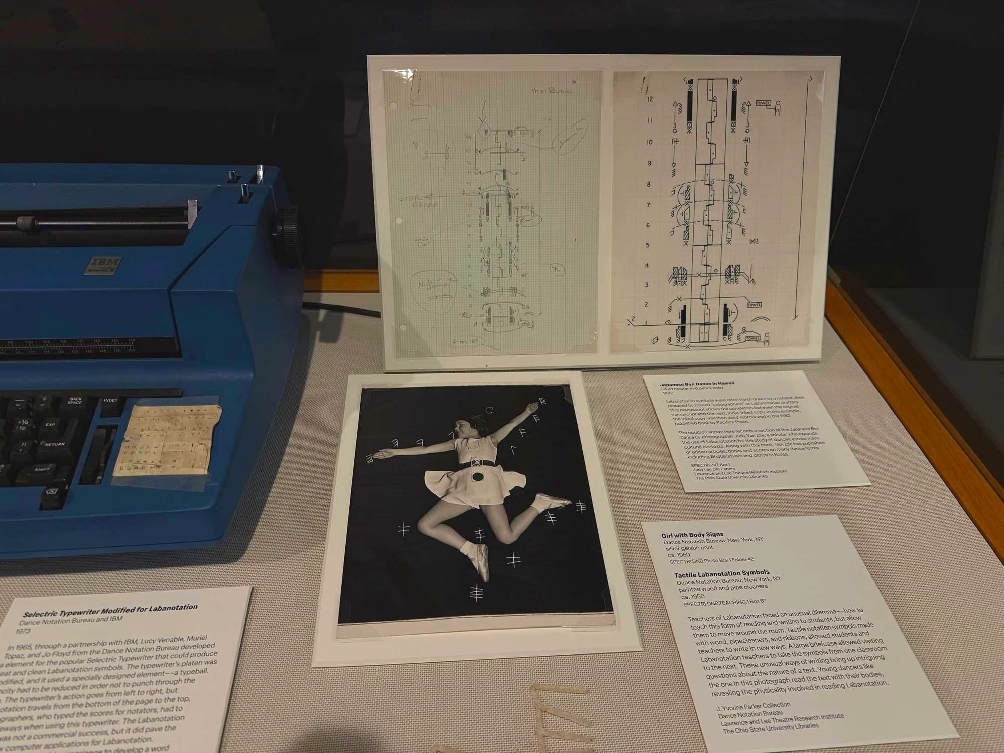
In the main library, there's currently an exhibit on Labanotation, the depiction of physical movement in written form.
As you can imagine, such depiction isn't easy. Music can be shown on paper by capturing the notes and tempo of what's to be played. But dance is a three-dimensional body with multiple appendages moving through space. It's a much trickier thing to formalize with a written language.
I spoke with Mara Frazier, the curator of dance for The Ohio State University Libraries and the organizer of the exhibit, who explained how the documentation form emerged.
"Labanotation" — named for choreographer Rudolf Laban — "originated in the expressionist dance movement of Weimar Germany in the 1920s and 1930s," she said, before it made its way around the world. Not entirely unimpeded: "During World War II, censors blocked correspondence thinking it was spy code."
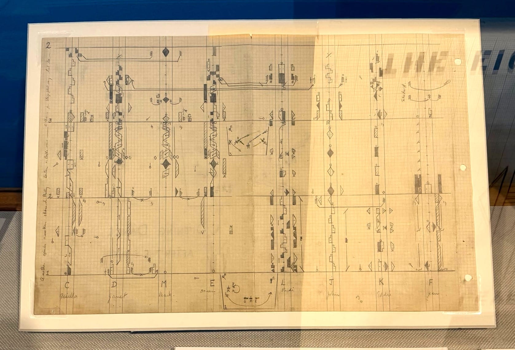
Being able to document choreography, Frazier told me, made it easier to establish a copyright for performances. At the exhibit (which runs through January), you can see notations for famous performances, such as the one above.
One of Frazier's favorite items in the exhibit, she said, is the IBM Selectric typewriter (seen below at left) equipped with a printing ball that allows for Labanotation. This technological development "played [a part] in imaginings about the potential of quantifying movement and the future of physical computing," Frazier said. (You see her discuss it here.)
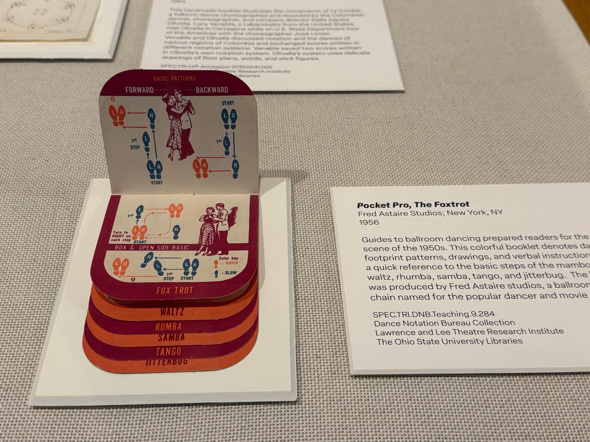
Documenting dance moves was not simply some arcane intellectual effort aimed at professional choreographers. Guides like the one below showed regular people how to perform popular dance steps, a simpler form of dance visualization that was much more common.
The eventual arrival of ubiquitous recording devices made Labanotation obsolete. There is less need to document a dance on paper when you can show it to someone on your phone.
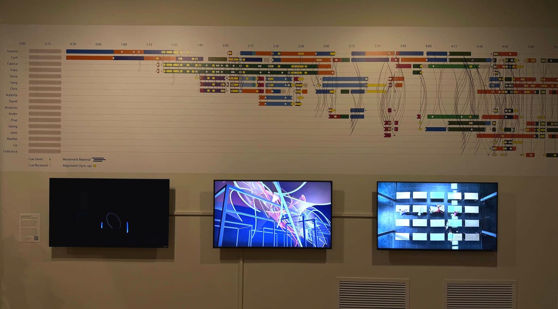
This is not the sort of thing that we usually think of when we think of data visualization. But unusual examples like this help remind us what the term means: making quantifiable information visibly comprehensible.
But I suppose this is the sort of thing that former university math students say.
Chapter 2, Part 3
When in Columbus, do as the Columbusites do
Anyway, being at Ohio State at this particular moment, it was inevitable that I should also consider the success of the football team.
Ohio State has been the top-ranked team in the country all year, and has repeatedly held opponents to single-digit or zero points. I was curious, then, how unusual this was: Were the 2025 Buckeyes enjoying the most dominant season of all time?
Well, no. They aren't even the most dominant team of this season — as of writing.
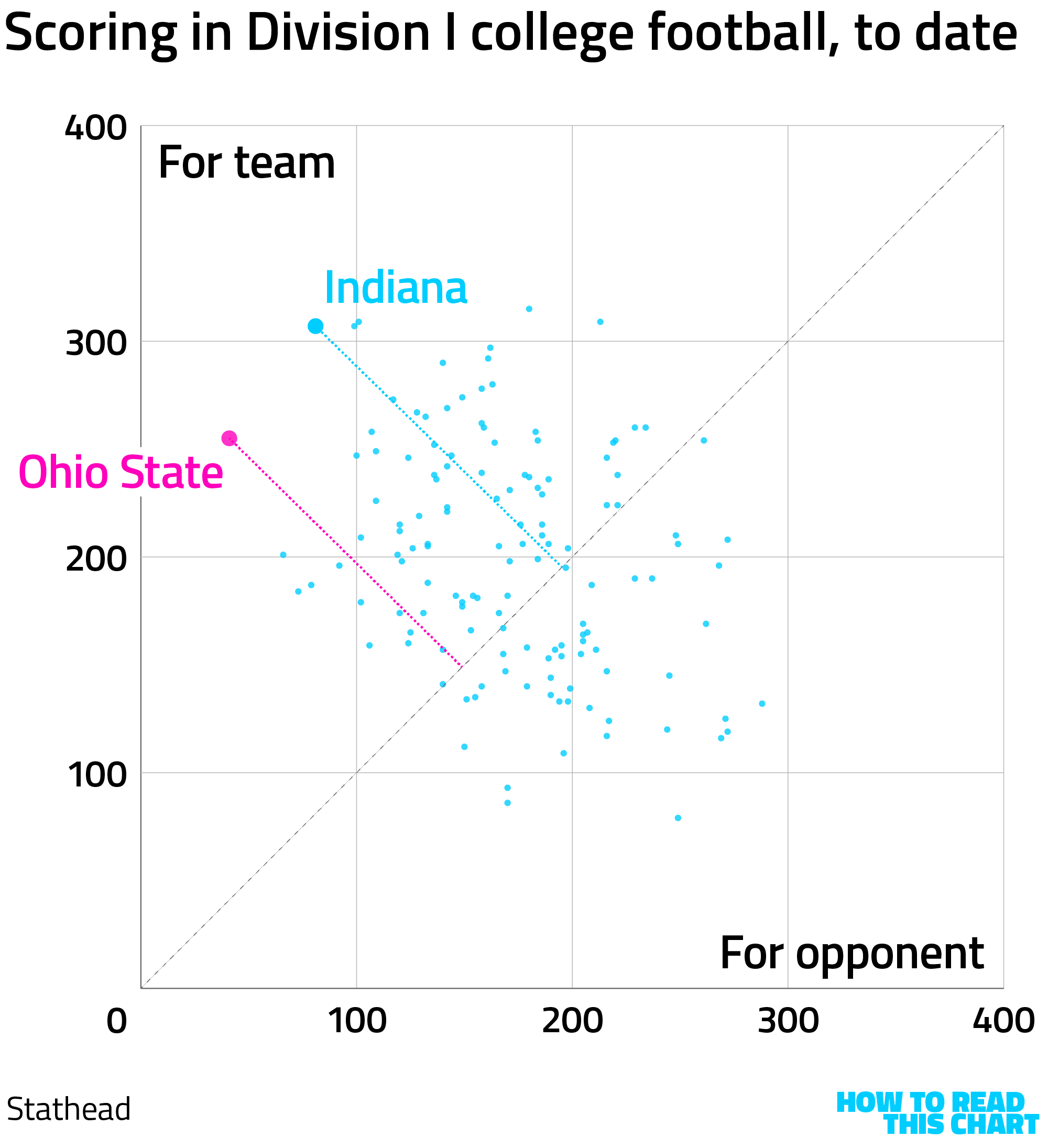
The metric I'm using here is points scored vs. points scored against. We can plot those two numbers for each of the 100-plus NCAA Division I schools. We get a nice, diverse little cloud of results, with some teams outscoring their opponents, the dots representing them sitting above the diagonal line. Some teams have been outscored; they're below that line.
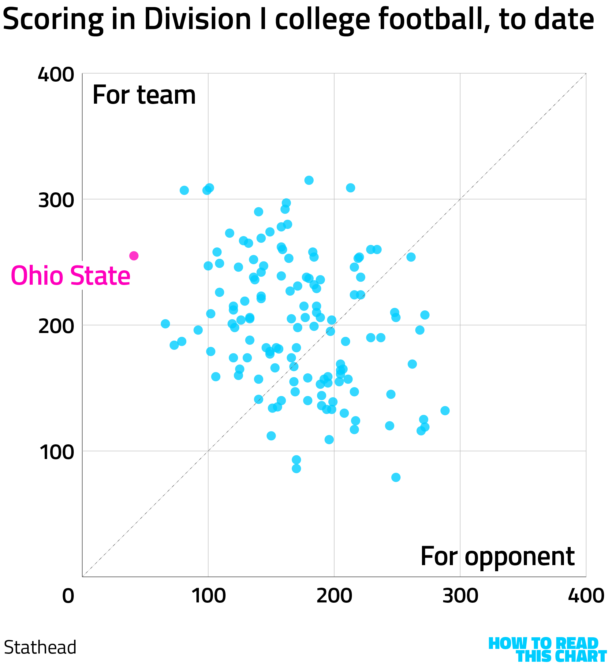
You can see Ohio State at far left. No school has had fewer points scored against them, to date this season. But other teams have scored more points, like number-two-ranked Indiana University. And the gap between Indiana's points scored for and against is larger than Ohio State's — represented visually by Indiana's dot being slightly further from that diagonal line.
It's interesting to consider how the five teams with the best for-against records and the five teams with the worst got to where they are. Week by week, points for and against accrue, with bigger wins shooting upward and bigger losses jutting further to the right.
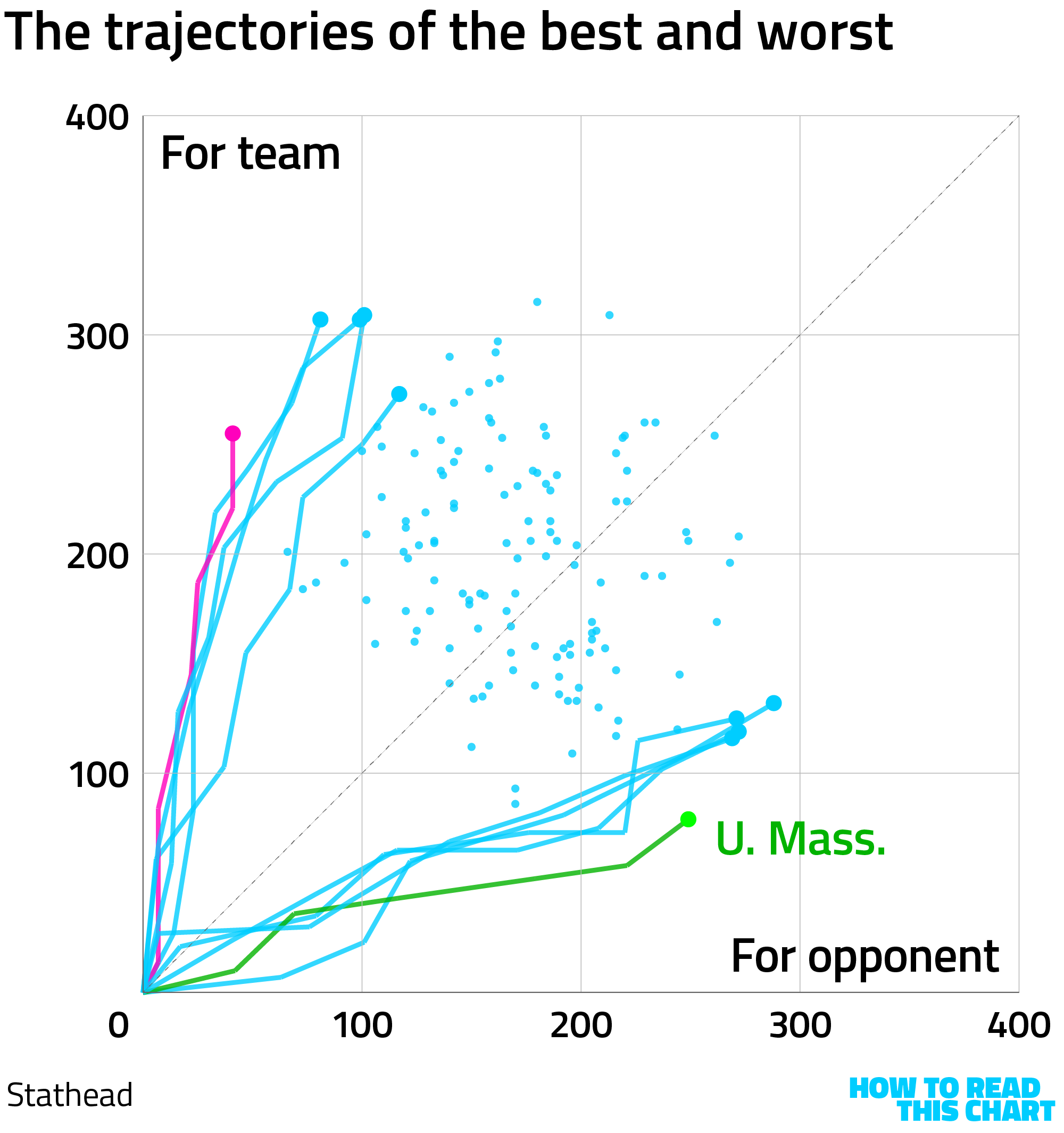
(I will note that the University of Massachusetts has the worst point differential of the season so far, a comment offered mostly because my friend Michael went there so this is a way to embarrass him.)
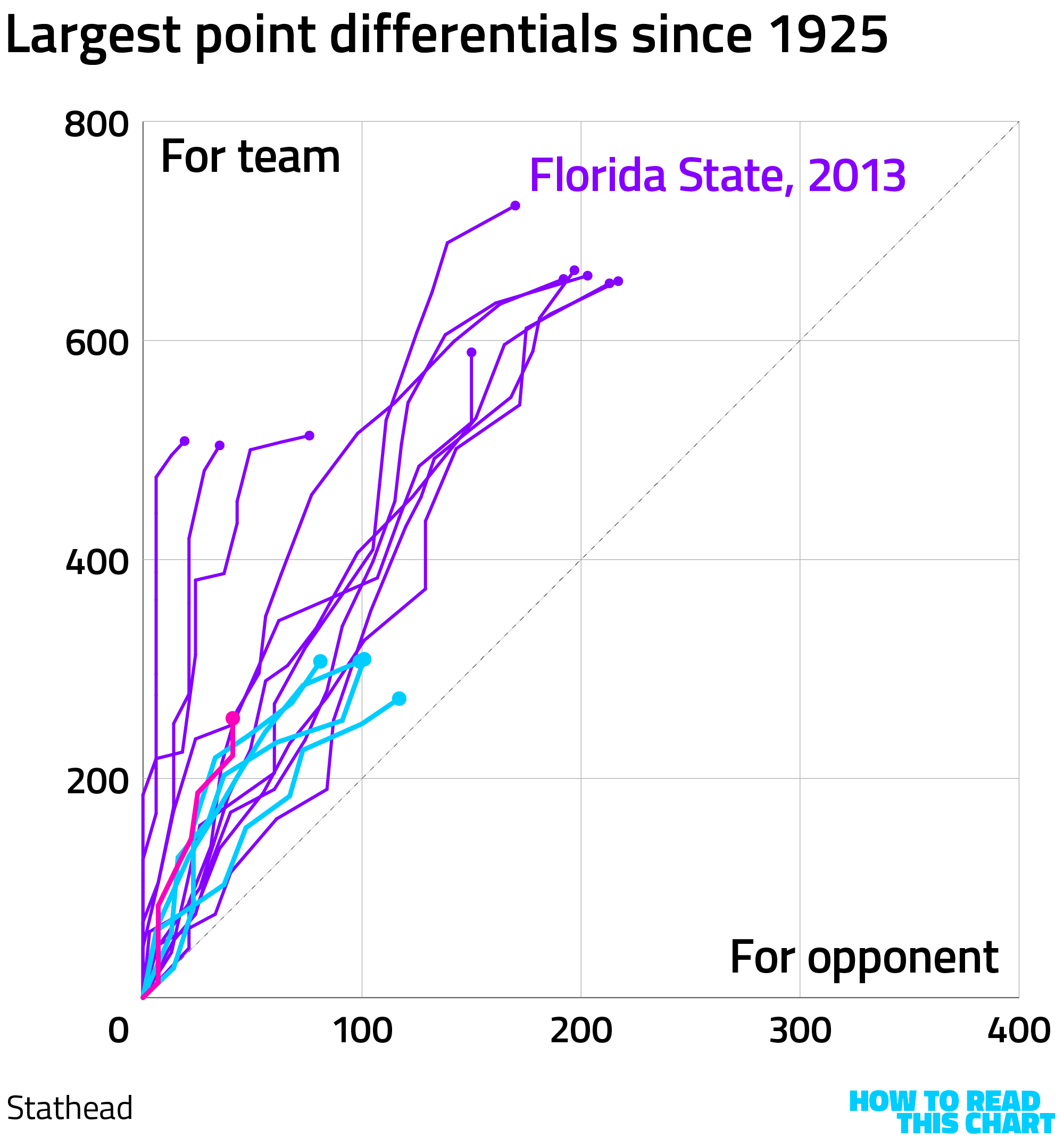
The season with the biggest for-and-against difference in the last 100 years was compiled by Florida State in 2013. And while that season included a lot more games than have been played to date, you can see how high up it shot over the course of the season. (This season's best teams are overlaid in blue, with Ohio State's 2025 season in pink.) (Just pretend it is scarlet.)
If you're curious why the chart above extends out to 400 points scored by opponents, it's because I also wanted to show the worst season since 1925. That belongs to another team from the Big Ten: Northwestern University, which had a remarkably crummy season in 1981.
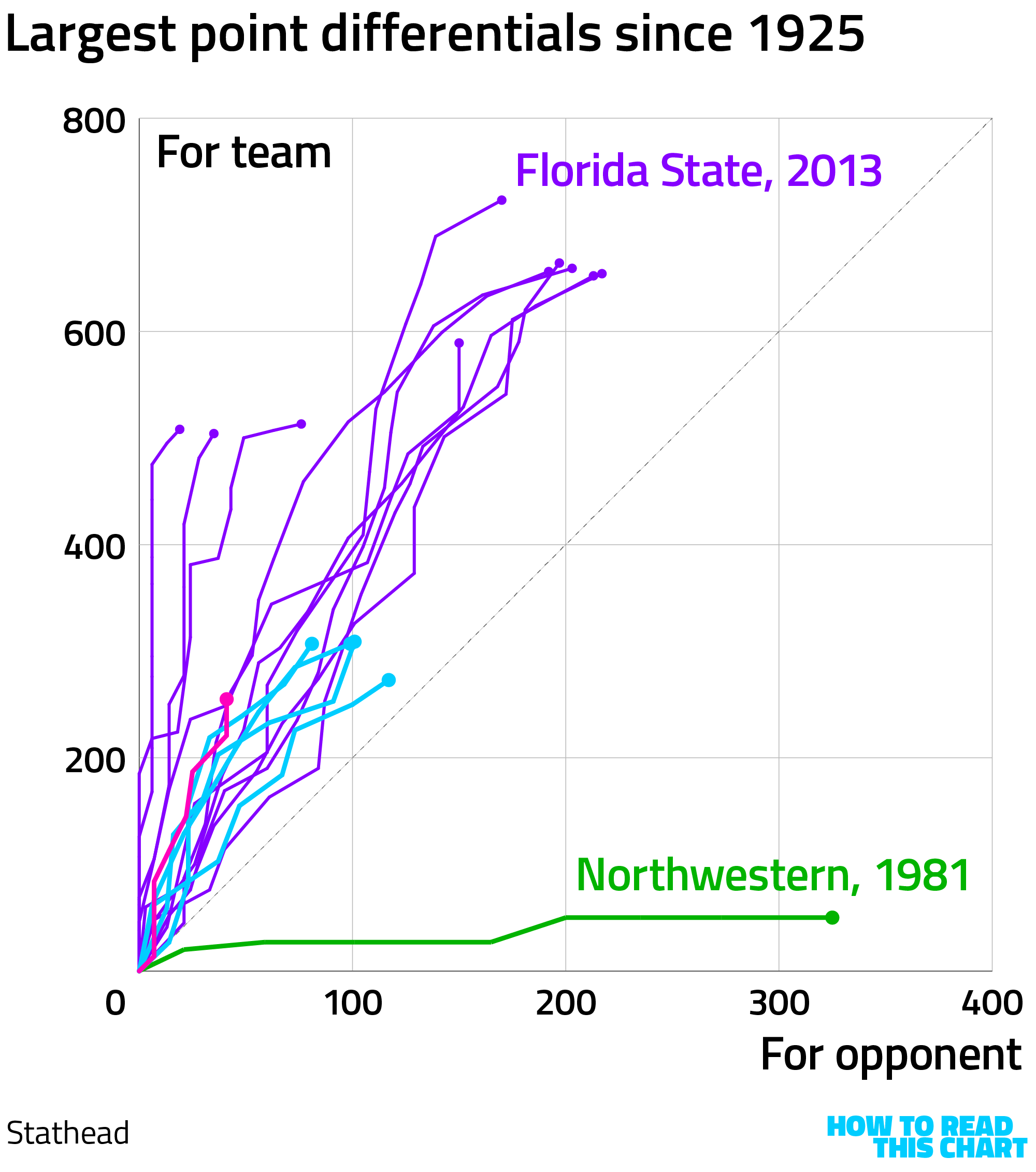
If you have any friends who went to Northwestern, feel free to show them that to embarrass them.
Chapter 3
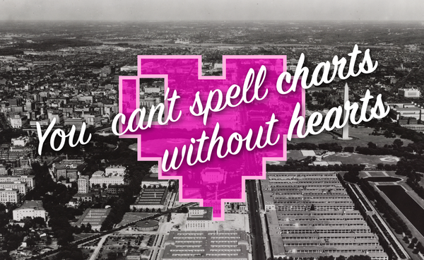
Chart Attack
Last week, I talked a bit about Alphadots, Bloomberg's chart-based word game. That prompted reader Brian Fremeau to point me to Chartle, another chart-based game in which you are given five chances to guess the country represented in a line chart.
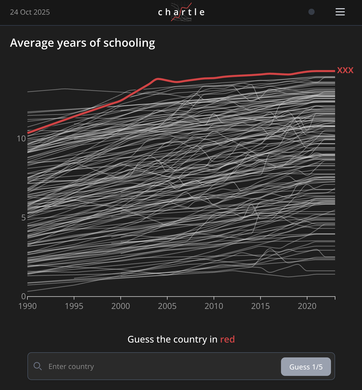
It's not quite as elegant as Wordle, given that your guesses don't really help you narrow down the answer. But, what, am I not going to promote a chart game? Come on.
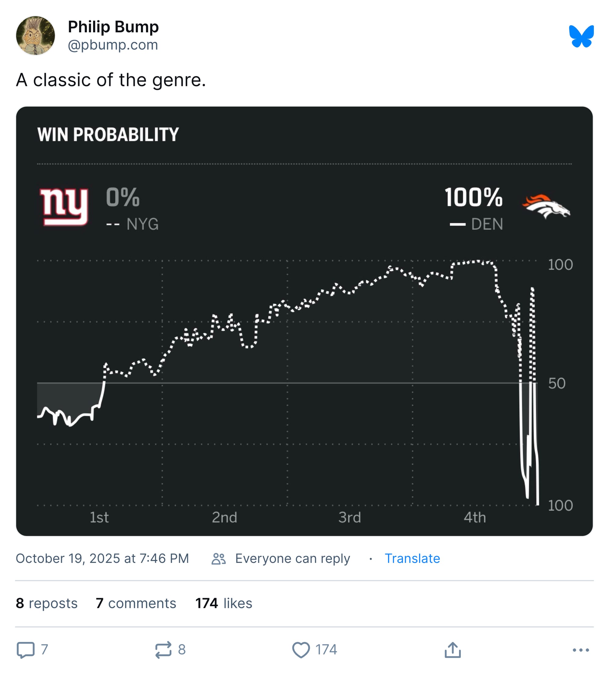
Speaking of me, I was impressed by the functional uselessness of the "win probability" chart for the Giants-Broncos game last week. The Giants were almost certain to win until they weren't and then were and then didn't. OK!
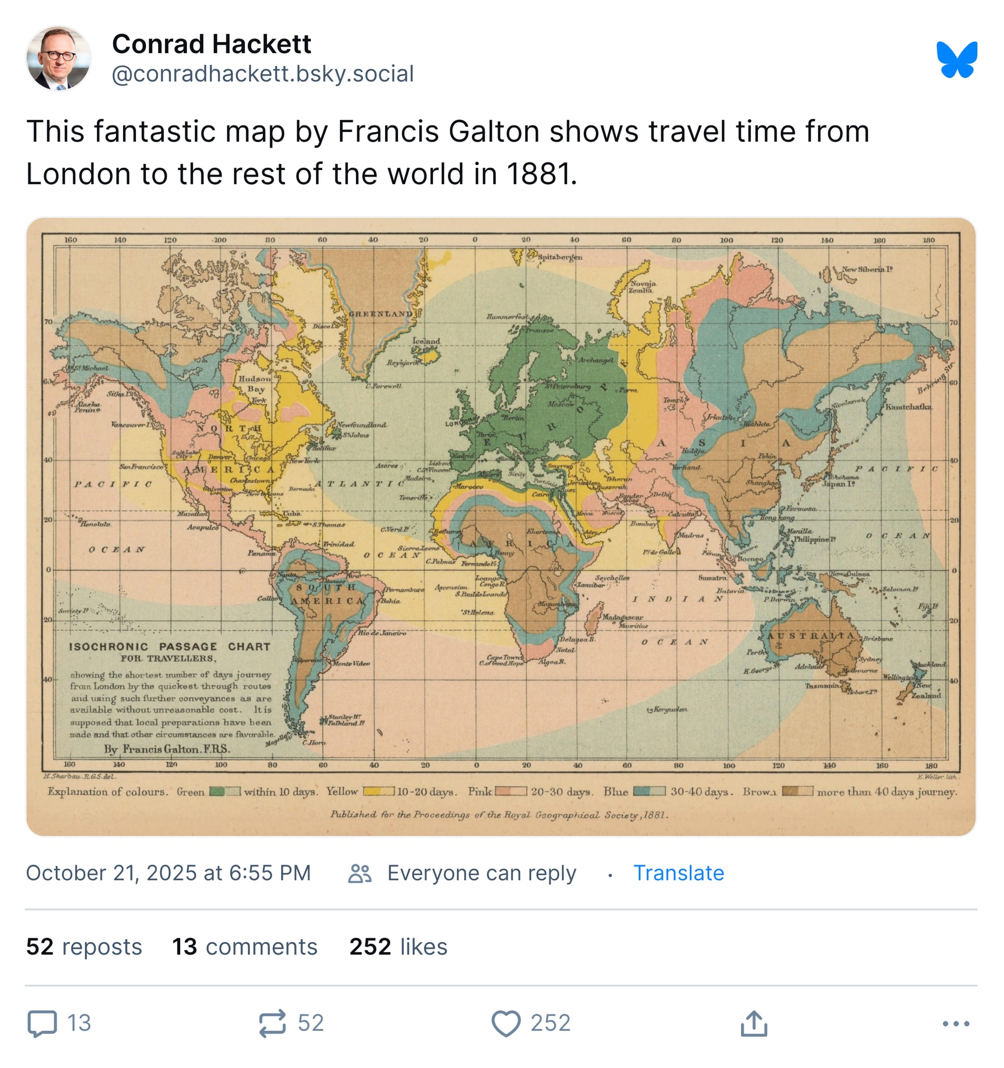
Pew Research Center's Conrad Hackett always has interesting visualizations to share and the map below is no exception.
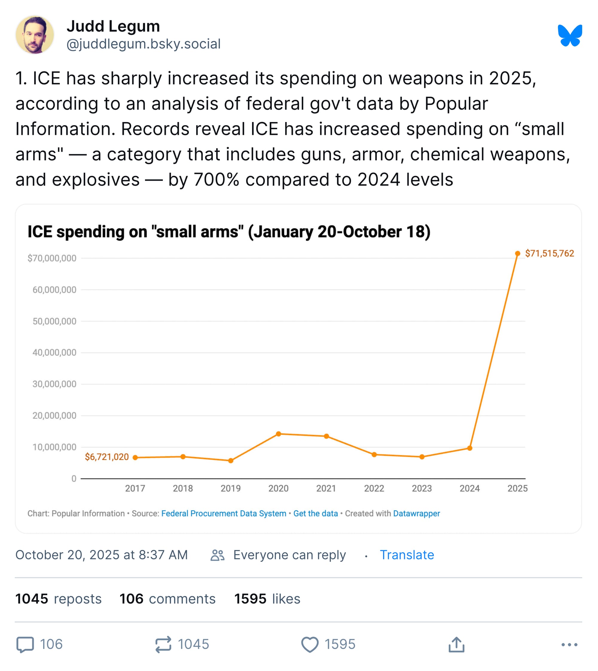
In contrast to that map's complexity and nuance, journalist Judd Legum shows how a very simple chart can make an important point effectively.
And while we are on the subject of visualizations that are as uncomplicated as they are grim…
Finally, we have a very helpful cartoon from xkcd, depicting the utility of objects (arrayed along the top) at shielding someone from various forces (arrayed from top to bottom) in a handy, pocket-sized guide.
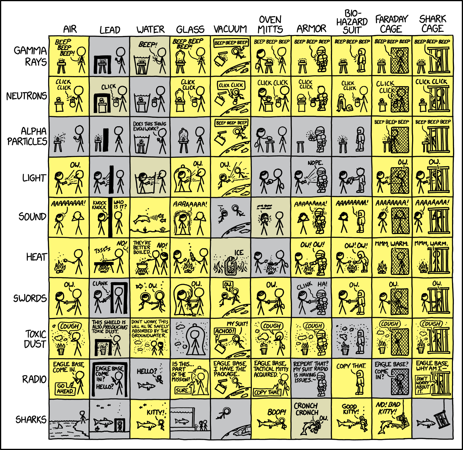
If you are facing, say, a shark and have in your possession only oven mitts, guide your mitt-covered fingers across and down until you reach the yellow square near bottom center. And then say a prayer to whichever god you and your community worship.
Appendix
Some other things I've written
As I mentioned, I was traveling this week, so next week I'll compile the results of last week's survey and start sending out subscriber rewards (including the photos of my big dumb dog).


You are receiving this email because you at some point in time volunteered to, either at Ghost or Substack or pbump.net or pbump.com. If you don't want to receive future emails, then I am afraid we cannot be friends. What you want to do is support the newsletter financially, right?
Another one is coming next week. Be prepared.