Where Trump's money comes from (and other mysteries)


This week's newsletter covers a range of topics: The president's complex network of companies, how weather has gotten worse, a new tool to visualize the whole world at once. But I did reserve some time to call out a terrible chart from Fox News, so stick around for that!
Chapter 1
Most presidents don't have several hundred businesses
As you may know, federal officials and their senior staff are required to file annual reports detailing their income and debts. These financial disclosures are both detailed and vague, offering a sweeping overview of the often-complex finances of our elected and appointed leaders, but lacking specificity on just how large or small their finances actually are.
It is a tool that is particularly poorly suited for the current moment, one in which a dozen billionaires at one point served as or for the president. Billionaires spend a lot of money to figure out how to shield their assets through legal complexity, and boy is that obvious from their financial statements.
I raise the subject because ProPublica this week published a useful database of federal financial disclosures. It allows you to search the records of specific officials or to, for example, search for specific corporations in which multiple officials have invested. Would you be surprised to learn that 1 in 11 of the 1,500-plus officials included in the dataset have invested in Palantir? You probably shouldn't be.
ProPublica's work reminded me that it had been a bit since I looked at President Trump's financial disclosure. Back in 2019, I created a visualization of the complex network of limited-liability corporations (LLCs) that Trump's advisers had created to (presumably) shunt cash around. It was eye-opening, particularly as his allies began claiming that a few dozen LLCs created by then-President Joe Biden's son suggested nefariousness. Trump had hundreds.
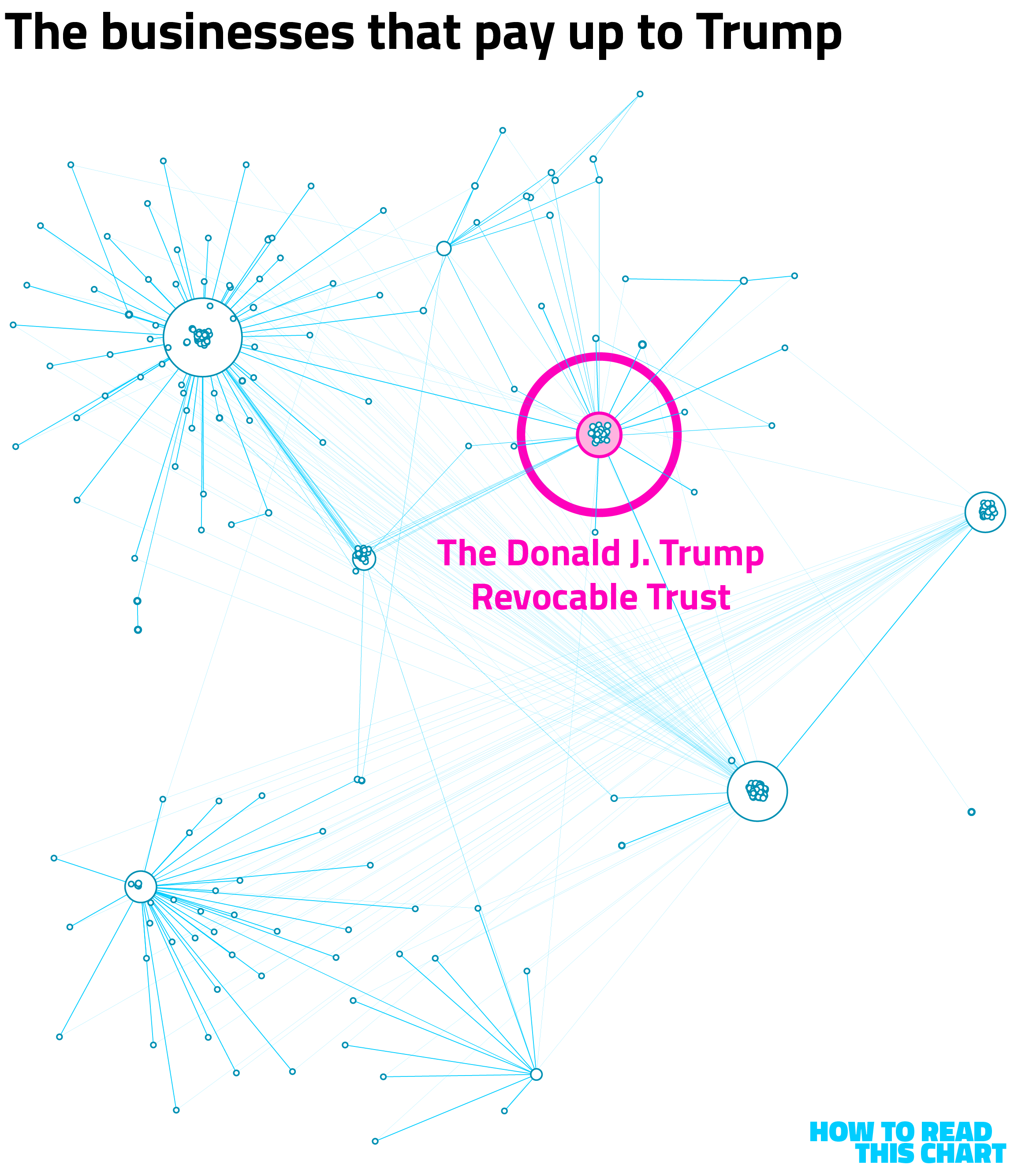
According to his financial disclosure, he still does. The form requires that officials detail assets and income vehicles, including data on ownership. The chart below shows how those entities intertwine for Trump — nearly 400 of them that feed into one another and to Trump, his family and third parties.
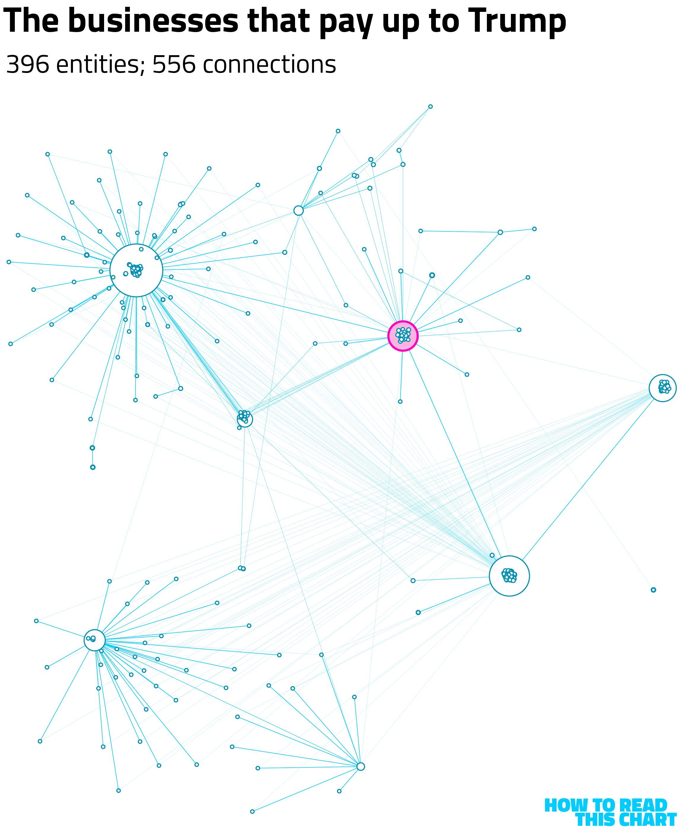
The size of each node on the graph above is determined by the number of other entities in which it has an ownership stake. See, each LLC has one or more owners, creating the lines between the circles. The thicker the line, the larger the stake (from 0.01 percent to 100 percent). To be clear, every node is included because it is identified as being owned by Trump (almost all of them) or owning part of an entity also owned by the president.
The highlighted pink circle on that chart is the trust that was created for Trump before he entered the White House during his first term. The idea was that this would introduce a layer of abstraction between him (as president) and his income (as a business owner), though experts at the time and since didn't think it would actually do much.
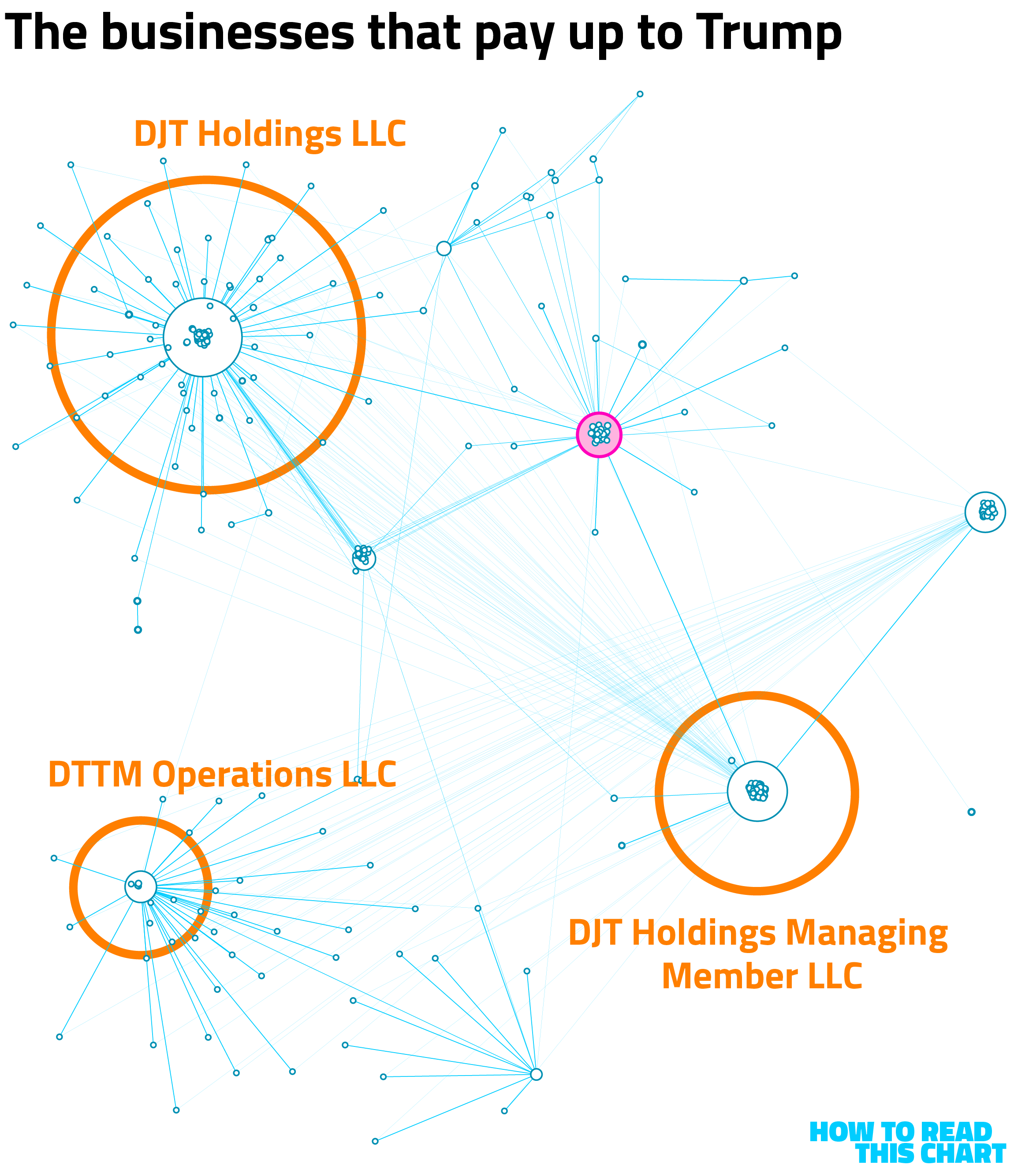
There are several other LLCs that serve as parents to large numbers of entities. They're given generic names — DJT Holdings, DTTM Operations, etc. — presumably because they exist not as brands but as legal structures.
At some points in this network, there are seven layers of LLCs through which income does or did flow. If we reorient the visualization above to be a tree map, you can see the entities that have no identified parents in the report. Beneath, the entities they "own," all the way down.
On that top layer, I've flagged Trump himself and the trust. I also called out TMTG — Trump Media & Technology Group, the company that owns and runs Truth Social. Beneath that layer? 387 other LLCs
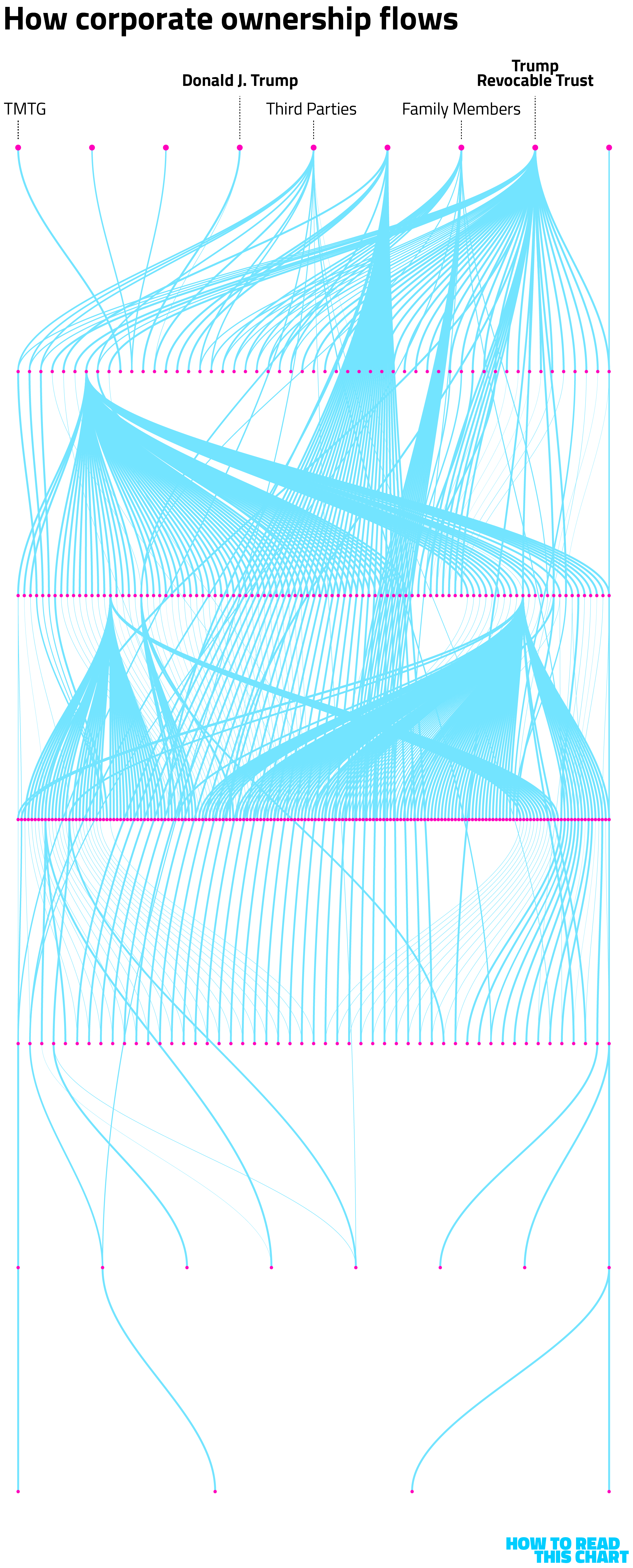
To see how all of this works, consider one of the LLCs that sits furthest from the top. Trump Ruffin Commercial LLC is owned by Trump Ruffin Tower I LLC which is owned by Trump Ruffin LLC which is owned in part by Trump Las Vegas Managing Member LLC which is owned in part by DJT Holdings LLC which is owned in part by DJT Holdings Managing Member LLC which is owned by The Donald J. Trump Revocable Trust.
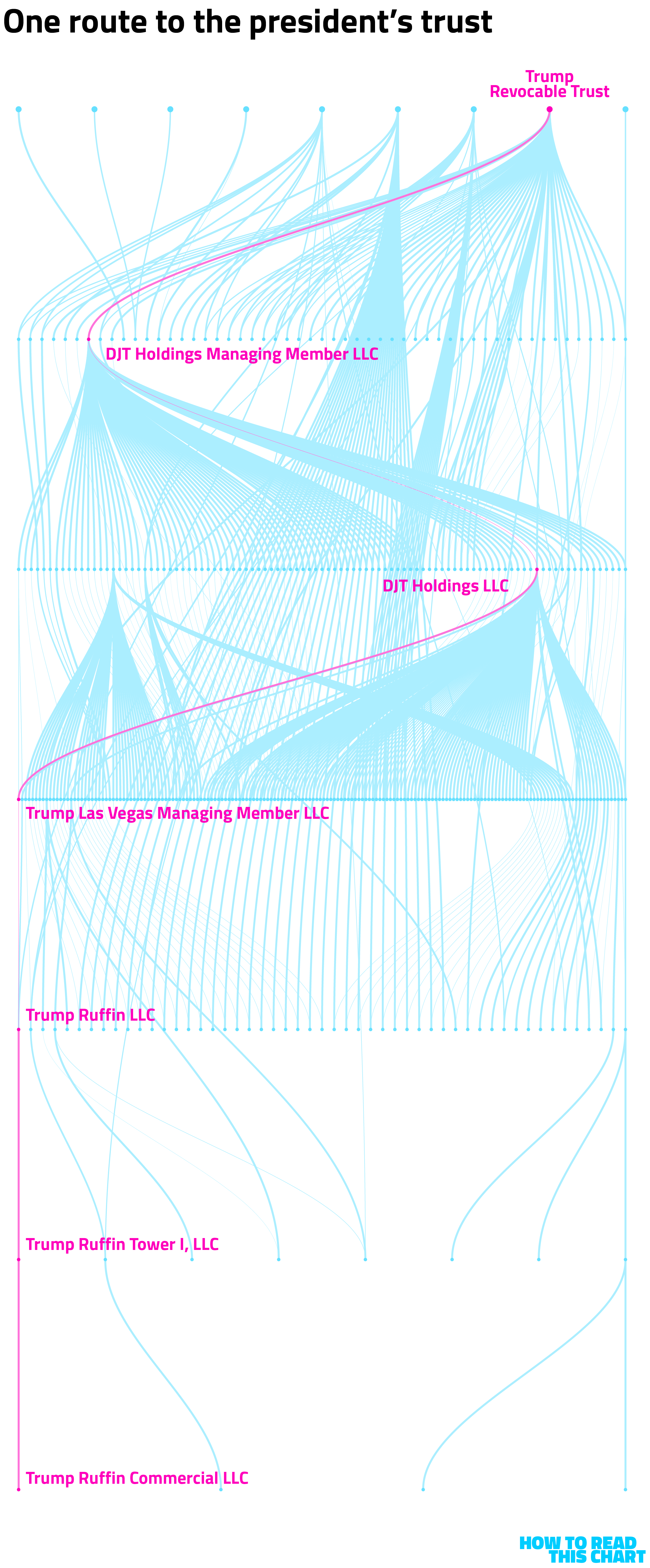
Couldn't be more straightforward, right? Really gives you a good understanding of the president's income stream. And here people were worried about possible corruption.
Chapter 2
A century ago, people noticed that winter was getting warmer
Washington D.C.'s famous cherry blossoms will be blooming later than normal this year because this winter has been colder than normal. But, of course, "normal" is relative — and our current normal is, relative to the grand sweep of the ages, hardly normal at all.
This abnormal normal is itself not new. Meandering through the New York Times archives this week, I found a story from a 1939 issue of the Times Magazine, musing about the increasing warmth of Northeastern winters. They were a bit off on the cause (proposing, for example, sunspot activity), but nailed the trend.
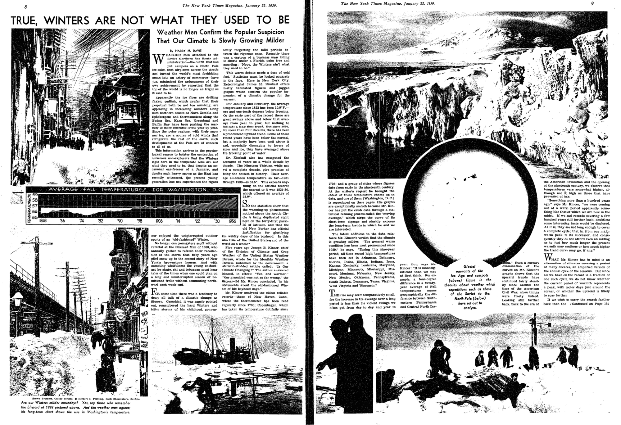
You can see that on the chart included in the article. Autumn temperatures in the nation's capital had risen from the mid- to upper-50s over the course of the prior eight decades.
(As always, I can't help but marvel at the creation process here. This is hand-drawn, each point and variation plotted and connected, with that terrific hand-lettering. Would I have made this chart a bit taller? Yes, but, first, I am not the person who was the editor of this article 87 years ago and, second, if you want to hear me complain about charts, just scroll down a bit.)
There's an obvious follow-up question here: What happened to the pattern after 1937, the last year for which data is shown on the chart? And there's an obvious answer: It continued.
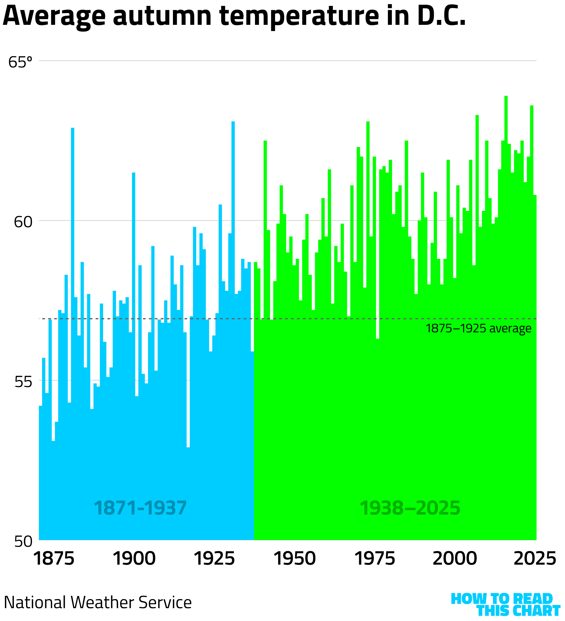
Since then, there have been only three years during which D.C.'s average autumn temperature was below the average from 1875 to 1925. 2025 was the coldest autumn in more than a decade — and it was still more than three degrees above the 1875-1925 average.
I'll add that, after reading that Times article, I think I might have solved another mystery. It's written as a validation of the idea that winters were not as wintry as they used to be. So it could be that the popular "I had to walk to school through the snow, uphill both ways" trope in which older people complain about how easy kids have it these days is rooted in an understanding that winter really was harsher when they were young.
The uphill thing is still garbage, though.
Chapter 3
An actual everything app
Elie Habib's day job has him running a streaming-music company. In his downtime, though, he completed another project: compiling enormous amounts of realtime data into a browser-based monitoring tool.
Called (appropriately enough) World Monitor, the tool compiles a wide range of publicly available information — news feeds, news broadcasts, webcams, AI-driven analysis — into one busy, apparently-intentionally-overwhelming dashboard.
It looks like this.
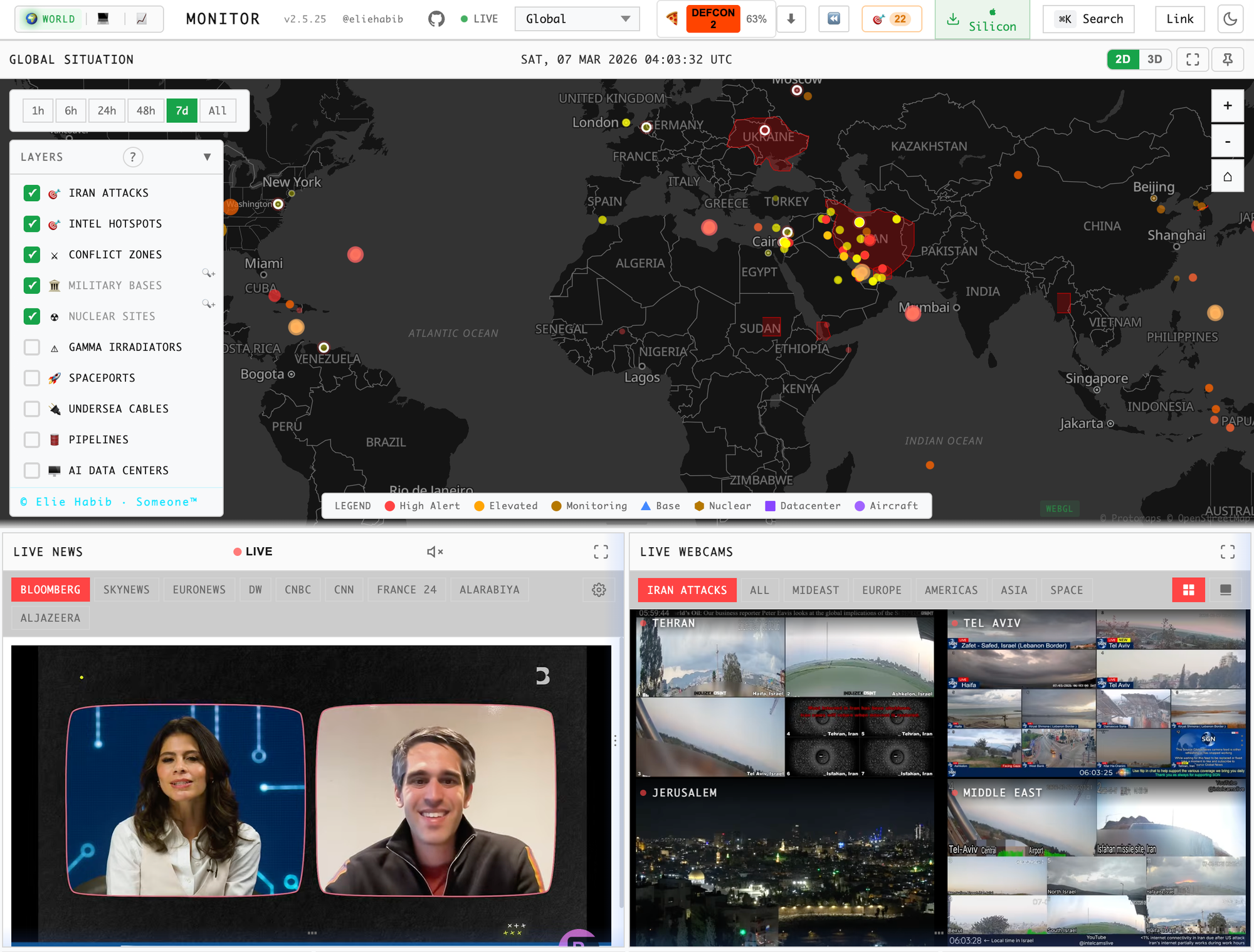
"I needed something that showed me how these events connect to each other in real time," Habib told Wired. "The existing OSINT tools" — open-source intelligence — "that did this cost governments and large enterprises tens of thousands of dollars annually." So he created an aggregation that costs users nothing at all.
If you click on elements of the map, more information pops up: updates on conflicts, magnitudes of earthquakes, whatever bit of additional data popped up as part of the monitoring system.
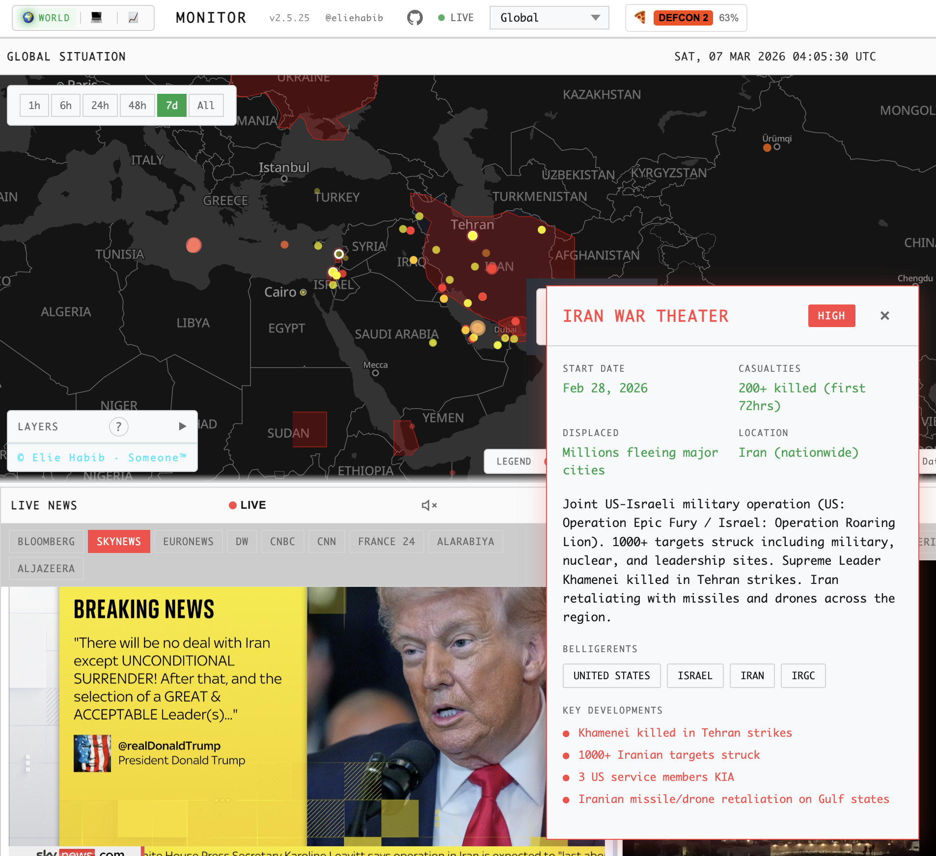
I will admit that I'm not entirely clear on the functional utility of the tool, just as I'm not entirely clear what the arrays of small, colored, incandescent bulbs set into Cold-War-era control panels were meant to do. As with those lightbulbs, though, I do enjoy looking at it.
Chapter 4
This is not a good chart
People sporadically send me charts from around the internet that they find confusing or sloppy. Sometimes, I find them myself.
The chart below falls into that latter category. Created as part of a news article conveying the results of a new poll from Fox News, it delineates the frustrations people have with the system of taxation in the U.S. For some reason, though, the designer chose to illustrate those results with five slightly different shades of green, conveying less that there are differences in peoples' views than that you can make a pretty gradient of dollar signs if you want to.
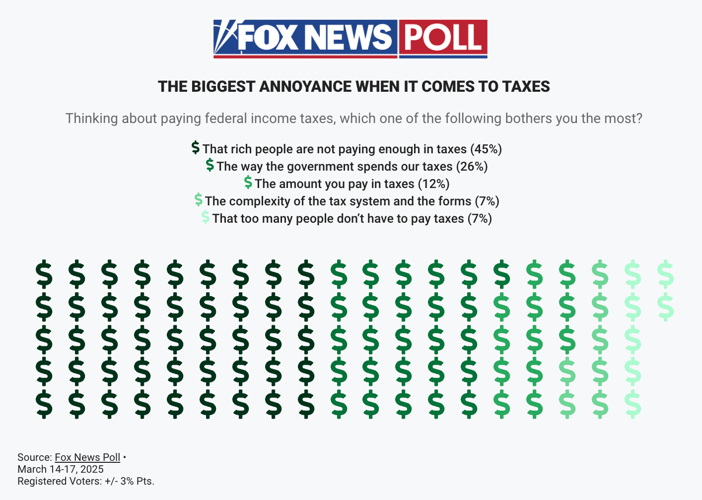
Compare that presentation with my version. I am obviously not immune to creating overly complex charts that occasionally don't land the way I hoped, but, in this case, I think that the direct approach works perfectly well (and much better than the original).
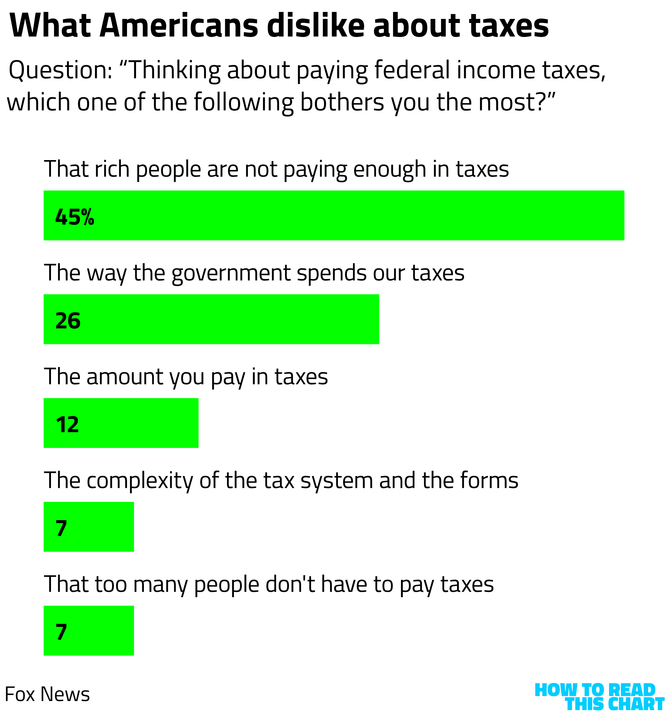
What the original Fox graphic obscured is that frustration with rich people figuring out loopholes to avoid paying more is the most common complaint about taxes in America. To emphasize this point, I have read that one prominent American set up literally hundreds of different corporate entities that help reduce his tax burden. We can only hope that our leaders in Washington will take note and then take action.
Chapter 5
Chart Attack
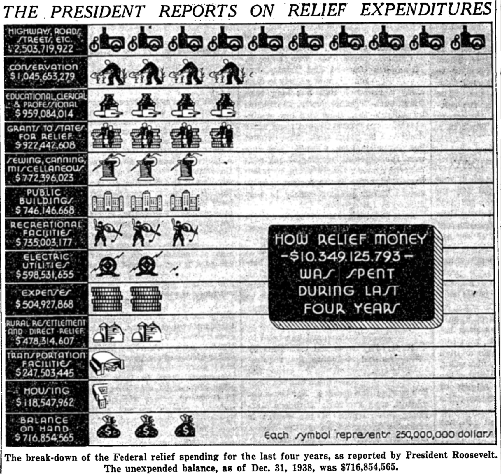
As I was perusing that 1939 issue of the New York Times, I also came across this chart of federal spending during the Roosevelt administration. Again, I am deeply enamored of the lettering and iconography. The $118 million in housing funding — $2.8 billion in 2026 dollars — isn't too shabby either.
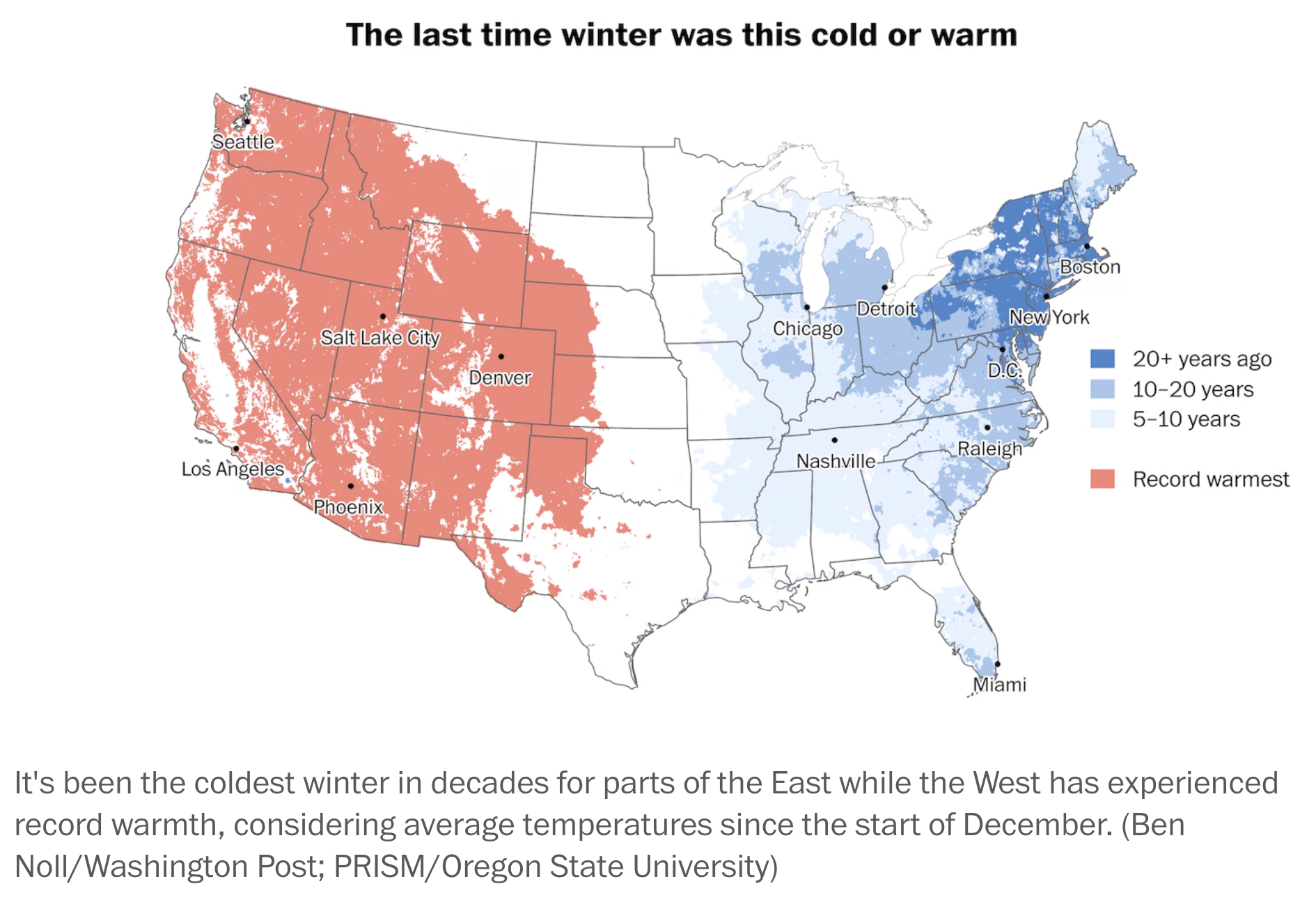
In another follow-up to the D.C. weather chapter from this newsletter, The Post also created this terrific map of the winter's abnormal weather. On the East Coast, it was far colder than normal; in the West, far warmer.
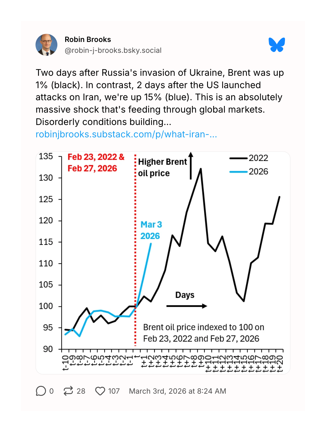
The Don't-Call-It-A-War in Iran is now one week old, meaning that we are starting to get useful data visualizations about the effects of the conflict. On the map below, we can see the effects of two conflicts: airplanes squeezed into the relatively safe channel between Iran and Ukraine as they head from Europe to Asia and back.
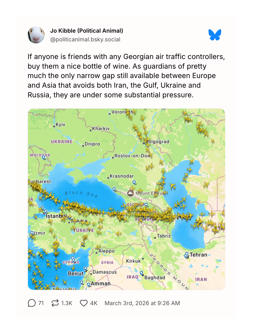
One place where there is not heavy traffic is the Strait of Hormuz…
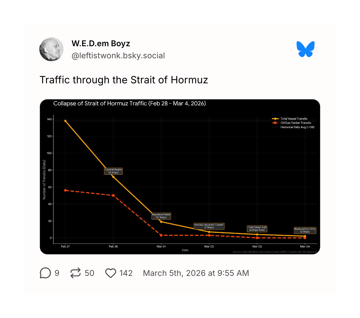
…which is a central reason that oil prices are spiking even faster than they did at the outset of Russia's expanded invasion of Ukraine.
Here at home, Friday gave us a lousy jobs report — a reflection of the reality (covered by the Times's Ben Casselman) that the federal bureau responsible for collecting this data is still doing so in an objective way.
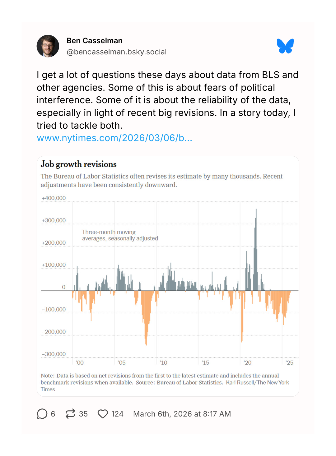
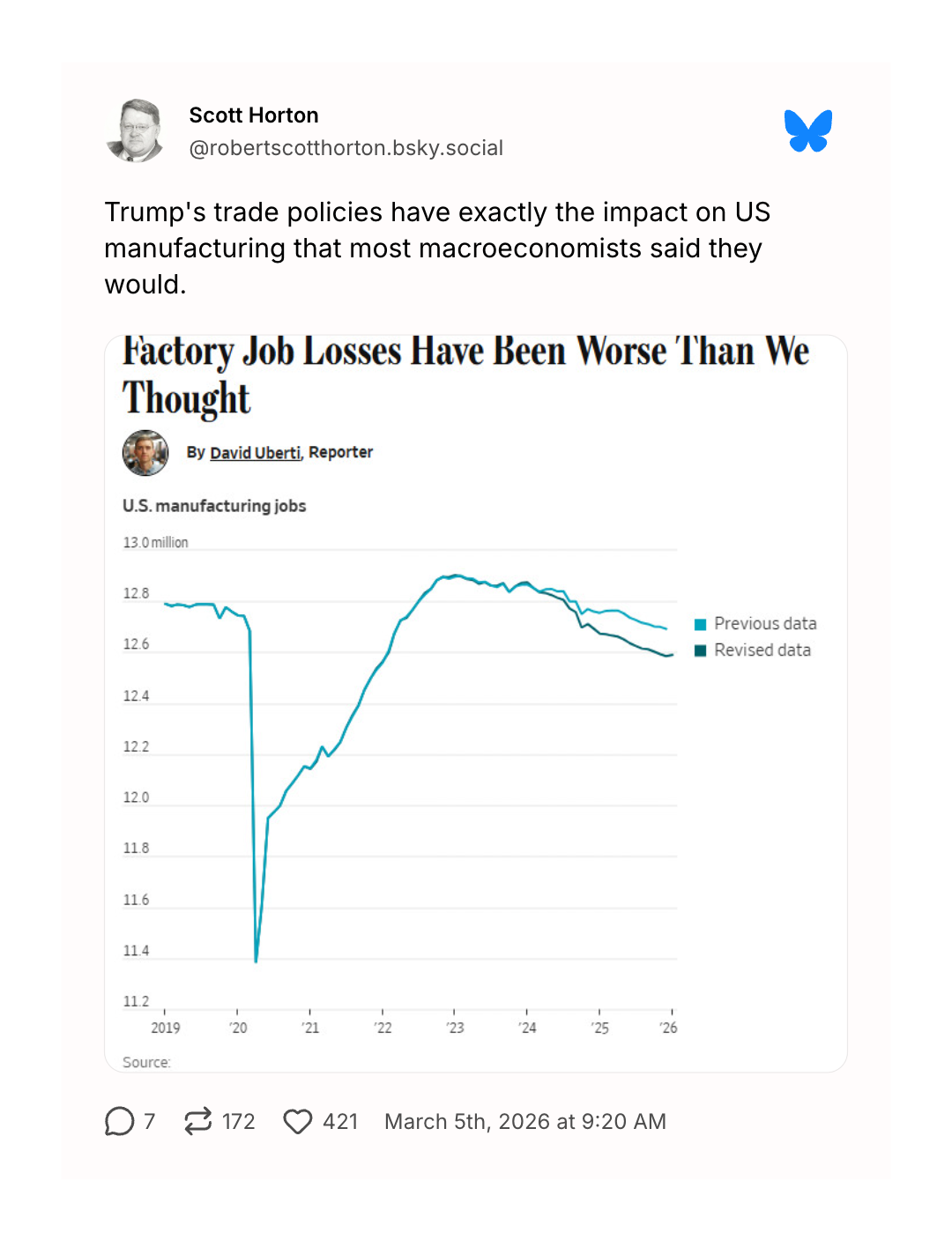
At the beginning of every year, the government revises the prior year's employment data to reflect population changes. The most recent revision revealed that Trump's promised manufacturing revival was even more of an un-revival than previously understood.
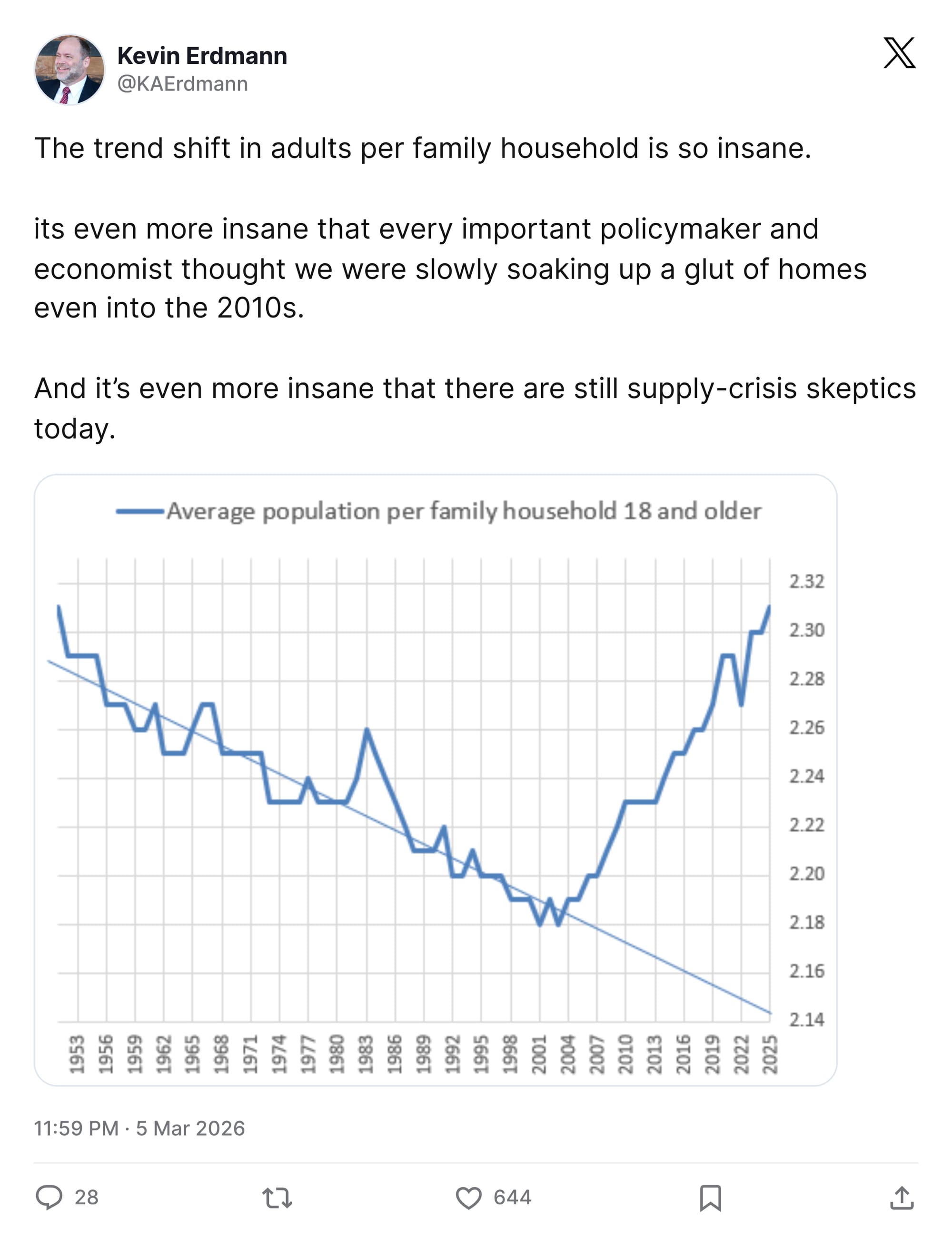
Writer Kevin Erdmann created a useful graph showing the increase in adults living with other adults (often their parents). Perhaps investing $2.8 billion (in 2026 dollars) might shift that trajectory? Just spitballing here.
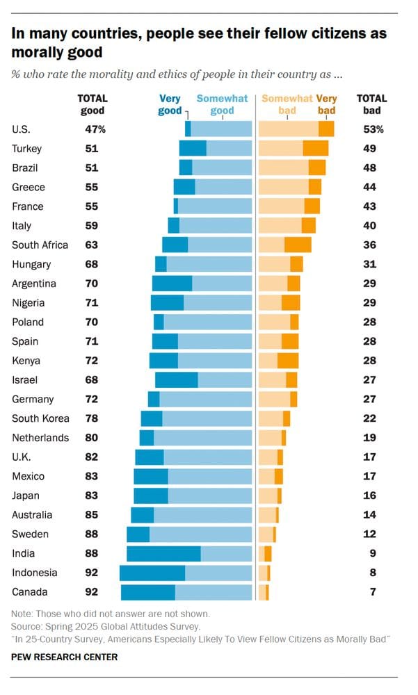
You may be surprised to learn from new Pew Research Center analysis, that the U.S. is the only one of 25 surveyed countries in which residents were more likely to see their fellow citizens negatively than positively. Or perhaps you weren't surprised by that, because you are bad. (That's a joke; any subscriber to/reader of this newsletter is definitionally Good™.)
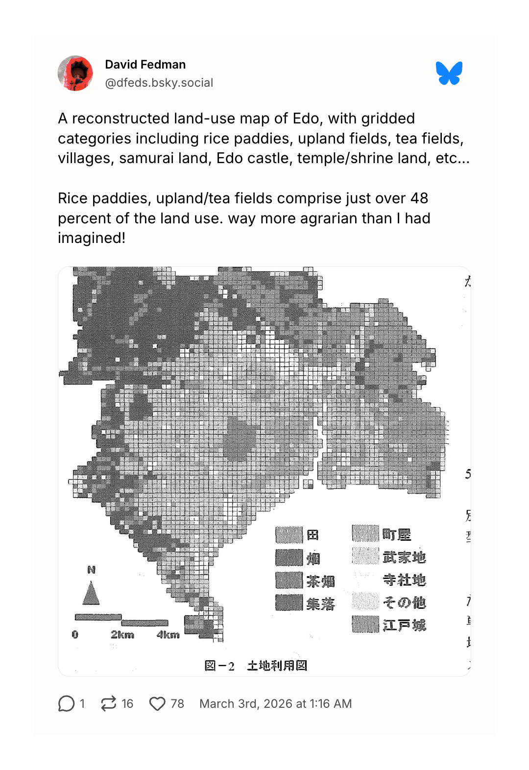
My Japanese is poor (read: non-existent) so I can't say that I understood this map at a glance, but I do appreciate the aesthetic which looks like something that would have popped up on the monitor of my IBM PC in 1986. How to read this chart? わからない。
We'll close with a data visualization that I highlighted in the prior iteration of this newsletter. Installed at the Sies + Höke gallery in Düsseldorf, it is connected over the internet to a buoy plunked down in the Atlantic off the coast of France. As the actual buoy moves, so does the one in the gallery.

This, the gallery explains, serves as "a barometer of nature’s moods." Add it to the World Monitor, stat.
Appendix
Some other things I've written


You are receiving this email because you at some point in time volunteered to, either at Ghost or Substack or pbump.net or pbump.com. If you don't want to receive future emails, it's probably just because you're so busy keeping track of all of your LLCs.
Another one is coming next week. You have been warned.