Whaddaya mean, 'home'?

"You can't go home again," Thomas Wolfe wrote, but he didn't have geopositioning tools on his cell phone.
Chapter 1
Sorry about your luck, kids.
So the president of these United States, one Donald J. Trump, participated in a Cabinet meeting this week, at least until he got a bit sleepy. Before being "caught in a blink," Trump offered his assessment of housing prices.

"I don't want to drive housing prices down," he said — as seen in the admittedly off-putting animation above. "I want to drive housing prices up for people who own homes."
You don't need to be a stable genius to understand where the winners and losers are in this scenario. If you own a home — and particularly if you own a few, maybe one in Manhattan and one in West Palm Beach — this sounds pretty good. If you are someone looking to buy a home, though? Oh well!
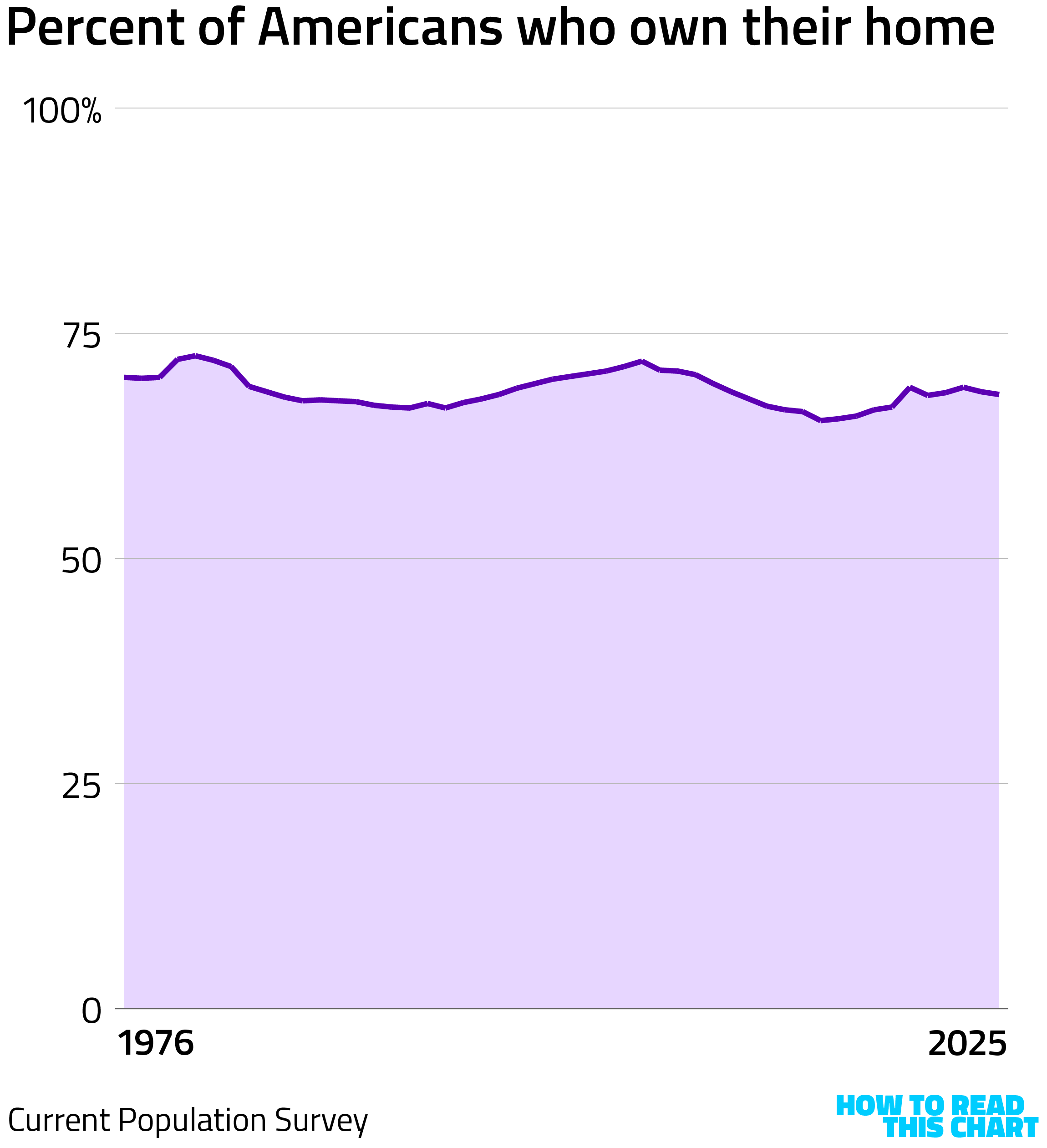
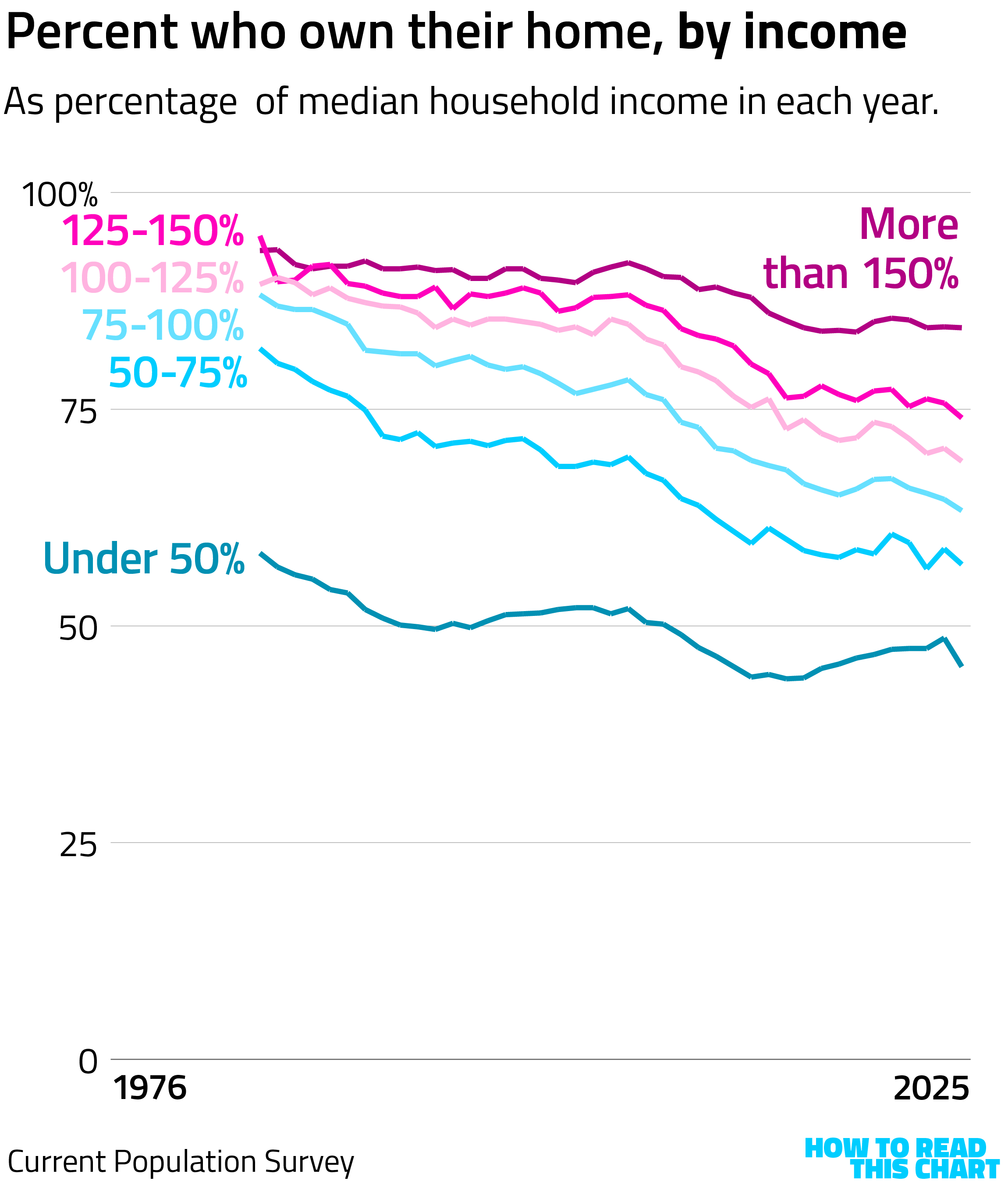
Using the excellent repository of Census Bureau information at IPUMS.org, I grabbed data on home ownership in the U.S. over time. Most Americans live in homes that they own or for which they have a mortgage. But many do not.
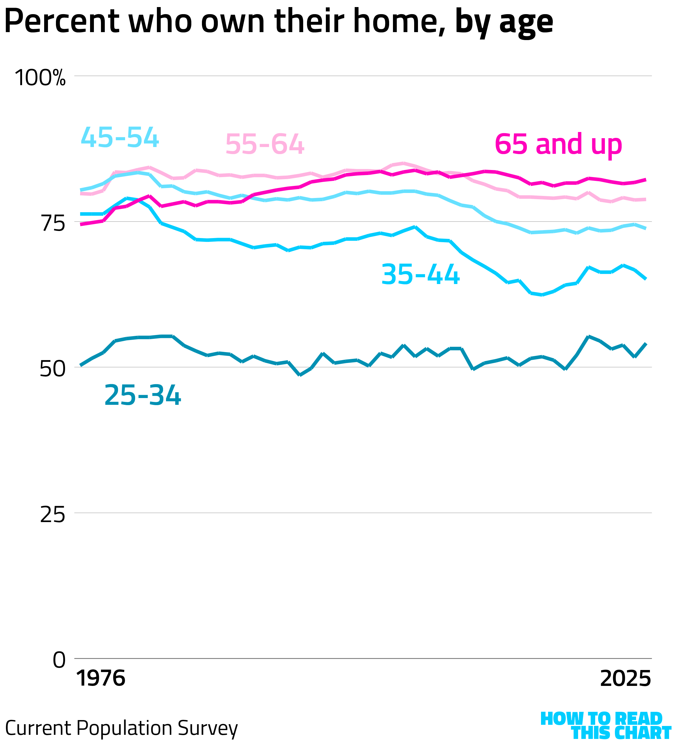
As you might have guessed, there are some differences by age. Young people are much less likely to own homes, and those aged 35 to 44 are less likely to now than they were before the recent recession. (One moment [holds earpiece] — I am being told that the Great Recession was nearly 20 years ago, which can't be right. I'll keep you posted.)
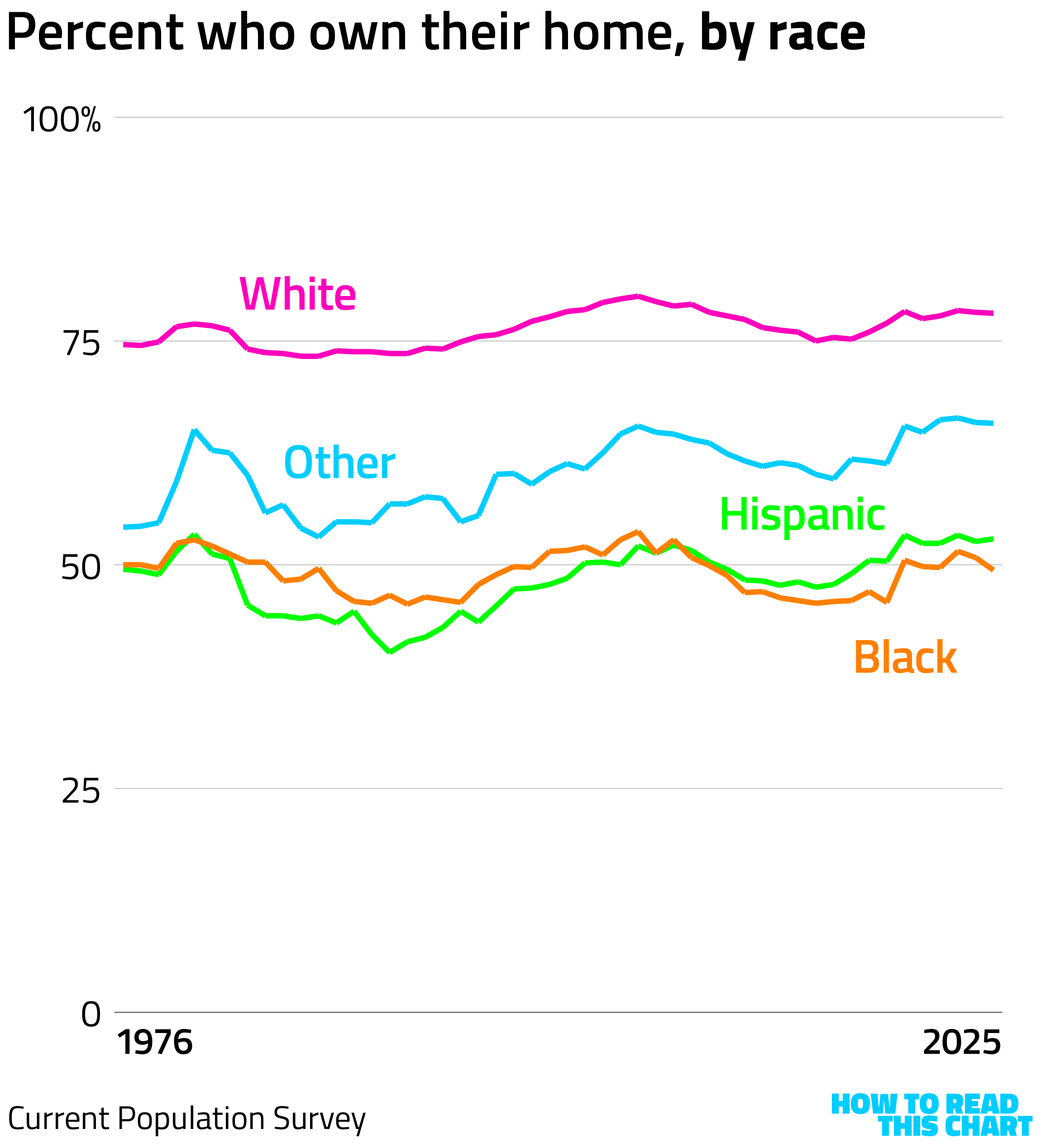
You will also probably not be surprised to learn that White Americans are more likely to own their homes than non-White Americans. (As always, my apologies to those who are clumped into the category of "other." Sample-size issues force us into uncomfortable positions.) (As Thomas Wolfe also said, probably.)
Perhaps the most useful way to understand Trump's comments is that his proposal generally advantages wealthier Americans. The more you make relative to the median household income, the more likely you are (and long have been) to own your own home.
This isn't surprising: age and race correlate to income. But age, race and income also correlate to partisanship, so I was curious the extent to which this proposal benefitted Republicans in particular.
I took a stab at a bivariate choropleth map — a fancy term for a map that uses a color palette that changes along two dimensions. The problem is that data was only available for more populous counties (sample size!), so the map looks a bit barren.
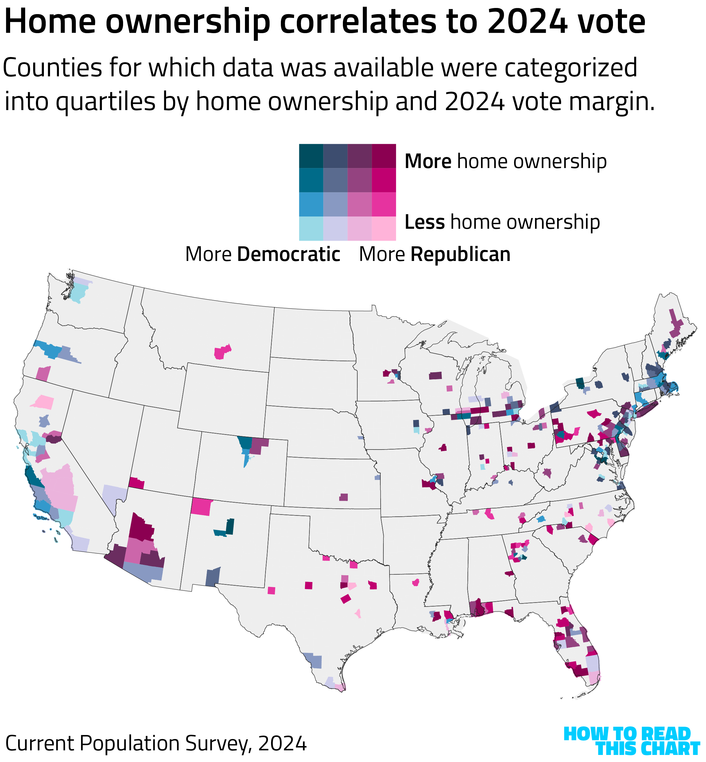
If we cluster those counties into deciles (chunks representing one-tenth of the total), we see a correlation: places with more home ownership were more likely to support Trump in 2024.
See how the dots below fall into a rough line from lower left to upper right? Lower left is lower home ownership and more support for Kamala Harris. Upper right is higher home ownership and more support for the guy who wants to increase the wealth of home owners.
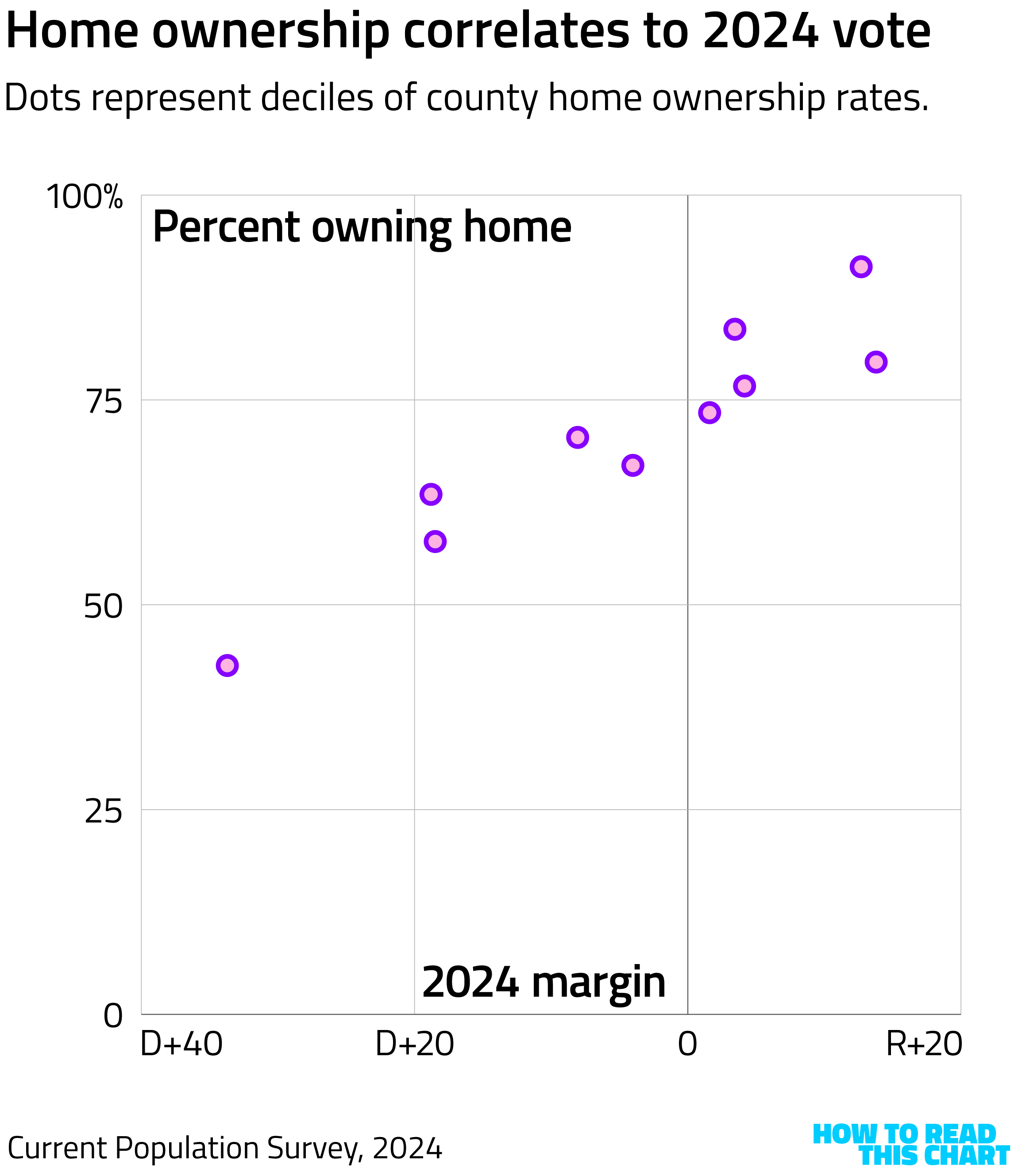
Just a coincidence, I'm sure. Once Trump realizes that young, non-White people will be disadvantaged by his proposal, I imagine he'll reconsider it. (One moment [holds earpiece] — I am being told "hahaha.")
Chapter 2
Americans dislike snow more than Democrats
The relentlessly (and still) useful Census Bureau also released data this week showing where Americans moved between 2023 and 2024. This is immensely interesting, for those who like this sort of thing, an index of interstate movement that informs you (for example) that approximately 550 people moved from Hawaii to Alaska for inexplicable reasons.
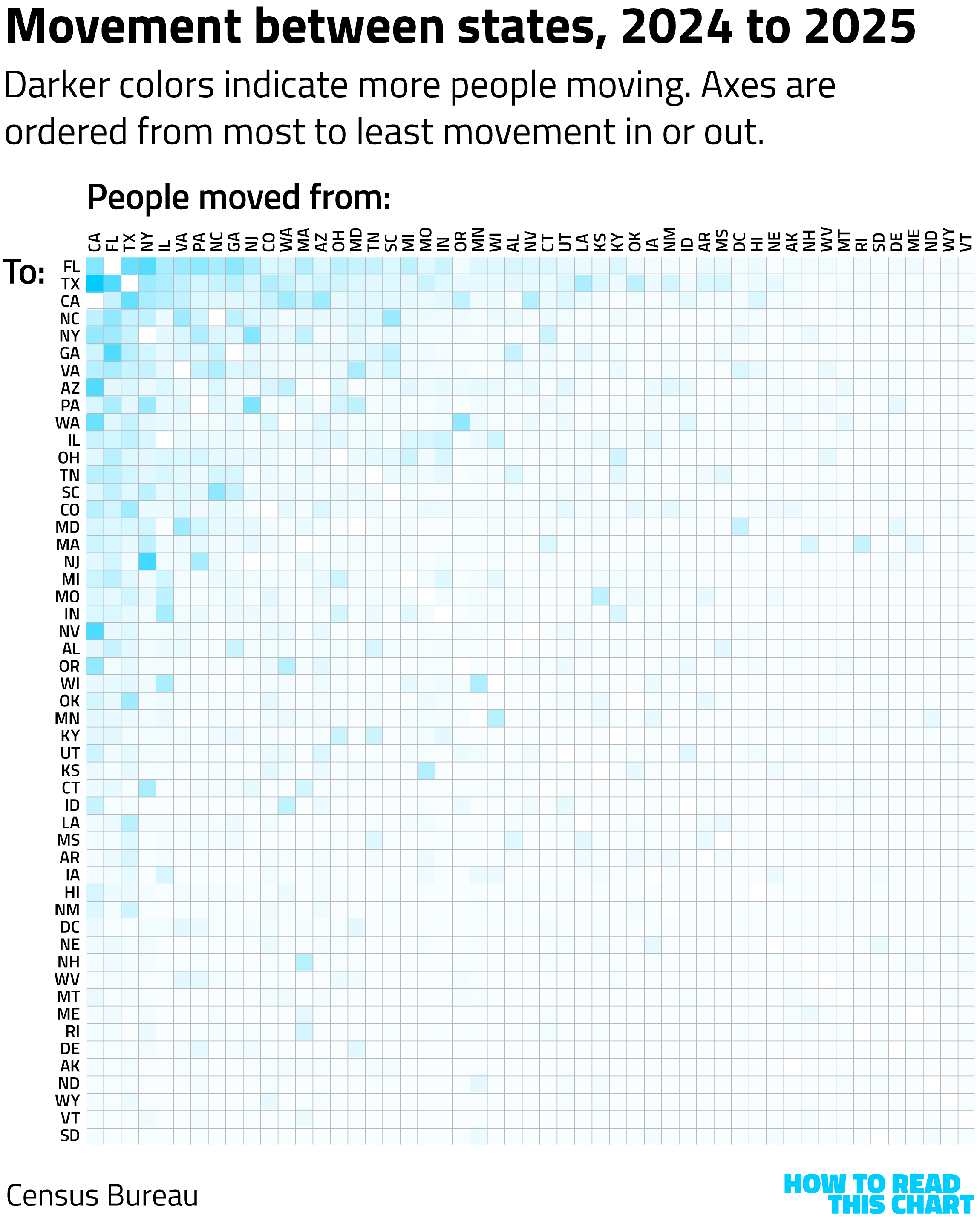
I mean, moving from a blue state to a red one? In this economy?
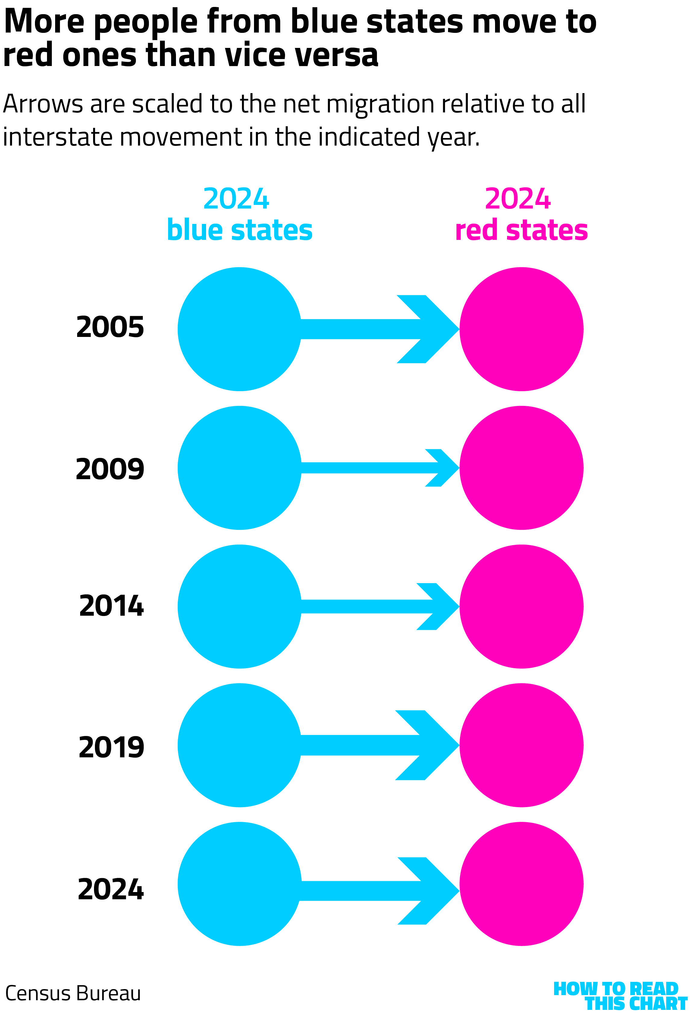
As some online commentary noted, such moves are not atypical. In fact, more people moved from blue states to red states in 2024 than vice versa. But this has actually been the norm. Stepping back in five-year increments to the earliest available data, we see that blue states have consistently shipped more people to red ones, to varying degrees.
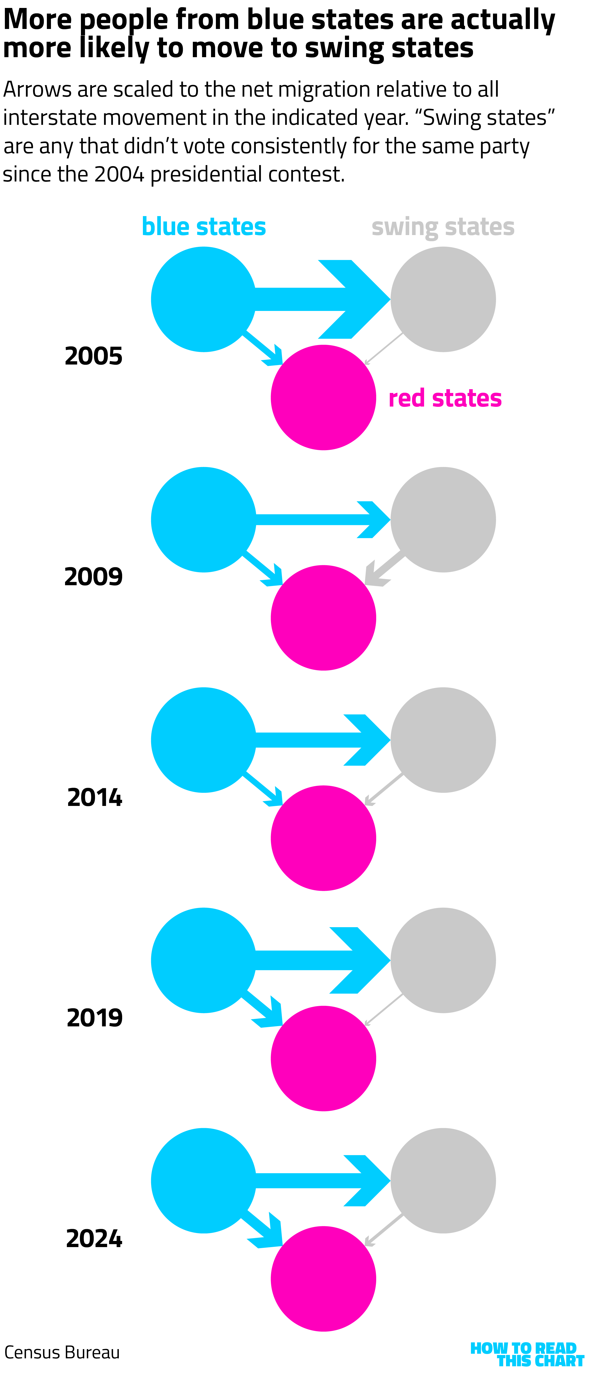
But this is using a definition of "red" and "blue" that depends on the 2024 election. If we use a more nuanced definition — looking at states that have always voted red or blue since 2004 and those that haven't — we see that blue states are sending far more people to swing states. (If you're curious, there have been 16 consistently blue states and 20 consistently red ones during that period.)
Again, though, this isn't the full picture. The actual trend has less to do with politics than it does weather. Over the past 20-odd years, people have moved from the Northeast to the South, in part because the weather is generally better.
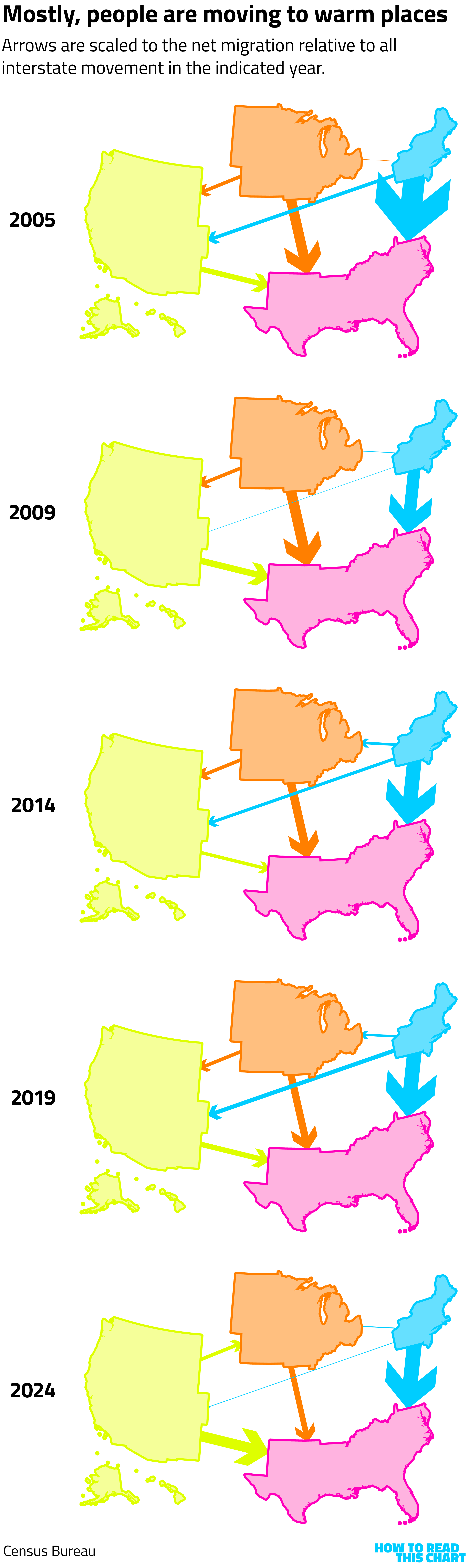
This isn't the only reason, of course. Housing constraints in blue, urban areas play a big role, which I have to assume that the president is working on. But it is also the case that the ten coldest states (according to NOAA data) backed Trump by a 1.2-point margin in 2024. The ten warmest states backed Trump by 13.5 points.
As I write this, I am looking out my office window at more than a foot of snow that's been frozen in place for a week and I have to say: Fine. OK. I get it.
Chapter 3
A better way to think about car speeds
Let's change gears. That's a segue — but also a reference to cars, which is what we're about to talk about! That's the sort of clever wordplay you can only get here at How To Read This Chart™.
I came across the video below a few weeks ago, in which a British ad guy named Rory Sutherland offers an alternative way of considering car speedometers. Here's a still from the video, that I'm not entirely sure why I'm sharing since it doesn't show much, but at least now you know I'm not making it up.
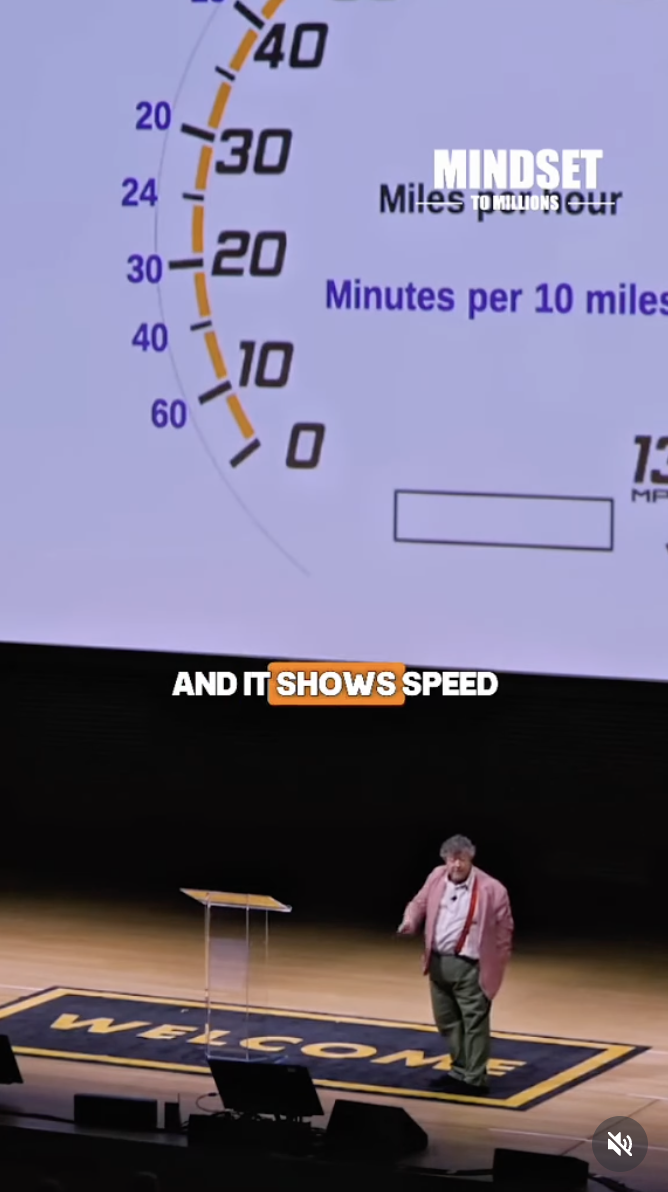
Sutherland's point is that speedometers don't have to show miles-per-hour and, in fact, that in doing so we may be encouraging misunderstandings of how speed works. Sure, distance equals rate times time, so we tend to show distance per time in order to illustrate rate of speed, as on the example below (in case you've never been in a car).
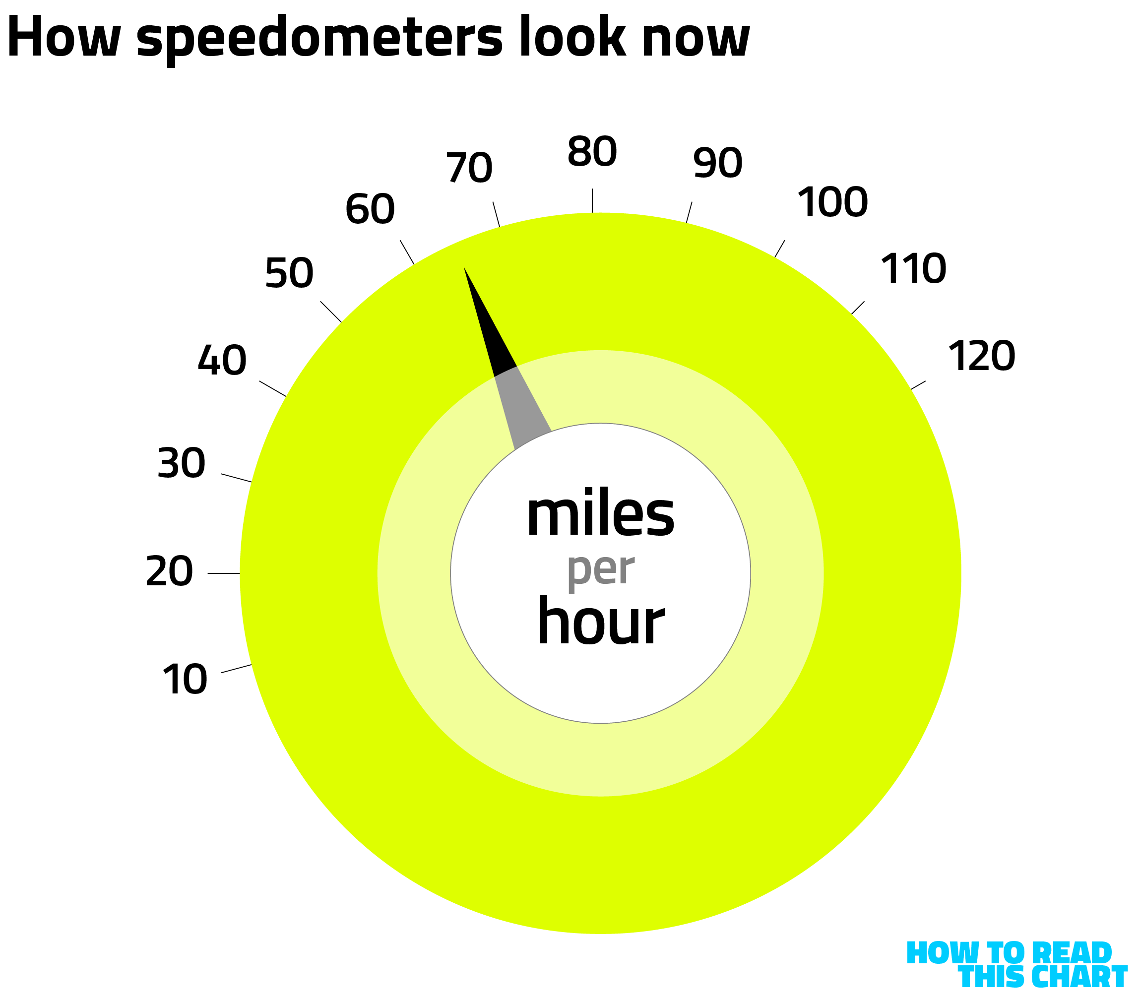
But this can suggest that increased speed means a consistently reduced time until a certain distance is covered, when that reduction isn't consistent at all. Sutherland proposes an alternative speedometer, showing how long it will take to drive 10 miles at a given speed.
Here's what that might look like.
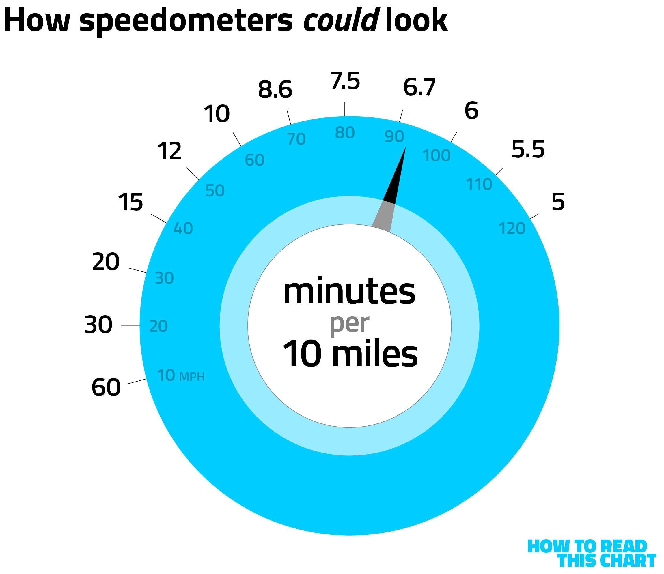
You can see the logarithmic decrease in the number of minutes it would take. If you speed up from 10 miles-per-hour to 40, you save 45 minutes on that 10-mile trip. If you speed up from 70 to 100, you save less than 3 minutes.
Since high rates of speed correlate to accidents and deaths, Sutherland suggests that reinforcing the limited utility in driving faster than 60 miles an hour could be a lifesaver. Of course, this might also lead to people speeding in low-speed, denser areas, increasing road deaths in those areas, but it is at least an interesting math problem.
Chapter 4
Republicans increasingly aren't sure about this Trump fella
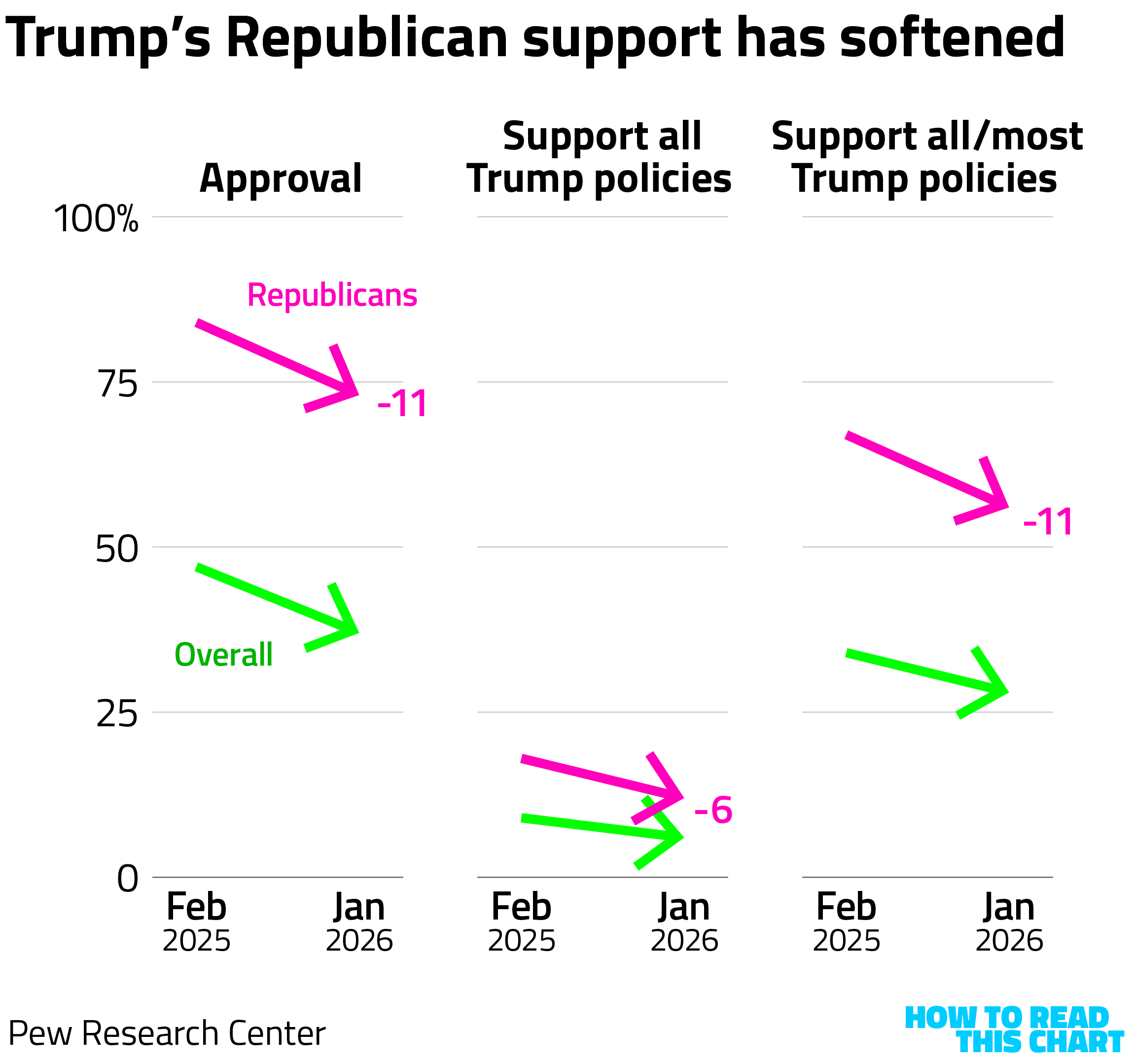
On Thursday, Pew Research Center released a new poll assessing the first year of Trump's second term in office. What it found was not only that Americans were more skeptical of Trump than a year ago, but that Republicans in particular were.
Republicans, for example, are 11 points less likely to express approval of Trump's presidency than they were last February. Most still do, but that's a big drop.
It gets worse.
"Only about a quarter of Americans today (27%) say they support all or most of Trump’s policies and plans, down from 35% when he returned to office last year," Pew's Hannah Hartig and Jocelyn Kiley write. "That change has come entirely among Republicans."
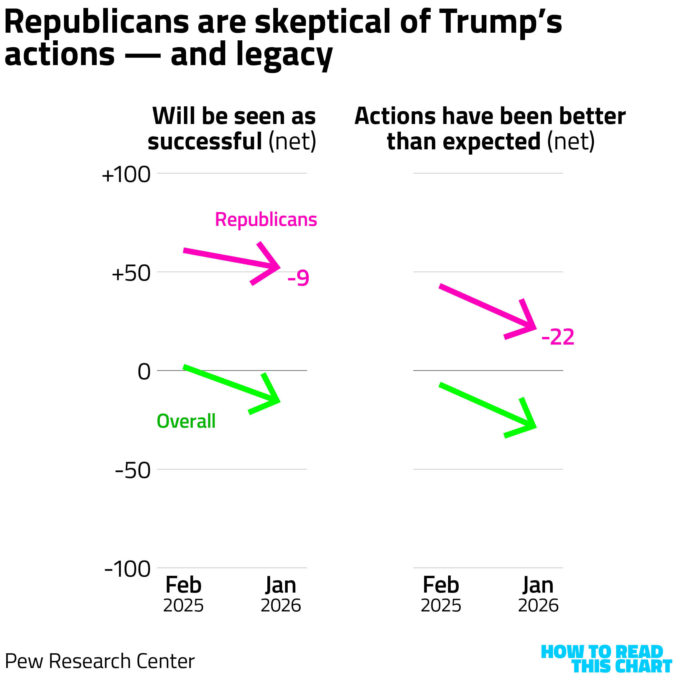
Respondents were also asked whether they thought Trump's presidency would be seen as successful, with the gap between those saying yes and no shrinking 9 points among Republicans since February. The gap between those saying his actions have been better than expected and those saying they've been worse, meanwhile, fell by 22 points.
Not only that, but Republicans increasingly view Trump more negatively on personal characteristics. Less than half think he acts ethically! Only a bare majority think he has the physical fitness needed to serve as president.
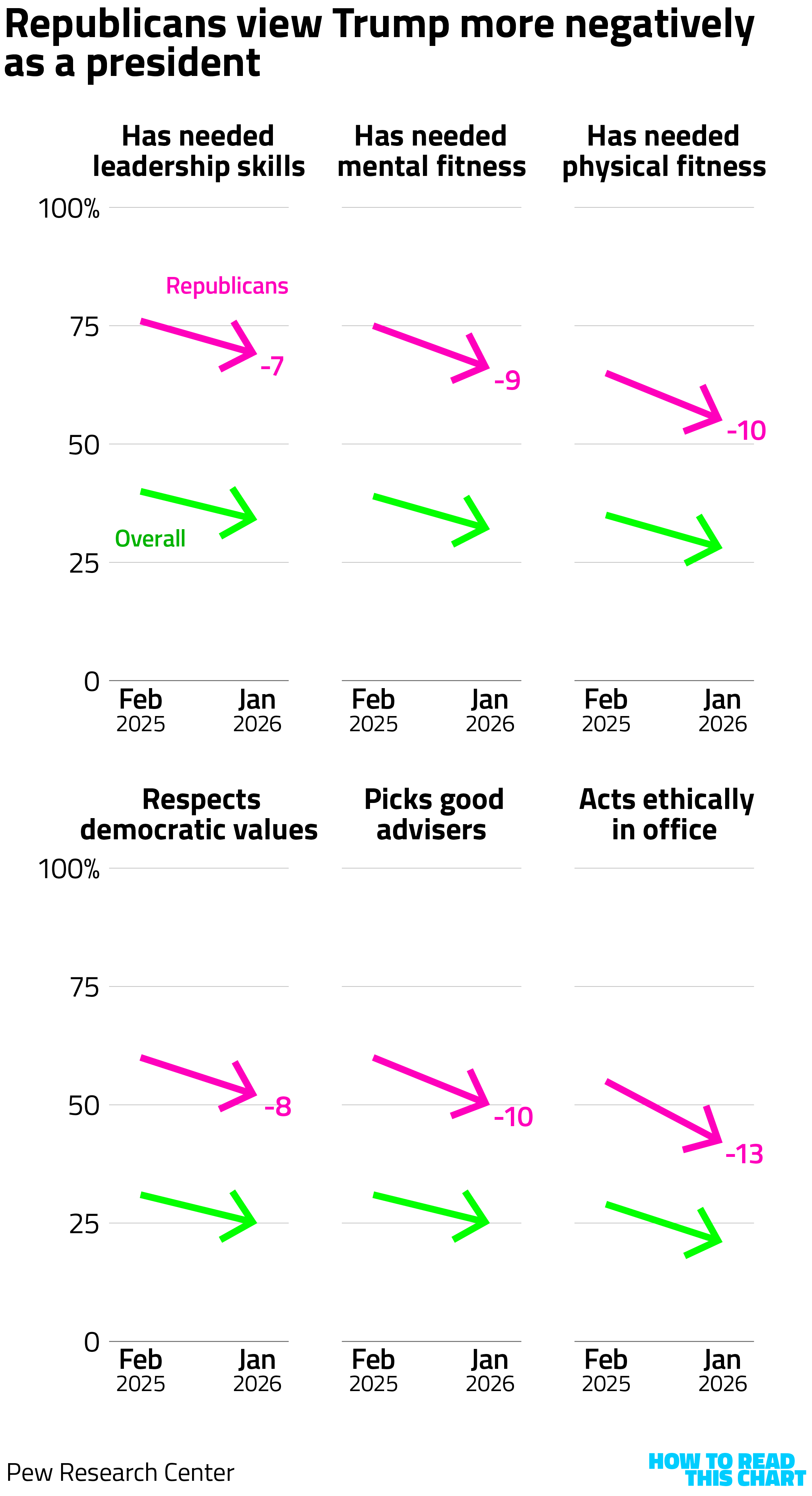
I mean, when only about half of Republicans think Trump respects the country's democratic values? That's a striking finding. Though, of course, this assumes that respondents agree that those values are, well, valuable.
Chapter 5
DHS's memes are about as unpopular as you'd expect
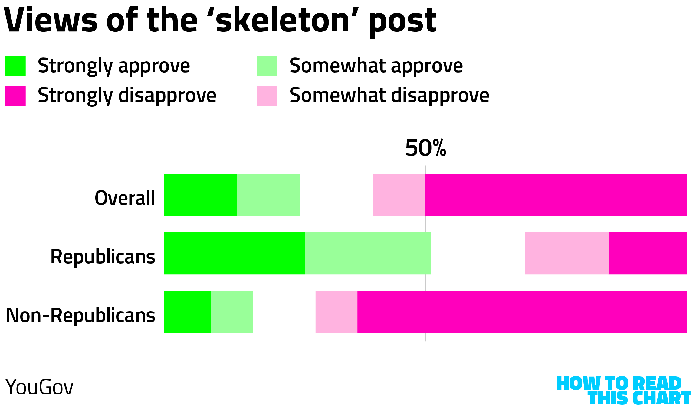
Speaking of hostility to American traditions, you might have noticed that the Department of Homeland Security's social media feeds are cluttered with weird, fascistic memes. YouGov, bless them, showed ten of them to Americans and asked whether they approved or disapproved of what they saw.
The least popular was this one, a clumsily aggressive riff on a not-very-popular meme format.

Half of respondents viewed that one with strong disapproval; even among Republicans, only about half approved of it.
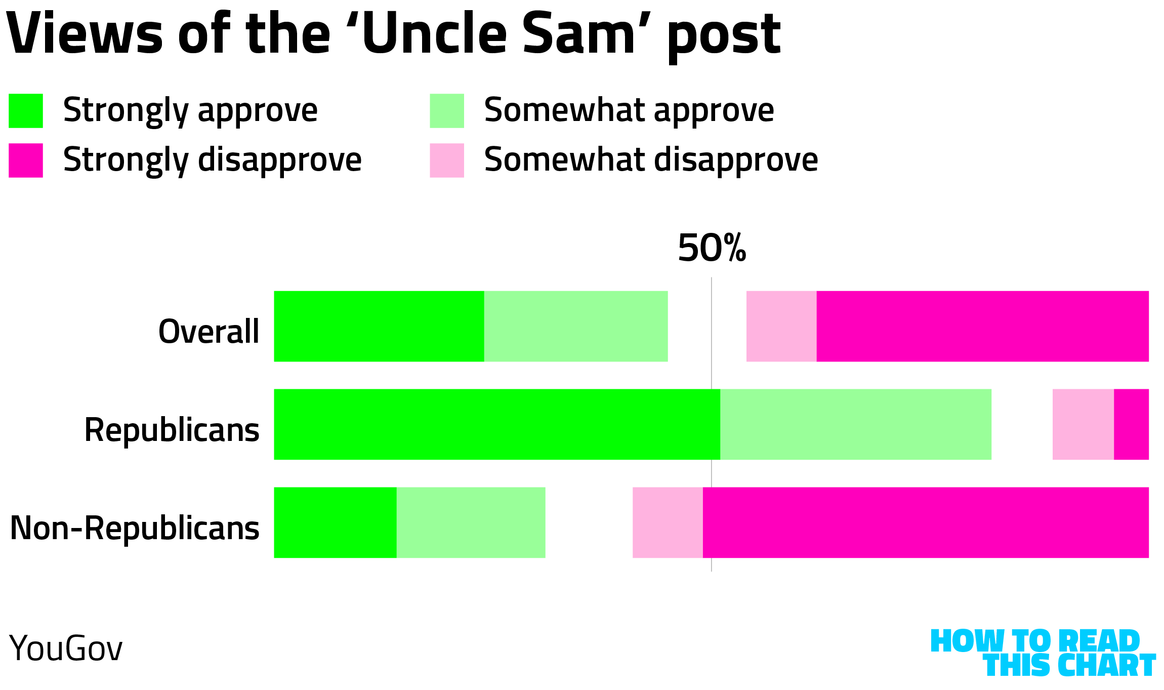
The most popular of the ten was this one, a variation on World War I recruitment posters.

This one — again, the most popular — was viewed with disapproval by slightly more people than approved of it. Most non-Republicans strongly disapproved of it, perhaps because they understand that America has not been "invaded by criminals and predators."
Each of the other eight posts was also viewed more negatively than positively. But, as has been established elsewhere in this newsletter, the administration has a relatively narrow target audience for what it's up to.
Chapter 6
Chart Attack
You were probably not aware that this was a big week in the history of data visualization. Forty years ago this week, the space shuttle Challenger exploded shortly after take-off, a disaster attributed to the failure of a seal in the unusually cold launch weather.
NASA had data showing that these O-rings were more likely to be damaged in colder weather, but that data was not — as designer Edward Tufte has argued — presented in a way that made this correlation clear. When that damage is plotted relative to temperature, it's easy to see why the cold weather should have triggered more alarm.
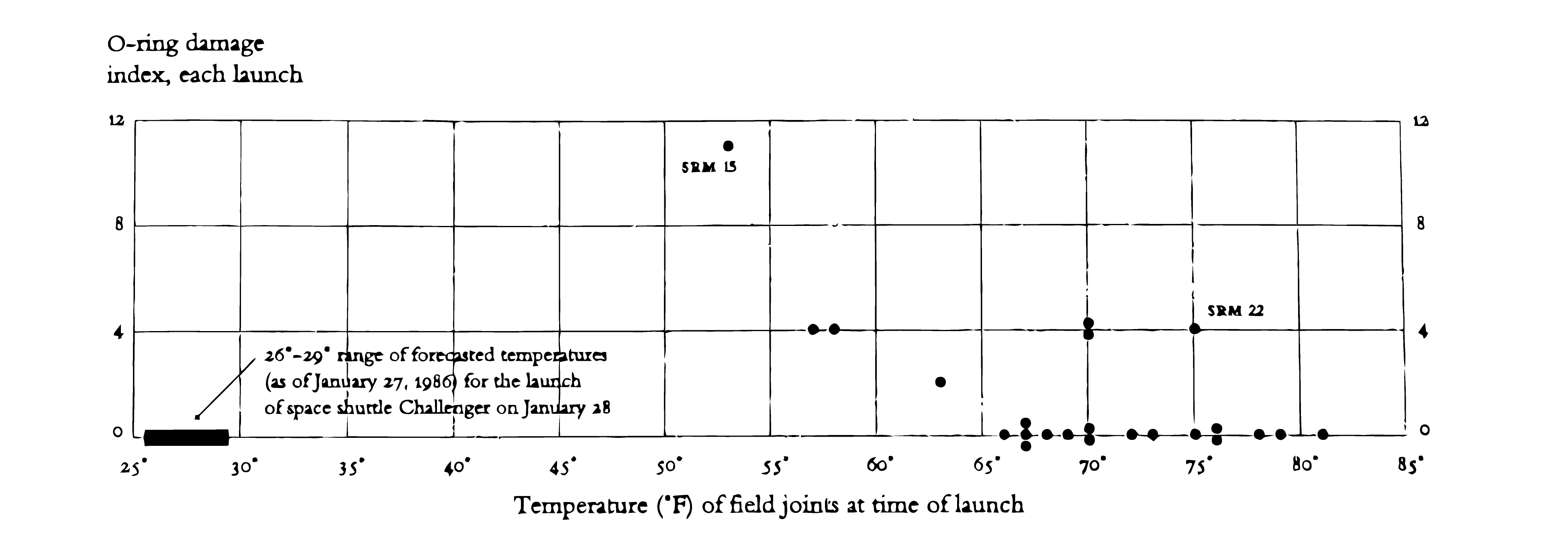
Tufte's work remains among the most influential in the data visualization business, and his books are worth the time, on the off chance that you didn't already know that.
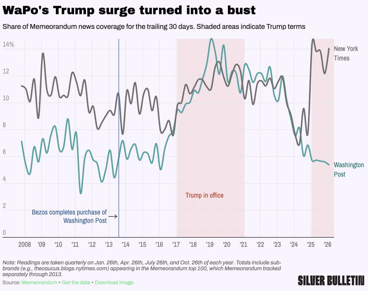
Speaking of disasters that I lived through, Nate Silver showed how The Washington Post has waned as a source of news coverage, particularly relative to the New York Times.
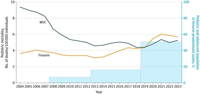
A study released late last year showed how gun deaths have surpassed car accidents as a cause of death for children. There is, unfortunately, no clever, math-based hack to reinforce the futility of firing a gun more often.
Reader Lynnette Haggerty passed along this visualization of how the global reputations of various countries changed between 2024 and 2025. See if any countries jump out at you!
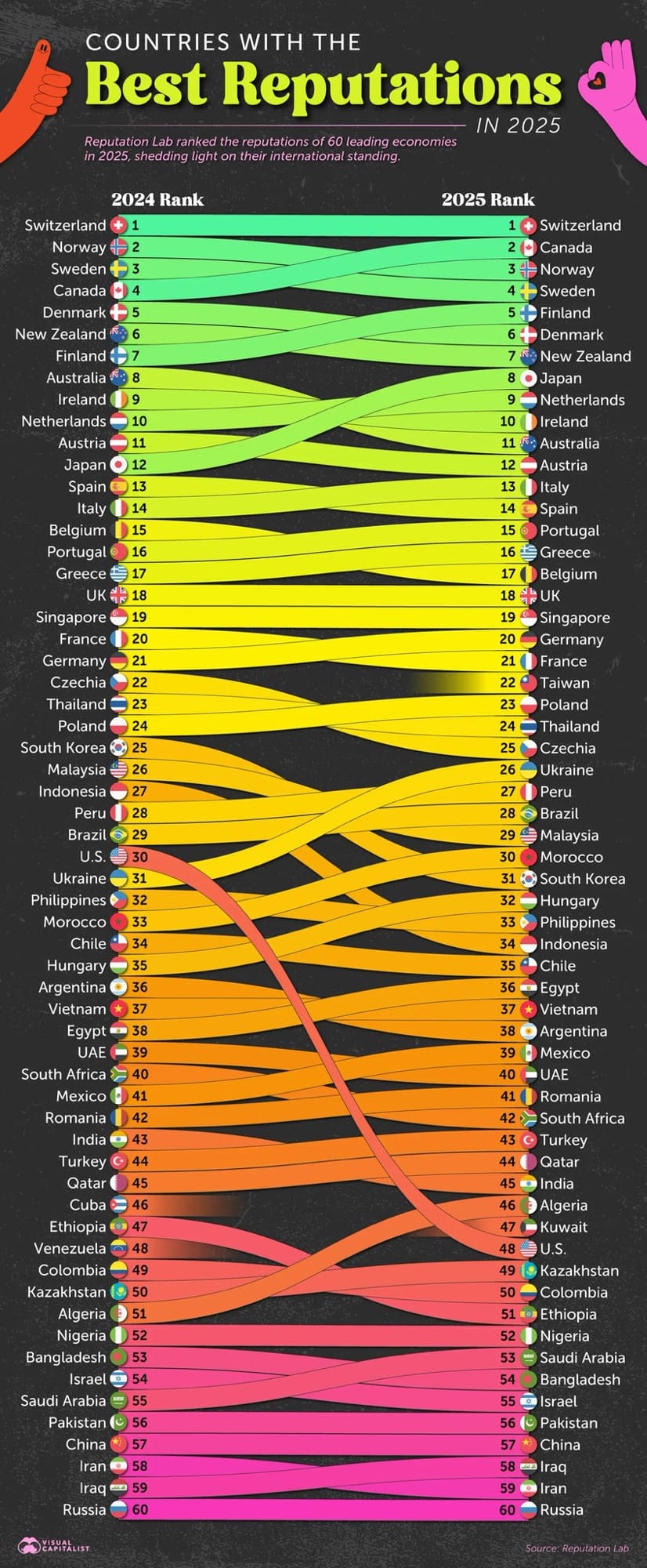
Congrats to Algeria, though.
Speaking of busy infographics centered on nationality, the LinkedInLunatics subreddit, with aggregates garbage from LinkedIn (as was probably obvious) dug up this AI-generated nonsense.
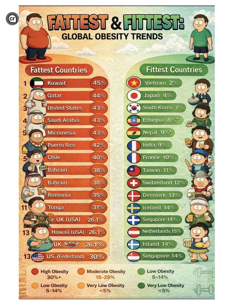
A tip of the hat to the U.K. (U.S.A.), which is trimmer than the U.K. (weird symbol) even though they have the same percentage of … something. And props to those of you who live in U.S. (Federland), who are much svelter than those of us in the United States. If only we could all be as thin as the people of Island!
Last week, you will recall, I wrote a bit about the utility of A.I. for data analysis. This ain't that.
Appendix
Some other things I've written


You are receiving this email because you at some point in time volunteered to, either at Ghost or Substack or pbump.net or pbump.com. If you don't want to receive future emails, maybe a change of scenery is in order. What you really want to do is support the newsletter financially, right?
Another one is coming next week. You have been warned.