Unlocking the mundane mysteries of the world

Congratulations; Hell Week is over. In preparation for Hell Week Redux, whenever it may arrive (next week), this week's newsletter flips data visualization on its head, focusing on a fascinating project that extracts data from presentations that wouldn't seem to include any.
Also, President Trump shared a chart that we should talk about. As I said: Hell Week.
Chapter 1
Inverted data visualization
When I first saw it in 2015, the photograph below reshaped my approach to journalism.

You will be forgiven if it is not immediately apparent why. At a glance, it looks like a not-particularly-interesting scene from a city, maybe one — if one were to engage in a little Geoguessrism — somewhere in Europe.
But there's a detail that, a decade ago, made this photo particularly important: That brownish-green vehicle that's about to pass behind the tree at the righthand edge of the picture. That is a Russian Buk missile launcher, a system that, a few hours later, would fire the projectile that downed Malaysia Airlines Flight 17, killing nearly 300 people.
Russia fervently denied (and still denies) involvement. So knowing where this missile launcher was and when became an important part of the investigation. But, with no metadata attached to the picture — digital information appended to photos or videos that can include time, location and camera data — how could investigators prove that the Buk was in the right place at the right time?
Enter Bellingcat. Founded by Eliot Higgins, Bellingcat is an independent collective of open-source investigators, people who work together to review publicly available information — like the photo above, which was posted to social media — and fit them into complex puzzles.
In the case of the photo, finding the physical location was perhaps the easy part. It was in a town called Torez, in the contested Donetsk region of Ukraine. But the amateur investigators were also able to determine the time of day by looking at the shadows. The sun was almost overhead, just as it was at about 12:30 on the day of the attack.
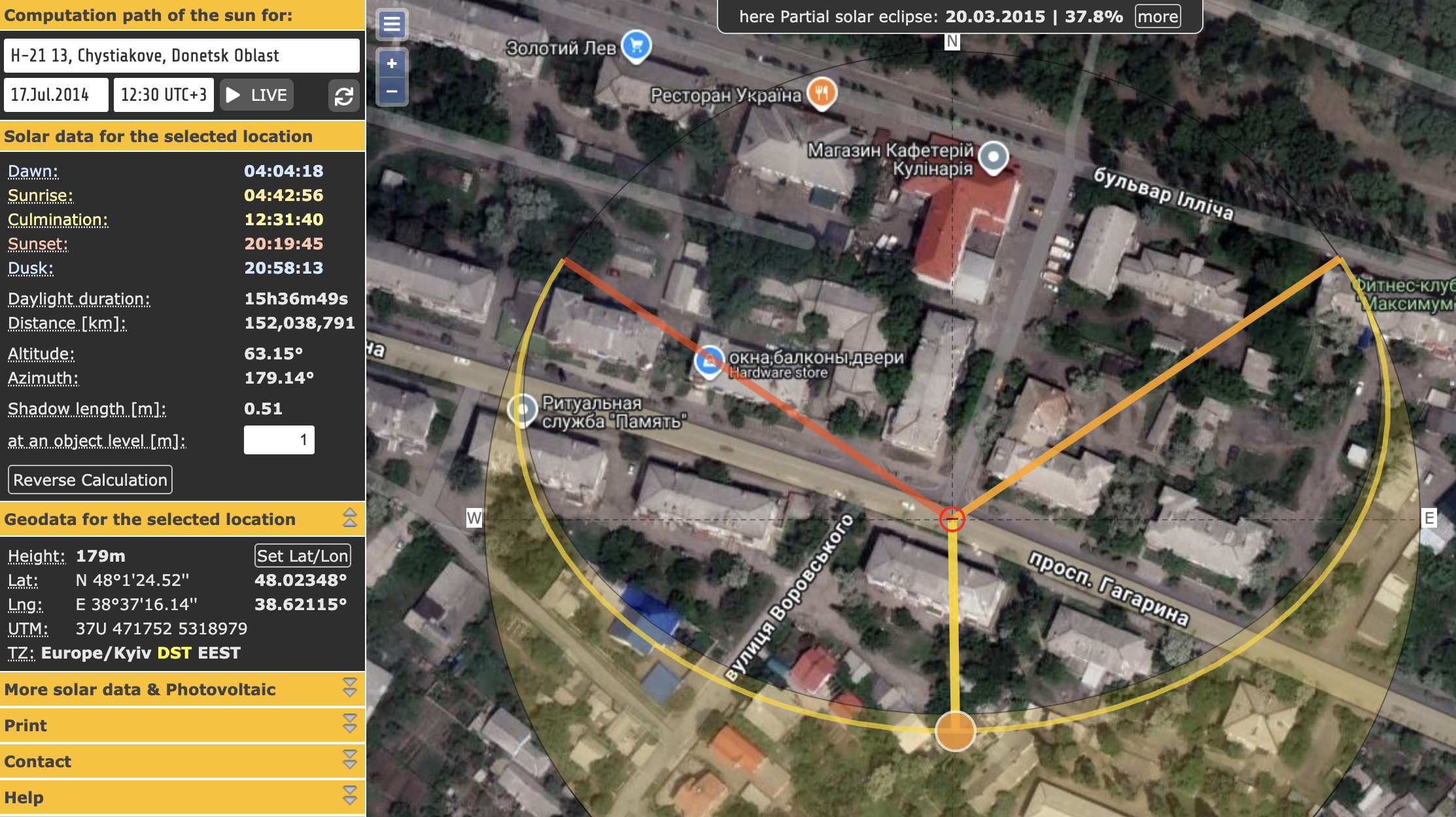
This determination put the Buk on a path that made it the likely culprit in the MH17 disaster.
Fascinating research, which did not endear Bellingcat to Russia. But it also demonstrated the utility of this sort of analysis, prompting the organization to wonder how they might get more people to be adept at it.
The result? The Bellingcat Open Source Challenge, a series of puzzles aimed at doing just that.
"We were trying to find a way to take the type of work that we showcase in Bellingcat articles and give an ordinary reader a challenge, a reason to attempt those same techniques," Bellingcat's Galen Reich explained when we spoke this week. "If you're looking at war crimes or some atrocity that's happened, that's not a fun thing to spend your time working on if your goal is just to learn some skills."
Reich and his colleague Merel Zoet have created a number of bite-sized mysteries allowing users to explore open-source investigative tools on their own time and, if desired, working with the Bellingcat community (largely on the chat platform Discord).
A key benefit to this process, Reich noted, was that the puzzles have a known solution, eliminating the real-world hurdles of dead ends and red herrings.

In addition to building new open-source investigators, the Open Source Challenge introduces users to new tools — including ones Bellingcat's team might not have expected. For those curious, however, they do have a useful catalog of online tools that can be applied both to their casual challenges and to real-world ones.
It struck me that this practice might have an additional benefit in the moment: helping people identify images created by AI.
"It's not the silver bullet for solving AI misinformation," Reich agreed, "but any exercise that encourages people to look at images critically and to particularly look at details in images" is likely to aid in that sort of differentiation.

"I think that's a valuable contribution that we can make," Reich said, "helping build those communities and help people understand the skills that they have and skills that they can develop."
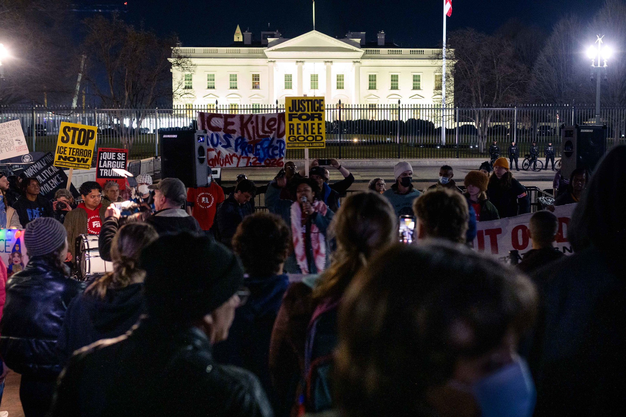
Meanwhile, Bellingcat's real-world work continues. This week, that meant analyzing video from the killing of Renee Good in Minneapolis.
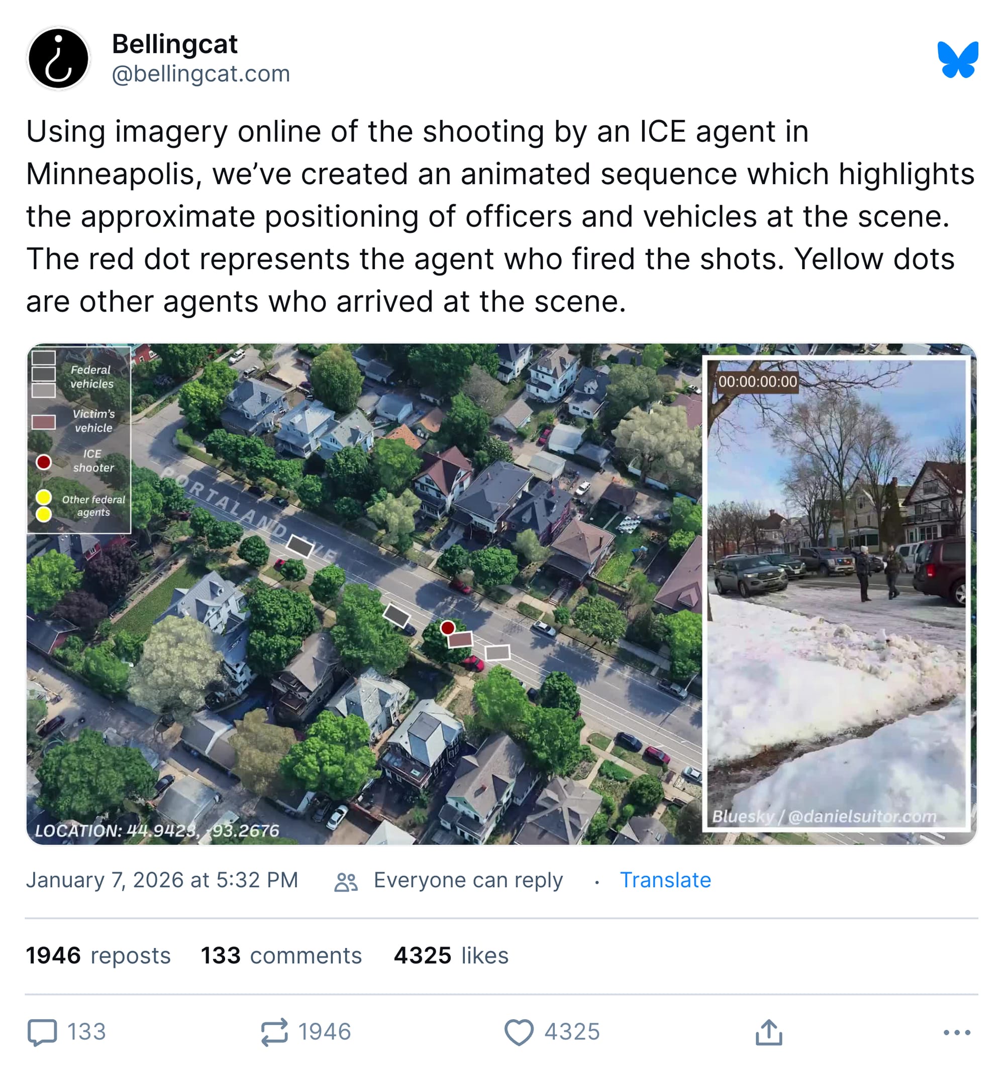
"Historically," Higgins, the founder of Bellingcat, wrote on Bluesky in reference to that work, "we've focused a lot on the brutal actions of authoritarian regimes, and today is no different."
Ten years after marveling at Bellingcat's work in Ukraine, it is indeed striking to see how useful those skills are for analyzing news events here in the United States.
Chapter 2
The president found a chart he likes
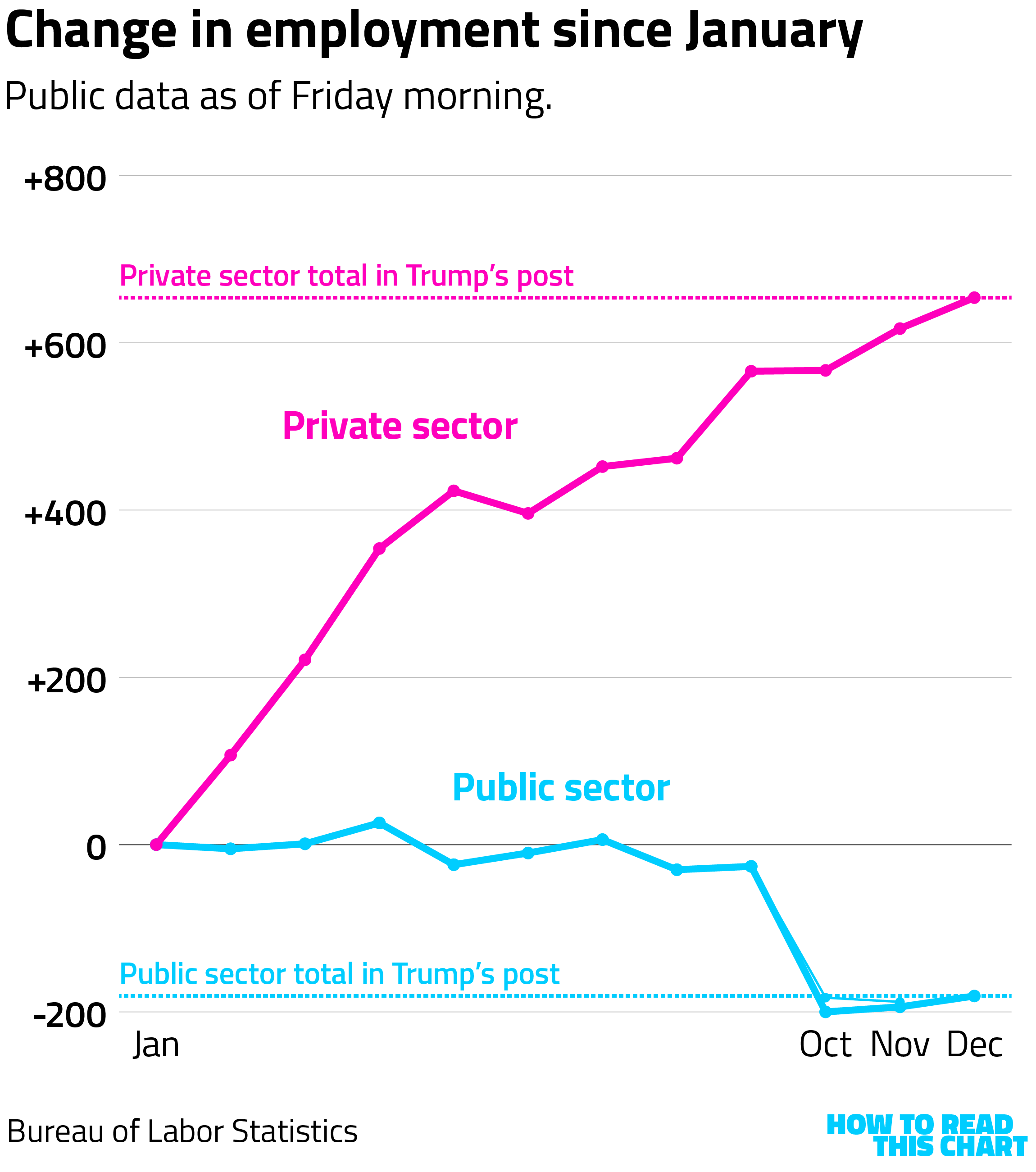
On Thursday evening, Trump shared a chart to his account at the social media platform he owns showing employment changes during 2025.
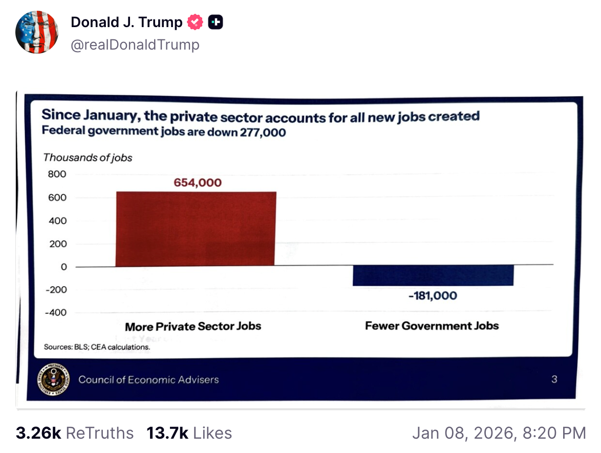
You don't have to be a Bellingcat investigator to notice that he appears to have taken a photograph of a print-out and then attached that as an image — an observation that definitely tells us something about how the White House works.
But there may be another reason that Trump didn't simply have a digital version of the slide at hand: he wasn't supposed to be sharing that information.
As of 8:20 p.m. on Thursday, the most recent public jobs data from the Bureau of Labor Statistics (BLS) didn't match what Trump shared. According the November report, the country had added 33,000 more private sector jobs than Trump's chart showed and lost 7,000 more public sector ones.
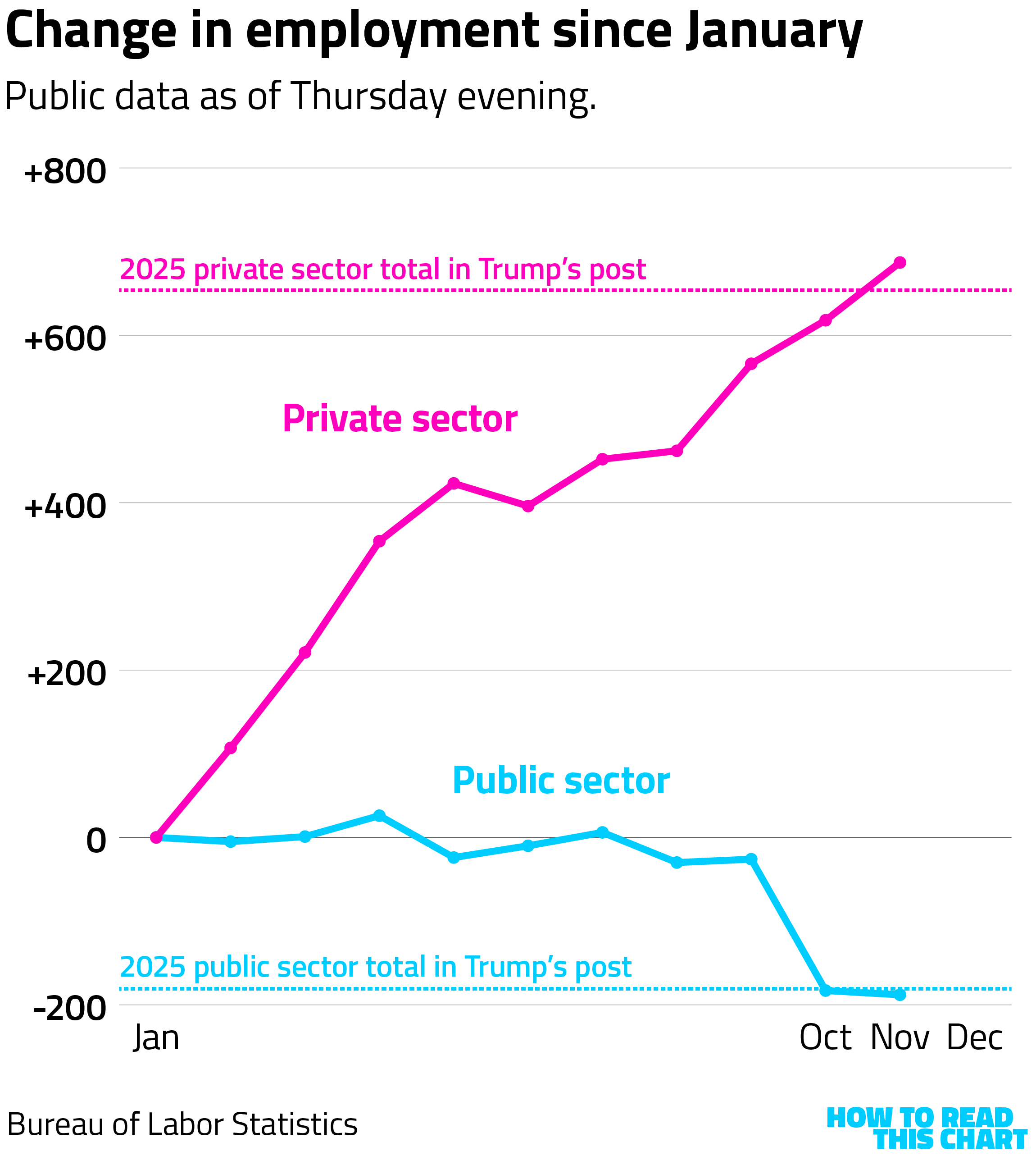
When it was released publicly on Friday morning, though, the BLS data showed revisions to both of those figures. The October and November private sector job totals, for example, were determined to have been too high.
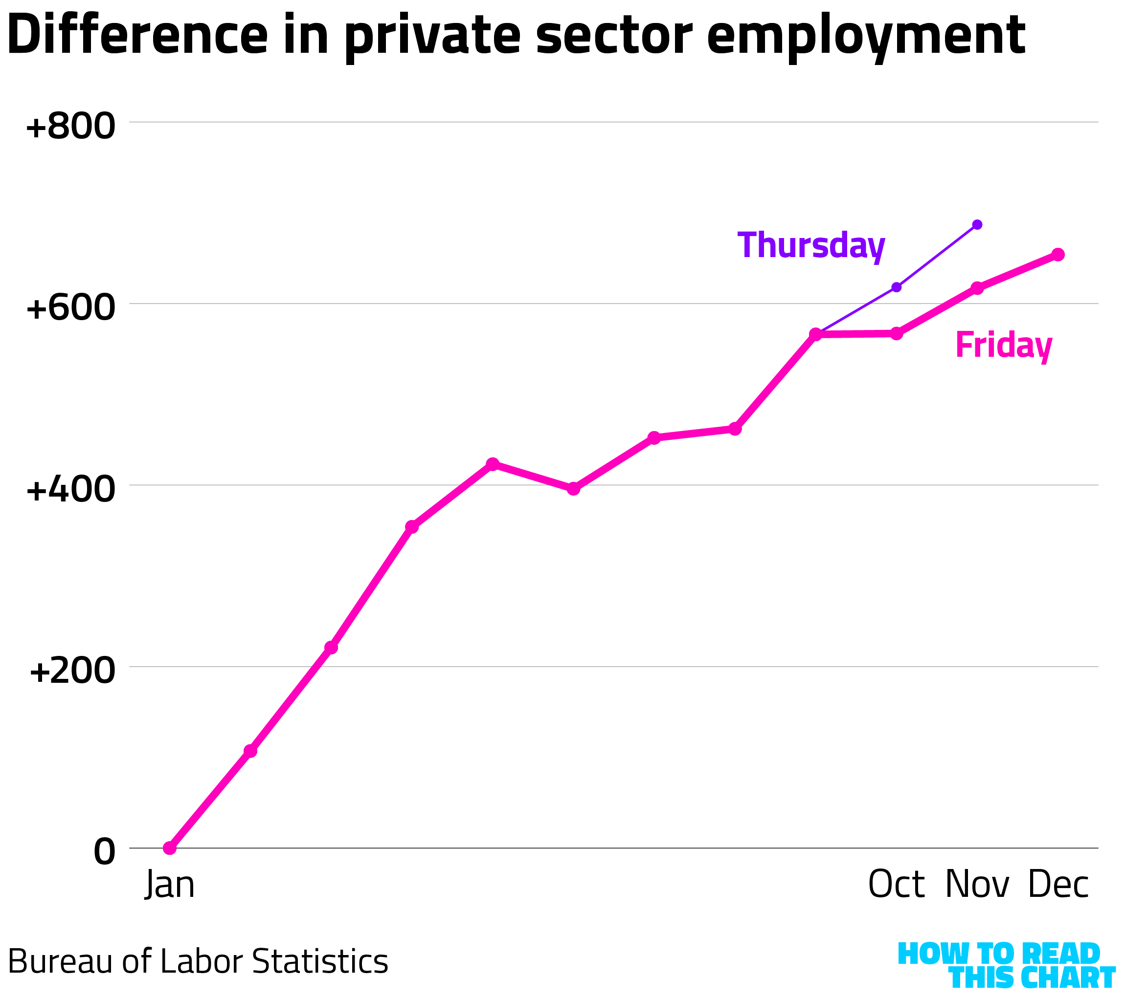
After those revisions and with the new data: voila. The public information now precisely matched the numbers that Trump had shared about 12 hours too early.
This is not a minor thing. While presidents have traditionally gotten the data in advance of the public release, they have been carefully controlled precisely because jobs data can have a robust effect on the markets. Getting those numbers early could provide a significant advantage to some investors. And here was Trump, taking a handout, getting a photo of it and slapping it on Truth Social.
If you're curious, the New York Times has analysis of where those federal government jobs were lost.
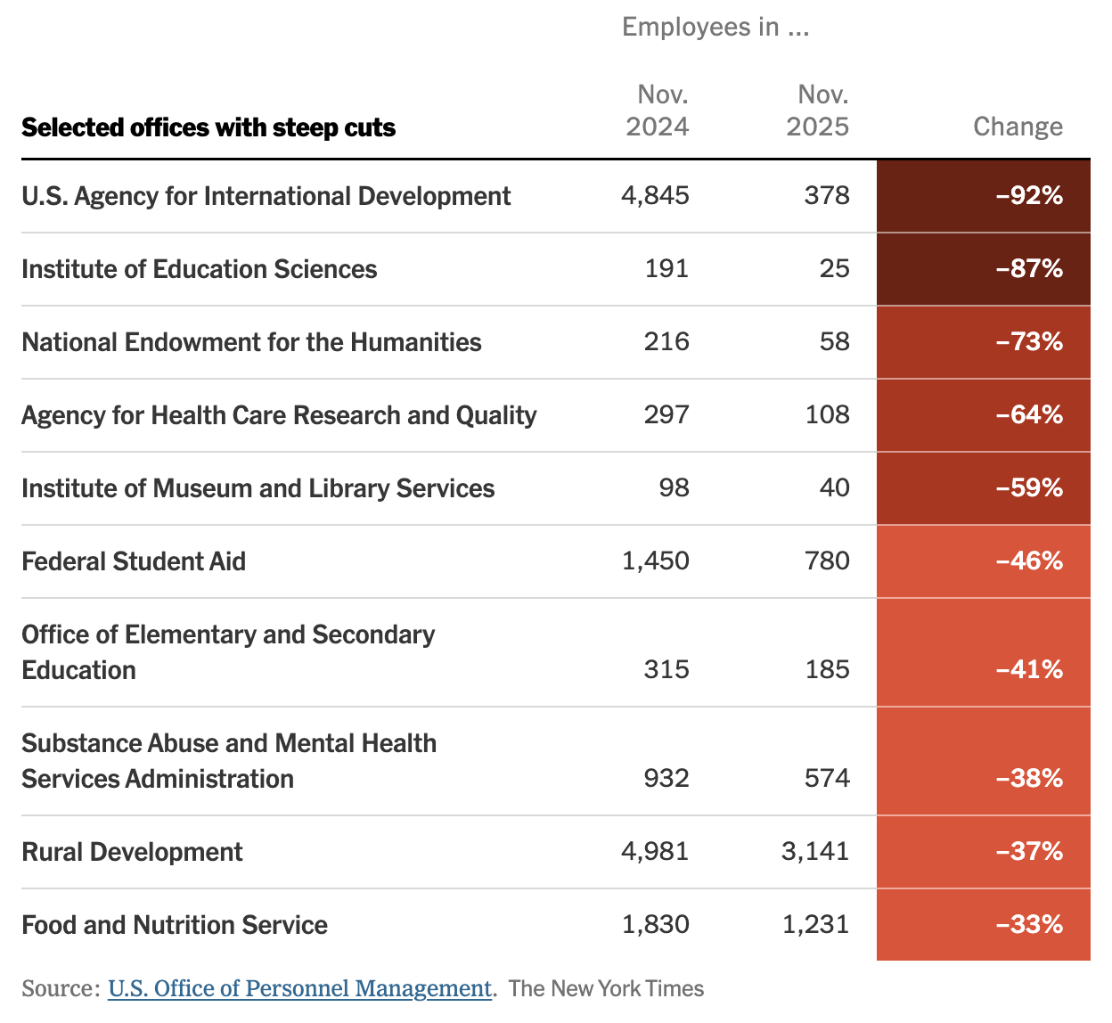
You'll notice that the Times isn't using the administration's new method of percentage calculation. Perhaps their reporters spent a lot of time using library services or secondary education. So much for that!
Chapter 3
Cops vs. cars
I wrote a piece for The Washington Post in 2021 analyzing new laws passed in the wake of the racial-justice protests that had blanketed the nation in 2020. Those laws reduced the possible penalties faced by drivers who struck protesters with their cars. Protesters had, at times, surrounded vehicles, so red state legislatures decided to give drivers some leniency in using their SUVs as bulldozers.
Beyond the obvious problem with doing so, there was an irony: Police officers frequently identified vehicles as a threat that justified their use of deadly force against civilians.
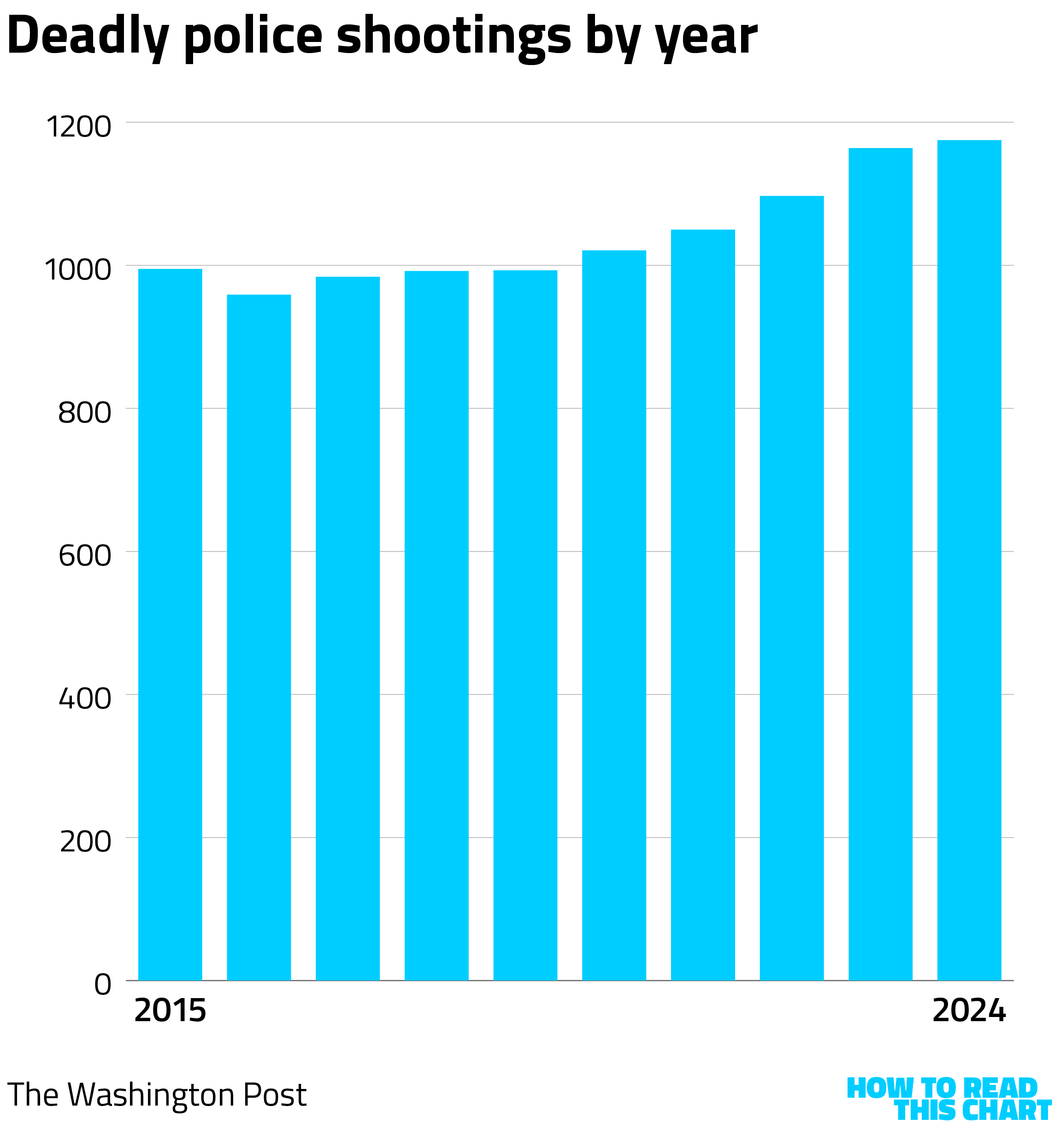
At the time, The Washington Post was collecting data on fatal police shootings. (They stopped doing so at the beginning of 2025.) From 2019 to 2024, the number of such incidents increased by nearly a fifth.
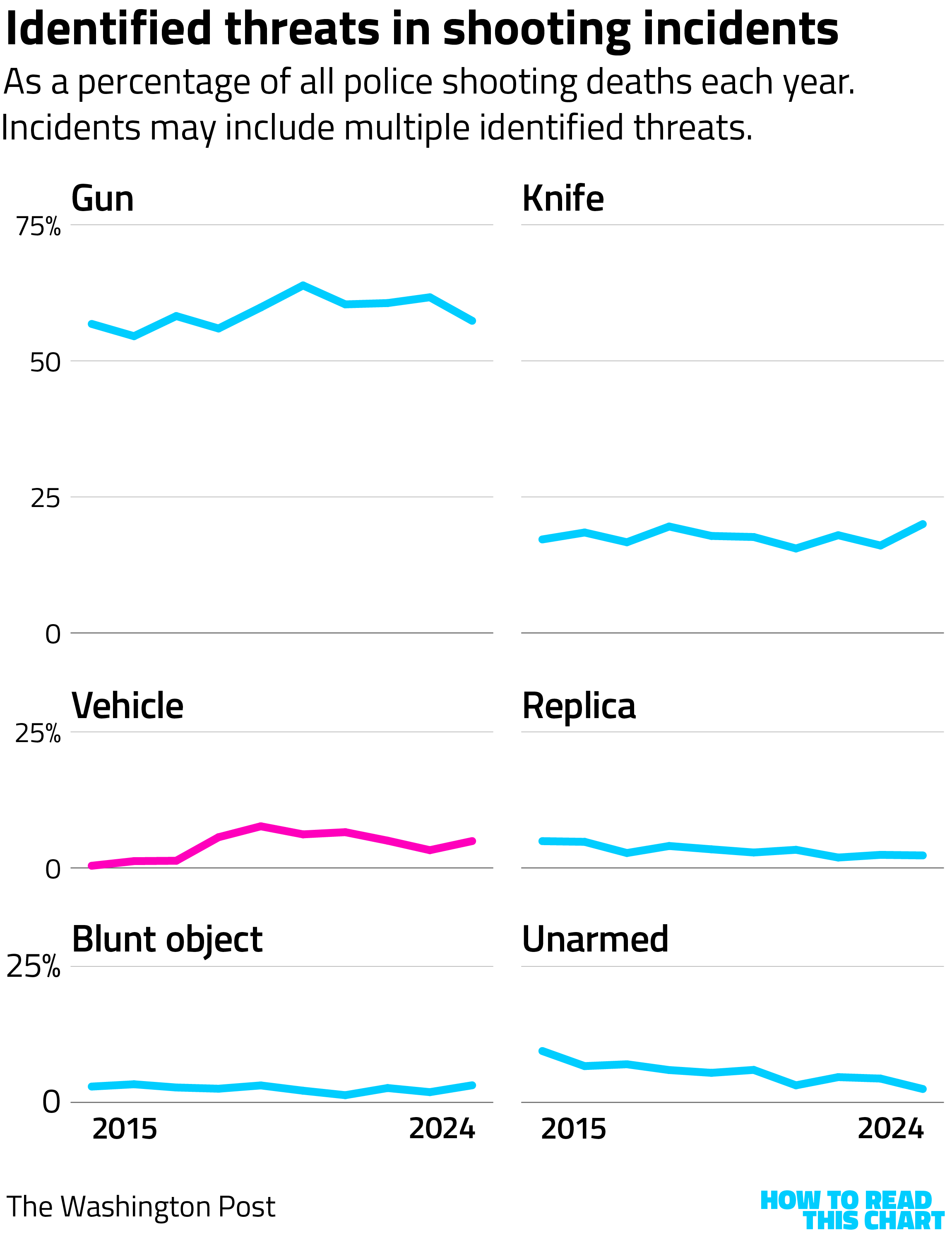
In most of the shootings, police identified an imminent threat, most often a firearm (and sometimes a replica gun or toy). Over the ten years during which The Post collected the data, there were more than 10,000 shootings, 444 of which cited the use of a vehicle as a threat. Put another way, vehicles were an identified threat in about 4.3 percent of fatal police shootings.
I raise this now for obvious reasons. The rationalization of the killing of Renee Good in Minneapolis is that she was using her vehicle to try to kill ICE agents, a claim belied by available video footage and by analysis from Bellingcat and others.
But there's probably a reason that, according to analysis from the New York Times, all nine of the ICE agents who fired their weapons from September through Wednesday were firing at people in vehicles: those were the only weapons — "weapons" — protesters had. If the use of deadly force requires an imminent threat, the threat requires a rationalization.
In the case of the Good killing, one was identified.
Chapter 4
Maybe there are some good wars?
You might recall two years ago when the U.S. military launched an operation to seize Venezuelan president Nicolas Maduro? Well, careful data analysis reveals that that was one week ago.
Soon after the news broke, the polling firm YouGov began asking Americans to offer their opinion on what had unfolded. Many (about a quarter) didn't have an opinion on whether intervention in Venezuela was the right decision or the wrong decision. Partisans, though, were more confident in their views, with Democrats viewing it negatively and Republicans positively.
YouGov also included some useful context, asking people to evaluate a number of other U.S. interventions. There were still often partisan splits, with Republicans consistently viewing intervention more positively than Democrats. (I was about to clarify this sentence so that you understood I was referring to Democrats' views, but it also works as is.)
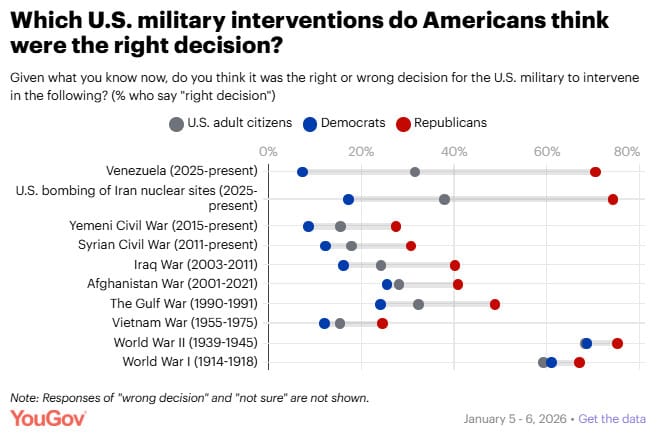
The three interventions most commonly viewed as the right decision by Democrats:
- World War II
- World War I
- Afghanistan (though well under half do)
The three most commonly viewed as right by Republicans:
- World War II
- The bombing of Iran last year
- Venezuela
OK, sure.
Partisanship isn't the only dividing line. Men are also consistently more likely to view intervention positively, with the exception of Vietnam. (There's some cross-pollination here, since men are more likely to be Republican.)
I was also struck by the glow-up World War I's gotten as it has vanished into a historic haze. It was … not great! So I was curious whether there were interesting divides by age. And there were — but not the ones I expected.
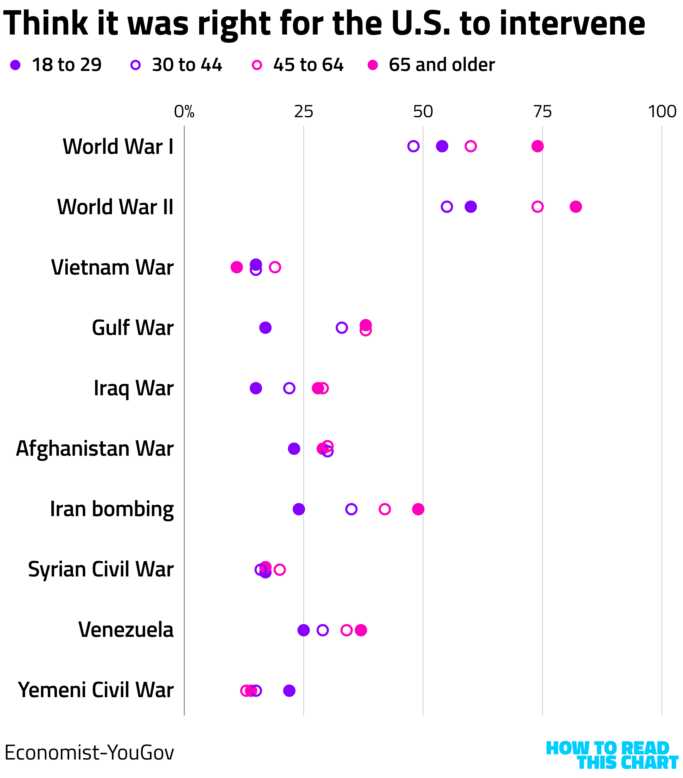
Older Americans were more likely to view both world wars as righteous than were younger ones. The most obvious exception here is that Americans 65 and older were least positive about Vietnam — the conflict that 65-plus year-olds were most likely to have had strong emotions about in real time.
The most skeptical, almost across the board? Young people, the ones who would have to serve in any future conflict. It's a good reminder that however positively Republicans might view Trump's belligerence, there's another generation of Americans watching.
Chapter 5
Chart Attack
This hasn't been a very fun newsletter, has it? So here's a joke from my six year-old.
Who's there?
Europe.
Europe who?
No, you're a poo!
What can I say? He's six.
And now, back to Hell Week, as manifested in charts.
On the topic of the jobs report, the newest data reinforces that job growth basically stalled after Trump announced his tariffs.
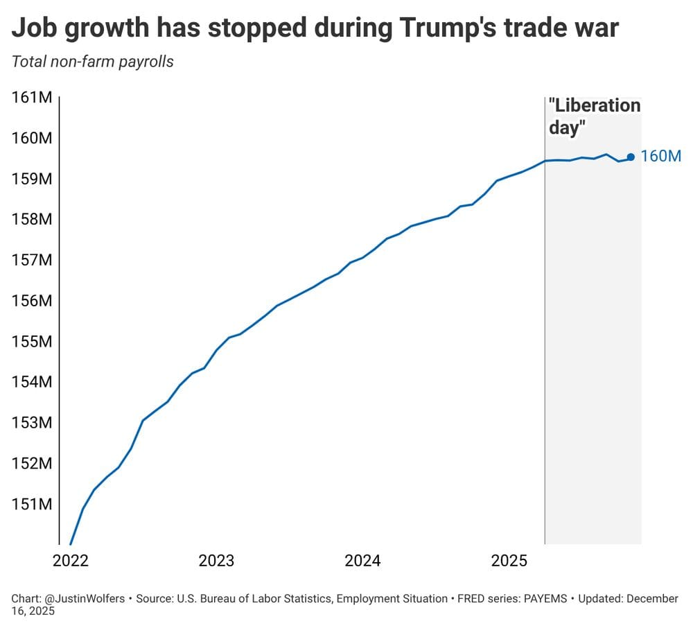
Correlation isn't necessarily causation, but sometimes it is.
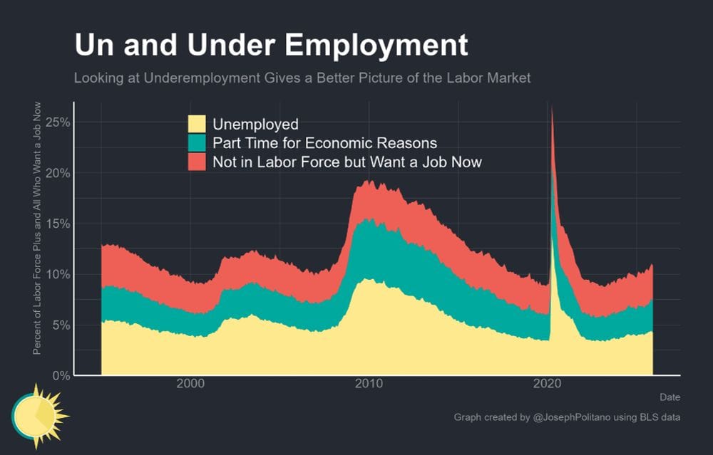
Meanwhile, the number of people who are underemployed (ahem) continues to rise.
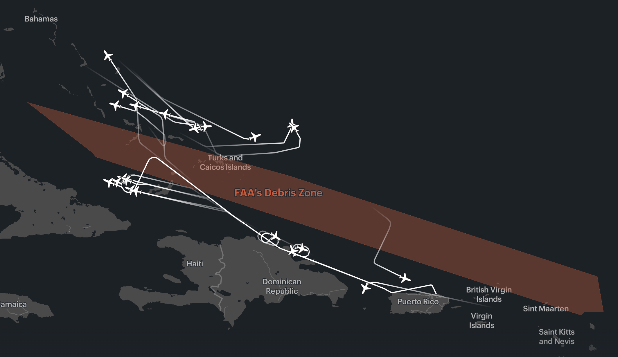
On the topic of using public data for reporting, ProPublica has a fascinating article about how a SpaceX failure forced commercial flights to urgently shift their routes.
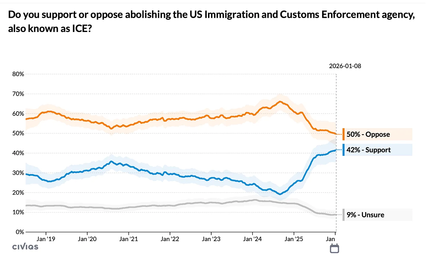
On the subject of ICE, an increasing percentage of Americans are ready to get rid of it.
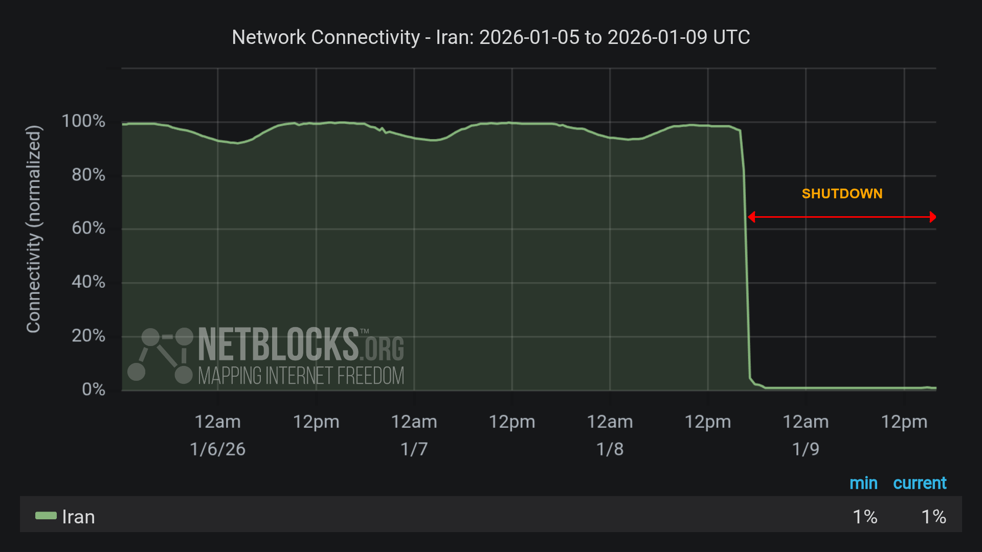
On the subject of, uh, the internet? — I guess we were talking about the internet? — here's how the government in Iran is hoping to shut down anti-regime organizing.
See also:
On the topic of people (me) complaining about things, individual people making complaints makes up an increasing percentage of all complaints.
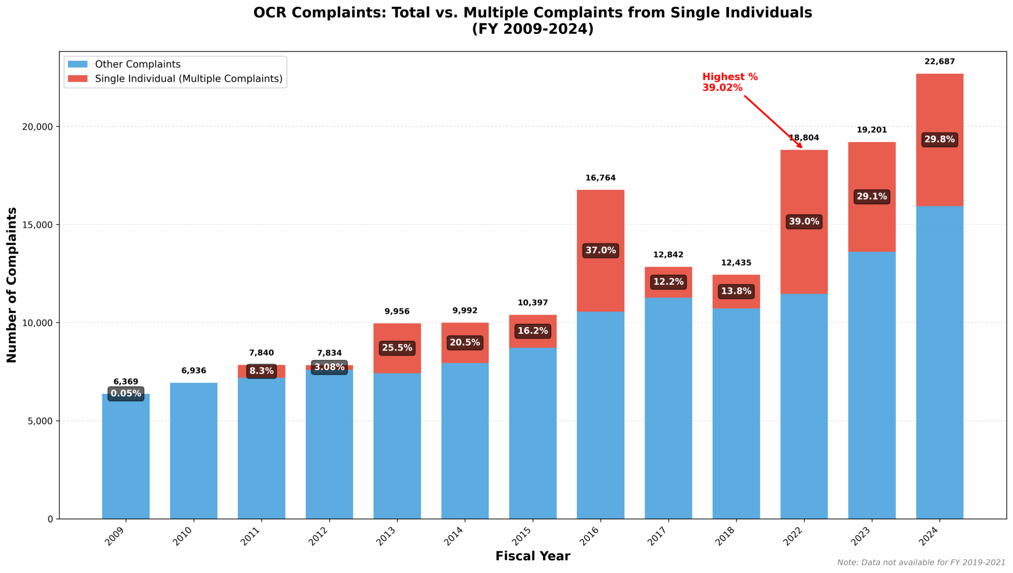
We are in our Karen Era. (My apologies to those named Karen who've been unfairly maligned by this bit of modern slang.)
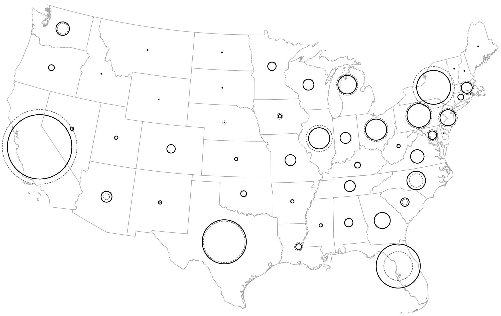
And finally, on the topic of birds and (indirectly) baseball, two things that are more likely to be good than bad, here's a map of where the birdsong detection device Haikubox tracked the song of orioles last year.

The birds, at least, seem happy.
A note from the editor, who is also me: Last week I said that I was going to start doing weekly updates on Trump's golf-playing. But I realized it doesn't change that much, week to week, so I'm going to do it monthly instead. So expect that in February — or as I like to call it, Hell Month Redux.
Appendix
Some other things I've written


You are receiving this email because you at some point in time volunteered to, either at Ghost or Substack or pbump.net or pbump.com. If you don't want to receive future emails, maybe sending $100,000 to a Greenlander would convince you? What you really want to do is support the newsletter financially, right?
Another one is coming next week. You have been warned.