This way madness lies, but you knew that


It's the most relatable thing in the world: You've just put your weekly data-visualization newsletter to bed when the president of the United States unilaterally decides that the country is going to launch a war against a foreign country. Not much to do but throw some charts together!
Foreword
So we're doing this again, huh?
Those old enough may recall the year 2003.
The president of the United States, one George W. Bush, had spent months trying to convince the country that the nation of Iraq posed such a dire threat to American security that an invasion aimed at ousting its leadership was warranted. There were hearings and speeches and rallies, debates in newspapers, all the sorts of things you might expect before putting numerous soldiers, sailors and airmen in harm's way.
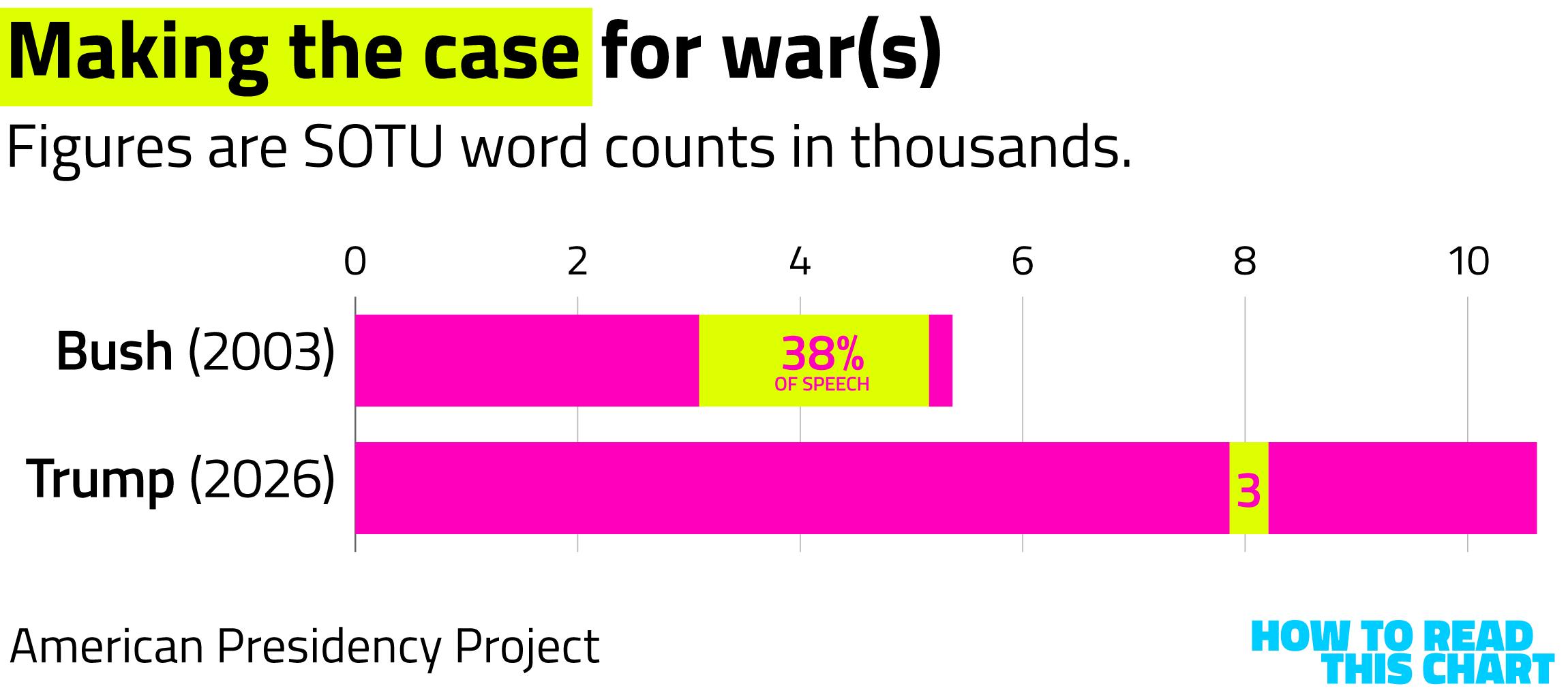
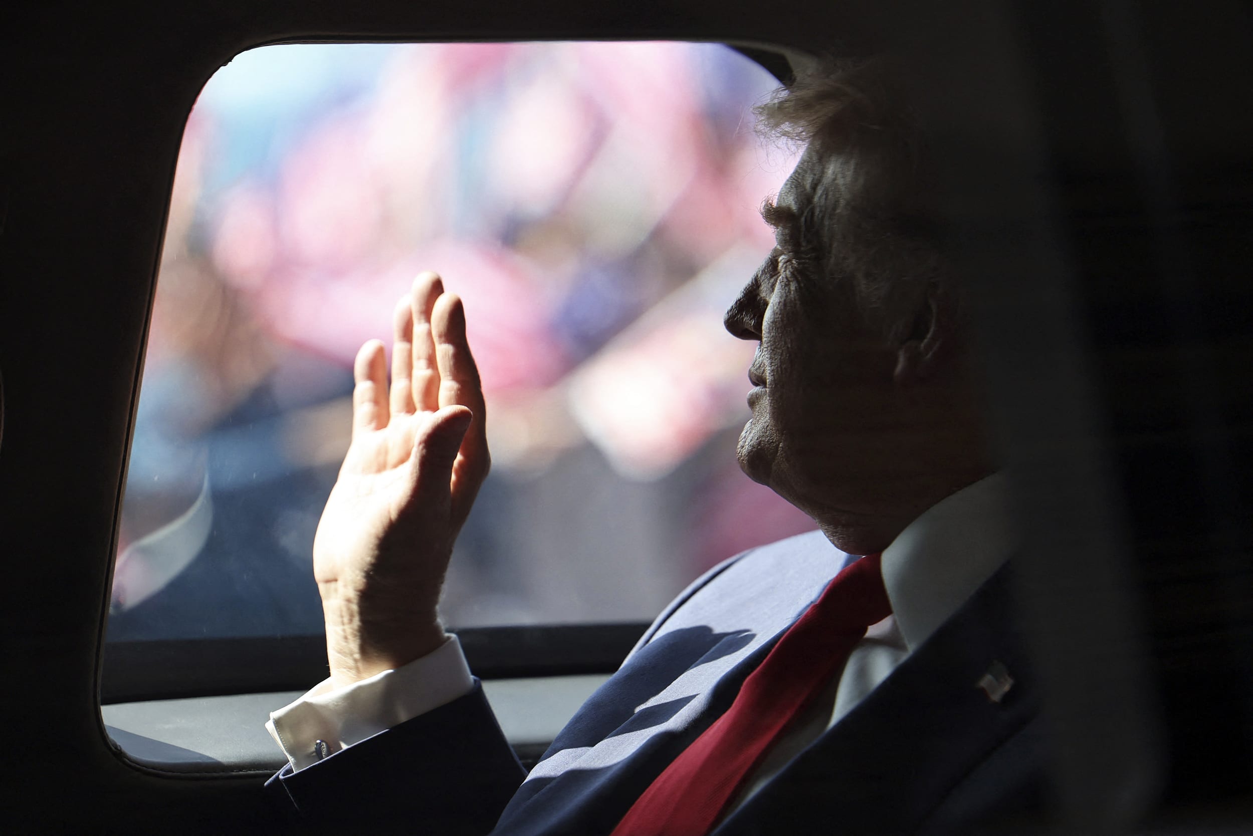
At the time, it seemed rushed and superficial. But history will show that it was, in fact, thorough and well-crafted — at least compared to the action against Iran President Donald Trump initiated this morning.
In 2003, Bush spent a big chunk of his State of the Union address arguing for the need to strike Iraq. During his SOTU speech this week, Trump mentioned Iran only briefly, including commenting that the nation's ability to build nuclear weapons had been "obliterated" during strikes last year. But, uh, they are still/now/again a threat!
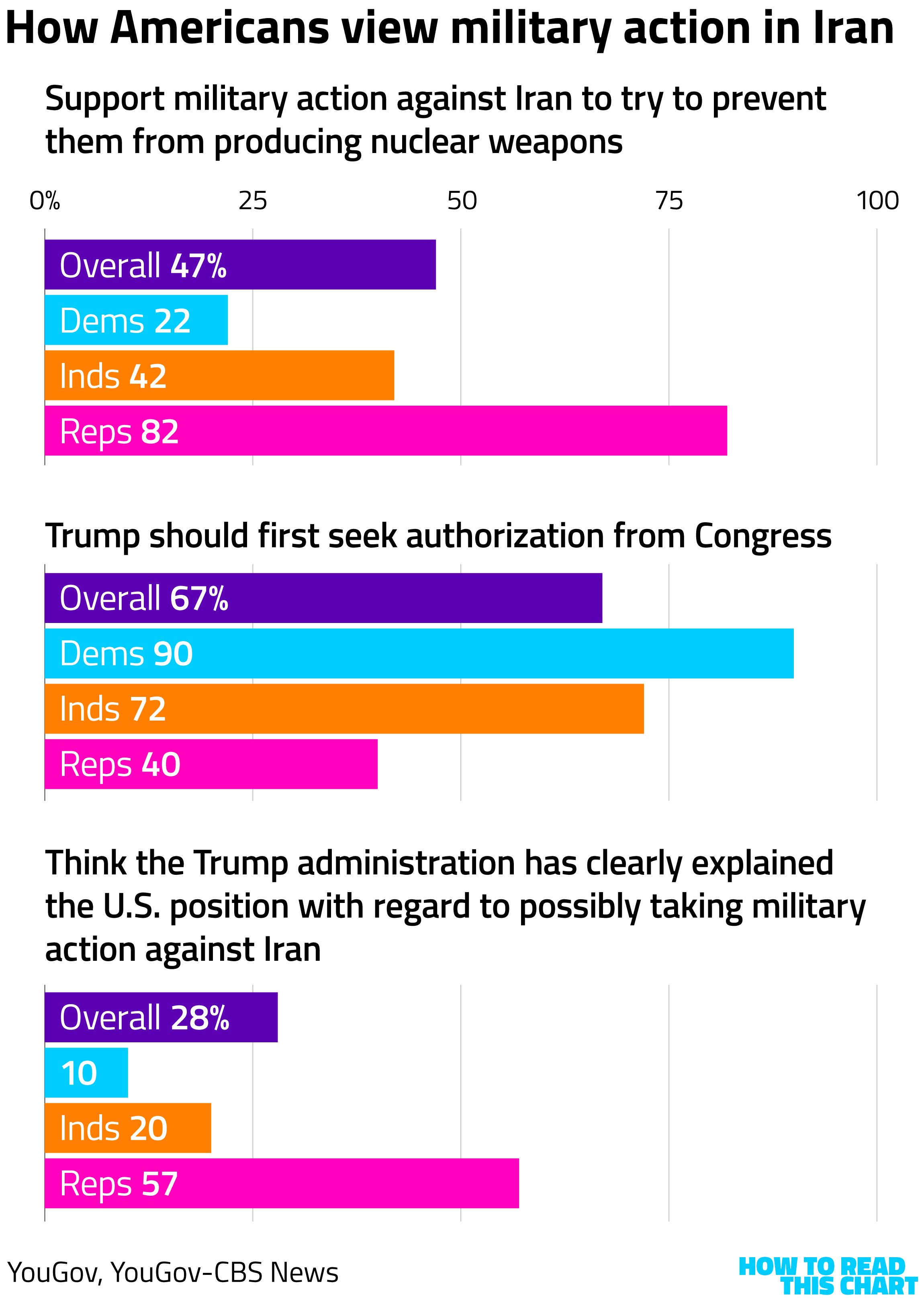
As you might expect, given the lack of consensus-building, polls show that Americans are skeptical of Iran strikes. Even when YouGov asked narrowly about curtailing Iran's putative nuclear weapons program (as opposed to a full regime-change play), less than half of Americans supported strikes. Two-thirds of Americans thought Congress should authorize any such action (as Bush sought before the 2003 invasion) and basically no one who isn't a Republican thinks Trump actually made the case for strikes.
One irony here is that many supporters (though not really Trump himself) positioned him as the anti-war candidate, something he never was and never will be. Another irony is that Trump's rise in Republican politics was heavily predicated on casting Bush's decision and the Iraq War as mistakes (though Trump actually supported the Iraq invasion at the outset).
So here we are. Again. Hopefully what follows from this moment is as limited in its damage and death as possible.
Chapter 1
On a, uh, lighter note…
Now let's talk about what I'd originally intended this newsletter to begin with: The files related to financier-slash-sex-criminal Jeffrey Epstein.
In another era, the federal government's release of millions of documents, images and videos related to a criminal case would fill some warehouse in suburban Maryland, with those interested in finding linkages and through lines forced to schlep to Elkridge to spend weeks digging through pieces of paper.
But this is this era (he said tautologically). So not only is all of that material online but myriad bespoke tools have been created to help casual users skim and organize what's been released. It's a ton of material, published at a time when people have gotten very good at thinking about how tons of material can be presented.
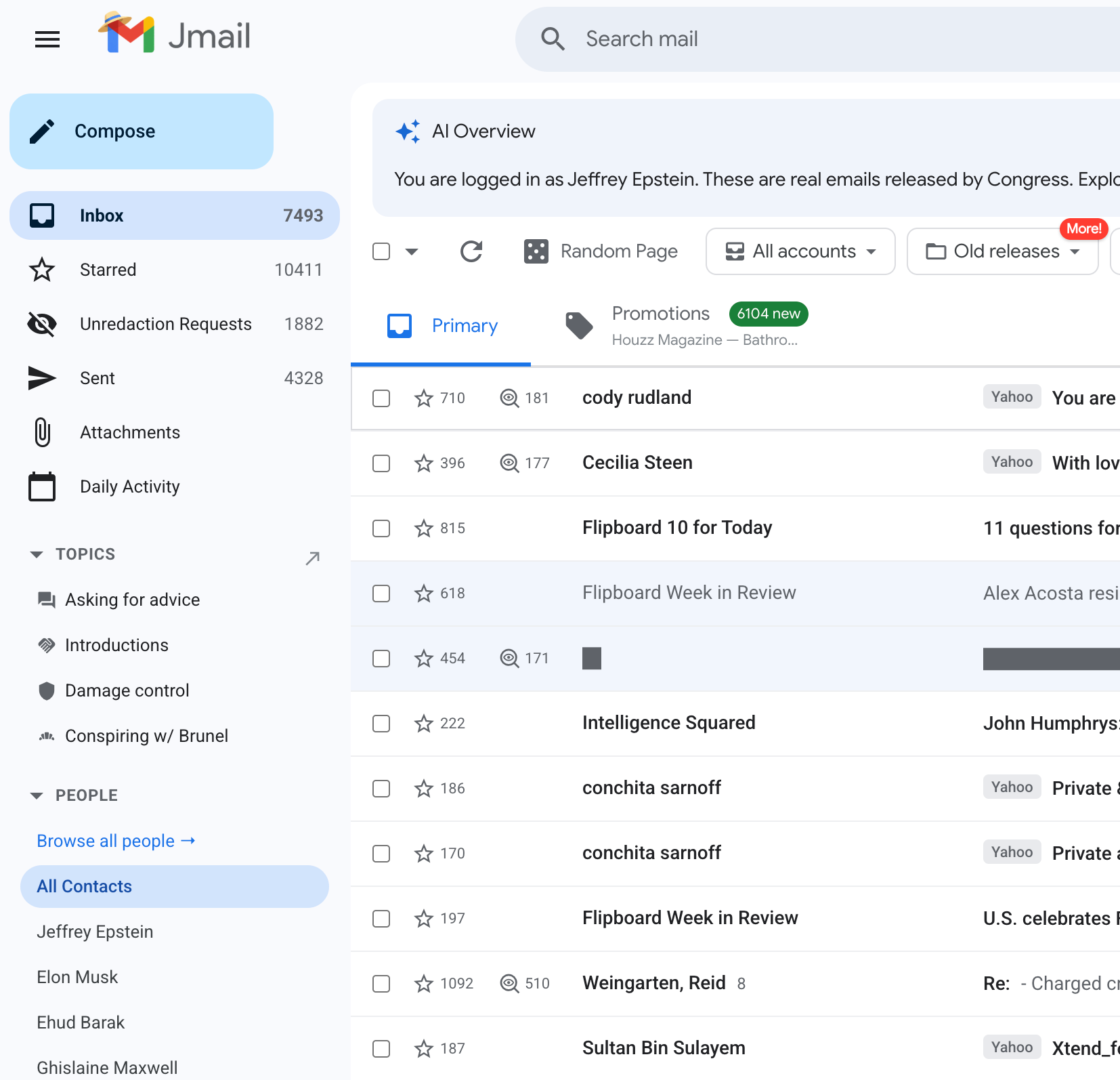
Perhaps the most clever example here is Jmail.world. The site took all of the emails released from the government and organized them as they might have appeared in Epstein's actual Gmail inbox. You can read, search and filter the messages as you might your own inbox.
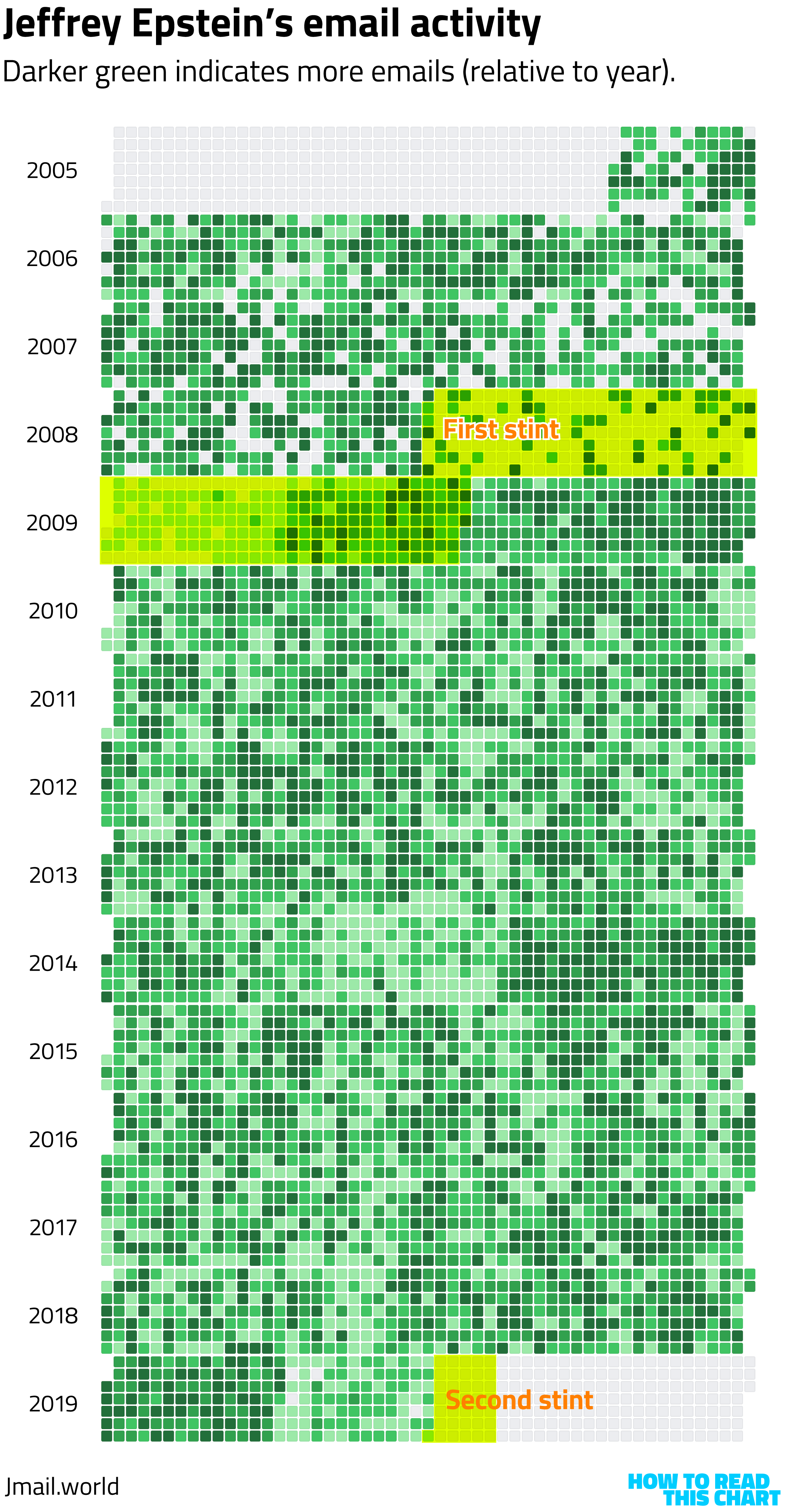
It's not solely an inbox. The site also includes information about patterns in the messages and popular communication partners of Epstein's. I appreciated its year-by-year visualization of when the email account was busiest. It allows you to see, for example, how his email activity dropped off when he was incarcerated in 2008-2009 and again in 2019.
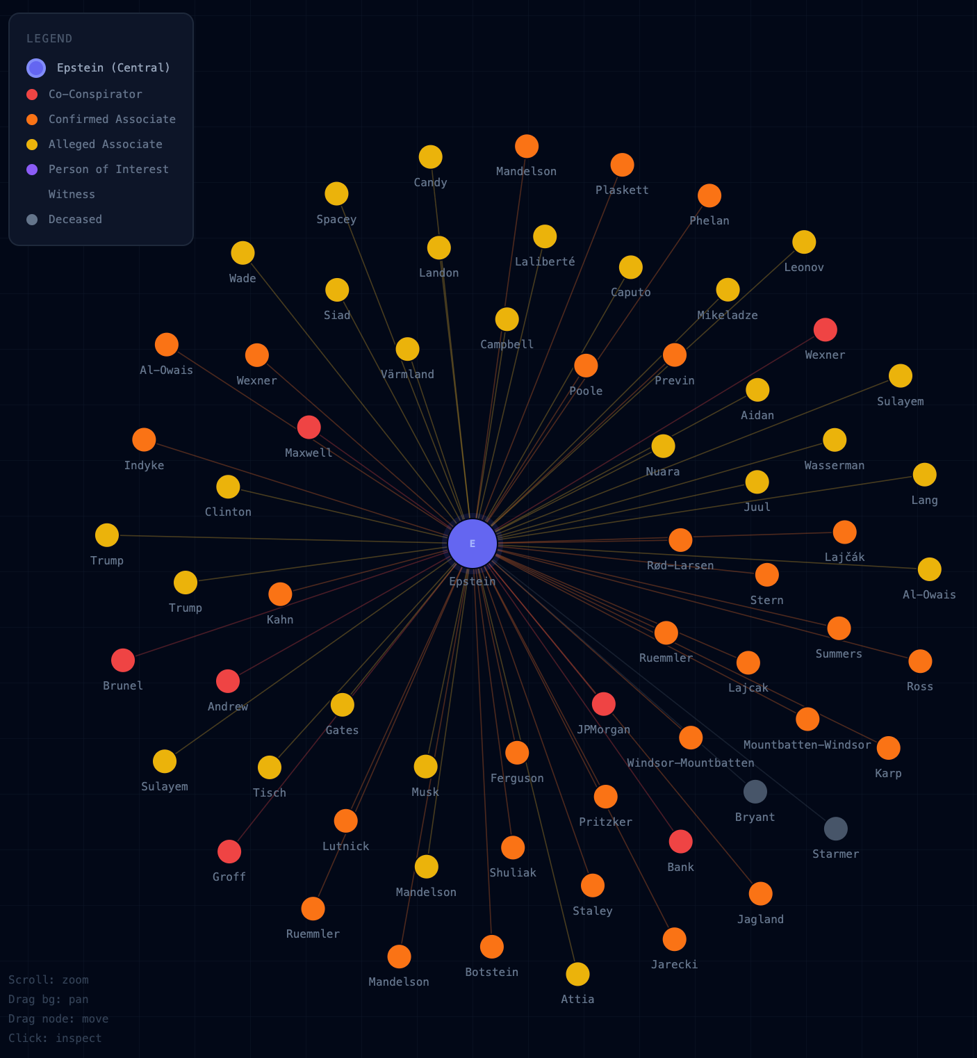
What I was interested in, you might not be surprised to learn, is the pattern of interactions between Epstein and others that emerge from the released material. I started trying to build out a network visualization of those connections before realizing that I'd probably been beaten to the punch.
And I had, multiple times. (Unsurprisingly.) There are relatively simple visualizations users can explore…
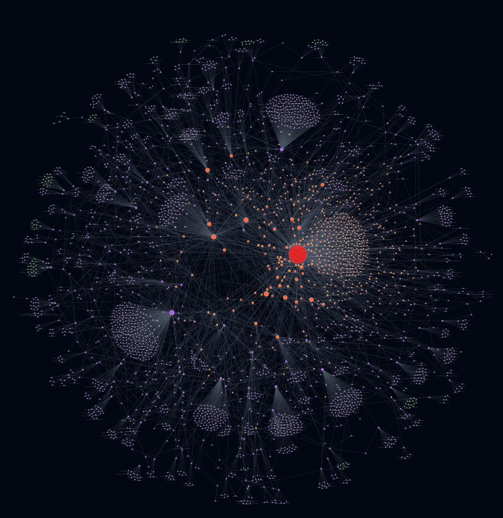
…relatively complicated ones…
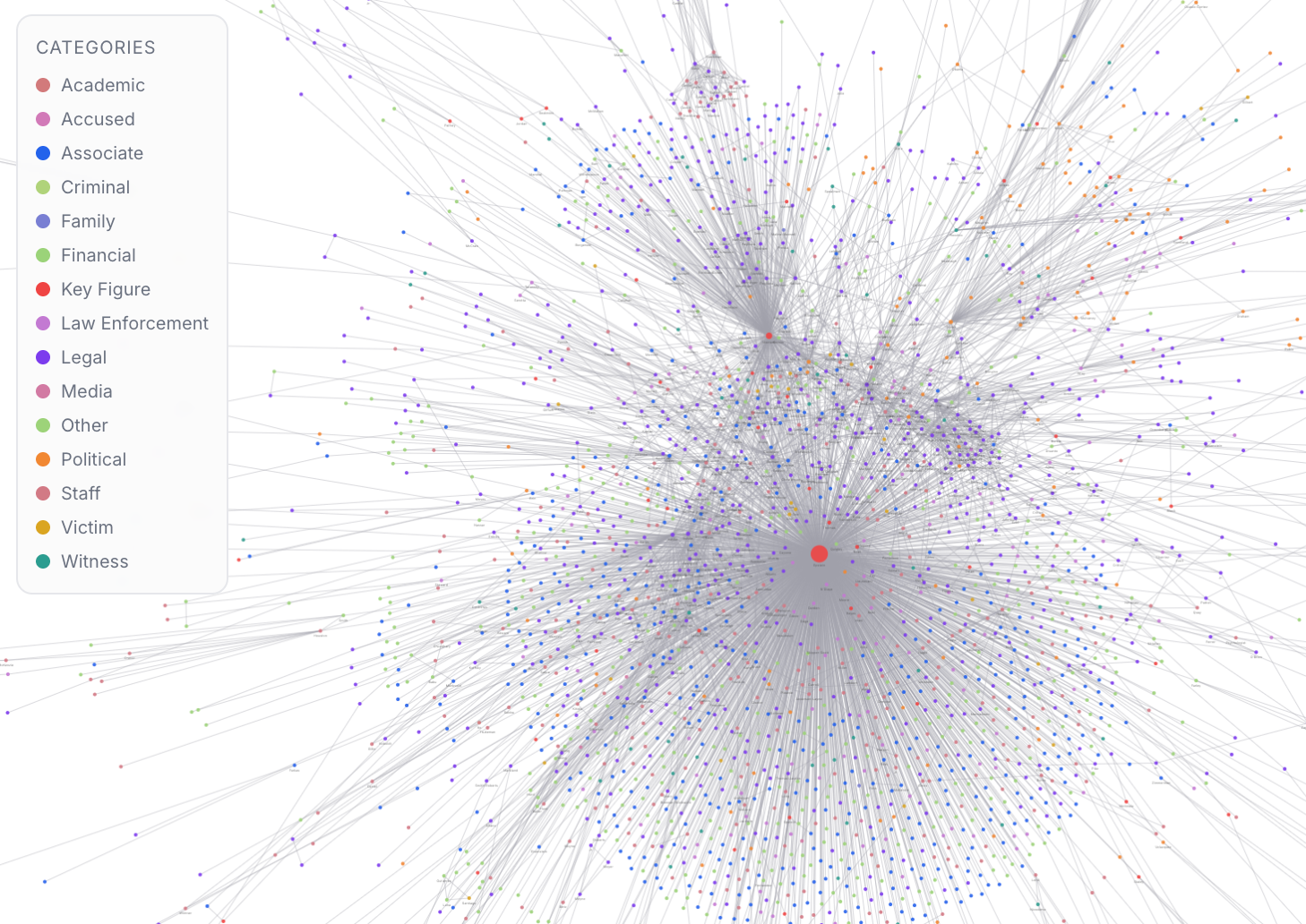
…and visualizations that look like the results of an atomic collision in a cloud chamber.
We have reached a point where a visualization/catalog of the visualizations/catalogs is in order, a meta-level analysis of the analyses. I'm just going to assume it probably already exists, so I don't spend my weekend doing it.
Chapter 2
The birth rate issue
Earlier this week, the New York Times published an article examining the decline in birth rates in the U.S. The number of babies being born to American women has fallen, which the far-right (and this administration) often use as an argument against immigration (incongruously).
One reason for the decline is that fewer teenagers are having kids, which is hard to see as a bad thing. But a central reason that this has become a political issue is that birth rates correlate to race. Birth rates have fallen more sharply among White Americans, which constitutes most of the subtext.
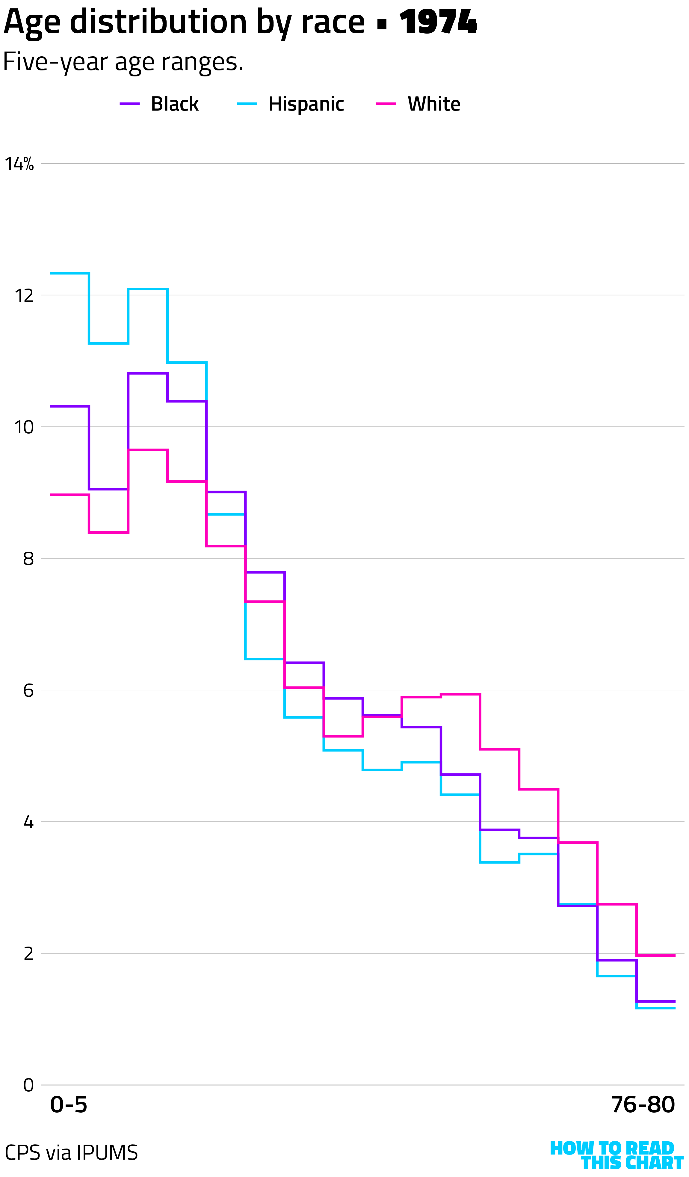
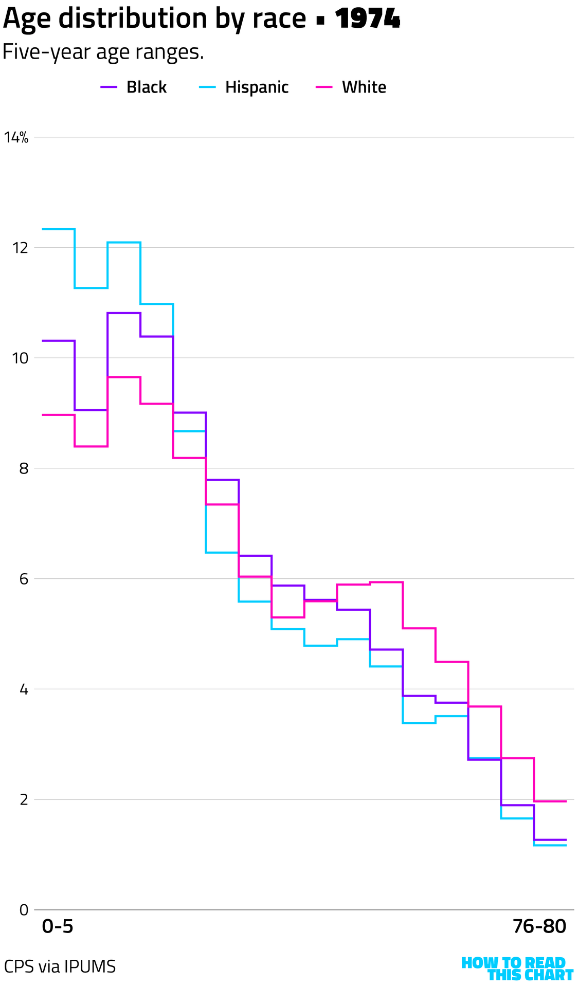
You can see that on the chart below: the White population in the U.S. skews older while the Black and Hispanic populations skew younger. (Here and on the charts, I'm excluding Hispanic Americans — considered an ethnicity by the government — from the Asian, Black and White racial categories.)
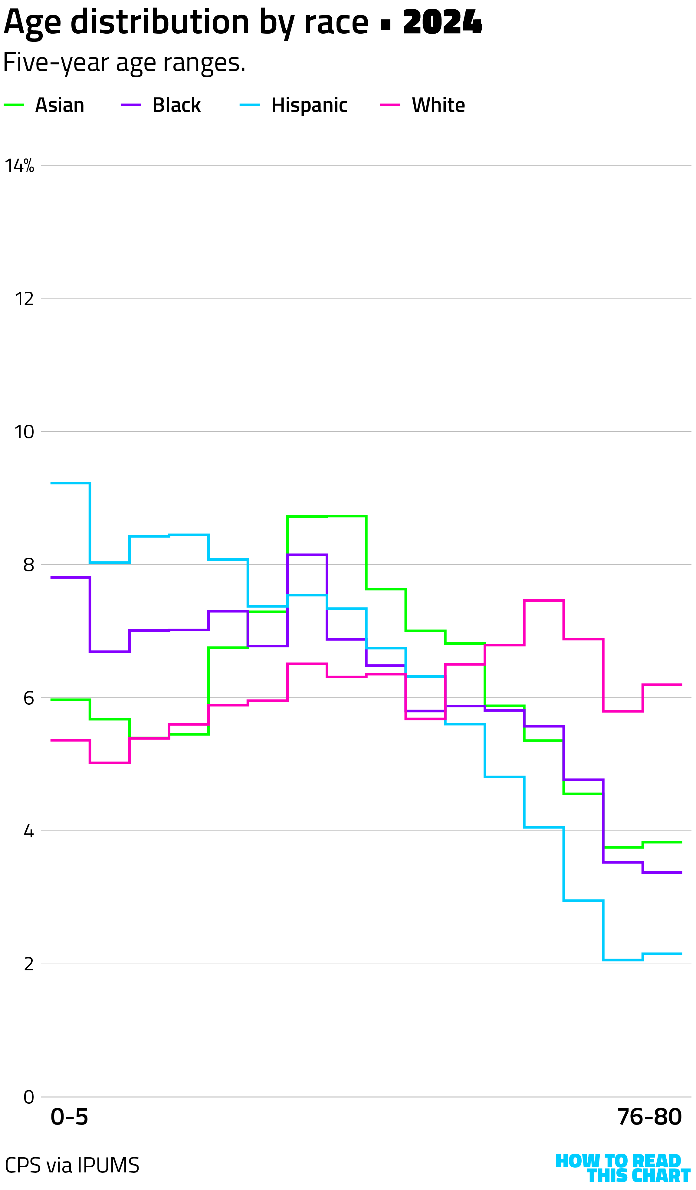
This is a distinct change from what these distributions looked like 50 years ago (before the number of Asian Americans was significant enough to break out in federal data).
You can see in the animation below how populations shifted over time, bringing us to the current moment.
What you can also see there is the baby boom, a demographic event that occurred during a time when immigration was limited by law and therefore was more pronounced among White Americans. (It's that lump that propagates through the White-American line from left to right.)
Population growth is beneficial to the country! To attain it, we can either have more babies (which is tricky) or allow more new Americans (which is theoretically easier). Unfortunately, the immigration pattern in the U.S. at the moment is shifting from inward to outward.
You already know why.
Chapter 3
Trump's other war
The Minnesota Star Tribune has a fascinating, data-driven article looking at how the federal occupation of the Twin Cities compares to federal deployments in other states. The graph below tells most of the story.
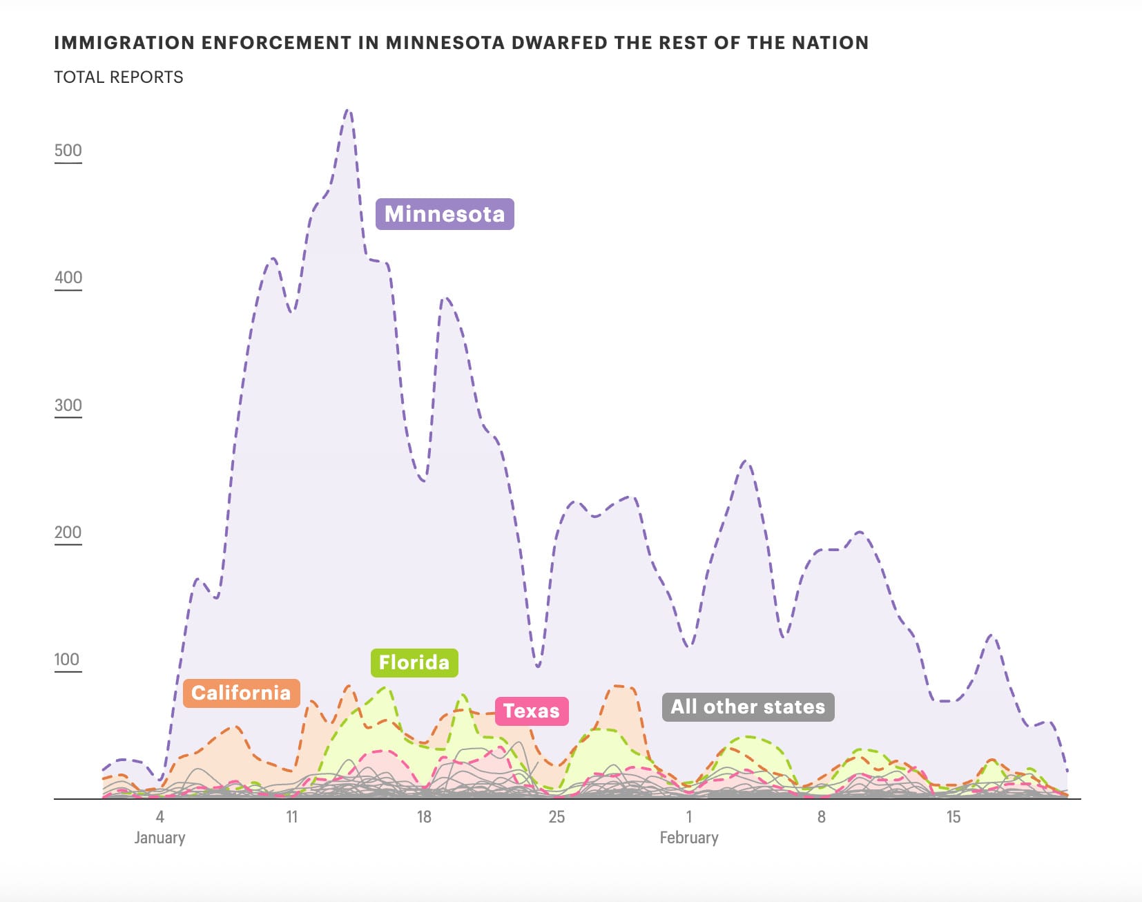
This is self-reported data, but that also tells part of the story. Residents of Minneapolis quickly organized to track and report immigration actions, with the effect of providing a better picture of what actually unfolded.
Chapter 4
Remember when Trump gave a speech? That was this week.
While I was watching the State of the Union this week, I made an off-handed joke on social media about how the speech would be received by Trump's allies on the Supreme Court. That led to my wondering how often Supreme Court justices actually showed up to watch the speech (and the addresses new presidents present upon taking office).
Happily, The Hill's Zach Schonfeld has been compiling that data. I made a visualization, showing which justices have attended since 2000 (when none did), tracking seats as they changed hands after deaths and retirements.
On the chart below, red/pink lines indicate justices appointed by Republicans; blue lines are those appointed by Democrats. Blue dots indicate that a justice attended a speech by a Democratic president; red/pink dots indicate a Republican speech. A line with no dots? The justice didn't attend.
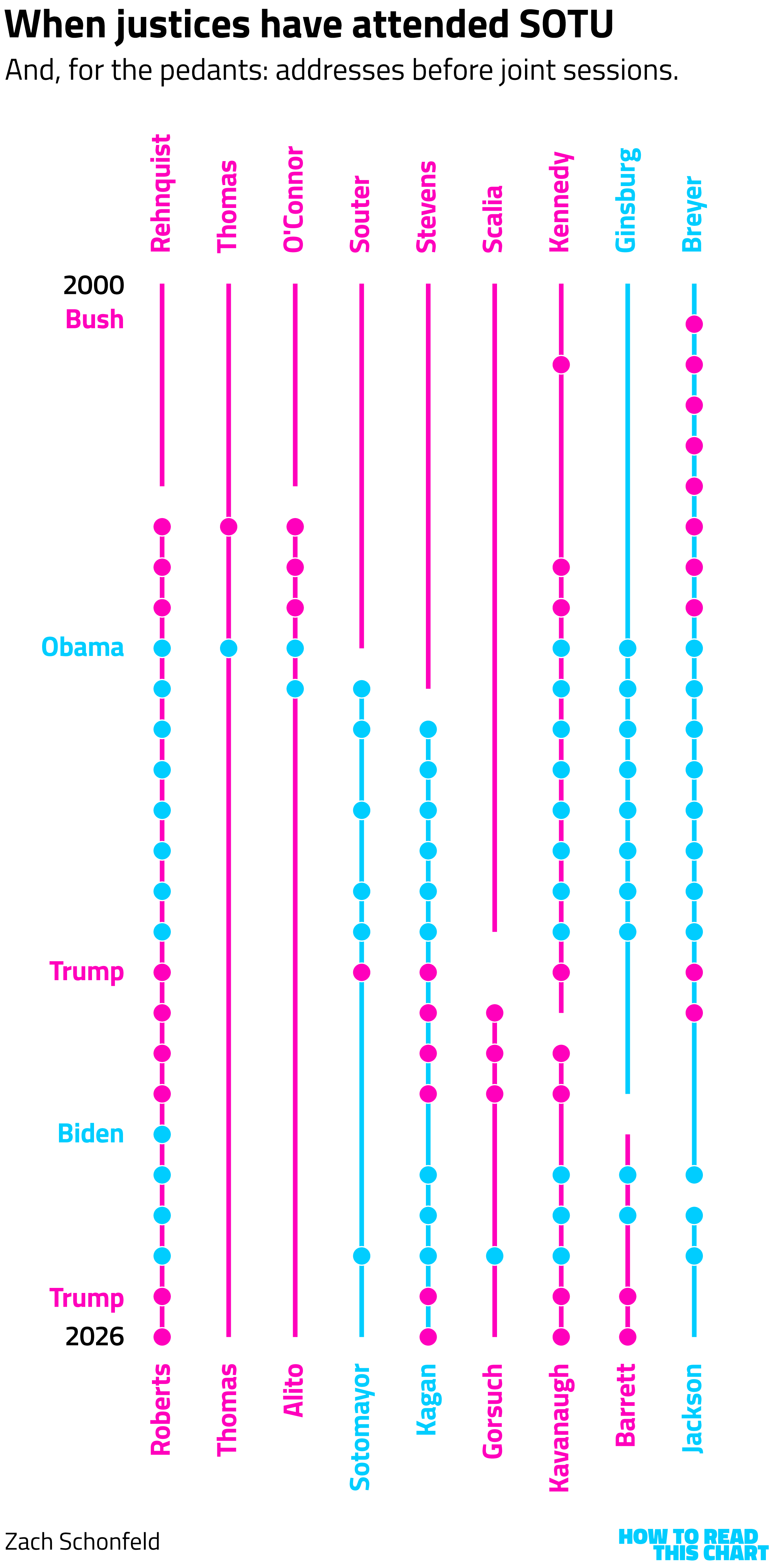
There's no real partisan pattern here. Some justices go a lot; some rarely or never do. Samuel Alito used to go until he was seen reacting negatively to Barack Obama's 2010 speech. Seems to have soured him on the process.
Speaking of being soured on State of the Union addresses, Americans are too.
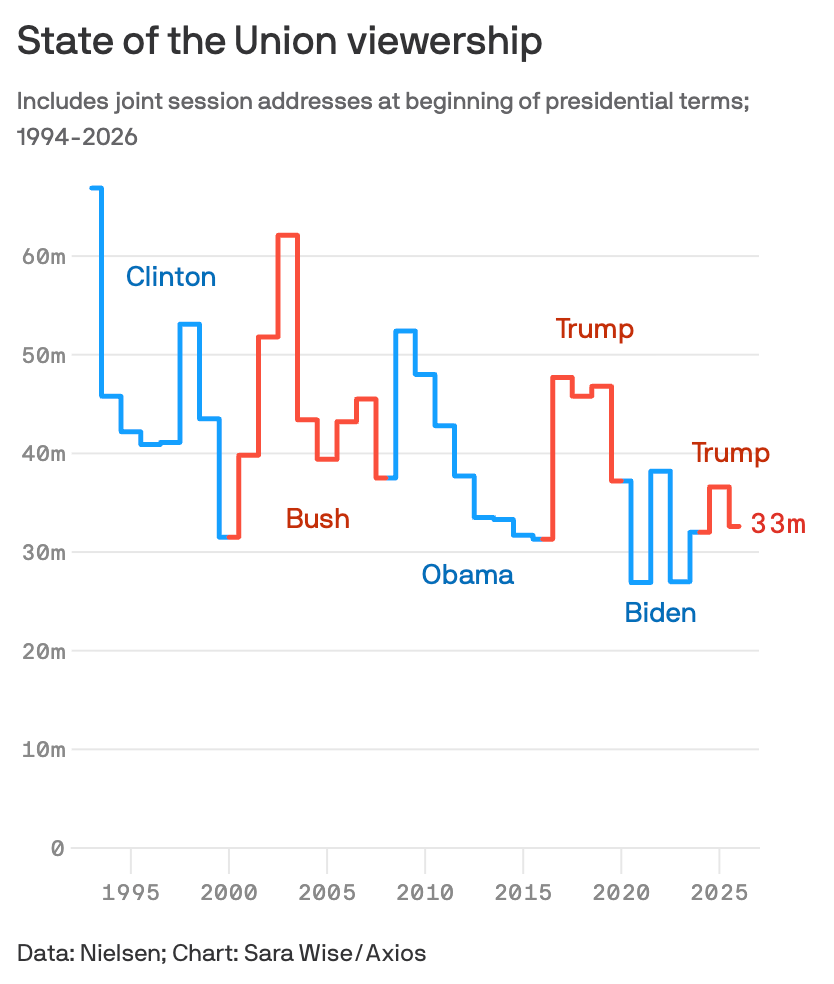
Hard to blame them.
Chapter 5
The dramatic shift in American views of Israel
The strikes on Iran that began Friday were initiated unilaterally by the Trump administration, but are not unilateral internationally: Israel is also participating in the action. It's not surprising, given Trump's relationship with Israeli Prime Minister Benjamin Netanyahu, but it comes in the immediate aftermath of new Gallup polling showing how much more skeptical Americans are of Netanyahu's nation.
For decades, Americans were generally much more sympathetic to the Israeli side in its tensions with Palestinians. This year, though, Gallup found that Americans are now more sympathetic to the Palestinian side.
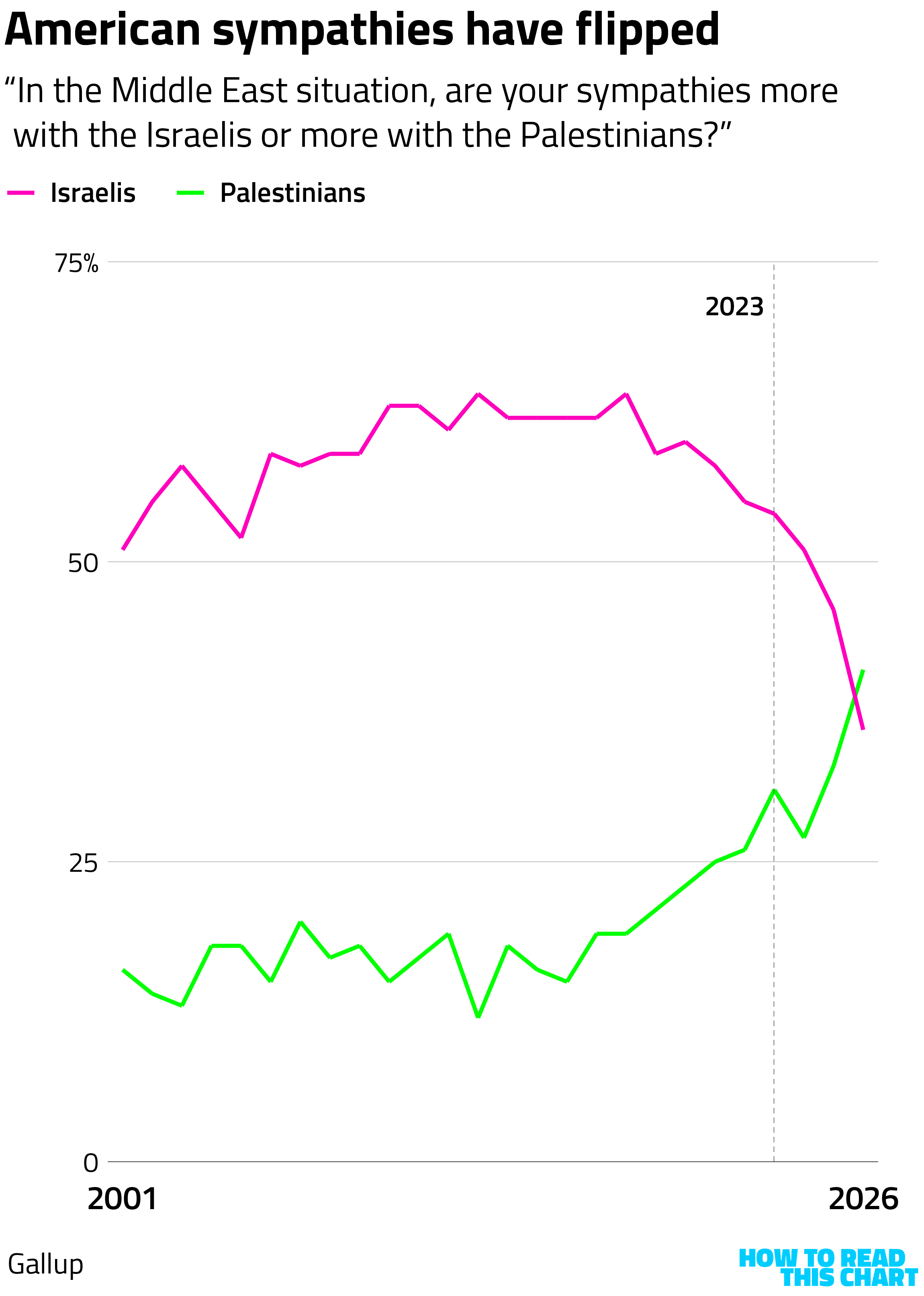
This occurred in the wake of the Oct. 7, 2023 terror attack in Israel (after which American sympathy for the Palestinian cause dropped) and the overwhelming Israeli response, which unquestionably plays some role in the shift.
But as you can see above, the shift was already underway prior to 2023, driven heavily by shifts among Democrats. That shift began at the tail end of the Obama administration, and is likely linked to Netanyahu's opposition to the agreement the U.S. signed with Iran, the Joint Comprehensive Plan of Action (JCPOA).
In 2015, you may recall, Netanyahu spoke before Congress (at Republicans' invitation) to criticize Obama and the deal. Democrats were not happy. The decline in Democratic sympathy for Israel picked up after that point and sympathy for Palestinians increased.
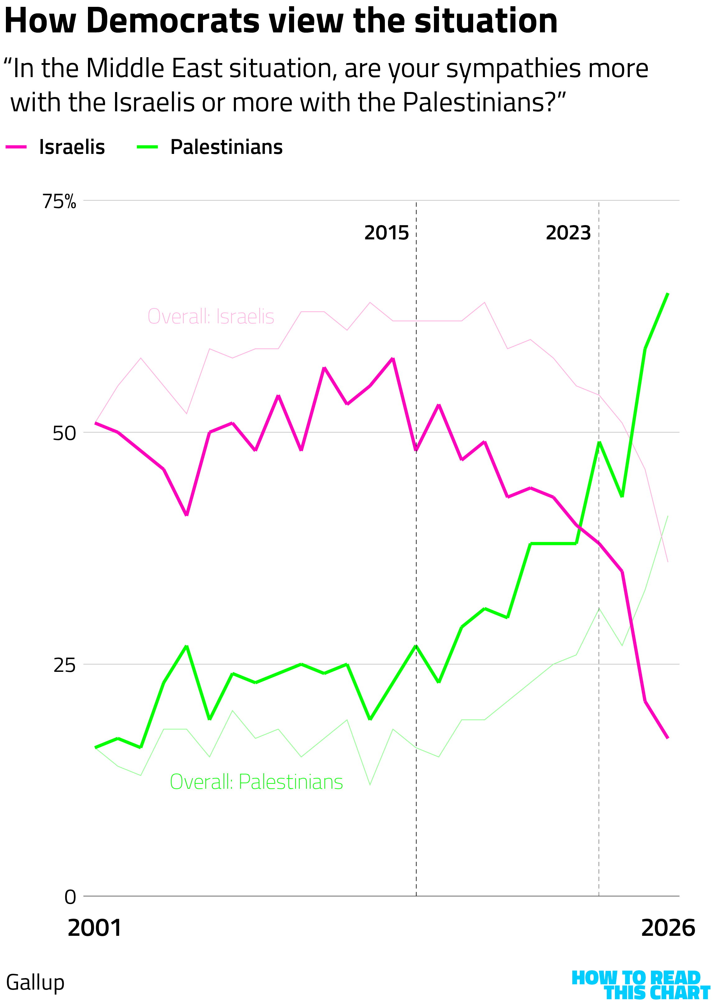
That agreement with Iran, of course, was centered on blocking Iran's nuclear ambitions. By all outward appearances it was working — until Trump ripped it up during his first term in office. And here, once again, we are.
Chapter 6
Chart Attack
OK. Now an actual palette cleanse. Until the last Chart Attack chart, anyway.
Hey, remember last week's newsletter in which I mentioned my family was on a trip to Florida? Well, we were scheduled to fly back on Sunday night which hahahahaha no
We made it, eventually, through a John-Candy-and-Steve-Martin-esque combination of cars, planes and melodrama. Imagine "Planes, Trains and Automobiles," but with two kids under the age of 10.
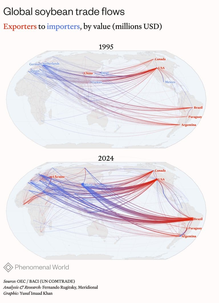
Speaking of complex movement, here are neat charts of soybean trade.
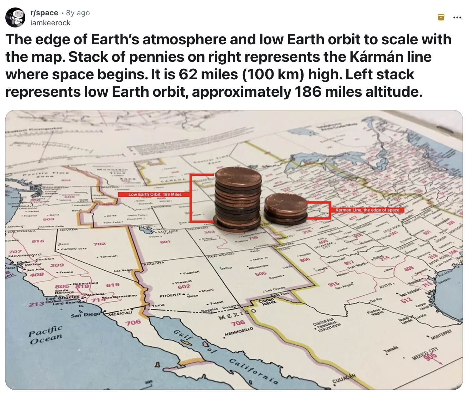
And here is an (old) (but effective) visualization of how thin the Earth's atmosphere is.
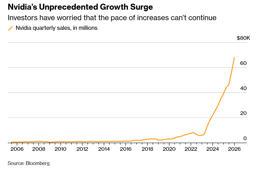
The computer-chip maker Nvidia has an enviable chart of sales growth, a function of providing many of the chips driving the implementation of artificial intelligence systems.
Which brings us to an all-timer chart from the Financial Times, explaining that AI will either obliterate the economy, end all human suffering or slightly increase economic output.
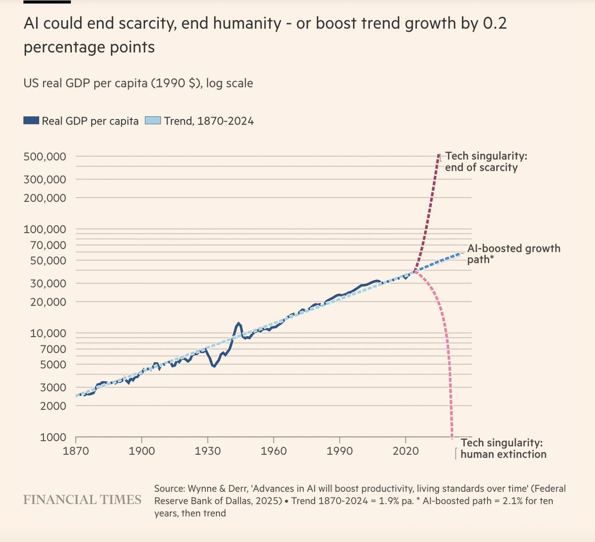
This assumes, of course, that the world doesn't collapse into deadly international conflict before then. But what are the odds of that!
Appendix
Some other things I've written

You are receiving this email because you at some point in time volunteered to, either at Ghost or Substack or pbump.net or pbump.com. If you don't want to receive future emails, it's probably only because you are in prison. What you really want to do is support the newsletter financially, right?
Another one is coming in two weeks. You have been warned.