The glorious return of How To Read This Chart


Chapter 1
So, uh, what have you been up to?
The last time anyone received an issue of "How To Read This Chart," President Trump hadn't yet deployed the military to D.C., the Mets were only a game-and-a-half out of first and I, Philip Bump, still had a job. That was back in mid-July, when I was at The Washington Post. Then I left The Post and left the newsletter — only to discover that I missed it.
So it is back.
I will assume that most of you who are receiving this volunteered to get more emails from me because you were a subscriber to that newsletter. If that isn't you, if you signed up for updates from me for some other reason, well, hello! This is a newsletter about charts and data visualizations but mostly about things I find interesting or funny. It began in December 2021, as I prepared to launch my chart-heavy book "The Aftermath" and continued from there.
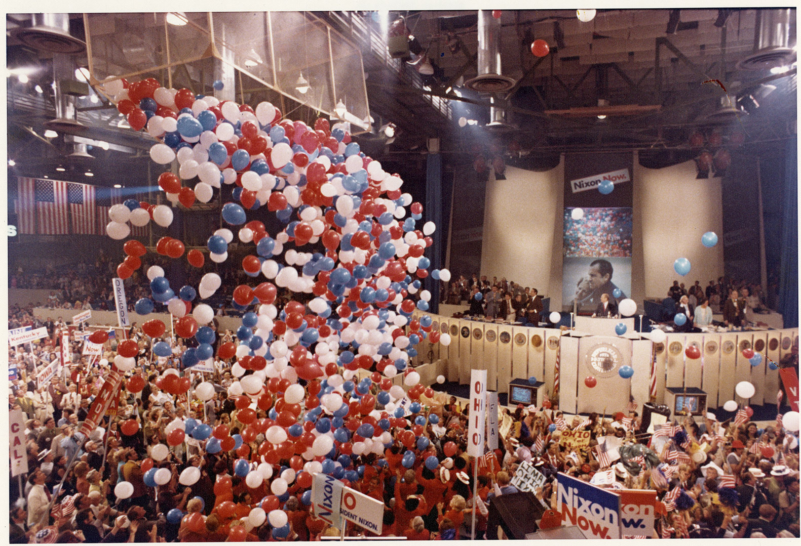
Or, to put the timeline visually and to use Jan. 6, 2021 as a reference point for no particular reason:
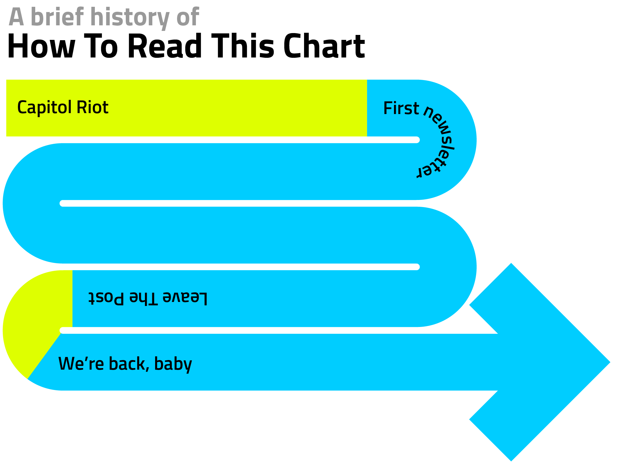
See how that chart is sort of bizarre and a bit unhelpful but interesting to look at? Yeah, that's the vibe here.
Now let me do a little bit more housekeeping so you know what to expect should you choose to stick with the newsletter, which I insist that you do:
- There's no paywall. If you enter your email address, you get the newsletter.
- But I'd encourage you to contribute. If this newsletter doesn't at least pay for itself, I'm probably not going to stick with it. I guess that's sort of a threat, which isn't my intent but: still!
- I am not going to use A.I. images for anything. As I wrote at my personal site a month or so ago, I'm trying to be deliberate about how I use and allocate my resources in a responsible way.
- I want this newsletter to be engaging and want to hear from you about it! See a dumb graph? Have a question about a confusing one? Wondering how data might be displayed? Email me!
I think that's about it. So, without further ado, let's consider some charts.
Chapter 2
Mr. Popularity
Earlier this week, ABC's Jimmy Kimmel celebrated another win over Trump: a poll finding that the talk-show host was viewed more favorably than the president.
Kimmel had a lot of amusing/ungenerous things to say about Trump that would probably be gratuitous to recapitulate here. (You may read them for yourself, should you so desire.) (I am going to see whether that ends up being the most-clicked link in this newsletter and I bet it will be.) But the upshot was what you'd expect: people like Kimmel better.
This claim is based on polling conducted by YouGov for The Economist and, in fairness, Kimmel's lead isn't that robust. About 44 percent of U.S. adults have a very or somewhat favorable view of Kimmel compared to 41 percent who view Trump that way — a 3-point difference that's well within the poll's margin of error.
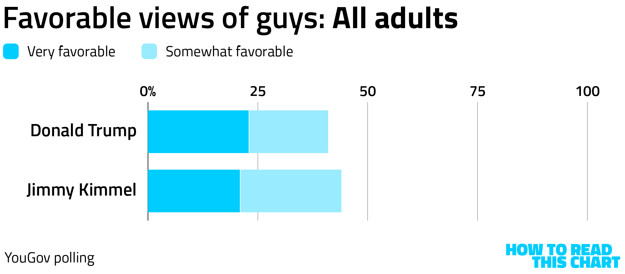
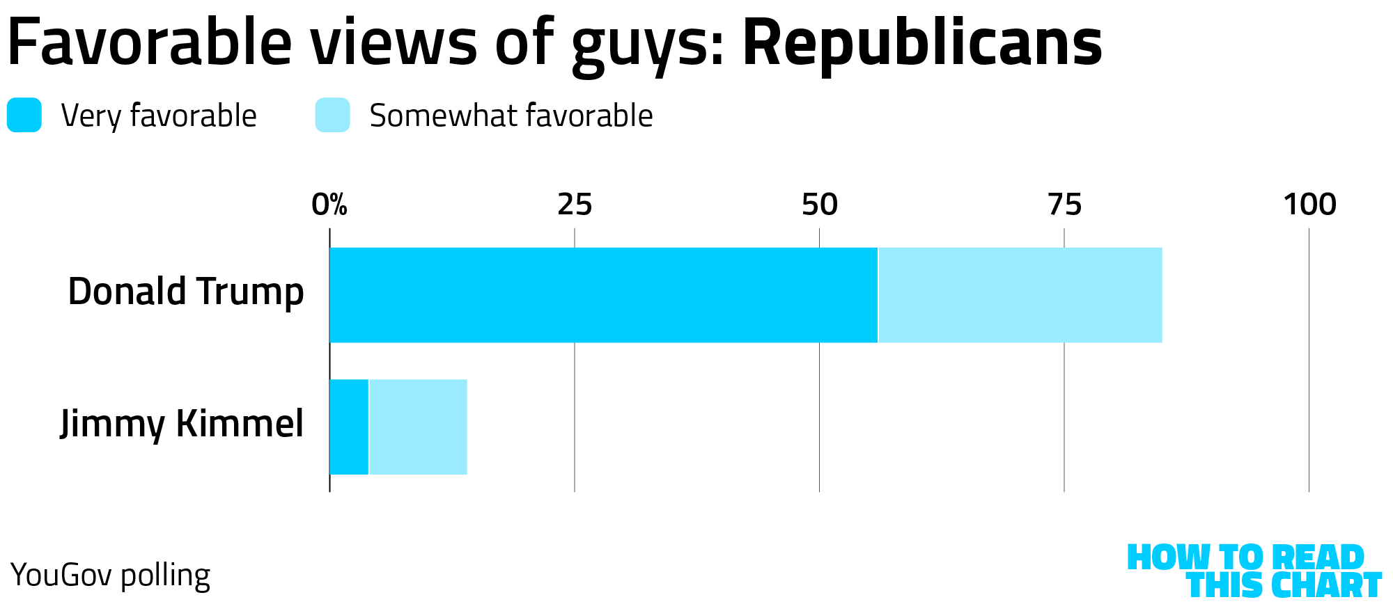
Of course, this ratio is affected heavily by members of Donald Trump's party. Republicans view Trump much more favorably and view Kimmel — whose first win over Trump centered on his show being tabled in the face of right-wing hostility — much less favorably.
The flip side of that? Everyone else views Kimmel far more favorably than Trump.
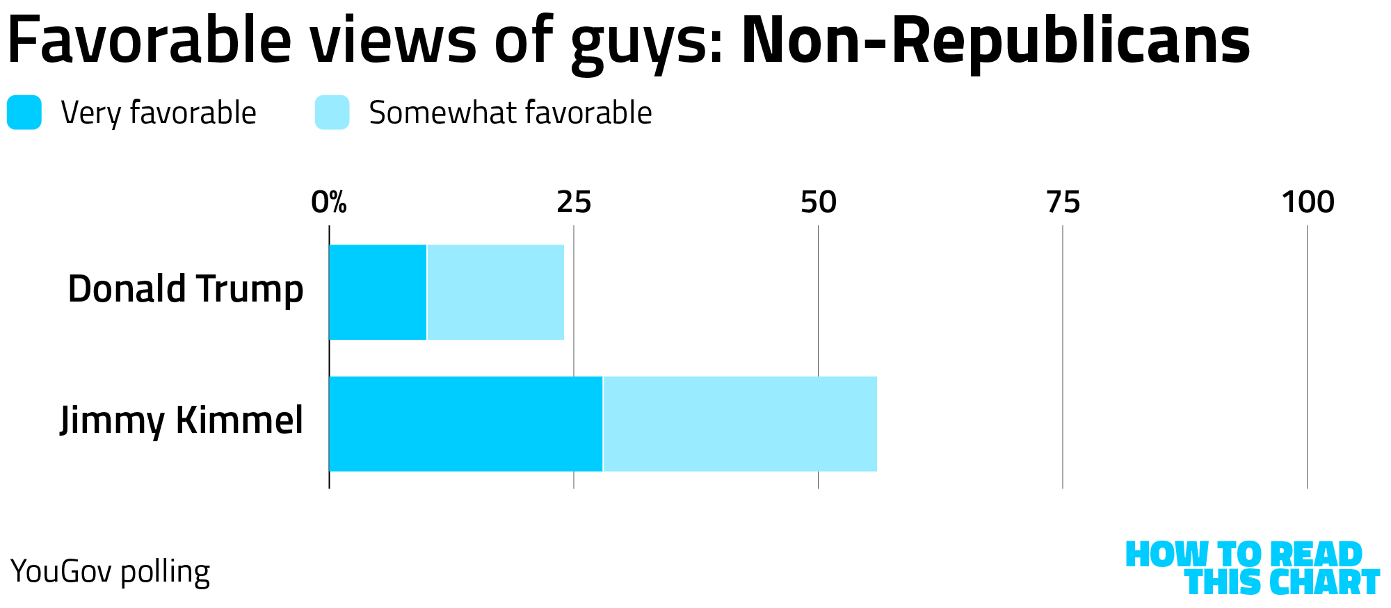
But there is a really important qualifier here that deserves to be mentioned. YouGov's poll allowed people to indicate that they had no opinion of either man, something that is admittedly easier to believe about Kimmel. The result, though, is that about 1 in 8 people didn't view Kimmel favorably or unfavorably.
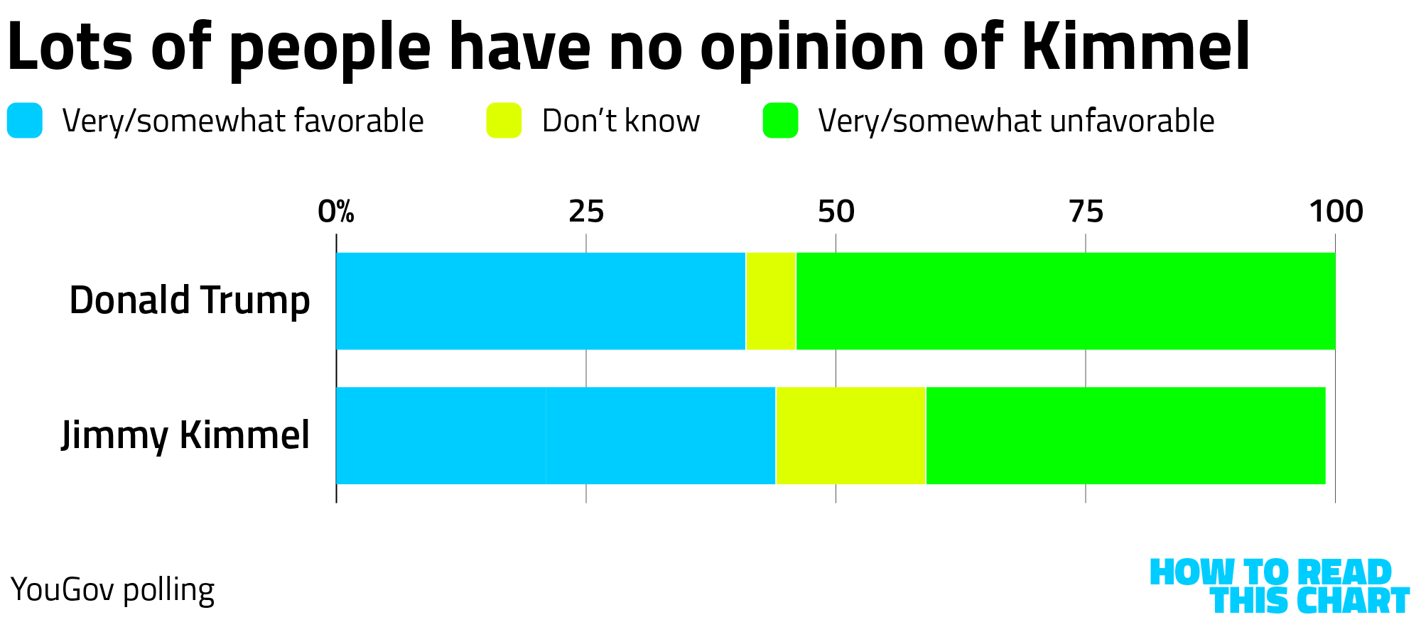
Why does this matter? Well, it means that Kimmel is viewed more favorably than Trump even though fewer people have an opinion about him.
There are a few ways we can adjust for this. One is to consider the percentage of the population that views each man favorably relative to all of those with an opinion. In other words, since 44 percent of adults view Kimmel positively but only 87 percent have an opinion, about 51 percent of those with an opinion view him favorably (44 out of/divided by 87). Adjusting his and Trump's favorability in that way extends Kimmel's favorability lead to 9 percentage points.
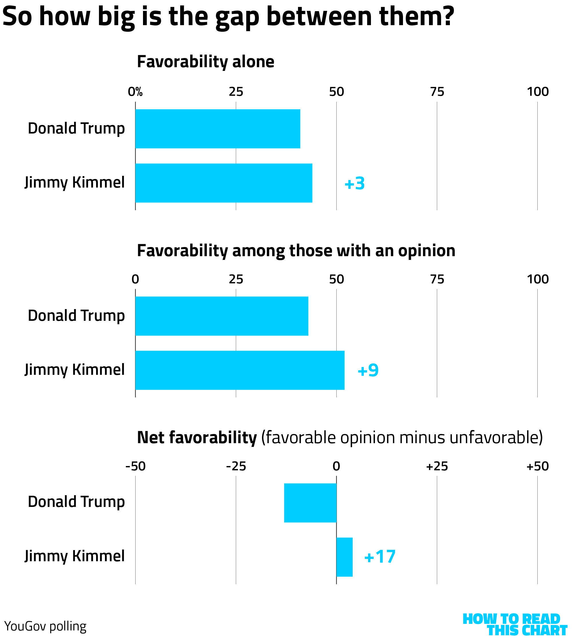
Another way to account for those without an opinion is to look at net favorability — those who view either man favorably minus those who view him unfavorably. Here, Kimmel is above water (has a positive net favorability) while Trump is under water (has a negative one). And the gap between them gets larger still: 17 points.
My original plan for this section was to compare Trump to a bunch of other people who've been included in recent YouGov polling, but I realized I'd already gone on longer than intended. I will therefore simply leave you with one of the most interesting comparisons of those I compiled: How Trump's net favorability compares to professional sporting leagues.
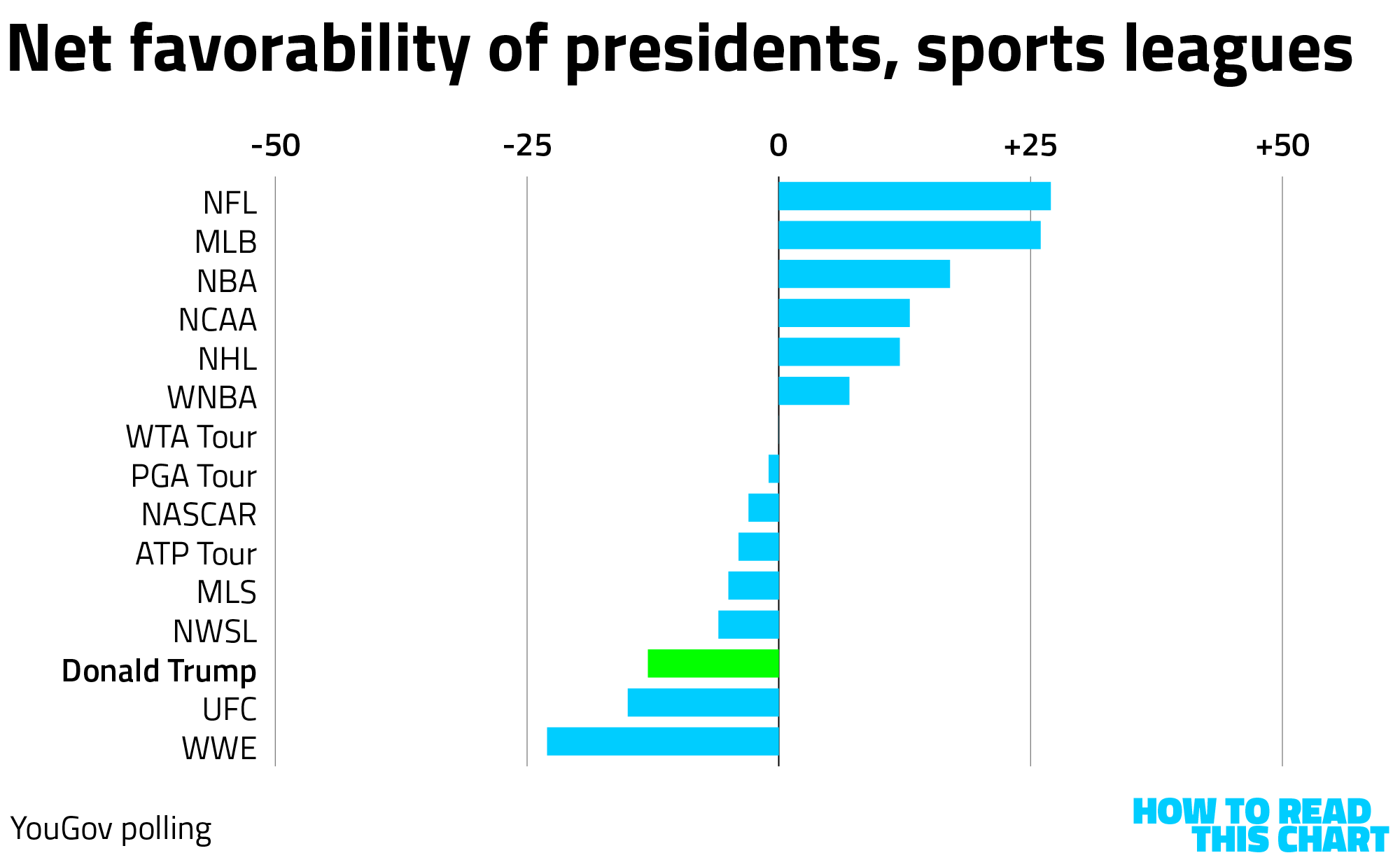
The president is viewed less favorably on net than any league, including Major League Soccer (which fares awfully poorly). The only leagues with lower numbers? WWE and UFC, which are providing Trump his Education Secretary and 2026 birthday entertainment, respectively.
Chapter 3
Chart Attack
One of the more popular features of How To Read This Chart has long been Chart Attack, née (Chart Attack is female) Chart-a-rama, or something like that. Uncomplicated, it's simply a quick barrage of data visualizations that I thought were interesting.
And since it has been a while, I have more than a few visualizations to share.
Like this animation, via CNN (click any image to see the source) showing plumes of pollution in the NYC area.

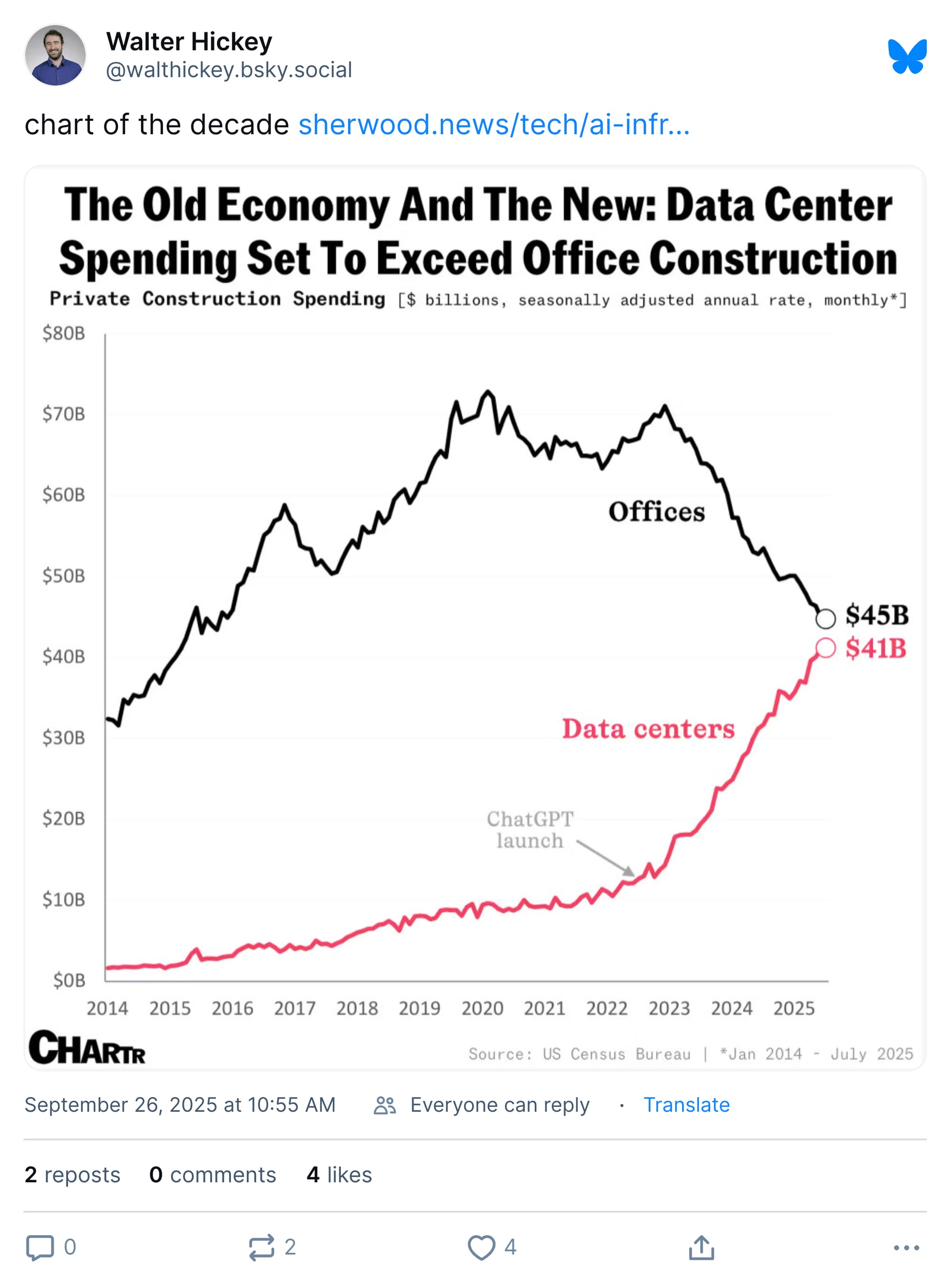
Or what (Pulitzer-winning data journalist) Walt Hickey credibly dubs the "chart of the decade."
Oh, by the way, the old issues of How To Read This Chart are not available at The Washington Post website, but can (somewhat spottily) be found at the Internet Archive. Why? Because the internet is rotting away beneath us. (Also because The Post doesn't archive its newsletters.)
Magazines, on the other hand, can last forever. Like this 1930s issue of Fortune that journalist Elizabeth Spiers owns.
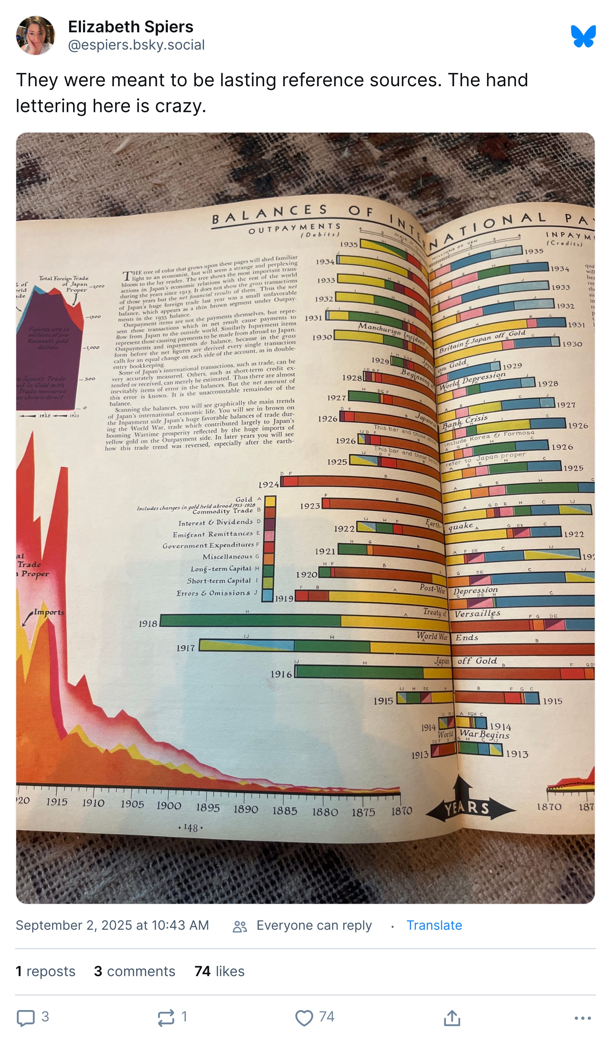
There are other benefits to print media relative to more modern forms of communication.
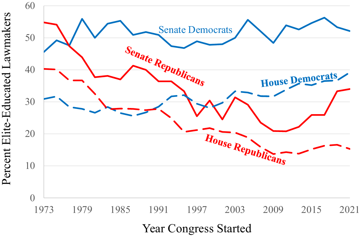
I found this chart from a recent study revealing: the Republican backlash against higher education has made its way to Capitol Hill.
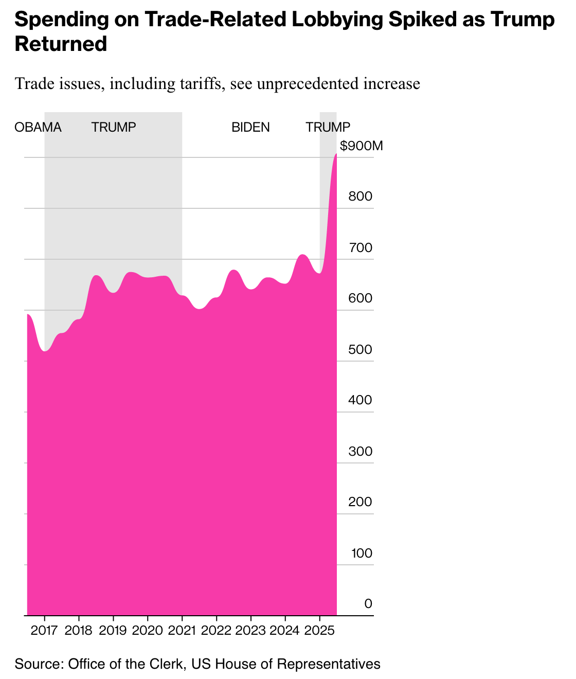
And you know what else has made its way to Capitol Hill? Lobbyists. (I know lobbyists are always there, but lobbying has surged since January! I was just trying to bolster the point.)
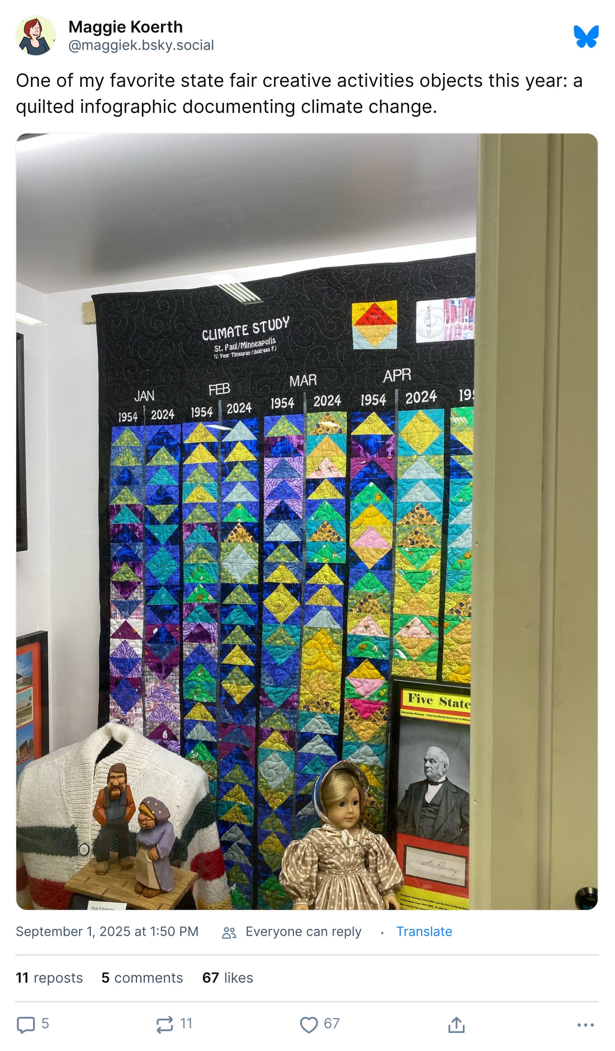
Meanwhile, Minnesotans are tackling the problems of the world, they way only they can, with quilts.
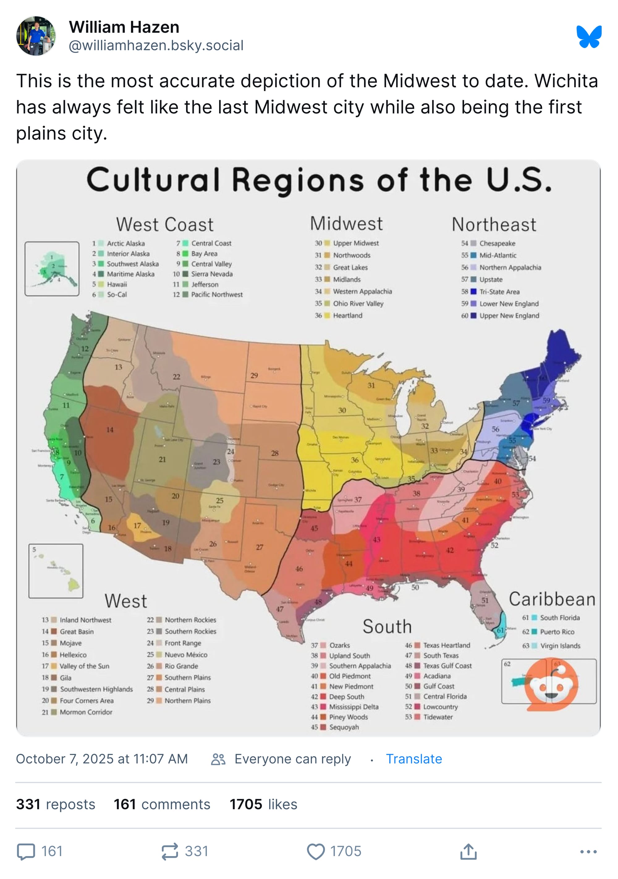
Minnesota, of course, is in the Midwest, along with western Pennsylvania and eastern Kansas. The South covers most of West Virginia (no doubt to its founders' chagrin) and Reno is on the West Coast. I don't make the rules; this diagram does.
It has probably taken you north of 45 minutes to get to this point in the newsletter, indicating that perhaps I have gone on longer than might be recommended. Well, I am sorry but this is what happens when you let data visualizations build up in the brain. Eventually they need to find an outlet or you turn into ChatGPT.
But I'm done. Mostly.
Appendix
Some other things I've written
(I also write at pbump.net if you want to hear me meander about stuff on a more regular basis.)


You are receiving this email because you at some point in time volunteered to, either at Ghost or Substack or pbump.net or pbump.com. If you don't want to receive future emails … what, are you fancy? Too cool for this? No, you aren't. What you want to do is support the newsletter financially, right?
Anyway, another one is coming next week. You have been warned.