Putting the real world down on paper

This week's newsletter looks at how we use maps. I review a new book on the subject, interview a mapmaker and show how maps can reshape our assumptions about borders. It's all topped off with what I think is maybe the most effective visualization I've ever made? So stick around.
Chapter 1
What should a map even be?
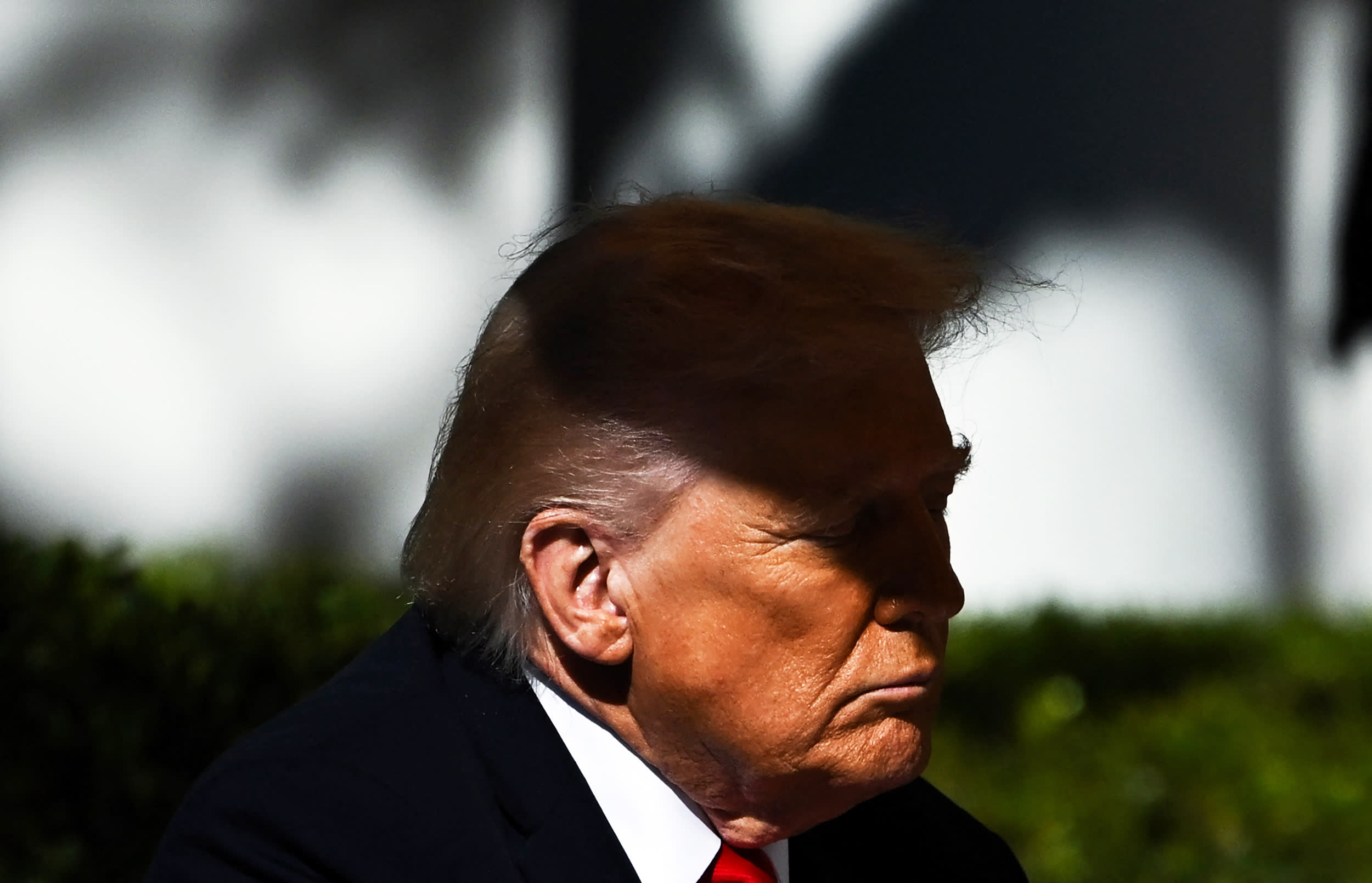
Speaking with Reuters reporters in the Oval Office in April 2017, President Trump handed over maps of the county-level results from the prior year's election. I don't need to explain any more about the situation for you to understand why he did so: defensive about his popular-vote loss, he compensated by reveling in the amount of red those maps showed.
Even eight years ago, such maps were the subject of a tired, quadrennial debate. There's lots of red, rural land, but it's an imperfect reflection of the contest since land doesn't vote. By sharing a geographically accurate map, Trump was actually distorting what the electorate had said. There were other ways to show the same results, ones in which that distortion was removed — but other distortions were often introduced.
I was thinking about those presidential-election maps as I read "Radical Cartography: How Changing Our Maps Can Change Our World," a newly published book from Yale University's William Rankin. Those 2016 depictions are a familiar manifestation of what Rankin tackles across 200-plus wonderfully illustrated pages: that designing maps for data visualization requires more than simply mapping.
"The default way of doing data maps — which is the kind of jigsaw-puzzle map where you have every area, a crisply bordered, solid colored shape — is often hiding more than it reveals," Rankin said when we spoke on the phone Friday. "I think that we'd be better off finding ways to have fewer of those maps in our lives and to explore other ways of understanding the world."
Rankin's training is as an architect, a field that requires illustrating information but doing so "as a kind of invention, imagination, world-making," he said. When he began creating maps — initially for his own edification — he came to understand how the decisions made in doing so shaped the resulting representation of the world.
"There's not just plotting data beautifully, but also saying, oh, the way we plot data actually really changes our understanding of how the world is put together," Rankin said. "What kinds of things are there? What kinds of things we should pay attention to? Whose perspectives matter?"
It's admittedly a bit silly of me to try to write out his argument when the book presents it much more effectively through its actual maps. I've got some real Plato-checking-out-the-shadows action going on here. But I suspect he and his publisher (which, full disclosure, was also the publisher of my book) would prefer I not simply recreate the entire thing in this email.
In our call, Rankin distilled the lesson that he was hoping to convey.
"Even beyond particular techniques, there's really a set of cartographic values that I think we can do more to think about: Uncertainty, multiplicity, subjectivity," Rankin said. The book's intent is "not to say we should use dots or colors in this way but that we should let our decisions be guided by these kinds of values."
Ultimately, his argument was one that would be familiar to those who track the evolution of media at large: we can retreat from the idea that there is some neutral, flat presentation of information in favor of understanding that perspective is inevitable and can be shaped even while retaining accuracy.
Naturally, I also asked Rankin about those presidential election maps. His answer was not exactly what I expected, though (given the above) I probably should have.
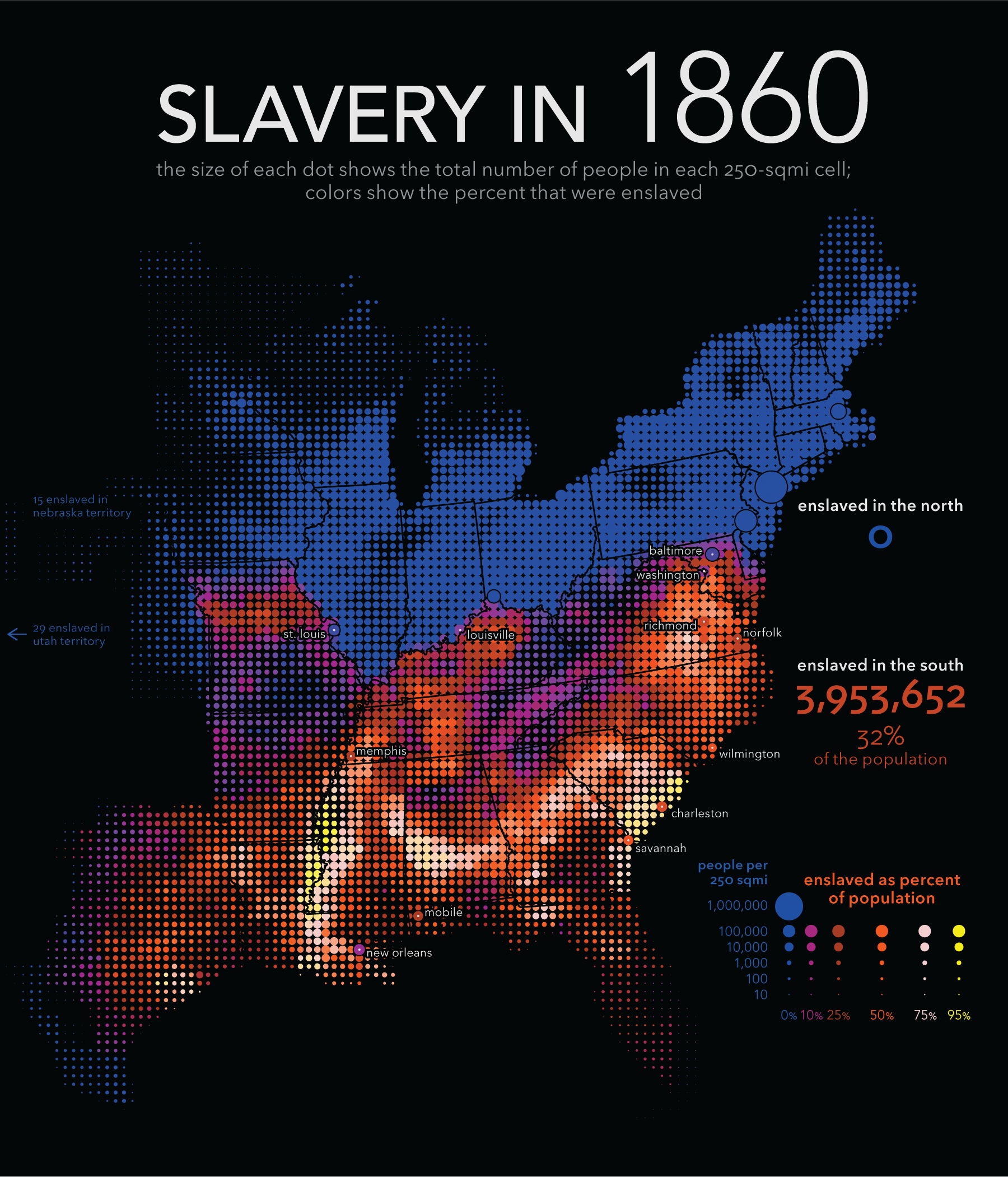
Trump's red-coated map presented a specific (and obvious) point of view, he conceded — but, then, so do maps skewing the presentation to accentuate areas with more voters. Middle ground exists; he pointed to a map in the book that, like the map of enslaved people shown above, combined circle size and color to show both density and frequency as a better option. But any option involves making a choice about intent, including seeking a middle ground.
And I realize, as I write this, that presidential maps are the perfect example for this discussion. After all, what is a national election but a matter of uncertainty, multiplicity and negotiated subjectivity?
So ends our seminar course in relativism. Thank you for auditing.
Chapter 1, part two
The working cartographer
Oh, wait: a bonus lecture.
As it happened, I was perusing Rankin's book at my desk when a well-timed social media post caught my eye: Mapmaker John Wyatt Greenlee was offering his services to those needing maps for academic books.
Greenlee — a medievalist by training — began making maps during the pandemic. Eventually, it became his full-time occupation, under the business name Surprised Eel Maps. (Greenlee's academic research centers on eels, an interest stoked — naturally — by having spotted eels on old maps.) Given Rankin's work, I was curious how someone who makes maps as a trade goes about the task. So I sent Greenlee an email.
He explained his process, which centers on allowing the authors themselves to determine what information gets included. As drafts accumulate, he and they suss out the balance between necessary and extraneous information, keeping intent in mind.
Greenlee shared an early and late draft of a map he'd created showing the trade of enslaved humans and goods across the Atlantic in the 17th through 19th centuries.
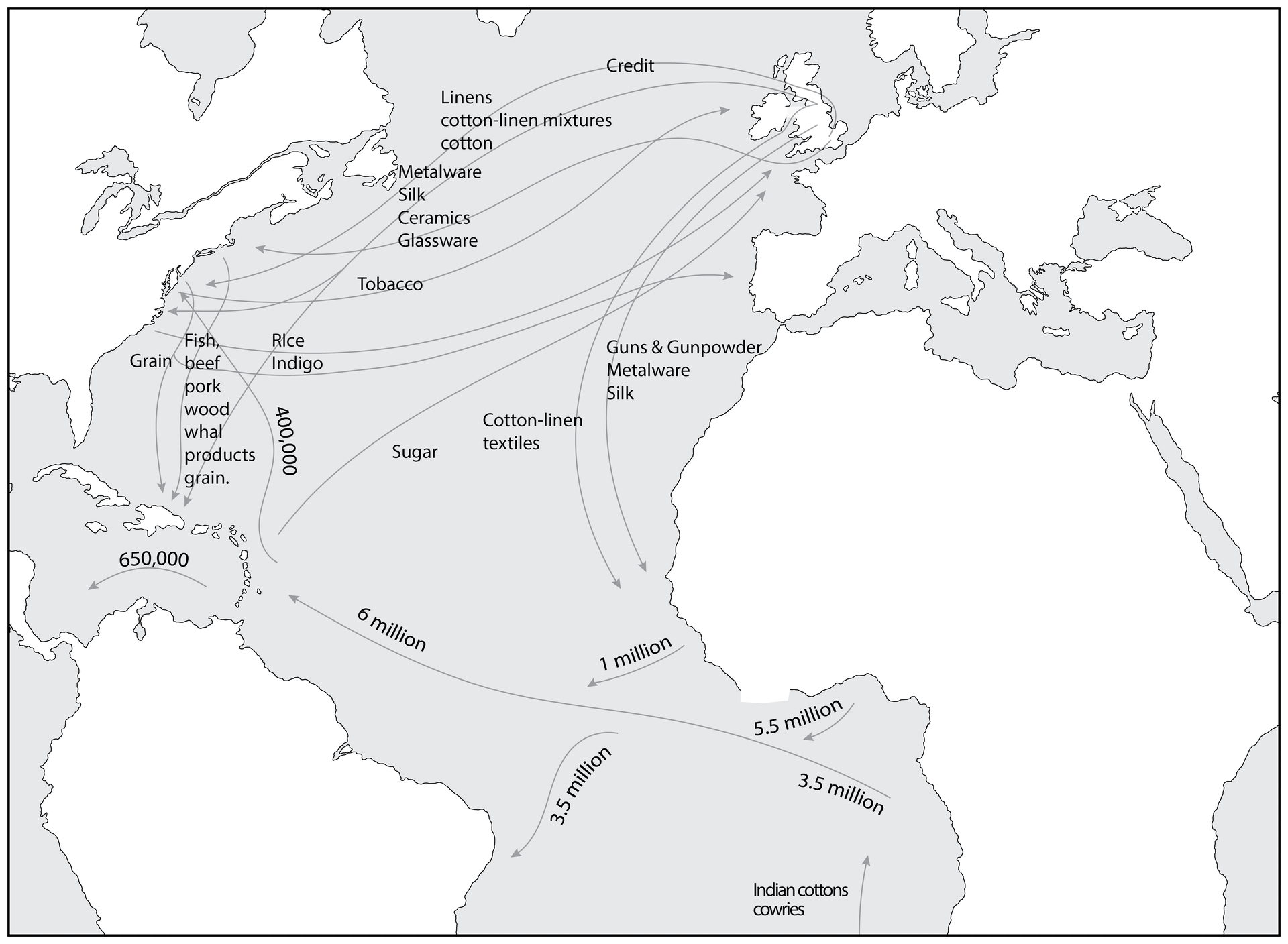
I found this coincidence interesting, that both Rankin and Greenlee shared attempts to capture the nuances and scale of human enslavement. It's a subject that is inherently hard to capture at its full scale, with each mapmaker illuminating a different aspect of it, offering a different perspective.
What was also interesting was Greenlee's discussion of his work creating maps for fictional worlds. Those, he wrote, "must often carry a heavier narrative load than maps of the real world, as they are an important element in helping readers imagine the book's spaces."
World-making in a literal sense — though, as Rankin might point out, the result is not always significantly more fictional than many putative maps of reality.
Chapter 2
Deep in the East Cali town of El Paso
At the risk of turning this newsletter into a simulacrum of a social media feed about maps, there is another social media post about maps that I thought was worth sharing.
It was over at Threads, the Meta/Facebook Twitter clone that no one talks about much because it is to social media what Walmart stores are to interior design innovation. Scrolling through Threads is like scrolling through TV ads, but on a random weekday night, not on Super Bowl Sunday.
A rare exception came in the form of a post by a guy named Steve DuCharme: "The SE corner of Montana is closer to Texas than The SE corner of the State is to the NW corner of Montana."
It's a bit hard to understand his point just by reading it (a theme for this edition of the newsletter!) so I made a map to make it clear. Imagine a circle centered at the southeastern corner of Montana. One radius (in heavy pink) extends down to the northern edge of Texas. But another (in dotted pink) isn't quite long enough to reach the other end of the state.
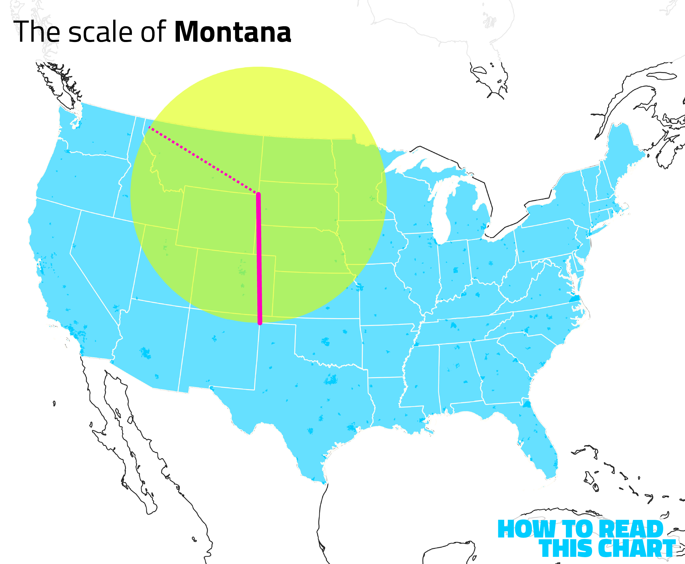
This is admittedly mostly a way of saying that Montana is big. But it's an interesting perspective, given that geography and culture often overlap. Borders aren't usually hard barriers, so people and ideas and preferences move across them. Is the eastern side of Montana more like South Dakota (or even Texas) than it is like the other side of Montana?
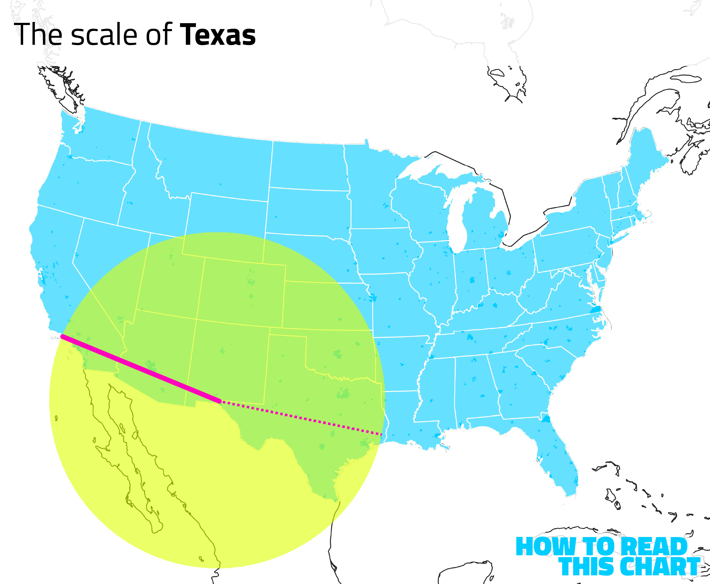
Of course, Texas is also big. And, as it turns out, if we use El Paso as the center of a circle, we discover that it is closer to Los Angeles than it is to the eastern border of Texas itself.
Oh, and California is big, too. The southwestern most part of that state is closer to the suburbs of Boise and to Wyoming than it is to the northernmost part of California.
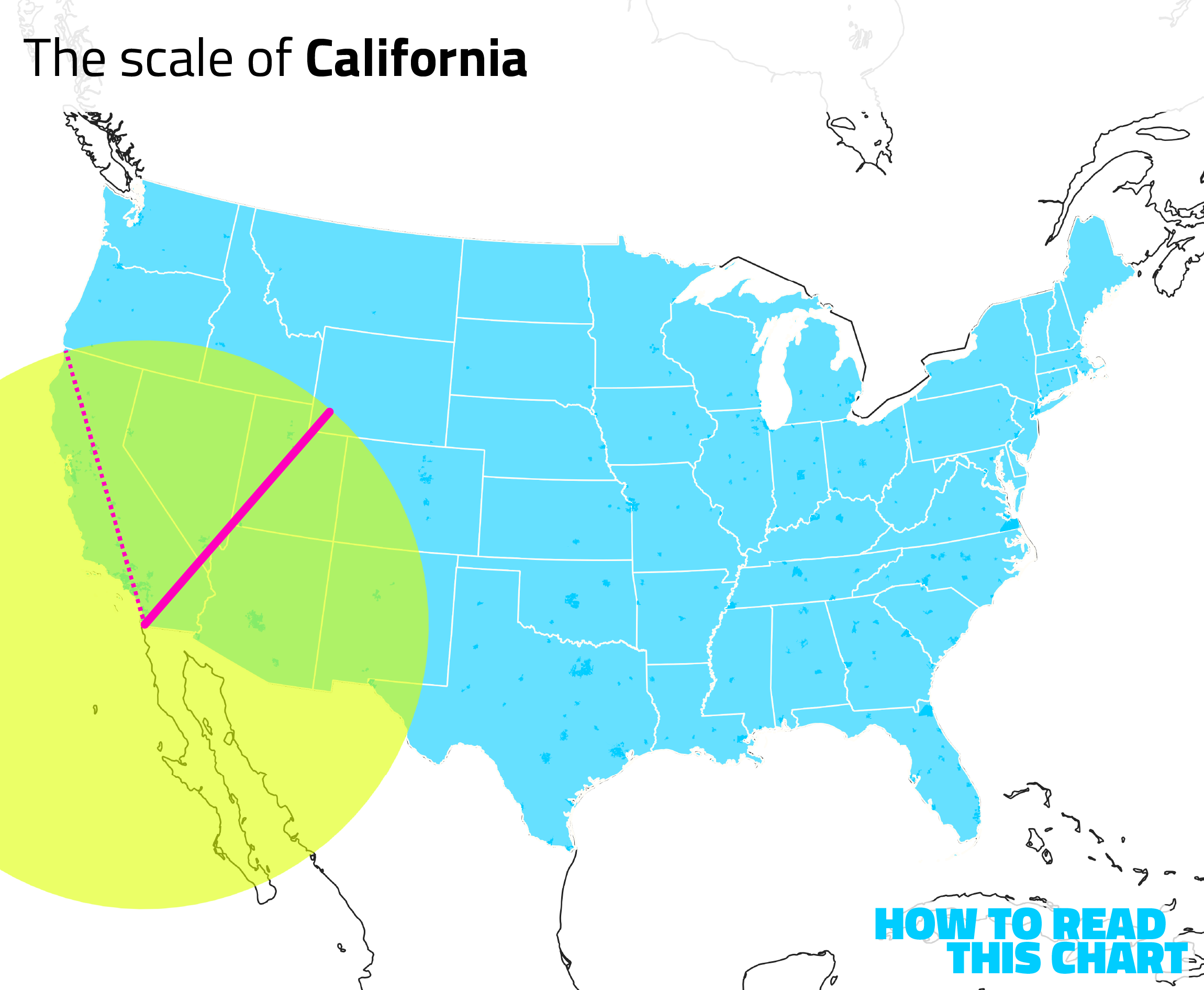
We can do this with other states, too. The western edge of North Carolina is closer to Toledo than it is to the eastern part of North Carolina; Buffalo is closer to Detroit than it is to New York City, etc. There's often homogeneity at a local level that erodes quickly as you start heading in any direction.
Anyway, it's a bit of a thought experiment for you, if you're looking for extra credit. (There is an exam at the end of this newsletter.) But instead of spending more time on that, I'd like to discuss a social media post I saw. One for which I made some maps.
Chapter 3
How close almost all of us are to nothing
In my aforementioned book, I told the story of Nobel laureate Leon Lederman, who was forced to sell his prize in order to pay his medical bills. I was reminded of that when I saw a story about "Dawson's Creek" actor James Van Der Beek auctioning off memorabilia from the show to help pay for his own cancer treatments.
On Bluesky, Ryan Marino offered an interesting perspective on this grim situation: "You are infinitely closer to struggling than you ever will be to billionaires." Even if you are a celebrity, someone with prestige and fame, he notes, you are more likely to find yourself in a financial predicament than you are to be one of the wealthiest people in the world.
It struck me that this could be visualized. So I did.
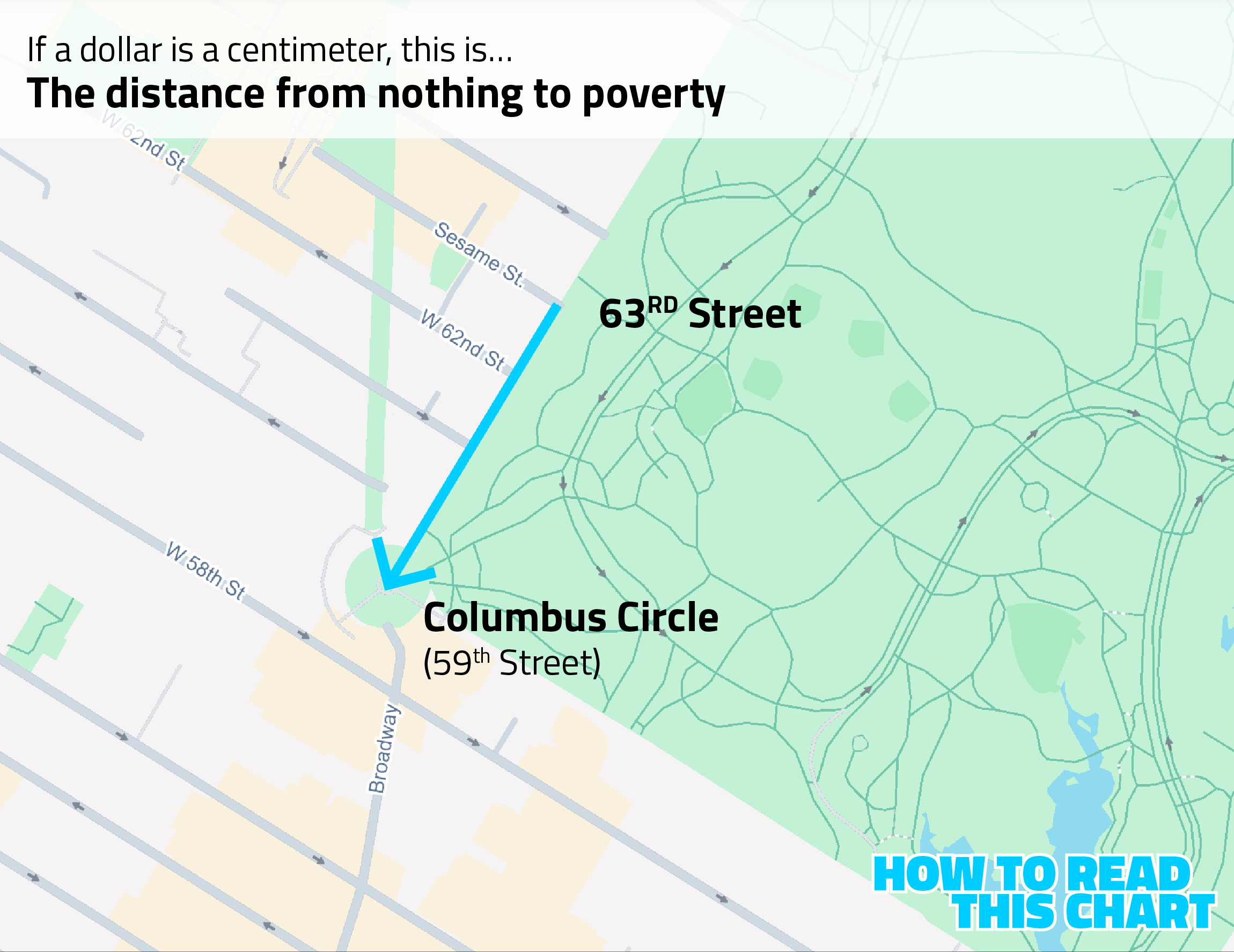
Imagine if one dollar equaled one centimeter in the real world — specifically New York City. In that case, the distance from having no money at all to having an income that would meet the federal poverty level for a family of four would cover about 32,000 centimeters, the distance from 63rd Street in Manhattan down to Columbus Circle. Four blocks.
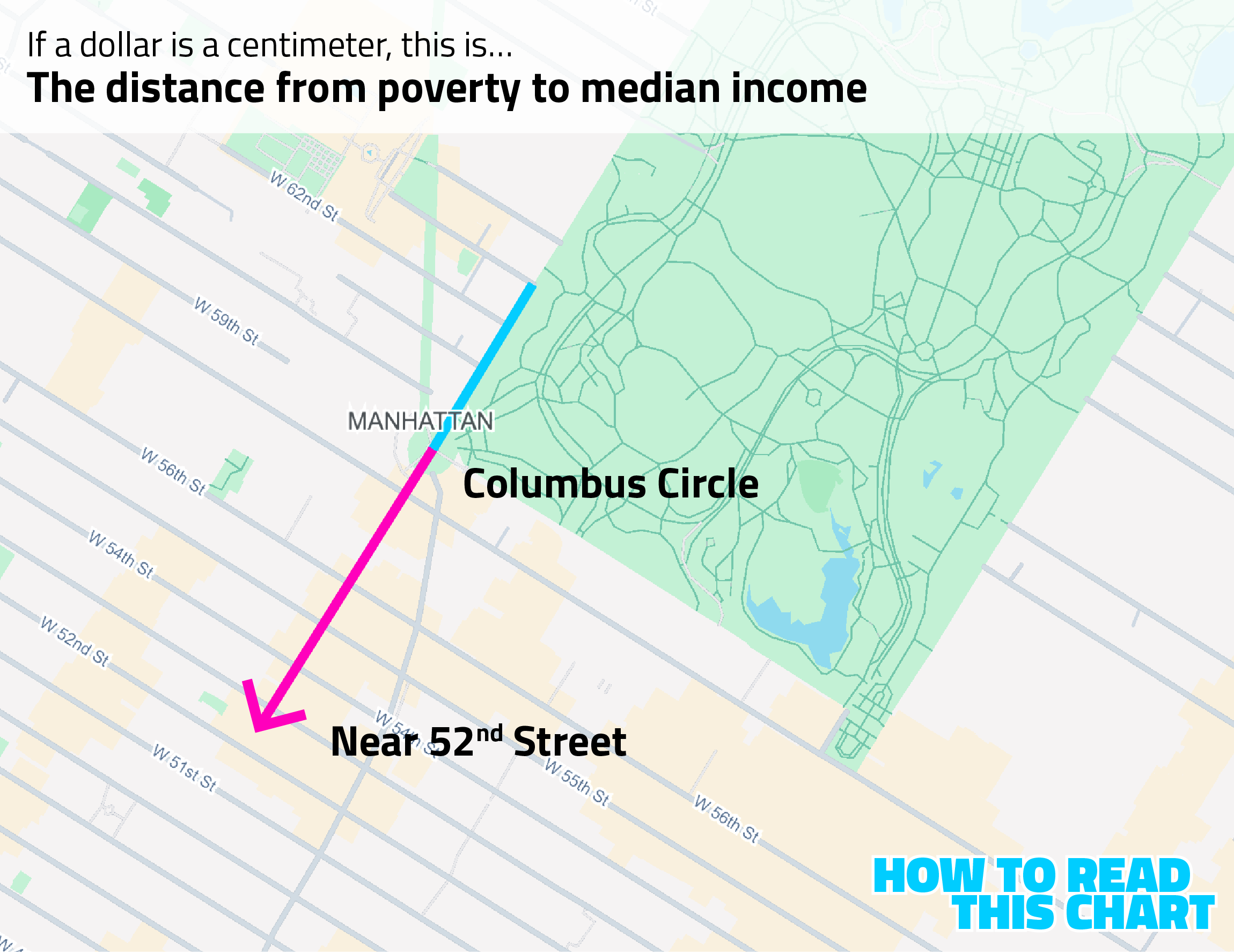
If you were to keep going, measuring out the distance between poverty and the median household income in the U.S. in 2024, you'd go from Columbus Circle to almost 52nd Street.
If you had an income of $200,000, you'd go further still, making it from Columbus Circle down to 38th Street — more than 20 blocks.
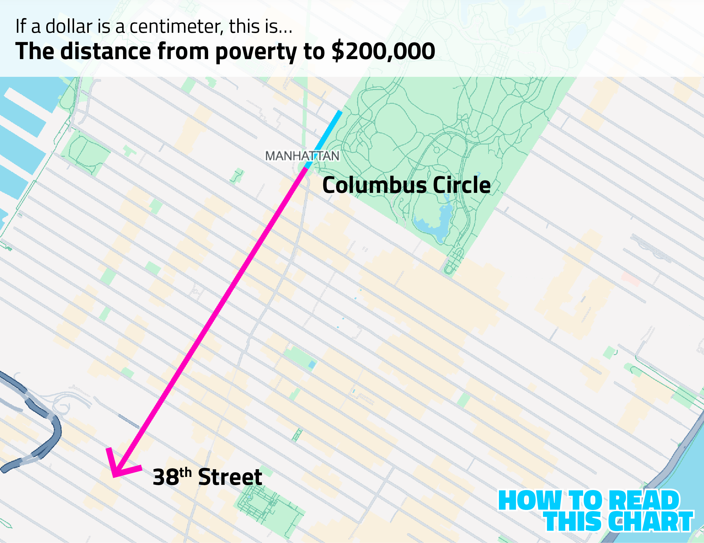
That's how far from poverty you are, making $200,000 a year. If you made a million dollars a year, though, you're suddenly off Manhattan Island entirely.
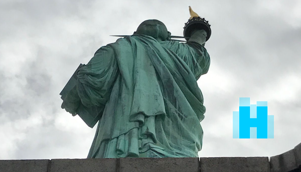
That amount of money puts you out in New York Harbor, about halfway between Ellis Island and the Statue of Liberty.
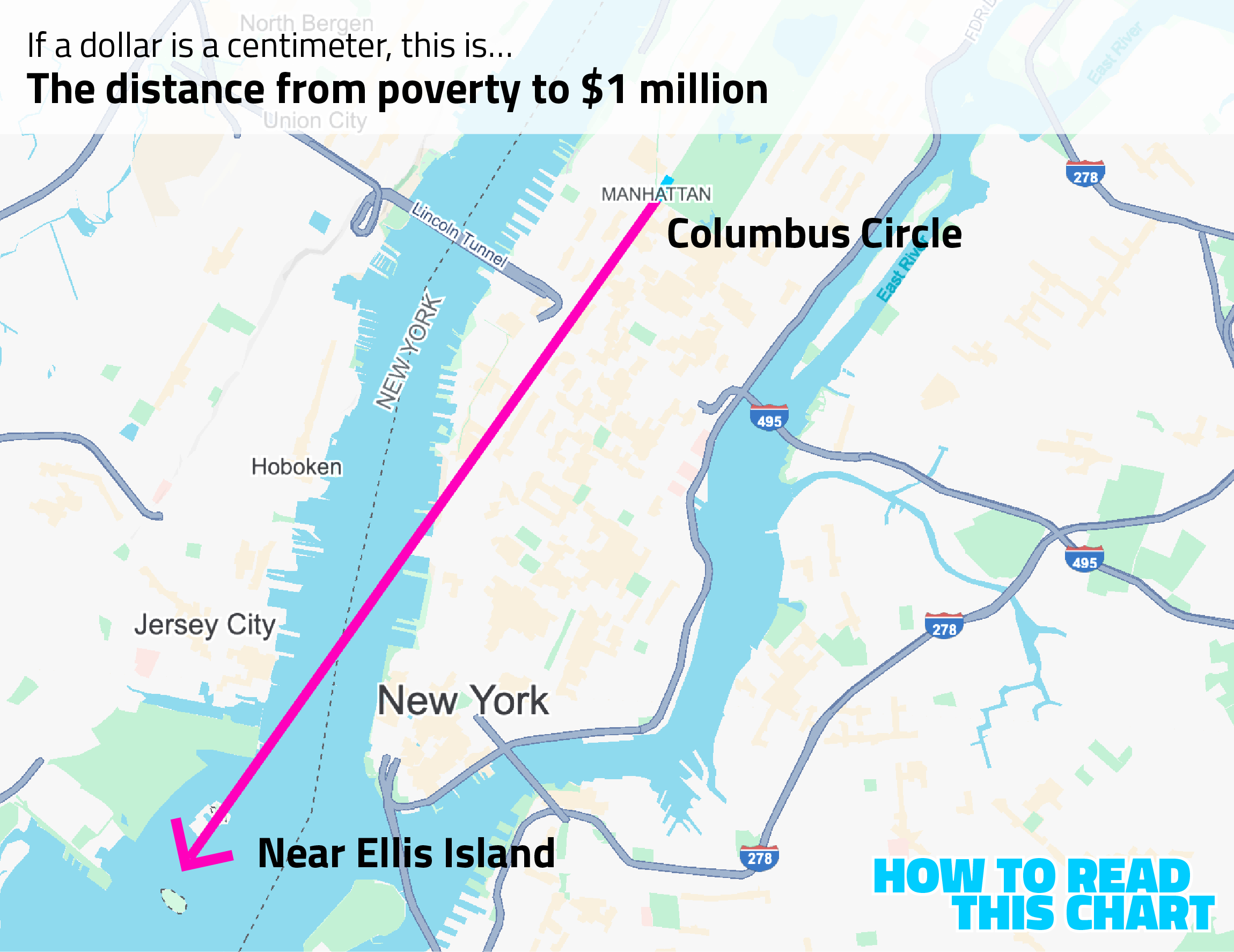
Pretty far from poverty. But, in the grand scheme of things — not really.
If you had the wealth of the poorest person on Bloomberg's Billionaires Index, you'd head away from Columbus Circle, past the Statue of Liberty … and then past New Jersey and Florida and South America and all the way around the world and past Columbus Circle again and then almost all the way around the world until you reached the vicinity of St. Petersburg, Russia.
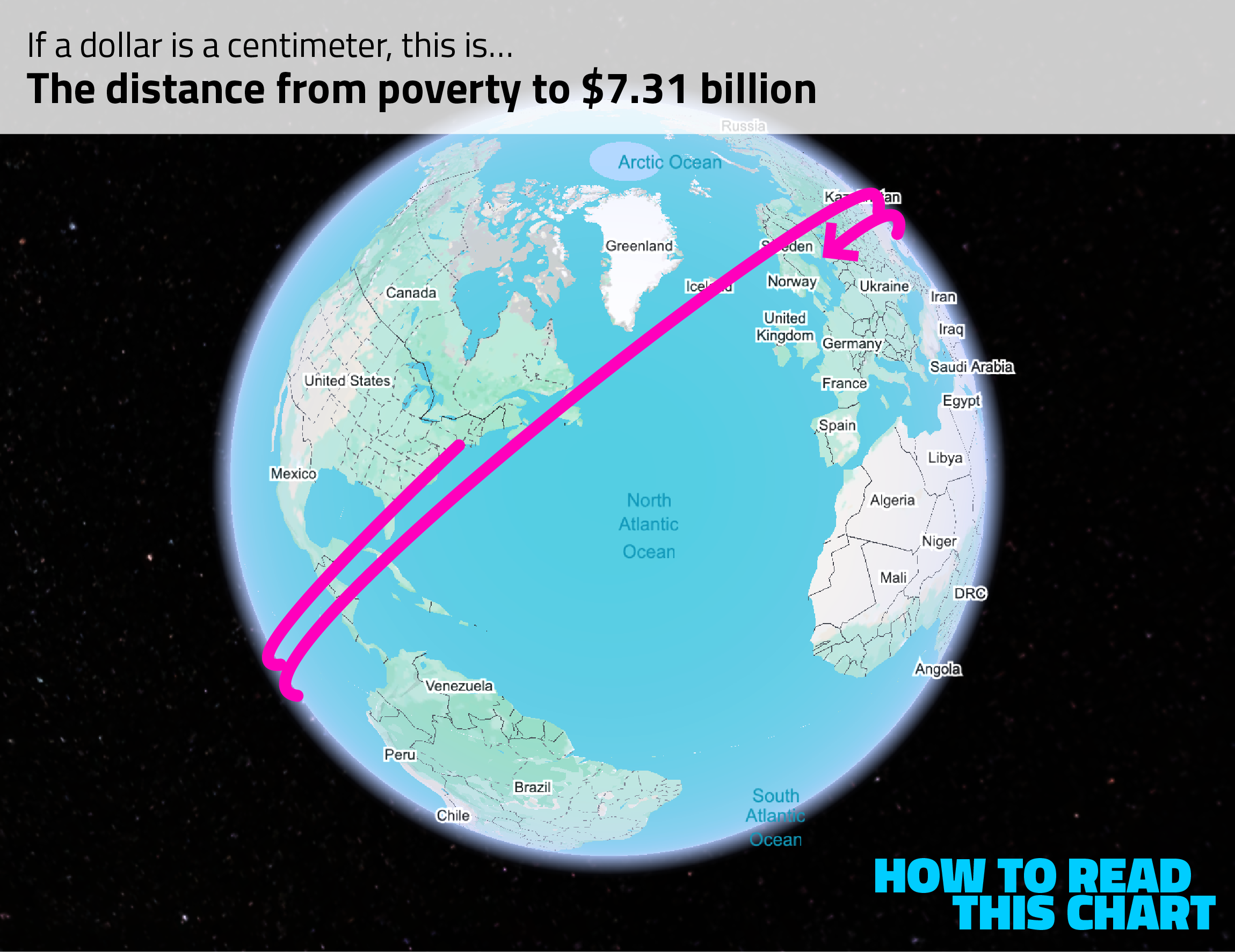
That's how far from poverty one of the less-rich billionaires sits.
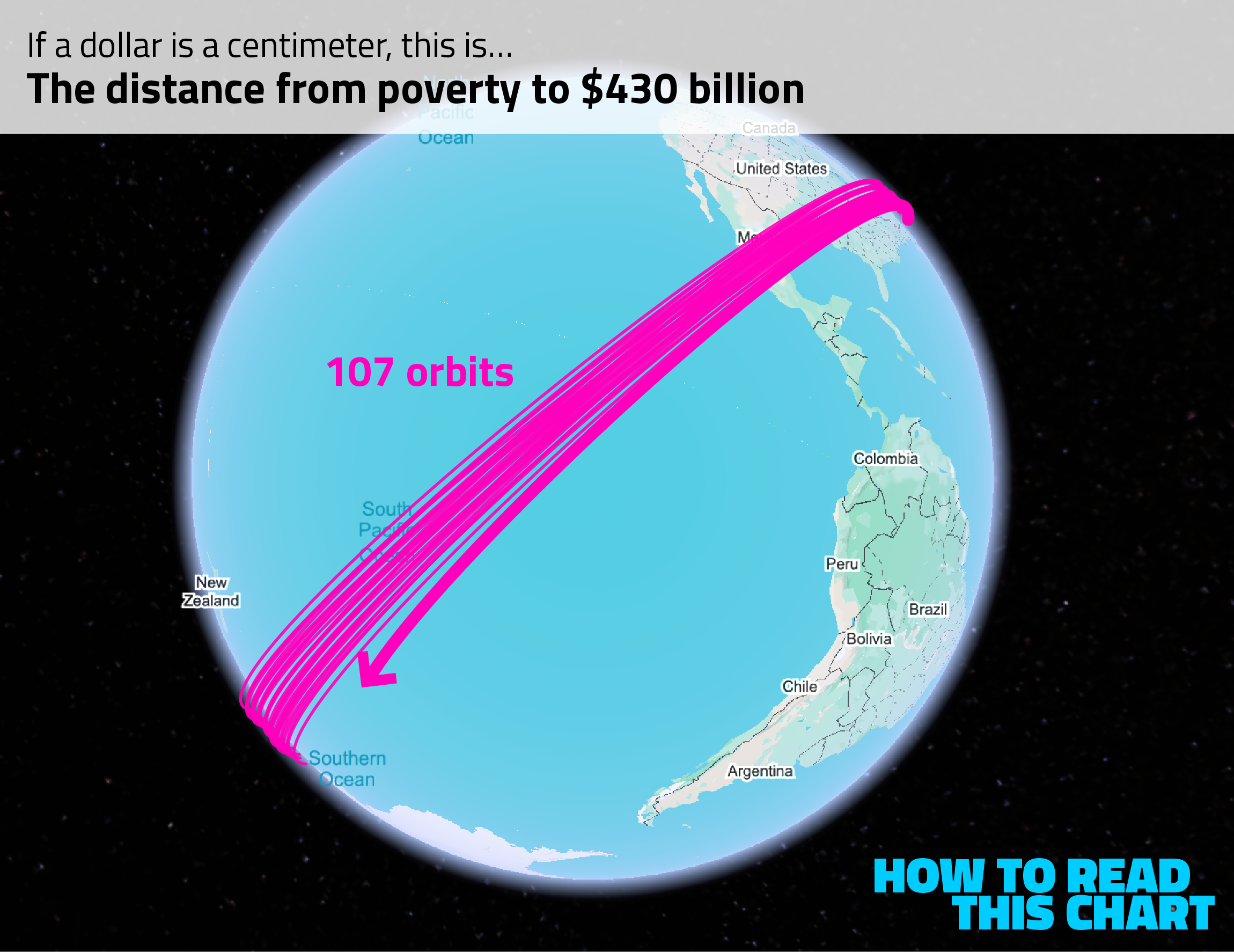
If we look at the world's richest billionaire, the guy who owns the other big social media platform, the whole exercise gets ridiculous. Starting at Columbus Circle, we'd march southwest and then around the world and then around the world again and then around the world again and end up circling the entire globe 107 times before counting off the last of our 430 billion centimeters somewhere between New Zealand and Chile in the South Pacific.
Elon Musk's fortune is large enough that, converted to centimeters, we could go to the Moon and back. And then to the Moon and back again. And again. And again. And again. And then back to the Moon, with enough centimeters left over that we could walk around the Moon six-and-a-half times.
Technically you aren't infinitely closer to struggling than you ever will be to billionaires. But functionally you are.
Chapter 4
Chart Attack
Alright. Enough maps. Let's get to some charts.
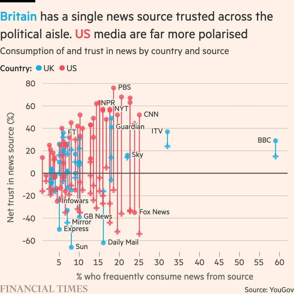
Like this presentation from John Burn-Murdoch, showing the BBC's unique position as both widely consumed and trusted by both liberals (circular markers) and conservatives (cross-shaped markers). There is no American equivalent.
The Wall Street Journal continued its streak of fascinating visuals linking Trump with Jeffery Epstein by making a visualization that effectively shows how often Epstein was talking about Trump in his emails.
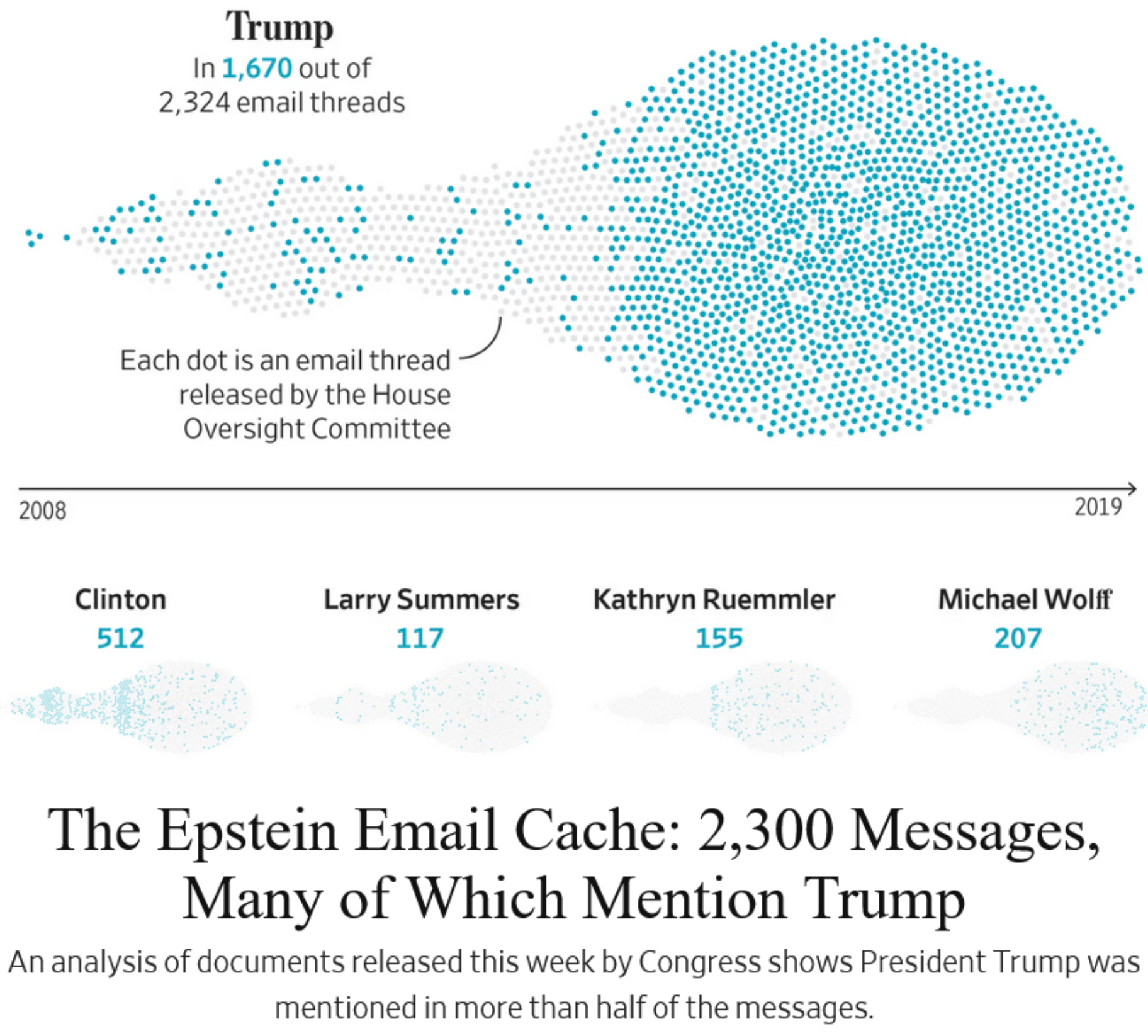
Nothing to see here, except for all of those blue dots.
I thought this chart of the age of U.S. home buyers was interesting, showing a recent jump in the median.
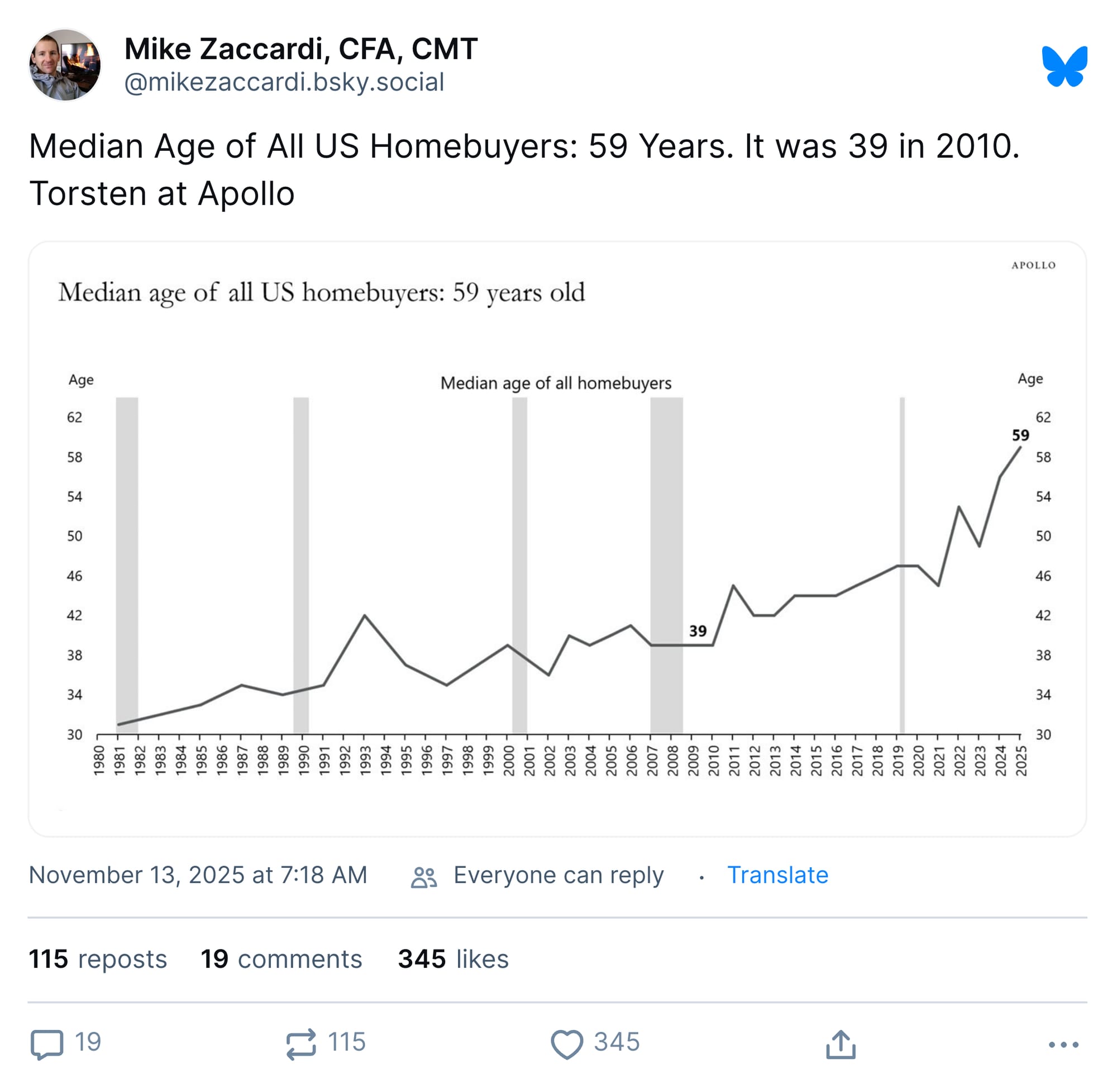
A 59 year-old was born in 1966, just after the baby boom — meaning that half of buyers are baby-boom aged or older. This may be a function of boomers transitioning into retirement, but I suspect Viking would prefer I not simply recreate the entirety of my own book in this email, either. (I'm sorry I keep bringing up my book.)
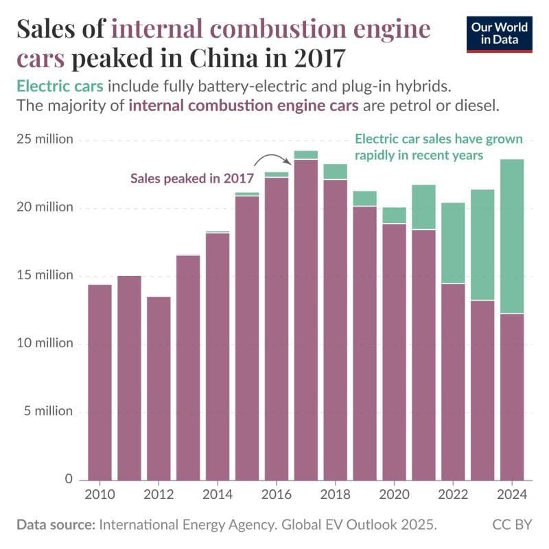
Here's a simple chart, but a striking one: China is on the brink of a striking milestone, selling more electric cars than gasoline-powered ones.
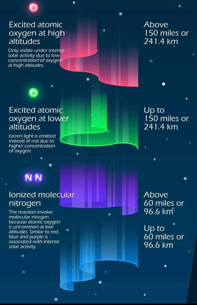
Folks who live in some areas of the Midwest got a treat this week when their northern latitude offered them something other than frigid weather: pretty lights in the sky! The colors of the aurora borealis, it turns out, are a function of altitude.
And I will leave you with one last map, again of Manhattan. Here, a 3D-printing device is overlaying the route of the New York marathon onto a relief presentation of the city.
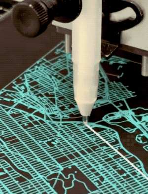
If you're curious, a 26.2-mile marathon is about 4.2 million centimeters — which, when converted to dollars, is 0.001 percent of Elon Musk's net worth.
I told you this newsletter was going to test you, didn't I?
Appendix
Some other things I've written
It is possible that you have been busy this week and missed a small bit of news from How To Read This Chart headquarters (also known as my house): For the next few months, I'll be contributing columns to MS NOW, the media-outlet-formerly-known-as-MSNBC that will be celebrating its ten-hour birthday the moment this email lands in your inbox. It's not a full-time role, but it does at least let me pester everyone with my thoughts about stuff on occasion.
See how that last one mentions charts? I'm nothing if not consistent.
You are receiving this email because you at some point in time volunteered to, either at Ghost or Substack or pbump.net or pbump.com. If you don't want to receive future emails, you might just as well leave the internet entirely. Because what you really want to do is support the newsletter financially, right?
Another one is coming next week. You have been warned.