Post-holiday potpourri

An inherent problem arises at the end of the year, for my purposes at least: there's a glut of data detailing the 12 months that have just transpired — often accompanied by visualizations of what unfolded. So what choice did I have, humble reader? What choice did I have but to compile a sincerely overwhelming compendium of the year that was? And what choice did I have but to throw some other stuff in, too, because that's the sort of thing I do?
Truly, what choice did I have but to spend more hours than I'd like to admit parsing the contents of a song that came out when I was in high school? I can only hope that, somehow, you will find all of this to be of some use, edification or entertainment.
So let's go.
Chapter 1
The two Americas (of news consumption)
Every year, Google provides Axios with data on the most-searched terms in the news. And every year, Axios produces a chart like the one below, showing the ebbs and flows of what people are hoping to learn more about.
Some topics arise and fade in interest, as did "Camp Mystic" in 2025 — the site of a deadly flood in Texas. Others build and wane over a longer time period, like interest in Labubu, a deadly monkey-toy-thing. (It is probably not actually deadly.) Some rise and stay high, like inflation (both literally and in Google's search data).
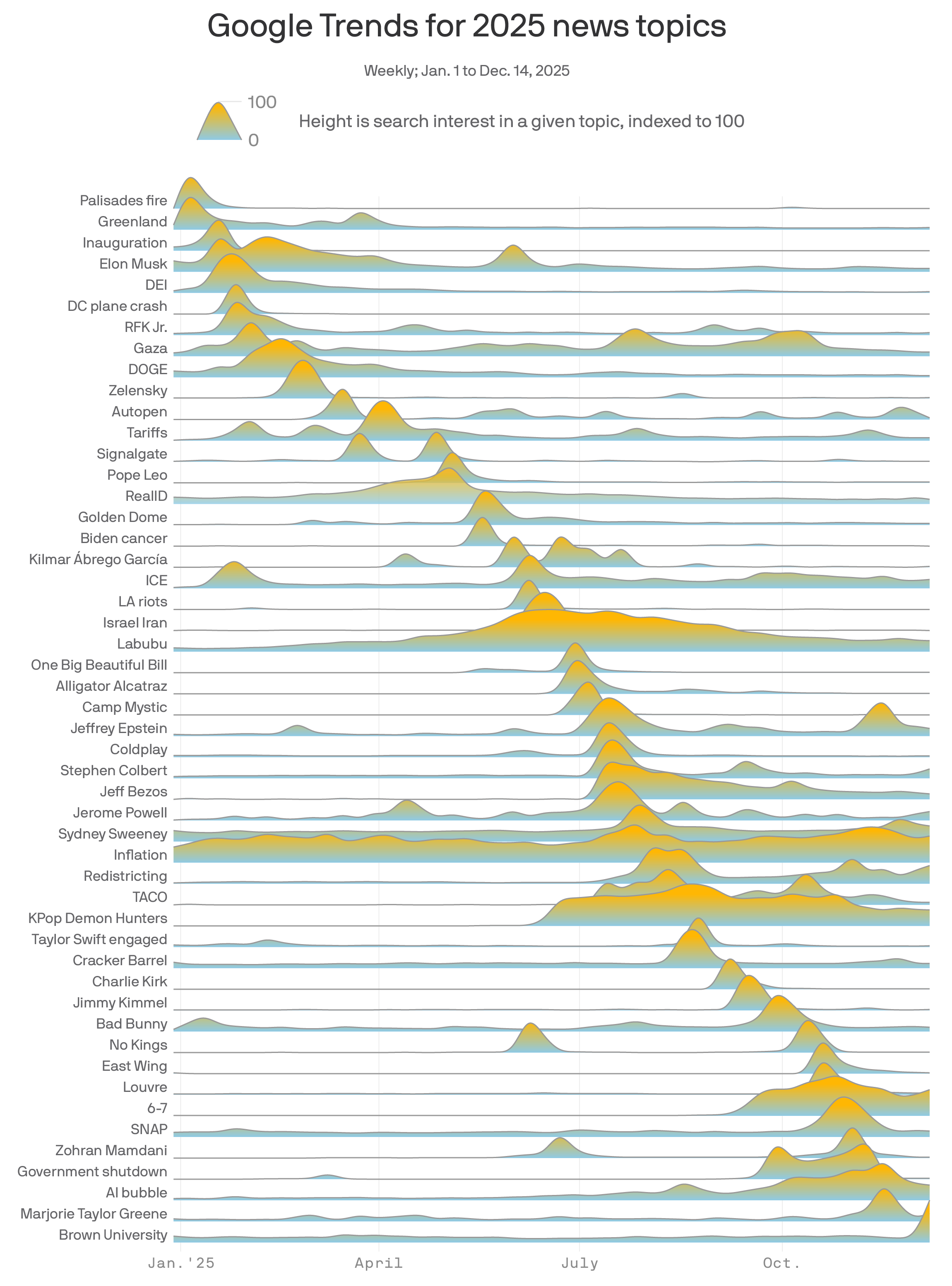
What emerges is a sort of cheat sheet about what happened and how it happened, more than anything else. But, it's important to remember, this is seen only through the specific lens of what people were searching for.
The polling team at Marquette Law School took a different approach. Over the course of 2025, they asked Americans how much they'd read or heard about various things in the news, as poll director Charles Franklin explained last month. Delineated in chronological order below, the news story that got the most attention was President Trump's tariffs.
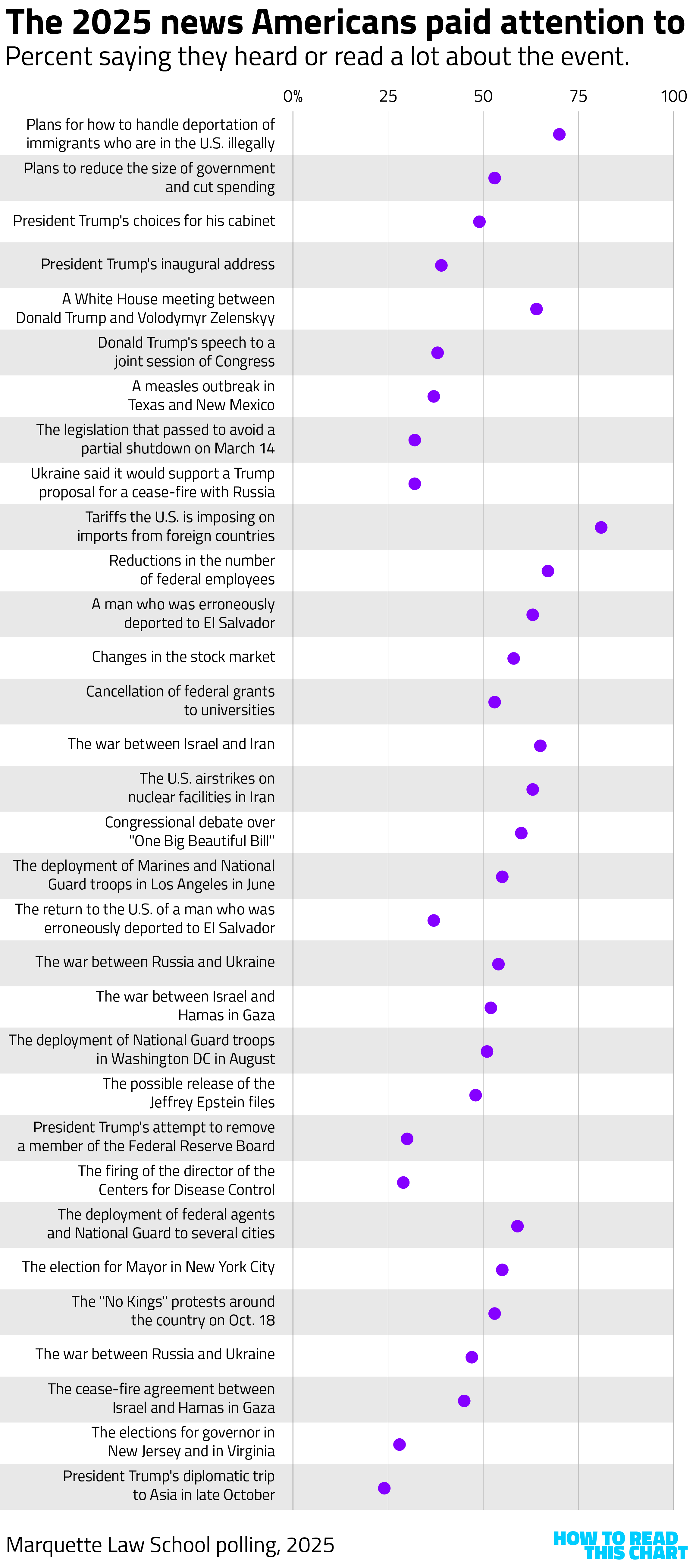
What's interesting about the Marquette data (unlike the Google numbers) is that we can also see attention by party. What we find is that, on most news topics, Democrats were more likely to have paid attention than Republicans, often by a wide margin. Exceptions were limited to news items that focused on Trump and foreign policy. (Independents, true to form, were always less attentive to the news than partisans.)
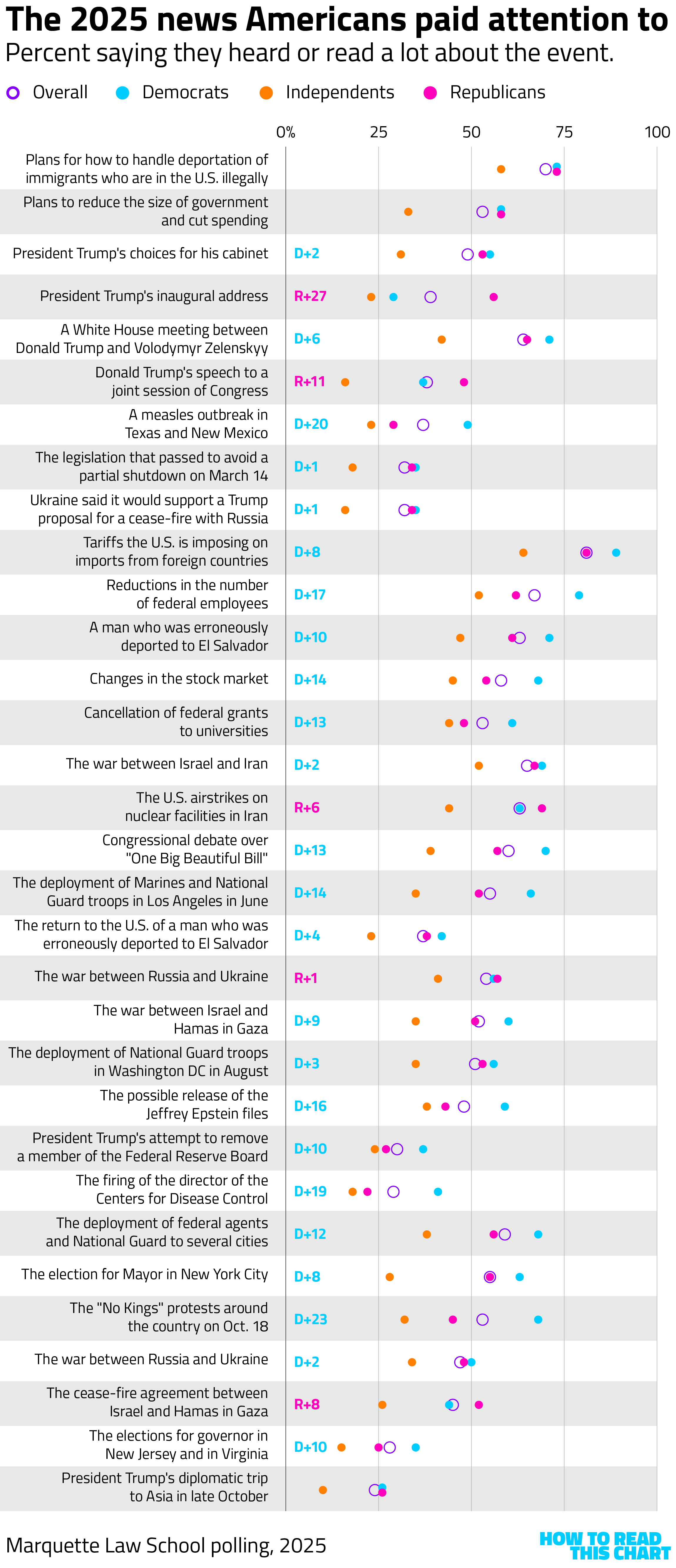
Before you make too many assumptions about the partisan gap, Franklin offered some thoughts. He noted that there wasn't much difference in awareness of news stories among Republicans between those who track mostly conservative outlets and those who consume mainstream sources.
"This," he wrote, "casts some doubt on the idea that it is differences in content that drives differential awareness, and suggests that partisanship has more to do with what news people pay attention to, and remember."
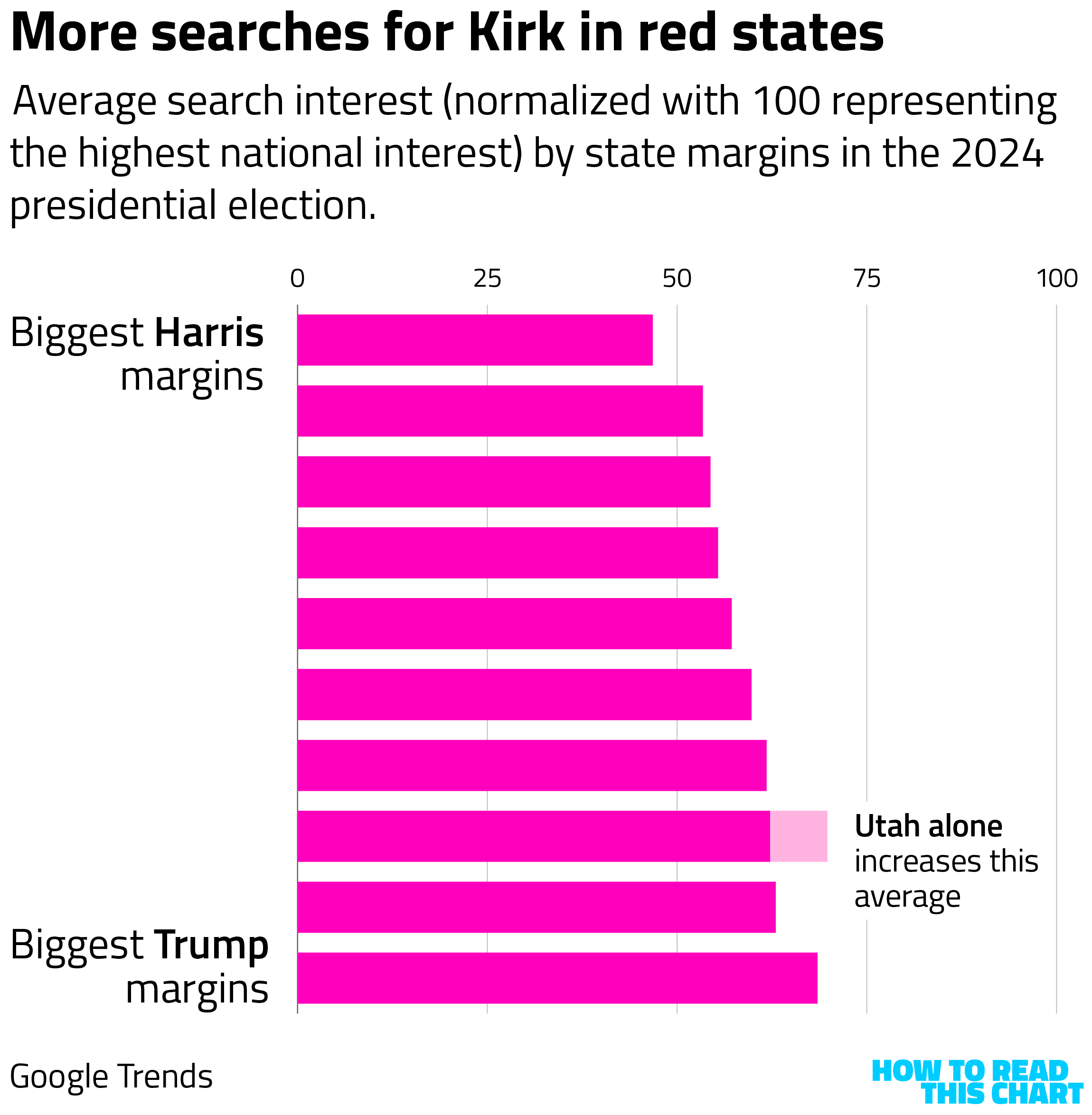
Incidentally, we can suss out some partisan differences from the Google data, too. The story that generated the most overall interest, Axios found, was the assassination of Charlie Kirk. If we group states into buckets ranging from those that voted most strongly for Kamala Harris in 2024 to those that voted most heavily for Trump, we see that presidential voting correlates to state-level interest in the Kirk story. The only hiccup in the correlation is due to the interest in Utah, where the killing occurred.
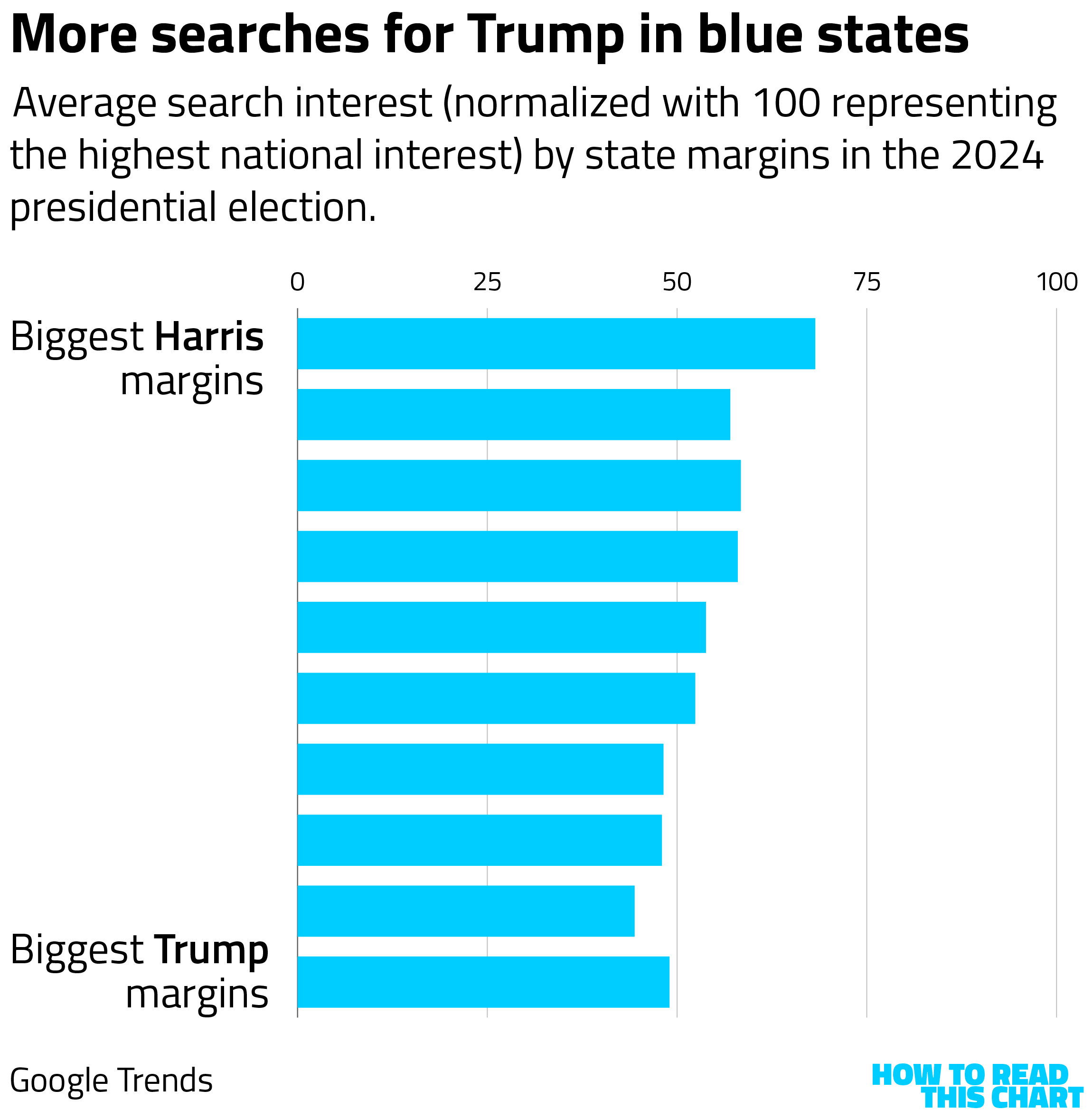
One of the most consistently searched news topics in 2025 was Trump himself (as has been the case in every year for the past decade). If we apply the same analysis to Trump, we see that the correlation is roughly flipped: bluer states searched Trump more often in 2025.
I'm not going to pour cold water on your assumption-drawing on that one. Go nuts. Have fun.
Chapter 2
Is Peter Pan really part of "the fire"?
Let me lay my cards on the table at the outset: I am not particularly fond of Billy Joel. I'm not hostile to him, or anything; I just never found his lounge-act-with-a-backbeat shtick very appealing. To each their own, I say!
And then Brigitte Bardot died. As you may have heard, her death meant that, of the numerous people mentioned in Joel's 1989 song "We Didn't Start the Fire," only three remained alive. So there I was, suddenly contemplating the song not as a corny omnipresence on the radio but as a document of what was viewed as important at a particular moment in time — where "important" is colored more than a little by "rhymes with something else."
And so I now present to you: The complete timeline of things mentioned in "We Didn't Start the Fire." They are divvied up into three categories, with descriptors plucked from the song itself. You'll notice that I highlighted the three surviving mentioned individuals: Chubby Checker, Bob Dylan and New York City subway vigilante Bernhard Goetz.
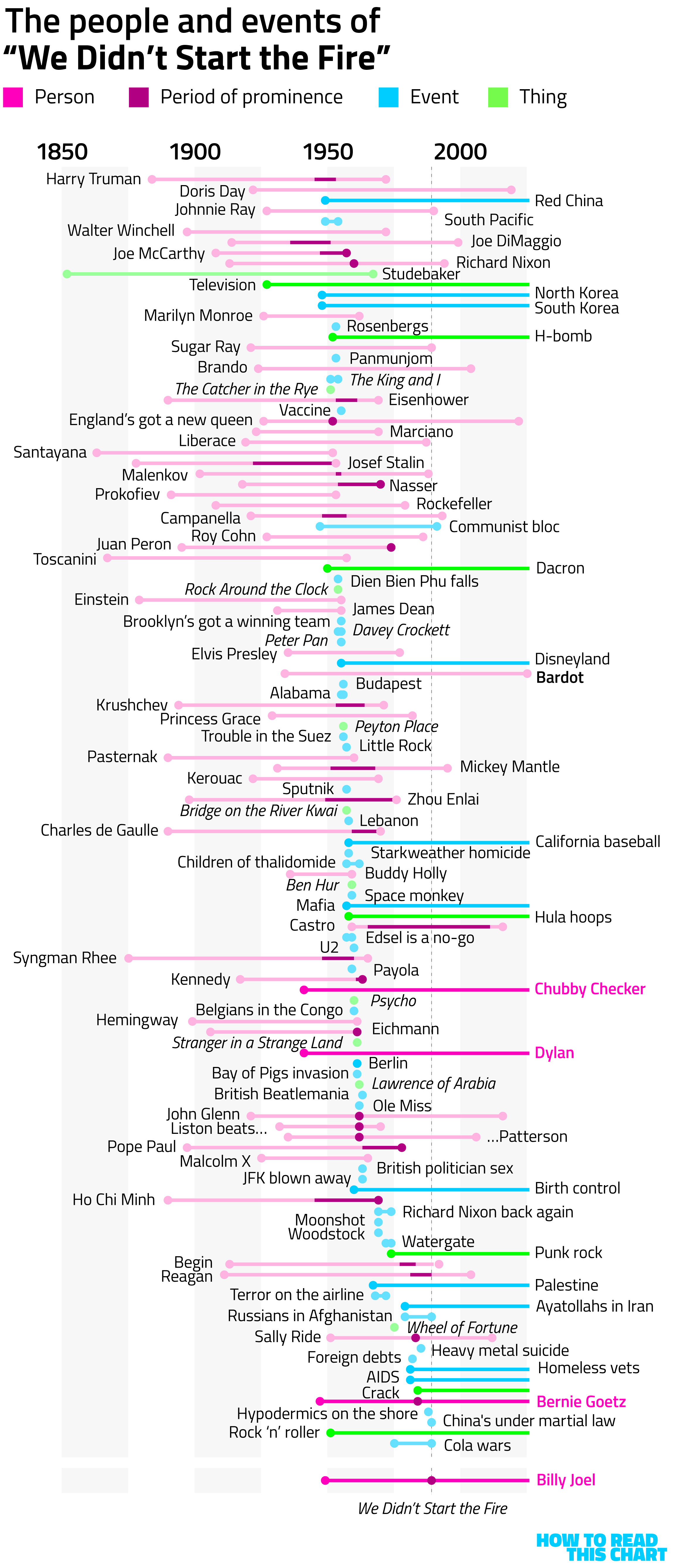
How to read this chart: For each topic in the song, I show either its lifespan or the year it occurred. For people who were included for specific achievements, like astronaut Sally Ride, I indicate when that achievement occurred. Circles indicate events or truncation, so living people and still-extant things have no terminating circles. For plays or books that still exist, I indicated only release dates or theatrical runs.
I also highlighted Joel's own life because I think it's instructive: This is a very baby-boomer view of the 20th century. Which makes sense; as I wrote in my 2023 book about the baby boom, that generational surge defined much of what America was and now is.
Chapter 3
Jayden can now vote
At some point this week, I saw a reference to the Social Security Administration's essential, wonderful database of baby names. Every baby born in America gets two things right off the bat: a name and a Social Security number. Meaning that the government has data on what names Americans have been using going back for nearly 150 years.
With the new year rolling around, I thought it would be interesting to see how names had changed over time. For example, here are the most common names of people born in 1961 — people who will this year be reaching retirement age. (And, I'll note: People who were born at the tail end of the baby boom.)
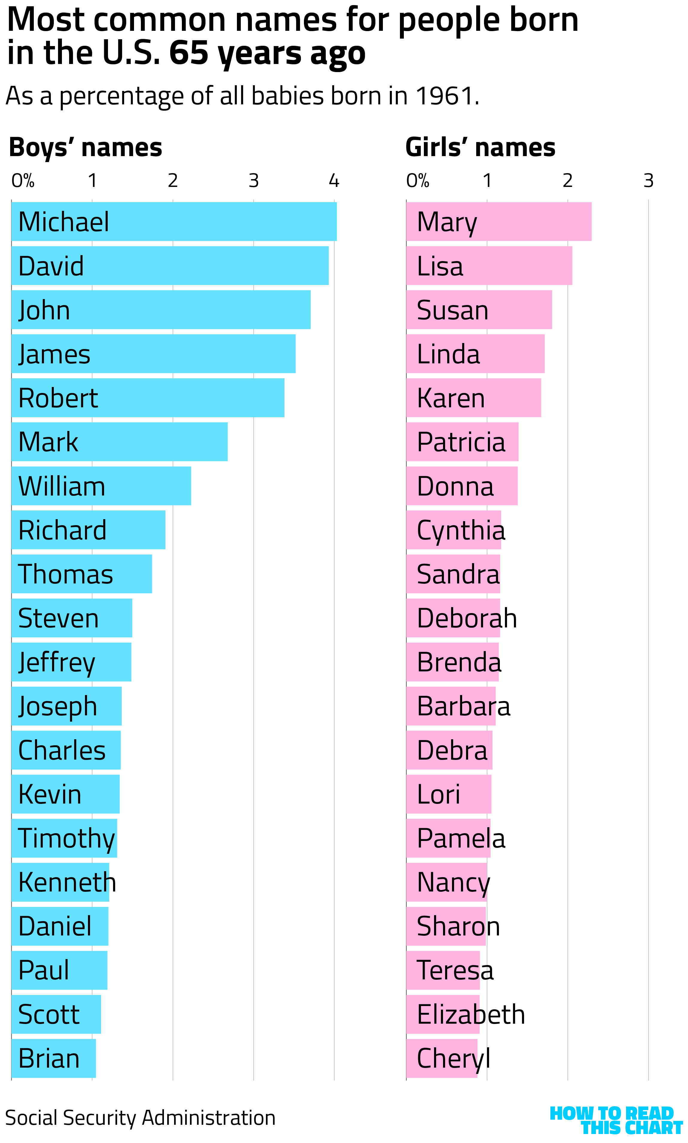
Congratulations on your retirement, Michael and Mary.
Contrast that with the most common names of people born in 2008, 2026's newly minted adults.
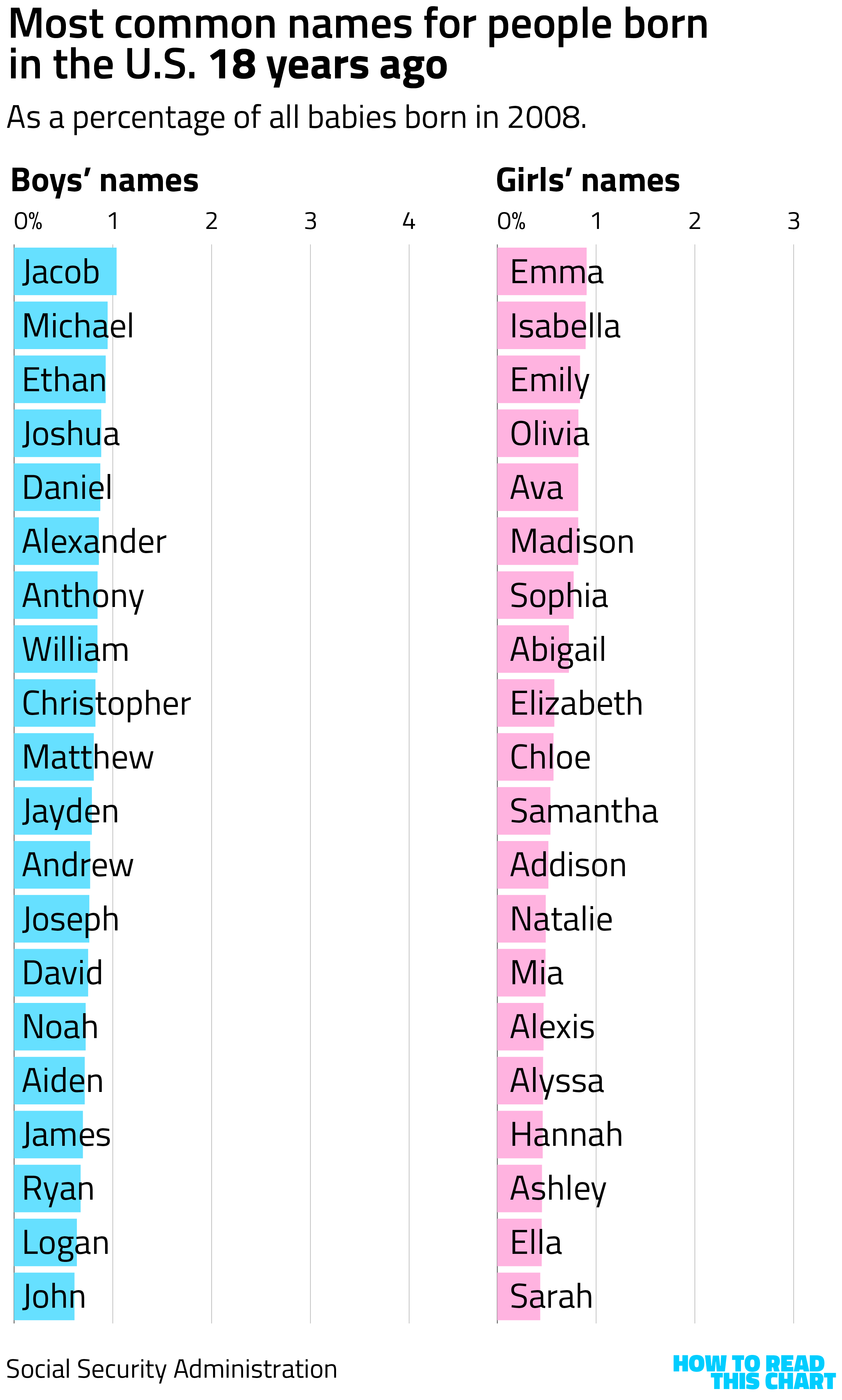
One thing you'll notice is that the density of the most popular names is lower. In other words, the most common male name in 1961, Michael, was given to more than 4 percent of boys born that year. The most common name in 2008, Jacob, was given to only about 1 percent.
That's in part because America is much more diverse now than it was in 1961 (another bit of subtext from my book). That means a broader range of kids' names — and also should serve as a reminder that this is only kids born in the U.S.
I, for one, am completely comfortable with a more diffuse set of names, meaning that "Logan," despite being among the most popular names, makes up only about 0.6 percent of 2008's total.
No offense, Logan.
Chapter 4
Conduct unbecoming a FIFA Peace Prize recipient
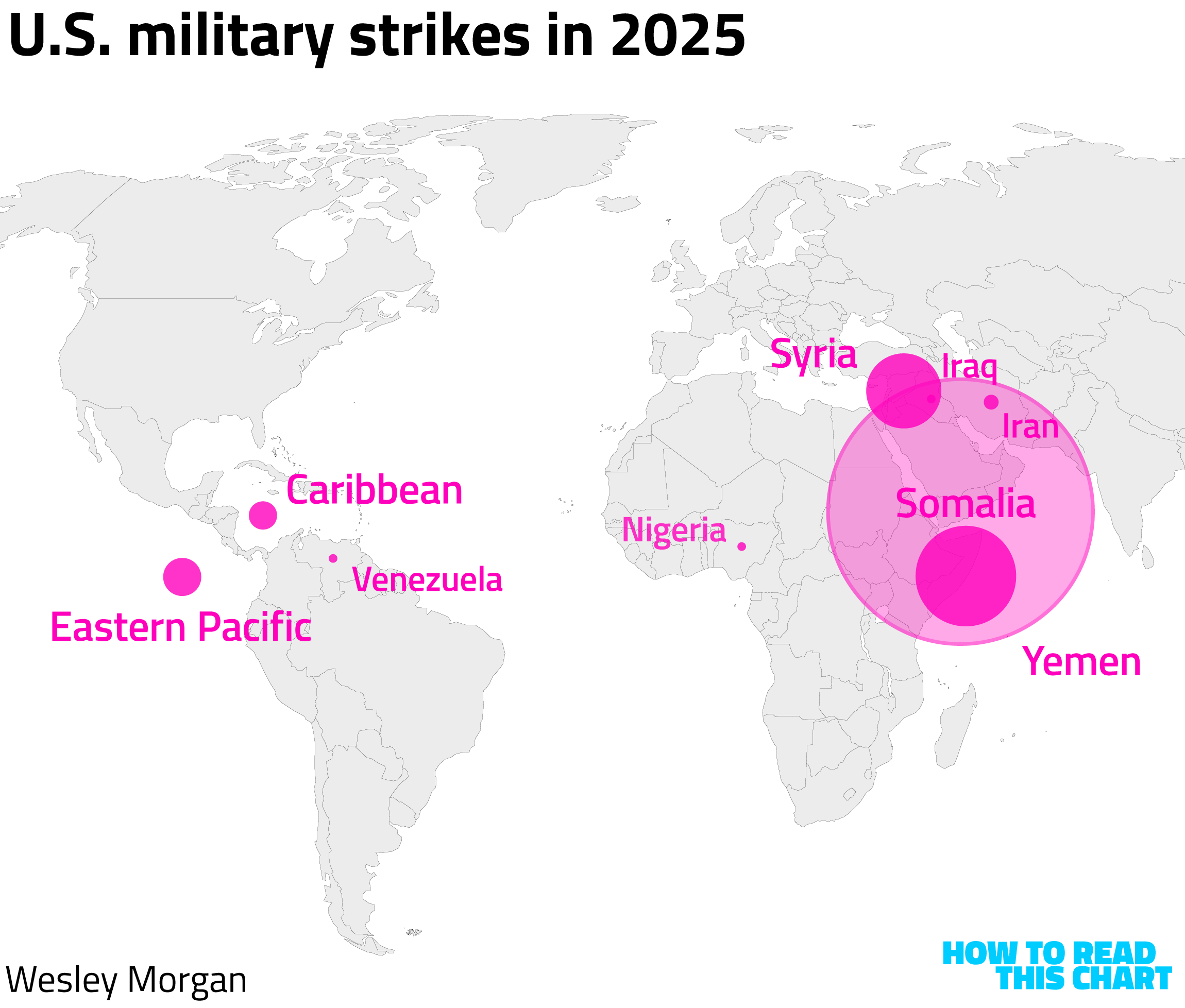
Author Wesley Morgan has been tracking the combat actions undertaken by the Trump administration. On Friday, he published his running total.
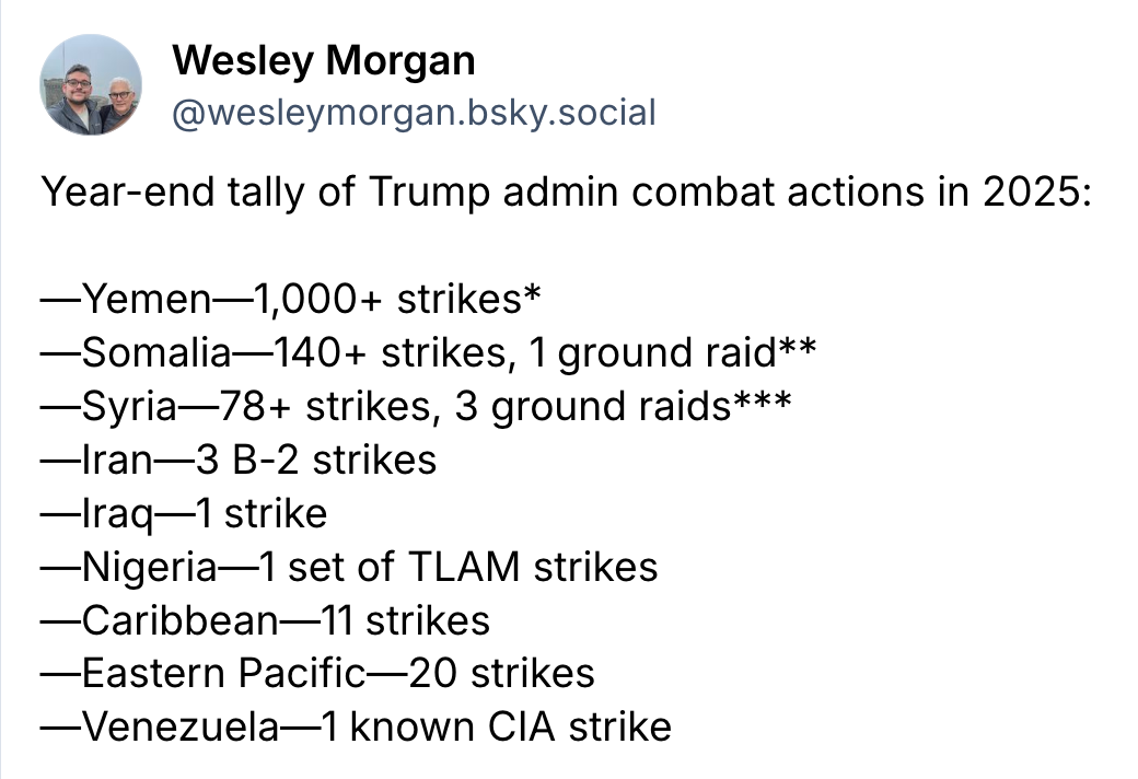
Given Trump's incessant insistences that he's solving conflicts the world over (with the notable exception of the one he said he'd solve immediately upon inauguration), it seemed useful to visualize where these strikes occurred.
Here is the Peace President's 2025 legacy.
You will note that this was as of Friday. It is now Saturday and, well, some new numbers for 2026 are in. Congress, if you want to weigh in at any point as the constitutional arbiters of war-making, feel free.
Chapter 5
Always check your x-axes
Speaking of the Trump administration, Attorney General Pam Bondi had a bit of a rough week, chart-wise (which is the only -wise that truly matters).
On Tuesday, she shared this chart from recent research showing a decline in drug overdose deaths, declaring that it demonstrated how "the Trump Administration and this Department of Justice have been fighting to end the drug epidemic in our country."
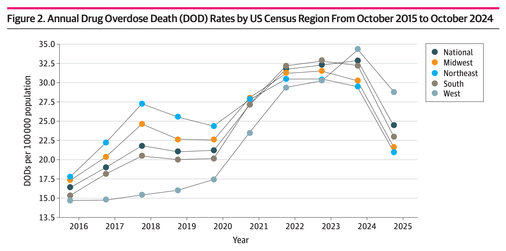
"Elections have consequences," she crowed. "Electing President Trump and enforcing the law is saving American lives."
OK. Except that, as the chart indicates in its title, the data only run through October 2024 — a month in which the aforementioned election hadn't yet occurred. While the chart's x-axis does show 2025, the dots indicating the data stop short of that. Because, again, the data ended two months before 2025 began.
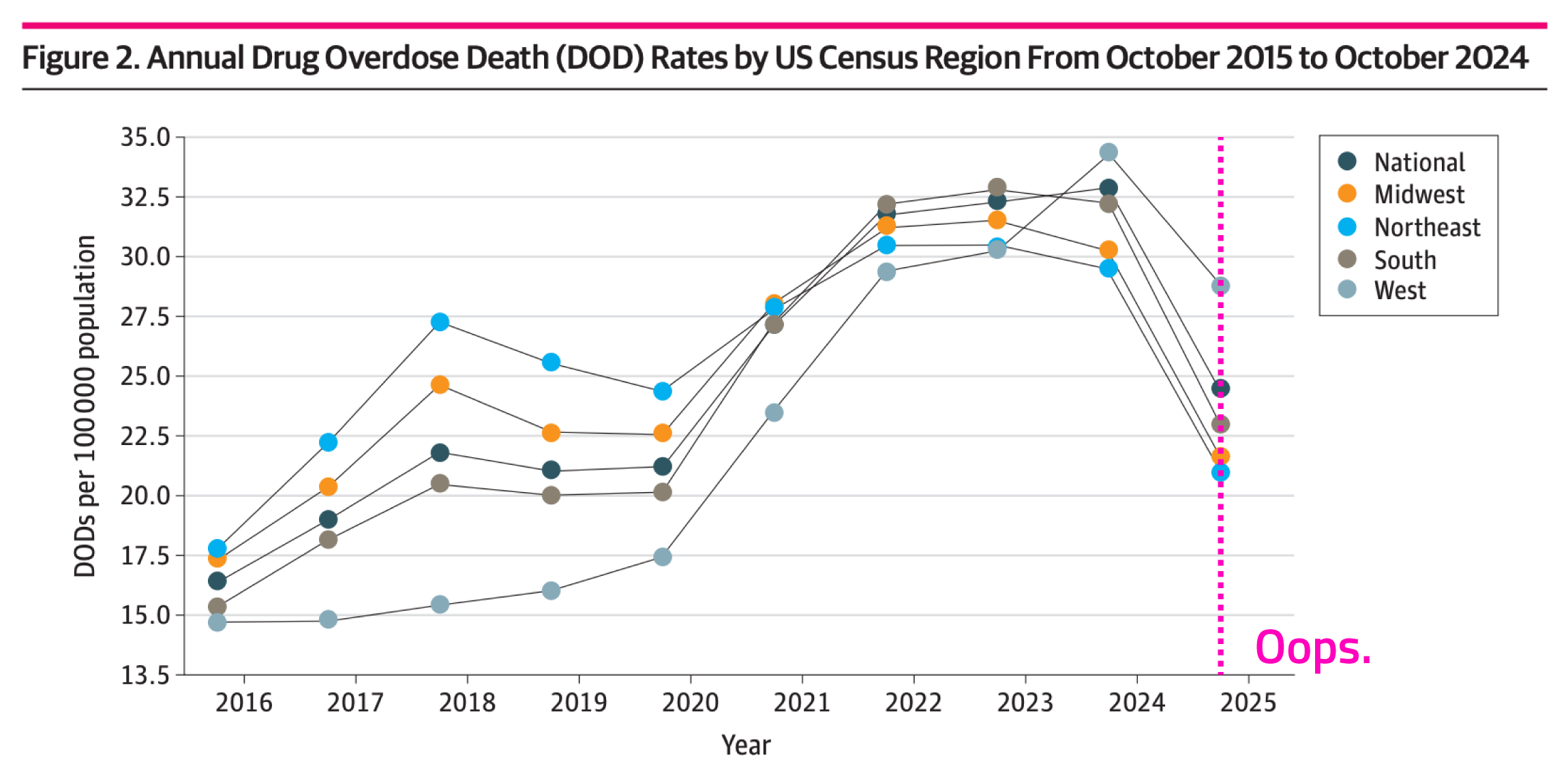
Bondi deleted her tweet.
Chapter 6
An interlude from watching football
I think I mentioned that I'd compiled more stuff than I knew what to do with? With that in mind, here, in order, are the categories of the 100 most-watched prime time telecasts of 2025, in order from first to 100th, displayed as emojis.
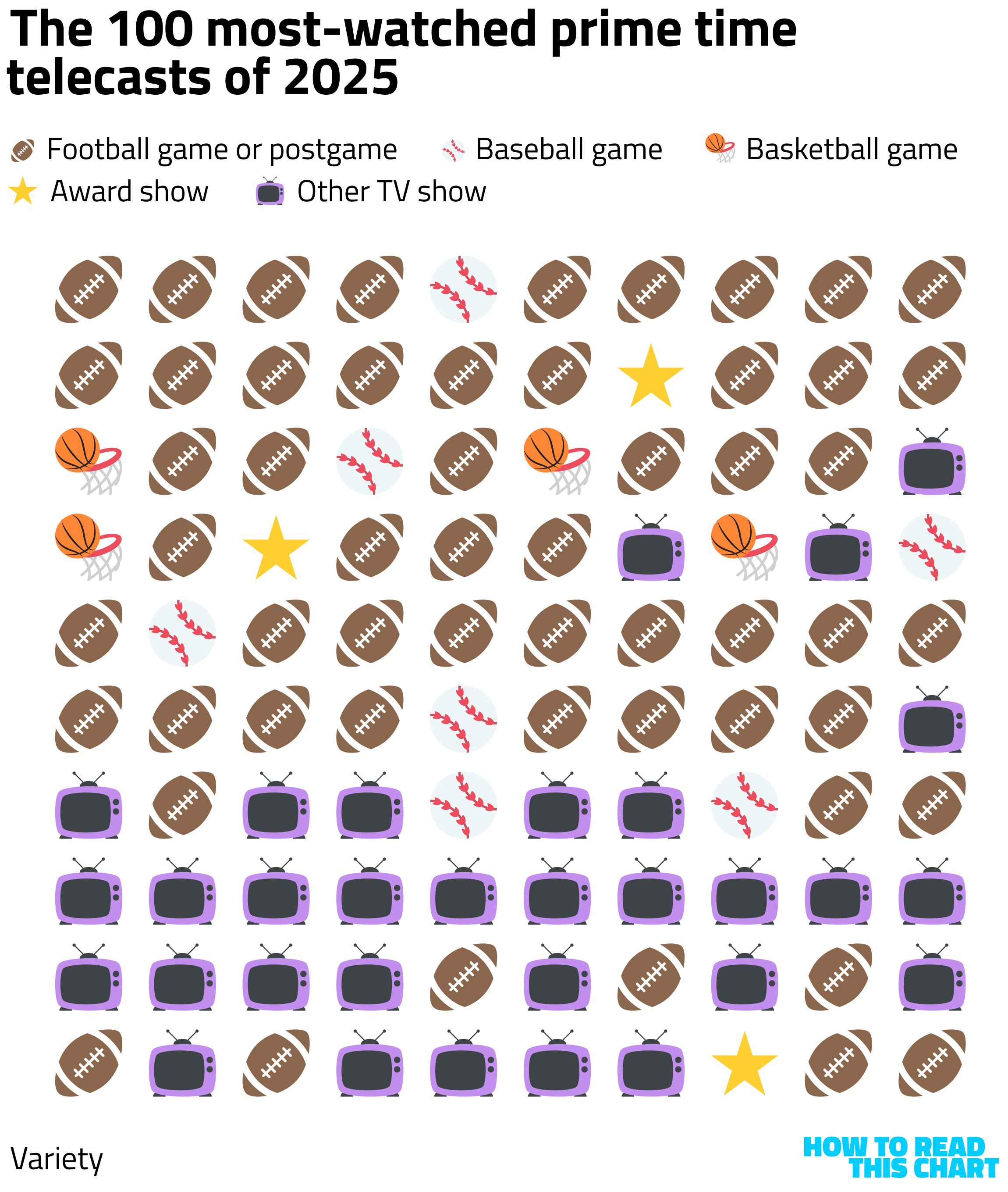
[jotting something down in a notebook titled "how to make lots of money"] "Buy … the … NFL."
Chapter 7
Continuing to nag the Golfer-in-Chief
Last week, the (much shorter) iteration of this newsletter focused on how much time Trump had spent at his private properties and playing golf. I decided that, for 2026, I'd update those numbers weekly, since I'm tracking them anyway.
I'm not sure those updates will always take the form below, but here's the inaugural edition. At left, the percent of days in which Trump likely golfed or was at a Trump Organization property at any point. At right, how his golf playing compares to Barack Obama's (given how often he excoriated Obama's golfing during the 2016 campaign).
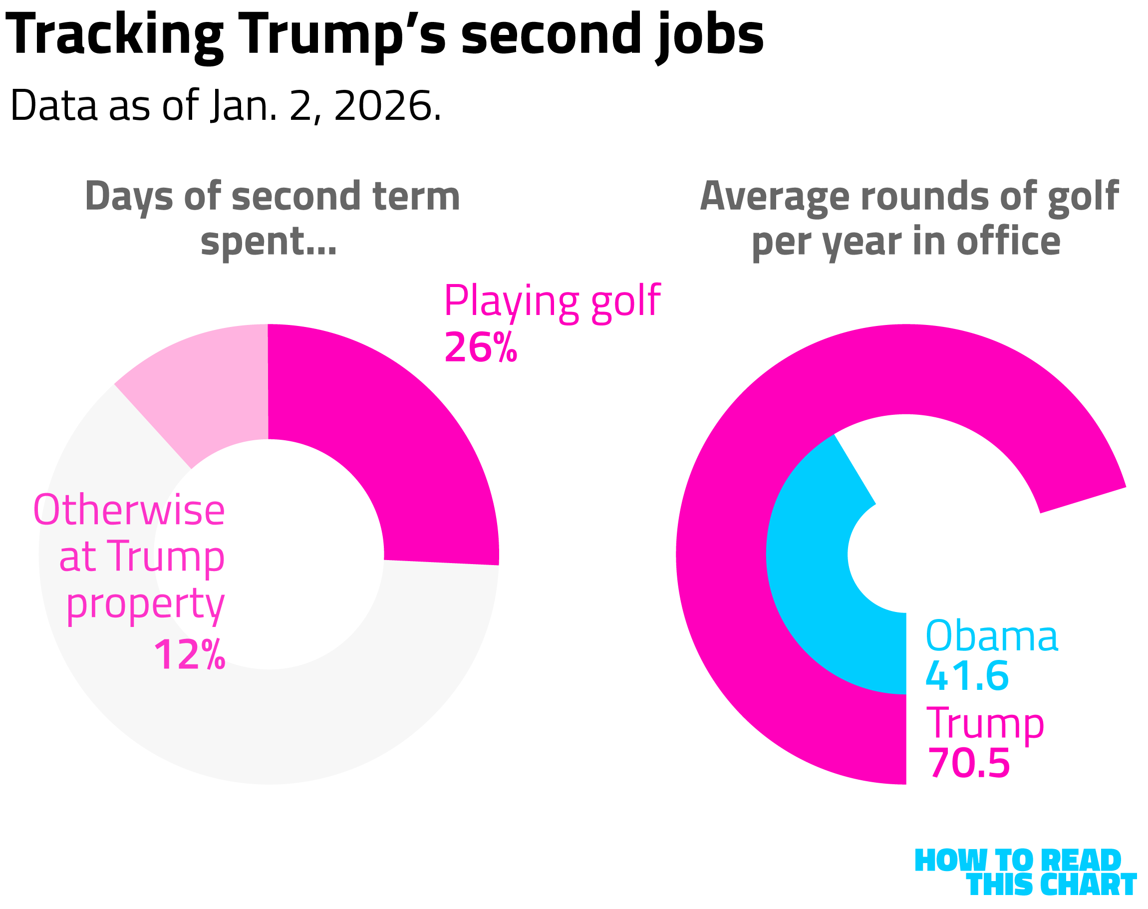
He has played golf on 10 of the past 14 days, among the most productive periods of either of his presidencies. Uh, golf-wise, at least (which is probably the only -wise that truly doesn't matter).
Chapter 8
Chart Attack
All that and still some Chart Attack.
In re: the new data on military action in 2026, here's a chart of what your profit-taking looks like if you (apparently) know about military action in advance. (Click through for the full explanation.)
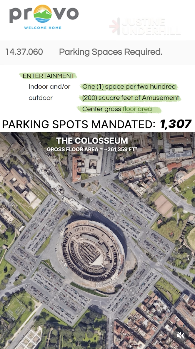
I appreciated this video showing what world landmarks would look like if subjected to the parking-space requirements of American (well: Provo, Utah) zoning requirements.
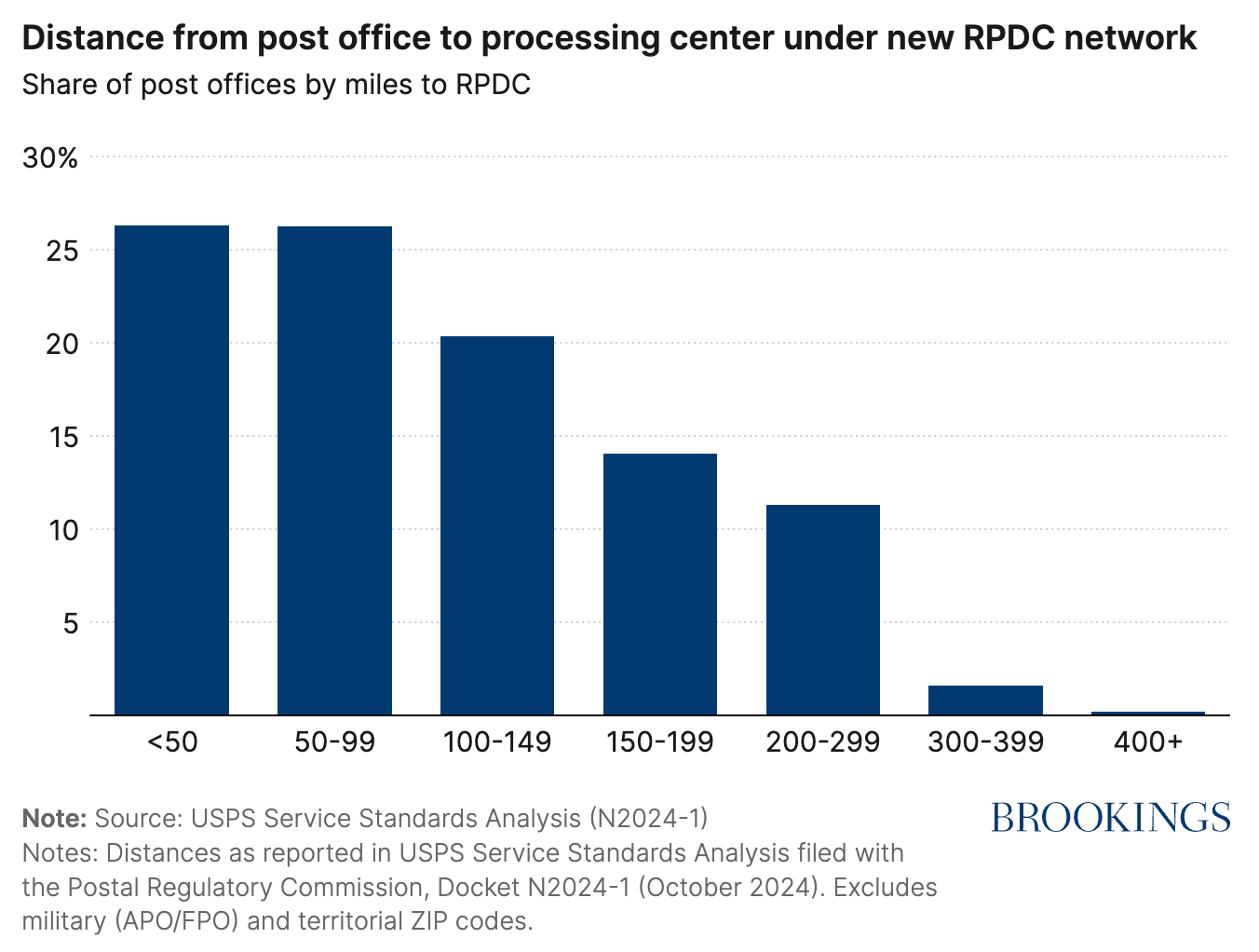
This Brookings chart of the distance to post-office processing centers isn't particularly exciting, but it does have potential ramifications for the midterm elections. (Click through to see how.) (You should always click through in general, obviously, but reminders never hurt.)
In its excellent year-end compendium of data visualizations, the New York Times Upshot team included this look at a tool they made to measure the goriness of movies.
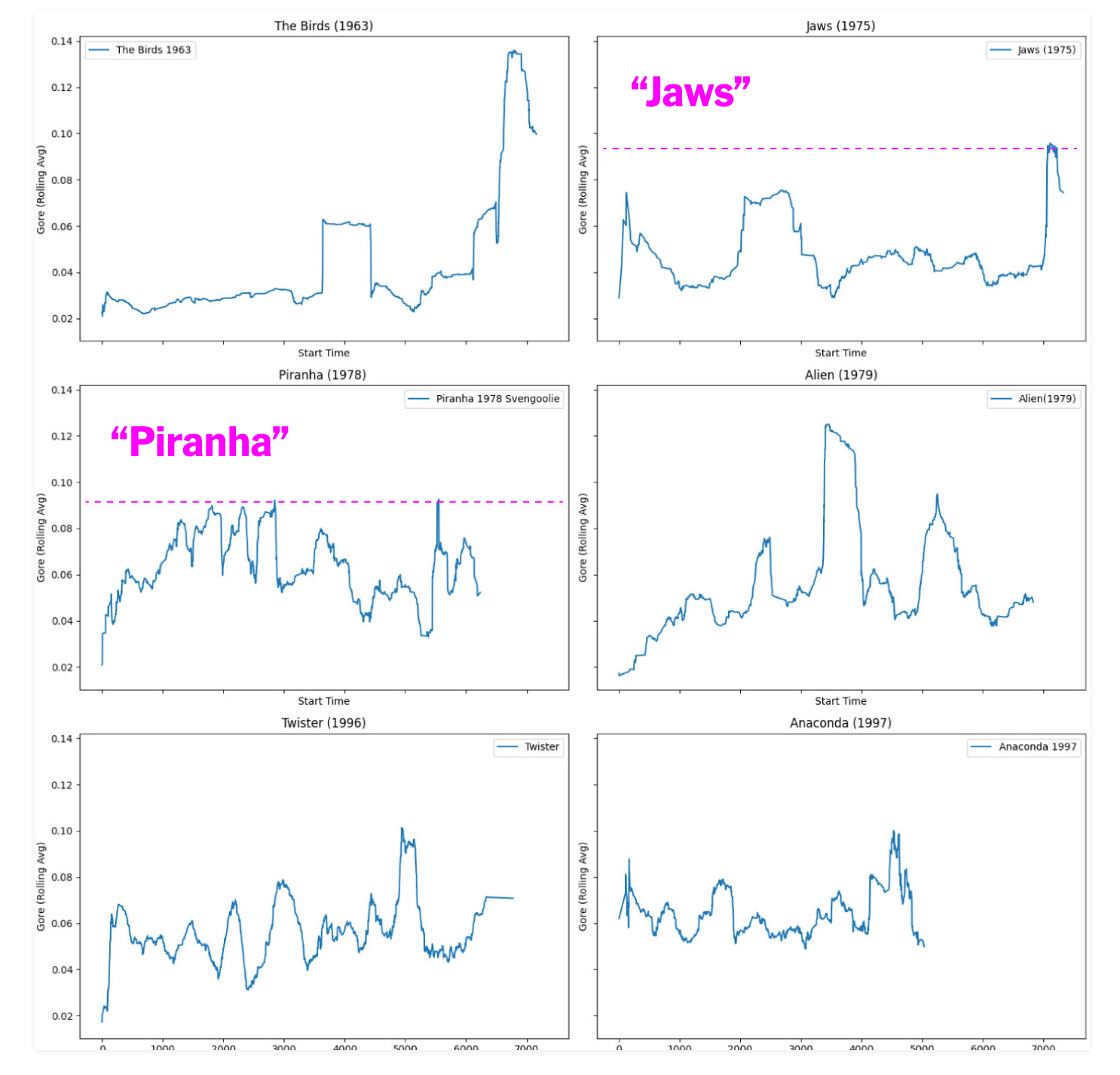
I'm slightly skeptical that "The Birds" peaked higher than "Jaws," but who am I to doubt the data?
Finally, a visualization that I've been meaning to share for a while: Neal.fun's elegantly illustrated comparison of the size of different objects in the universe. A very pleasant thing to spend part of your weekend watching.

So ends the newsletter. So ends 2025. Here's hoping your 2026 is superior but, if your 2025 was anything like mine, how could it not be?
Appendix
Some other things I've written


You are receiving this email because you at some point in time volunteered to, either at Ghost or Substack or pbump.net or pbump.com. If you don't want to receive future emails, I suggest you rethink your new year's resolutions. What you really want to do is support the newsletter financially, right?
Another one is coming next week. You have been warned.