On to new frontiers

I was sitting on set at MS NOW yesterday evening as I was introduced — Philip Bump, MS NOW contributor and author of "How To Read This Chart" — and I realized, oh, crud, I probably should have anticipated that.
If you are one of the people who saw me on Chris Hayes's show and began following the newsletter: Uh, hello! Don't get too comfortable.
You see, earlier this week I announced that I was accepting a new job with Hearst, one that meant this newsletter would be ending. People who've subscribed to How To Read This Chart for more than 24 hours were notified of this change on Wednesday, but it's possible that some of you might have missed the email, arriving as it did some 72 hours before my emails usually do. So: Uh, hello to you, too!
I will maintain an archive of this newsletter at my personal website, if you have a yearning for outdated-but-brightly-colored charts in the future. And I'm starting a new newsletter through my new employer, for which you can sign up. The first of those will arrive next week.
But before we go, let us put our entire existences into context, shall we?
This will be a long email.
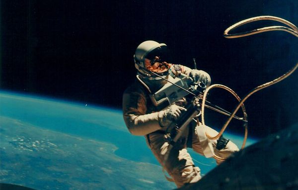
When I sent out the email about my new job, I topped it with an image of astronaut Edward White conducting a space walk in 1965. There wasn't really a coherent reason for that, save that a jaunt into the unknown seemed fitting … and that I'd just watched the launch of the Orion spacecraft with my kids.
I didn't realize how exceptional this mission will be. That it was the first mission targeting the moon in my lifetime. That it provided the opportunity for high-resolution photography from deep space. That the astronauts on the spacecraft will, God willing, go further into space than any human has before.
It's also the first deep-space mission in the internet era, meaning that it's the first to push reams of data out to the public in real time.
There are countless ways in which that data is now consumable. NASA itself has a clever visualization of the spacecraft's current position, including its expected path and (simulated) views from the ship itself.
Various elements of the mission have been similarly presented. I found this animation of the massive fuel consumption during the launch interesting. My sons, who didn't grow up watching rocket launches, marveled at how much of the rocket served as nothing more than a gas tank.
Perhaps I am unusually attuned to issues of scale and scope in the moment, but what strikes me about the mission is the humbling distances involved. In our sky, the Moon and Sun are about the same size. They seem close enough that humans for millennia seemed to think that reaching them required little more than a robust ladder and a bold constitution.
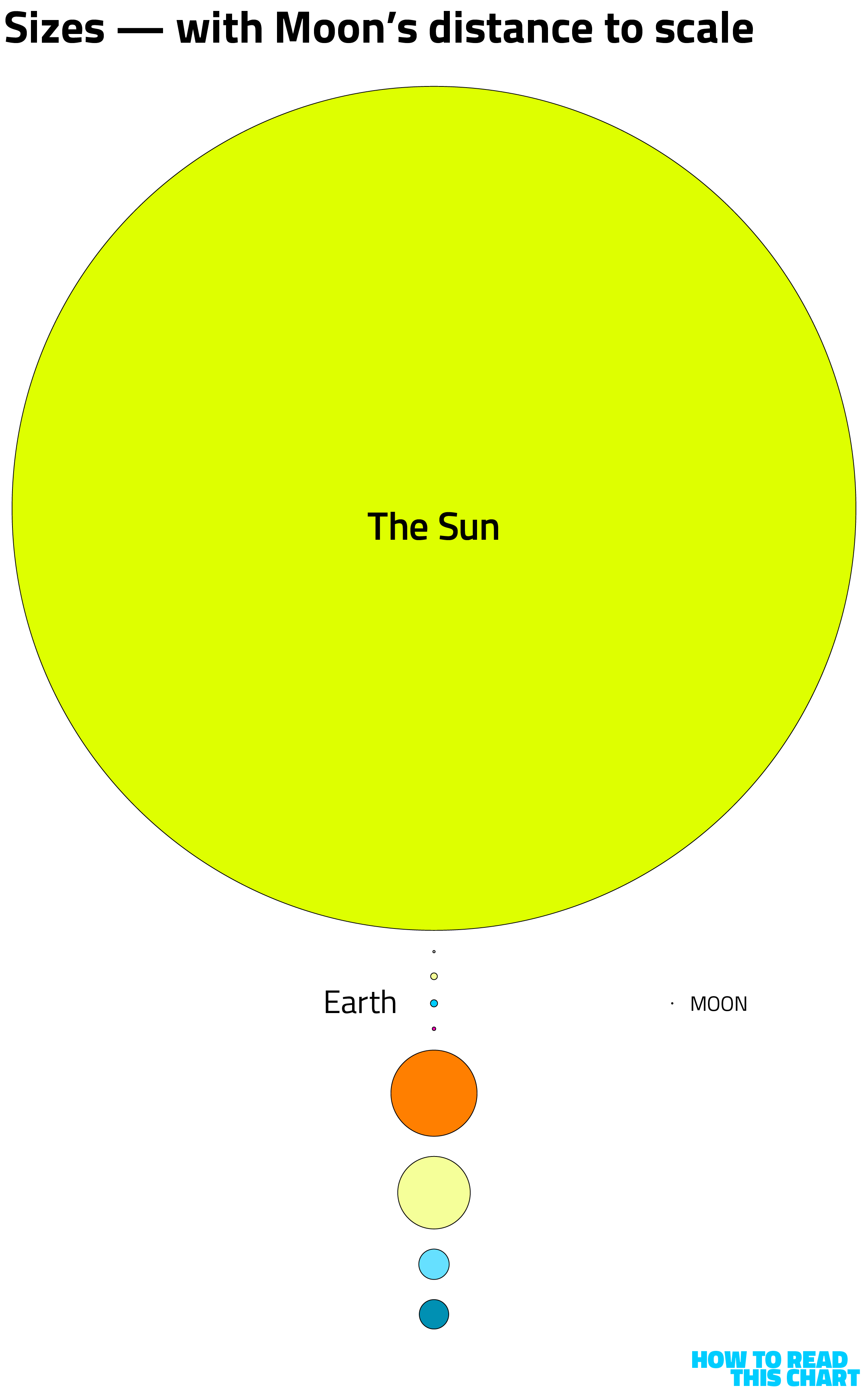
But this is very much not the case. You are aware that the Sun is significantly larger than Earth, I assume, but perhaps not aware just how much larger it is. So I made a little diagram.
All of those planets are to scale. The Sun is 109 times wider than the Earth, which is four times as wide as the Moon.
Size isn't really the point here. Distance is. And the distances between the elements of the solar system are nearly impossible to convey with any accuracy in the email format.
For example, here's a to-scale illustration of the distance between the Sun and Mercury, the closest planet to the star. You'll … have to scroll a bit.
Orion isn't headed from the Sun to Mercury or (happily) from Mercury to the Sun. Instead, it's headed to the Moon. But that, too, is much farther than you might think.
There's a clever visualization of the distance over at Instagram, the first image of which is below. See all those dots at the bottom? That's how many more images there are until you get to the Moon. It's worth clicking through to see.
In my original illustration, I just threw the Moon next to the Earth so you could see the relative size. If we move it to its actual distance (meaning its average distance, since that changes), this is the result:
This also brings me to one of my Favorite Solar System Facts™: Every other planet in the solar system could fit between Earth and the Moon (when the Moon is at its furthest point away).
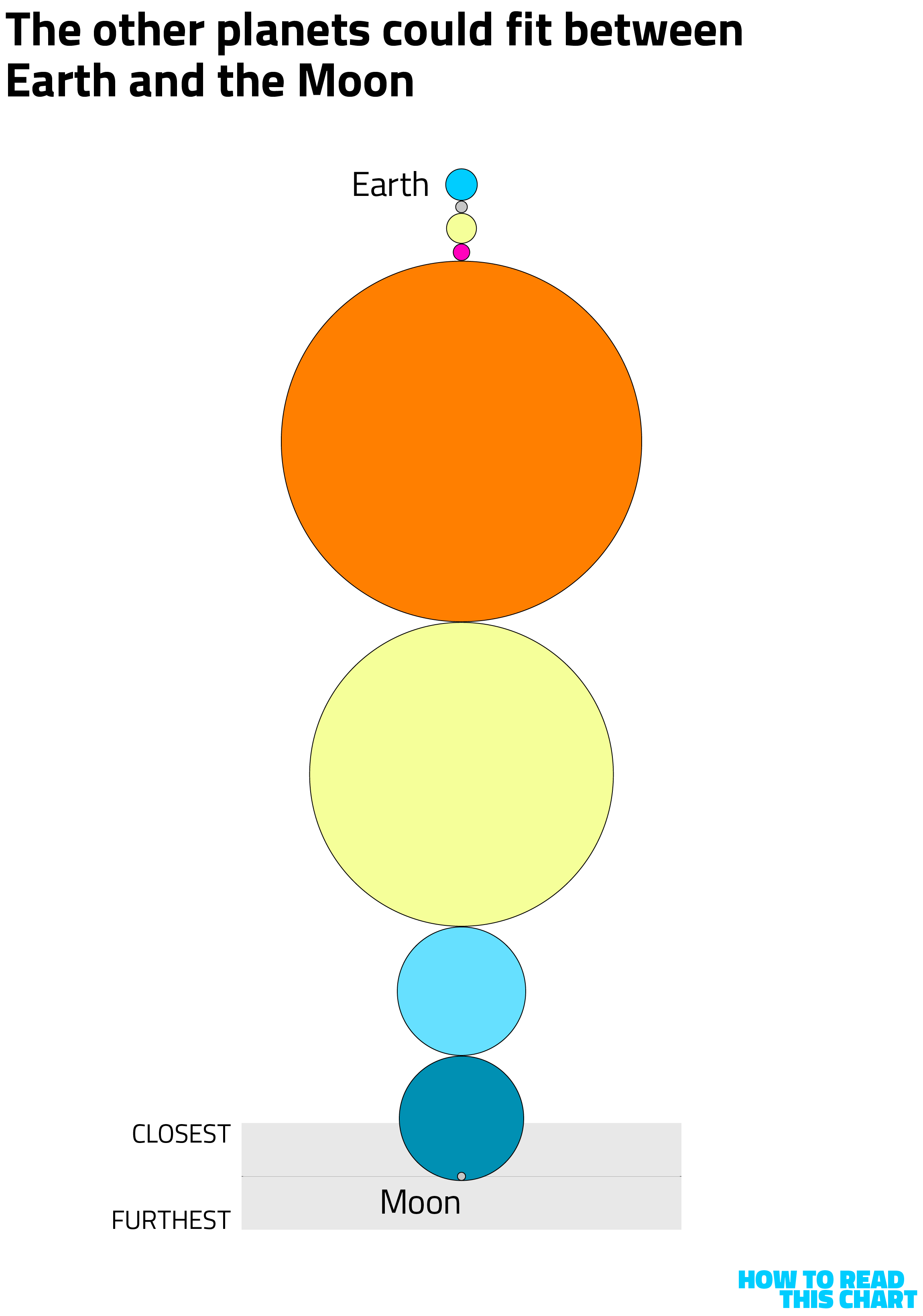
(You could fit Pluto in there, too, if you're a traditionalist.)
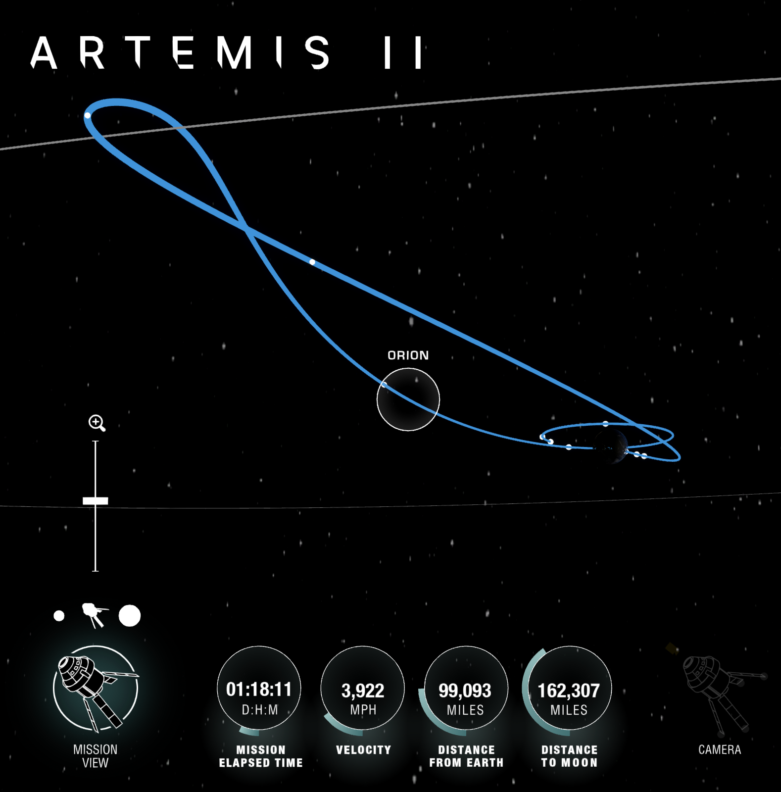
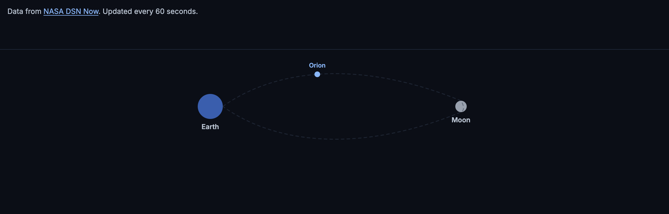
That's the gulf that Orion is traversing. If you want to track how far away it is and how fast it's moving, Jakob Rosin created an elegant dashboard with current data.
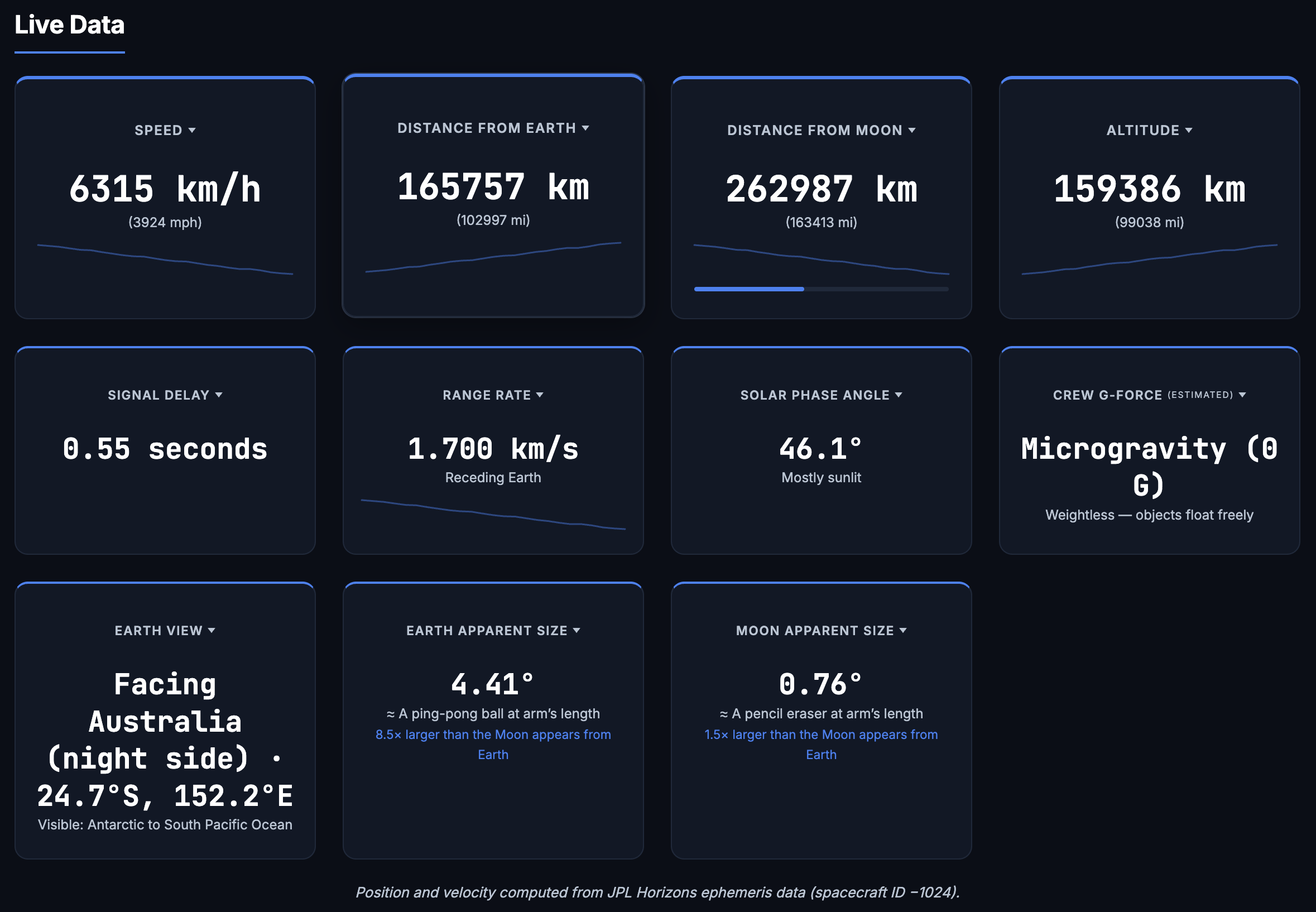
It, too, shows the spacecraft's location. (Notice that the image below is as of Friday afternoon.)
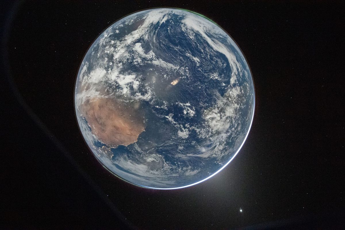
NASA also has a livestream of images from Orion, providing images that generally show little more than the blackness of space. Sometimes, though, other objects slip into view.
There's one more element of scale that's interesting to consider here: age. If we illustrate the relative ages of the Sun, Earth and Moon, the result is below — with the emergence of man also shown.

If I were to show the era in which humans had progressed past a hunter-gatherer society, it would occupy the bottom 4 percent of the barely visible pink line. The era of space exploration? The bottom 0.023 percent of it.
This is the voyage four humans are now undertaking — past a four-billion-year-old rock, across hundreds of thousands of miles, slingshotting around the closest celestial body to Earth.
If this is not awe-inspiring to you, I'm not sure what else I can say. We are tiny creatures that have been on a minute planet for a cosmic instant.
The first chart
Also notable on the cosmic timeline: I started a newsletter once.
How To Read This Chart began in December 2021, while I was still at The Washington Post. It was intended to be a way for me to promote my 2023 book, which had its own fair share of data visualizations. That's where the name came from; my editor at Viking asked that I include a little "how to read this chart" blurb on each of the book's visualizations.
The conceit that I was showing people how to read charts quickly eroded, I'll admit. In fact, the first graphic I included in the newsletter (if I remember correctly) was the one below — an intensely complicated and unintuitive look at how Hispanic voting shifted from 2016 to 2020.
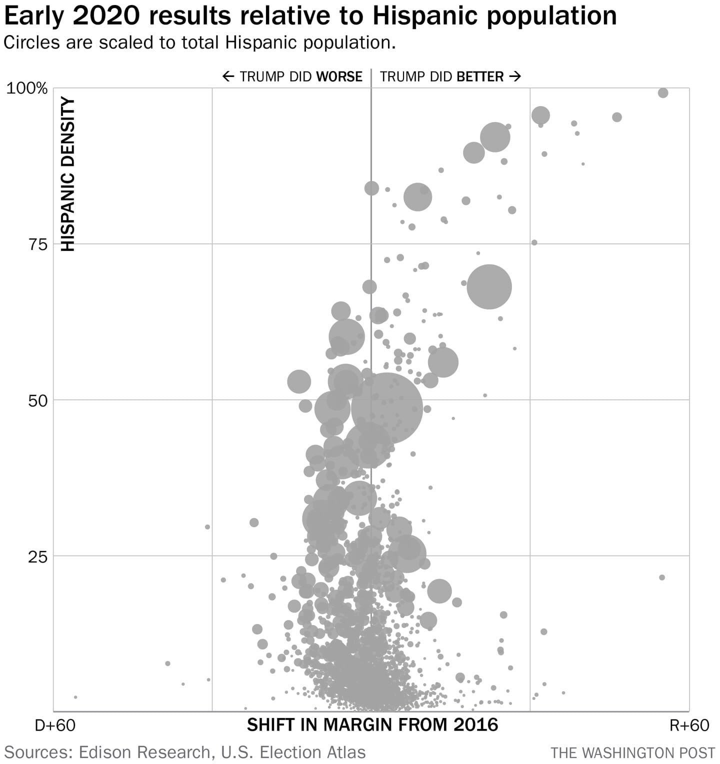
Explaining how to read that chart was a chore. I probably failed at it. It did presage what was to come in 2024, admittedly, but it wasn't really fodder for an interesting newsletter. So instead I made the newsletter about interesting things I'd seen or could make jokes about. And that's what it remains to this day.
One more loose end.
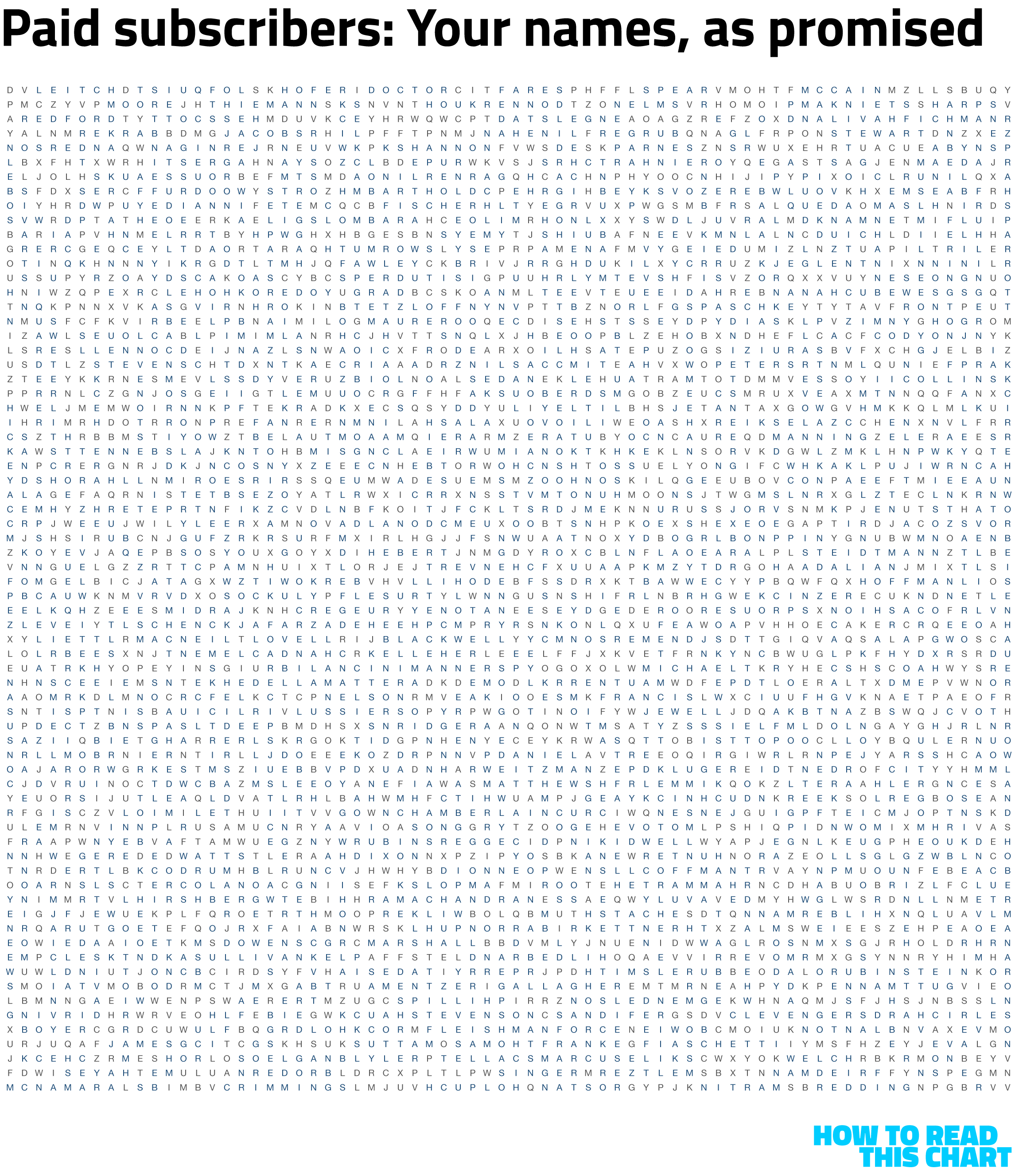
What made the second iteration of this newsletter possible was that hundreds of people voluntarily donated to cover its costs. I can't express enough how moving that was; that, without the tedious gimmicks of paywalls and read-more barriers, people thought this collection of charts and corniness was worth spending money on. Who knew!
Not expecting that kind of response, I promised donors that I would work their names into an edition of the newsletter. But there were too many to do so elegantly, so I kept putting it off.
Until now. Below, every paying subscriber's name is presented (either in full or as a last name), somewhere in this oversized grid of letters. See if you can find yours!
And with that, my work here is done. Thank you for reading — whether this is your first time or your 100th. Hopefully, I will write other things in the future that you also find of value or of interest.
I guess we'll see.