Let's consider some disasters.


It has been quite a week in quite a month in quite a year in quite a decade, has it not? A lot of things have gone sideways, often driven into ditches by distracted drivers. Happily for us, some interesting data visualizations have emerged as a result.
Chapter 1
The disaster in Washington
The evisceration of The Washington Post is not the most important thing in the world, certainly. It has gotten a great deal of attention in part because it is A Bad Thing That Happened To The Media™, which is the sort of thing that the media spends a lot of time talking about and the media consumes a big chunk of the national conversation by definition.
But I would argue that it is more important than other ABTTHTTM™ because of the circumstances: one of the world's richest men gutting an institution as he cozies up to a wannabe autocrat. That's particularly problematic, certainly, even if it is more common than it used to be in the U.S.
For me, of course, The Post's collapse holds personal importance. I spent 11 years there. Nearly every Post employee with whom I remained close lost their jobs this week.
There have been myriad eulogies written for the paper as it was since the culling. I didn't contribute one, having rebutted Jeff Bezos's arguments about media objectivity when he first raised them in 2024, concluded my tenure at The Post with a rumination about the collapse of institutions and published an essay the day before the layoffs about how power is shifting in America. I'd said my piece.
Except there is still one aspect of all of this that deserves highlighting.
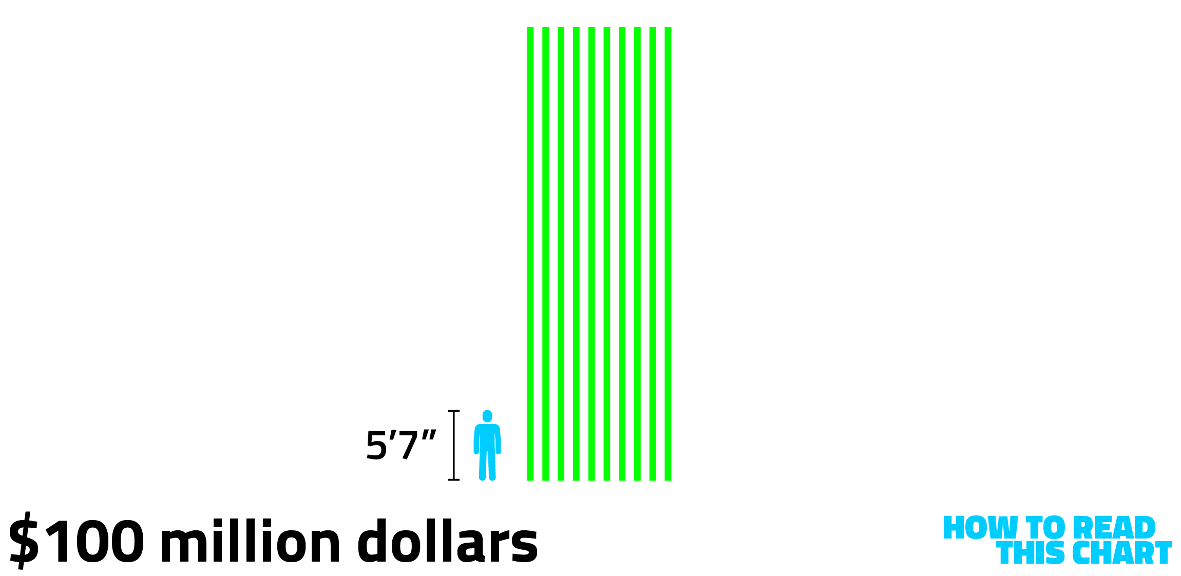
It has been mentioned, repeatedly, that The Post lost $100 million in 2024 — a loss driven in part by the shifts Bezos was already implementing. If you stacked $100 bills in a pile until you had $10 million, it would reach about 36 feet in the air. Here's what $100 million would look like, in ten stacks of $10 million, positioned next to a powerful 5'7" gentleman.
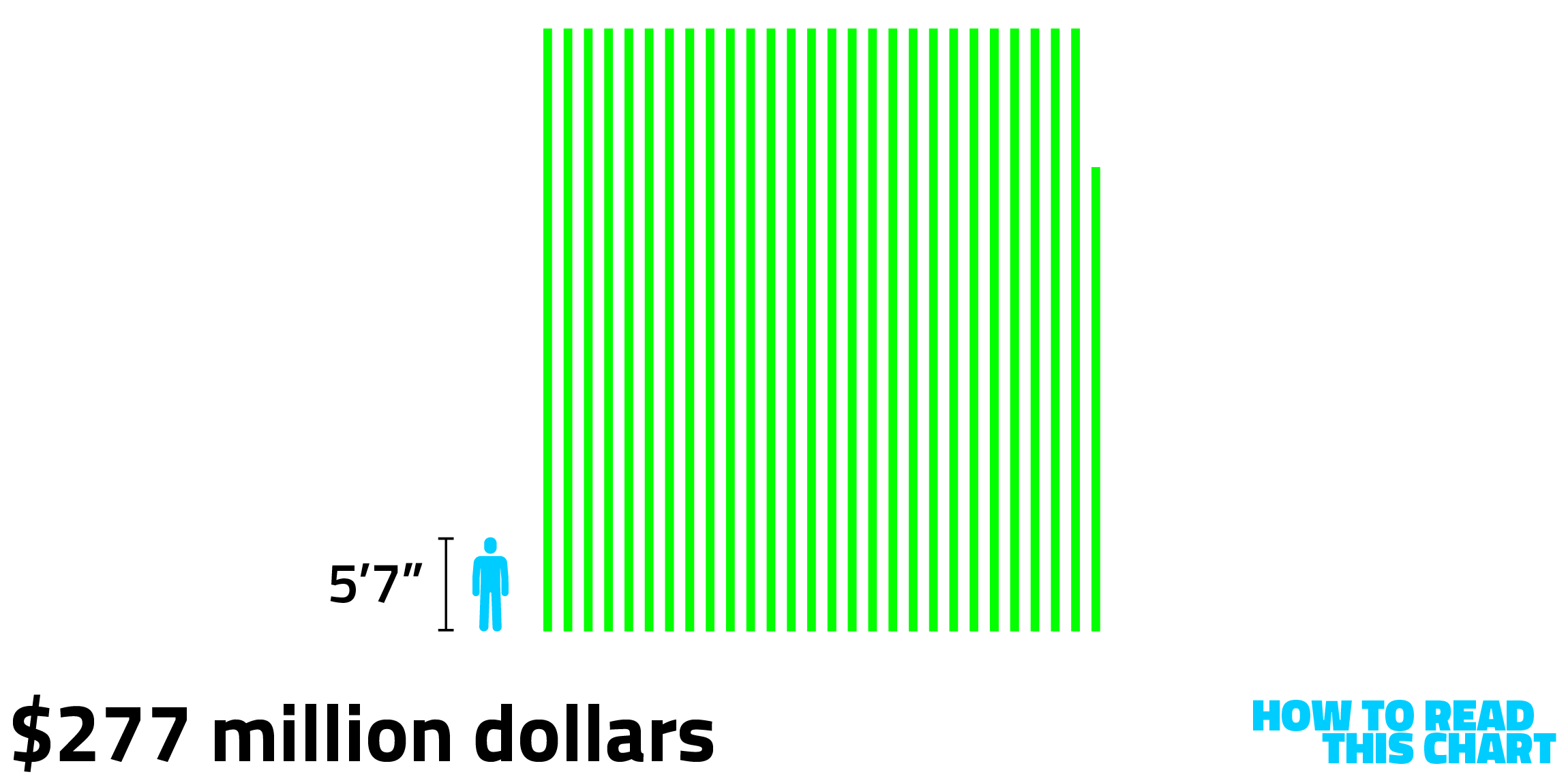
It's worse than that, though: The Post lost $277 million from 2022 to 2024, according to news reports.
That's a lot of money to lose, admittedly. At least for you or me. It is, relatively speaking, a lot less to lose for Jeff Bezos. After seeing his net worth plunge dramatically over the past few days, Bloomberg's Billionaires index still has him at a worth of nearly $240 billion.
Here's what that would look like in $10 million stacks.

Not too shabby.
Of course, his net worth isn't all liquid; Bezos doesn't have a big vault he swims around in like Scrooge McDuck (I assume). But this is still the equivalent of someone with a net worth of $500,000 finding themselves with a $240 credit-card charge.
There's another useful way to look at how much Bezos's net worth has grown. Since he bought The Washington Post in August 2013, he has become one of the wealthiest people in the world. In fact, from the day he bought the paper until yesterday, his net worth has increased an average of more than $45 million a day.
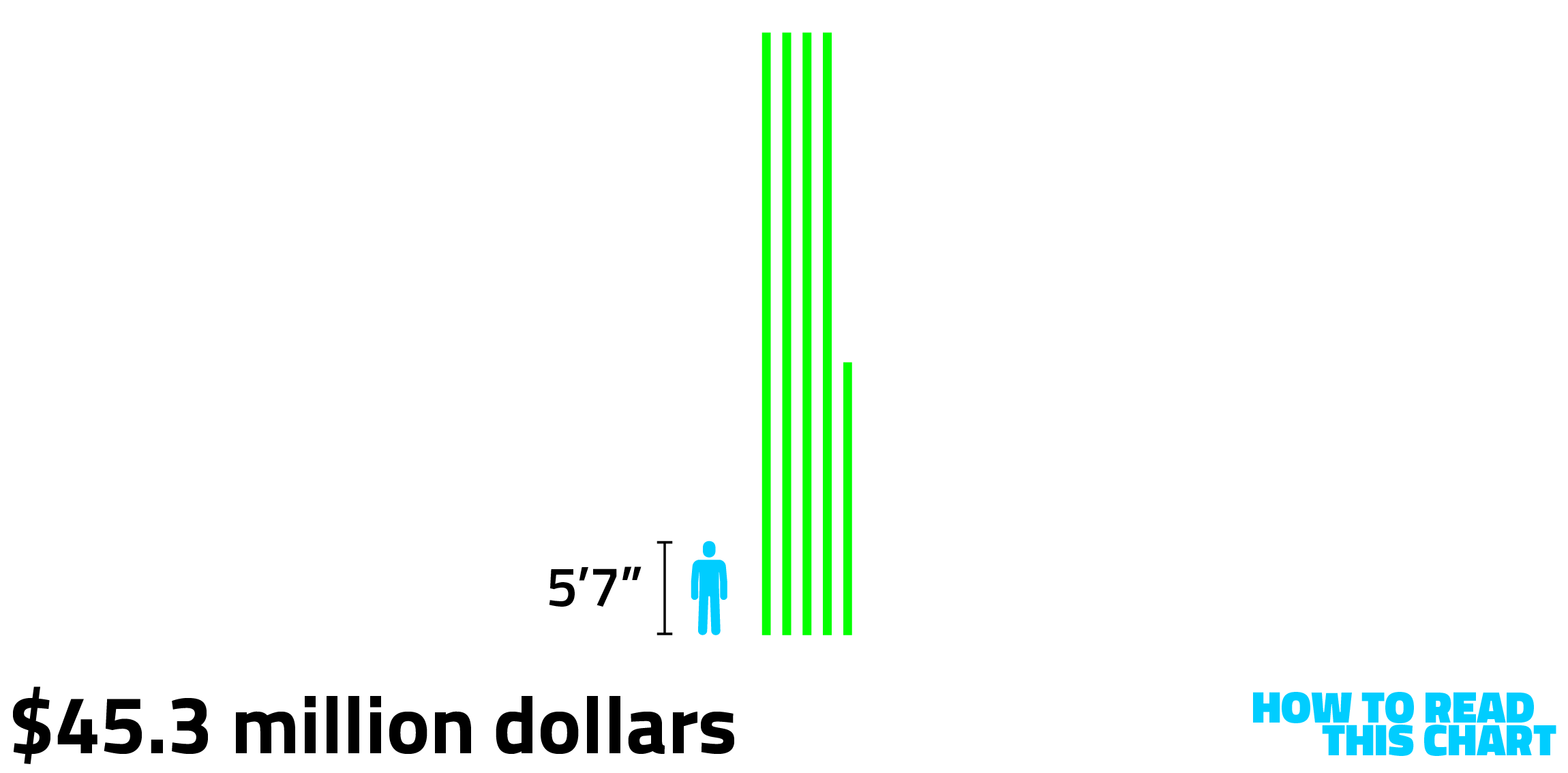
Based on that average, Bezos's net worth increased enough over any five-day work-week to offset The Post's $277 million in losses.
He's certainly not obligated to take a laissez-faire approach to a money-losing business, certainly. But he has been willing in the past to stick with a business's core proposition despite massive losses: Amazon lost almost $3 billion from 1998 to 2002, but he stuck with it. Because he believed in it.
Somehow, somewhere, he lost faith in what The Post was doing and how it was doing it. As a result, the paper will never again be what it was; we will see if it ever again is anything at all.
Chapter 2
Preventing disasters across America
I live close enough to our local volunteer fire department that its noon-time siren always gets my dog howling. But I'd never really considered it as a member of set, a bespoke organization serving a discrete area — like any number of other such organizations nationally.
Then I read a thread of posts about the number of fire departments in Pittsburgh and on Long Island.
The thread claimed that there are 200 different departments in Pittsburgh's Allegheny County and another 180 in Nassau and Suffolk Counties in New York. That last figure is a bit high, according to data compiled by FEMA, but the Pittsburgh one is on the mark.
My first thought was that Pittsburgh's number was driven by its terrain; you need lots of stations to ensure you can get to different neighborhoods quickly. But this is independent departments, not stations, each of which may have several (or dozens) of fire houses.
So I pulled county-level data on population and departments and mapped the relationship. Bigger circles below indicate more departments per county resident.
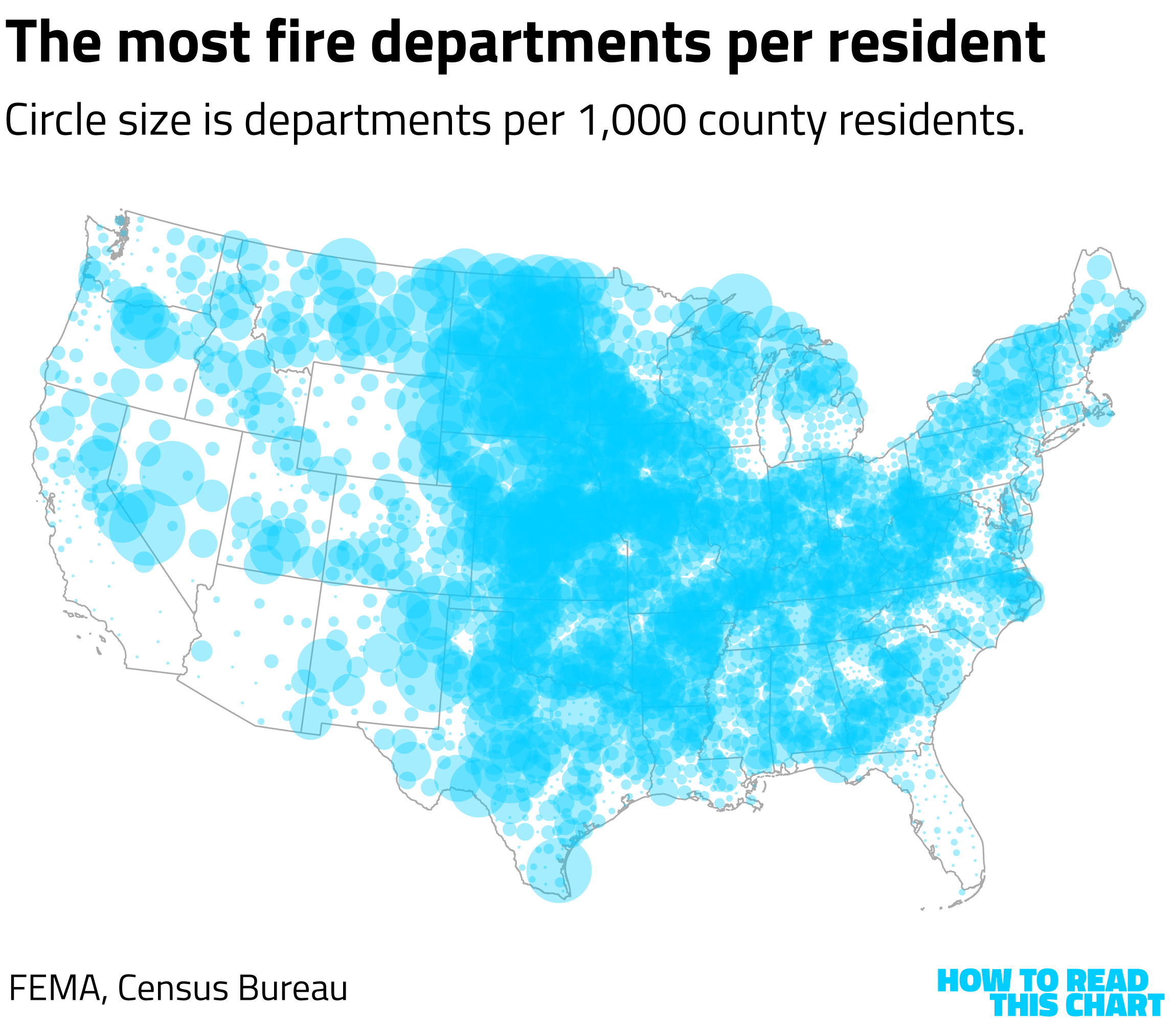
What you'll notice is that this appears to be an inverse map of population density. Places with lots of people tend to be cities with unified departments, so they have one department for a lot of people. This doesn't hold universally; even rural California doesn't have a lot of different departments, probably in part because the counties there are so large and often served by county-level departments.
But there is a correlation. (Notice that the vertical axis below uses a logarithmic scale.) Less populous counties tend to have more departments per resident.
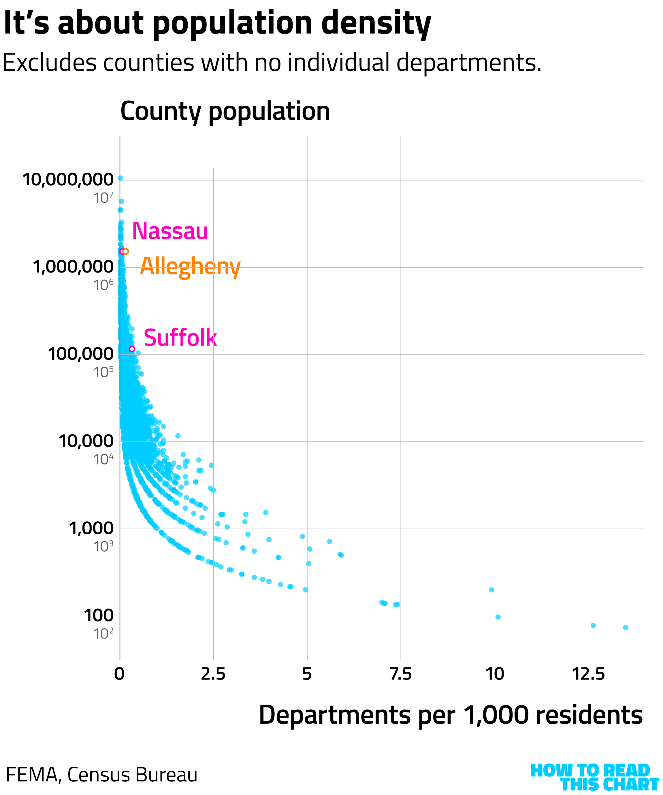
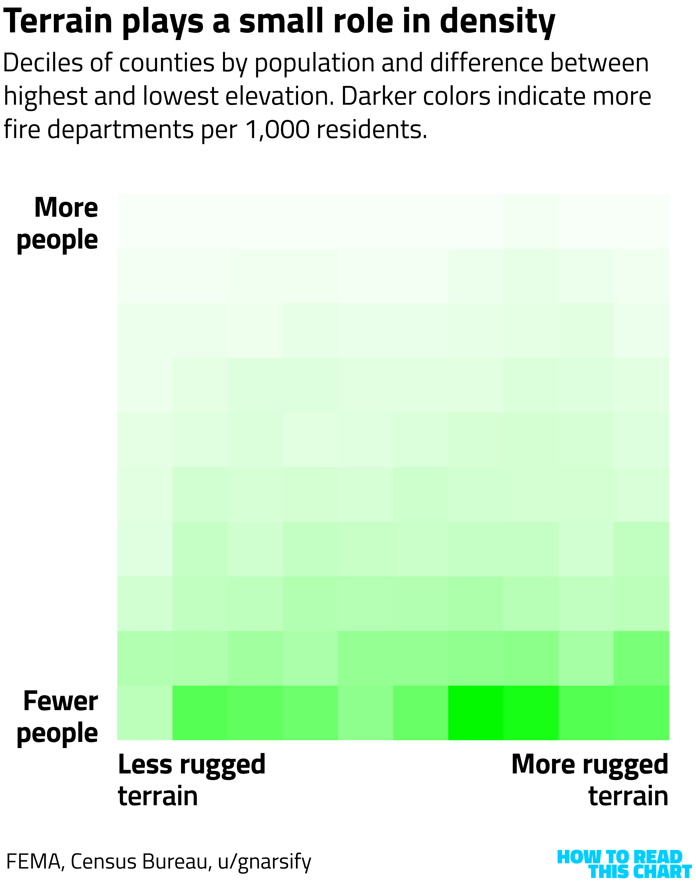
Allegheny County (hilly) has more departments per person than about-equally-populated Nassau County (flat). As you can see below, there is a modest effect from terrain — probably in part because terrain correlates to smaller towns and townships, each of which might have its own department.
I don't have a grand conclusion from any of this? Just an interesting artifact of America's evolution.
Chapter 3
Tracking a disaster's effects
You may recall two weeks ago when a massive storm dumped huge amounts of snow across the country. I remember it; looking out my window we still have a foot-plus of snow on the ground. As the storm was unfolding, someone I follow on Bluesky shared this map, showing how power outages tracked the path of the storm.
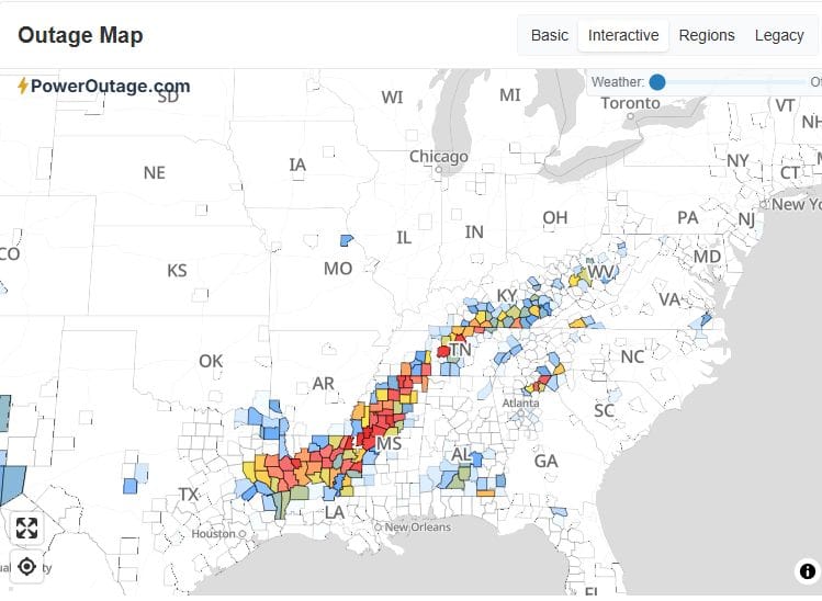
It was from the aptly named site PowerOutage.com. The site does what you would think, tracking the existence and severity of shutdowns as they occur.
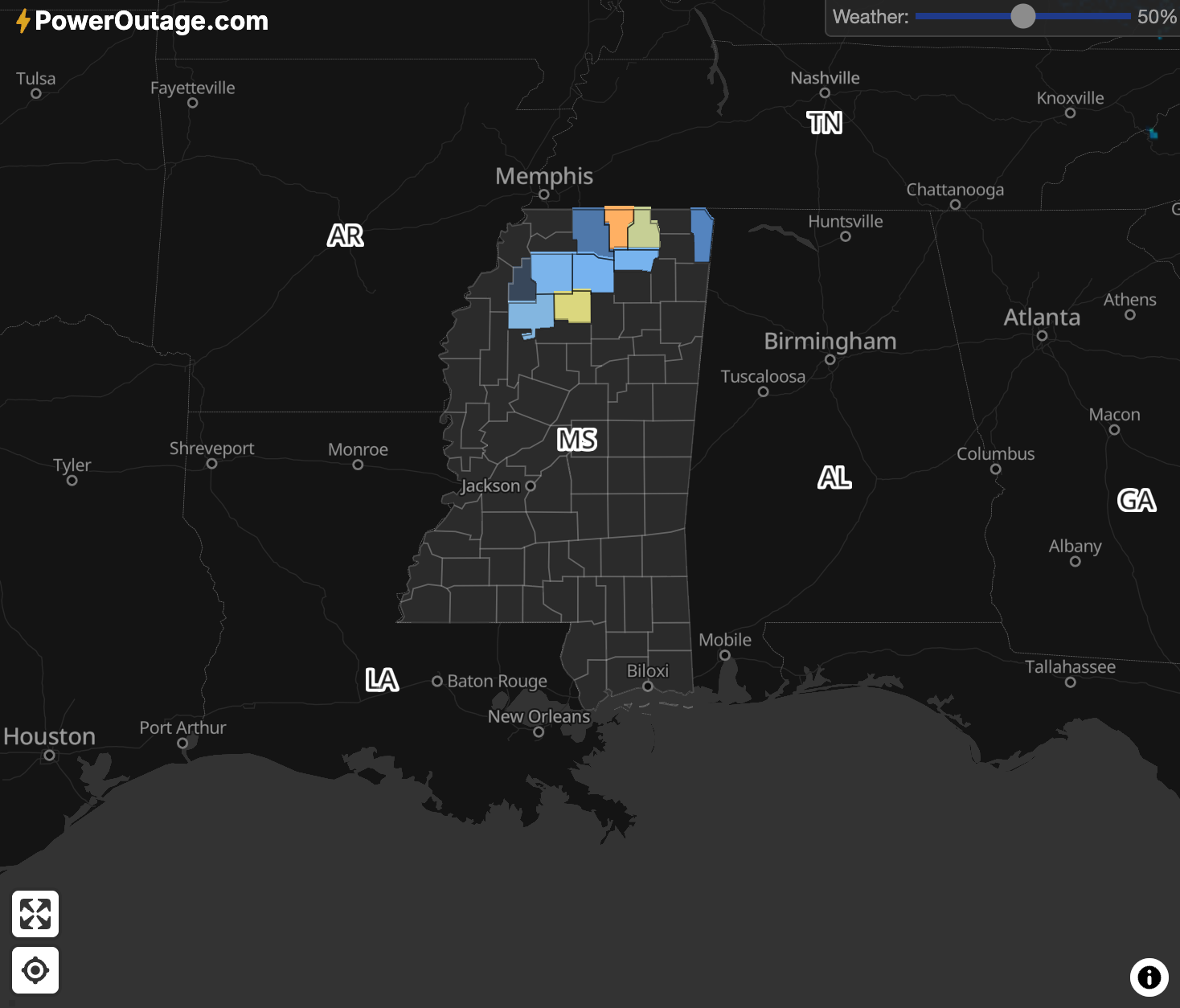
They also have information about historic outages, letting them compile visualizations like this look at the effects of Hurricane Helene.
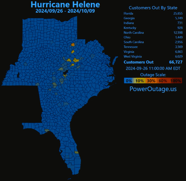
It's a useful resource to see both what's happened and how long recovery has taken. For example, as of Friday, there were still parts of Mississippi with outages.
That late January storm was apparently named "Fern," now that we are naming winter storms for whatever reason. The Weather Channel put together a nice look at how and where snow accumulated.
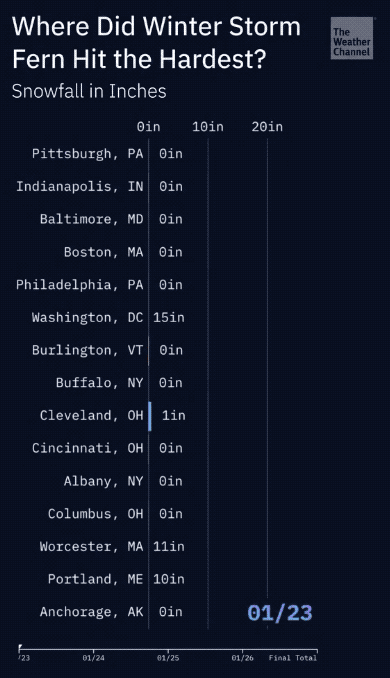
We didn't get 20-plus inches here, happily, but they did in parts of Pittsburgh. Hopefully the city also has 200-plus snow removal services.
Chapter 4
Another disaster in Washington
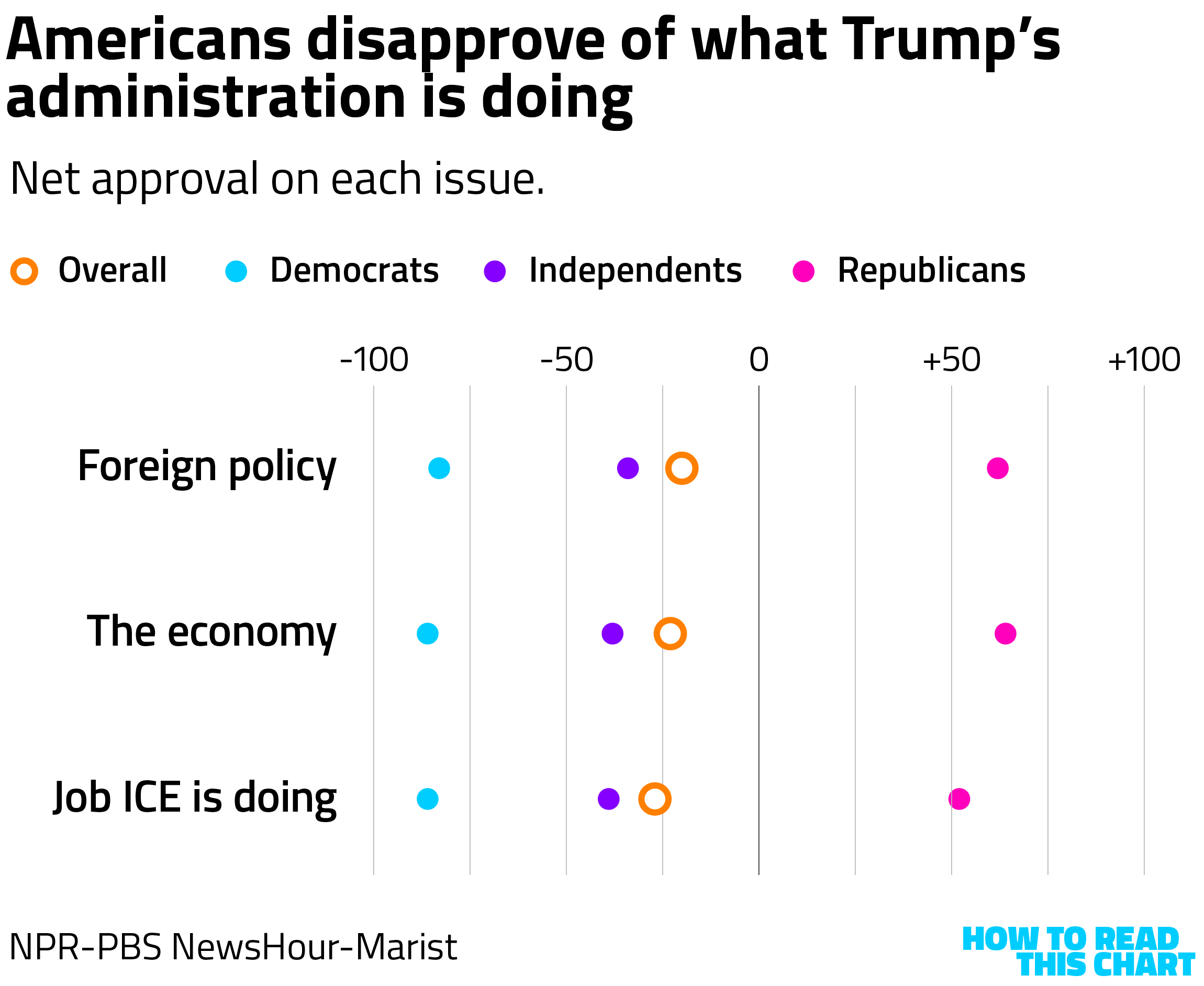
While The Washington Post was being hollowed out on K Street, the White House was incurring ongoing harm a few blocks away. The second year of Trump's second term in office begins with Americans viewing his presidency negatively overall — but also negatively in his handling of specific issues.
Polling out this week from Marist Poll documents this. Most Americans — including nearly every Democrat and most independents — view Trump's handling of foreign policy and the economy with more disapproval than approval. Disapproval of what ICE is doing is even higher, including with less support from Republicans.
And yet! Polling released by YouGov this week asked Americans which party they had more confidence in handling various issues. Americans preferred Democrats on health care. But they preferred Republicans on most other issues … including the economy, immigration and defense.
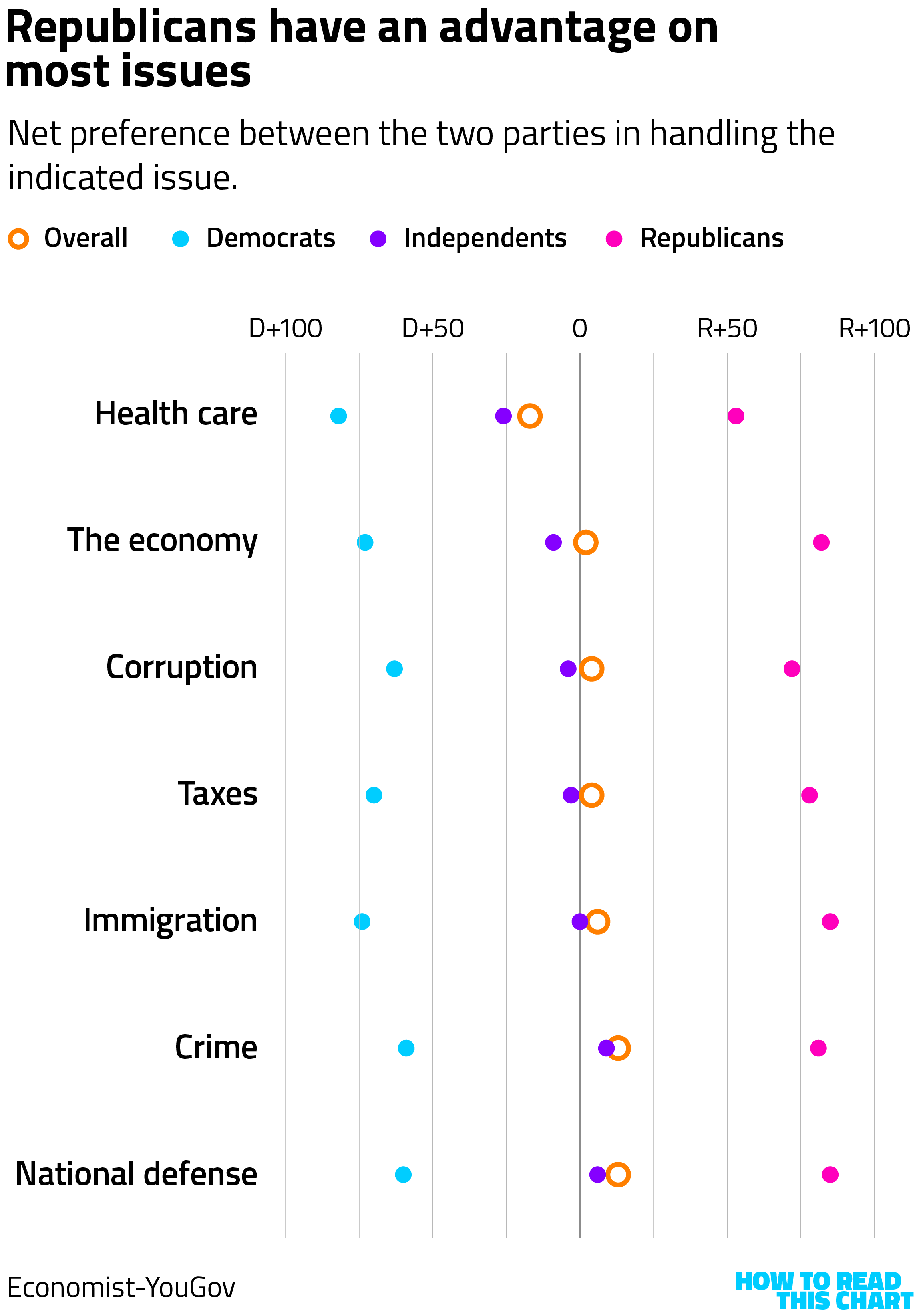
This is not great news for Democrats, suggesting that people differentiate between what Trump is doing and what his party does. This may be somewhat unfair for the opposing party, but it is an important distinction for those wondering what the post-Trump era of politics will look like.
But another caveat should be applied here. Part of the reason Republicans hold those advantages is that Democrats are much less enthusiastic about their party's handling of issues. We've seen this in other polling, Democratic dissatisfaction with the Democratic Party, but here it means that they are pulling their party's measurements to the left less than Republicans are pulling theirs to the right.
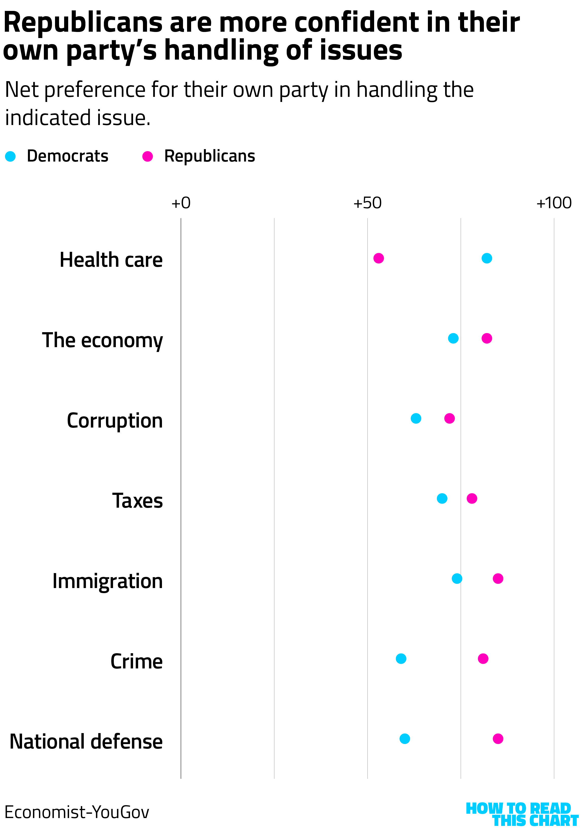
This suggests that the story isn't only that frustration with Trump isn't tainting his party — it's also that frustration with Democratic leaders' wan response to Trump is tainting theirs.
Chapter 5
A disastrous chart
Check out the y-axis on this triumphant social media post from the White House.

If you were to extend that axis to zero, as is warranted in this case, the chart looks like this. Instead of looking dramatic, the modest increase looks, well, modest.
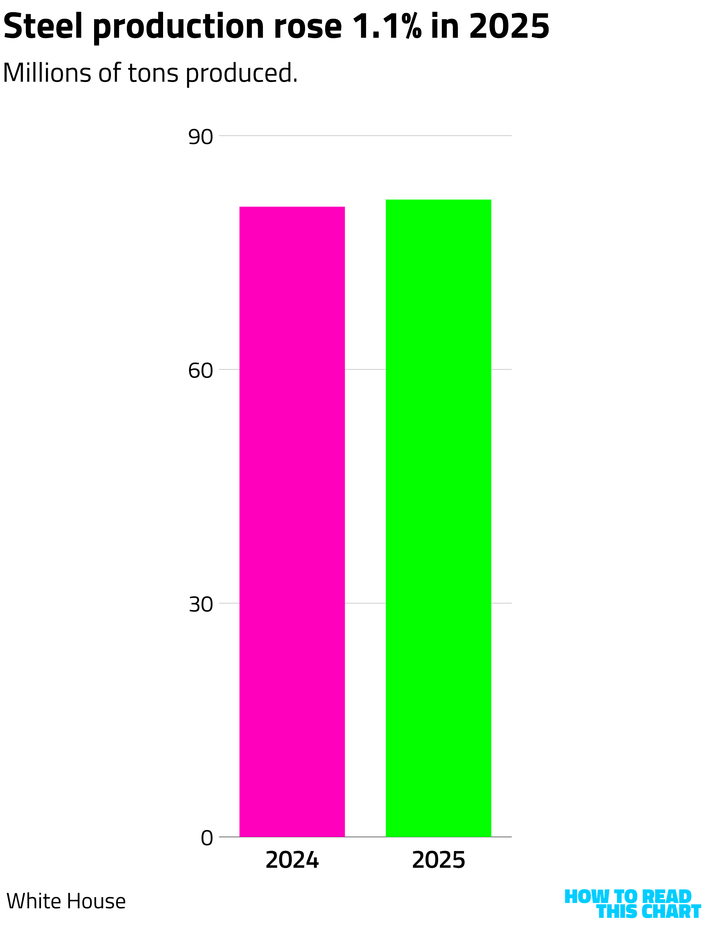
Hard to figure out why some people are skeptical of this president.
Chapter 6
Palette cleanse: Look at this neat book!
This is another of my endlessly long newsletters, I admit, meaning that I probably didn't need to include anything else. But, hey, this thing only comes out once a week! You have seven full days to peruse and dig into what I give you here. Space it out! Take breaks! Let it sink in! (…he said as he injected another 70 useless words into this thing.)
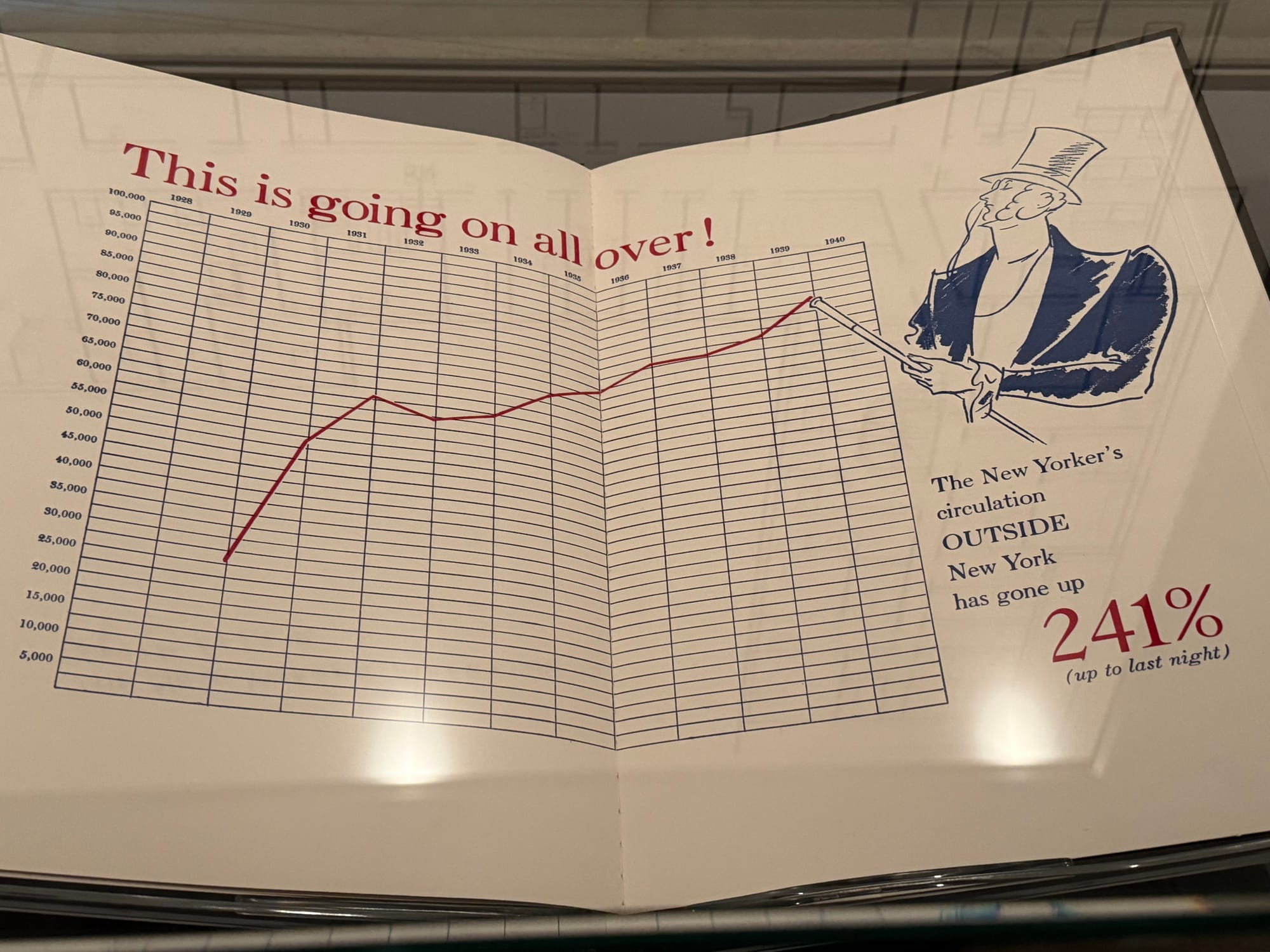
I did think this was worth including, though: elements of an exhibit at the New York Public Library's main branch celebrating the centennial of the New Yorker.
Look at this terrific, hand-drawn chart of subscriber growth into 1939, with Eustace Tilley helpfully pointing out the contemporaneous peak. (Also notice that the y-axis goes to zero.)
What particularly caught my eye, though, was this book.

What a title! What a cover!
The full book isn't online, given that it was a limited-run look at the numbers behind the magazine. New Yorker cartoonist Michael Maslin has a copy (as does the Metropolitan Museum of Art) and shared a tantalizing image of its contents.
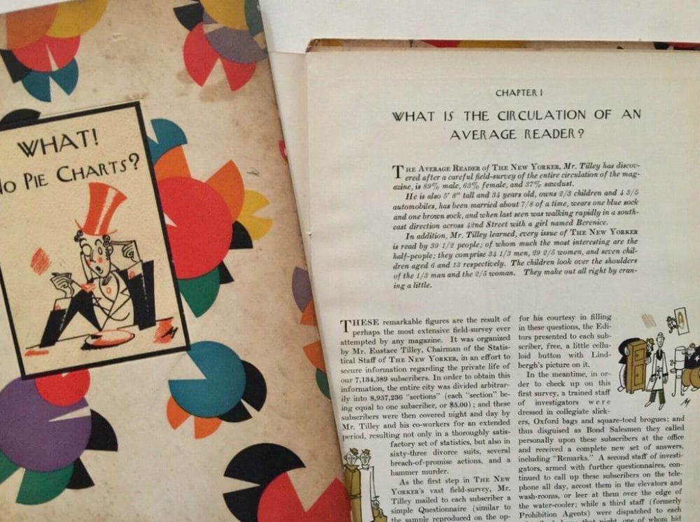
It is admittedly a bit humbling to discover that I'm about a century late to the jokes-plus-charts business.
If you have copy of this and want to donate it to the How To Read This Chart Archives (my office bookshelves), please feel free to get in touch.
Chapter 7
Chart Attack (finally)
If you've been taking my advice and reading this slowly over the course of the week, you might have gotten to Chart Attack only on Friday. So I'd better speed things up, so you can be done in time to read the Feb. 14 edition of the newsletter, visualizing the invasion of Italy after the U.S. was denied gold in four-man bobsled.
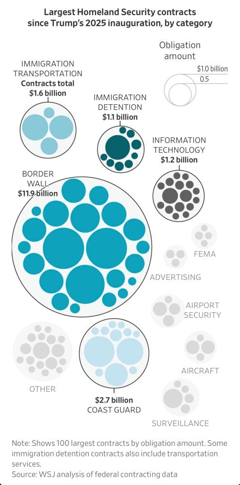
The Wall Street Journal looked at how Homeland Security was spending its (your) money.
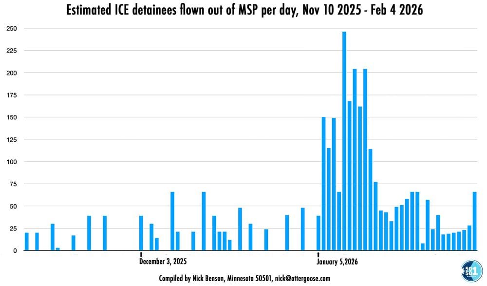
Observer Nick Benton compiled a chart showing ICE flights out of Minneapolis this year.
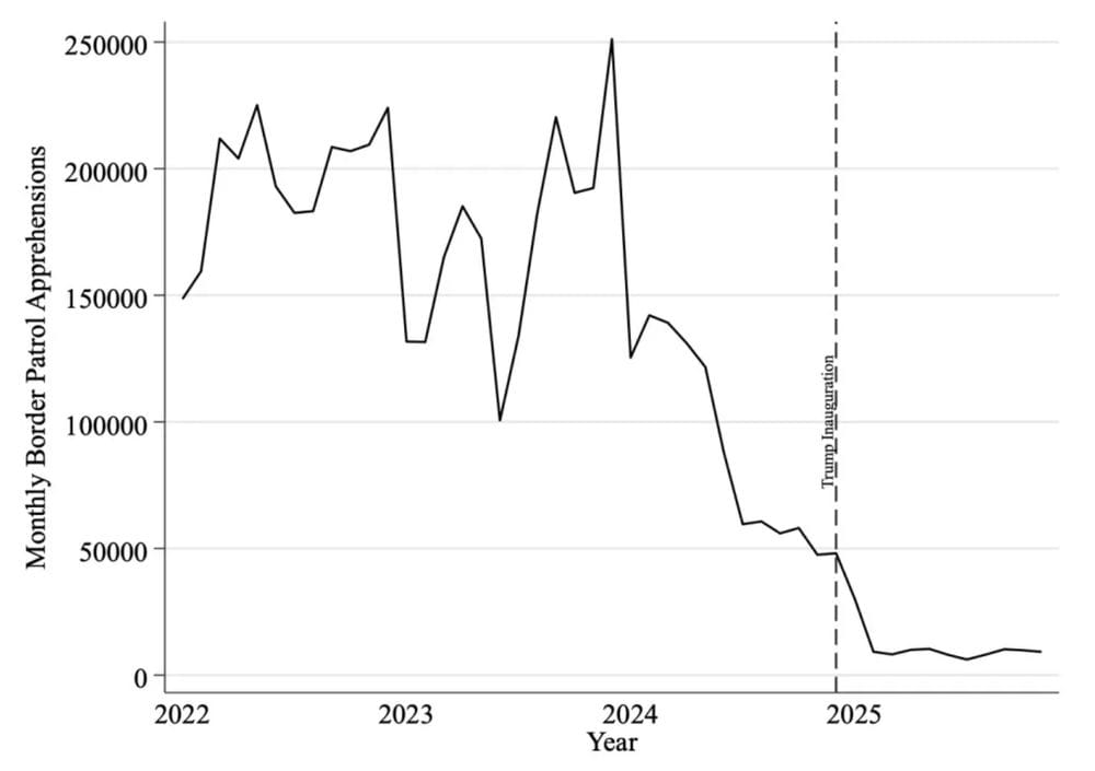
Over at Just Security, a graph showing when the downturn in border crossings began. (Hint: Not Jan. 20, 2025.)
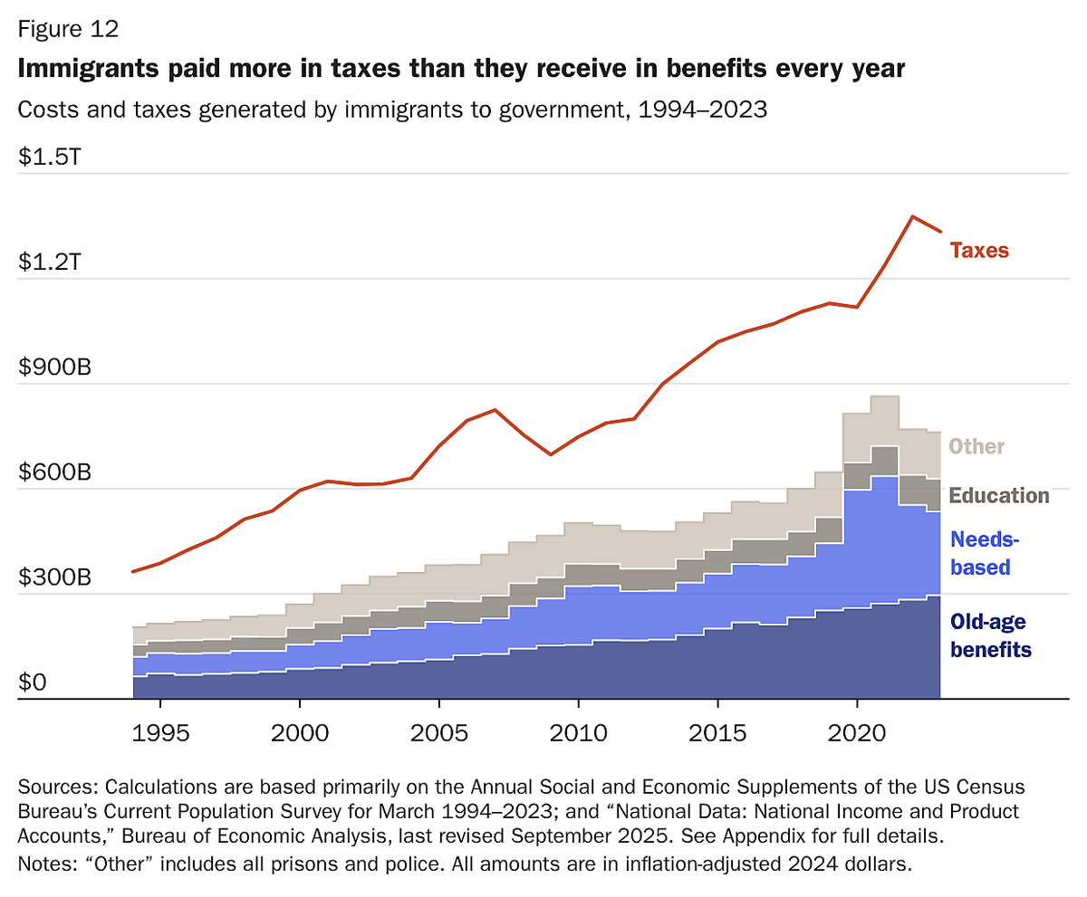
And the libertarian Cato Institute shows that immigrants contribute far more to the government than they receive.
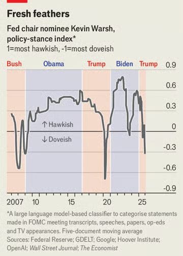
As economist Justin Wolfers said of the chart below, it shows how Trump's nominee to lead the Federal Reserve Kevin Warsh is "consistently hawkish, except when Trump is President and about to appoint a new Fed Chair."
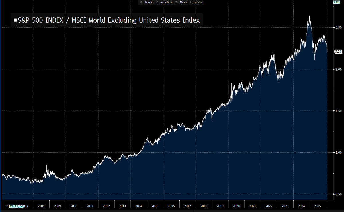
For a long time, the S&P 500 consistently outperformed the MSCI World Index, and by widening margins. But then something happened in 2025???? Not sure what.
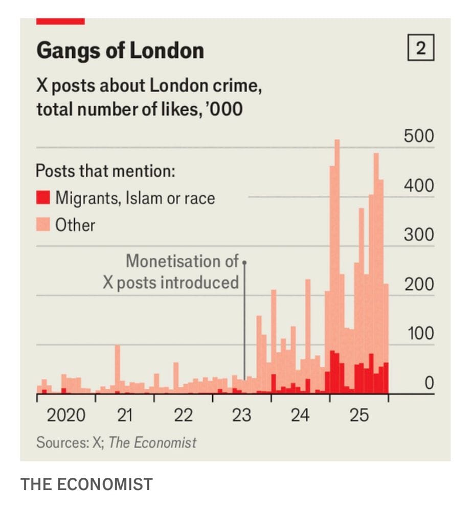
The Economist found that, once X (né Twitter) began paying people for generating traffic, the number of posts about crime in London soared — particularly those mentioning people of color or immigrants.
Relatedly, a national survey found that people who use X were the only ones to view Trump's job performance positively.
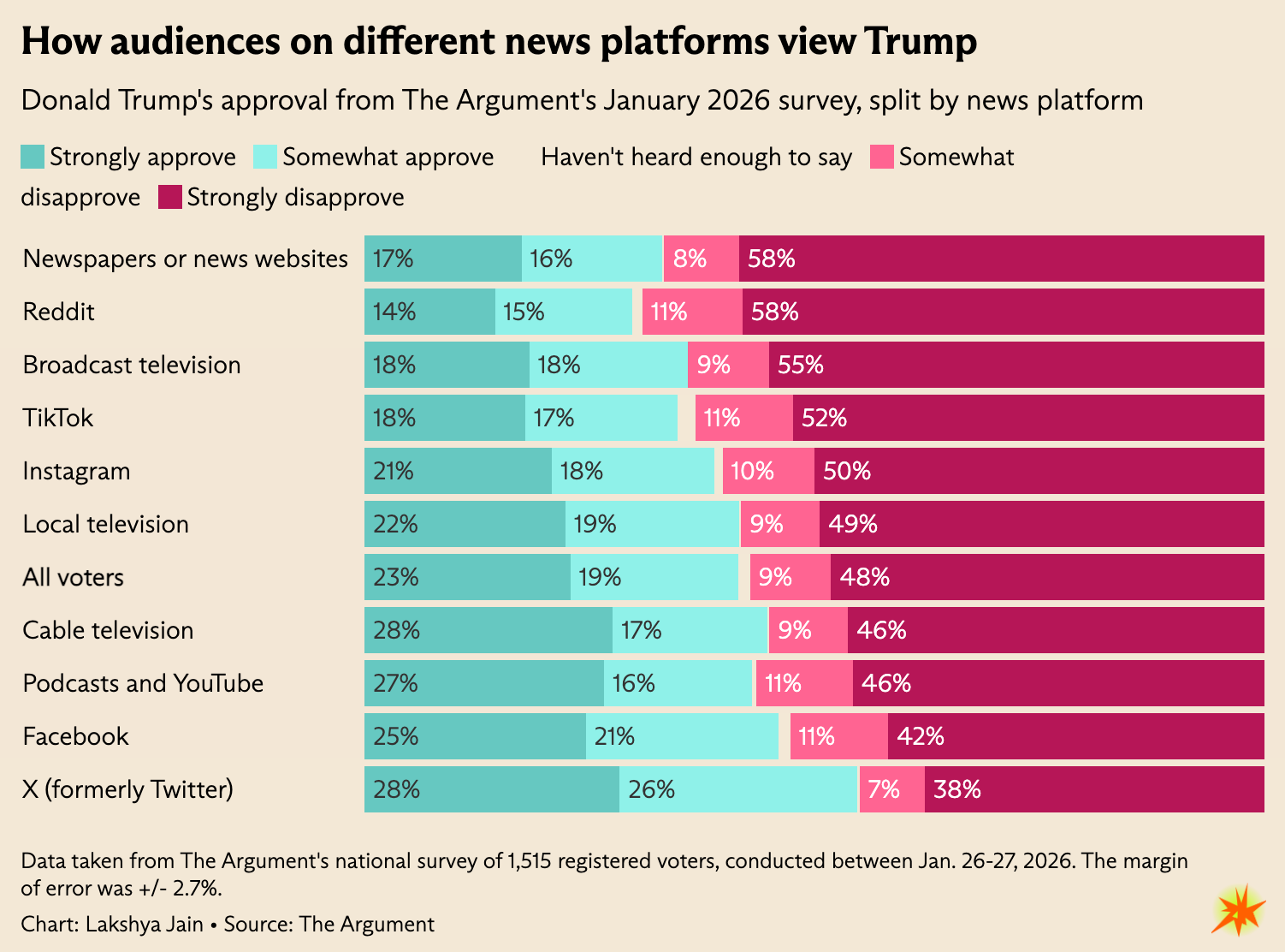
The group that viewed him with the most skepticism? Readers of newspapers. So if you're someone looking to ingratiate yourself with the president, maybe decimate any newspapers you own? Just a tip!
I'll end with something slightly gentler. Author Jess Calarco has begun a project of embroidering a news event for every day of the year. She shared the completed January section this week.
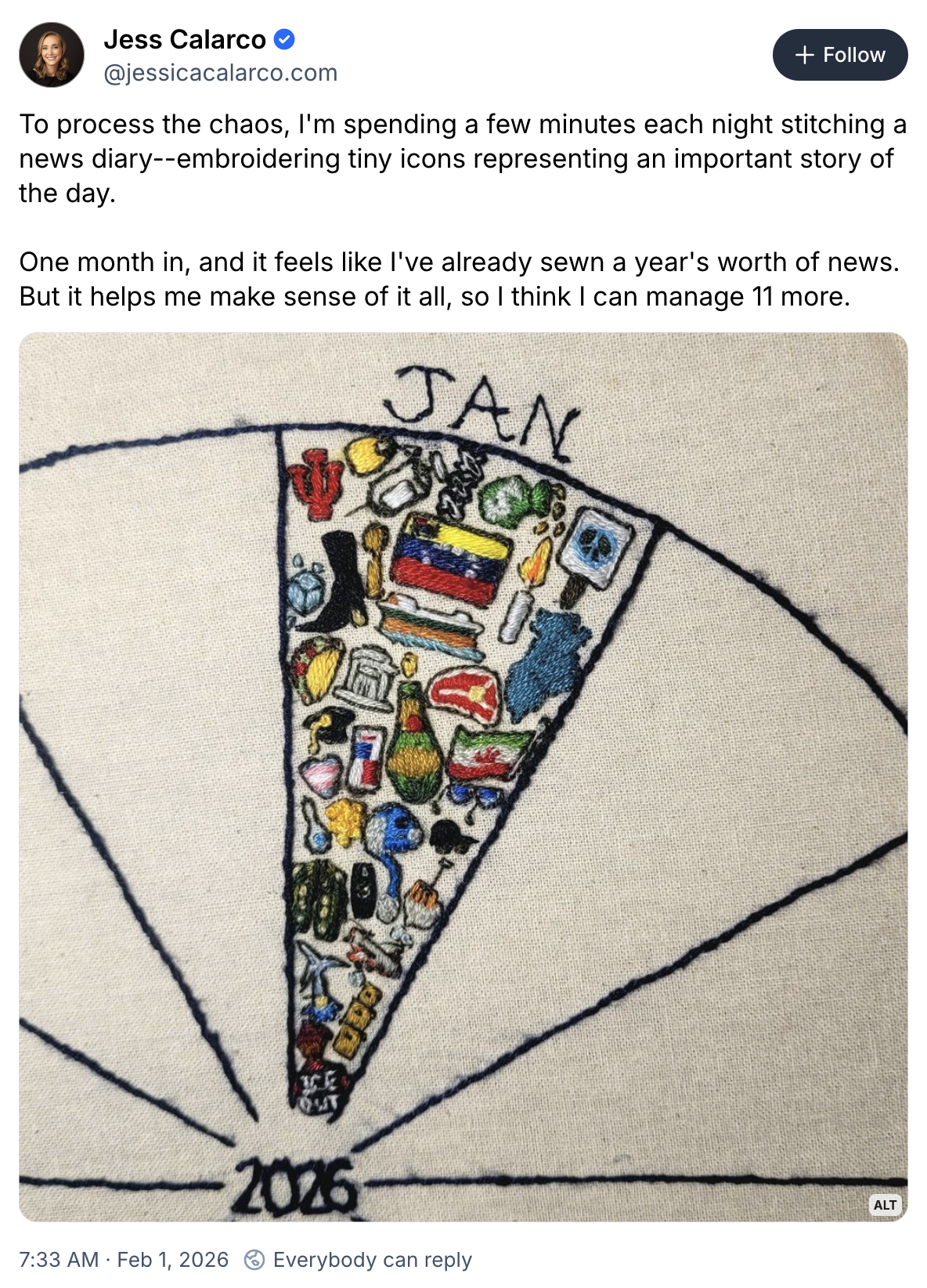
A fascinating, unique bit of data visualization! I look forward to seeing how the amphibious assault on Venice (Feb. 12) is depicted.
Appendix
Some other things I've written


You are receiving this email because you at some point in time volunteered to, either at Ghost or Substack or pbump.net or pbump.com. If you don't want to receive future emails, you might wonder why you made a commitment to this information source and now are suddenly bailing on it. Sounds sort of familiar. What you really want to do is support the newsletter financially, right?
Another one is coming next week. You have been warned.