It's beginning to look a lot like bad math, everywhere you go


Last week, I promised you something quick for this week's edition of the newsletter, as we downshift into 2026. And then the president decided to make some charts and, well, here we are.
Chapter 1(a)
The administration charts the same way it does everything else
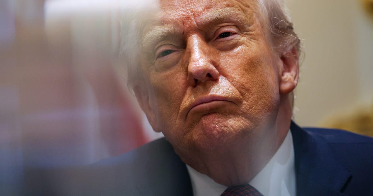
On Wednesday of this week, Donald Trump walked to a lectern at The Philip Bump and The People's House (my friends held a vote, congratulations to me!) and berated America for not appreciating his presidency.
This is not really an exaggeration, as you probably know. A clearly annoyed Trump attacked Joe Biden's presidency and then insisted the economy is doing better than people think — which, ironically, is something Joe Biden did during his presidency.
And if you refused to believe him, you ingrates, Trump did something else that Biden did: he showed us charts.
If you didn't see them, that's because only Fox News put them on the air, to the White House's annoyance. (Sean Hannity, picking up coverage on the channel once Trump was done, declared that "I think they very effectively used these charts tonight.")
"I was expecting when I was flipping around to just see the slides everywhere," economic adviser Kevin Hassett moaned to "Morning Joe." "Gosh, we spent so much time on them."
You did?
If you're curious, you can see some of them at the White House website. Like, for example, this chart of price changes under each president.
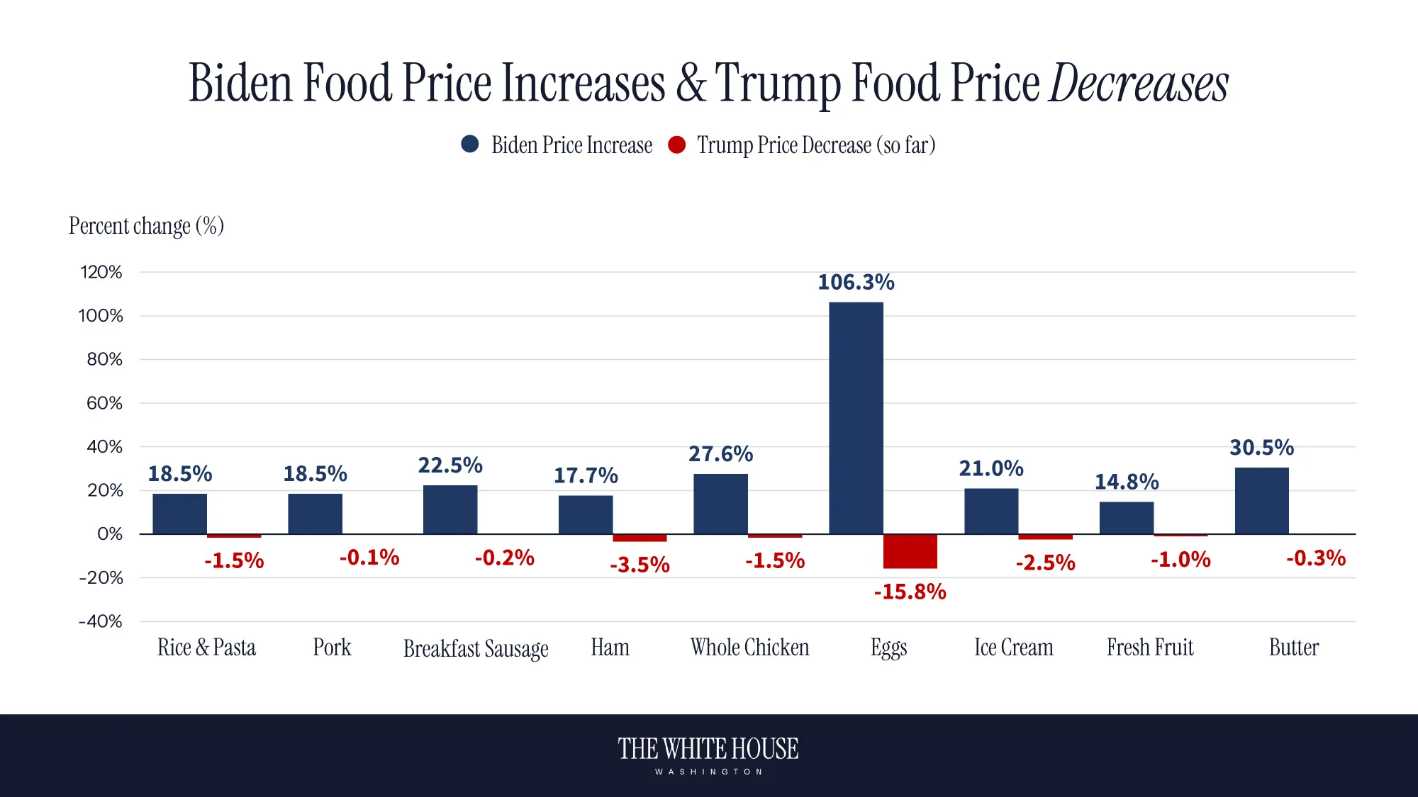
To recycle a joke I made last month, it's too bad the price of cherries didn't fall, because then they could have picked cherries.
What the chart above shows is twofold. First, some prices have gone down since the beginning of the year (most notably eggs, prices of which had spiked last year due to bird flu). Second, it shows that prices surged on a number of things under Biden because of inflation. Which, yeah, we knew.
There are lots of prices that have gone up under Trump, of course, because that is how inflation works. When I was still at The Washington Post, I helped make a tool that shows price increases on food items. The cost of basically everything that isn't egg-dependent has risen.
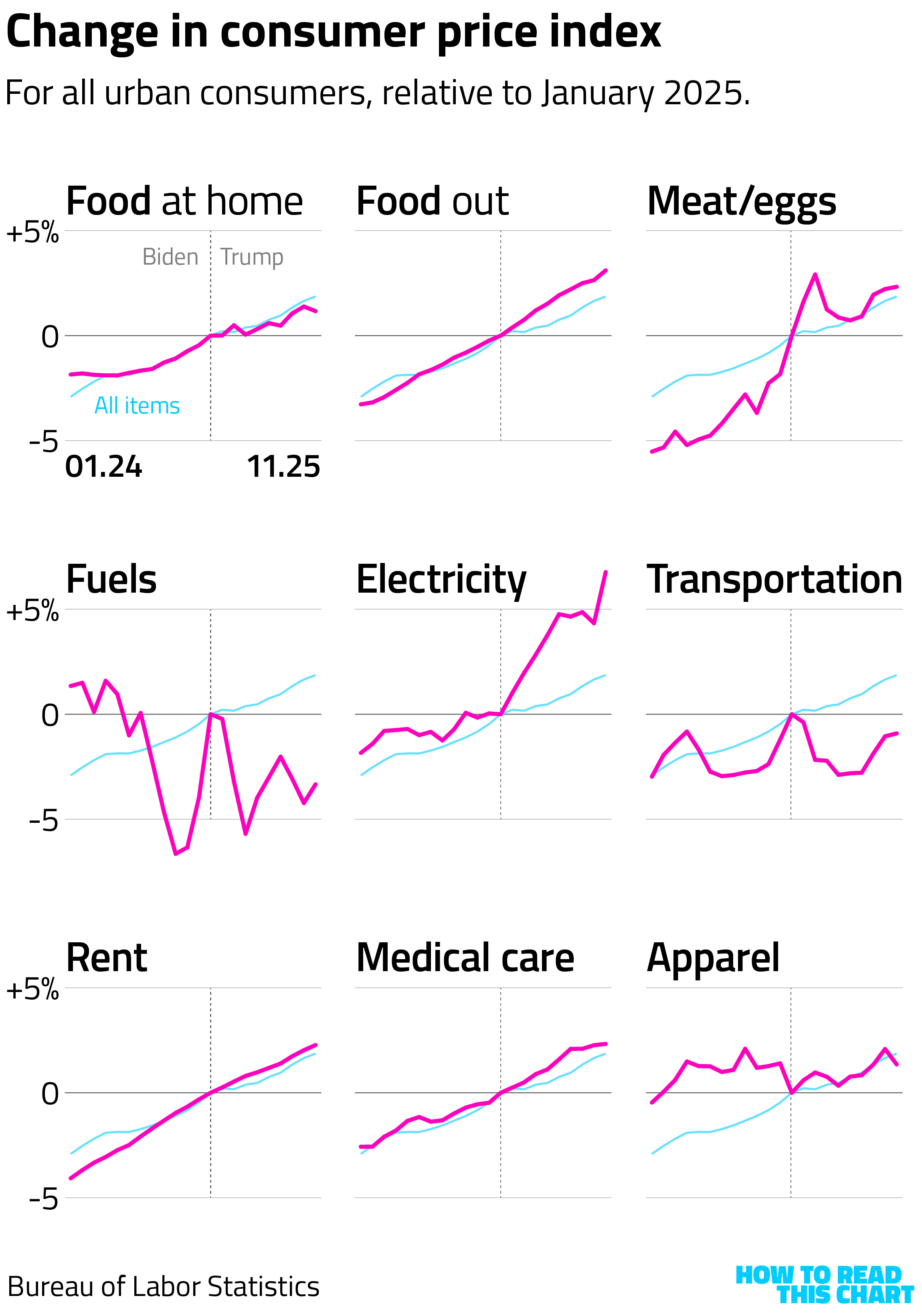
We can see that in consumer price index data, too. In most cases, the trends that existed in 2024 continued into 2025. (The overall change in inflation is shown in light blue.) There are exceptions — like electricity prices, which have surged.
Trump is heavily fixated on the price of gasoline, which, he told people, is down near or below $2. It's a tough sell because not only do people buy their own gas, gas stations have the inconvenient habit of displaying their prices in very large numbers in very public places. And, anyway, that's not what Trump's chart says.
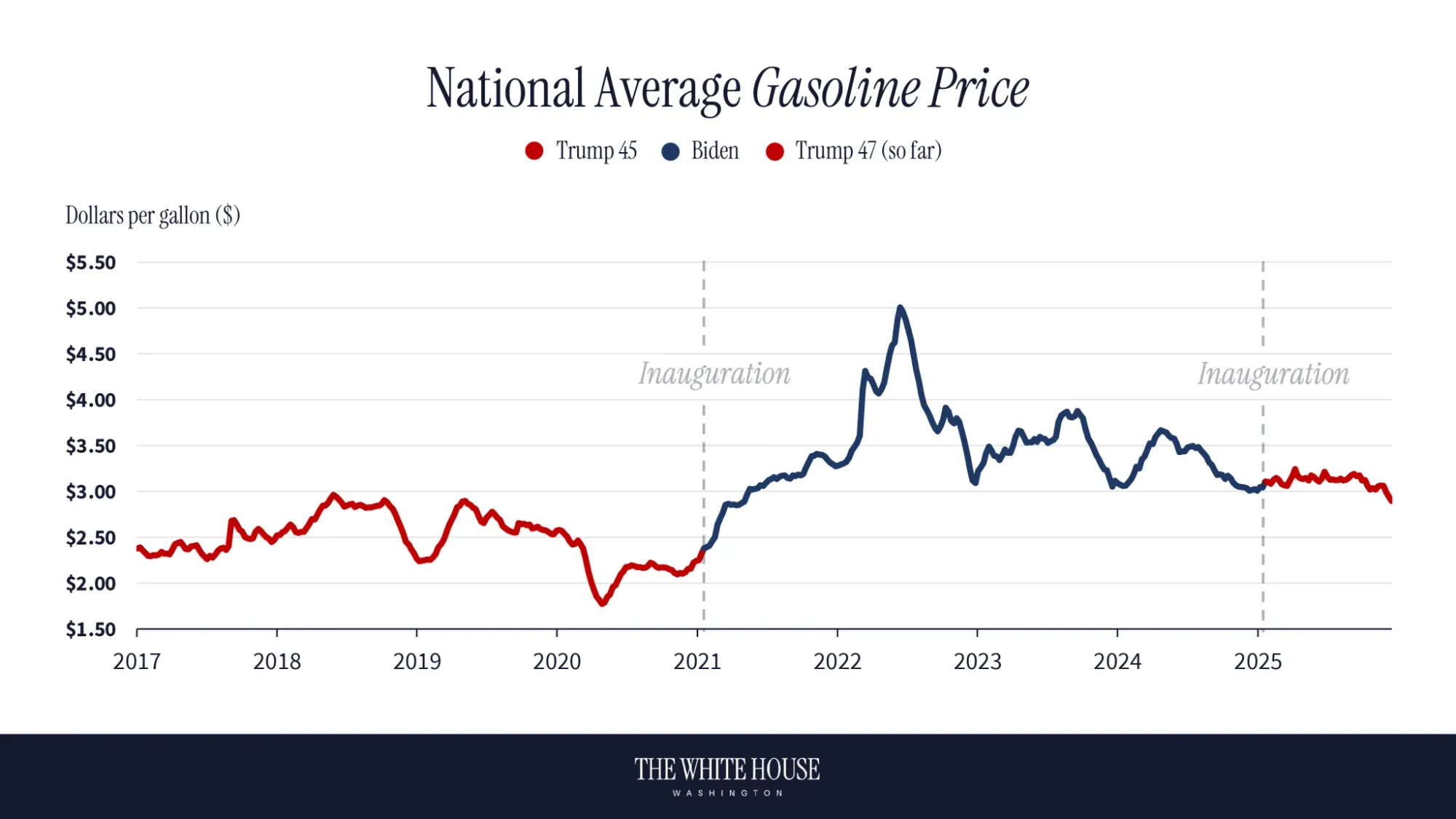
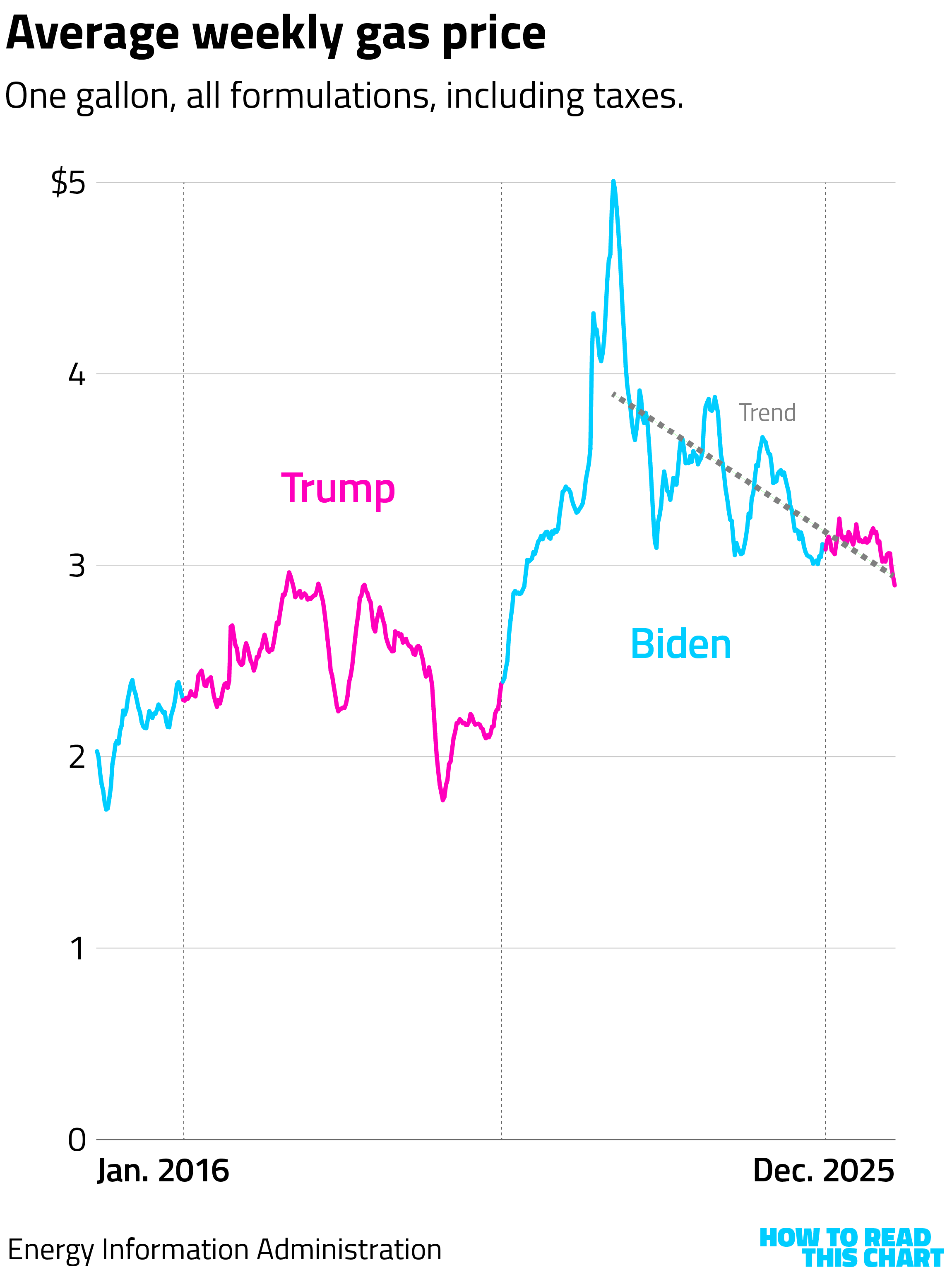
That chart's pretty accurate, much moreso than when Democrats tried to make a gas-prices-are-down chart in 2021. But, by including data only since 2017, it ignores that prices rose in his first term. Its stumpiness also makes it hard to see that prices have been falling in fits and starts since 2022.
Trump also revived one of his favorite talking points from 2024: We should pay attention to employment among native-born Americans. It's up, he insisted, with a graph to prove it.
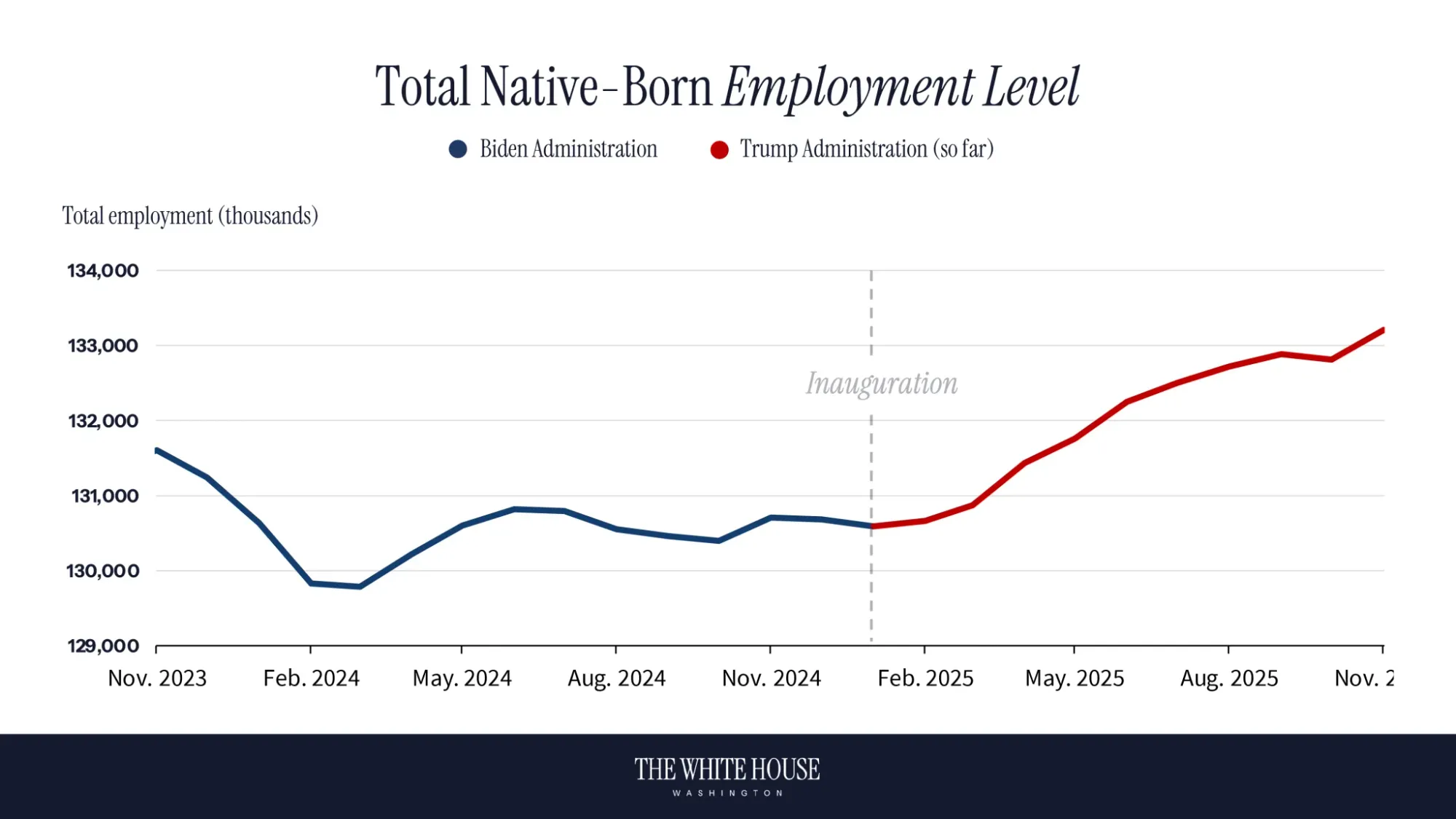
This is a rhetorical point, not an economic one.
The apparent drop is because fewer immigrants are being measured in the labor force, probably in part due to Trump's anti-immigrant policies. But it's also because the data are subject to various statistical flukes, making comparisons (particularly over time) problematic. The White House should know this, having been called out on it before, but why let accuracy get in the way of immigrant-bashing?
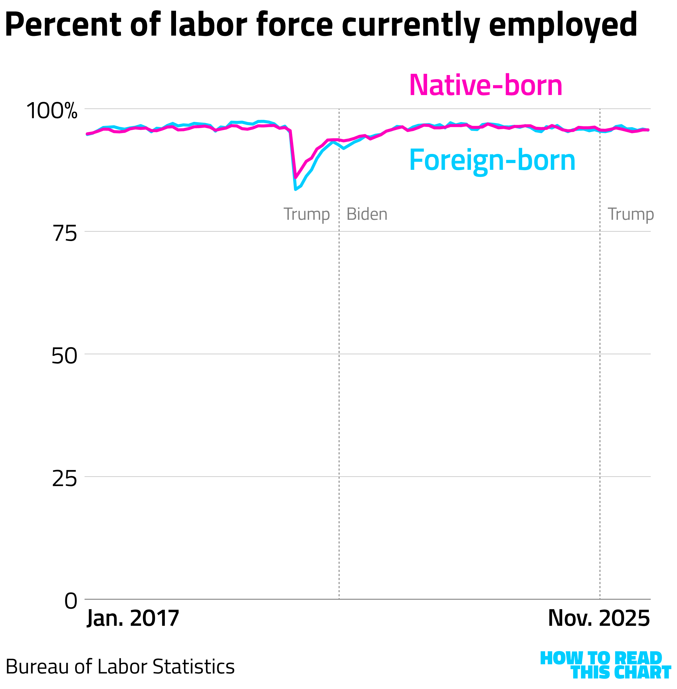
We could also look at the data this way, obscuring the denominator (the number of people in the labor force) but showing similar overall employment trends.
Getting back to Hassett's complaint, you can understand why (responsible) cable channels would be wary of slapping Trump charts up on TV: he has a history of using lousy charts for rhetorical purposes. He and his team like the aura of legitimacy data visualizations provide and they try to siphon off some of that legitimacy for themselves.
Attempting that familiar ploy during his speech, you'll be interested to know, was far from the most mathematically egregious thing Team Trump did this week.
Chapter 1(b)
Trump rolls out the New Math
You've probably heard Trump say (as he did in that speech) that his administration is reducing the price of prescription drugs by 400 or 500 or 600 percent — a nifty feat that, basic math will tell you, means that drug manufacturers will be paying you to purchase their medicines. Because, after all, a 100 percent discount is a full discount. A 200 percent discount means a full discount (100 percent) plus you get the full price of the product given to you (the other 100 percent).
This is basic stuff, which you would think that, say, a member of the Cabinet would understand. But in an interview with Fox News's John Roberts, Commerce Secretary Howard Lutnick — who came to D.C. from Wall Street — apparently didn't.
Roberts: Well, if you cut something by 100%, the cost goes down to zero. If you cut it by 4, 5, or 600%, the drug companies are actually paying you to take their product. So it raises the question, how much of last night's speech was hyperbole, and how much was fact?
Lutnick: Nah, what he's saying is, if a drug was $100, and you bring the drug down to $13, right? If you're looking at it from $13, it's down seven times.
Roberts: It's not a 600—
Lutnick: Well, but it's 700% higher price before. It's down 700% now, right? So $13 would have to go up 700% to get back to the old one. So it all depends on what you look at.
Uh, no. It depends on how honest you want to be.
To calculate a percentage change, the math is simple. You take the new value and subtract the old value, dividing the result by the old value. So a drop from $100 to $13 would be -$87 (13 minus 100) divided by $100 — or 0.87, which equals -87 percent.
Lutnick is proposing that we flip it: old minus new divided by new. Which, in his example, would be ($100-$13)/$13 – or 669 percent. Positive 669 percent, mind you.
It's a ridiculous claim, one contrived to make Trump's ridiculous math seem less ridiculous. It's like saying that Trump's approval rating is up 10 percent since January because it went from 48 to 43 percent.
So here's a clip-and-save visual you can use to remember how not to do Trump Math.
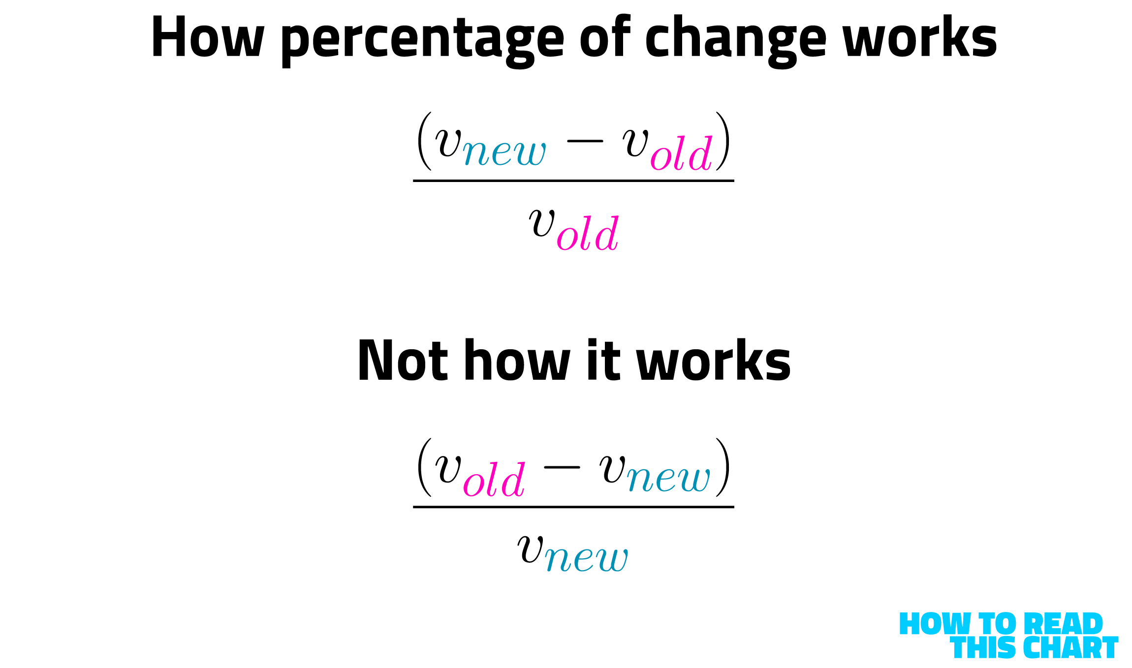
If you happen to work at the Commerce Department, please drop one off at Lutnick's office.
Chapter 2
An objective sorting of Christmas music
Getting back to my original intended focus of this newsletter: It is Christmas time, which a pundit once observed as "the most wonderful time of the year." (This is debatable.)
This also means that a lot of familiar songs are played on repeat: some good, some terrible. And this got me thinking about developing a means of visualizing just how good or terrible they might be.
I took a USA Today report on the most-streamed songs of the holiday season and created a New-York-magazine-style matrix of them on two axes. From top to bottom, my personal, objective assessment of how good or bad the song is. From left to right, where it sits from piped-in department-store dreck to legitimate seasonal nostalgia trigger.
First, here are the songs, thrown into a Spotify playlist.
And now, the rankings — using the songs' album art to position them.
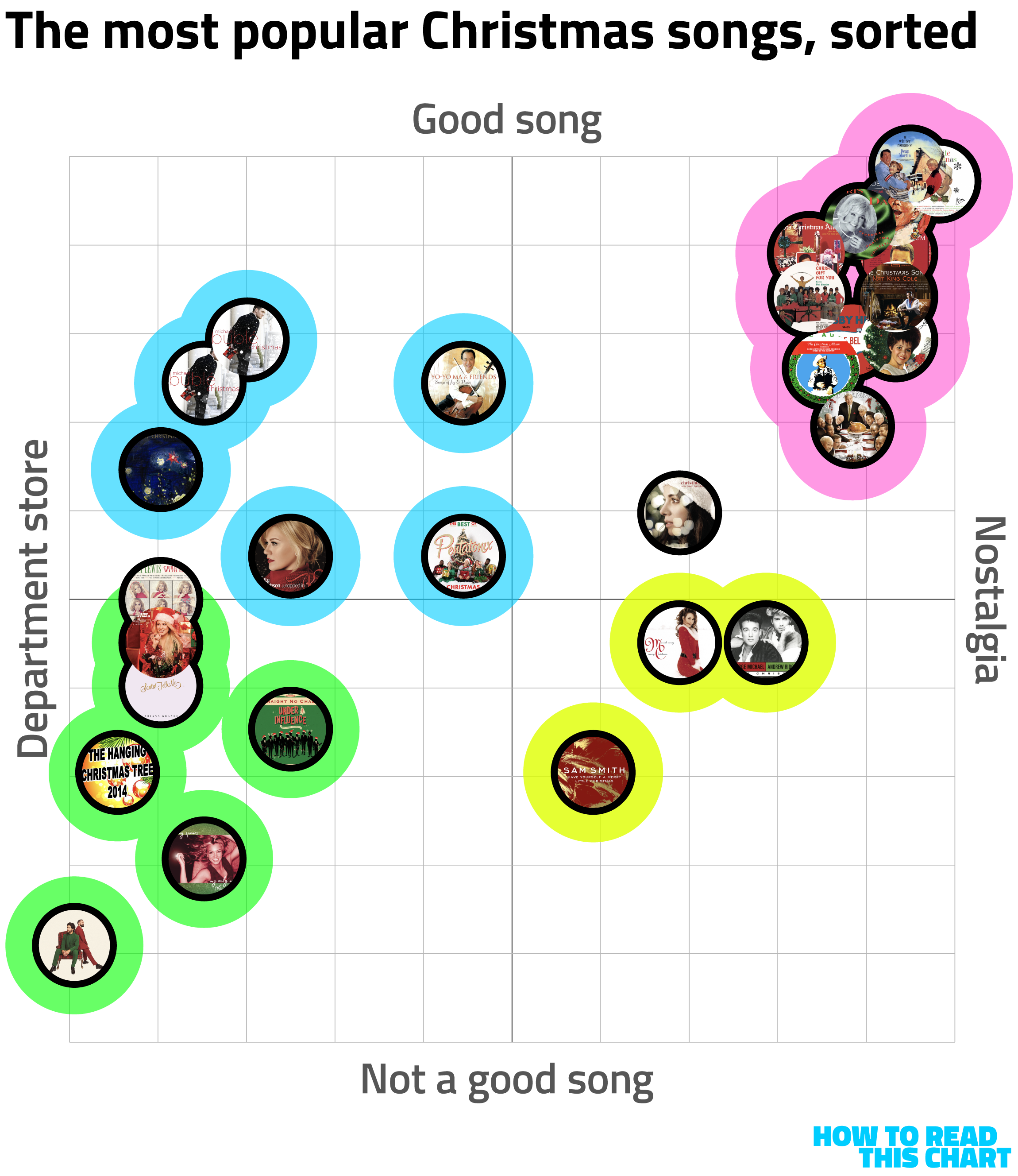
You can see that that fall into four rough groupings, as follows:
- Pink: The classics. Good songs ("White Christmas," "Let It Snow") that evoke Christmases past.
- Yellow: The earworms. Songs that aren't very good ("All I Want For Christmas is You" or Sam Smith's "Have Yourself a Merry Little Christmas") that evoke nostalgia either through repetition or by hijacking someone else's (better) version.
- Blue: The Target experience. These are decently put-together tunes (everything Bublé) that are overly polished and corporate friendly. Maybe you grew up listening to these, because maybe you are 10.
- Green: The dregs. I cannot say enough bad things about "Officially Christmas" by Dan + Shay.
I'd thought about making a tool letting you create your own matrix, but why would I do that when mine is objectively correct? I wouldn't, so I didn't.
Chapter 3
I'm gonna be rich
Besides, this will be my last newsletter, probably, because I'm about to win the Powerball. How do I know this? Because I did some math.
Imagine that you're flying in a helicopter above the Metropolitan Museum of Art in Manhattan. You drop a golf ball, aiming for a particular spot on the building's roof — say, an area one square foot in size. What are the odds you hit that spot?
Well, the building is big, as you can sort of see in the background of this photo.

In fact, it's about 491,000 square feet meaning, if the golf ball's landing spot is random, you have a 1-in-491,000 chance of hitting your mark.

But these are better odds than you have when playing the Powerball.
So let's zoom out: What if we drop the golf ball over Central Park (in which the Met sits)?

That's about 36.7 million square feet, so your chances of hitting a particular square foot go down quite a bit. But this is still not equivalent to the odds of winning the Powerball.
No, for that we'd have to drop the ball over an area the size of Manhattan south of 75th Street, a space that covers nearly 300 million square feet.
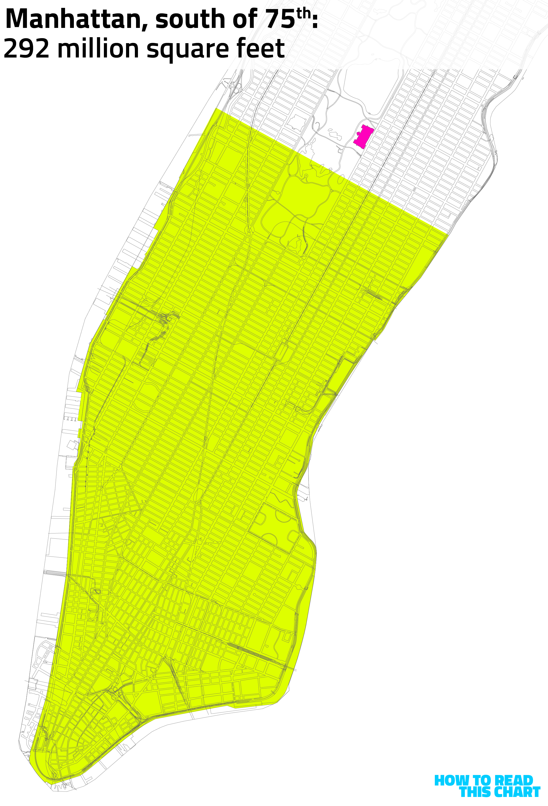
If the golf ball lands on the particular square foot of that area that you'd selected — a 12" by 12" spot in Bryant Park, say, or on Howard Lutnick's old Wall Street office or in Chinatown or in Lincoln Center — you win the estimated $1.5 billion prize.
So why am I confident that I'm going to win, given these long odds? Because I bought five tickets, meaning the golf ball can hit any one of five square feet in that area. It's basically a sure thing.
Chapter 4
Making money the easy way
Even if I didn't have to fork over half of my inevitable winnings to the government, my $1.5 billion haul, massive as it is, wouldn't get me close to being one of the world's richest people. According to the Bloomberg Billionaires Index, which tracks rich peoples' net worths in near-real-time, I'd still be about $6 billion short of making the top 500.
It's been a good year for billionaires, I'm sure you'll be happy to hear. Since January, the world's 500 richest billionaires have added more than $2 trillion to their collective net worths, $200 billion of which was gained by Elon Musk alone. He's not only the richest guy in the world (on paper), it's not even particularly close.
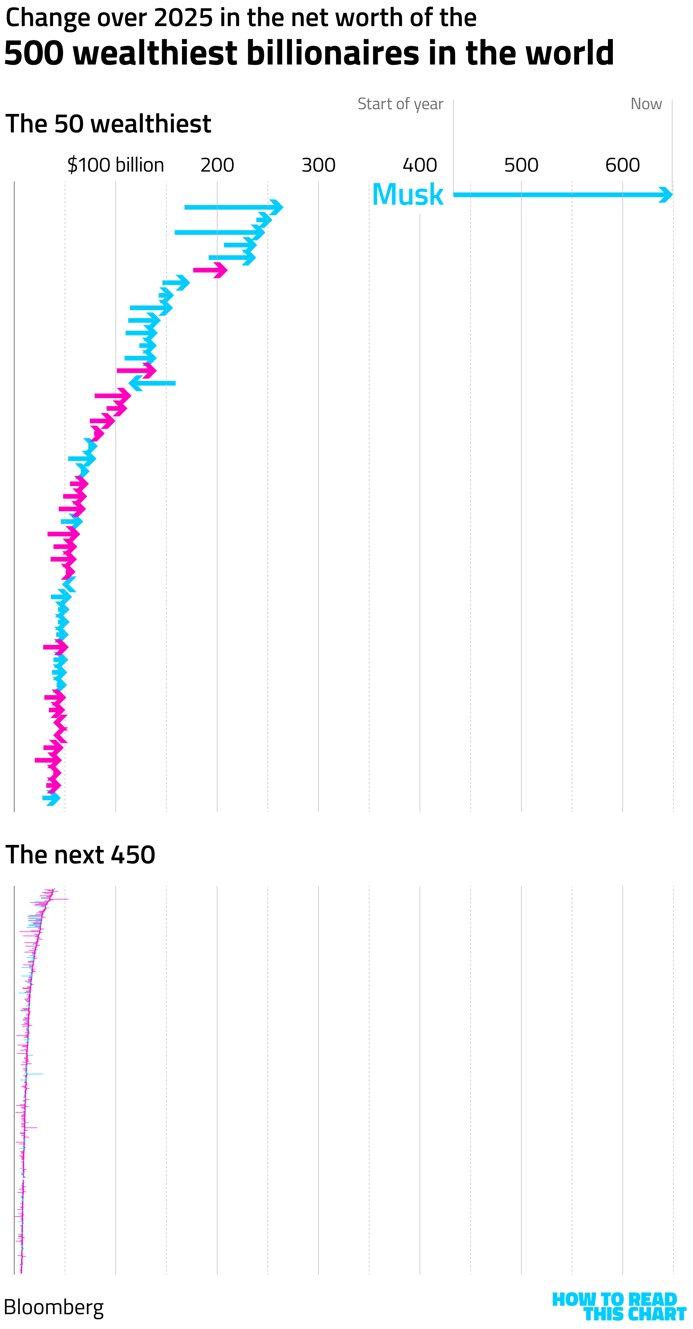
How much money did the richest billionaires make this year? Well, if you divvied up just what they'd gained among the world's 8.2 billion people, everyone would get $250 in cash.
If you divvied up just the gains among American billionaires (the blue arrows above) and handed them out to every American, we'd all receive checks of nearly $3,000, $615 of which came from Musk alone.
And that's just the gains. If we took all of the money represented by the net worths of the 500 richest billionaires, we could give everyone in the world $1,200. Redistributing the wealth of the richest Americans would give every American more than $17,000 in cash.
If you're curious, Musk going from $644 billion to $17,000 is a drop of 3,734,996,672 percent — at least according to Howard Lutnick.
Chapter 5
Chart Attack
This newsletter is overstuffed like a Christmas turkey, so here are some other charts to look at as you stuff wrapping paper into a garbage bag where it will quietly decompose for the next eight to twelve years.
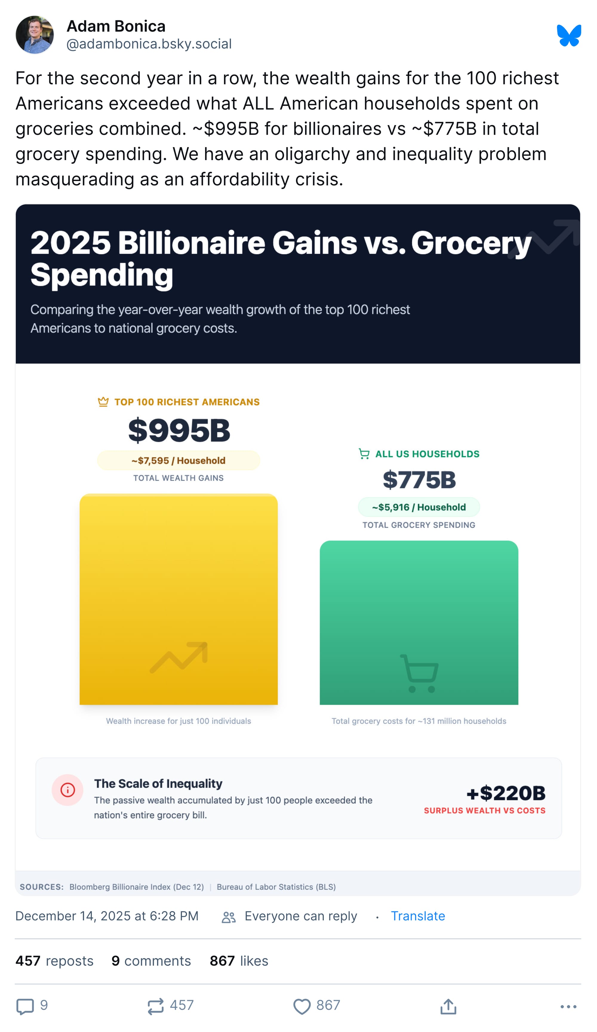
Speaking of billionaires:
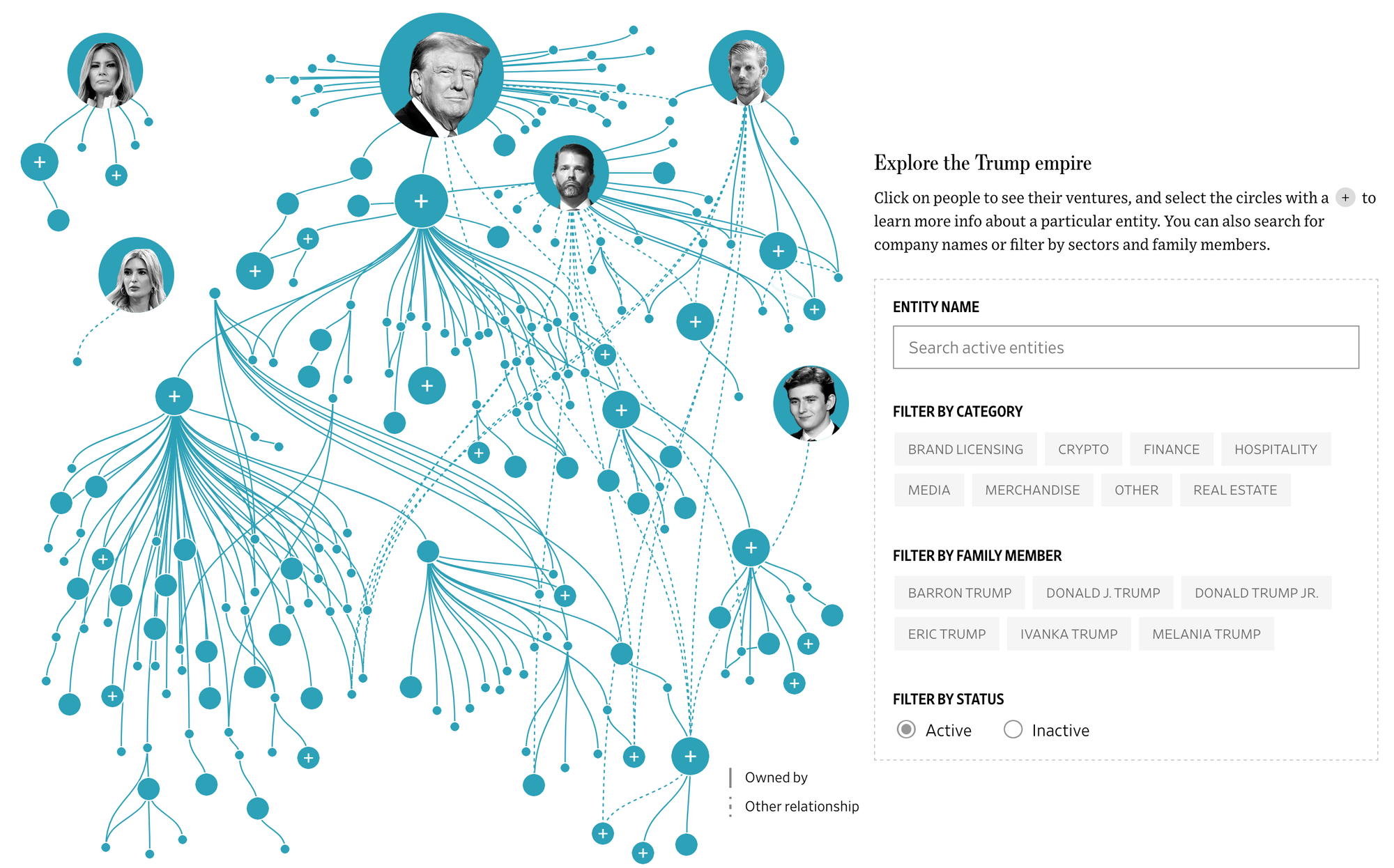
And also speaking of billionaires, the Wall Street Journal has an interesting interactive on how Lutnick's boss's family is lining their pockets while Donald Trump is president.
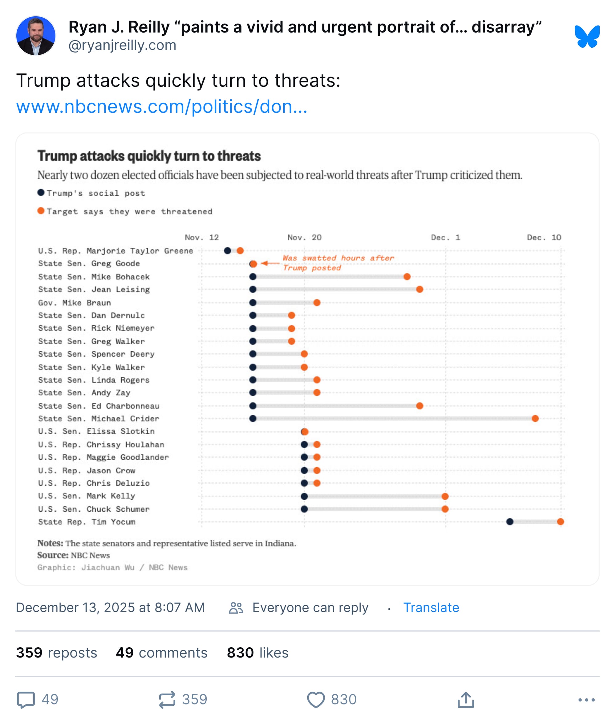
NBC News looked at how Trump's grip on power is aided by the looming threat of violence against his political targets.
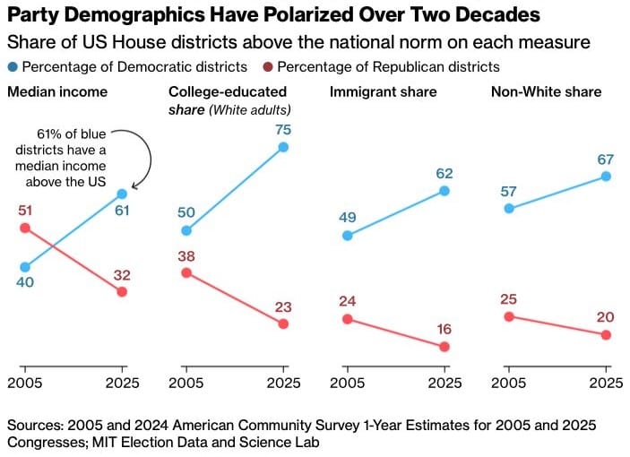
Over at Bloomberg, meanwhile, there's a useful analysis of how House districts have polarized over the past 20 years — in part, a look at why House Republicans are disincentivized to leverage their power against the president.
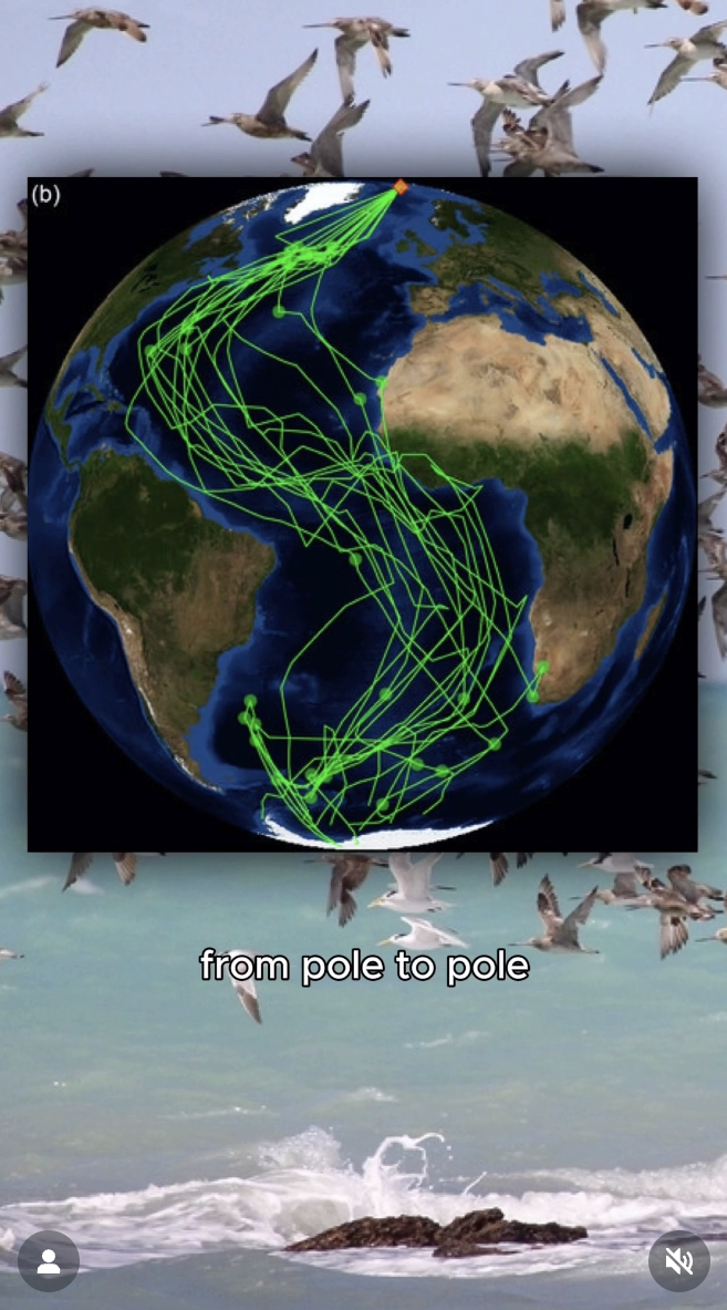
But here I go dwelling on politics again. When I could, instead, be showing you maps of the global migration of Arctic terns, from an interesting Instagram video on the subject.
Or, returning to the Christmas song theme, showing you this flowchart of the most common joke/Batman-related versions of "Jingle Bells."
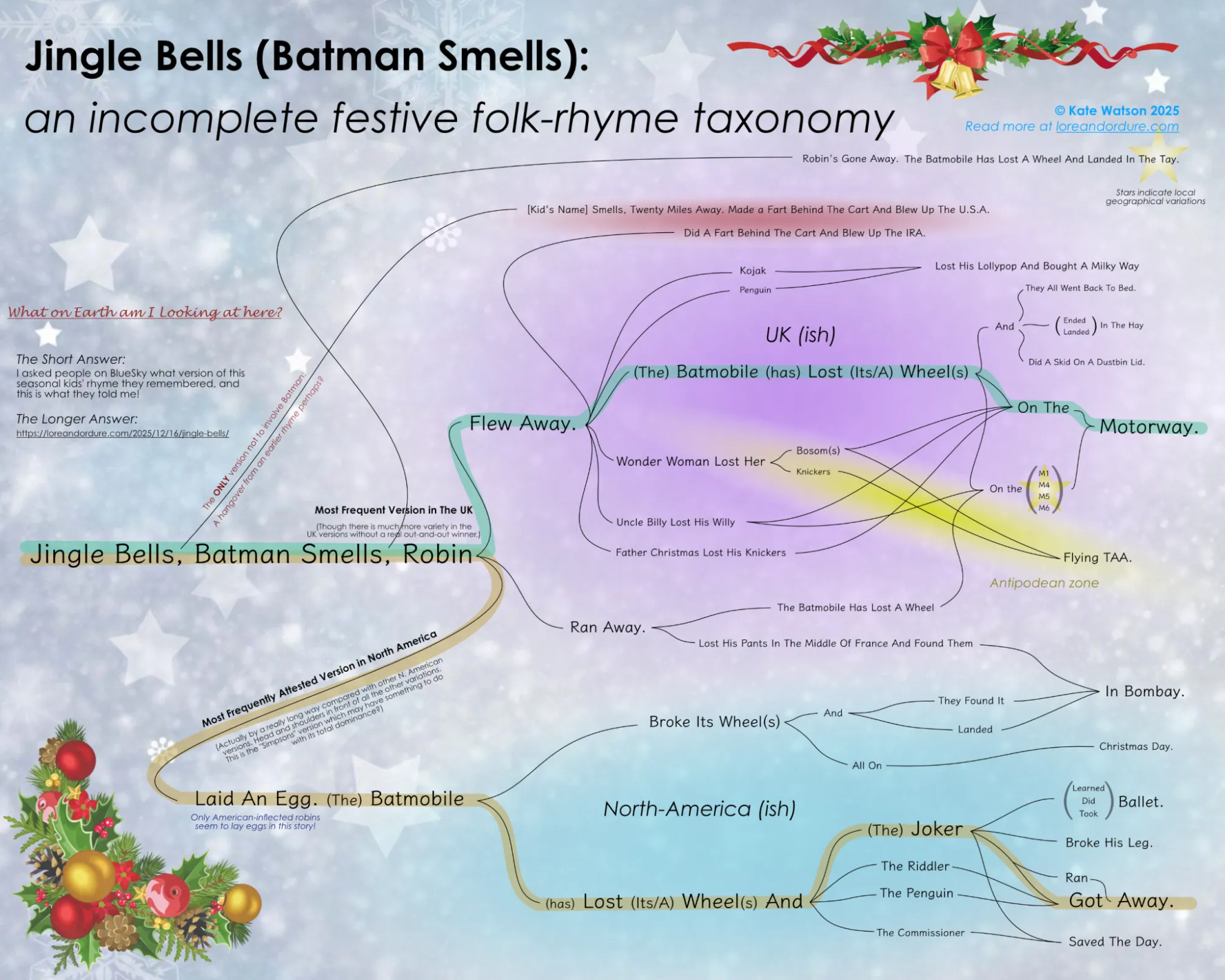
I am a laid an egg/lost its wheels/Joker/got away guy by heritage. I am proud to report that, upon questioning, my sons also learned this version of the tune. I hold in utter disdain those who sing about Robin losing his pants in France and finding them in India; this sort of cosmopolitanism is not what America is all about.
And with that: Merry Christmas and happy holidays. I'll save my new year's greeting for next week's newsletter which will be shorter.
I hope.
Appendix
Some other things I've written
If you'd like some holiday-themed material, I wrote two things while at The Post that you might enjoy:
- A look at the number of children Santa would actually have to reach and how much time it would take to do so, and
- An estimate of how much the extravagant Christmas gifts requested in "Santa Baby" would actually cost.
Please note that the latter article uses 2019 dollars.


You are receiving this email because you at some point in time volunteered to, either at Ghost or Substack or pbump.net or pbump.com. If you don't want to receive future emails, create a compelling chart to explain why not. I mean, what you really want to do is support the newsletter financially, right?
Another (short?) one is coming next week. You have been warned.