Ample examples of chartable samples

In this week's newsletter, we have some music — specifically, the innovative way in which Tracklib illustrates the art of sampling. I also look at new data on ICE detentions (sigh) and the gold rush on naming generations that occurred a few decades ago. There is also a photo of a raccoon waaaaaay at the bottom, but you're not allowed to jump ahead.
Chapter 1
Seeing the recipe for mom's spaghetti
Like many of us, I used to be younger.
I was once so young, in fact — and this is true — that I can remember when hip-hop and electronic music were still relatively new. My parents lived through the emergence, evolution and maturing of rock. I (and probably many of you) lived through the birth and adolescence of music made by computers, DJ turntables and mixing boards.
Perhaps this music isn't to your taste. Fine. Your taste has a significant gap in it, but: fine! To each his own! Live and let live! But the art of creating music with something other than traditional instruments is a vibrant one.
It also poses an interesting question: When part of your song is a part of another song, how do you depict what you've sampled? This is one way in which modern music works, as you probably know. Hip-hop artists in particular pluck a snippet of beat or melody, repeat it or change the speed, and it becomes part of a new song entirely. But it's not something that you can easily indicate on sheet music.
Enter the Swedish company Tracklib. By day, Tracklib (as in "track library") is a clearinghouse for samples, offering musicians licensed clips of music for use in their own compositions. On social media, though, the company has built a huge audience by showing where samples come from and how they're altered for use in popular songs.
The videos are brilliant, both in form — simple visualizations of waveforms depicting the sample and how it is reused — and in function. They're bite-sized analyses of already popular bite-sized things. Perfectly tailored for the social media world.
"People's impression [of the music] always used to be, like, 'Oh, this artist just stole this song'," Tracklib's art director Viktor Korchounov said when we spoke over Zoom this week. "We wanted to show to people in an intuitive way that sampling is an art form and that a sampler is an actual instrument. We wanted to give those artists some credit, and show that it's an actual art form and not just stealing people's music."
The first of the company's visualizations that went viral was an explanation of the Daft Punk song "One More Time," which samples a 1979 song "More Spell on You" by Eddie Johns. An initial draft of the video, shared by Korchounov, showed a more literal interface of a turntable and then a sampling pad.
The original "One More Time" video.
Eventually, it was simplified, centering on the waveform and the parts of the sound that were clipped and repeated by Daft Punk. The original had explanations for what was being done and how; the videos now just show the samples and let visitors hear how they're reused.
The final version.
As you might expect, this is not always easy. Some albums include the original sampled track in liner notes, some don't. Even when you find the original source, though, your work isn't done.
"Step two is trying to confirm what's actually the sampled part and how they've done it, which is very manual," Korchounov said. "Just by ear, trying to pick all the parts you can hear in the finished song and then try to make them match one to one — especially if they've been distorted or tweaked or flipped."
"Doing electronic artists is such a pain," he added with a sigh, "because they do way too much to their sounds. At some point, you can't even figure it out anymore."
The heavily blended samples for Jay-Z's "The Story of OJ."
Korchounov originally pitched the idea for the videos to Tracklib and worked with the marketing team, including former CMO Per Stenius, to develop them into what they are. And, again, what they are is great — tremendously effective visualizations that can't be easily conveyed in an email newsletter format. They work even if you don't like electronic or hip-hop music.
And for those of you who don't: the "mom's spaghetti" joke in the chapter title up there was a reference to a very famous Eminem song. You need to know about these things, if only because Eminem has been referenced in the New York Times crossword more than 40 times or to do well in LearnedLeague or to impress your children.
(I just asked my eight year-old if he was impressed I knew Eminem lyrics. He was not. Your mileage may vary.)
Chapter 2
Mapping the administration's immigration crackdown
And now onto grimmer fare.
Over the past ten months, as you know, the federal government has shifted its immigration enforcement focus from "dangerous criminals" to "everyone." There's been a big jump in the number of people detained by Immigration and Customs Enforcement who have criminal records or pending criminal charges, but a huge jump in the number of detainees who have neither.
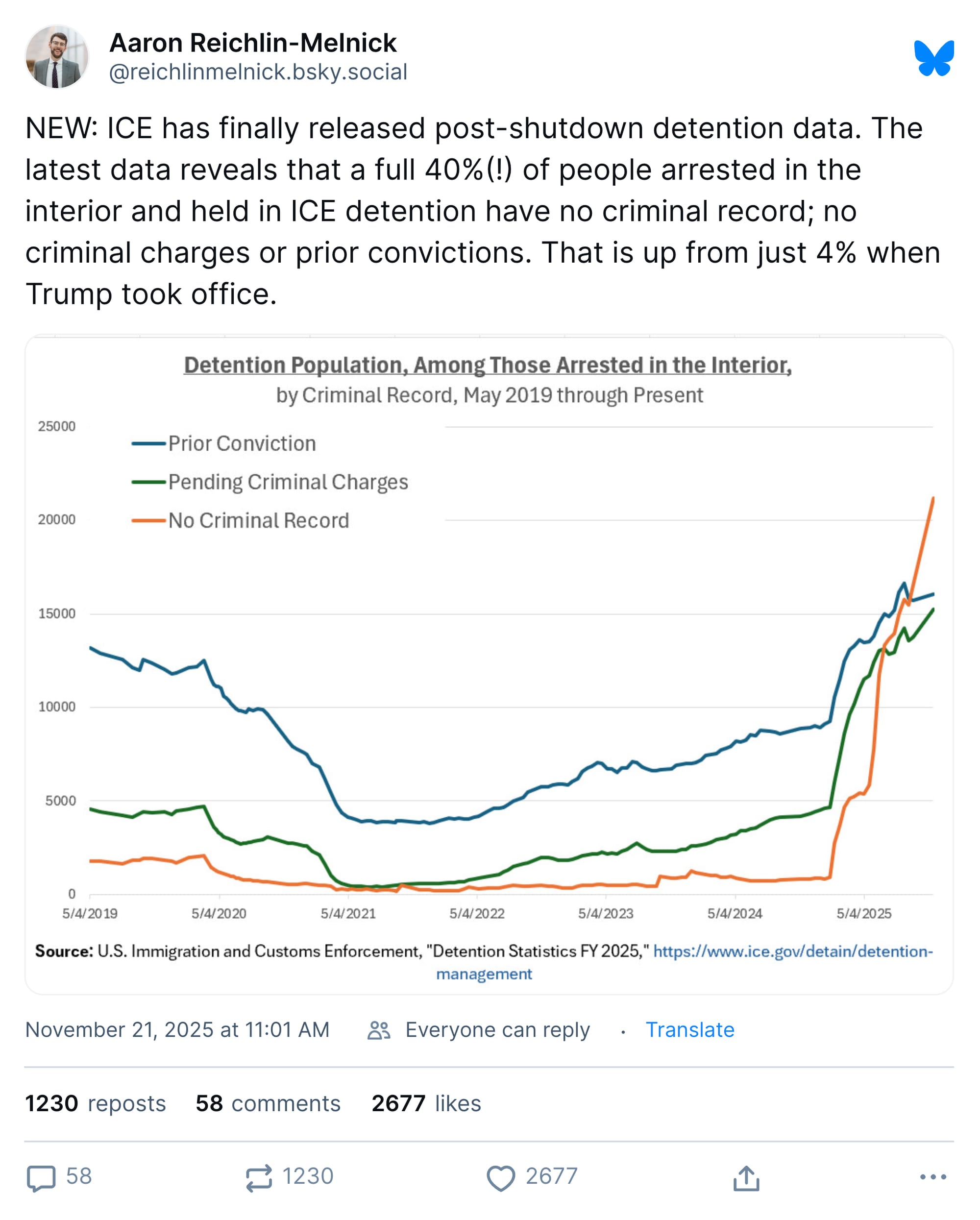
We know this because the government regularly publishes data on who is being held in detention. That data includes the number of detainees, the facilities where they are being held and their criminal records and "ICE threat level" determinations. It's enough data, compiled long enough, that we can visualize how immigration detention has changed since Donald Trump returned to the White House.
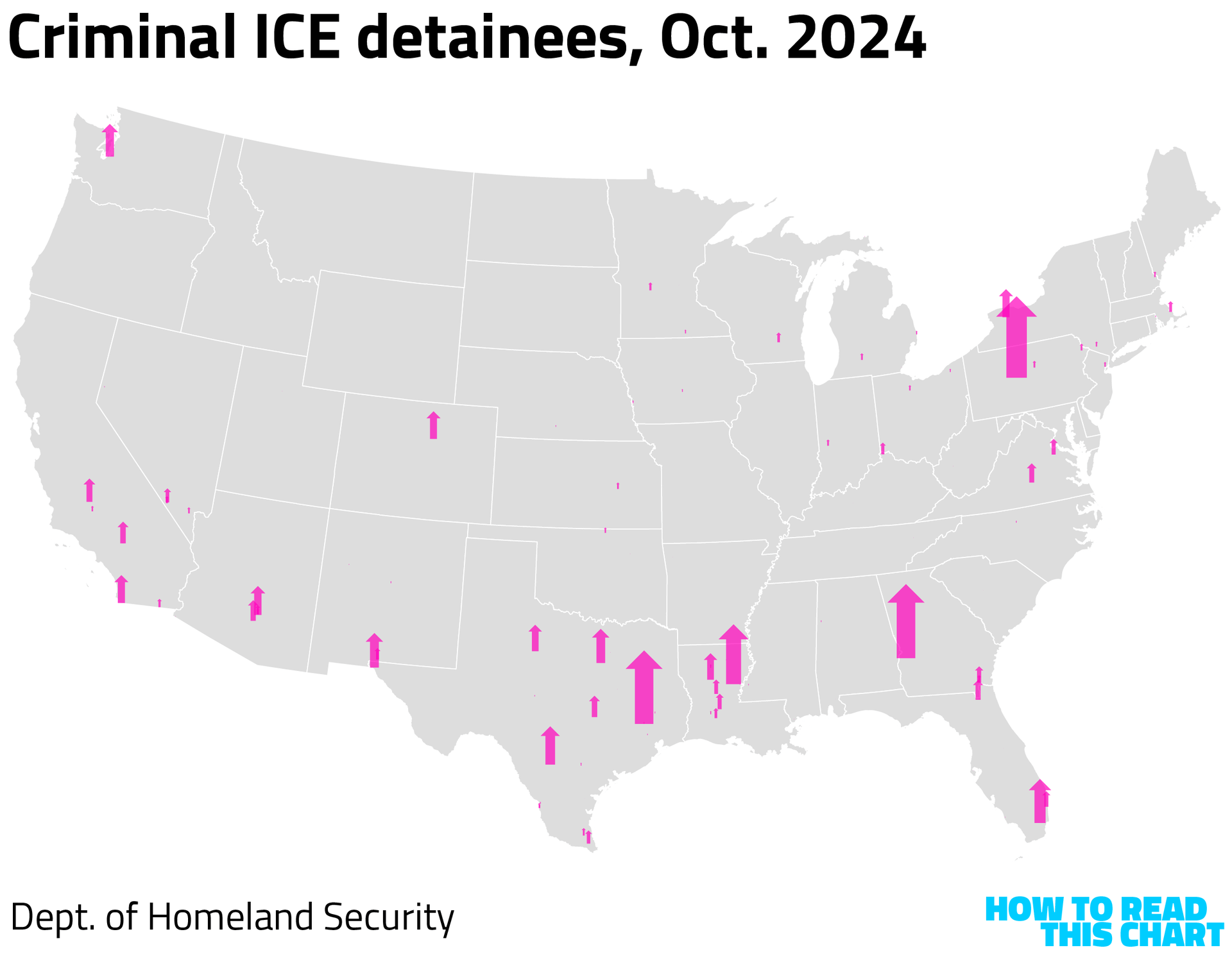
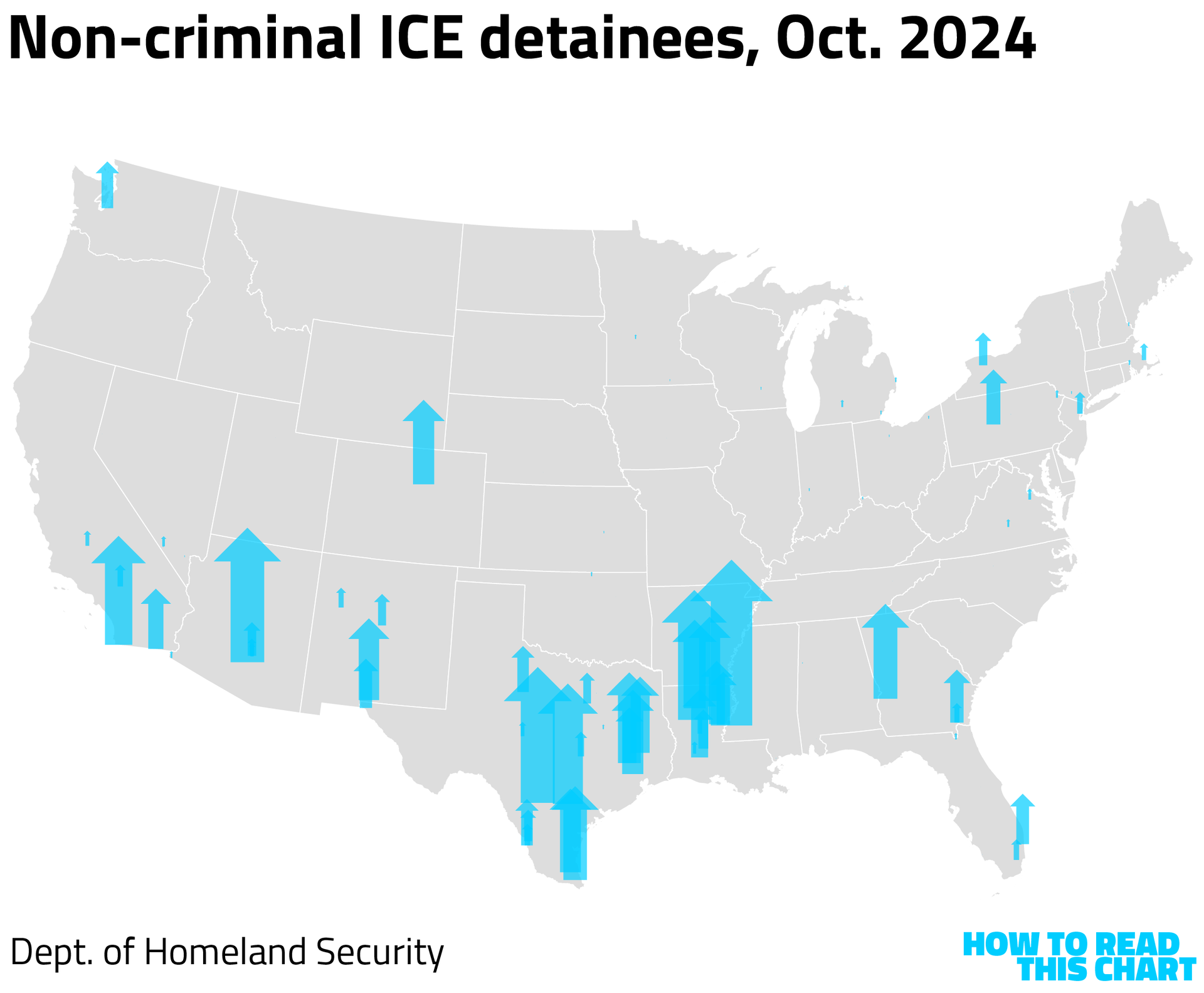
There are more than 200 facilities around the country where detainees are kept, including a lot of local jails. Comparing detentions now with data from last year, you can see the huge surge in the number of people being kept in custody — and the geographic distribution of where they're being kept.
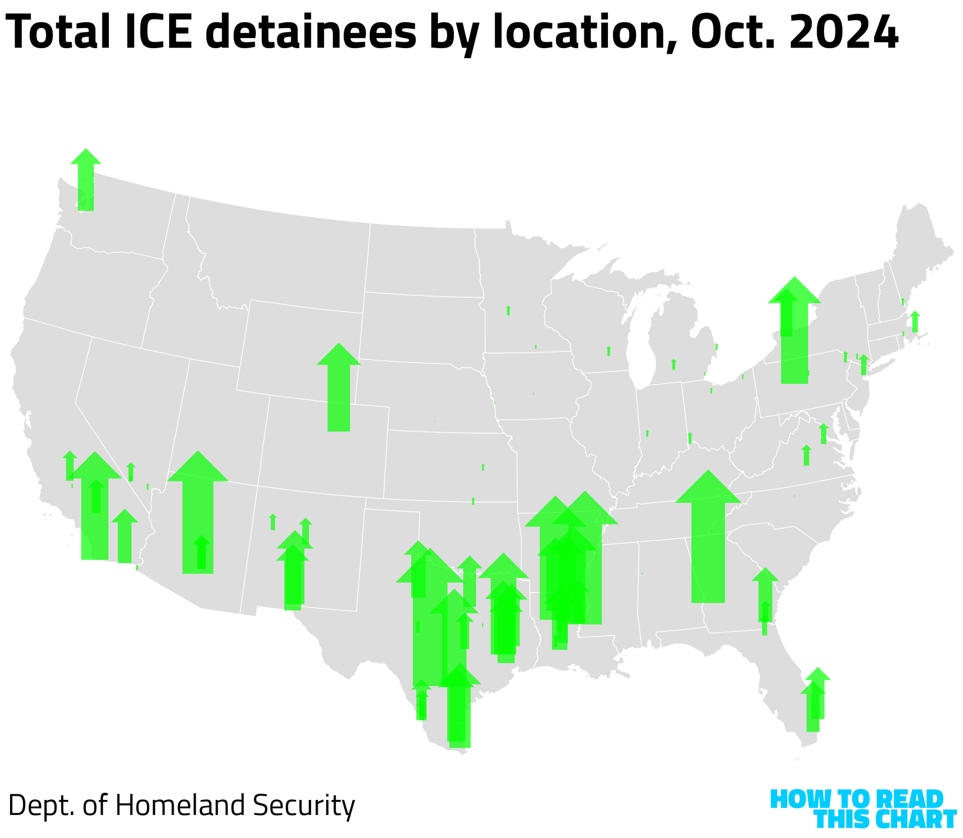
The number of detainees with criminal records has grown more modestly, in keeping with the data above. (All of the arrows on these maps share a common scale.)
The number of non-criminal detainees, though, has soared.
As you might then expect, so has the number of detainees who aren't given any ICE "threat level" at all.
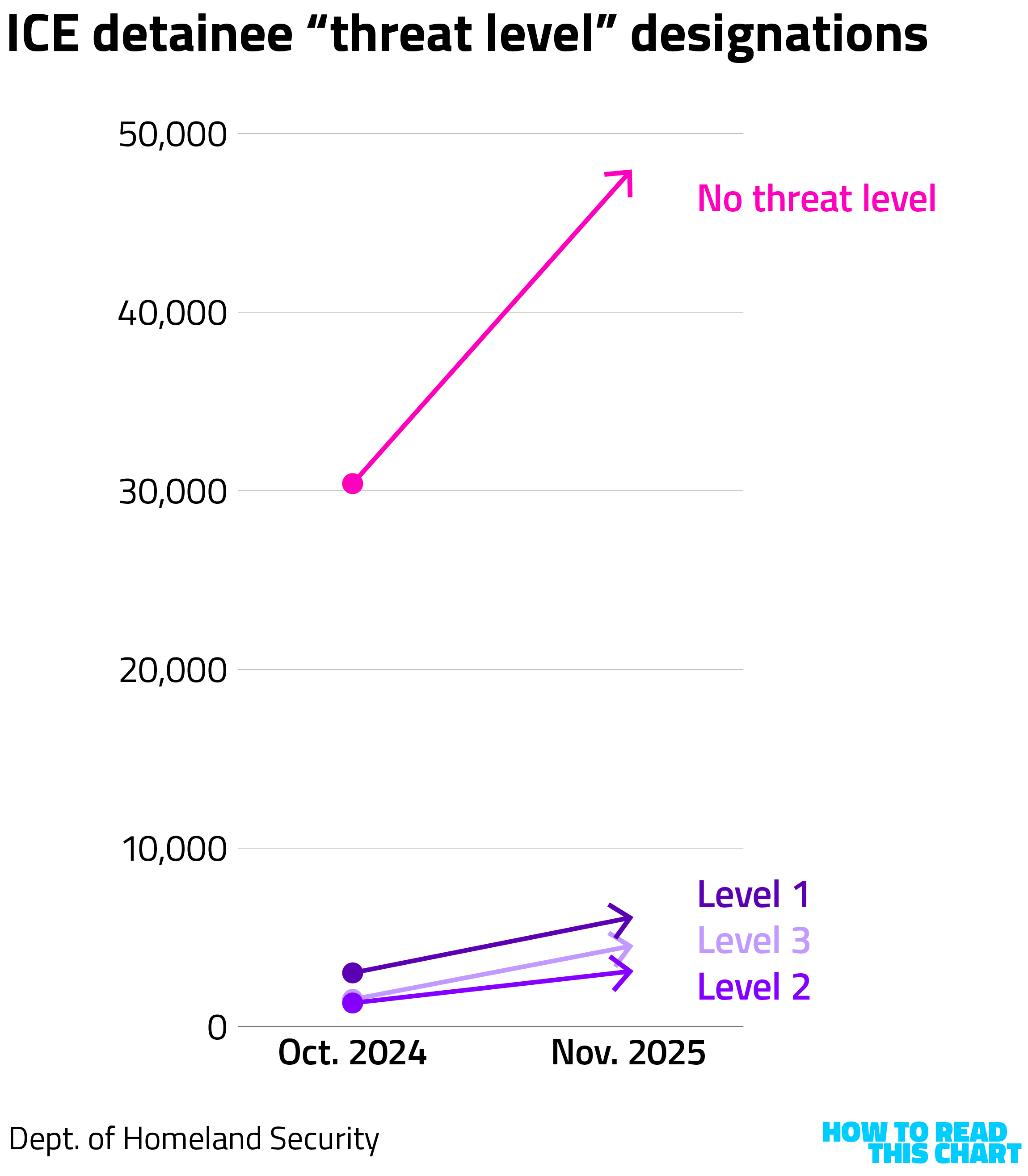
Level 1 detainees are those considered the most dangerous, with Level 3 being less dangerous. But the overwhelming majority of the current detainees simply aren't identified as threats.
Tens of thousands of non-threatening people taken off the streets, sure, but at least we also have a widespread climate of fear. So that's nice.
Chapter 3
Did I mention generations? Well, about that.
Let me level with you for a moment. Let me give you a peek behind the ol' curtain.
My original idea for this section was that I was going to use Google's Ngram tool — which tracks the frequency of mentions of phrases in books released during a given year — to show how we talk more about billionaires than millionaires these days. The reason is simple: "millionaire," amazing as it may be, is no longer seen as an aspirational level of wealth.
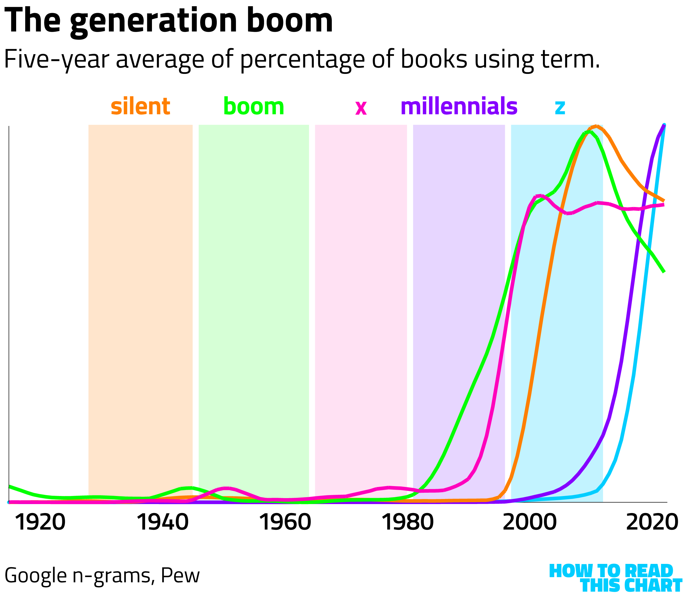
But then I had another thought: I could use the tool to look at the emergence of one of my favorite subjects, generation names. Generational boundaries, as you will know if you've read my articles or my book, are fake. They're invented. The names we give them are mostly (but not entirely) marketing tools. And one way we can see that is that the names themselves are a recent invention.
Consider the "silent generation," as bounded by Pew Research Center. That name arose in the middle of the 20th century but only really started to catch on about 20 years ago — even as it was already overshadowed by Tom Brokaw's "greatest generation."
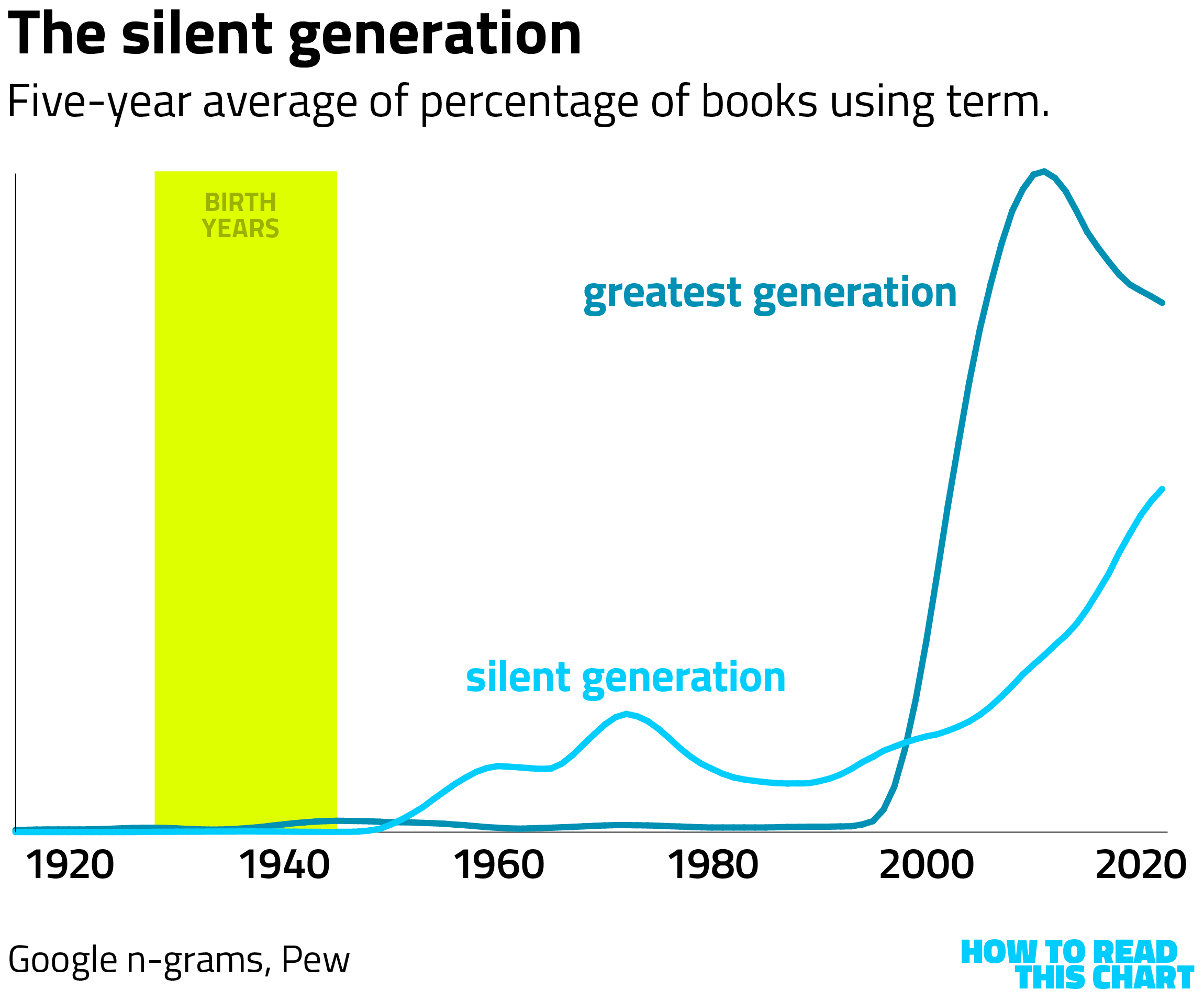
(On each of these charts, the vertical scale is determined by the highest percentage of annual mentions of the depicted terms over the course of the century. In other words, one generation's peak is not to scale relative to another generation's.)
The baby boom descriptor emerged more quickly, given that it 1) describes something that actually happened and 2) reshaped how Americans think about generations in general. My thesis (here and elsewhere) is that the boom's scale and effects functionally created the market for generational identities.
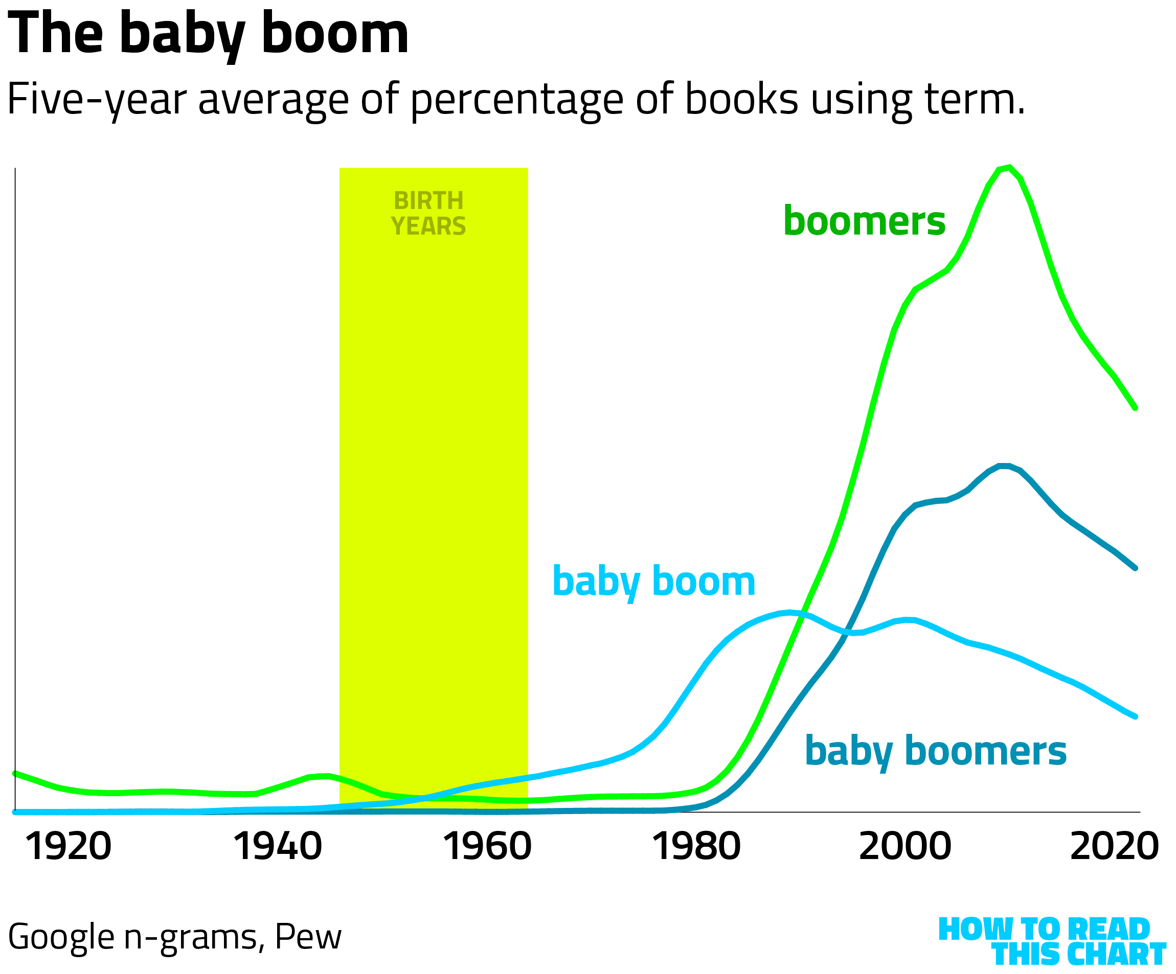
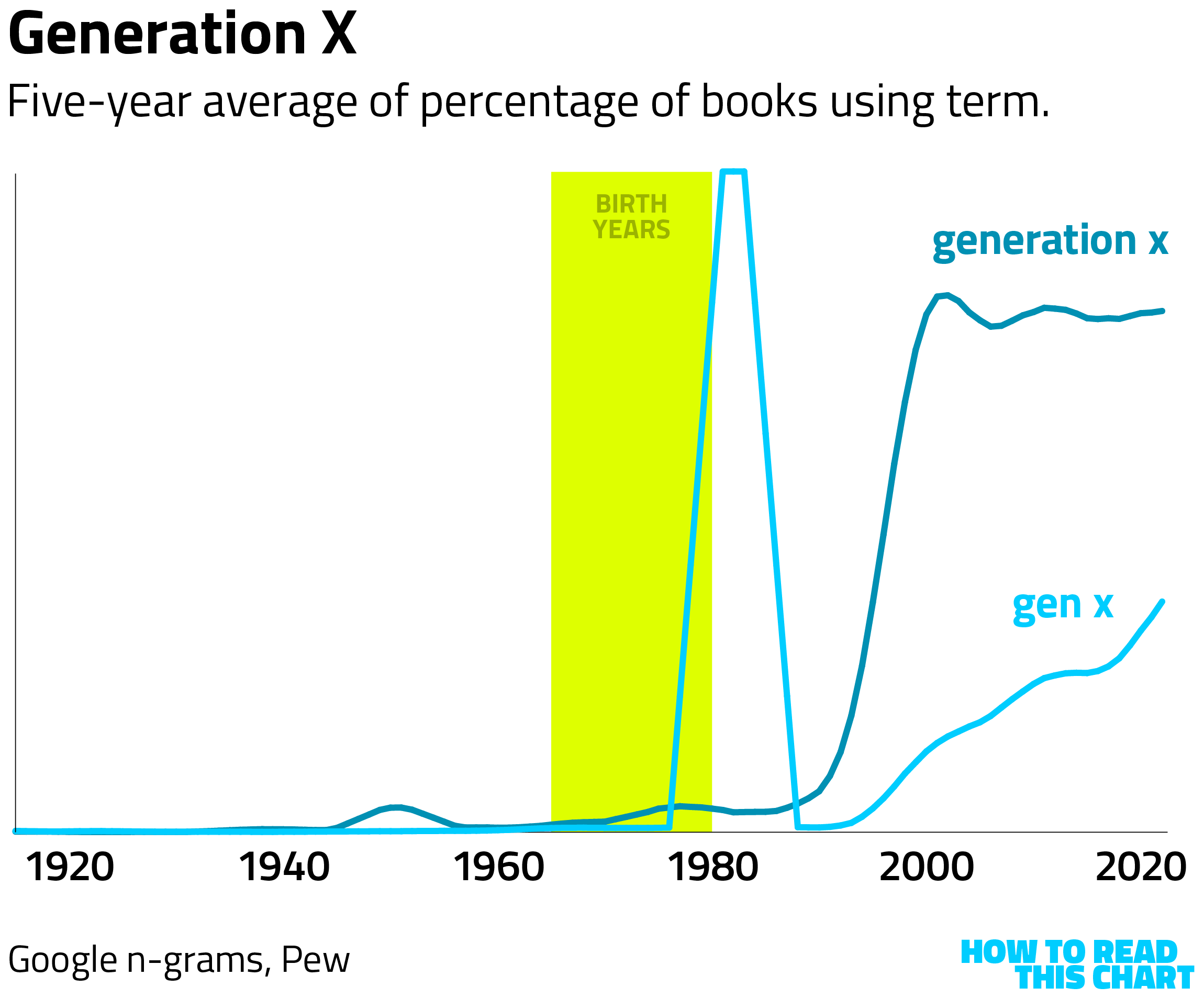
The now familiar "Gen X" shorthand had an anomalous peak in the 1980s, but the use as a generational descriptor also surged in the 1990s and early 2000s.
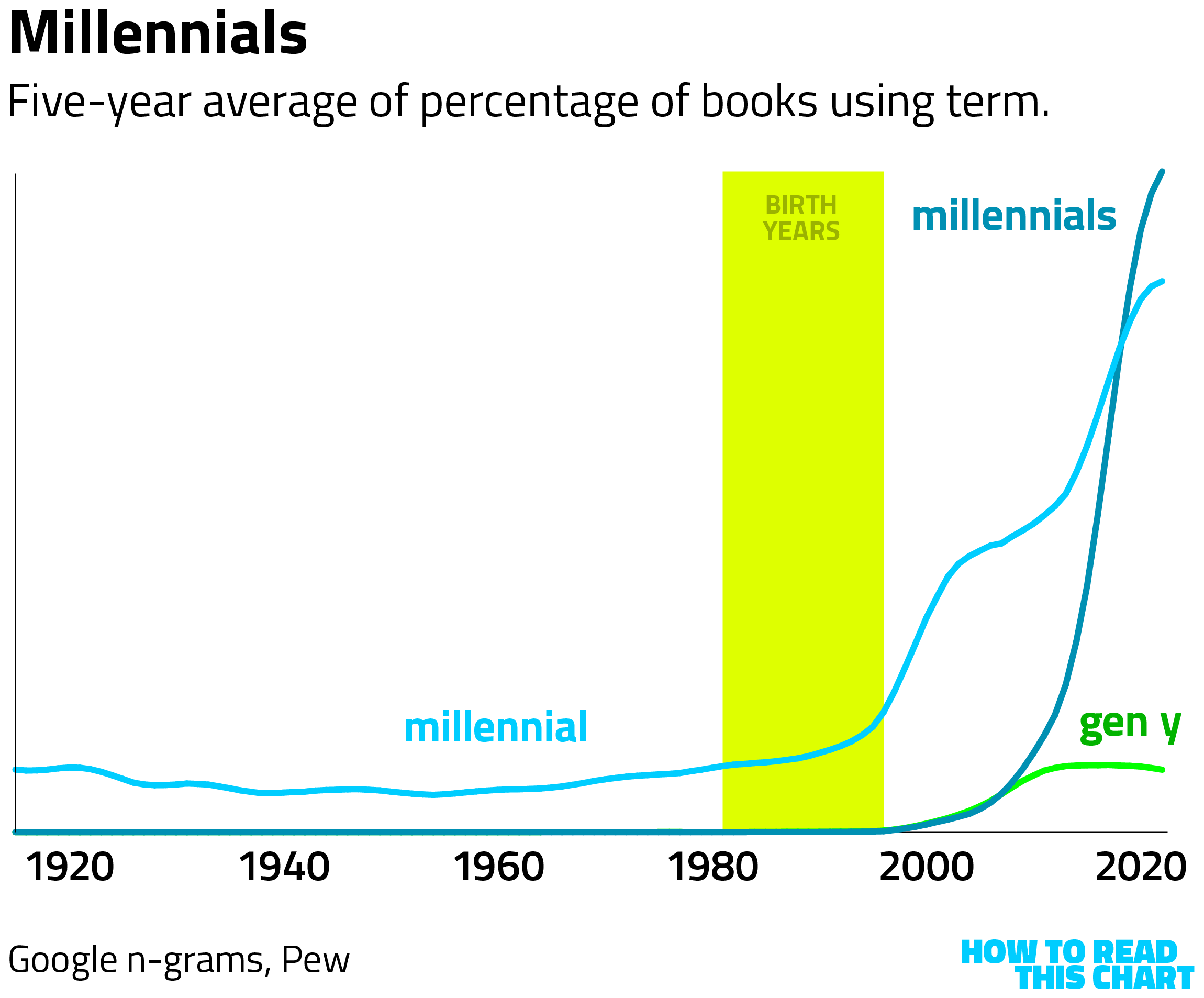
Millennials arrived a bit later, both literally and as an identifier. Gen Y never really caught on, thankfully.
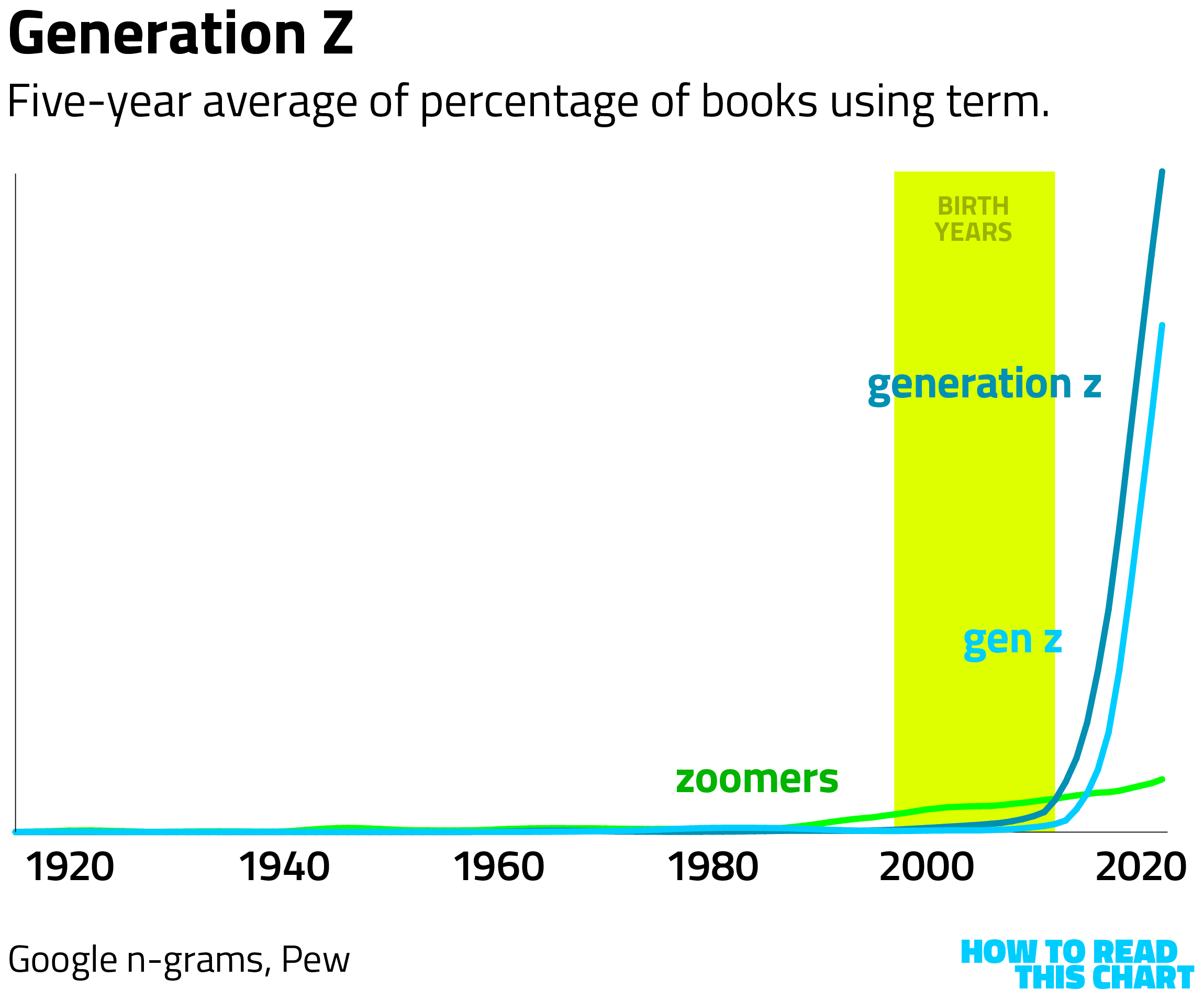
In contrast to the other generations, Gen Z was cemented quickly. Granted, we're still early on this one and some other name (like "zoomers") might surge past it in the decades to come.
Now consider all of the most-common terms, overlaid on top of one another. It's not driven by when the generations actually occurred but by the sudden attention paid to generations in the 1980s and 1990s, as baby boomers took over.
Incidentally, a Pew poll conducted in 2015 found that most people generally knew which arbitrary generational bucket they'd been dumped into. But there was a funny quirk: an awful lot of millennials thought they were members of the greatest generation. Very on-brand for millennials.
Chapter 4
Chart Attack
It was a banner week for two things: Donald Trump making friends with Democratic socialists and me finding data visualizations.
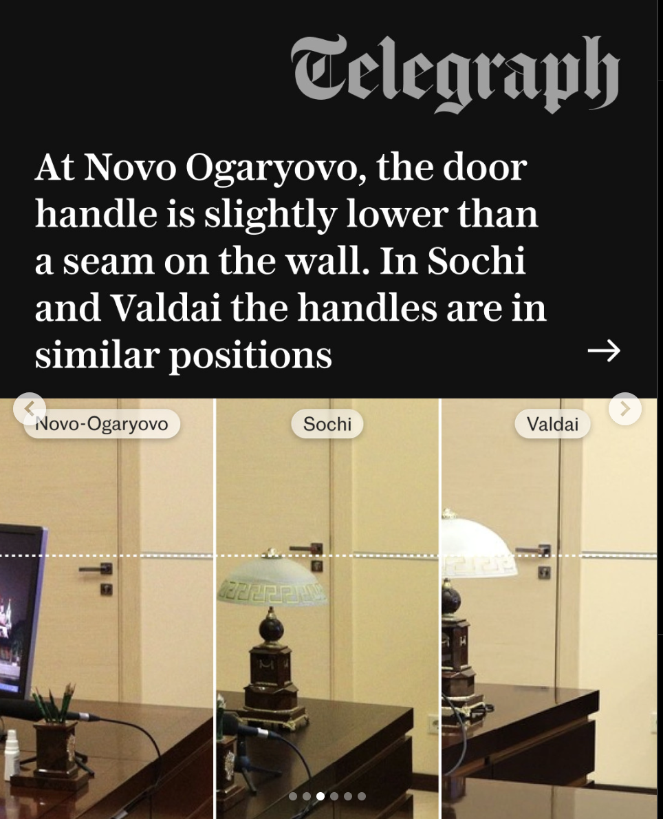
The Telegraph, for example, put together a report showing that Russian President Vladimir Putin has replicas of his office all over the country which can be differentiated by things like how the door handle lines up with the wall.
A Bluesky user reminded us that combatting the threat of communists (and Russia) used to be a top ten concern of Americans.
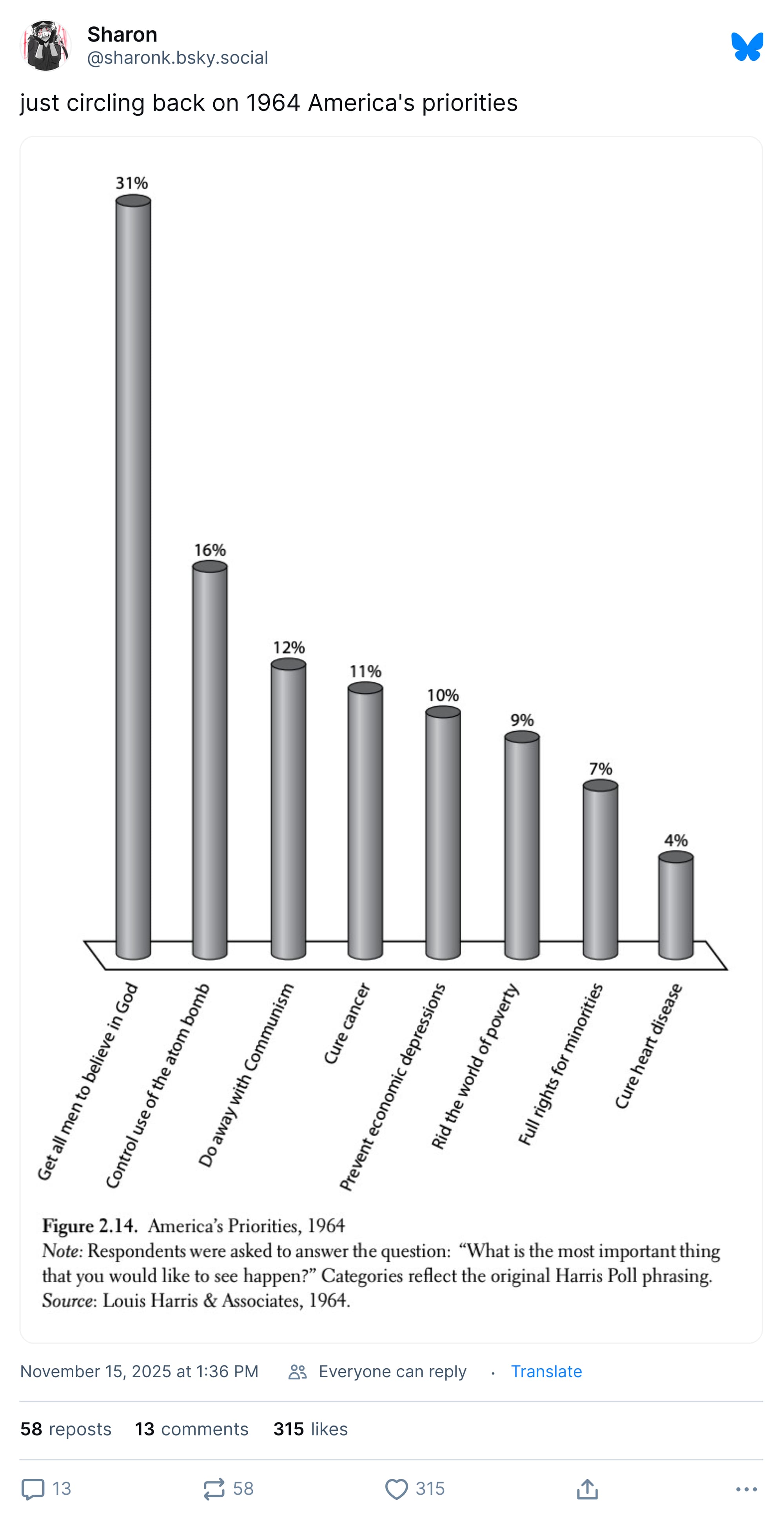
Happily, we won that fight, and we enjoy a government that lets the free market be free! Excuse me, I'm being handed a note.
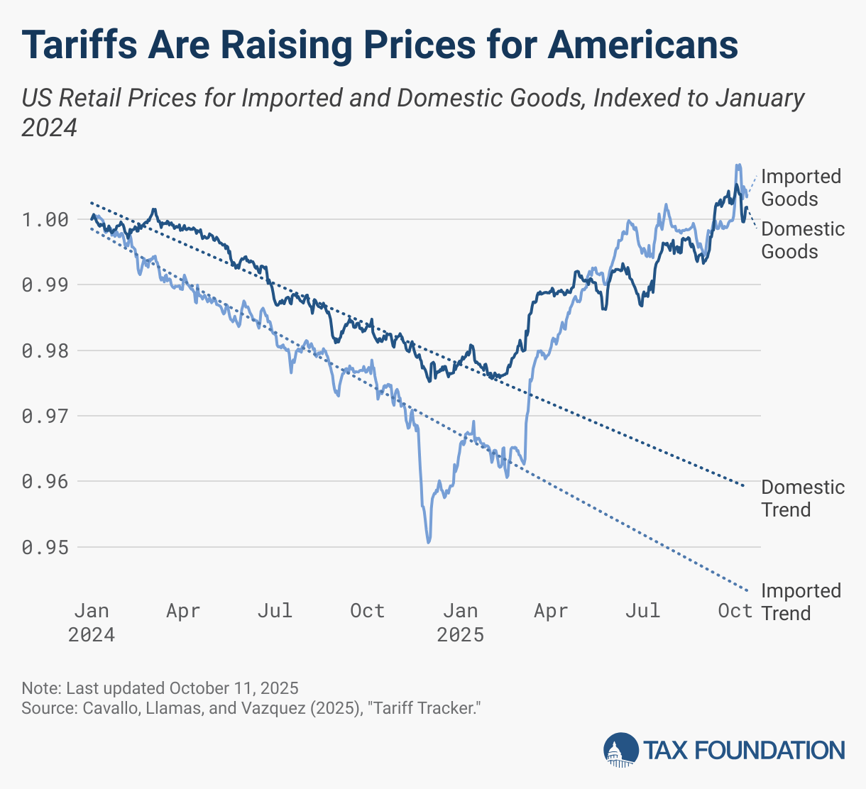
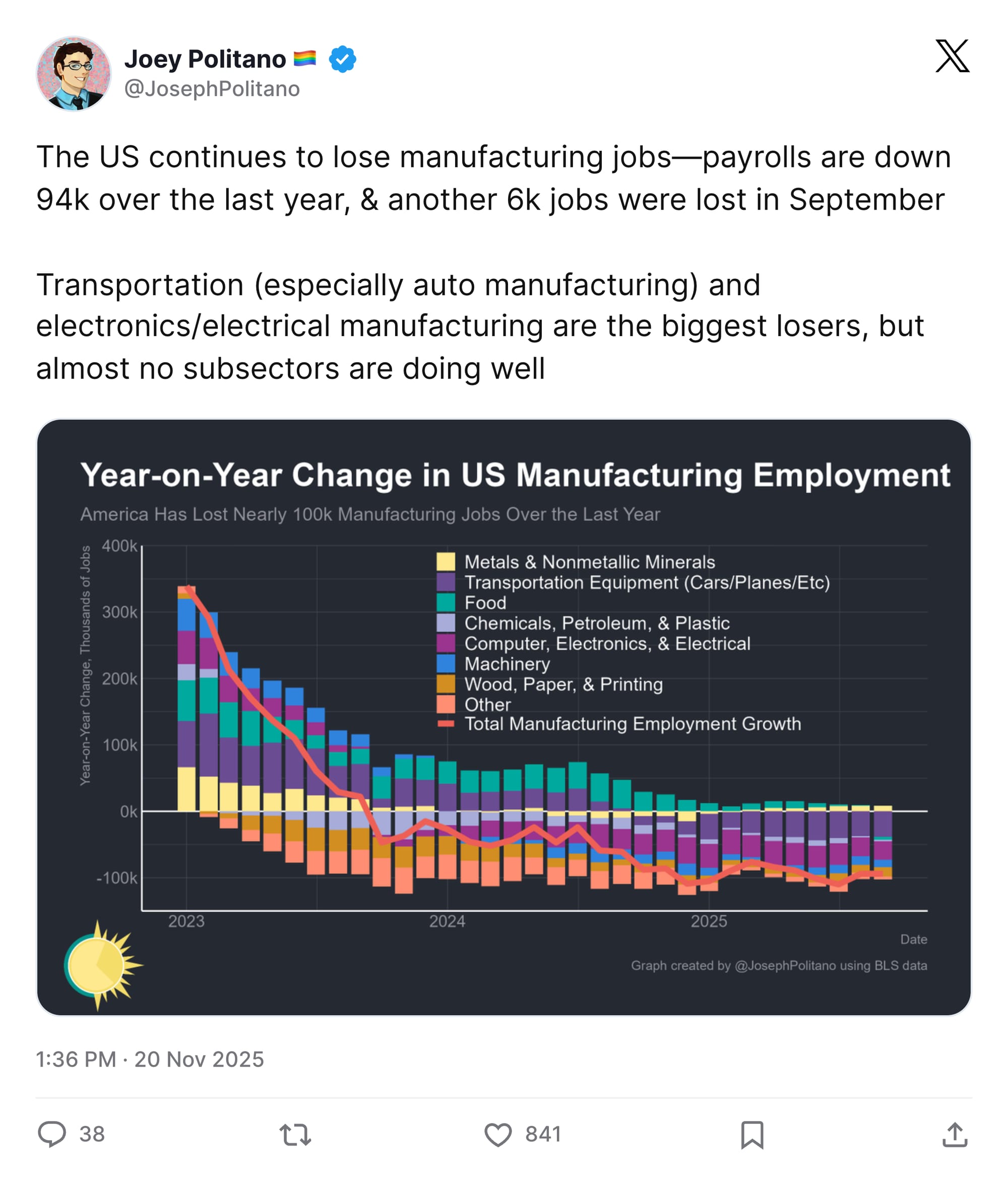
Sure, the tariffs are pushing prices higher. But they're also bringing back manufacturing jobs, right? Oh.
OK. Enough sarcastic political commentary. Instead, let me point you to this visualization of the day on which a New Hampshire ginkgo tree loses its leaves each year.
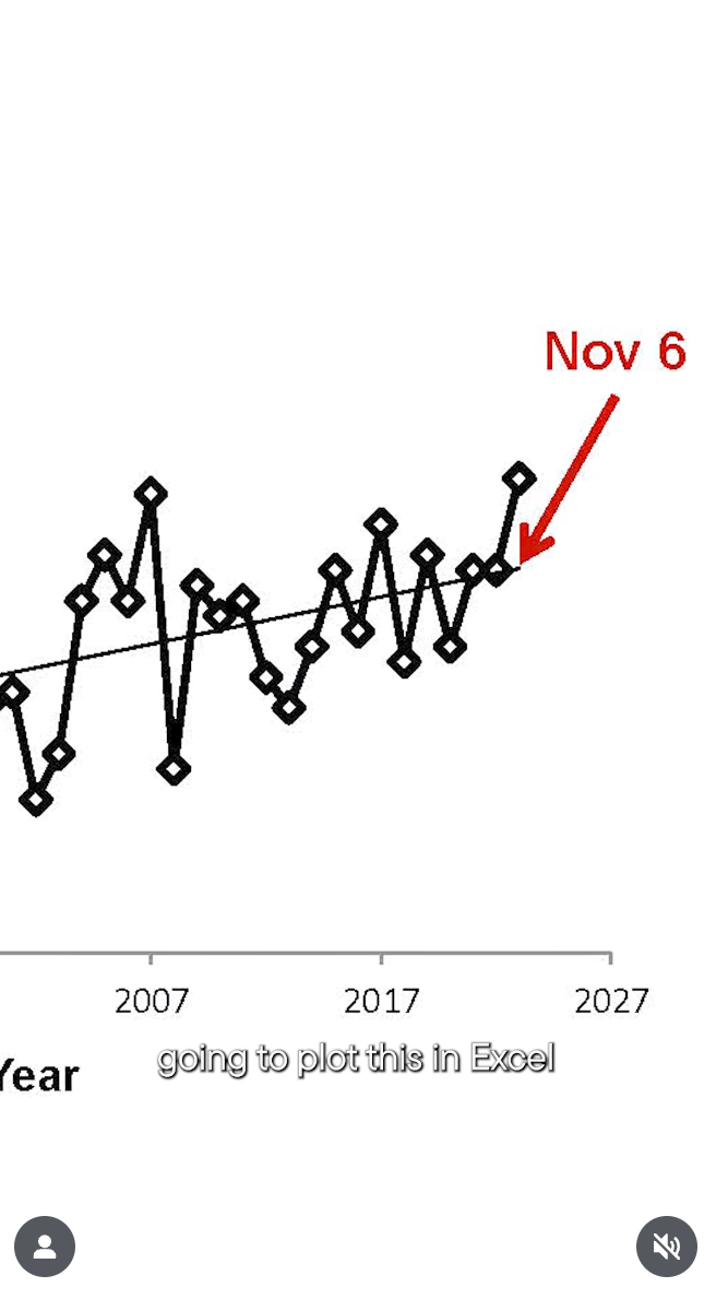
That's how ginkgos work; all the leaves drop at once. And by tracking that date over time, we see that the leaf-drop is happening later and later, as though something in the climate is changing somehow?
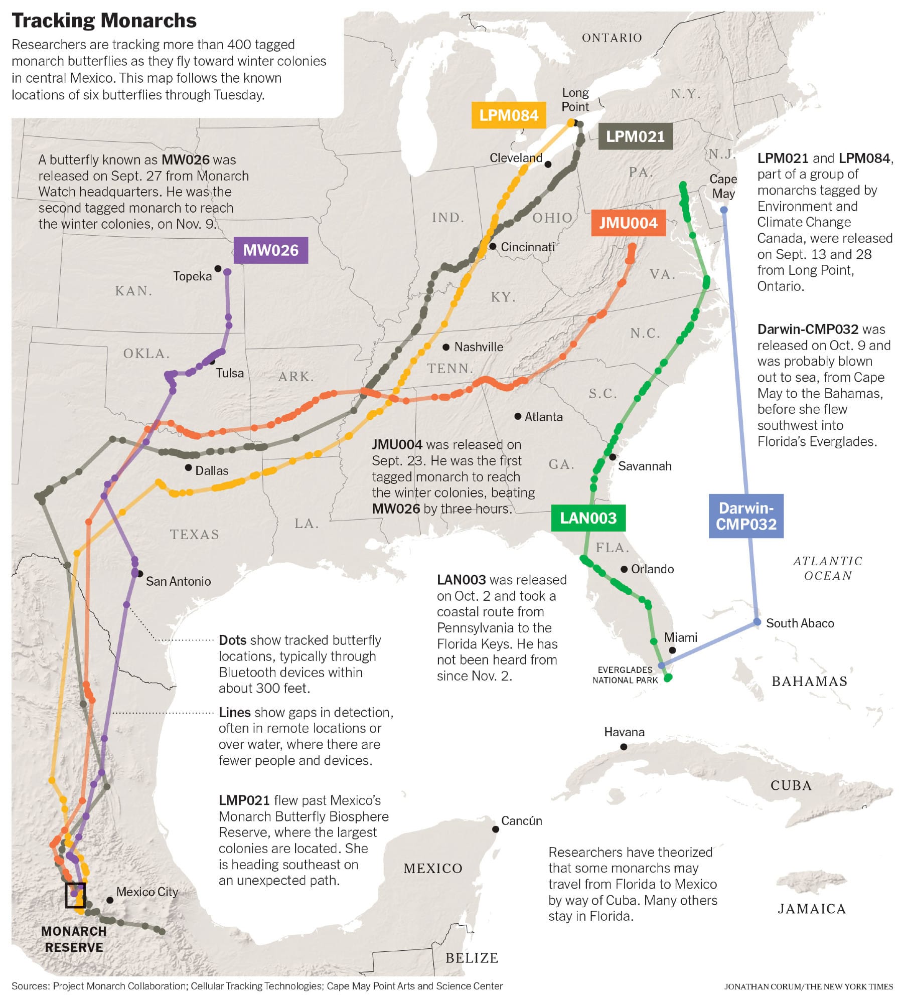
Oops, sorry. More sarcasm seeped in. So allow me to offer a non-sarcastic appreciation for the New York Times' report on the movements of individual monarch butterflies across North America.
And, of course, I had to include perhaps the most adorable data visualization of all time: a scientific study suggesting that raccoons are becoming increasingly domesticated because their snouts are getting shorter.
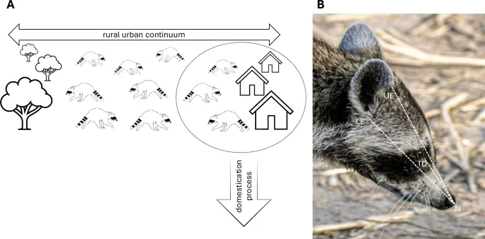
Raccoons: the cutest rats nature has to offer. Even my eight year-old agrees with that.
Appendix
Some other things I've written


You are receiving this email because you at some point in time volunteered to, either at Ghost or Substack or pbump.net or pbump.com. If you don't want to receive future emails, it's probably because of vaccines. What you really want to do is support the newsletter financially, right?
Another one is coming next week. You have been warned.