America's myriad afflictions


In this week's newsletter, we take a journey across various challenges facing the United States, some of them self-inflicted and some of them extra-self-inflicted. And then, at the very end, there's a funny chart about sports. So sort of an emotional wash!
Chapter 1
Where the measles is most likely to take root
Americans love nostalgia. We like to think about how things were, remembering the old days with a glass of wine and a twinge of melancholy. This is probably 95 percent a function of "the old days" tending to correlate with "a point when one had few responsibilities or bills and lots of free time," but it manifests as "weren't bell-bottoms kind of cool?"
Not every past trend needs to be revived, however. Like, say, deadly diseases. And yet here we are, making America splotchy again.
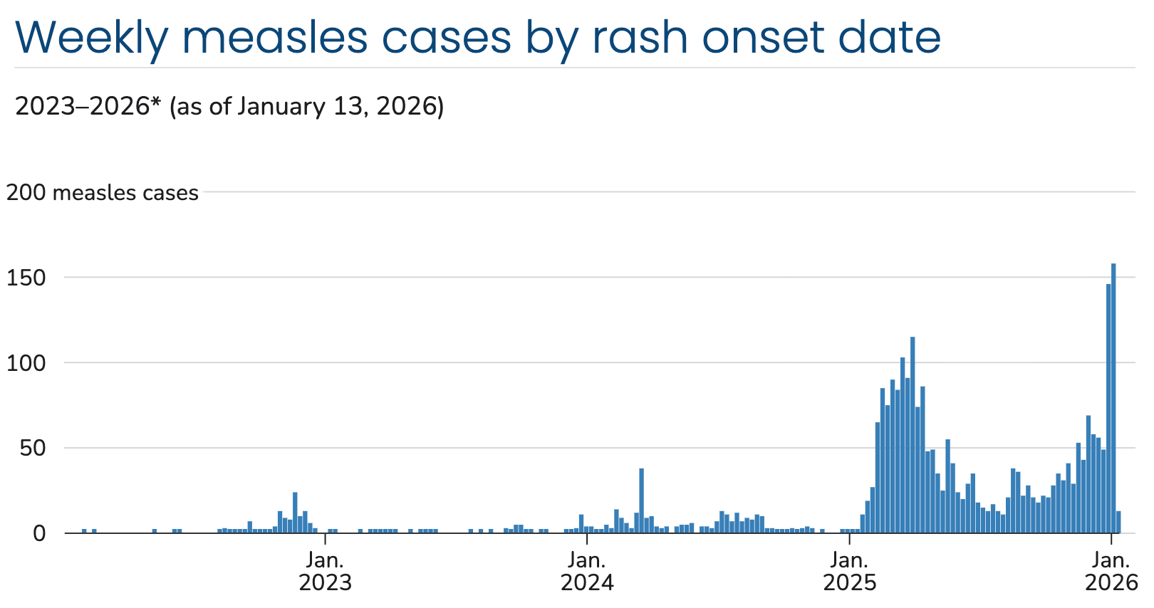
This week, ABC News published an interactive map showing where the risk of measles outbreaks was highest — meaning the places where vaccination against the virus was lowest. Compiled by researchers from Boston Children's Hospital, Harvard School of Medicine and Icahn School of Medicine at Mt. Sinai, the data is a useful compilation of where you might not want to take a breathing-in-people's-faces vacation. (Now there's something to be nostalgic about!)
Being me, I was excited to have a tidy vaccination dataset to play with. So I figured I'd test a few of my untested assumptions about why some places had lower vaccination rates than others.
For example, I was curious whether these numbers mirrored the decline in support for vaccination that accelerated among Republicans (and Republican presidential administrations) after covid-19 emerged. I was also curious how rates correlated to income.
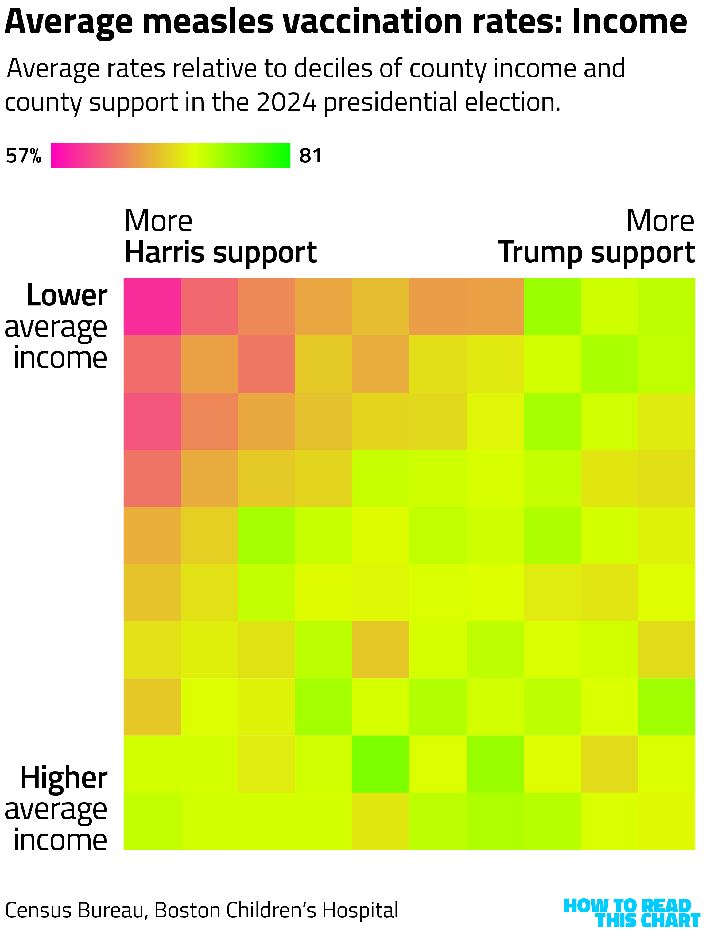
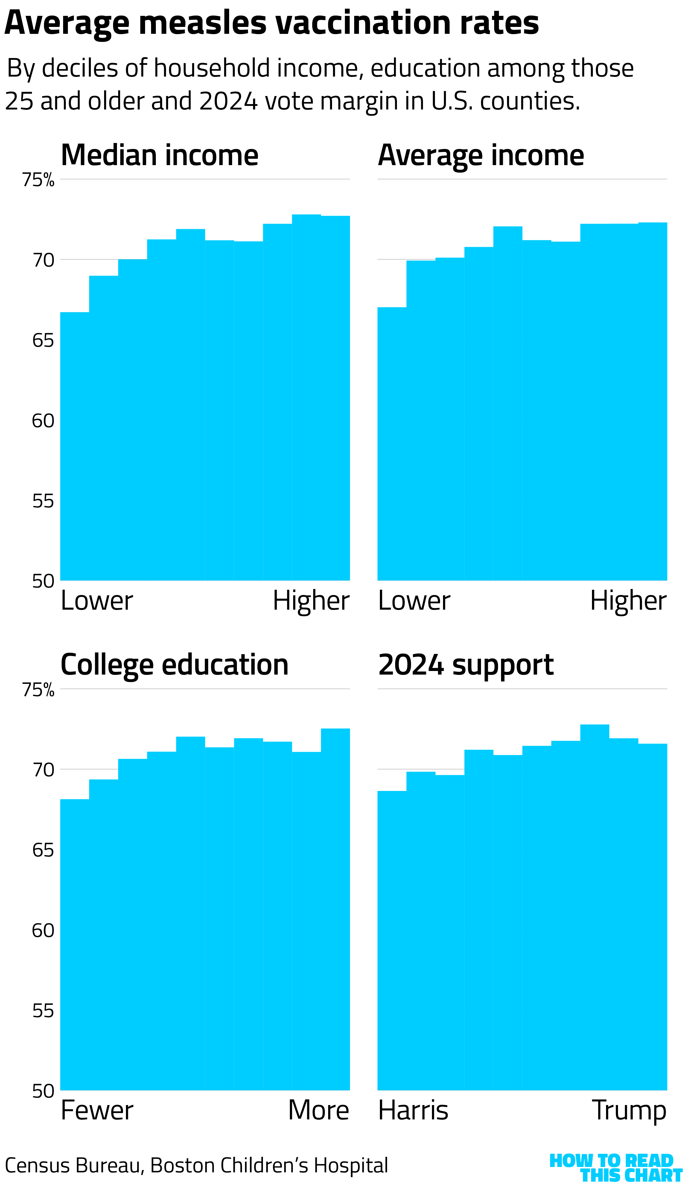
So I grouped the U.S.'s 3,000-plus counties into buckets by income and 2024 vote margins and averaged out the vaccination rates. What I found was that lowest rates were in lower income, more Democratic counties — not what I'd expected.
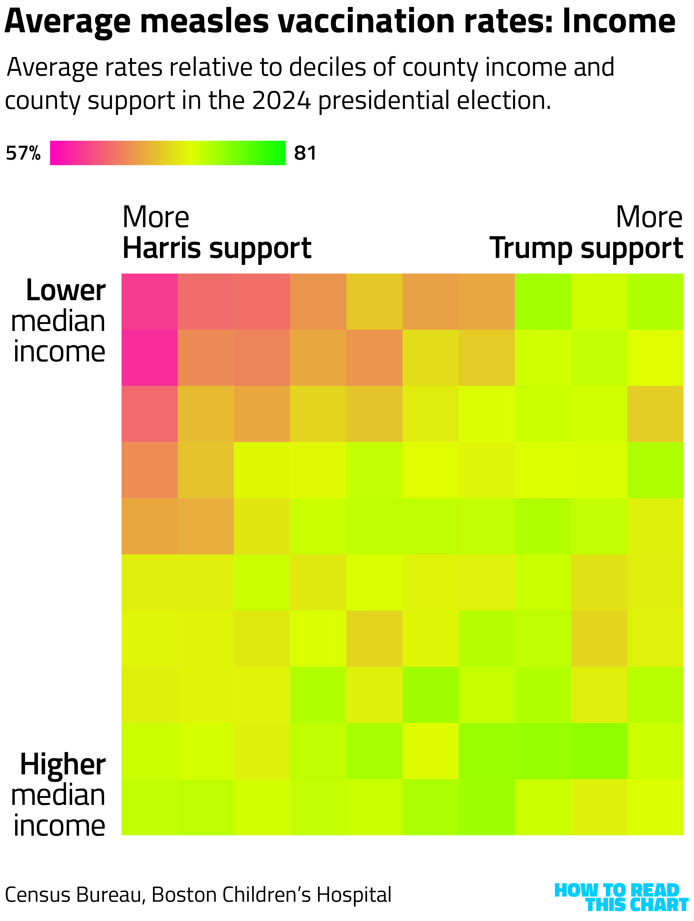
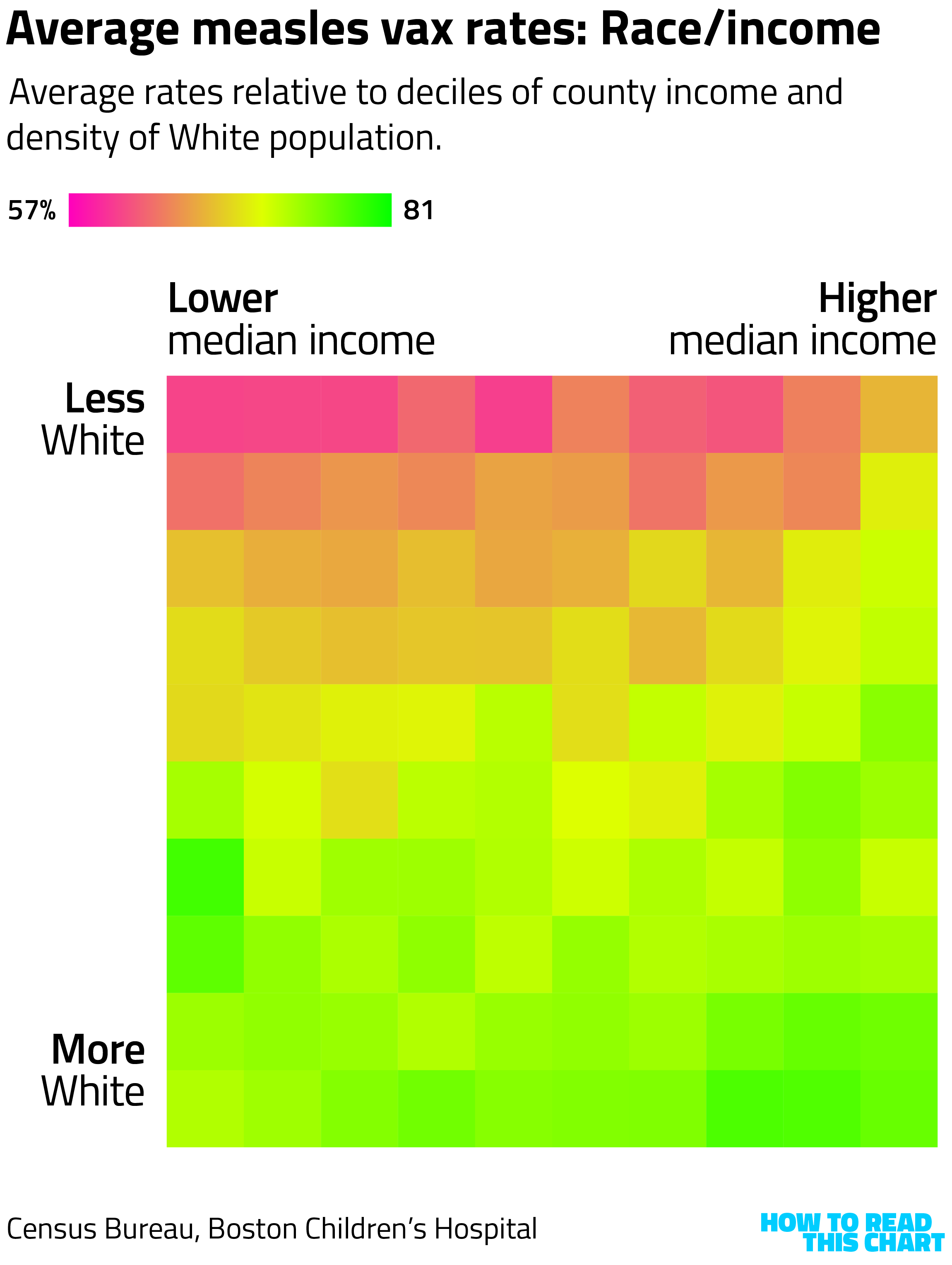
How to read this chart: This is essentially a heat map, showing values for 100 clusters of counties. At top left, the counties that are among the 10% with both the lowest median incomes and the biggest margins for Kamala Harris in 2024. At bottom right, the counties that are among the 10% with both the highest median incomes and biggest margins for Donald Trump. The more red, the lower the average vaccination rate.
If you are curious (as I was), looking at average vs. median income didn't make a significant difference.
Education and income tend to be correlated, but I isolated education anyway. Rates tended to be more uniformly low in counties that leaned more toward Kamala Harris in 2024, regardless of education.
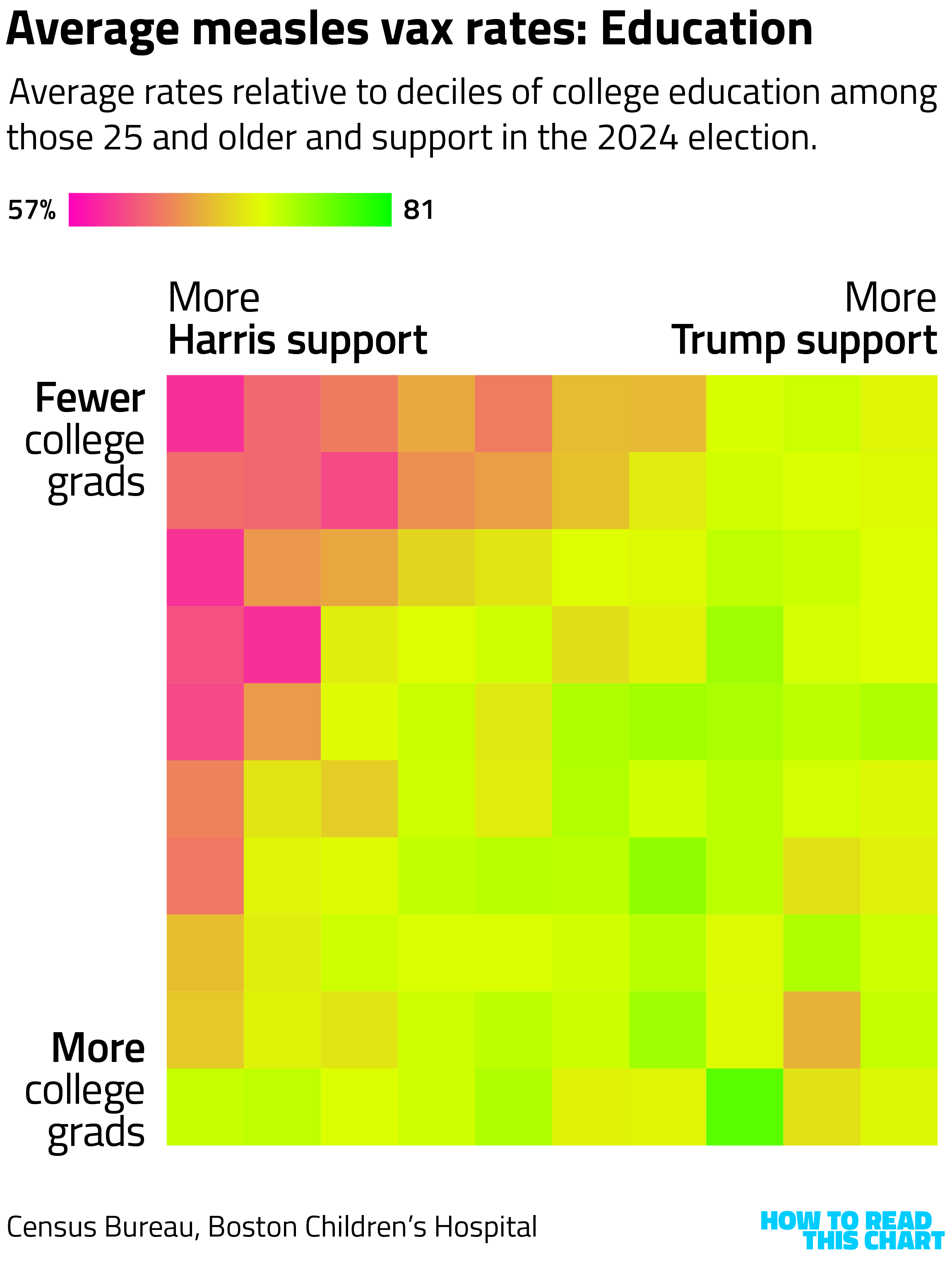
I started to see a pattern. Lower incomes, lower rates of education and more support for the 2024 Democratic candidate all correlated with lower vaccination rates.
And what do those things correlate with? Race. Black and Hispanic Americans tend to have lower incomes and offer more support to Democratic candidates. And, lo:
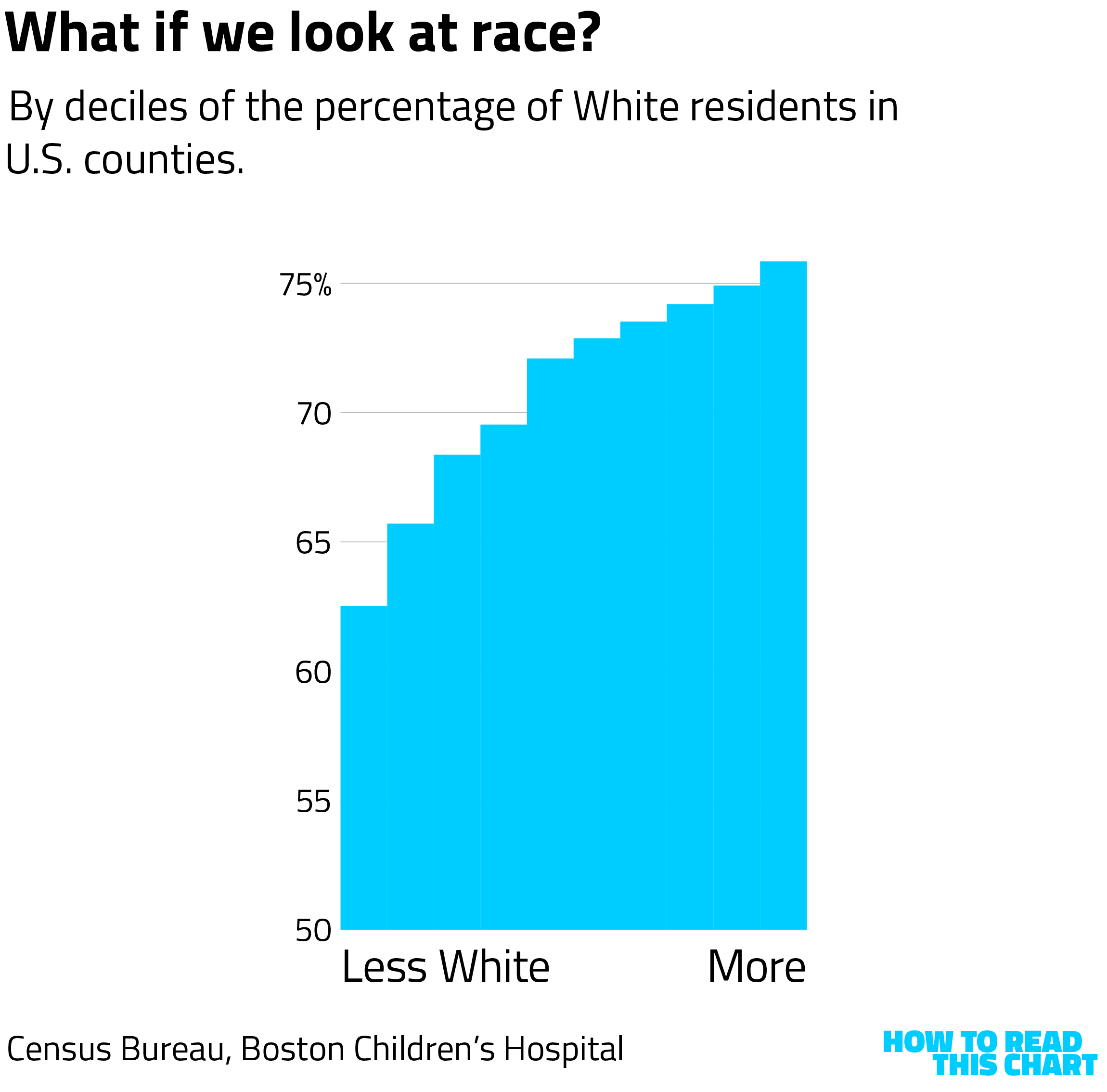
When we contrast 2024 results with race, suddenly the pattern shifts. Trump support is a better predictor of lower vaccination rates when you look at counties by density of the White population.
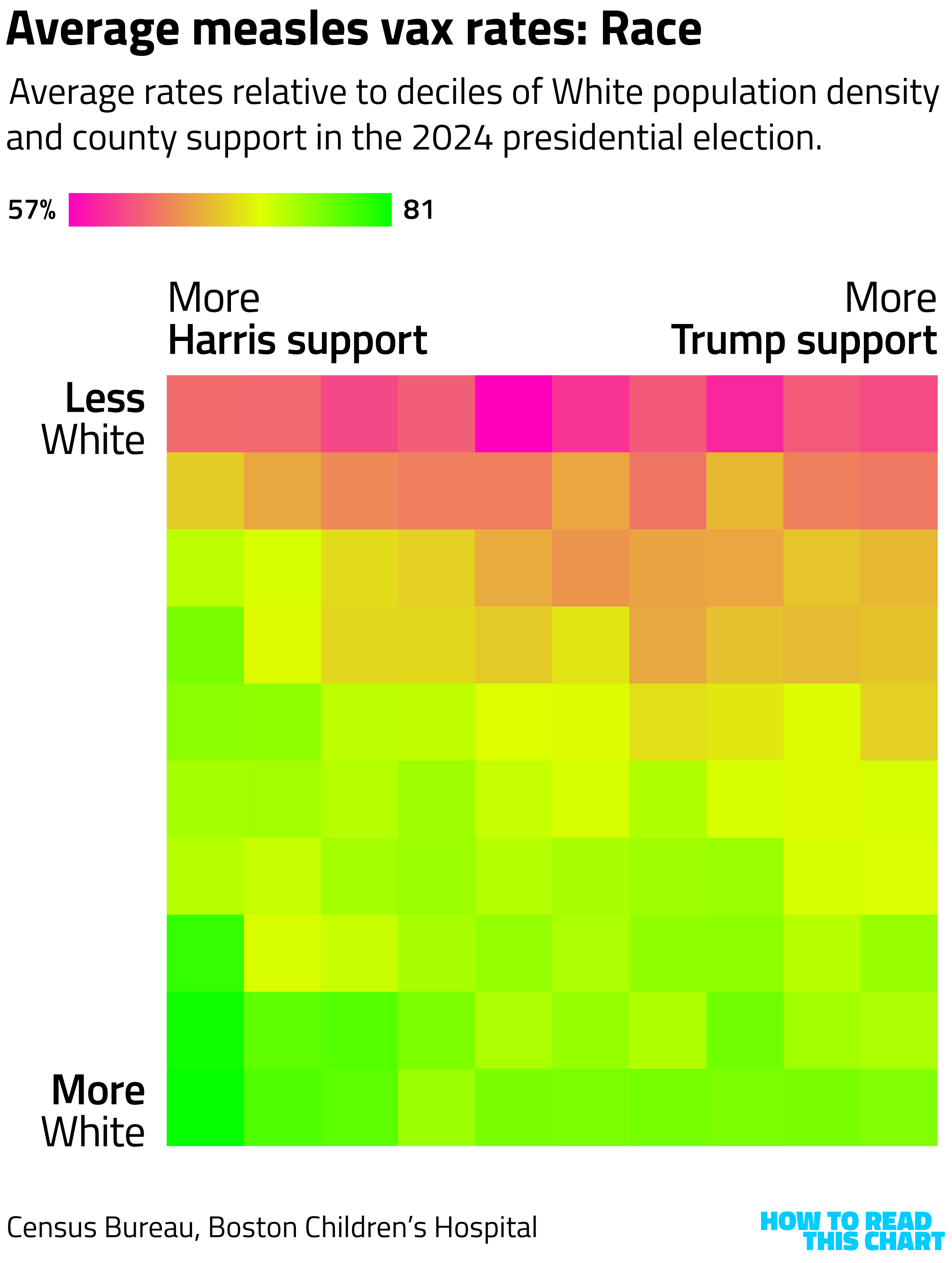
If we compare race and income, we see that race is still a stronger predictor of vaccination rates (since the gradient is more obvious from top to bottom than left to right).
This shouldn't be a surprise. At the outset of the covid pandemic, research and analysis noted higher rates of skepticism about vaccines among communities of color, for both historic and modern cultural reasons.
It shouldn't have been a surprise for another reason, too. After I pulled the data and made all these graphs, I went back and looked at the ABC News map again. The region with the most obvious elevated rates of measles risk? A sweep through the Deep South and into the Southwest — or, places with larger non-White populations.
I could have saved myself a decent amount of time, but then I wouldn't have these pretty charts.
Chapter 2
The U.S. population is in decline
Speaking of grim analysis, the Congressional Budget Office reported earlier this month that the country's population is likely to start shrinking by 2030 without immigration. Luckily for us, we're doing everything we can to encourage immigrants to come to this country. Right? I haven't checked the news for about 13 months, so let me know if something's changed.
This possibility reflects how two important patterns are intertwined — an interlacing that's important for reasons beyond just the raw population numbers.
Consider how state-level population has changed over the past 15 years. A lot of growth in the West and Southwest, stagnation in the Midwest and Northeast.
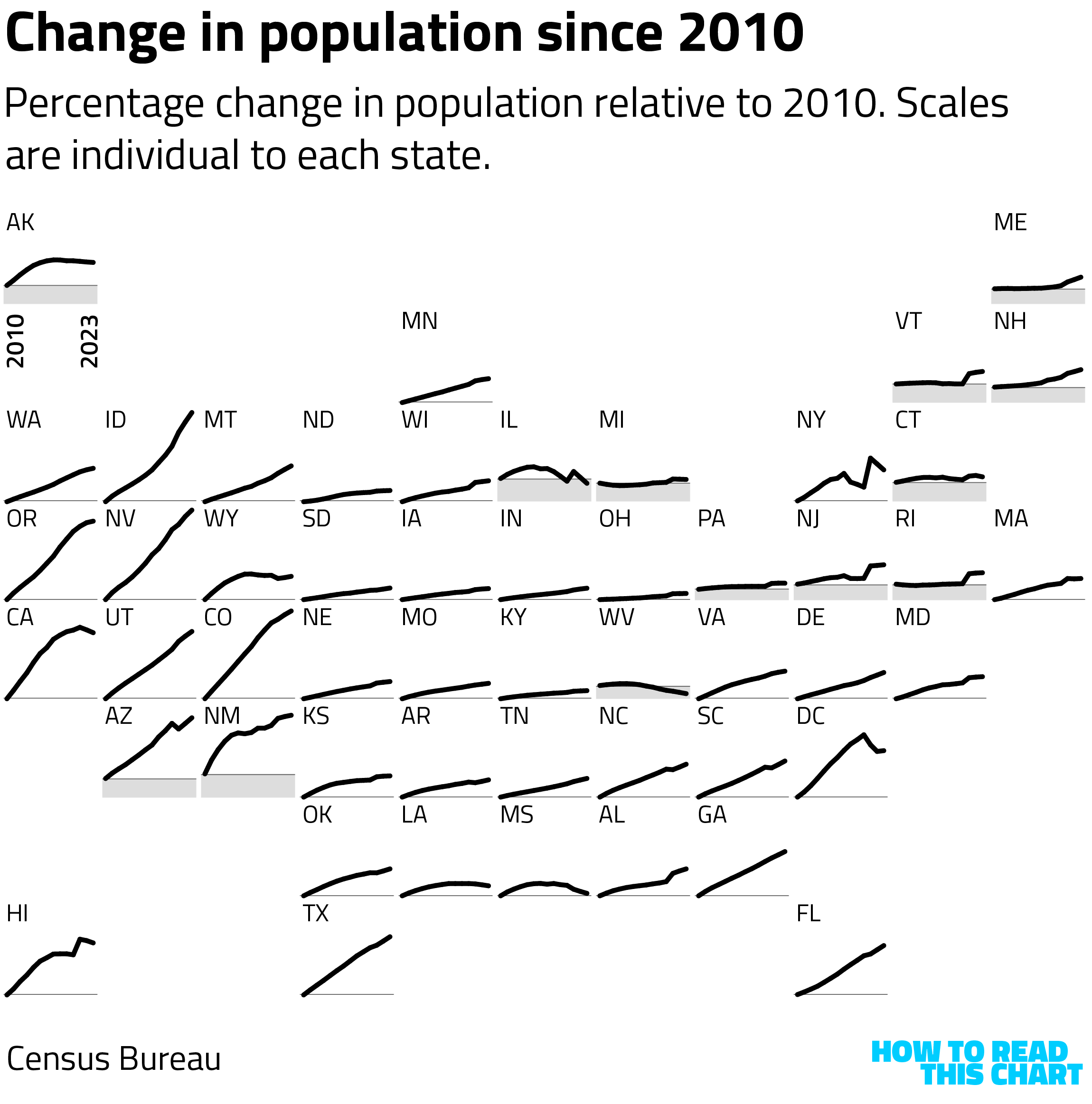
Now I know some of you are going to be frustrated that the vertical axes here are not labeled. Well, it doesn't really matter for our purposes. Just know that up-and-to-the-right means more population growth. If you want to email me about it to complain anyway, you can reach me at i.am.obsessive.about.axes@nowhere.bananas.
The reason it doesn't matter is because I'm going to use the same axes to show the difference in growth between the native-born (non-immigrant) and foreign-born (immigrant) populations over that same period.
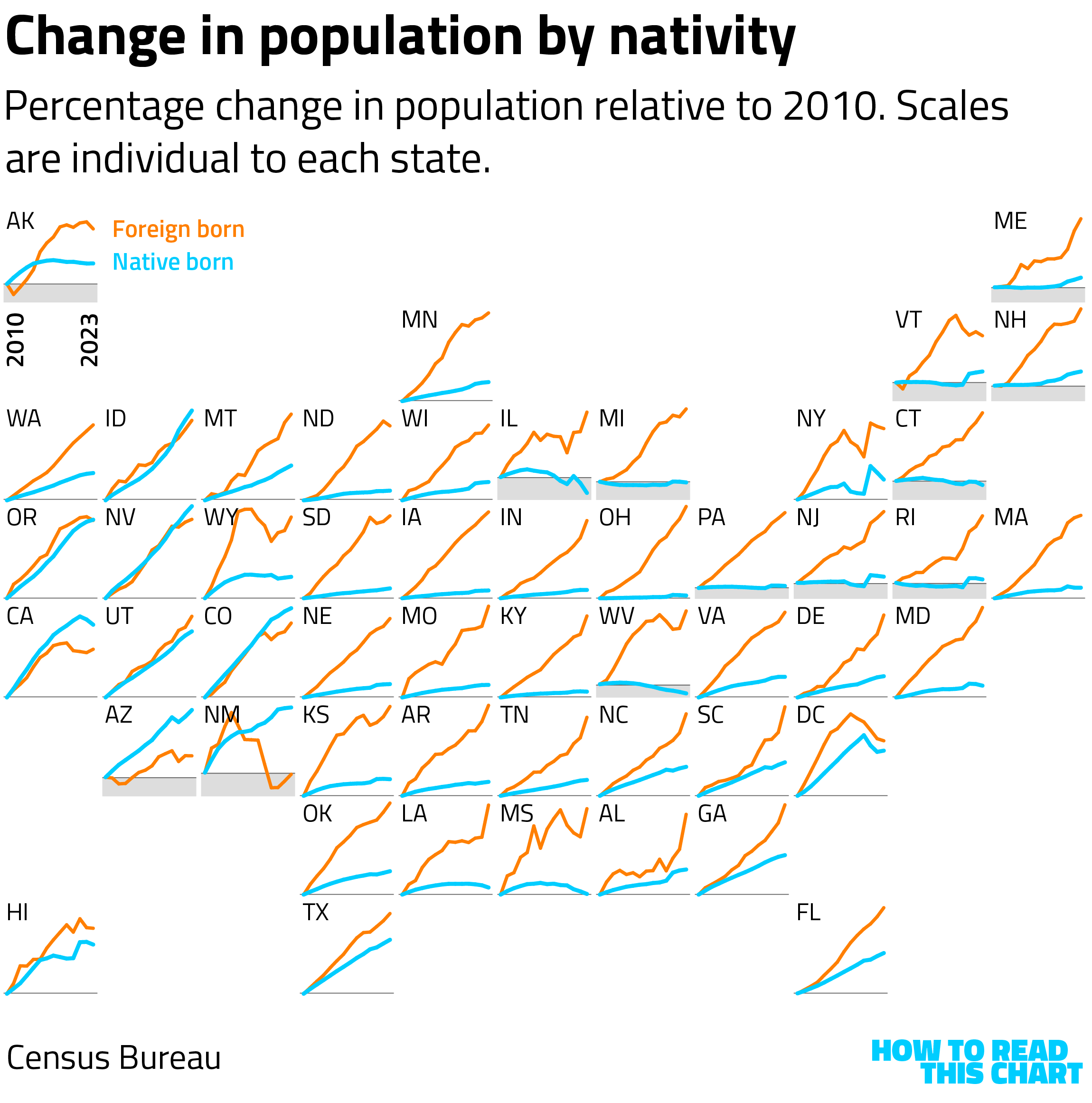
See how in nearly every state the rate of immigrant population growth is higher than the rate of growth among native-born Americans? In some cases, states have only grown because they've welcomed immigrants — a preview of the challenge that is looming for the whole country.
That challenge derives from the changing demographics of the population (and particularly the native-born population). I talk about the baby boom a lot, in part because I wrote a whole goldarn book about it.
But the combination of the baby boom getting older (its oldest member turned 80 on Jan. 1 of this year) and the advent of the coronavirus pandemic means that a number of states have seen negative natural population change — that is, more deaths than births — since 2000.
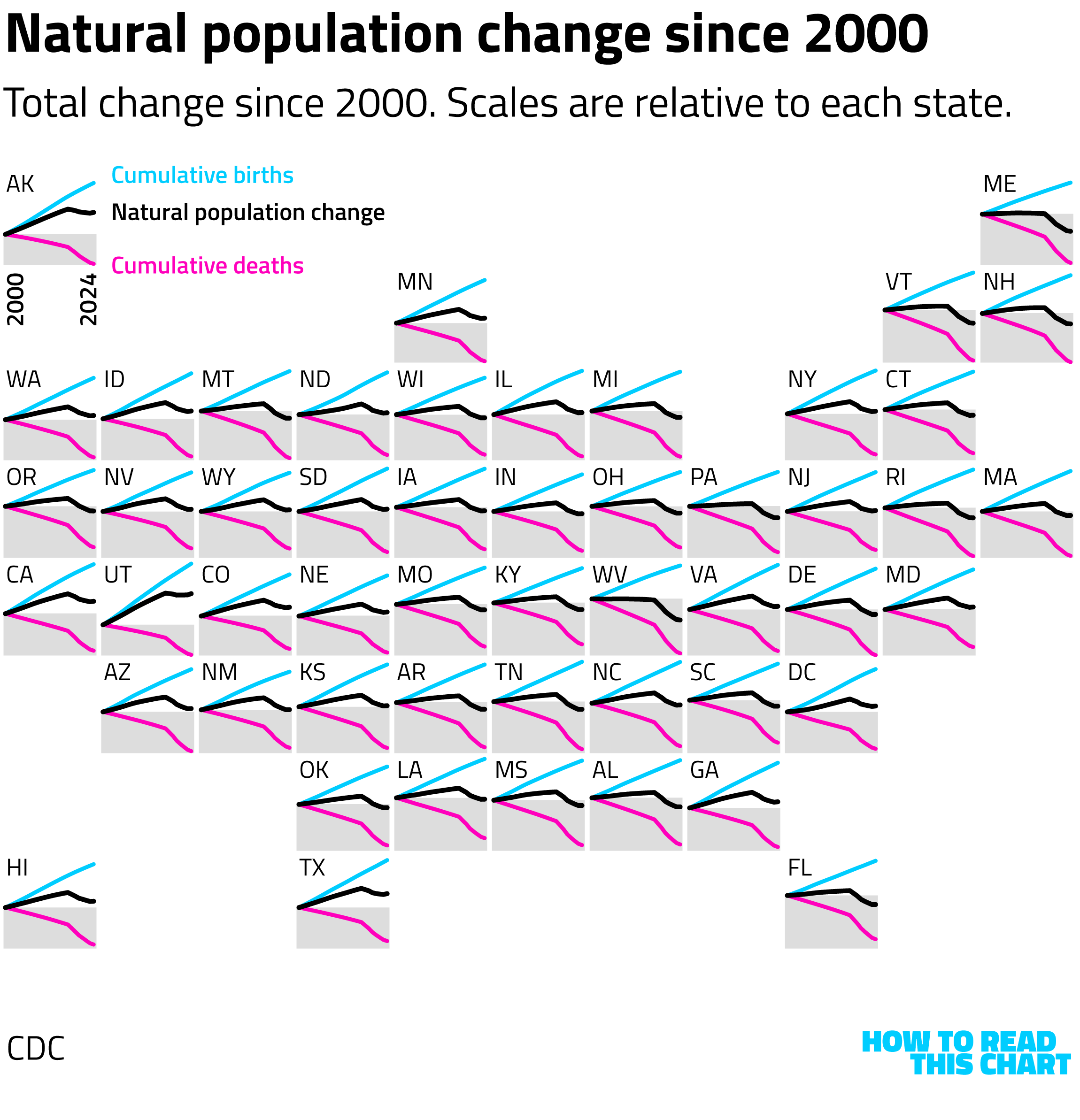
Fifteen states had more deaths than births in 2024 alone.
While I was still at The Washington Post, I wrote about how Trump's attack on immigration (I read the news just now) comes at a historically bad time demographically. If for no other reason than that the increasingly large elderly population needs caregivers, the ratio here matters.
Oh well!
Chapter 3
ICE is getting younger and less educated
You know who is getting younger? ICE agents.
Earlier this week, I wrote an analysis for MS NOW looking at how the funding allocated to ICE could otherwise be spent. For example: the $30 billion likely to go to ICE this year could also cover the entirety of the extended Obamacare subsidies. But it's not being spent for that.
For that piece, I pulled data from the Office of Personnel Management to see how ICE's employment growth compared to other government agencies. (There was growth, which was not the norm.) But then I discovered that OPM also included data on age and education, so I decided to see how the demographics of the agency had changed.
If we look at Customs and Border Protection, an agency that also grew (albeit more modestly), you can see that the change from January to November (the most recent month for which data is available) was subtle. Notice the animation, which may not immediately be obvious.
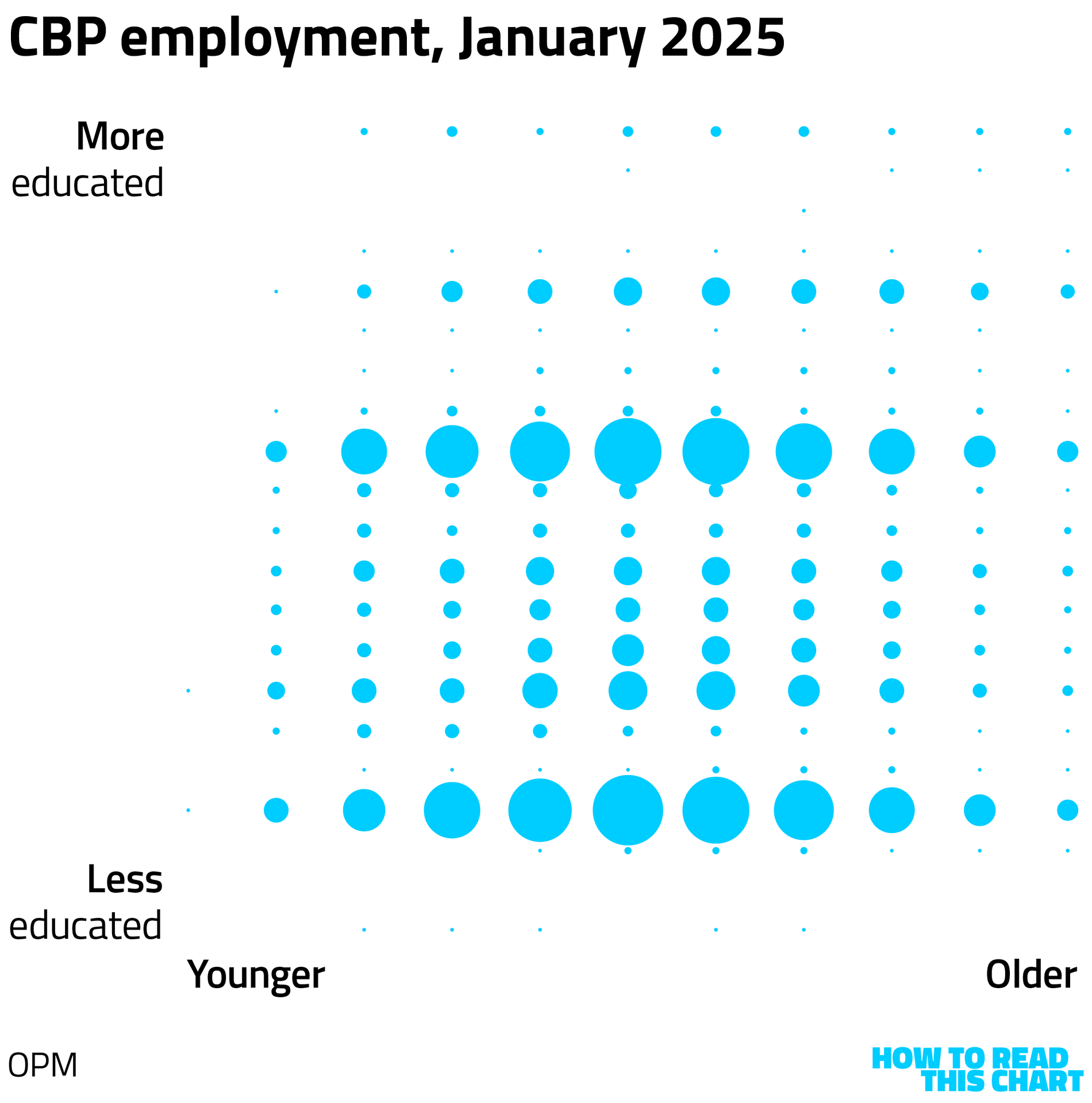
How to read this chart: This is also sort of a heat map, with education on the vertical axis and age on the horizontal. Most CBP agents have either a high school degree (the lower row of larger circles) or a college degree (the higher row of larger circles). Few are under the age of 20 (the far left, tiny column). Circles are scaled to the number of employees at that intersection of age and education.
Here's what the same chart looks like for ICE.
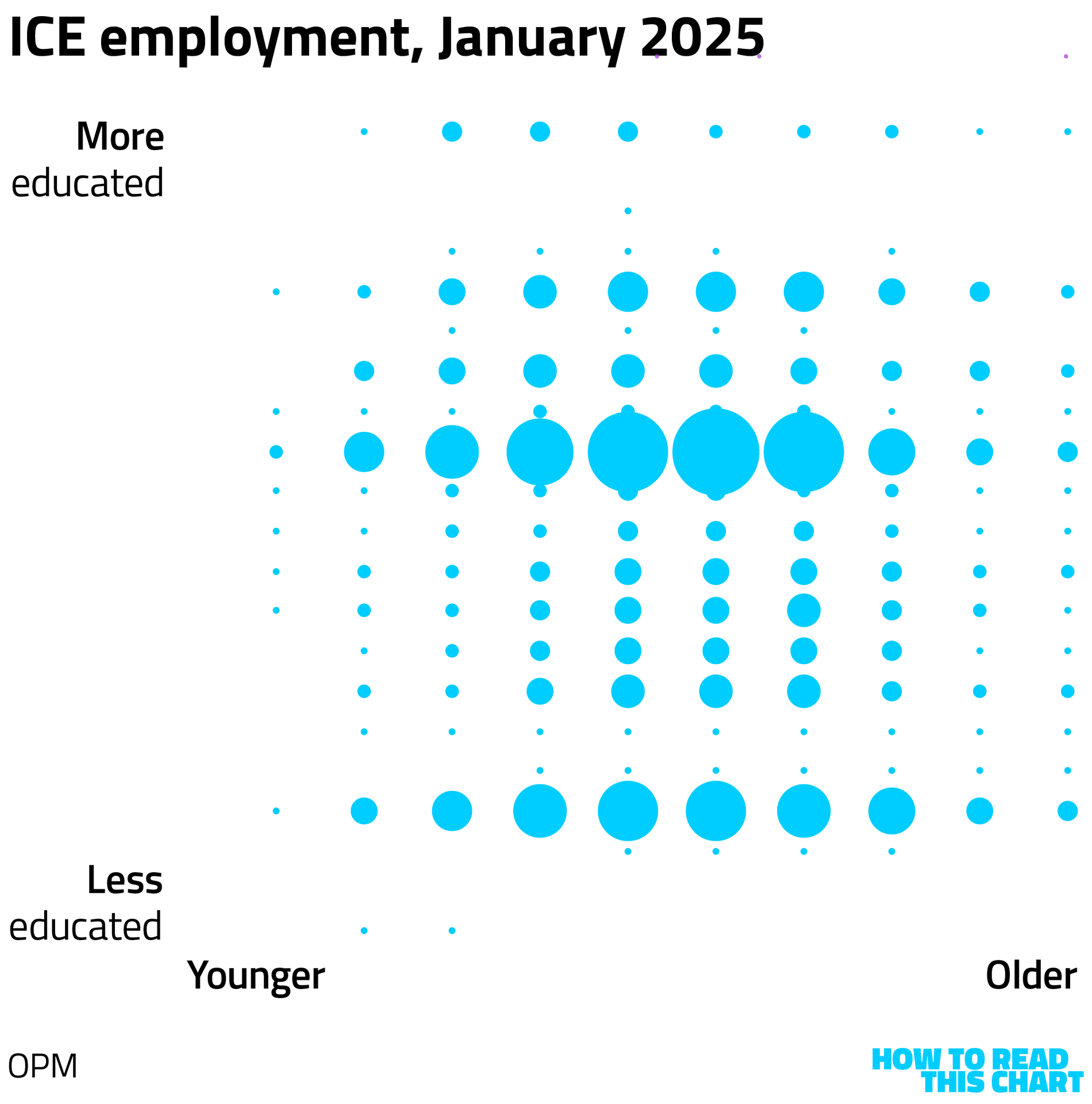
Notice that a lot of the circles get bigger — but particularly on the left and particularly in the lower left.
If we simply overlay the two months, you can see where the growth by November was largest.
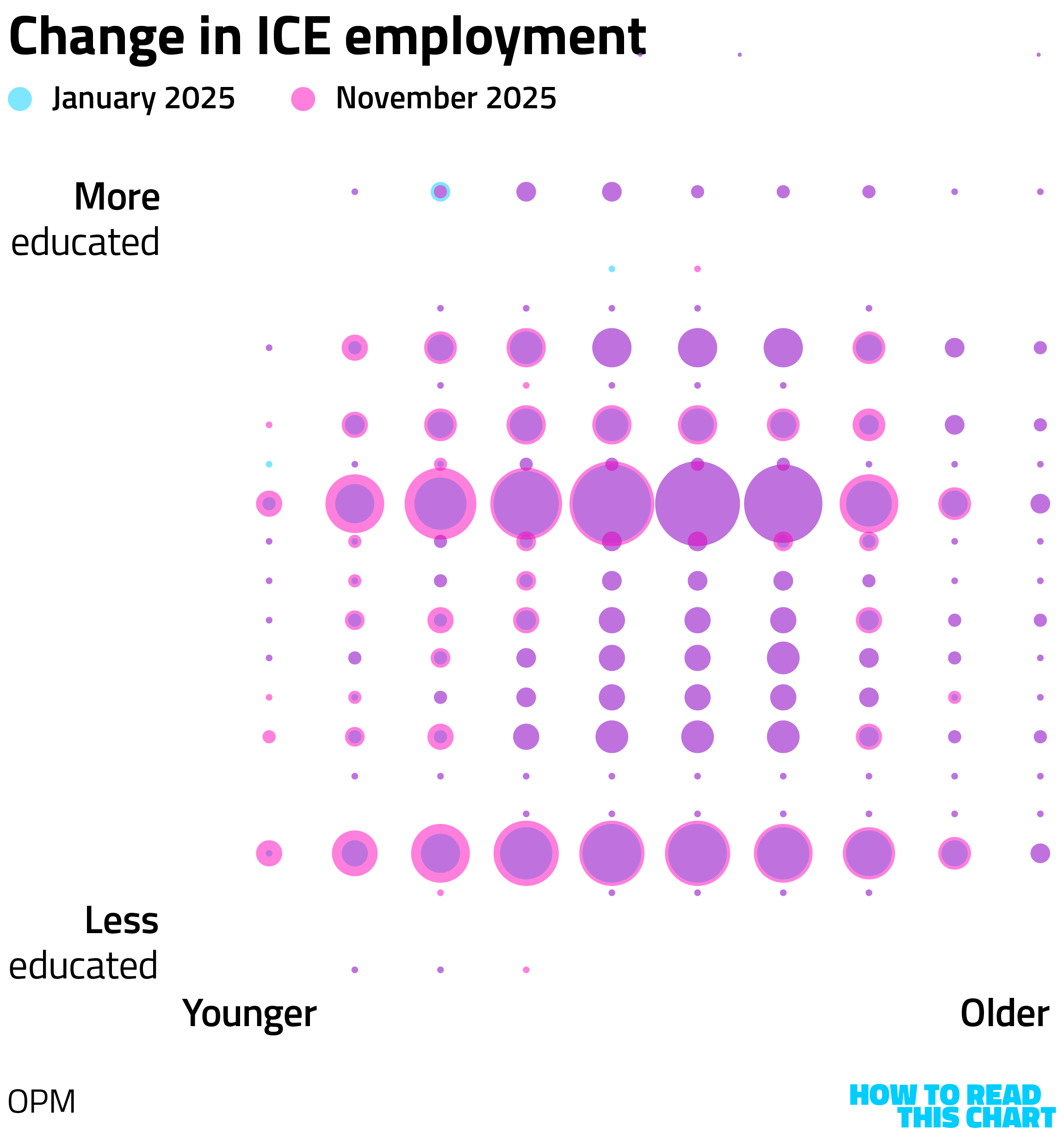
Here's how I summarized the shift in the article:
"The number of employees under the age of 40 jumped by two-thirds, while the number of employees age 40 and older increased by about a sixth. The number of ICE staffers without a college degree rose 36%; the percentage with a degree rose only 25%."
I am not ready to draw sweeping conclusions from this, but you are welcome to.
Chapter 4
There's probably a connection between these graphs
In fact, it was a big week for charts about ICE, a government agency that seems to be ill-advisedly operating under the any-press-is-valuable-press maxim.
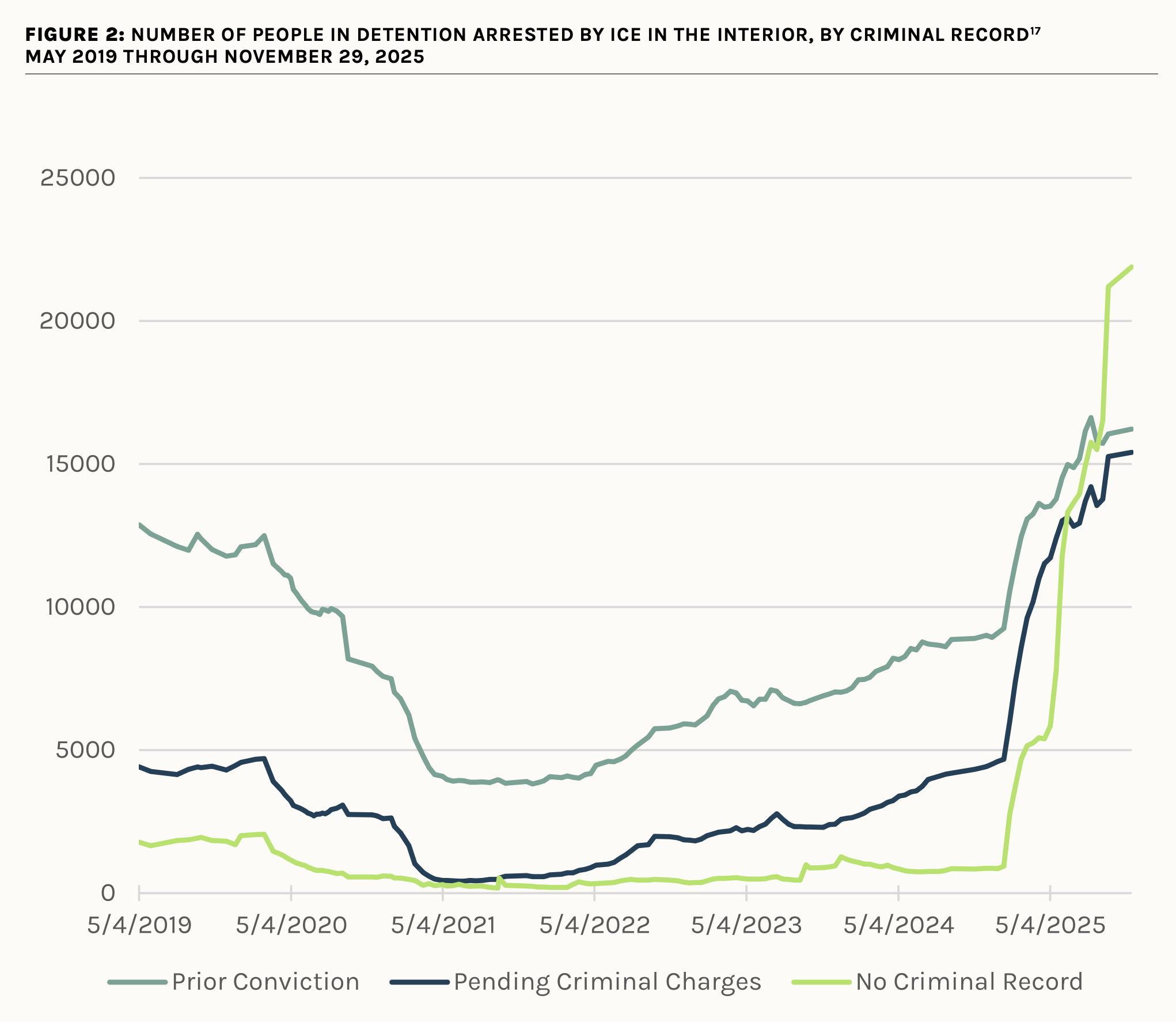
A sweeping report from the American Immigration Council, for example shows both how the number of people being detained by ICE has increased — and how the Trump administration hopes to increase it further still.
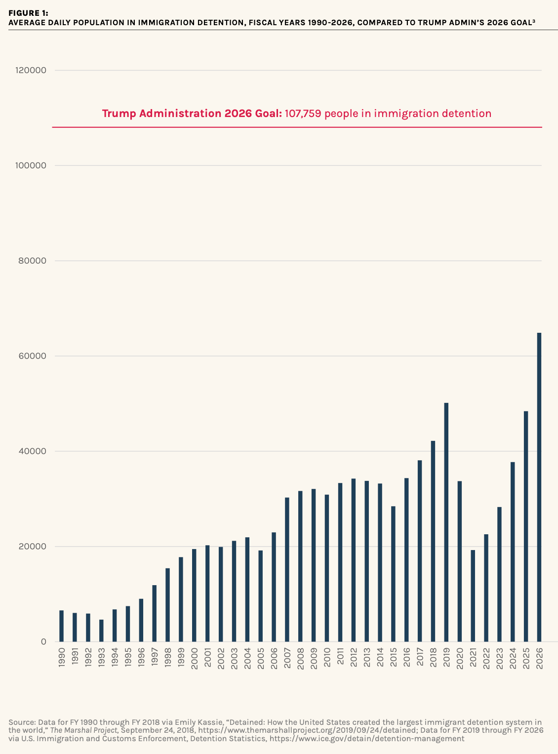
It also shows that there are more people being arrested and detained by ICE who have no criminal record at all than who have convictions or pending charges.
The Washington Post, meanwhile, made a chart showing how many people had died in ICE detention each month since Trump returned to office.
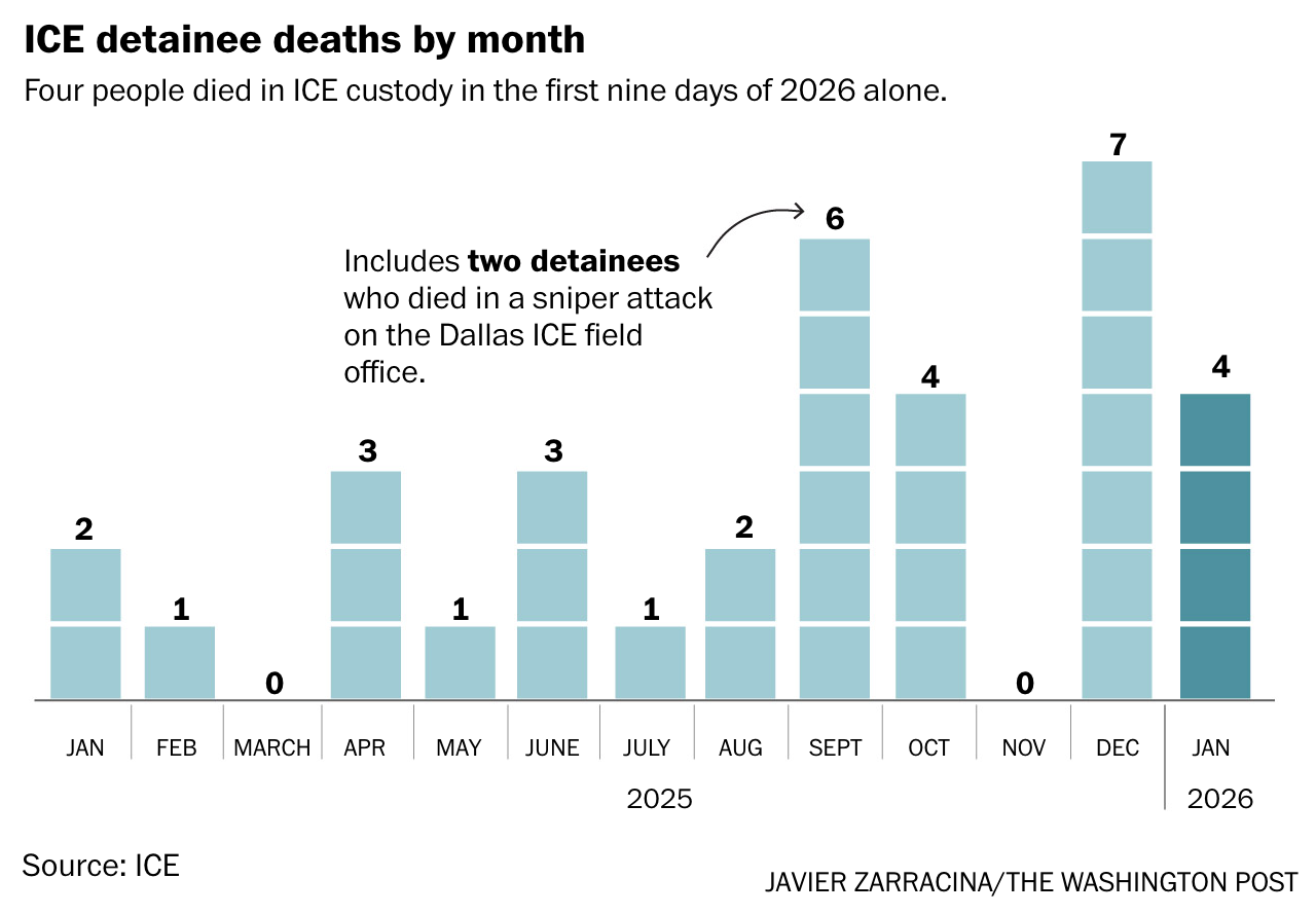
The 30 deaths in detention last year, the paper notes, was the highest in two decades.
For my personal site, the estimable pbump.net, I looked at polling on ICE. For the first time (that I've seen), abolishing ICE has more support than maintaining it, though it's still under 50 percent.
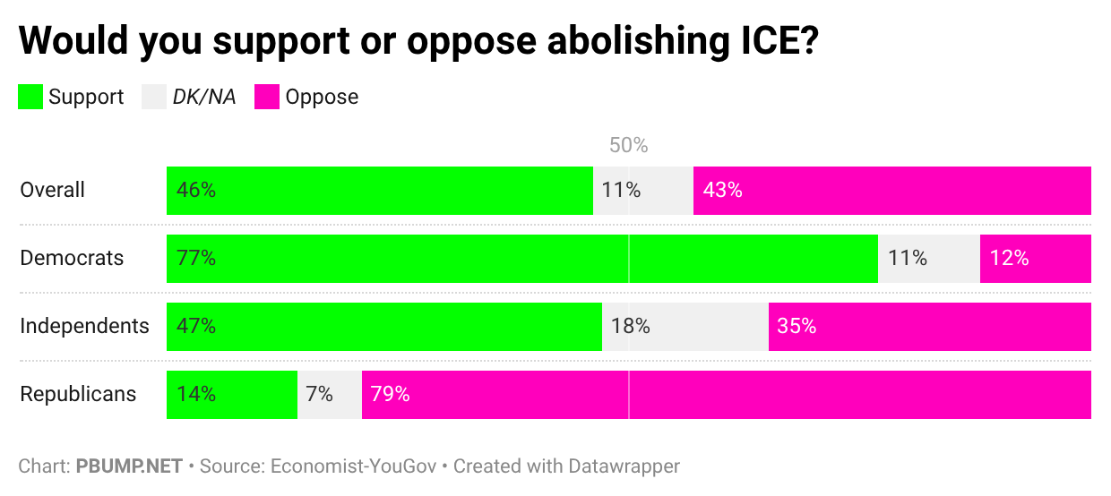
The way things are going, that might change.
Chapter 5
Chart Attack
It is now time for Chart Attack, when I move away from analysis of the news and into a quick presentation of charts about other things entirely!
Like the Minnesota Star-Tribune's look at how local law enforcement in the Twin Cities is dwarfed by the federal presence.
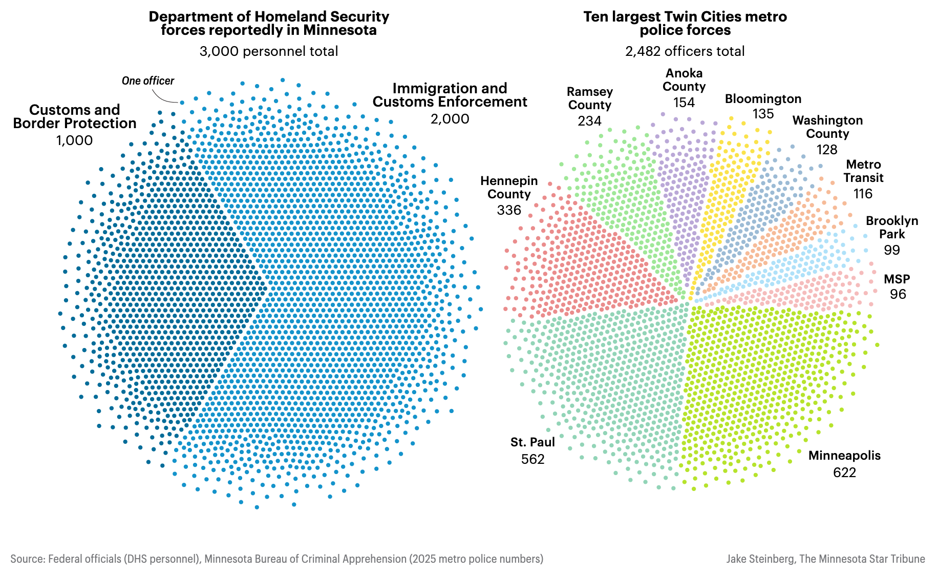
(I really like the use of points here, converting dull pie charts into something more like a beeswarm.)
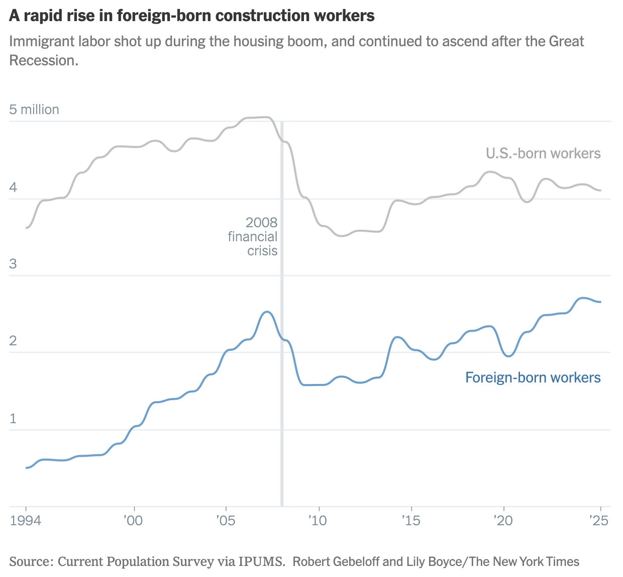
Oops. Sorry. I was supposed to be moving away from the news. OK, so how about The New York Times's look at how dependent the construction industry is on immigrant workers — a pattern that surged only after the collapse of the industry during the Great Recession.
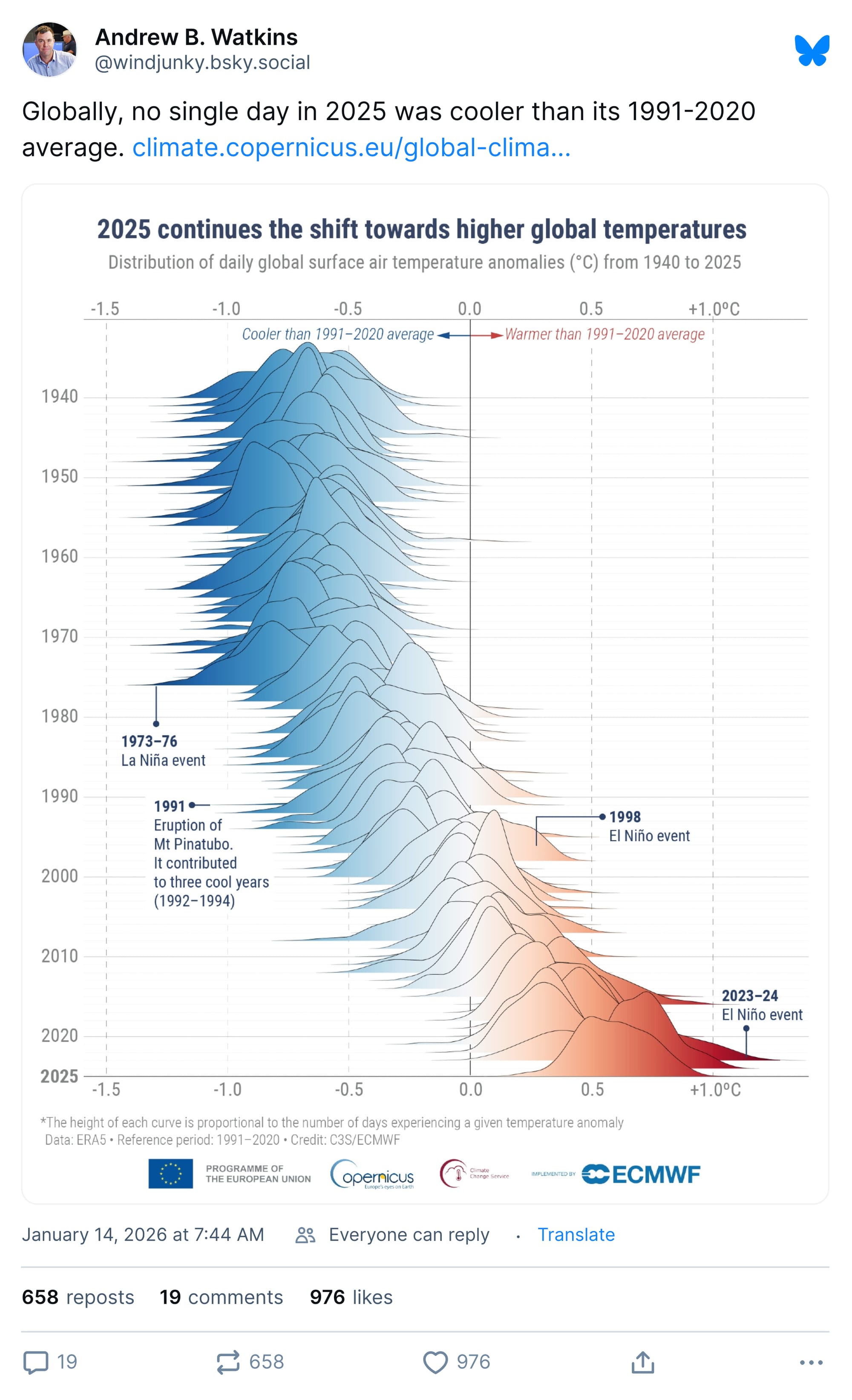
Gah, another news-related chart! My apologies. Here's a pretty chart about … let's see … maybe mountains or something? I've forgotten how to read, so I'll assume that's what this is.
I have to admit: I lied to you both about not tracking the news and not being able to read. No wonder people think journalists are so unethical. (That and a decades-long effort by the political right to devalue objective analysis and reporting that conflicts with their effort to build power.)
One thing that was in the news this week, you will recall, is that the chairman of the Federal Reserve accused the White House of trying to use a pretext to destroy the Fed's independence.
President Trump, meanwhile, decided to tell people that the fraud that is serving as the pretext for the sweeping immigration raids in Minnesota amounted to $19 billion. That's a bit higher than actual estimates.
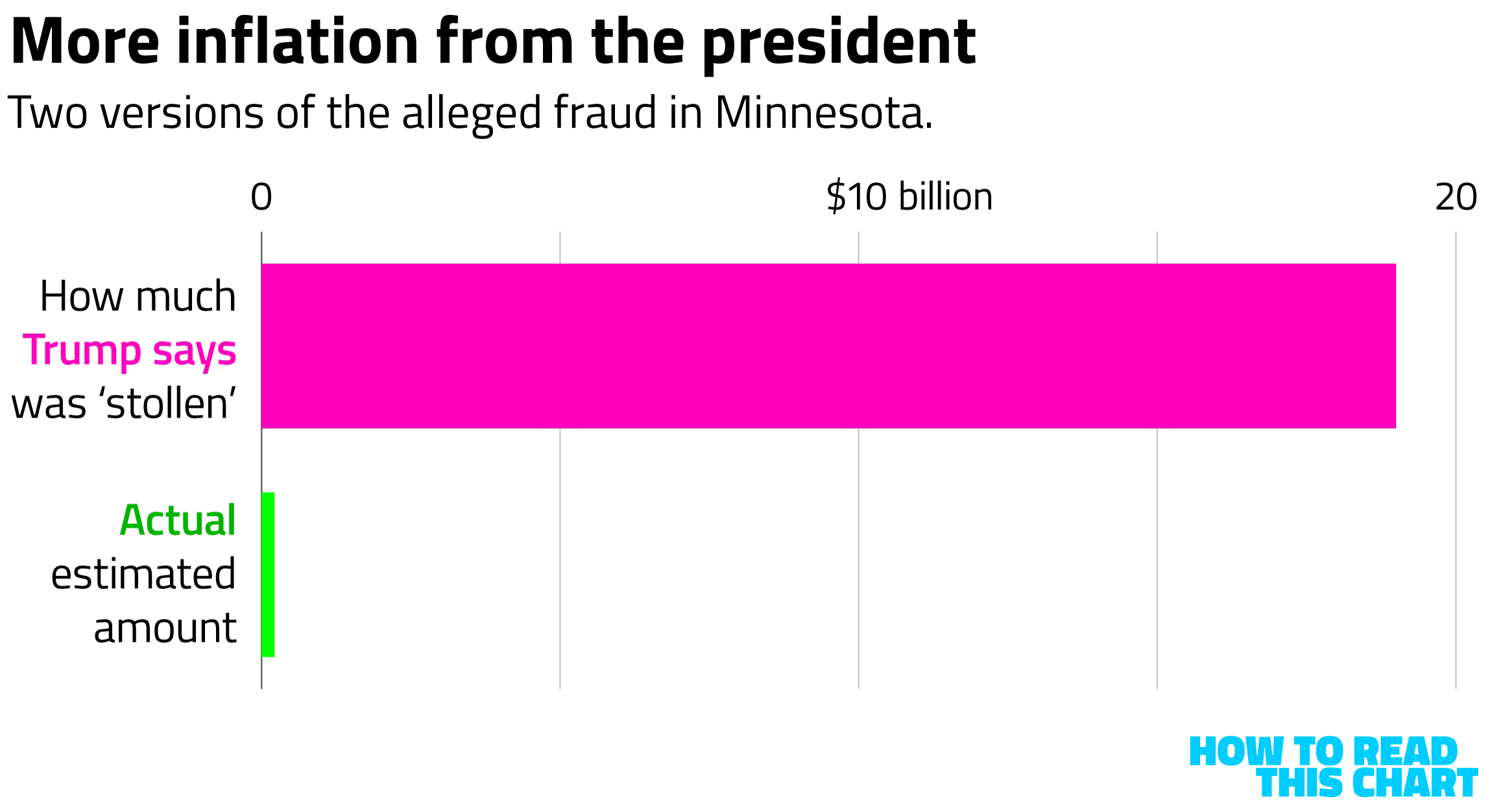
I made that chart, in case you couldn't tell from the little logo and the blindingly aggressive color scheme. I did not make the chart below, showing the evolution of the New York Mets roster and ownership since the team's inception, but I wish I had.
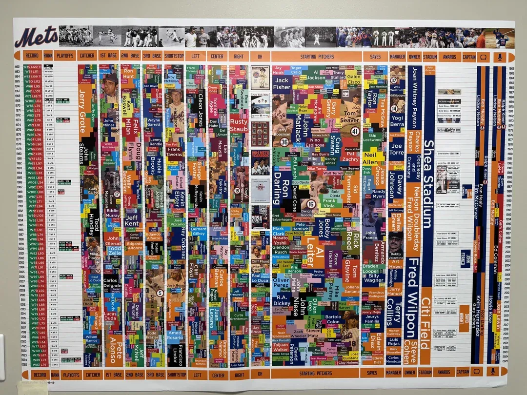
This is also a sort of heat map, except that in most of the years of the team's history it's been an opposite-of-heat map.
I'll end on a rare, isolated note of good news: Pitchers and catchers report in less than a month.
Appendix
Some other things I've written


You are receiving this email because you at some point in time volunteered to, either at Ghost or Substack or pbump.net or pbump.com. If you don't want to receive future emails, you probably ought to be quarantined. What you really want to do is support the newsletter financially, right?
Another one is coming next week. You have been warned.