A visualization you should see.


Some of you may have noticed that last week's newsletter ended with a bit of housekeeping: I wasn't planning on doing a newsletter this week, since I'm on a trip with my family. I was still rummaging around on the internet of course, bookmarking interesting visuals that I could include in the last missive of the month. But this week, I thought optimistically, I'd take Saturday off.
Until I saw this visualization.

This is what a planned ICE detention center a bit east of Atlanta would look like, once the large warehouse building is converted.
On the right side, you can see the intake and processing areas, as well as office space and a gun range. On the left: the "dormitory pods" — meaning beds. Nearly 5,000 of them, including some for detainees with disabilities. Row after row, cage after cage. In the full document, seen at the town's website, another 3,000-plus "pods" are to be built in a "mezzanine."
The presentation about the facility is striking because it's so anodyne. What's discussed is not the moral effect that hosting thousands of people targeted by ICE will have on the community but, instead, what effect there might be on water and electrical supplies. Don't worry: those concerns have been addressed.
As Aaron Reichlin-Melnick of the American Immigration Council explained, what the town of Social Circle is welcoming to its community is a facility intended to aid in the ultimate goal: shipping people out of the country as soon as possible.
"ICE doesn’t want to hold people in detention for lengthy periods of time," he wrote on Bluesky. "That’s why ICE officers pressure people in detention to give up, sometimes every day, sometimes with threats. Every person who fights keeps a bed full, not empty for the next arrestee."
These are not "dormitory pods" meant to provide a place to sleep to people waiting to hear the status of their immigration cases. They are containment areas that will be used as a tool to get people to want to leave the country.
But don't worry. A note from one of the officials advocating for the facility notes that "our team and engineers believe the solutions above, and the contingencies, will provide no adverse effect on the community and surrounding properties."
I mean, some of the internment sites used in World War II are even national historic sites!
You don't get rich by giving money away and vice versa
The good people at Forbes, who diligently document just how outrageously wealthy the outrageously wealthy are, put together data on the philanthropic activity of some of the world's richest people.
You will perhaps not be surprised to learn that the people at the top of the net-worth pyramid spend very little of that wealth on helping other people. Sure, some of them employ people (though perhaps fewer than they used to) and a number of them have made investors pretty rich, but philanthropy?
A table in the Forbes report explains that among a dozen of the wealthiest humans ever to live on this planet, a group worth nearly $3 trillion, the total lifetime philanthropic giving comes in at less than $100 billion. And more than two-thirds of that total is from Warren Buffett alone.
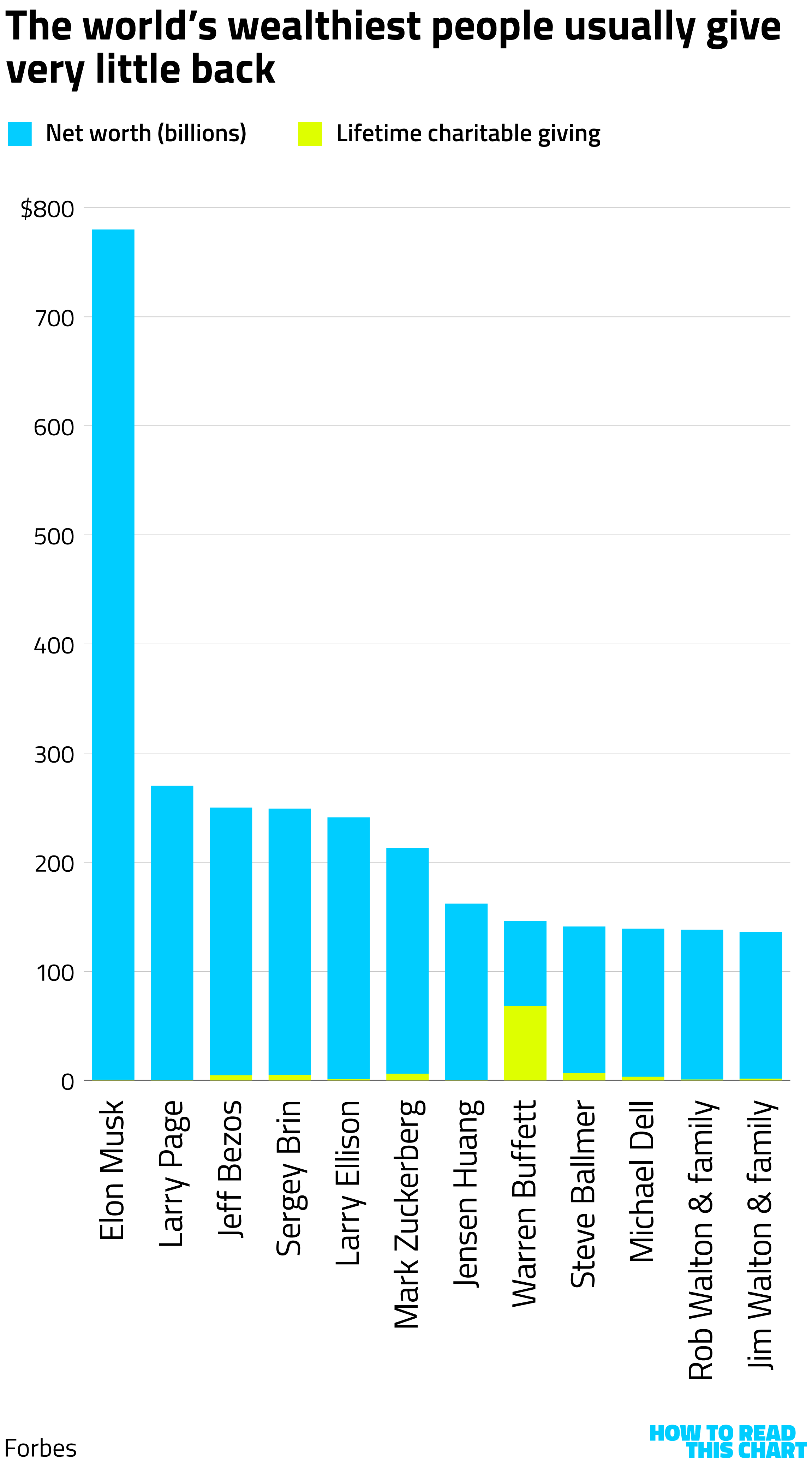
Imagine how much good could have been done had this group given back 10 percent of their net worth, rather than less than 4 percent. Imagine if even one more of them had given back as much as Buffett.
Oh well! At least the world now has some pretty sweet boats.
A little Chart Attack, as a treat
As I mentioned, I'd been storing up some charts/maps/graphs. So here they are, a week before I'd intended to share them.
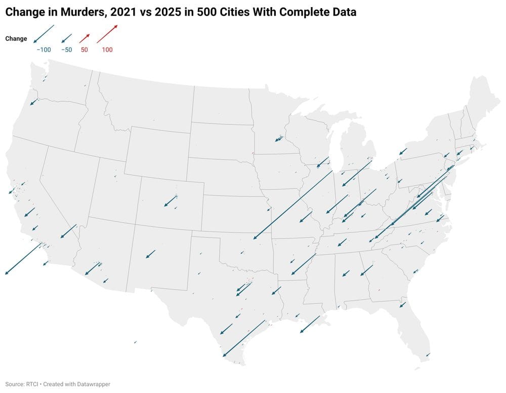
Like Jeff Asher's depiction of the drop in murder in U.S. cities.
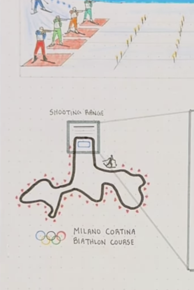
Or one of SportsBall's terrific, hand-drawn explanations of how sports works. Here, it's the Olympic biathlon.
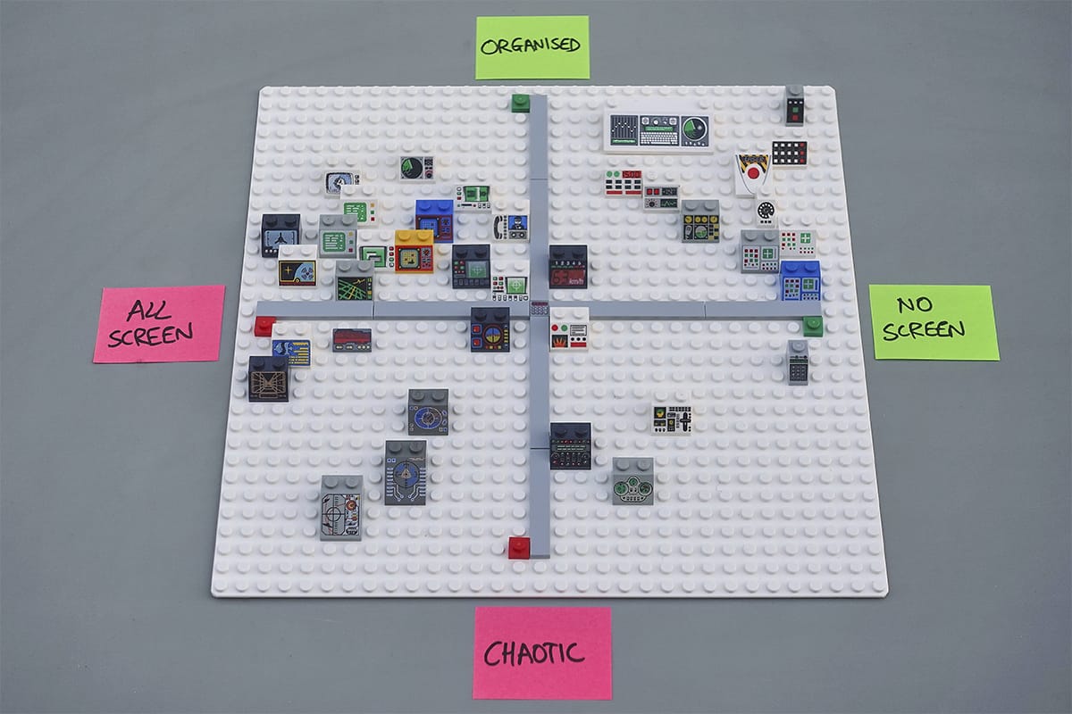
As a parent of kids who gorge on Legos (metaphorically), I was amused by this matrix of the functionality of Lego control panels.
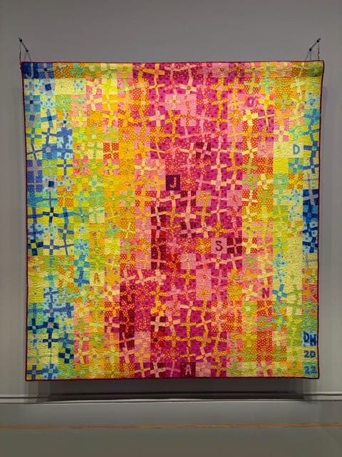
Reader Stephanie Martin sent in another visualization: A quilt depicting the temperature each day in 2022 for a town in Iowa, created by Debra Wykert and on display at the Renwick Gallery in D.C.
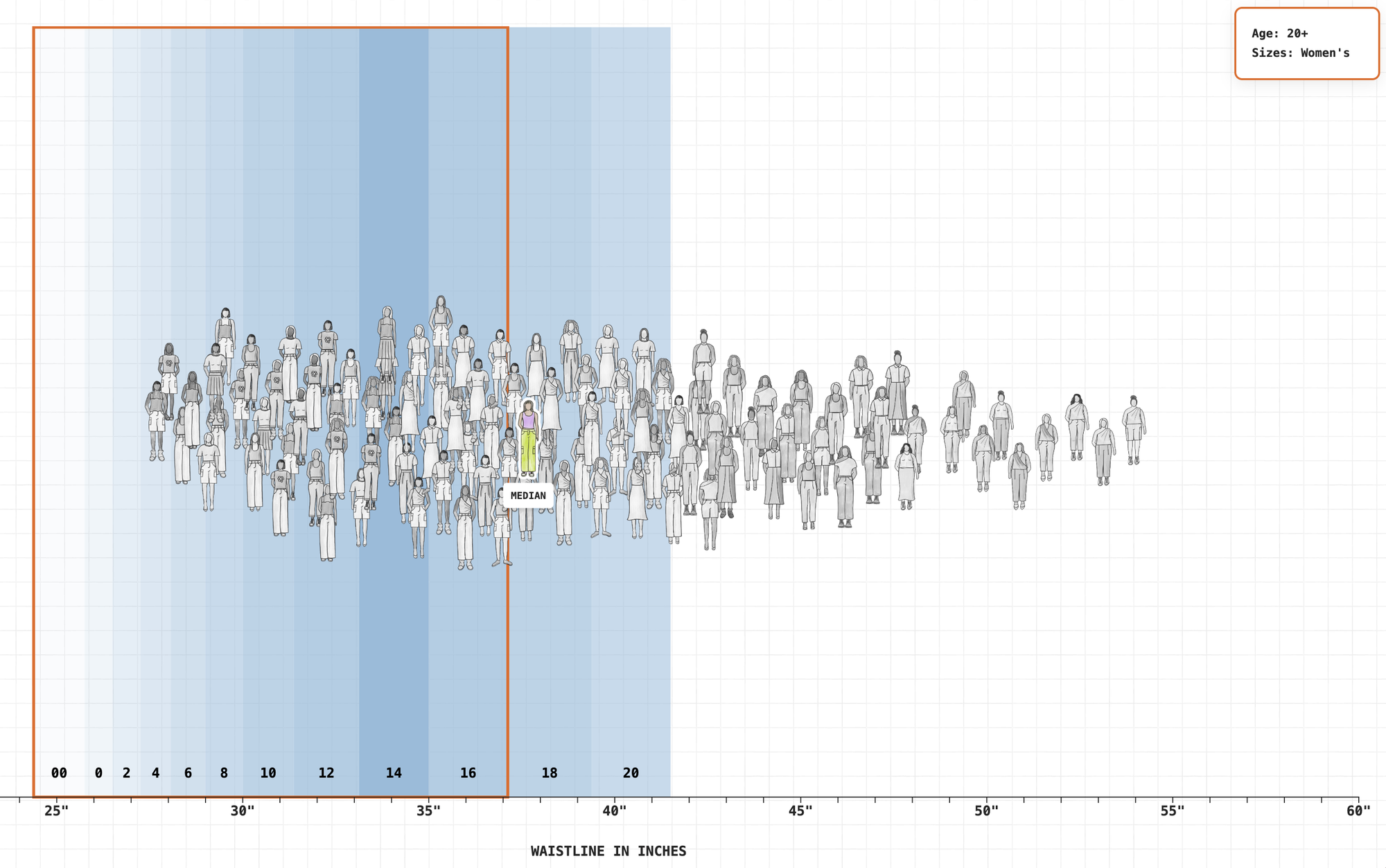
The always-excellent team at The Pudding created a visualization of how and why women's clothing sizes are broken.
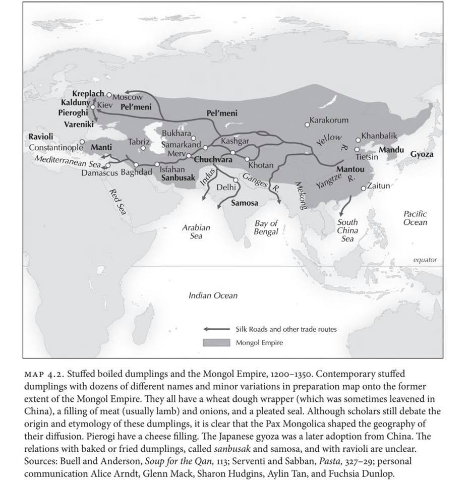
This chart of the evolution and movement of dumplings across Asia and into Europe was floating around social media, as it deserved to be.
And, finally, designer Erin Davis has charts (and, at her site, an interactive) showing the names that are going extinct in the U.S.
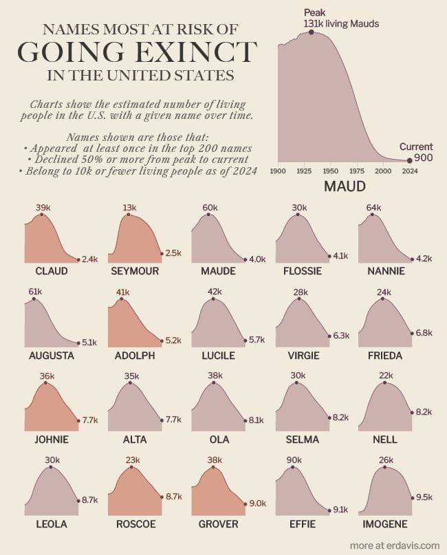
Just not as common to name your kids "Adolph" as it used to be!
We'll see if something similar happens to "Donald."
Some other things I wrote


You are receiving this email because you at some point in time volunteered to, either at Ghost or Substack or pbump.net or pbump.com. If you don't want to receive future emails, it suggests that you have the moral fiber of Elon Musk. What you really want to do is support the newsletter financially, right?
Another one is coming next week. You have been warned.